In this documentation, we will show you how to customize the Checkout Page widget by Ultimate Store Kit.
Enable the Checkout Page Widget
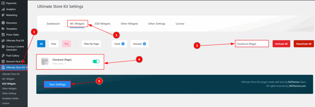
To use the Checkout Page widget by Ultimate Store Kit, first, you have to enable the widget.
- Go to WordPress > Ultimate Store Kit Plugin dashboard.
- Then, Click the WC Widgets Tab.
- Search the Checkout Page Widget Name.
- Enable the Checkout Page Widget.
- Hit the Save Settings Button.
Inserting the Checkout Page widget
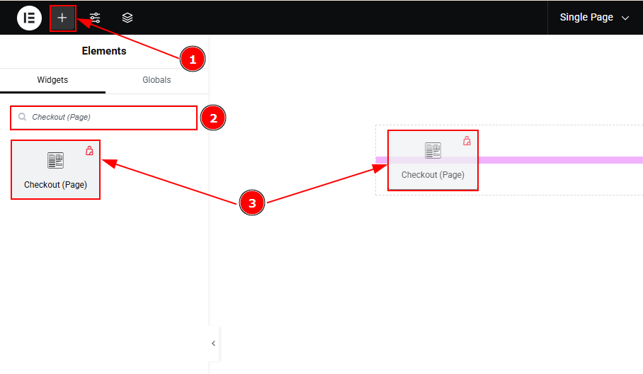
- Go to the Elementor Editor Page and Hit the “+” (Add Element) icon button.
- Search the Checkout Page widget.
- Drag the widget and drop it on the editor page
Work with the Style Tab of Checkout Page
Heading Section
Go to Style > Heading
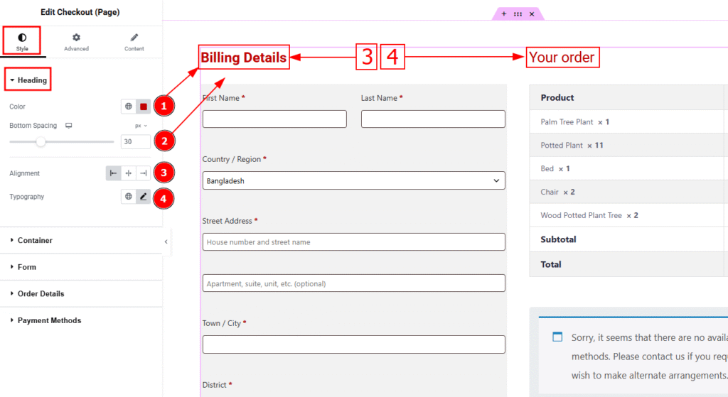
1. Color: You can change the product title color with this option.
2. Bottom Spacing: You can adjust the space between the heading and the container with this option.
3. Alignment: You can select the heading position to left, center or right with this option.
4. Typography: Change the heading’s font family, size, weight, transform, style, decoration, line height, letter spacing, and word spacing from here.
Container Section
Go to Style > Container
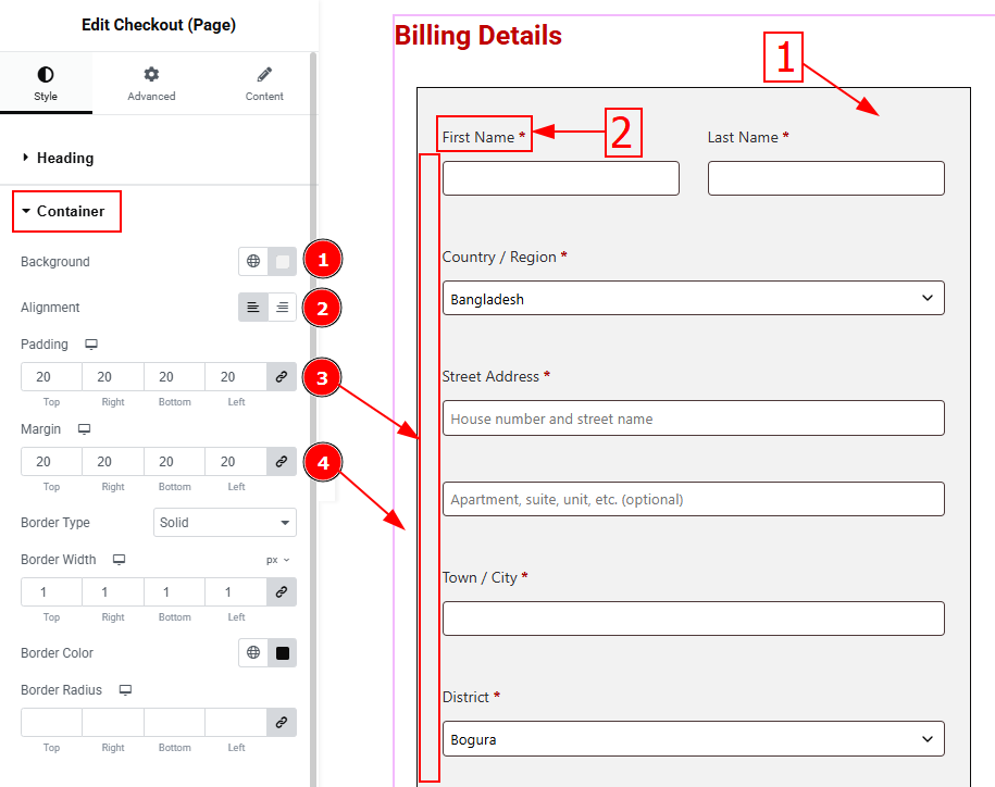
1. Background: You can change the product price color with this option.
2. Alignment: You can set the label position to left or right with this position.
3. Padding: Add spaces around an object to increase the inner area. Padding allows you to control the internal space within an element.
4. Margin: This option allows you to adjust the space & create gaps around the quantity field.
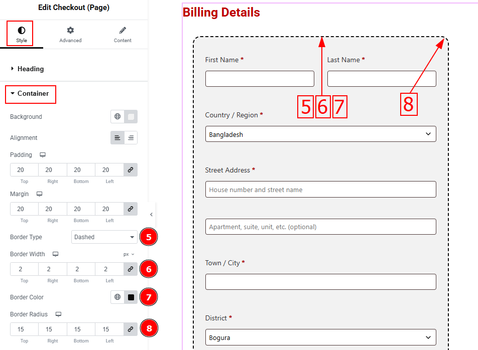
5. Border Type: This option allows you to add borders to your items. You can select various border types from this option. Such as solid, double, dots, dashes, and grooves.
6. Border Width: Set the thickness of the border with this option.
7. Border Color: You can change the border color with this option.
8. Border Radius: This option controls the roundness of the border.
Form Section
Go to Style > Form
In this section, we have two tabs. One is Label and the other is Input. Let’s start with the Label tab –
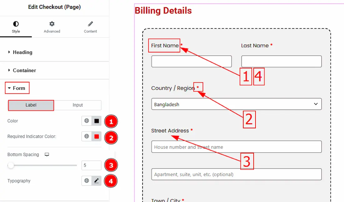
1. Color: You can change the label color with this option.
2. Required Indicator Color: You can change the required indicator color with this option.
3. Bottom Spacing: This option lets you set the bottom spacing of form label.
4. Typography: Change the text’s font family, size, weight, transform, style, decoration, line height, letter spacing, and word spacing from here.
Now, let’s proceed to the Input tab –
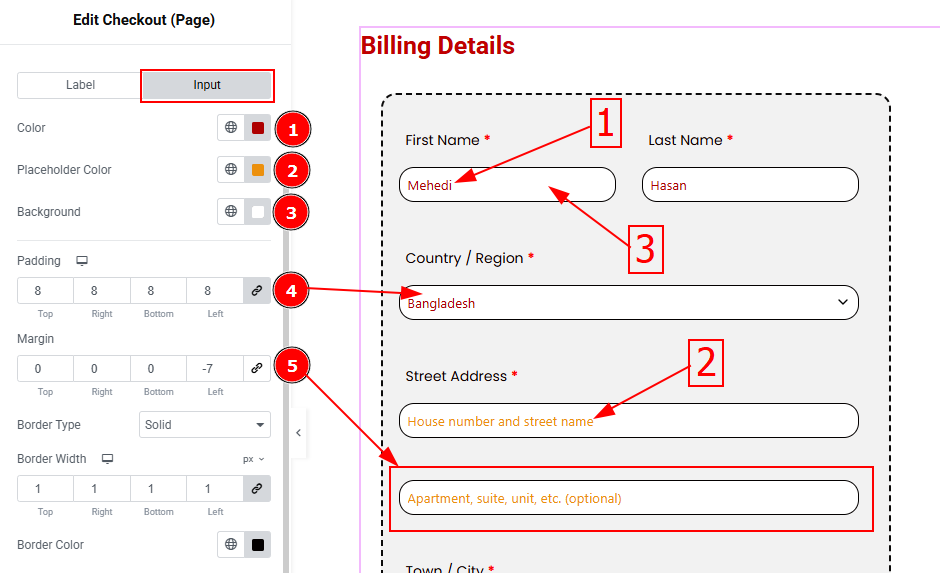
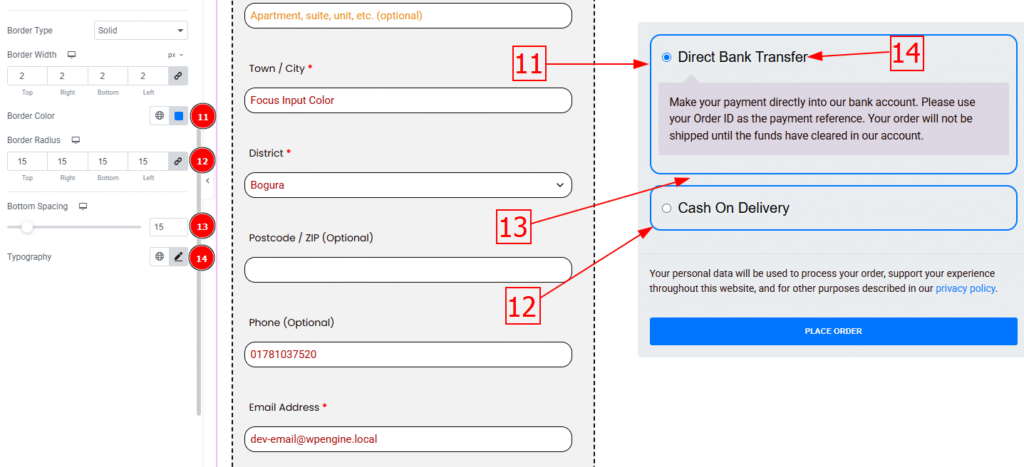
1. Color: You can change the input color with this option.
2. Placeholder Color: You can change the placeholder color with this option.
3. Background: You can change the input background color with this option.
4. Padding: You can adjust the inner space of the input field with this option.
5. Margin: You can adjust the space around the input field with this option.
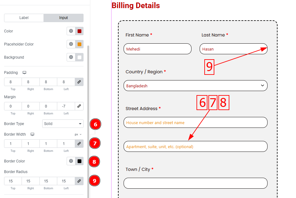
6. Border Type: This option allows you to change the border type.
7. Border Width: Set the thickness of the border with this option.
8. Border Color: You can change the border color with this option.
9. Border Radius: This option controls the border roundness with this option.
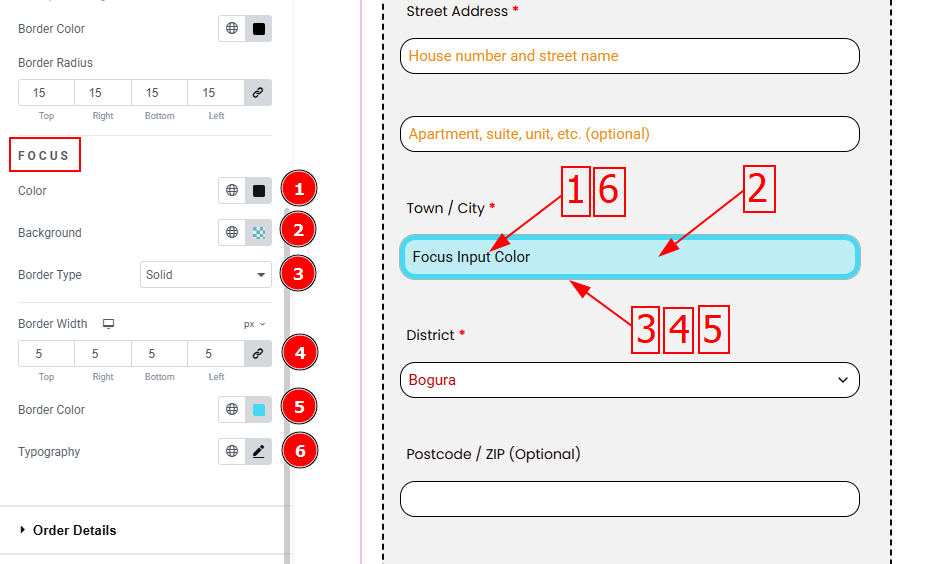
In this tab, we have one more sub-section. Let’s explore this Focus sub-section:
1. Color: You can change the focus input color with this option.
2. Background: You can change the focus background color with this.
3. Border Type: This option allows you to change the border type.
4. Border Width: Set the thickness of the border with this option.
5. Border Color: You can change the focus border color with this option.
6. Typography: Change the focus input text font family, size, weight, transform, style, decoration, line height, letter spacing & word spacing from here.
Order Details Section
Go to Style > Order Details
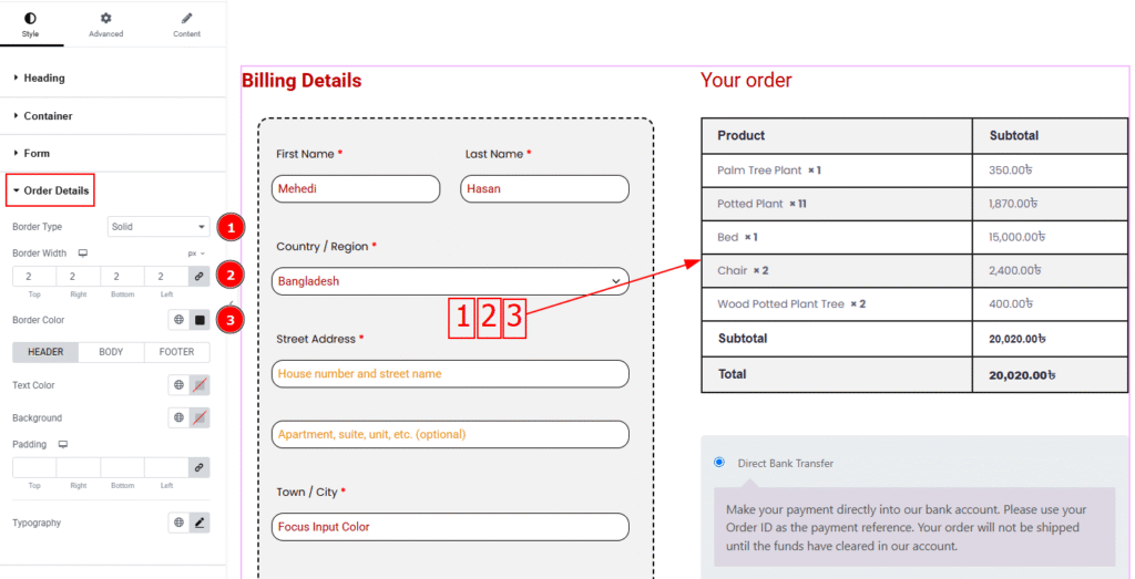
1. Border Type: You can add and change the border type with this option.
2. Border Width: Set the thickness of the border with this option.
3. Border Color: You can change the border color with this option.
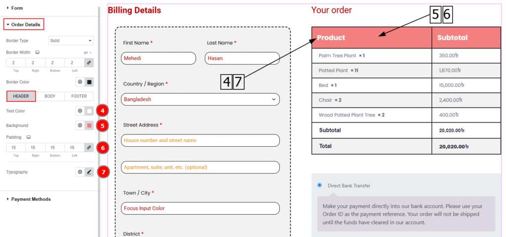
In this section, we have three tabs. These are Header, Body & Footer. Let’s start with the Header tab –
4. Text Color: You can change the header text color with this option.
5. Background: You can change the header background color with this option.
6. Padding: You can adjust the inner space of the heading field with this option.
7. Typography: Change the header text’s font family, size, weight, transform, style, decoration, line height, letter spacing & word spacing from here.
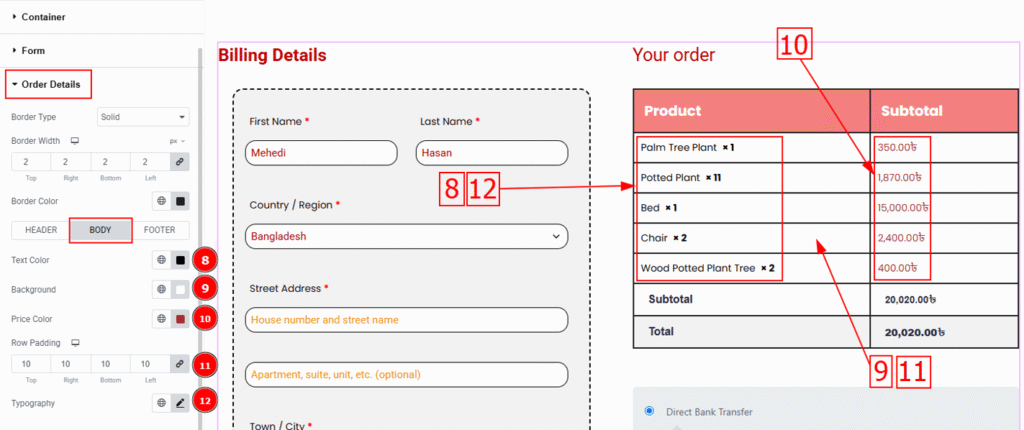
Now, let’s proceed to the Body Tab –
8. Text Color: You can change the body text color with this option.
9. Background: You can change the body’s background color with this option.
10. Price Color: You can change the price color with this option.
11. Row Padding: You can adjust the row’s inner space with this option.
12. Typography: Change the body text’s font family, size, weight, transform, style, decoration, line height, letter spacing & word spacing from here.
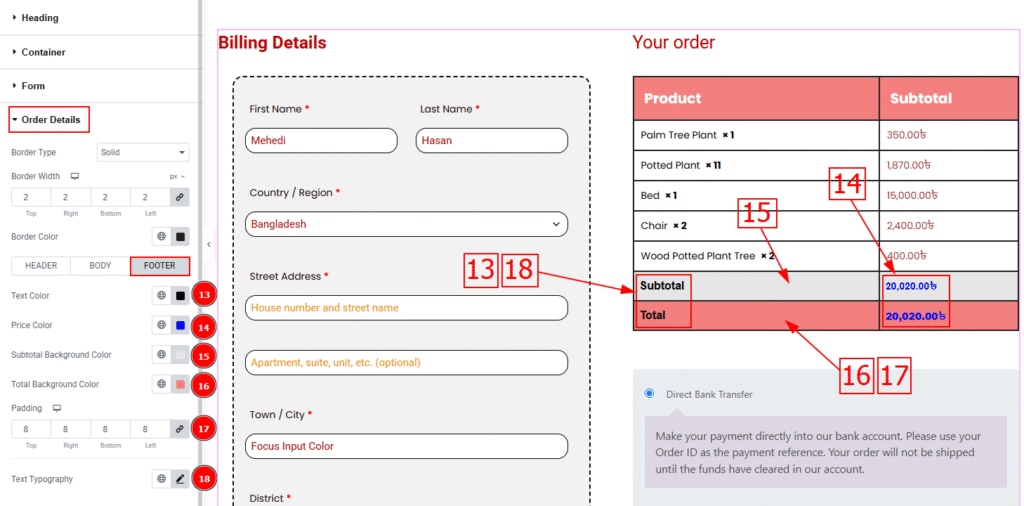
Now, let’s proceed to the Footer Tab –
13. Text Color: You can change the body text color with this option.
14. Price Color: You can change the price color with this option.
15. Subtotal Background Color: You can change the subtotal background color with this option.
16. Total Background Color: You can change the total background color with this option.
17. Padding: You can adjust the footer’s inner space with this option.
18. Typography: Change the footer text’s font family, size, weight, transform, style, decoration, line height, letter spacing & word spacing from here.
Payment Methods Section
Go to Style > Payment Methods
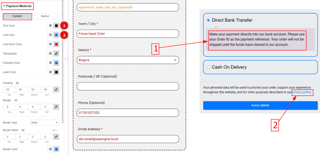
In this section, we have two tabs. One is Content & the other is Button. Let’s explore the content tab first –
1. Text Color: You can change the text color with this option.
2. Link Color: You can change the link text color with this option.
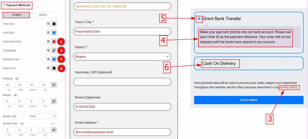
3. Link Hover Color: You can change the link text hover color with this option.
4. Typography: Change the text’s font family, size, weight, transform, style, decoration, line height, letter spacing & word spacing from here.
5. Checked Color: You can change the checked color with this option.
6. Label Color: You can change the label color with this option.
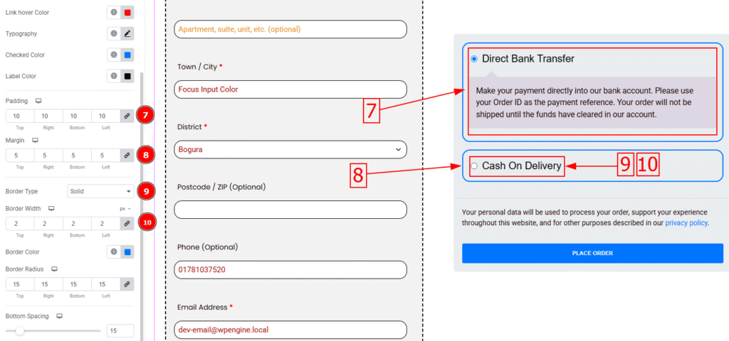
7. Padding: You can adjust the space inside the label field with this option.
8. Margin: You can adjust the space around the label with this option.
9. Border Type: This option allows you to add & change the border type.
10. Border Width: Set the thickness of the border with this option.
11. Border Color: You can change the border color with this option.
12. Border Radius: This option controls the roundness of the border.
13. Bottom Spacing: This option allows you to adjust the space between the label fields.
14. Typography: Change the label’s font family, size, weight, transform, style, decoration, line height, letter spacing & word spacing from here.
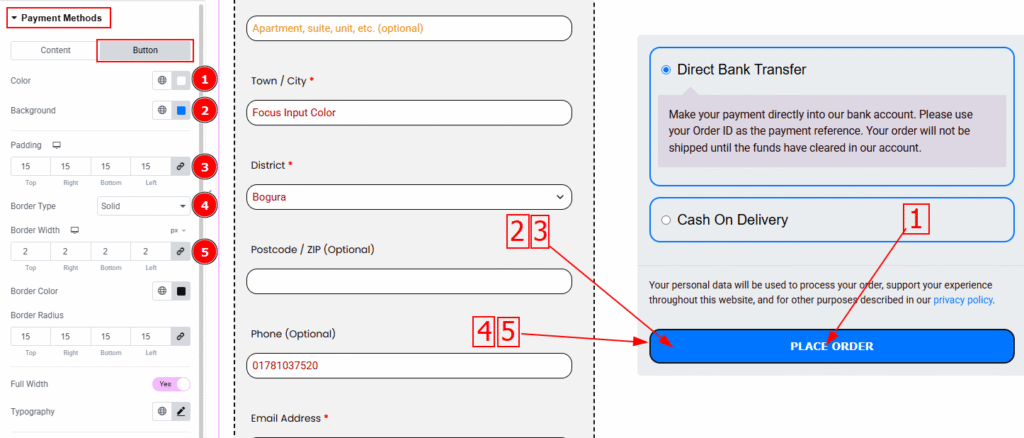
Now let’s proceed to the Button Tab –
1. Color: You can change the button text color with this option.
2. Background: You can change the button background color with this option.
3. Padding: This option controls the inner space of the button.
4. Border Type: This option allows you to add & change the border type.
5. Border Width: Set the thickness of the border with this option.
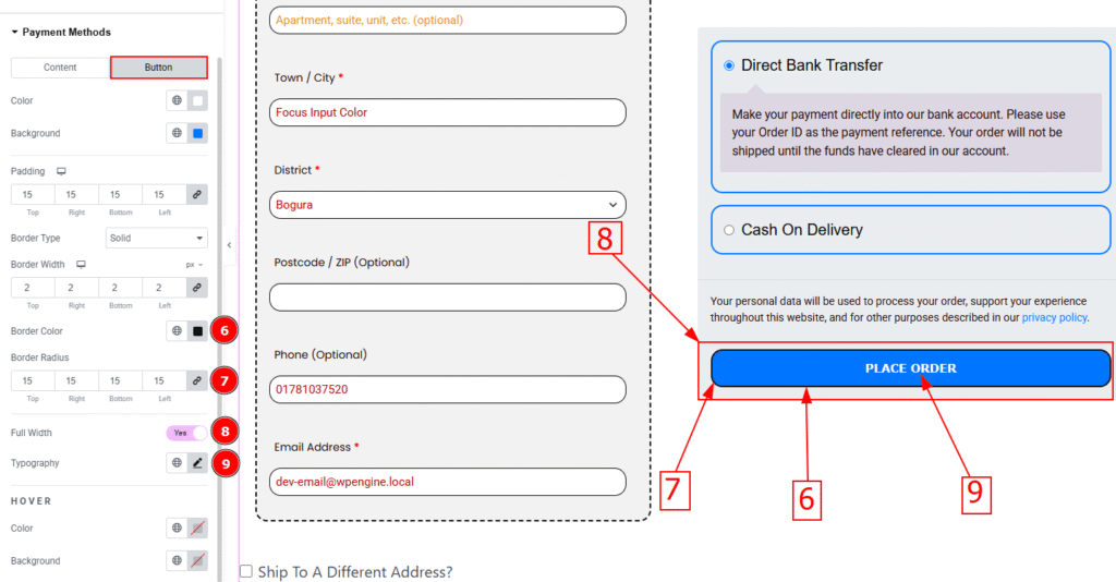
6. Border Color: You can change the border color with this option.
7. Border Radius: This option controls the roundness of the border.
8. Full Width: Enable this switcher to show the full width of the button.
9. Typography: Change the button text’s font family, size, weight, transform, style, decoration, line height, letter spacing & word spacing from here.
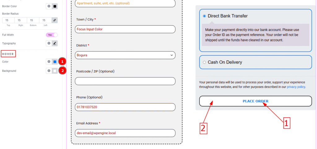
1. Color: You can change the button text hover color with this option.
2. Background: You can change the button background hover color with this option.
All done! You have successfully customized the Checkout Page widget on your website.
Video Assist
You can also watch the video tutorial to learn more about the Checkout Page Widget. Please visit the demo page for examples.
Thanks for being with us.