

The Stacks Cards widget from Prime Slider Pro lets you create interactive stacked card sliders with smooth transition effects. It’s ideal for showcasing images or featured items in a modern and engaging layout. This documentation explains how to use and customize the Stacks Cards widget in Elementor.
Enable the Cards Stack slider widget
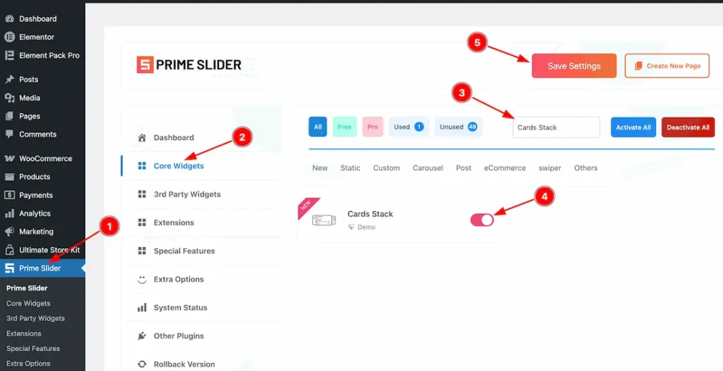
To use the Elementor Cards Stack Slider widget from Prime Slider, first, you have to enable the widget.
- Go to WordPress dashboard > Prime Slider Plugin dashboard.
- Then, click the Core Widgets Tab.
- Search the Cards Stack Slider Widget Name.
- Enable the Cards Stack Slider Widget.
- Hit the Save Settings Button.
Inserting the Cards Stack Slider widget
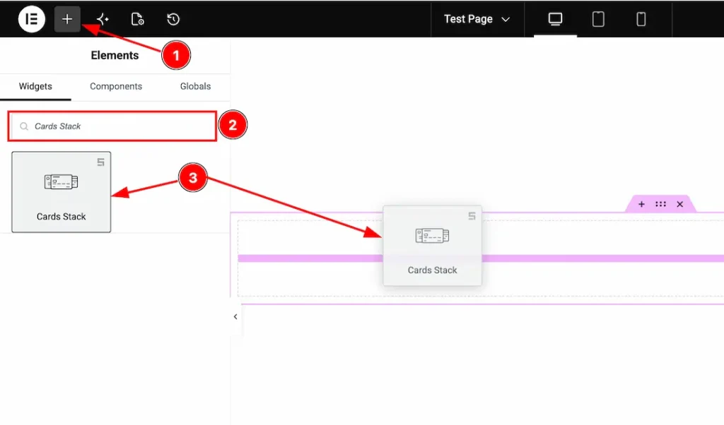
1. Go to the Elementor Editor Page and hit the “+” icon Button.
2. Search the Cards Stack Slider widget.
3. Drag the widget and Drop it on the editor page.
(Note: You need both Elementor and Prime Slider Pro installed to use this widget.)
Work With The Content Tab
Slides Section
Go to Content > Slides
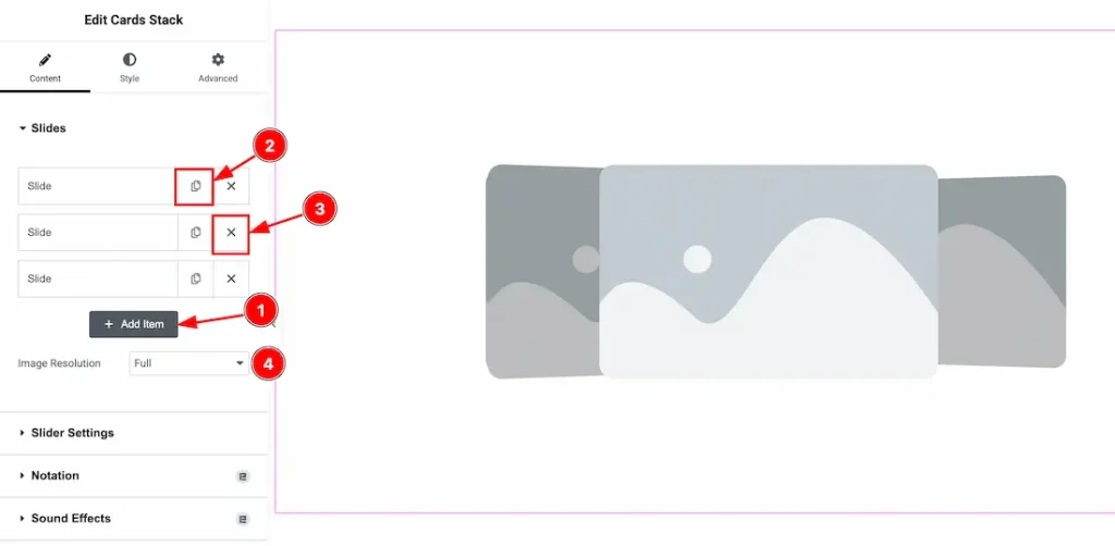
1. Add Item: You can add a new item by clicking the “+” Add Item button.
2. Copy Item: This option lets you copy the same item.
3. Close Item: You can delete the Slider item by clicking the Close icon button.
4. Image Resolution: This option lets you set the slider image resolution. You can choose your preferred image resolution from here.
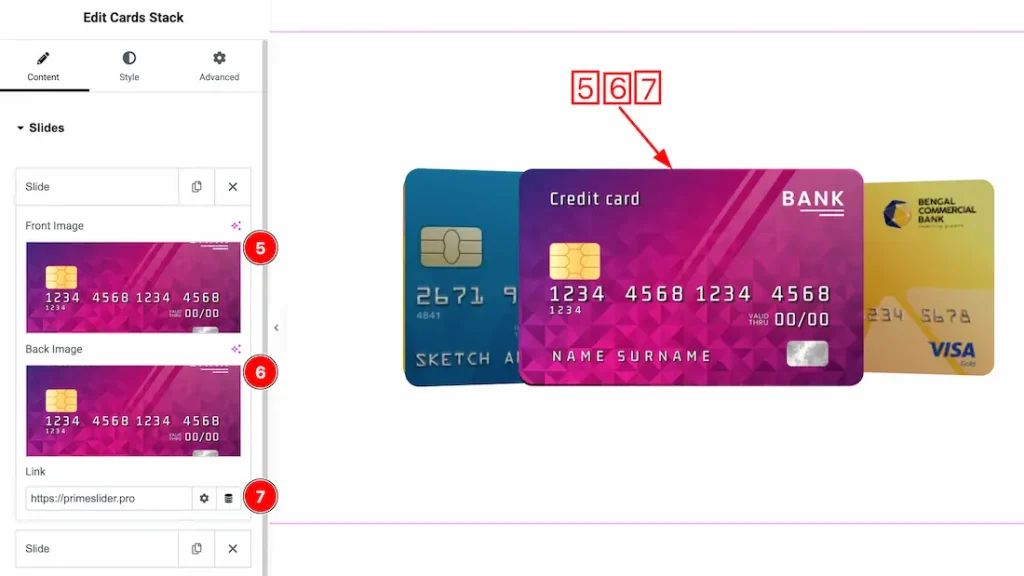
Come to the each slider item, you will get the following customization options-
1. Font Image: This option lets you change the slide’s font image.
2. Back Image: This option lets you change the slide’s back image.
3. Link: This option lets you set a link under the slide’s image.
Slider Settings Section
Go to Content > Slider Settings
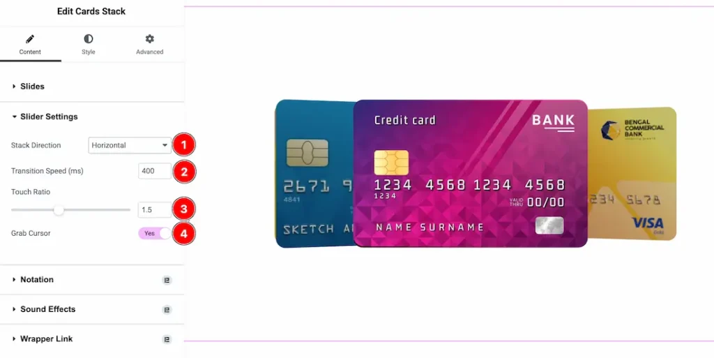
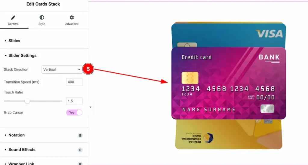
1. Stack Direction: From here, you can set the stack direction- Horizontal or Vertical. Here, we set the direction- Horizontal.
2. Transition Speed(ms): This option lets you set the slider transition speed.
3. Touch Ratio: The Touch Ratio setting controls the swipe sensitivity of the slider. Lower values make slides move faster with a small swipe, while higher values require more dragging to change slides.
4. Grab Cursor: Enable the Grab Cursor option to show a grab-style cursor while hovering over the slider, giving users a more interactive drag-and-swipe experience.
When Stack Direction is Vertical
Work with The Style Tab
Wrapper Section
Go to Style > Wrapper
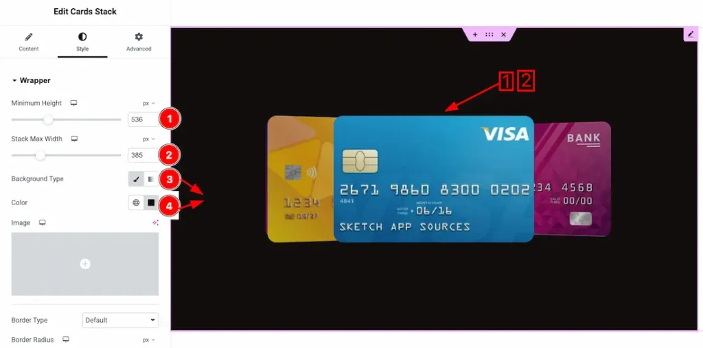
1. Minimum Height: This option lets you set the slider’s minimum height.
2. Stack Max Width: This option lets you set the slider’s Max width.
3. Background Type: You can change the slider background to classic or gradient. Here we choose the Background type Classic.
4. Color: This option lets you change the slider background color.
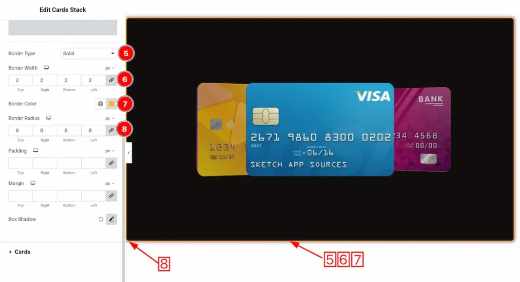
5. Border Type: You can set the Border Type to Default, None, Solid, Double, Dotted, Dashed, or Groove. We choose here the Border Type Solid.
6. Border Width: You can set the border width from here.
7. Border Color: This option lets you change the border color.
8. Border Radius: This option lets you set the border radius.
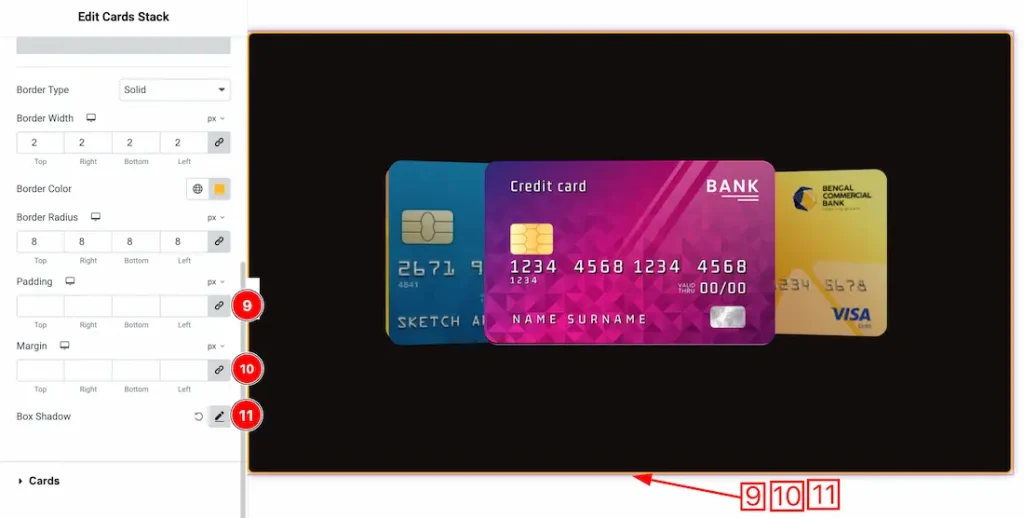
9. Padding: You can adjust the slider padding from here.
10. Margin: You can adjust the slider margin from here.
11. Box Shadow: If you want, you can add a box shadow under the slider.
Cards Section
Go to Style > Cards
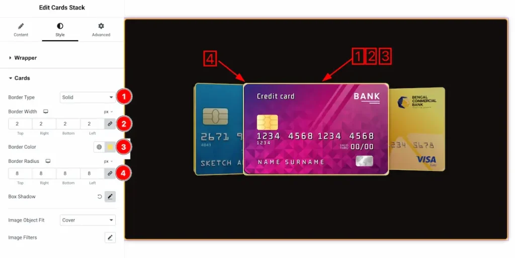
1. Border Type: You can set the Border Type to Default, None, Solid, Double, Dotted, Dashed, or Groove. We choose here the Border Type Solid.
2. Border Width: You can set the card’s border width from here.
3. Border Color: This option lets you change the card’s border color.
4. Border Radius: This option lets you set the card’s border radius.
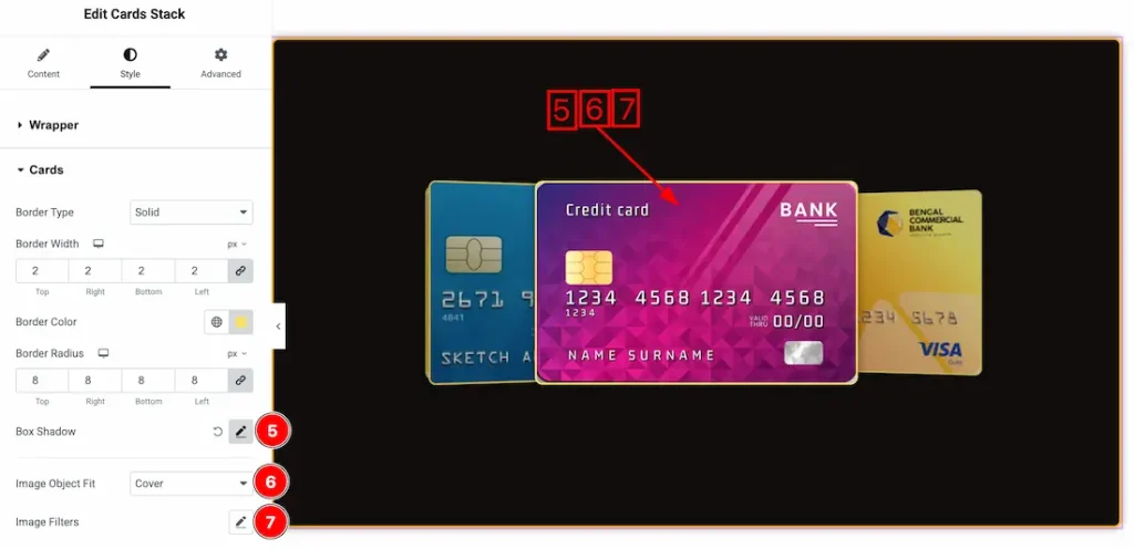
5. Box Shadow: You can add a box shadow under the cards.
6. Image Object Fit: The Object Fit Type setting lets you choose how images are displayed inside the slider container, such as cover, contain, or fill, to control image sizing and alignment.
7. Image Filters: CSS image filters are visual effects that change how images appear on a webpage without altering the original file. They let you adjust properties like blur, brightness, contrast, saturation, and color tone using CSS to create more dynamic and engaging designs.
- Hue – Shifts the overall color tone of the image across the color spectrum.
- Blur – Softens the image by reducing sharp details, creating depth or background focus.
- Brightness – Controls how light or dark an image appears.
- Contrast – Adjusts the difference between light and dark areas to make visuals stronger or softer.
- Saturation – Changes the intensity of colors, from muted to vivid.
All done! You have successfully customized the Cards Stack Slider on your website.
Video Assist
Please watch the video tutorial to use the Cards Stack slider widget. Also, check the demo page for more examples.
Thanks for being with us.