

The Panorama Slider widget from Prime Slider Pro lets you create modern and visually engaging sliders with smooth transition effects. It’s ideal for showcasing featured content, images, or promotions in an interactive layout. This documentation explains how to use and customize the Panorama Slider widget in Elementor.
Enable the Panorama slider widget
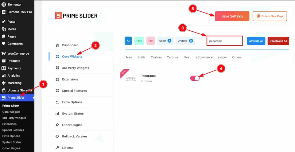
To use the Elementor Panorama Slider widget from Prime Slider, first, you have to enable the widget.
- Go to WordPress dashboard > Prime Slider Plugin dashboard.
- Then, click the Core Widgets Tab.
- Search the Panorama Slider Widget Name.
- Enable the Panorama Slider Widget.
- Hit the Save Settings Button.
Inserting the Panorama Slider widget
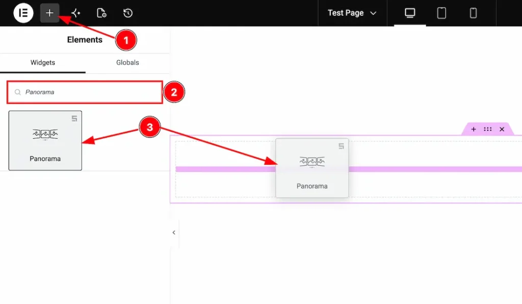
1. Go to the Elementor Editor Page and hit the “+” icon Button.
2. Search the Panorama Slider widget.
3. Drag the widget and drop it on the editor page.
(Note: You need both Elementor and Prime Slider Pro installed to use this widget.)
Work With The Content Tab
Slides Section
Go to Content > Slides
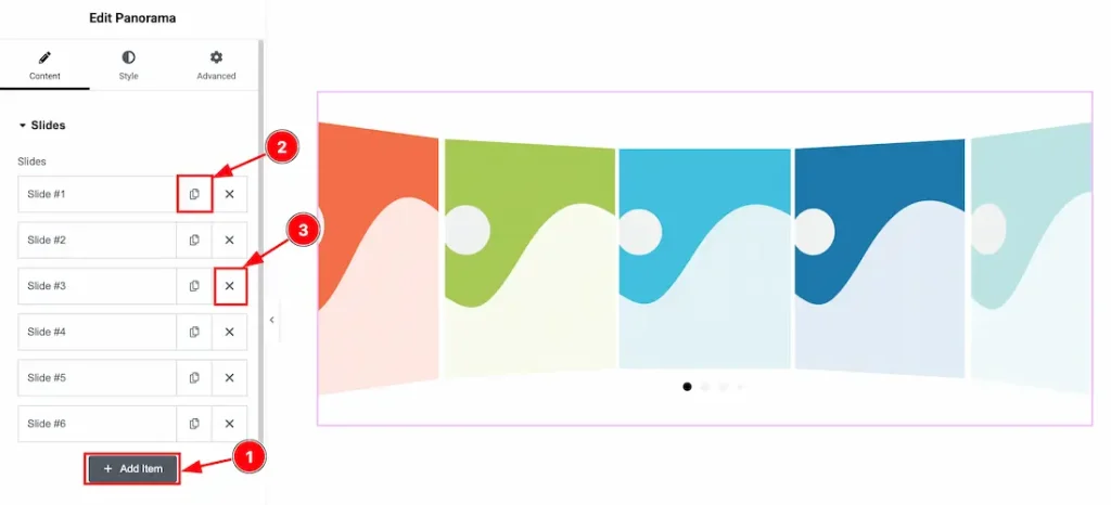
1. Add Item: You can add a new item by clicking the “+” Add Item button.
2. Copy Item: This option lets you copy the same item.
3. Close Item: You can delete the Slider item by clicking the Close icon button.
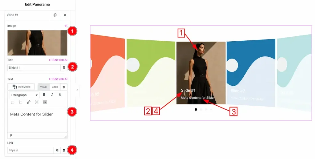
1. Image: This option lets you change the each slides image.
2. Title: This option lets you change the slider titles.
3. Text: This option lets you change the slider text.
4. Link: You can add a link under the title.
Additional Settings Section
Go to Content > Additional Settings
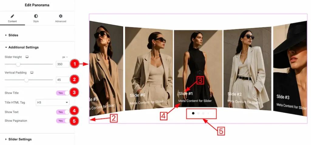
1. Slider Height: This option lets you set the slider height as your required need.
2. Vertical Padding: You can adjust the vertical padding from here.
3. Show Title: Enable/disable the show title switcher button to show/hide the title from slider.
4. Show Text: Enable/disable the show text switcher button to show/hide the text from slider.
5. Show Pagination: Enable/disable the show pagination switcher button to show/hide the pagination from slider.
Slider Settings Section
Go to Content > Slider Settings
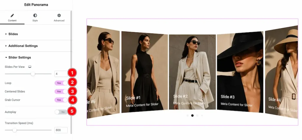
- Slides Per View: Controls how many slides are visible at the same time within the slider area.
- Loop: Enable the switcher button to continuously repeat the slider items in an endless cycle.
- Centered Slides: Enable the switcher button to keep the active slide centered within the slider.
- Grab Cursor: Enable the switcher button to change the cursor into a grab icon for better drag interaction.
- Autoplay: Enable the switcher button to automatically switch slides without user interaction.
- Transition Speed (ms): Sets the duration of the slide transition animation in milliseconds.
Panorama Effects Section
Go to Content > Panorama Effects
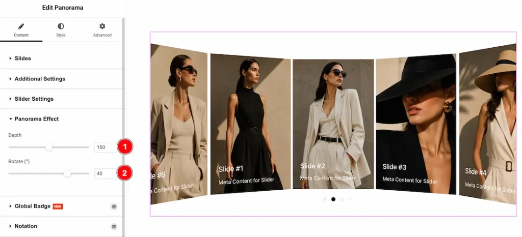
- Depth: Controls the 3D perspective depth of the panorama effect. Higher values create a more pronounced curved and immersive slider appearance.
- Rotate (°): Adjusts the rotation angle of the panorama effect, controlling how much the slides are tilted within the 3D view.
Work with The Style Tab
Wrapper Section
Go to Style > Wrapper
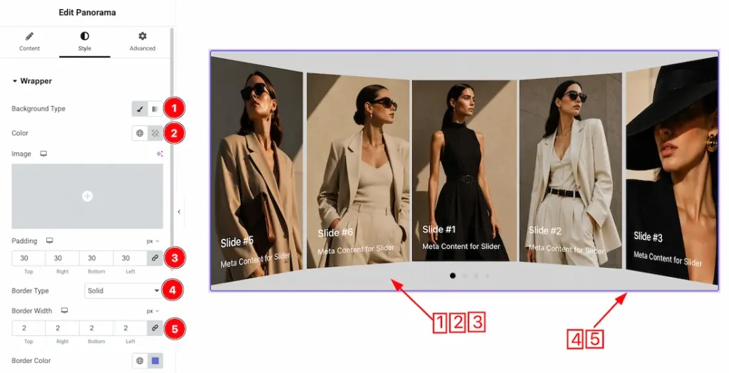
1. Background Type: You can change the slider background to classic or gradient. Here we choose the Background type Classic.
2. Color: This option lets you change the slider background color.
3. Padding: You can adjust the slider padding from here.
4. Border Type: You can set the slider Border Type to Default, None, Solid, Double, Dotted, Dashed, or Groove. We choose here the Border Type Solid.
5. Border Width: This option lets you set the border width.
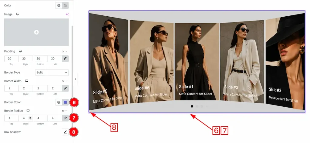
6. Border Color: This option lets you change the border color of the slider.
7. Border Radius: You can adjust the slider border radius.
8. Box Shadow: This option lets you add a box shadow under the slider area.
Images Section
Go to Style > Images
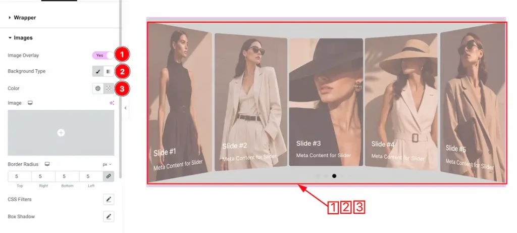
1. Image Overlay: Enable/disable the image overlay switcher button to show/hide the overlay.
1. Background Type: You can change the image background overlay to classic or gradient. Here we choose the Background type Classic.
2. Color: This option lets you change the slider image background overlay color.
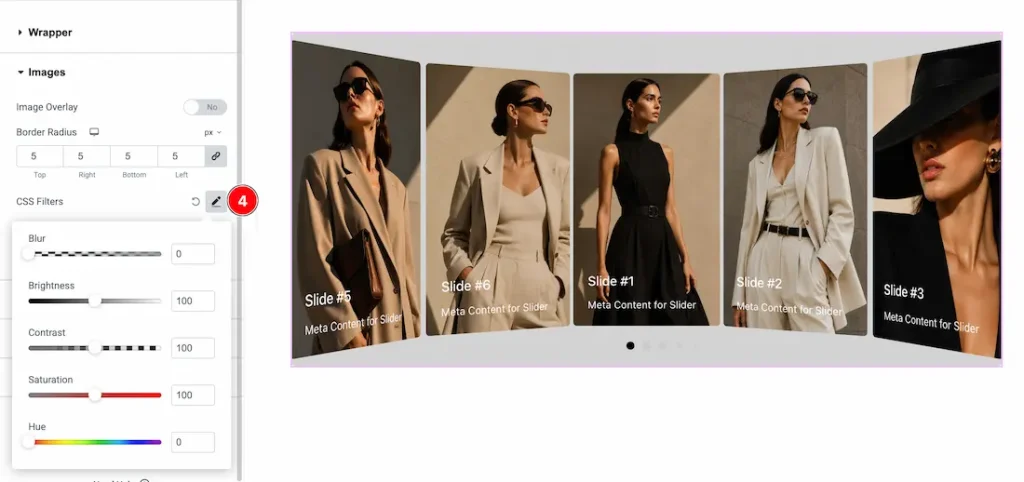
4. Image Filters:
- Hue – Shifts the overall color tone of the image across the color spectrum.
- Blur – Softens the image by reducing sharp details, creating depth or background focus.
- Brightness – Controls how light or dark an image appears.
- Contrast – Adjusts the difference between light and dark areas to make visuals stronger or softer.
- Saturation – Changes the intensity of colors, from muted to vivid.
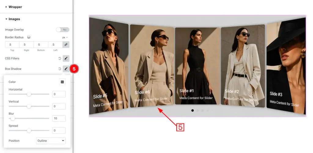
5. Box Shadow: The Box Shadow property is used to create the shadow around the Image. It takes four values: Horizontal offset, Vertical offset, blur, and Spread to customize the Box shadow.
Position: you can set the Box Shadow position Outline and Inset. Here we set the Box Shadow position Outline.
Content Section
Go to Style > Content
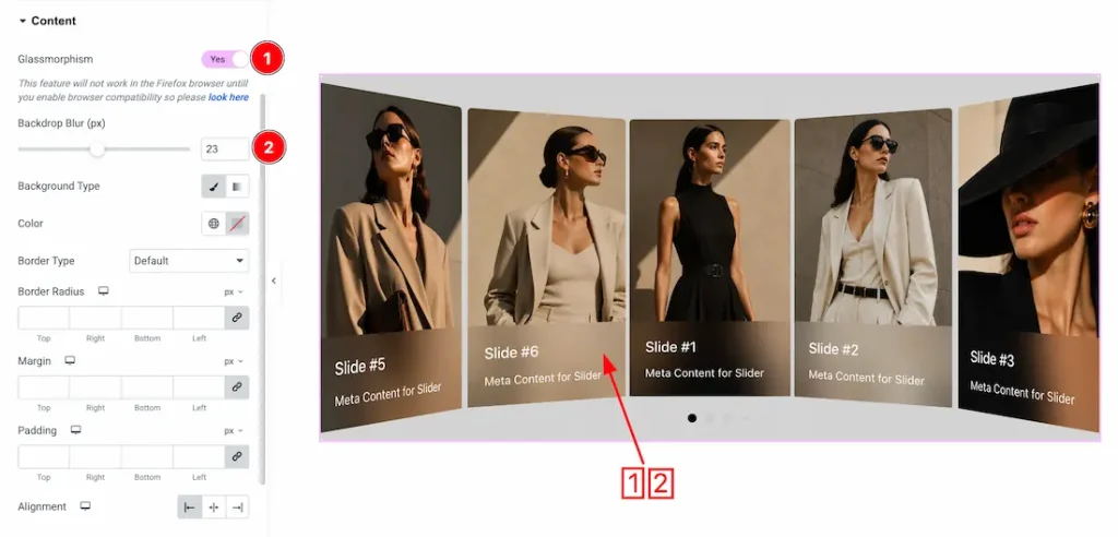
1. Glassmorphism: Enable/disable the glassmorphism switcher button to show/hide the effects.
2. Backdrop Blur: You can adjust the backdrop blur of the content to your preferred values.
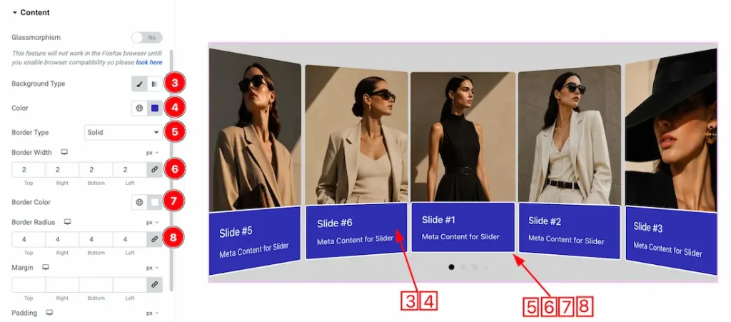
3. Background Type: You can change the slider content background to classic or gradient. Here we choose the Background type Classic.
4. Color: This option lets you change the slider content background color.
5. Border Type: You can set the slider content Border Type to Default, None, Solid, Double, Dotted, Dashed, or Groove. We choose here the Border Type Solid.
6. Border Width: This option lets you set the content border width.
7. Border Color: This option lets you change the content border color.
8. Border Radius: You can adjust the content border radius.
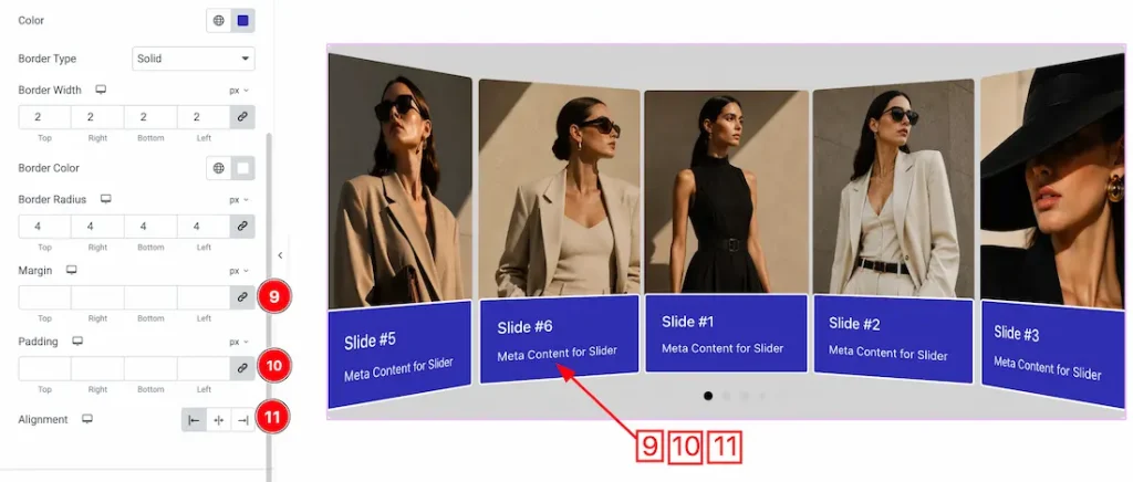
9. Margin: You can adjust the content margin from here.
10. Padding: You can adjust the content padding from here.
11. Alignment: You can set the content alignment- left, center, or right.
Title Section
Go to Style > Title
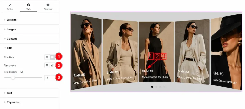
1. Color: This option lets you change the title color.
2. Typography: Change the font family, size, weight, style, transform, decoration, line height, letter spacing, and word spacing from here
3. Title Spacing: This option lets you adjust the title spacing.
Text Section
Go to Style > Text
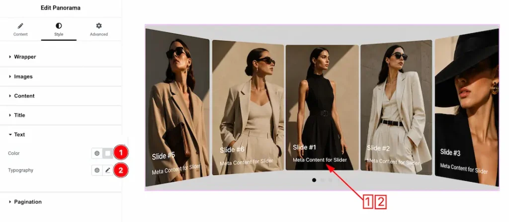
1. Color: This option lets you change the text color.
2. Typography: Change the font family, size, weight, style, transform, decoration, line height, letter spacing, and word spacing from here.
Pagination Section
Go to Style > Pagination
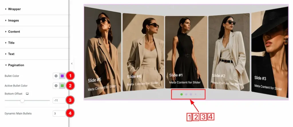
- Bullet Color: Allows you to set the color of the pagination bullets.
- Active Bullet Color: Lets you choose a different color for the currently active pagination bullet.
- Bottom Offset: Adjusts the vertical distance of the pagination bullets from the bottom of the slider.
- Dynamic Main Bullets: Controls the number of main pagination bullets displayed dynamically around the active bullet.
All done! You have successfully customized the Panorama Slider on your website.
Video Assist
Please watch the video tutorial on how to use the Panorama Slider widget. Also, check the demo page for more examples.
Thanks for being with us.