

The Expo Slider widget from Prime Slider Pro lets you create modern and visually engaging sliders with smooth transition effects. It’s ideal for showcasing featured content, images, or promotions in an interactive layout. This documentation explains how to use and customize the Expo Slider widget in Elementor.
Enable the Expo slider widget
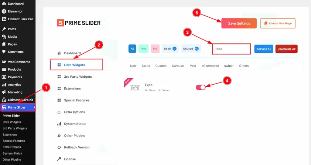
To use the Elementor Expo Slider widget from Prime Slider, first, you have to enable the widget.
- Go to WordPress dashboard > Prime Slider Plugin dashboard.
- Then, click the Core Widgets Tab.
- Search the Expo Slider Widget Name.
- Enable the Expo Slider Widget.
- Hit the Save Settings Button.
Inserting the Expo Slider widget
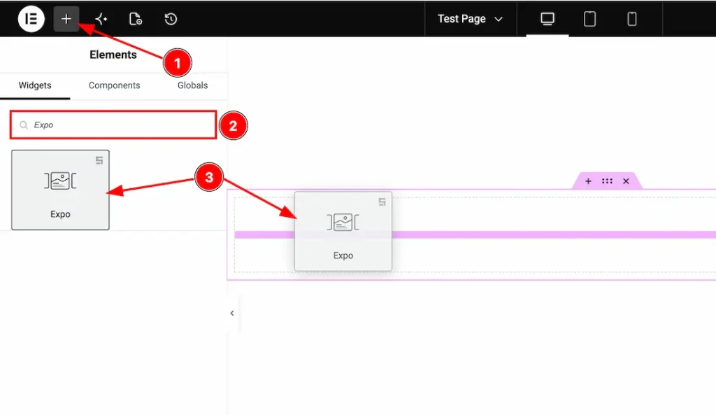
1. Go to the Elementor Editor Page and hit the “+” icon Button.
2. Search the Expo Slider widget.
3. Drag the widget and drop it on the editor page.
(Note: You need both Elementor and Prime Slider Pro installed to use this widget.)
Work With The Content Tab
Slides Section
Go to Content > Slides
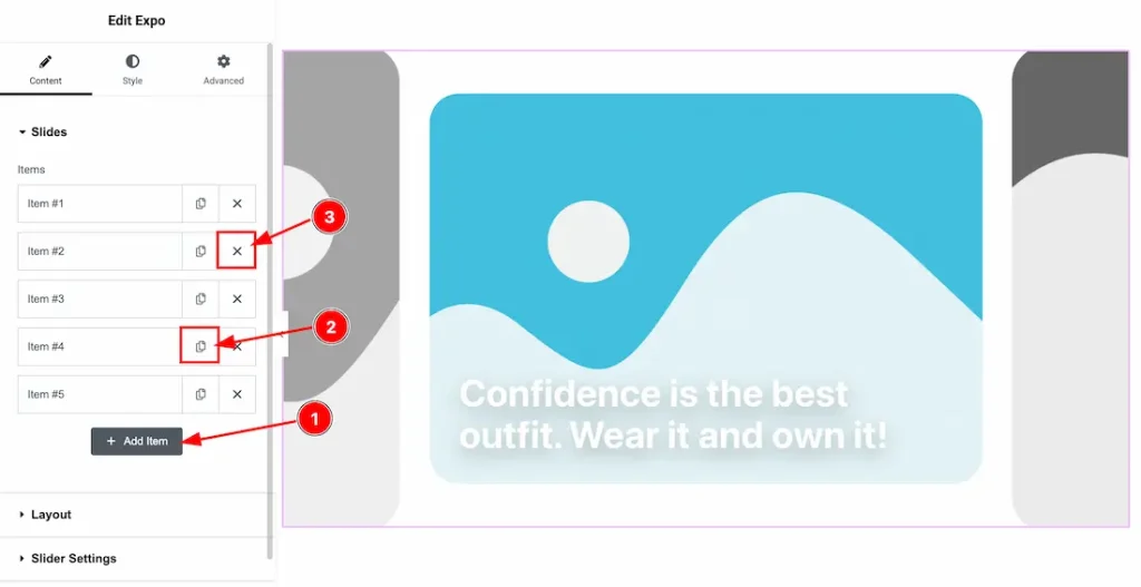
1. Add Item: You can add a new item by clicking the “+” Add Item button.
2. Copy Item: This option lets you copy the same item.
3. Close Item: You can delete the Slider item by clicking the Close icon button.
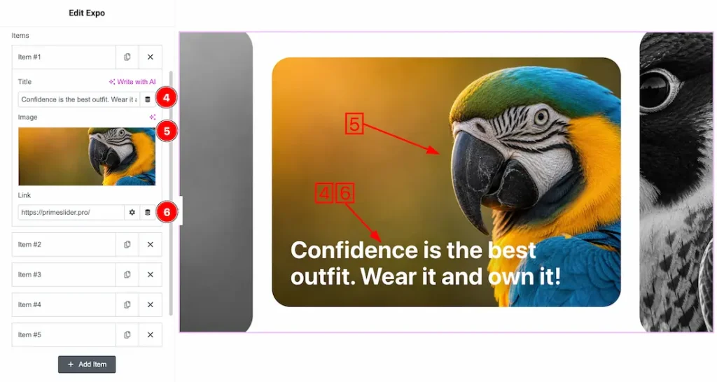
Come to the each slider item, you will get the following customization options-
4. Title: This option lets you change the slider Title.
5. Image: This option lets you change the slider image.
6. Link: This option lets you set a link under the slide’s title.
Layout Section
Go to Content > Layout
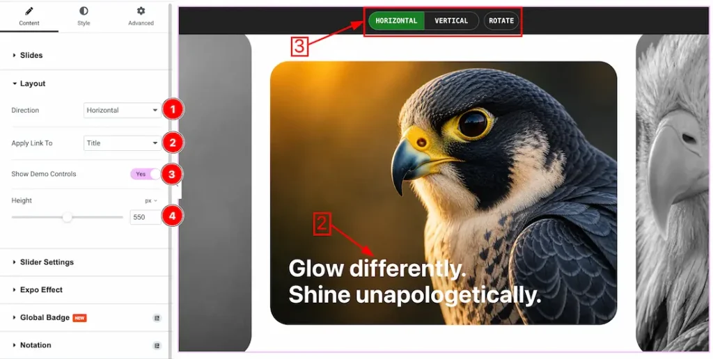
1. Direction: You can set the slider direction- Horizontal and Vertical. Here, we set the Horizontal First.
2. Apply Link To: You can set a link under the Slider Title or the whole item.
3. Show Demo Control: Enable or disable the show demo control switcher button to show/hide the demo control feature.
4. Height: This option lets you set the slider height.
Slider Settings Section
Go to Content > Slider Settings
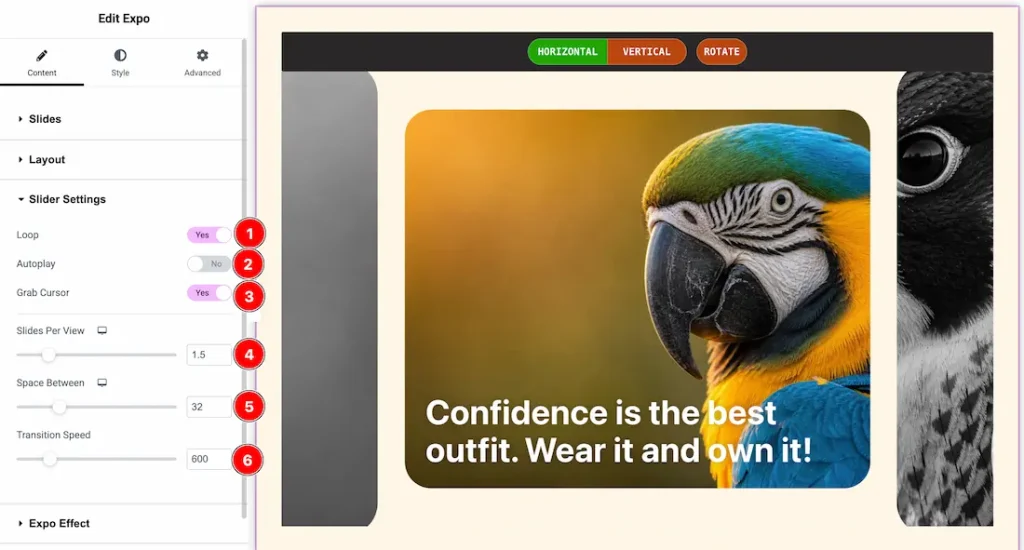
- Loop: Enable the switcher button to continuously repeat the slider items in an endless cycle.
- Autoplay: Enable the switcher button to automatically switch slides without user interaction.
- Grab Cursor: Enable the switcher button to change the cursor into a grab icon for better drag interaction.
- Slides Per View: Controls how many slides are visible at the same time.
- Space Between: Adjusts the spacing or gap between each slide.
- Transition Speed: Sets how fast the slide transition animation occurs.
Expo Effects Section
Go to Content > Expo Effects
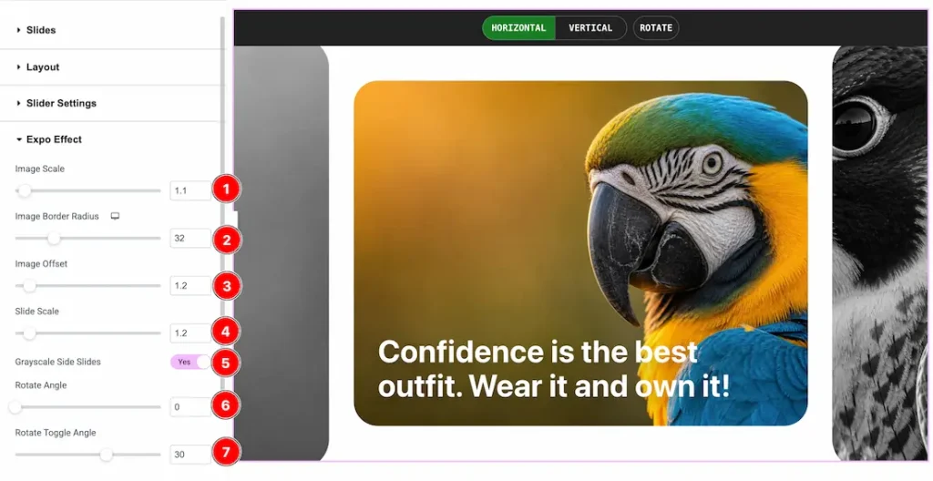
- Image Scale: Adjusts the zoom level or size of the slide image.
- Image Border Radius: Controls the roundness of the image corners.
- Image Offset: Sets the image position offset within the slide area.
- Slide Scale: Adjusts the overall scale or size of the active slide.
- Grayscale Side Slides: Enable the switcher button to apply a grayscale effect to the side slides.
- Rotate Angle: Controls the rotation angle of the slides.
- Rotate Toggle Angle: Sets the rotation angle change effect during slide transition.
Work with The Style Tab
Wrapper Section
Go to Style > Wrapper
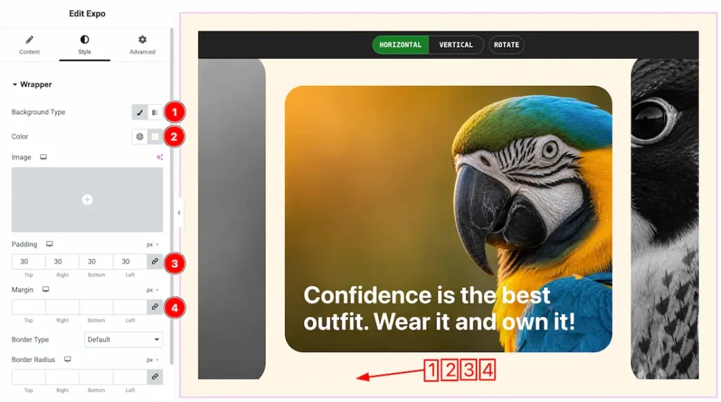
1. Background Type: You can change the slider background to classic or gradient. Here we choose the Background type Classic.
2. Color: This option lets you change the slider background color.
3. Padding: You can adjust the slider padding from here.
4. Margin: You can adjust the slider margin from here.
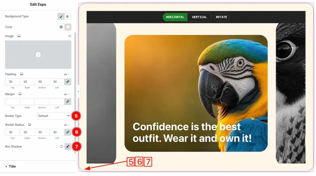
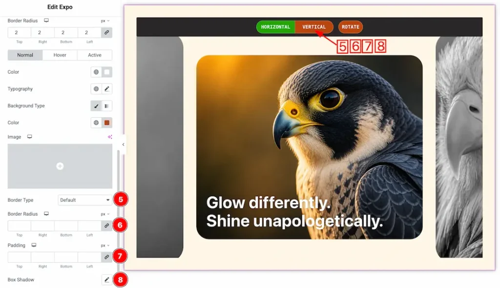
5. Border Type: You can set the slider Border Type to Default, None, Solid, Double, Dotted, Dashed, or Groove. We choose here the Border Type Solid.
6. Border Radius: This option lets you set the border radius.
7. Box Shadow: If you want, you can add a box shadow under the slider.
Title Section
Go to Style > Title
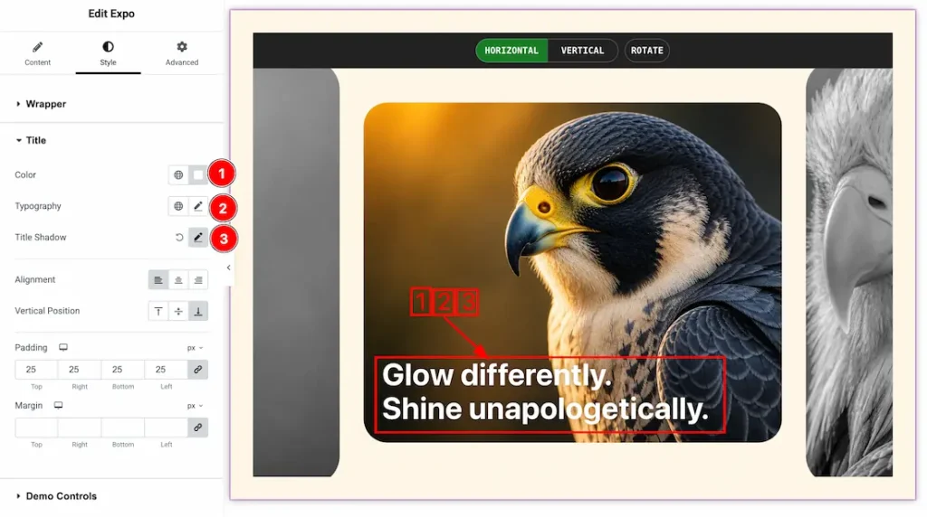
1. Color: This option lets you change the title color.
2. Typography: Change the font family, size, weight, style, transform, decoration, line height, letter spacing, and word spacing from here.
3. Title Shadow: This option lets you set the title shadow.
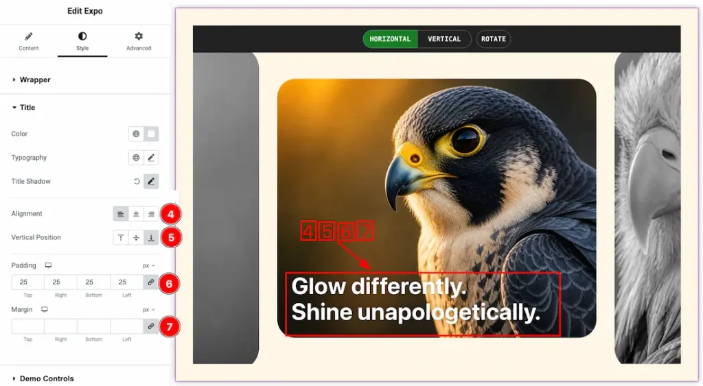
4. Alignment: You can set the title alignment- left, center, and right.
5. Vertical Position: You can set the title vertical position to top, center, and bottom.
6. Padding: You can adjust the title padding from here.
7. Margin: You can adjust the title margin from here.
Demo Control Section
Go to Style > Demo Control
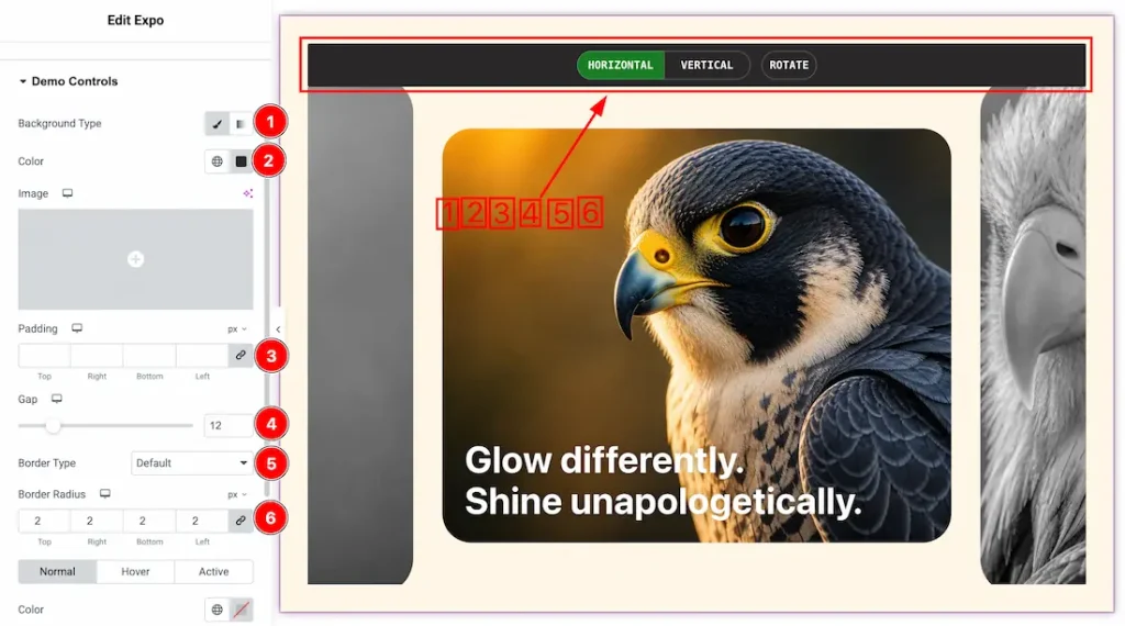
1. Background Type: You can change the slider demo control background to classic or gradient. Here we choose the Background type Classic.
2. Color: This option lets you change the slider demo control background color.
3. Padding: You can adjust the demo control padding from here.
4. Gap: You can adjust the gap between the demo controls.
5. Border Type: You can set the demo control Border Type to Default, None, Solid, Double, Dotted, Dashed, or Groove. We choose here the Border Type Solid.
6. Border Radius: This option lets you set the demo control border radius.
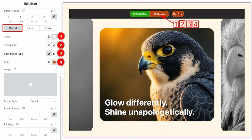
Come to the demo control section, you will get three more tabs- Normal, Hover, and Active. Let’s proceed with the Normal Tab-
1. Color: This option lets you change the demo control’s normal text color.
2. Typography: Change the font family, size, weight, style, transform, decoration, line height, letter spacing, and word spacing from here.
3. Background Type: You can change the slider demo control’s normal background to classic or gradient. Here we choose the Background type Classic.
4. Color: This option lets you change the slider demo control’s normal background color.
5. Border Type: You can set the slider demo control normal Border Type to Default, None, Solid, Double, Dotted, Dashed, or Groove. We choose here the Border Type Solid.
6. Border Radius: This option lets you set the demo control’s normal border radius.
7. Padding: You can adjust the demo controls’ padding from here.
8. Box Shadow: If you want, you can add a box shadow under the slider demo control.
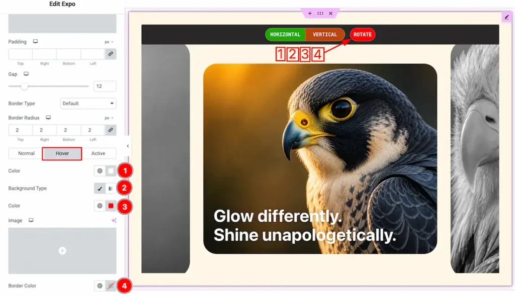
Let’s proceed with the hover tab-
1. Color: This option lets you change the demo control’s hover text color.
2. Background Type: You can change the slider demo control’s hover background to classic or gradient. Here we choose the Background type Classic.
3. Color: This option lets you change the slider demo control’s hover background color.
4. Border color: This option lets you change the hover border color.
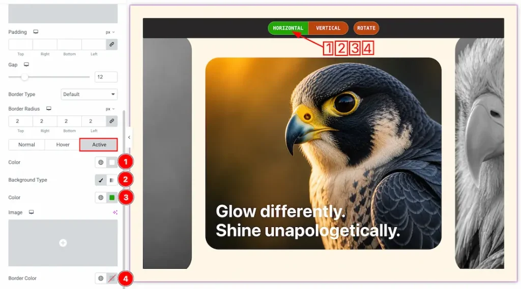
Let’s proceed with the Active tab-
1. Color: This option lets you change the demo control’s active text color.
2. Background Type: You can change the slider demo control’s active background to classic or gradient. Here we choose the Background type Classic.
3. Color: This option lets you change the slider demo control’s active background color.
4. Border color: This option lets you change the active border color.
All done! You have successfully customized the Expo Slider on your website.
Video Assist
Please watch the video tutorial to use the Expo slider widget. Also, check the demo page for more examples.
Thanks for being with us.