

The Cloud Slider widget in Prime Slider Pro lets you create visually stunning hero sections with smooth cloud-inspired transition effects. It combines elegant animations, customizable layouts, and responsive design to showcase images and content in an engaging way. With full Elementor integration and flexible styling options, you can easily build modern sliders without any coding.
Enable the Cloud slider widget
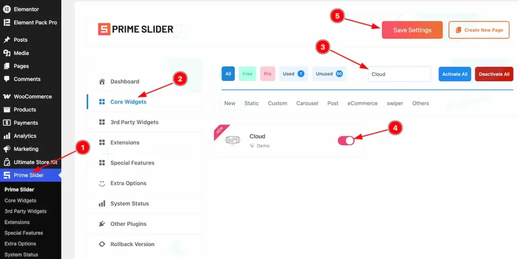
To use the Elementor Cloud Slider widget from Prime Slider, first, you have to enable the widget.
- Go to WordPress dashboard > Prime Slider Plugin dashboard.
- Then, click the Core Widgets Tab.
- Search the Cloud Slider Widget Name.
- Enable the Cloud Slider Widget.
- Hit the Save Settings Button.
Inserting the Cloud Slider widget
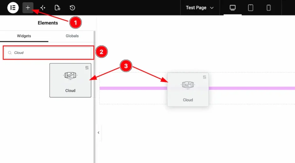
1. Go to the Elementor Editor Page and hit the “+” icon Button.
2. Search the Cloud Slider widget.
3. Drag the widget and drop it on the editor page.
(Note: You need both Elementor and Prime Slider Pro installed to use this widget.)
Work With The Content Tab
Slides Section
Go to Content > Slides
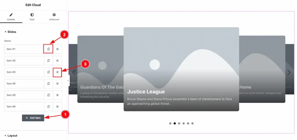
1. Add Item: You can add a new item by clicking the “+” Add Item button.
2. Copy Item: This option lets you copy the same item.
3. Close Item: You can delete the Slider item by clicking the Close icon button.
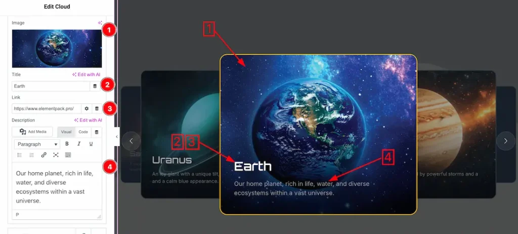
1. Image: This option lets you change each slider image.
2. Title: This option lets you change the slider title texts.
3. Link: You can add a link under the title.
4. Text: This option lets you change the slider text to your required text.
Layout Section
Go to Content > Layout
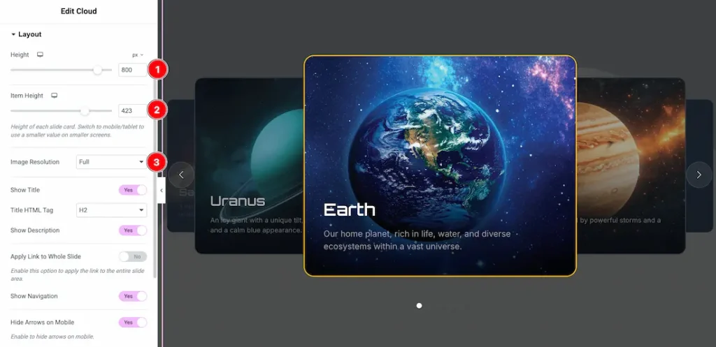
1. Height: This option lets you set the slider height.
2. Item Height: This option lets you change the slider item height.
3. Image Resolution: You can set your preferred image resolution from here.
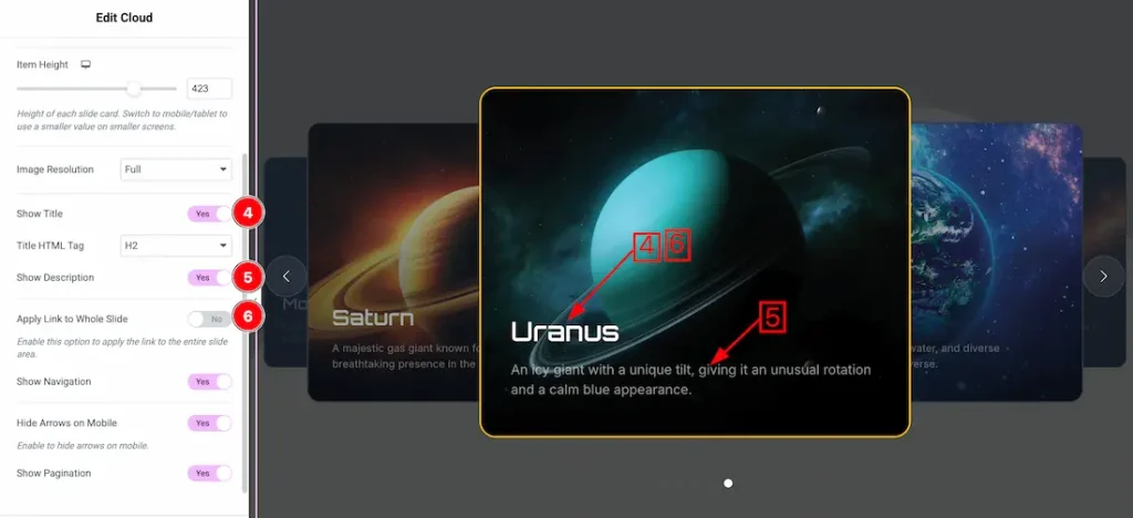
4. Show Title: Enable/disable the show title switcher button to show/hide the title from the slider.
5. Show Description: Enable/disable the show description switcher button to show/hide the title from the slider.
6. Apply link to whole item: If you enable the apply link to whole item, then the slider title link will work for the whole slide item.
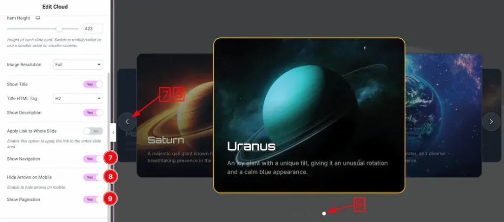
7. Show Navigation: Enable/disable the show navigation switcher button to show/hide the navigation from the slider.
8. Hide Arrows on Mobile: After enabling the switcher button, the slider arrow will be hidden from the slider for mobile devices.
9. Show Pagination: Enable/disable the show pagination switcher button to show/hide the pagination from the slider.
Cloud Effect Section
Go to Content > Cloud Effect
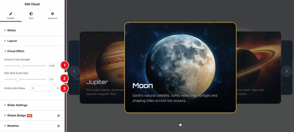
- Content Fade Strength – Controls the opacity fade effect of the slide content during transitions.
- Side Slide Scale Step – Adjusts the scaling difference between the active slide and side slides.
- Visible Side Slides – Sets the number of side slides displayed alongside the active slide.
Slider Settings Section
Go to Content > Slider Settings
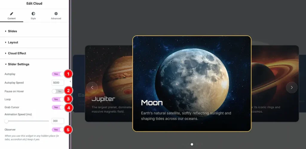
- Autoplay: Enables or disables automatic slide switching. From here, you can also adjust the auto-play speed.
- Pause on Hover: By enabling the button, your slider will pause when you hover over it.
- Loop: Keeps the slider running in a continuous loop.
- Grab Cursor: Enables drag/hand cursor for interactive sliding.
- Observer: Activates slider update inside hidden elements (tabs, accordions, etc.).
Work with The Style Tab
Slides Section
Go to Style > Slides
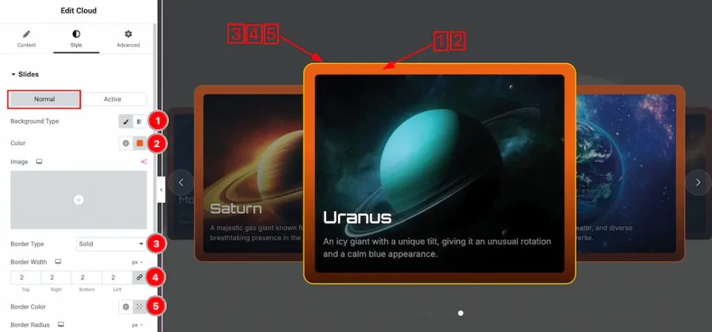
Come to the Slides section, you will get two subsections: Normal and Active. Let’s proceed with the Normal Tab section-
1. Background Type: You can change the slider background to classic or gradient. Here we choose the Background type Classic.
2. Color: This option lets you change the slider background color.
3. Border Type: You can set the slider Border Type to Default, None, Solid, Double, Dotted, Dashed, or Groove. We choose here the Border Type Solid.
4. Border Width: This option lets you set the border width.
5. Border Color: This option lets you change the border color of the slider.
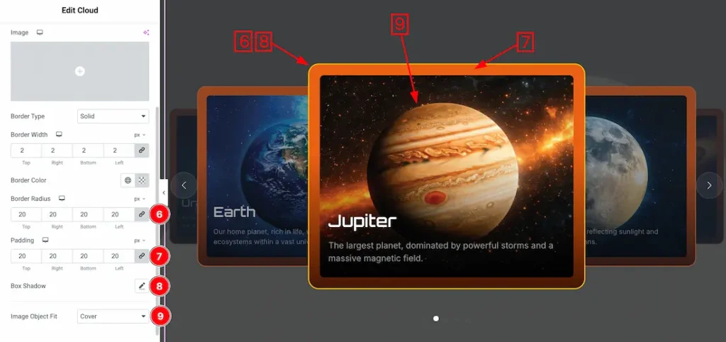
6. Border Radius: You can adjust the slider border radius.
7. Padding: You can adjust the item padding from here.
8. Box Shadow: This option lets you add a box shadow under the slider item area.
9. Image Object Fit: You can set the slider image position from here.
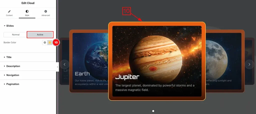
Let’s proceed with the active tab section-
10. Border Color: This option lets you change the item border active color.
Title Section
Go to Style > Title
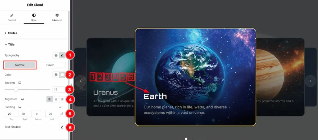
1. Typography: Change the font family, size, weight, style, transform, decoration, line height, letter spacing, and word spacing from here.
Come to the title section, you will get two sub-sections- Normal and Hover. Let’s proceed with the normal subsections-
2. Color: This option lets you change the title’s normal color.
3. Spacing: You can adjust the slider title spacing from here.
4. Alignment: You can set the title alignment- left, center, or right.
5. Padding: You can adjust the title padding from here.
6. Text Shadow: You can add text shadow under the title using the option.
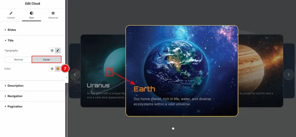
7. Color: This option lets you change the title hover color.
Description Section
Go to Style > Description
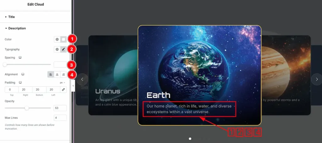
1. Color: This option lets you change the description color.
2. Typography: Change the font family, size, weight, style, transform, decoration, line height, letter spacing, and word spacing from here.
3. Spacing: You can adjust the slider description spacing from here.
4. Alignment: You can set the description alignment- left, center, or right.
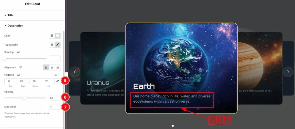
5. Padding: You can adjust the description padding from here.
6. Opacity: You can adjust the description opacity from here.
7. Max lines: You can set the description max number of lines from here.
Navigation Section
Go to Style > Navigation
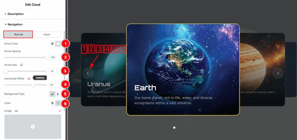
Come to the navigation section, you will get two subsections: Normal and Hover. Let’s proceed with the Normal Tab section-
1. Arrow Color: This option lets you change the arrow color.
2. Arrow Opacity: You can set the arrow opacity from here.
3. Arrow Size: This option lets you change the arrow size.
4. Horizontal Offset: You can adjust the horizontal offset from here.
5. Background Type: You can change the slider arrow normal background to classic or gradient. Here we choose the Background type Classic.
6. Color: This option lets you change the arrow background normal color.
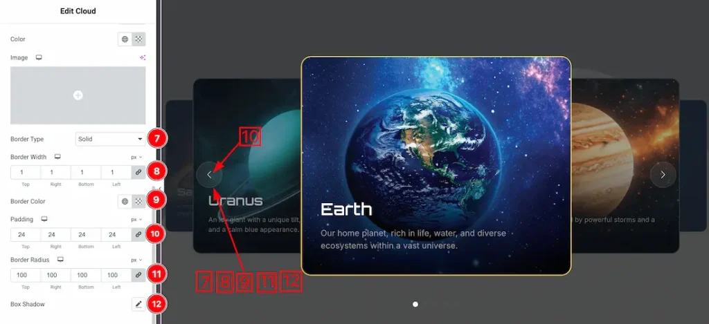
7. Border Type: You can set the slider arrow Border Type to Default, None, Solid, Double, Dotted, Dashed, or Groove. We choose here the Border Type Solid.
8. Border Width: This option lets you set the arrow normal border width.
9. Border Color: This option lets you change the arrow normal border color of the slider.
10. Padding: You can adjust the arrow padding from here.
11. Border Radius: You can adjust the slider arrow normal border radius.
12. Box Shadow: This option lets you add a box shadow under the slider arrow.
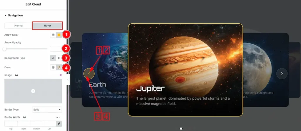
Let’s proceed with the hover tab section-
1. Arrow Color: This option lets you change the arrow hover color.
2. Arrow Opacity: You can set the arrow hover opacity from here.
3. Background Type: You can change the slider arrow hover background to classic or gradient. Here we choose the Background type Classic.
4. Color: This option lets you change the slider arrow background hover color.
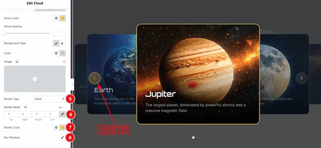
5. Border Type: You can set the slider arrow Border Type to Default, None, Solid, Double, Dotted, Dashed, or Groove. We choose here the Border Type Solid.
6. Border Width: This option lets you set the arrow hover border width.
7. Border Color: This option lets you change the arrow hover border color of the slider.
8. Box Shadow: This option lets you add a box shadow under the arrow hovering.
Pagination Section
Go to Style > Pagination
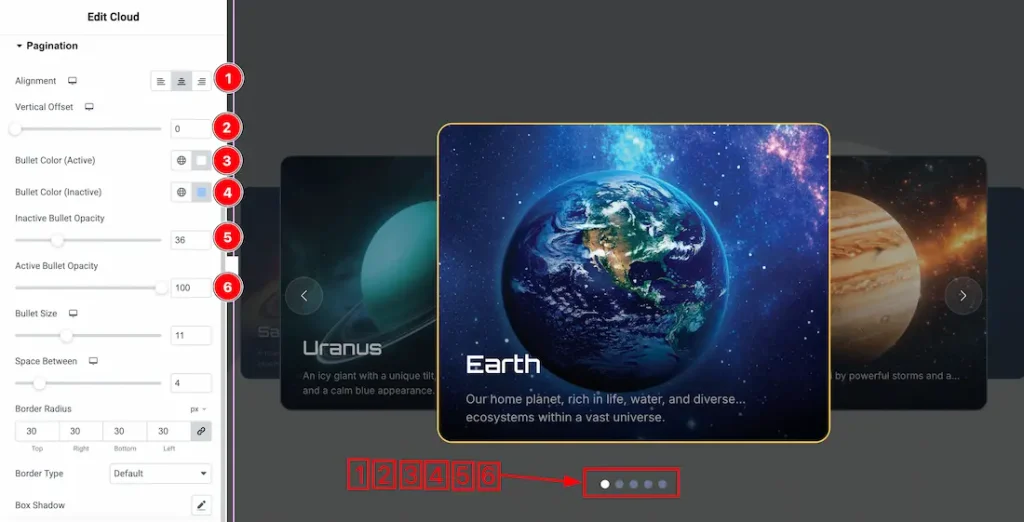
- Alignment: Sets the position of the pagination bullets (left, center, or right).
- Vertical Offset: Adjusts the vertical position of the pagination.
- Bullet Color (Active): Sets the color of the active pagination bullet.
- Bullet Color (Inactive): Sets the color of the inactive pagination bullets.
- Inactive Bullet Opacity: Controls the transparency of inactive bullets.
- Active Bullet Opacity: Controls the transparency of the active bullet.
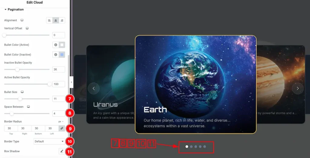
- Bullet Size: Controls the size of the pagination bullets.
- Space Between: Sets the spacing between the pagination bullets.
- Border Radius: Adjusts the roundness of the pagination bullets.
- Border Type: Defines the border style for the pagination bullets.
- Box Shadow: Adds and customizes a shadow effect around the pagination bullets.
All done! You have successfully customized the Cloud Slider on your website.
Video Assist
The video will come soon. Please check the demo page for more examples.
Thanks for staying with us.