

The Super Flow Slider widget in Prime Slider Pro lets you create smooth, fluid, and modern sliding animations for showcasing content. It delivers seamless transitions, responsive design, and easy Elementor customization, perfect for building engaging hero sections and landing pages.
Enable the Super Flow slider widget
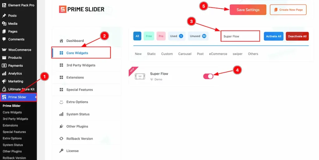
To use the Elementor Super Flow Slider widget from Prime Slider, first, you have to enable the widget.
- Go to WordPress dashboard > Prime Slider Plugin dashboard.
- Then, click the Core Widgets Tab.
- Search the Super Flow Slider Widget Name.
- Enable the Super Flow Slider Widget.
- Hit the Save Settings Button.
Inserting the Super Flow Slider widget
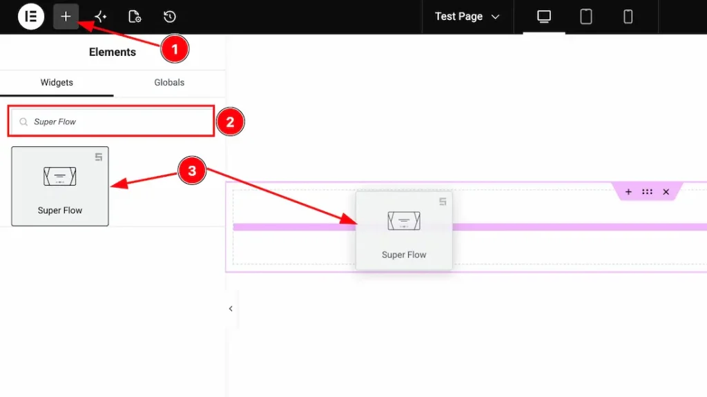
1. Go to the Elementor Editor Page and hit the “+” icon Button.
2. Search the Super Flow Slider widget.
3. Drag the widget and drop it on the editor page.
(Note: You need both Elementor and Prime Slider Pro installed to use this widget.)
Work With The Content Tab
Slides Section
Go to Content > Slides
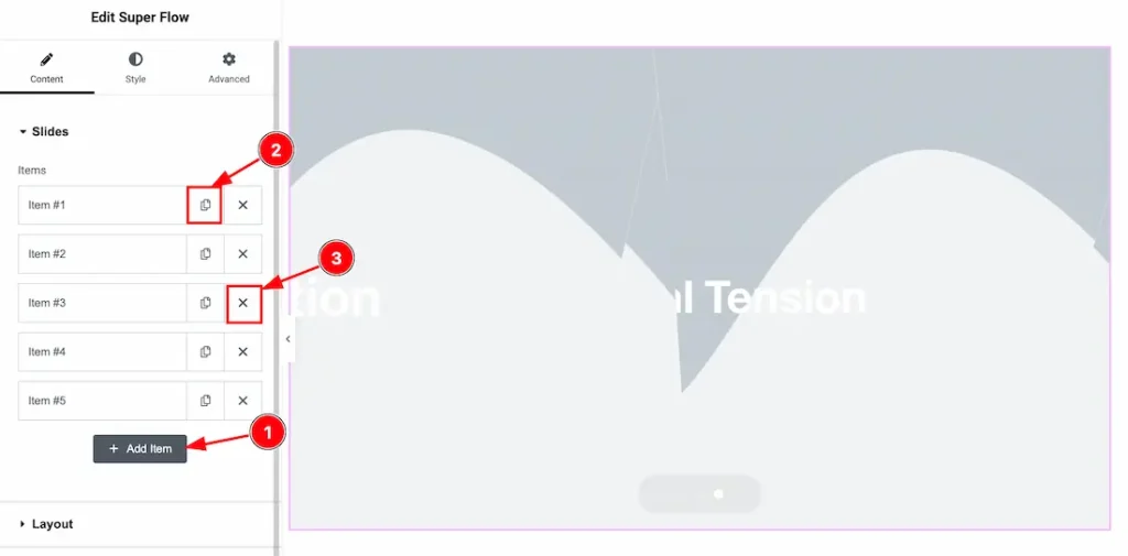
1. Add Item: You can add a new item by clicking the “+” Add Item button.
2. Copy Item: This option lets you copy the same item.
3. Close Item: You can delete the Slider item by clicking the Close icon button.
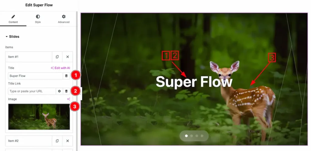
1. Title: This option lets you change the slider title texts.
2. Link: You can add a link under the title.
3. Image: This option lets you change each slider image.
Layout Section
Go to Content > Layout
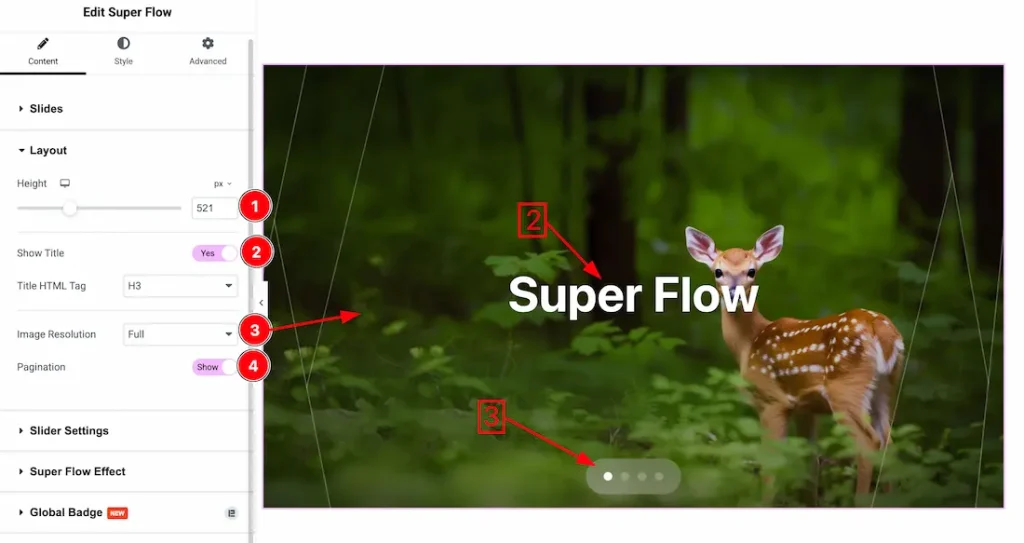
1. Height: This option lets you change the slider height.
2. Show Title: Enable/disable the show title switcher button to show/hide the title from the slider.
3. Image Resolution: You can set your preferred image resolution from here.
4. Pagination: Enable/disable the pagination switcher button to show/hide the pagination from the slider.
Slider Settings Section
Go to Content > Slider Settings
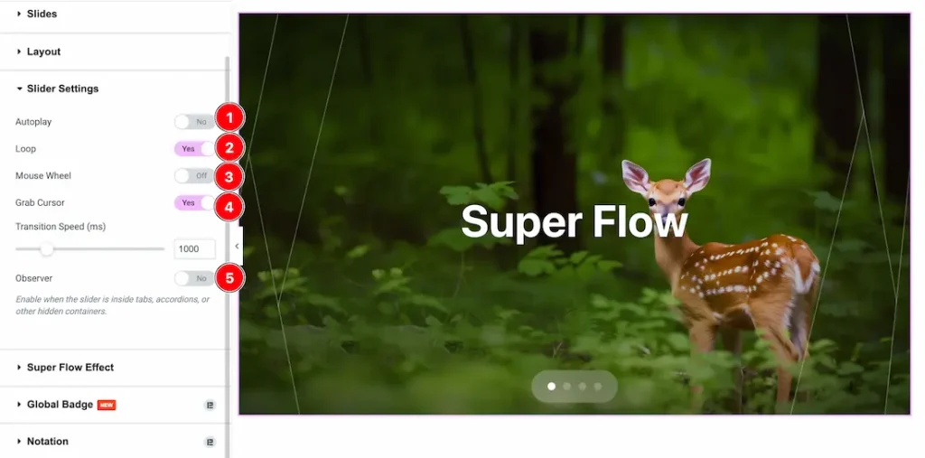
- Autoplay: Enables or disables automatic slide switching.
- Loop: Keeps the slider running in a continuous loop.
- Mouse Wheel: Allows slide navigation using the mouse wheel.
- Grab Cursor: Enables drag/hand cursor for interactive sliding.
- Observer: Activates slider update inside hidden elements (tabs, accordions, etc.).
Super Flow Effects Section
Go to Content > Super Flow Effects
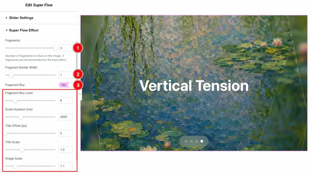
1. Fragments: Sets how many pieces the image is split into for the effect.
2. Fragment Border Width: Controls the border thickness between fragments.
3. Fragment Blur: Enables or disables the blur effect on fragments.
- Fragment Blur Level: Adjusts the intensity of the blur effect.
- Scale Duration (ms): Controls the animation speed of scaling transitions.
- Title Offset (px): Sets the position shift of the title text.
- Title Scale: Adjusts the size of the title during animation.
- Image Scale: Controls the zoom level of the image in the effect.
Work with The Style Tab
Wrapper Section
Go to Style > Wrapper
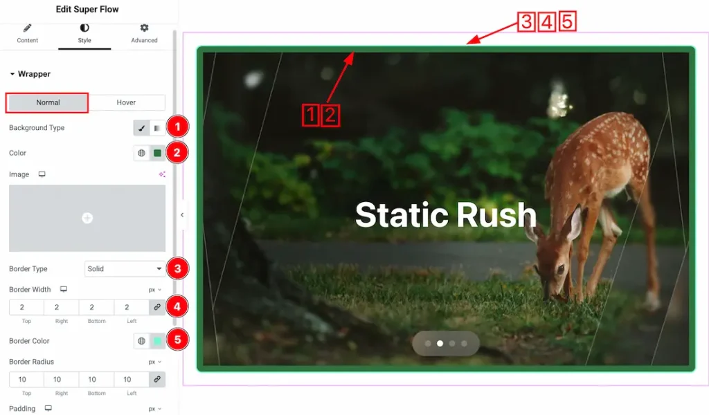
Come to the Wrapper section, you will get two subsections: Normal and Hover. Let’s proceed with the Normal Tab section-
1. Background Type: You can change the slider background to classic or gradient. Here we choose the Background type Classic.
2. Color: This option lets you change the slider background color.
3. Border Type: You can set the slider Border Type to Default, None, Solid, Double, Dotted, Dashed, or Groove. We choose here the Border Type Solid.
4. Border Width: This option lets you set the border width.
5. Border Color: This option lets you change the border color of the slider.
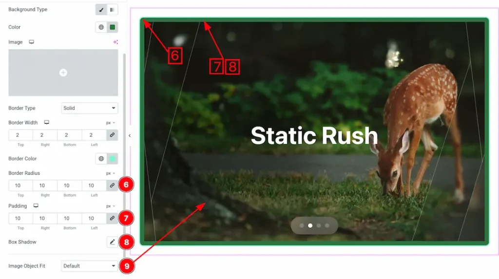
6. Border Radius: You can adjust the slider border radius.
7. Padding: You can adjust the wrapper padding from here.
8. Box Shadow: This option lets you add a box shadow under the slider area.
9. Image Object Fit: You can set the slider image position from here.
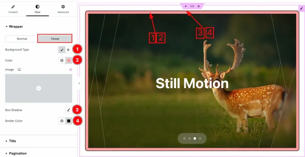
Let’s proceed with the hover tab section-
1. Background Type: You can change the slider hover background to classic or gradient. Here we choose the Background type Classic.
2. Color: This option lets you change the slider background hover color.
3. Box Shadow: This option lets you add a hover box shadow under the slider area.
4. Border Color: This option lets you add the hover border color.
Title Section
Go to Style > Title
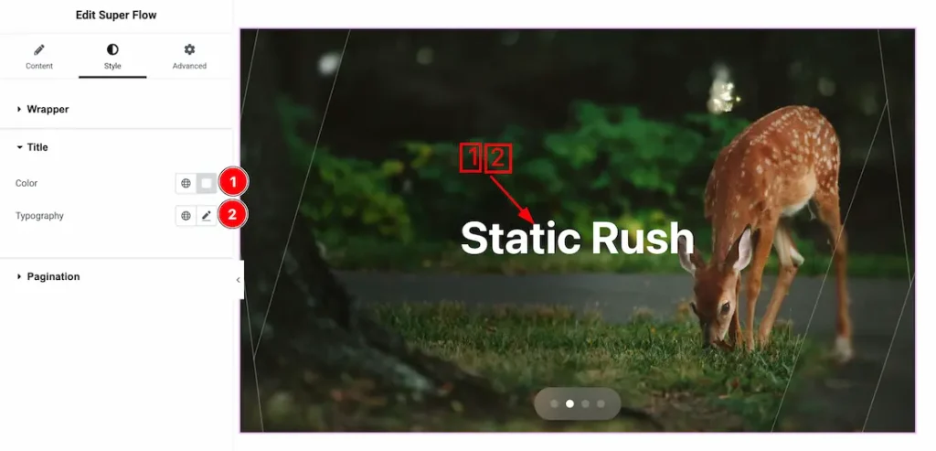
1. Color: This option lets you change the title color.
2. Typography: Change the font family, size, weight, style, transform, decoration, line height, letter spacing, and word spacing from here.
Pagination Section
Go to Style > Pagination
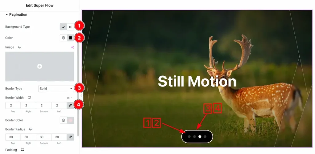
1. Background Type: You can change the slider pagination background to classic or gradient. Here we choose the Background type Classic.
2. Color: This option lets you change the slider background pagination color.
3. Border Type: You can set the slider Border Type to Default, None, Solid, Double, Dotted, Dashed, or Groove. We choose here the Border Type Solid.
4. Border Width: This option lets you set the pagination border width.
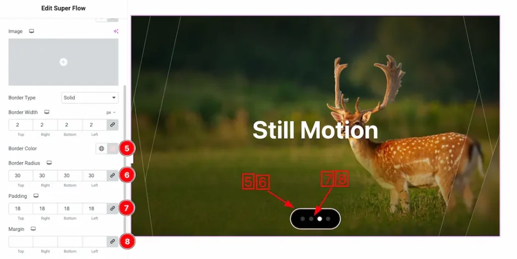
5. Border Color: This option lets you change the pagination border color of the slider.
6. Border Radius: This option lets you change the pagination border radius.
7. Padding: You can adjust the pagination padding from here.
8. Margin: You can adjust the pagination margin from here.
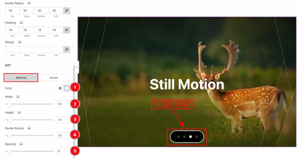
Come to the Pagination section, you will get two subsections: Normal and Active. Let’s proceed with the Normal tab section-
- Color: Sets the color of the pagination dots.
- Width: Controls the width of each pagination dot.
- Height: Adjusts the height of each pagination dot.
- Border Radius: Defines the roundness of the pagination dots.
- Spacing: Sets the space between individual pagination dots.
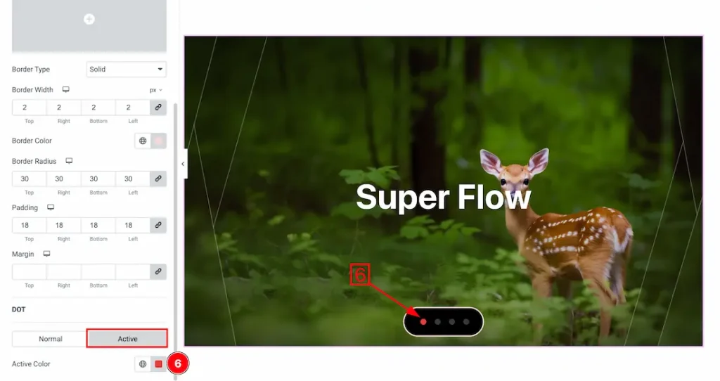
6. Active Color: This option lets you change the dots active color.
All done! You have successfully customized the Super Flow Slider on your website.
Video Assist
The video will come soon. Please check the demo page for more examples.
Thanks for staying with us.