

In this documentation, we will show you how to customize the WooCommerce Products Widget presented by Element Pack Pro.
Enable the WooCommerce Products Widget
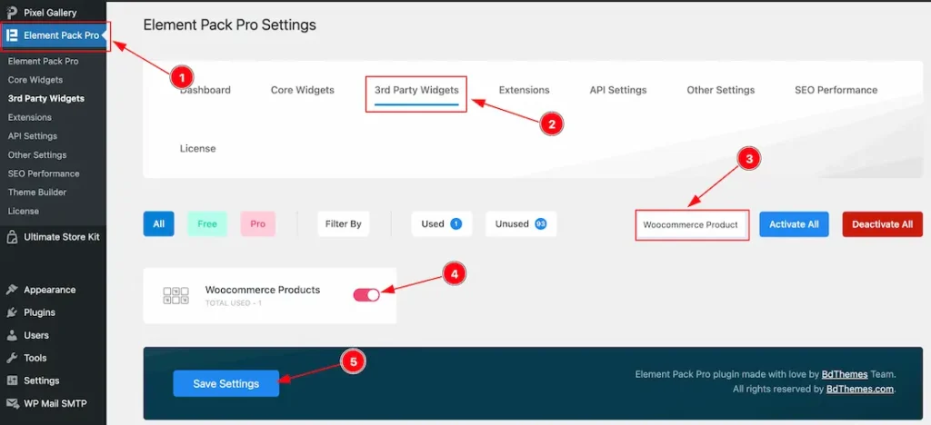
To use the Elementor WooCommerce Products widget from Element Pack, you must first enable the widget.
- Go to WordPress Dashboard > Element Pack Plugin dashboard.
- Then Click the 3rd Party Widgets Tab.
- Search the WooCommerce Products Widget Name.
- Enable the WooCommerce Products Widget.
- Hit the Save Settings Button.
Note: You should install the WooCommerce plugin separately for use this widget in the Elementor editor.
Inserting The WooCommerce Products widget
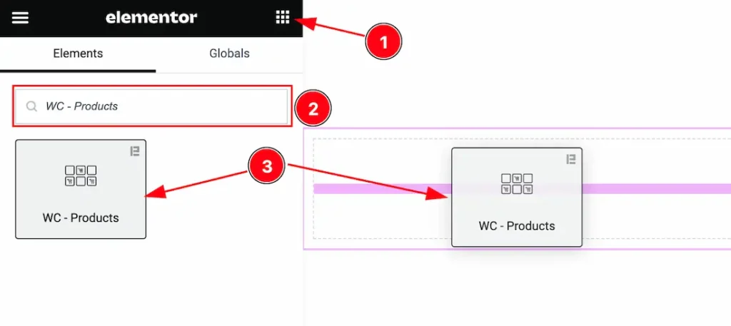
- Go to the Elementor Editor Page and Hit the Get Back To Button.
- Search the WooCommerce Products widget.
- Drag the widget and Drop it on the editor page.
Work With The Content Tab
Layout Section
Go to Content > Layout
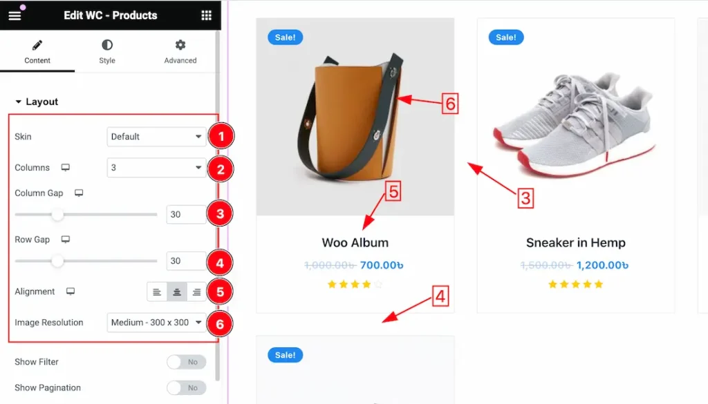
1. Skin: Under the Layout section, you can change the Skin – Default, and Table. Here we select the default skin and describe the below options.
2. Columns: You can set the Columns 1 to 6 to decorate your WC – Categories. Here we select the Columns – 3.
3. Column Gap: This option lets you adjust the Column Gap.
4. Row Gap: This option lets you adjust the Row Gap.
5. Alignment: you can set the Content Alignment – Left, Right, and center.
6. Image Resolution: You can adjust the image resolution for the products. Here you will get various image resolution options such as – Thumbnails, Medium, Medium Large, Large, Woocommerce Thumbnails, Woocommerce Gallery Thumbnail, Woocommerce Single, and Full options. You can choose any one of them.
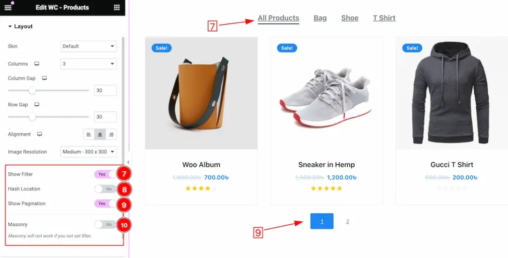
7. Show Filter: Enable or Disable to the show Filter switcher button to show or hide the Filter on your page.
8. Hash Location: The Hash Location switcher enables or disables hash-based URL navigation.
When enabled (Yes): The plugin or component will use the browser’s hash location (the part of the URL after the # symbol) to manage in-page navigation. This means that when users click on certain elements (like navigation links or tabs), the URL will update to reflect the current position or section with a hash (e.g., #section1). This allows users to bookmark or share the current state of the page.
When disabled (No): The plugin or component will not modify the URL with a hash. Navigation and state management will not be reflected in the URL, meaning users cannot bookmark or directly link to specific sections.
Top Offset ensures that the scrolled-to section is fully visible, accounting for fixed headers.
Scrollspy Time controls the scroll animation duration for smoother navigation experiences.
9. Show Pagination: Enable or Disable to the show Pagination switcher button to show or hide the Pagination on your page.
10. Masonry: If you enable the Masonry switcher button then the items or images are positioned in a way that optimizes the use of space, with each item filling the next available gap, creating a visually interesting and staggered effect.
When Select the Skin Type Table
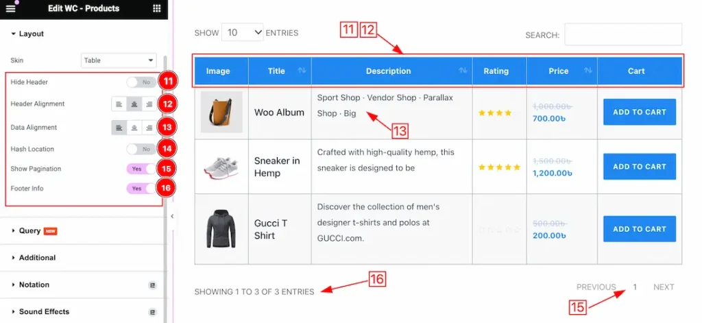
11. Hide Header: Enable or Disable the Hide Header switcher button to show or hide the Header on your page.
12. Header Alignment: This option lets you align the Header Text as – Left, Right, and Center.
13. Data Alignment: This option lets you align the Data Content as – Left, Right, and Center.
14. Hash Location: We discuss the function of the default skin section. We request you to visit the section to learn about it.
15. Show Pagination: Enable or Disable the Show Pagination switcher button to show or hide the Pagination on your page.
16. Footer Info: Enable or Disable the Footer Info switcher button to show or hide the Footer Info on your page.
Query Section
Go to Content > Query
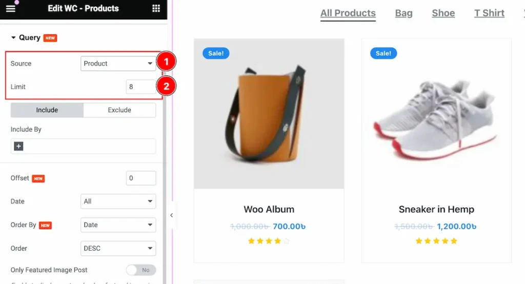
1. Source: Come to the Query section, you can select the Source Type ( Like- Product, Manual Selection, Current Query, and Related) to show your Categories. whatever you select, will appear on your editor page. We selected here Product that’s why it shows all the Products.
2. Limit: You can set the Product show limit from here.
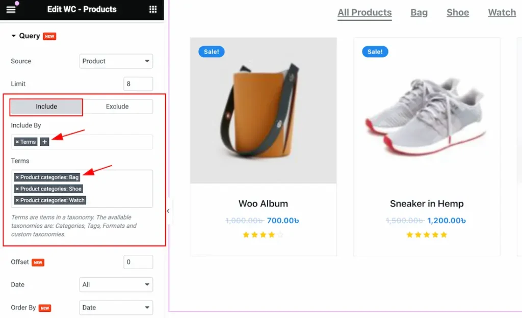
a. Click the Include Tab > Include By. The Include filter helps show only selected products.
b. After clicking the Terms (+) icons, you can select the specific Category or Tags to show the specific products on your page.
Note: The Exclude filter does exactly the opposite of the Include filter and helps hide selected products. Here you can hide your elements by selecting these options( Authors, Current Post, Manual Selection, and Terms).
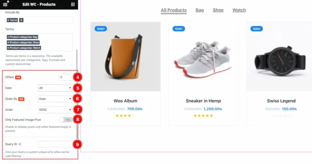
4. Offset: Offsets are useful because they can allow you to skip a certain number of WordPress Products before starting output. For Example, if you have 10 Products and you set the Offset value to 2 then the beginning 2 Products will Hide.
5. Date: Date: Here you can show your selected Source in Date category-wise. Here you will get the All, Past Day, Past Week, Past Month, Past Quarter, Past Year, and Custom options to show your selected Source(As Like Posts). Whichever your selected day Products will appear on your page.
- All: This lets you show All Products on your page.
- Past Day: If you select the Past Day then only the Past Days Products will appear on your page. If you haven’t any Past day Products then the section will show empty.
- Past Week: This option lets you show only the Past weeks Products on your page. If you haven’t any Past Week Products then the section will show empty.
- Past Month: This option lets you show only the Past Month Products on your page.
- Past Quarter: This lets you show Past Quarter Products on your page.
- Past Year: This option lets you show only the Past Year products on your page.
- Custom: If you want then you also set the custom Date and Time to show your products.
To Learn More About The Custom Date follow the below instructions-
Custom Date: if you select the Date Type as Custom then you will get two options “Before” and “After”. Here you can easily select your Before and After Date and Time to show your products.
- Before: The “Before” date will display all products published until the chosen date, including the specified date itself.
- After: When you set an “After” date, it typically retrieves and shows all products or items that were published on or after the chosen date, including the specified date itself.
6. Order By: you can decorate your selected product using Order By options. Under this option, you can select ( Title, ID, Date, Author, Comment Count, Menu Order, Random, Price, and Sales) any of them to show your selected posts on your Page.
7. Order: you can show the selected products in Asc and Desc Order.
8. Only Featured Image Post: If you enable the Only Featured Image Post switcher button then the Only Featured Image products will show on your page and the other products will hide from your page.
9. Query ID: The Query ID field is an extra feature. To learn more please visit the link custom queries.
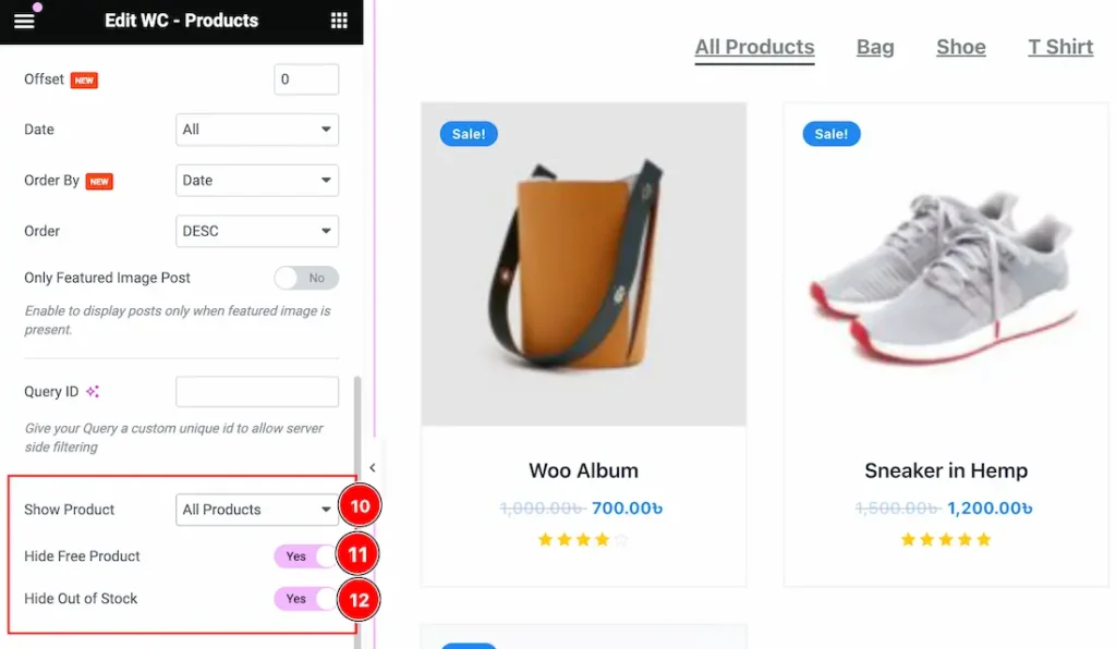
10. Show Product: This option lets you show specific products on your page. Here you will get these options to show your products – All Products, On Sale, and Featured.
11. Hide Free Product: Enable or Disable the Hide Free Product to show or hide the free products on your page. If you enable the Hide Free Product switcher button then the Free product will hide from your page.
12. Hide Out of Stock: Enable or Disable the Hide Out of Stock to show or hide the Out of Stock products on your page. If you enable the Hide Out of Stock switcher button then the Out of Stock product will hide from your page.
Additional Section
Go to Content > Additional
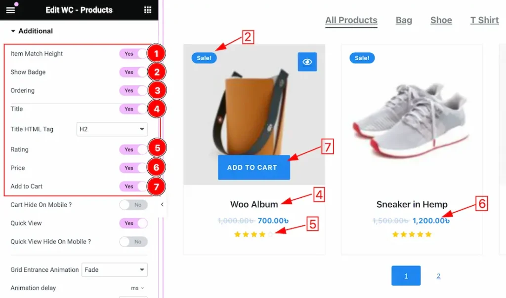
1. Item Match Height: If you enable the Item Match Height switcher button then your all showing products will appear at the same height.
2. Show Badge: Enable or Disable the Show Badge switcher button to show or hide the Badge for the product.
3. Ordering: This option helps you to order your products.
4. Title: Enable or Disable the Title switcher button to show or hide the Title for the product.
5. Rating: Enable or Disable the Rating switcher button to show or hide the Rating for the product.
6. Price: Enable or Disable the Price switcher button to show or hide the Price for the product.
7. Add to Cart: Enable or Disable the Add to Cart switcher button to show or hide the Add to Cart Button for the product.
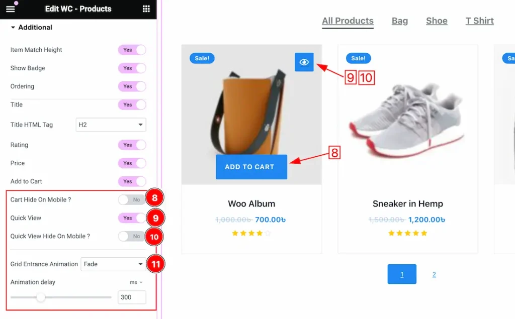
8. Cart Hide On Mobile: If you enable the Cart Hide On Mobile switcher button then the Cart will hide for the mobile devices.
9. Quick View: Enable or Disable the Quick View switcher button to show or hide the Quick View for the product.
10. Quick View Hide On Mobile: If you enable the Quick View Hide On Mobile switcher button then the Quick View will hide for the mobile devices.
11. Grid Entrance Animation: This option lets you set a Grid Entrance Animation for your Product grid. Here you will get 1 to 16 animations. You can easily choose any one of them.
Work With The Style Tab
Item Section
Go to Style > Item
Come to the Item section, you will get two subsections; Normal and Hover.
In the Normal subsection, you will get the below options-
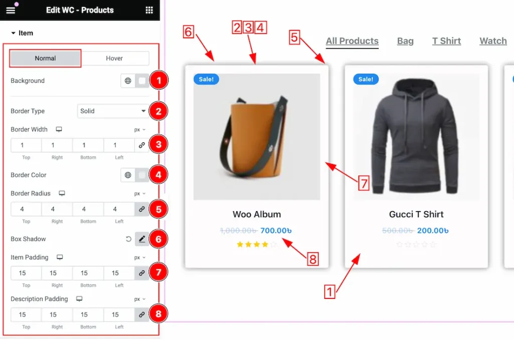
1. Background Color: you can change the Background Color to your needs for the items.
2. Border Type: you can set the Border Type to Default, None, Solid, Double, Dotted, Dashed, or Groove. We choose here the Border Type Solid.
3. Border Width: The border width property allows developers or designers to control how thick or thin the border around a widget should be.
4. Border Color: This lets you change the Border color.
5. Border Radius: Customizes the border corners for roundness.
6. Box Shadow: The Box Shadow property is used to create the shadow around the items. It takes Four values: Horizontal offset, Vertical offset, blur, and Spread to customize the Box shadow.
Position: you can set the Box Shadow position Outline and Inset. Here we set the Box Shadow position Outline.
Box Shadow Color: This lets you change the Box Shadow color.
7. Item Padding: This option lets you adjust the padding for all items.
8. Description Padding: This option lets you adjust the padding for all item descriptions.
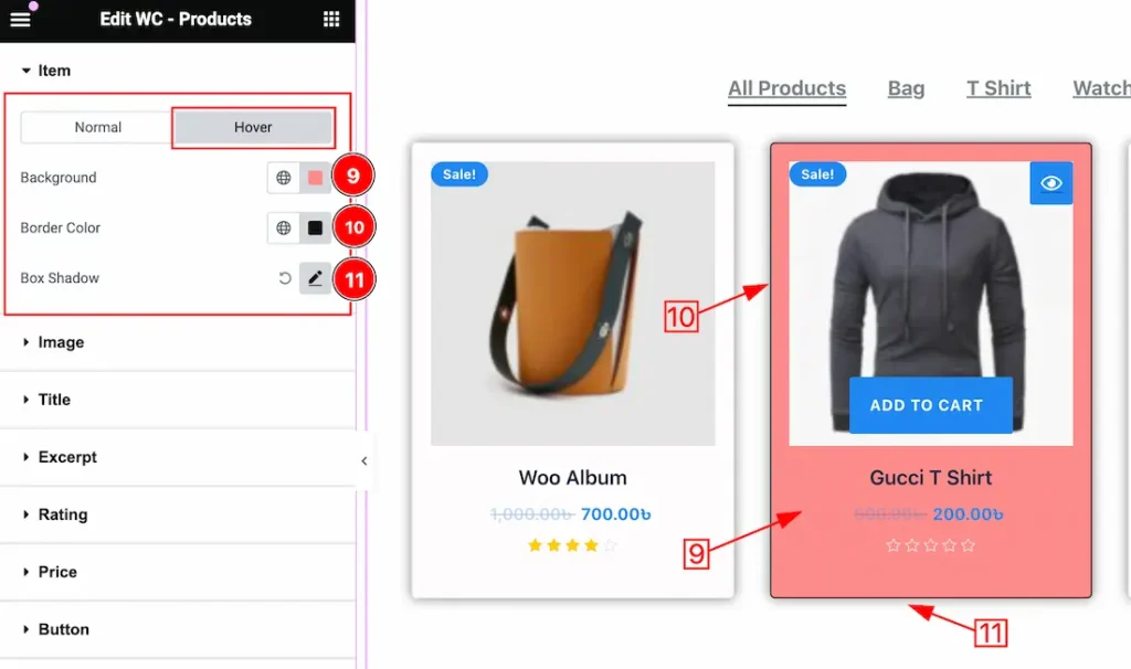
In the Hover subsection, you will get a similar customization option to the Normal sub-sections. So please try it yourself.
Image Section
Go to Style > Image
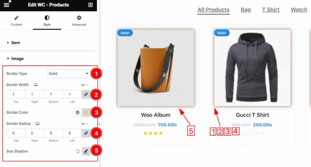
1. Border Type: you can set the Border Type to Default, None, Solid, Double, Dotted, Dashed, or Groove. We choose here the Border Type Solid.
2. Border Width: The border width property allows developers or designers to control how thick or thin the border around a widget should be.
3. Border Color: This lets you change the Border color.
4. Border Radius: Customizes the border corners for roundness.
5. Box Shadow: The Box Shadow property is used to create the shadow around the image. It takes Four values: Horizontal offset, Vertical offset, blur, and Spread to customize the Box shadow.
Position: you can set the Box Shadow position Outline and Inset. Here we set the Box Shadow position Outline.
Box Shadow Color: This lets you change the Box Shadow color.
Title Section
Go to Style > Title
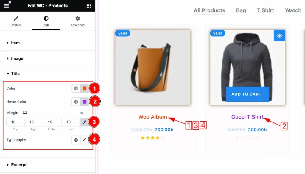
1. Color: This option lets you change the Title Color.
2. Hover Color: This option lets you change the Title Hover Color.
3. Margin: you can adjust the margin for the Title.
4. Typography: Change the font family, size, weight, style, transform, decoration, line height, letter spacing, and word spacing from here.
Rating Section
Go to Style > Rating
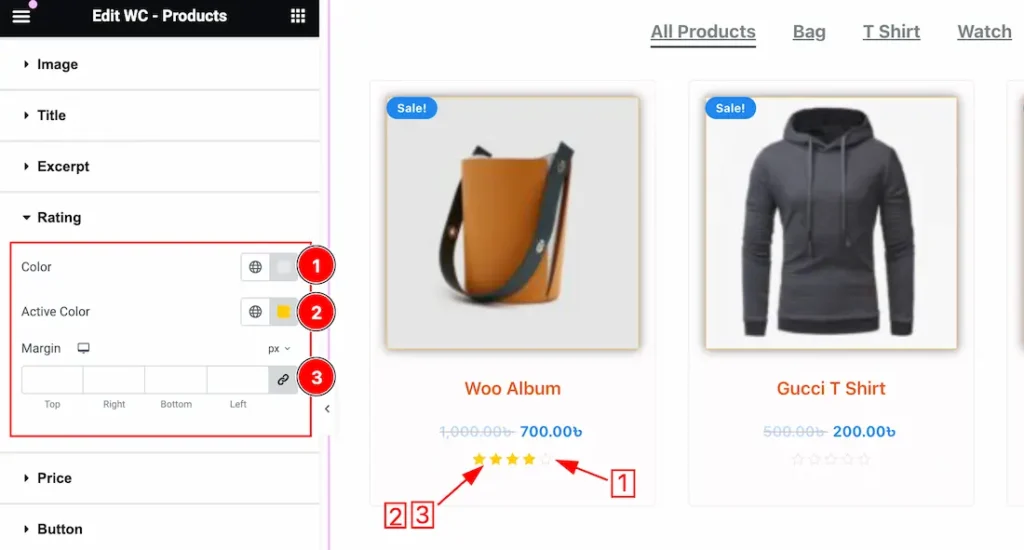
1. Color: This option lets you change the Rating Color.
2. Active Color: This option lets you change the Active Color for the Rating.
3. Margin: you can adjust the margin for the Rating.
Price Section
Go to Style > Price
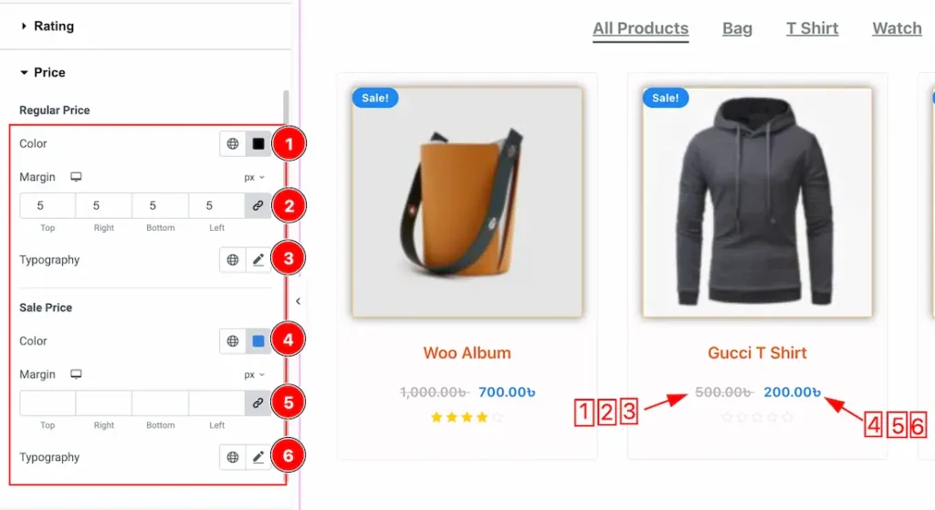
1. Regular Price Color: This option lets you change the Regular Price Color.
2. Margin: you can adjust the margin for the Regular price.
3. Typography: Change the font family, size, weight, style, transform, decoration, line height, letter spacing, and word spacing from here for the regular price.
4. Sale Price Color: This option lets you change the Sale Price Color.
5. Margin: you can adjust the margin for the Sale price.
6. Typography: Change the font family, size, weight, style, transform, decoration, line height, letter spacing, and word spacing from here for the Sale price.
Button Section
Go to Style > Button
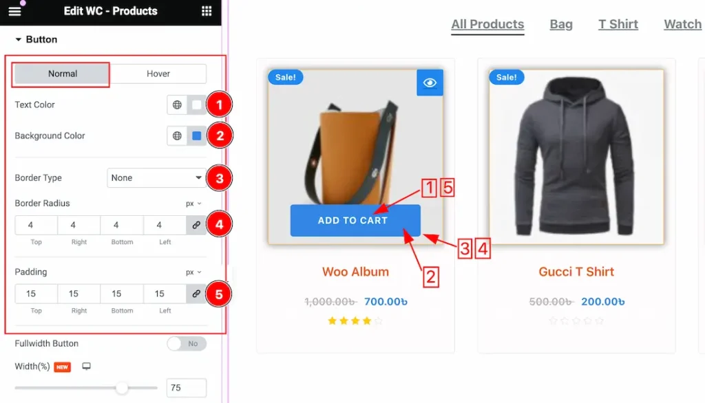
Come to the Button section, you will get two subsections; Normal and Hover.
In the Normal subsection, you will get the below options-
1. Text Color: This option lets you change the Normal Button Text Color.
2. Background Color: This option lets you change the Normal Button Background Color.
3. Border Type: you can set the Border Type to Default, None, Solid, Double, Dotted, Dashed, or Groove. We choose here the Border Type Solid.
4. Border Radius: Customizes the border corners for roundness.
5. Padding: Adjust the padding for the Button.
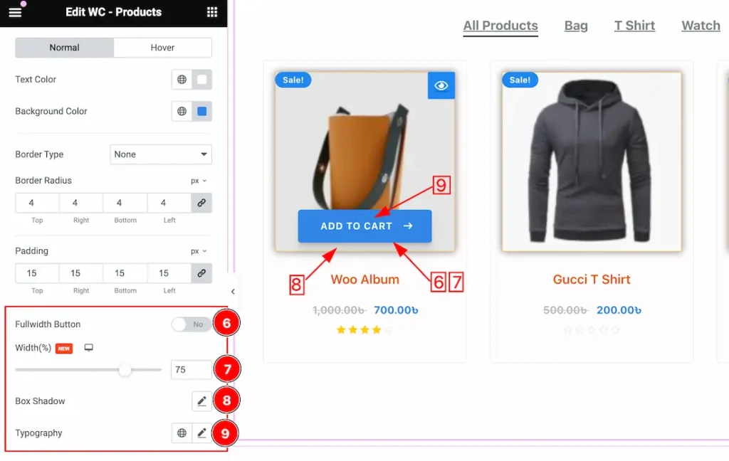
6. Fullwidth Button: If you enable the Fullwidth switcher button then the button will show in fullwidth.
7. Width: This option lets you set the button width to your working demand by using percentage.
8. Box Shadow: you can set a Box Shadow for the Button. The Box Shadow property is used to create the shadow around the items. It takes Four values: Horizontal offset, Vertical offset, blur, and Spread to customize the Box shadow.
Position: you can set the Box Shadow position Outline and Inset. Here we set the Box Shadow position Outline.
Box Shadow Color: This lets you change the Box Shadow color.
9. Typography: Change the font family, size, weight, style, transform, decoration, line height, letter spacing, and word spacing from here for the button.
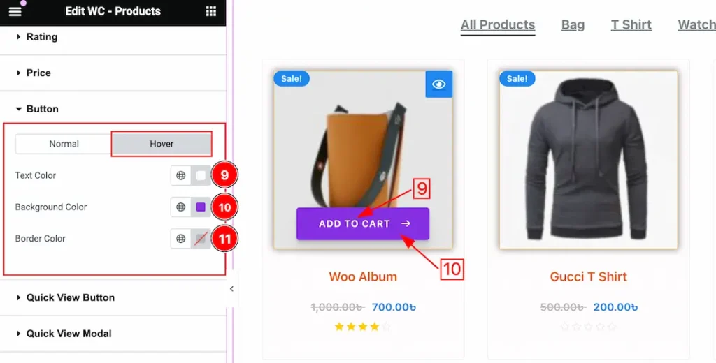
In the Hover subsection, you will get a similar customization option to the Normal sub-sections. So please try it yourself.
Quick View Button Section
Go to Style > Quick View Button
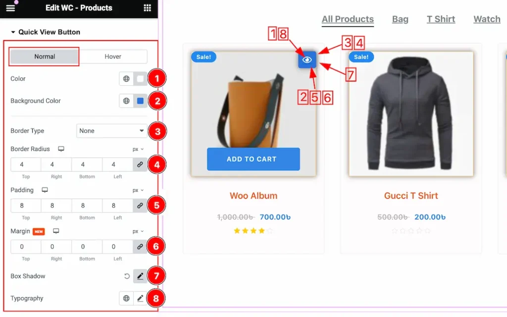
Come to the Quick View Button section, you will get two subsections; Normal and Hover.
In the Normal subsection, you will get the below options-
1. Color: This option lets you change the Quick View Button Text Color.
2. Background Color: This option lets you change the Normal Quick View Button Background Color.
3. Border Type: you can set the Border Type to Default, None, Solid, Double, Dotted, Dashed, or Groove. We choose here the Border Type Solid.
4. Border Radius: Customizes the border corners for roundness.
5. Padding: Adjust the padding for the Quick View Button.
6. Margin: Adjusts the position of an object over the canvas.
7. Box Shadow: you can set a Box Shadow for the Quick View Button. The Box Shadow property is used to create the shadow around the items. It takes Four values: Horizontal offset, Vertical offset, blur, and Spread to customize the Box shadow.
Position: you can set the Box Shadow position Outline and Inset. Here we set the Box Shadow position Outline.
Box Shadow Color: This lets you change the Box Shadow color.
8. Typography: Change the font family, size, weight, style, transform, decoration, line height, letter spacing, and word spacing from here for the Quick View button.
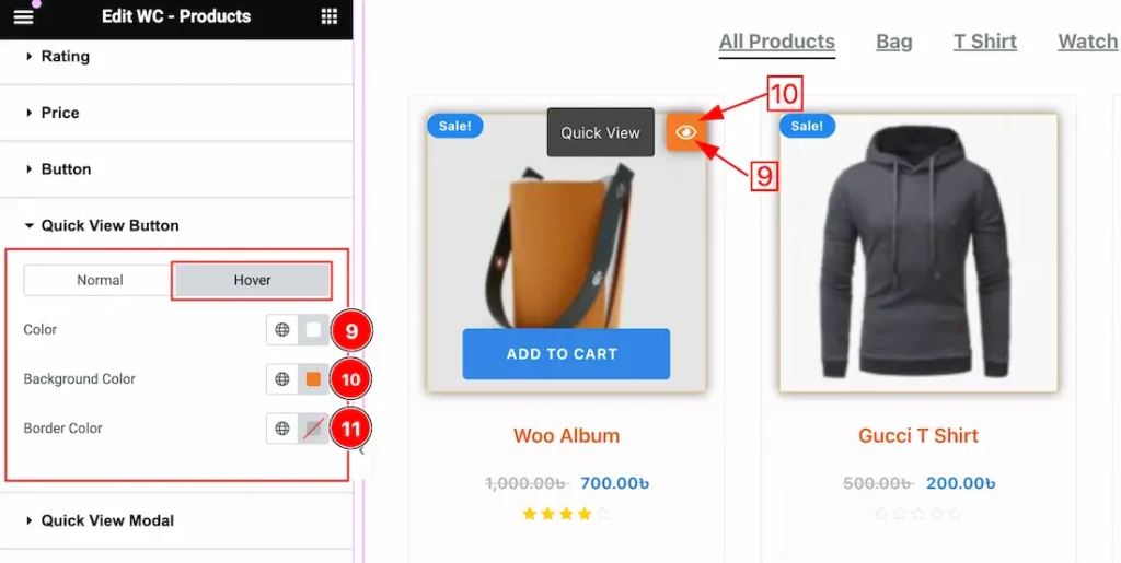
In the Hover subsection, you will get the below options-
9. Color: This option lets you change the Quick View Button hover color.
10. Background Color: This option lets you change the Quick View Button hover Background color.
11. Border Color: This option lets you change the Quick View Button hover Border color.
Quick View Modal Section
Go to Style > Quick View Modal
Title Subsection customization
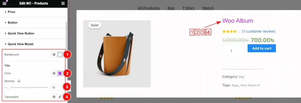
Come to the Quick View Modal section, you will get many subsections to customize the Quick View Modal. Now we are describing all the subsections step by step.
1. Background Color: You can change the Modal Background Color to your working demand.
2. Color: This option lets you change the Modal Title Color.
3. Spacing: You can adjust the spacing for the modal Title.
4. Typography: Change the font family, size, weight, style, transform, decoration, line height, letter spacing, and word spacing from here for the Modal Title.
Rating and Old Price Subsection customization
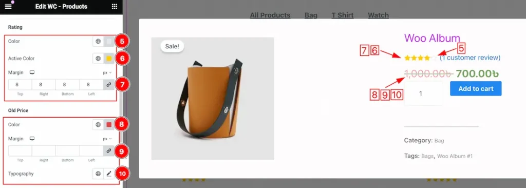
5. Color: This option lets you change the Modal Rating Color.
6. Active Color: This option lets you change the Modal Rating Active Color.
7. Margin: Adjust the margin for the modal rating.
8. Old Price Color: This option lets you change the Modal Old Price Color.
9. Margin: Adjust the margin for the modal Old Price.
10. Typography: Change the font family, size, weight, style, transform, decoration, line height, letter spacing, and word spacing from here for the Modal Old Price.
Sale Price and Badge Subsection customization
10. Old Price Color: This option lets you change the Modal Sale Price Color.
11. Margin: Adjust the margin for the modal Sale Price.
12. Typography: Change the font family, size, weight, style, transform, decoration, line height, letter spacing, and word spacing from here for the Modal Sale Price.
13. Text Color: This option lets you change the Badge Color.
14. Background Color: This option lets you change the Badge Background Color.
15. Padding: Adjust the padding for the badge from here.
16. Border Type: you can set the Border Type to Default, None, Solid, Double, Dotted, Dashed, or Groove. We choose here the Border Type Solid.
17. Border Radius: Customizes the border corners for roundness.
18. Typography: Change the font family, size, weight, style, transform, decoration, line height, letter spacing, and word spacing from here for the Badge.
SMeta and Close Button Subsection customization
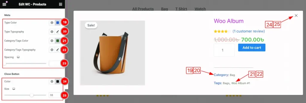
19. Type Color: This option lets you change the Category/Tags Type Color.
20. Type Typography: This option lets you change the Category/Tags Type Typography.
21. Category/Tags Color: This option lets you change the Category/Tags Text Color.
22. Category/Tags Typography: This option lets you change the Category/Tags Type Typography.
23. Spacing: Adjust the spacing for the Category/Tags.
24. Close Button Color: This option lets you change the Close button Color.
25. Size: This option lets you change the Close button Size.
Quantity Subsection customization
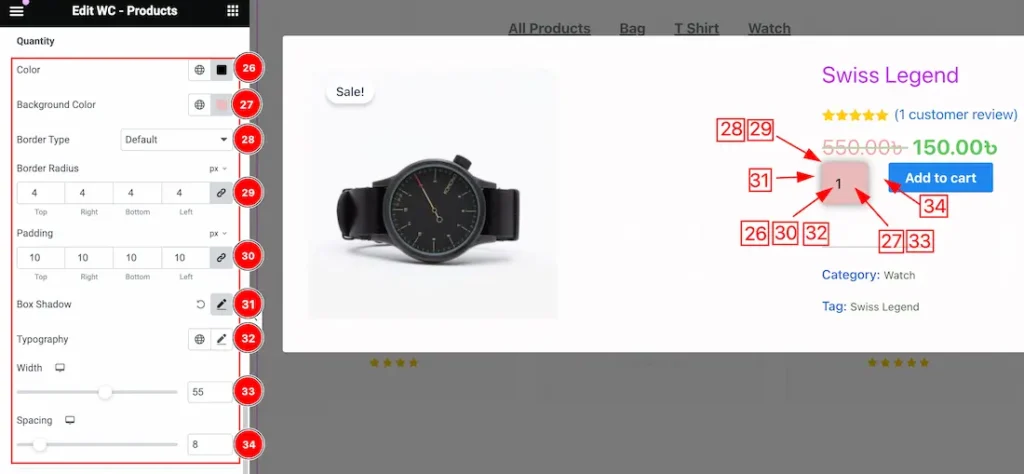
26. Color: This option lets you change the Quantity Color.
27. Background Color: This option lets you change the Quantity of Background Color.
28. Border Type: you can set the Border Type to Default, None, Solid, Double, Dotted, Dashed, or Groove. We choose here the Border Type Solid.
29. Border Radius: Customizes the border corners for roundness.
30. Padding: Adjust the Padding for the Quantity field.
31. Box Shadow: The Box Shadow property is used to create the shadow around the items. It takes Four values: Horizontal offset, Vertical offset, blur, and Spread to customize the Box shadow.
Position: you can set the Box Shadow position Outline and Inset. Here we set the Box Shadow position Outline.
Box Shadow Color: This lets you change the Box Shadow color.
32. Typography: Set the Typography for the Quantity.
33. Width: This option lets you adjust the width for the Quantity field.
34. Spacing: adjust the spacing between quantity and add to cart button.
Add to Cart Subsection customization
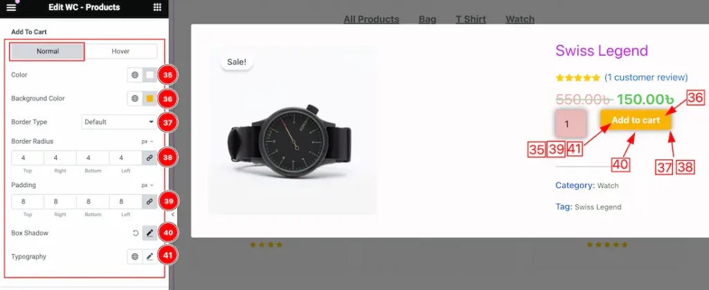
Come to the Add to Cart subsection, you will get two subsections; Normal and Hover.
In the Normal subsection, you will get the below options-
35. Color: This option lets you change the Add to Cart text color.
36. Background Color: This option lets you change the Add to Cart Background color.
37. Border Type: you can set the Border Type to Default, None, Solid, Double, Dotted, Dashed, or Groove. We choose here the Border Type Solid.
38. Border Radius: Customizes the border corners for roundness.
39. Padding: Adjust the Padding for the Add to Cart.
40. Box Shadow: The Box Shadow property is used to create the shadow around the items. It takes Four values: Horizontal offset, Vertical offset, blur, and Spread to customize the Box shadow.
Position: you can set the Box Shadow position Outline and Inset. Here we set the Box Shadow position Outline.
Box Shadow Color: This lets you change the Box Shadow color.
41. Typography: Change the font family, size, weight, style, transform, decoration, line height, letter spacing, and word spacing from here.
In the Hover subsection, you will get the below options-
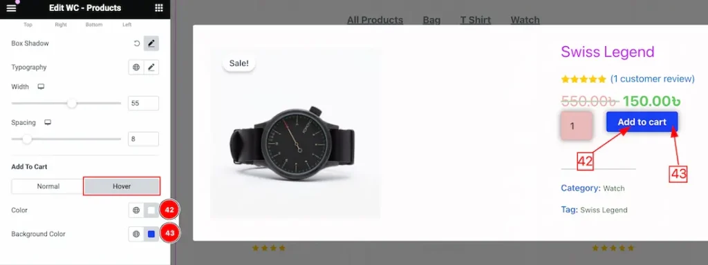
42. Color: This option lets you change the Add to Cart text Hover color.
43. Background Color: This option lets you change the Add to Cart Background hover color.
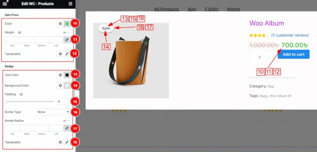
Badge Section
Go to Style > Badge
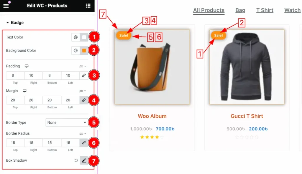
1. Text Color: This option lets you change the Badge Text Color.
2. Background Color: This option lets you change the Badge Background Color.
3. Padding: Adjust the Padding for the Badge.
4. Margin: Adjust the margin for the Badge.
5. Border Type: you can set the Border Type to Default, None, Solid, Double, Dotted, Dashed, or Groove. We choose here the Border Type Solid.
6. Border Radius: Customizes the border corners for roundness.
7. Box Shadow: This option lets you add the Box Shadow for the Badge.
Footer Section
Go to Style > Footer
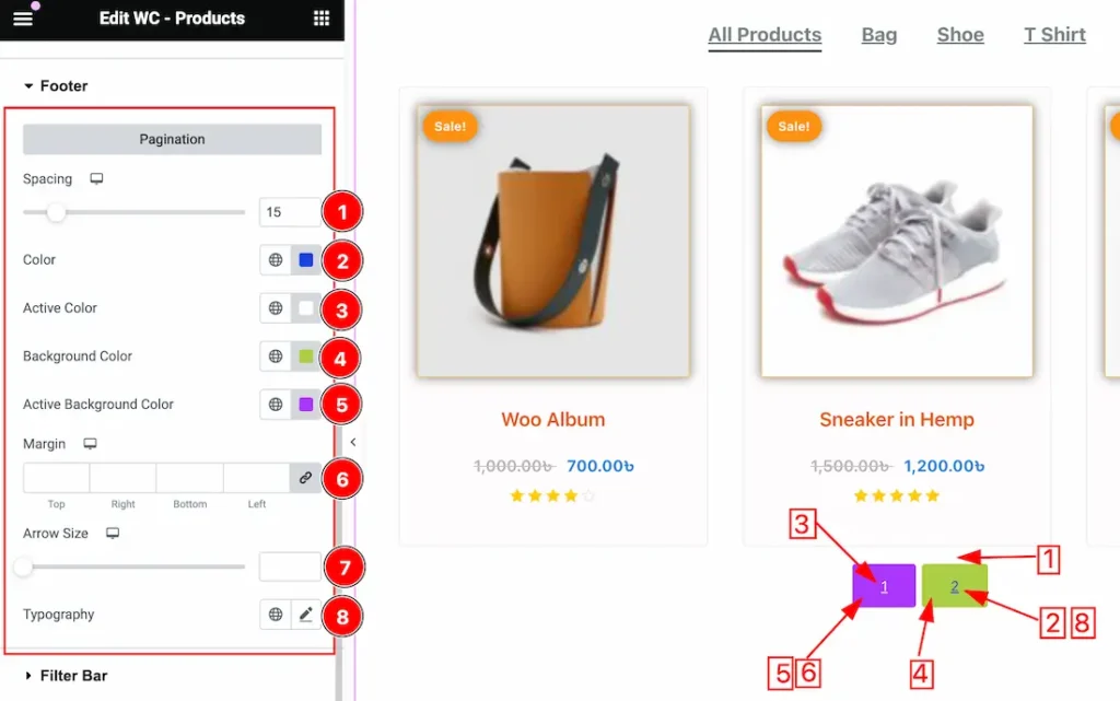
1. Spacing: This option lets you create space between Items and Pagination.
2. Color: This option lets you change the pagination text color.
3. Active Color: This option lets you change the pagination Active text color.
4. Background Color: This option lets you change the pagination Background color.
5. Active Background Color: This option lets you change the pagination Active Background color.
6. Margin: Adjust the margin for the pagination.
7. Arrow Size: If you have many pages then you will see the Arrow for the pagination. This option lets you change the Arror Size for the pagination.
8. Typography: Change the font family, size, weight, style, transform, decoration, line height, letter spacing, and word spacing from here for the pagination.
Filter Bar Section
Go to Style > Filter Bar
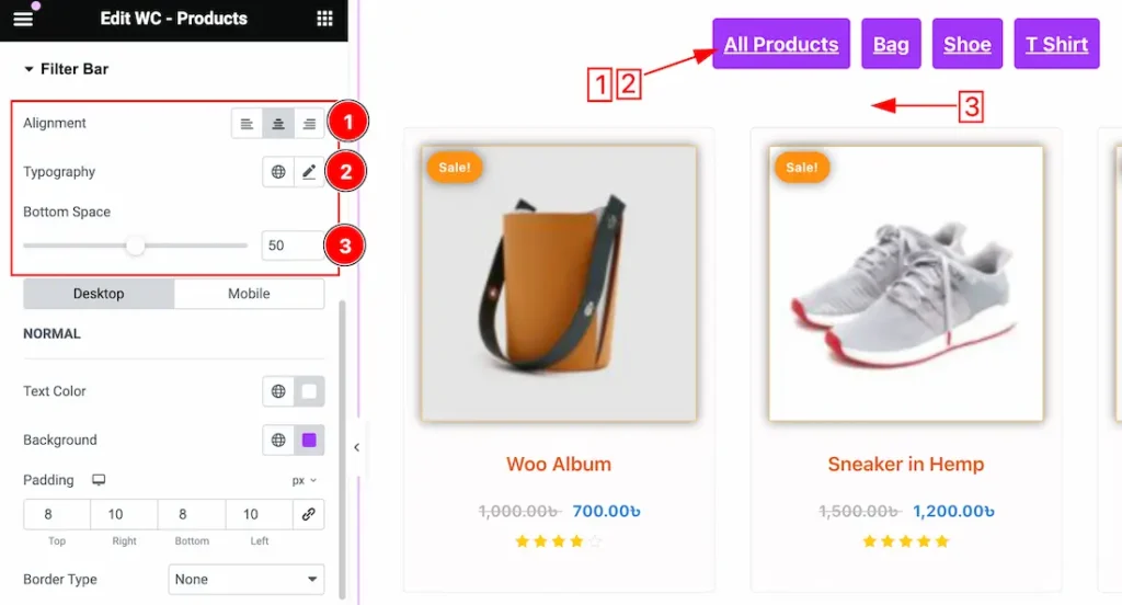
1. Alignment: You can set the Filter Bar Alignment as Left, Center, and Right.
2. Typography: Change the font family, size, weight, style, transform, decoration, line height, letter spacing, and word spacing from here for the Filter Bar.
3. Bottom Space: You can set the Bottom Space between Filter Bar and Products items.
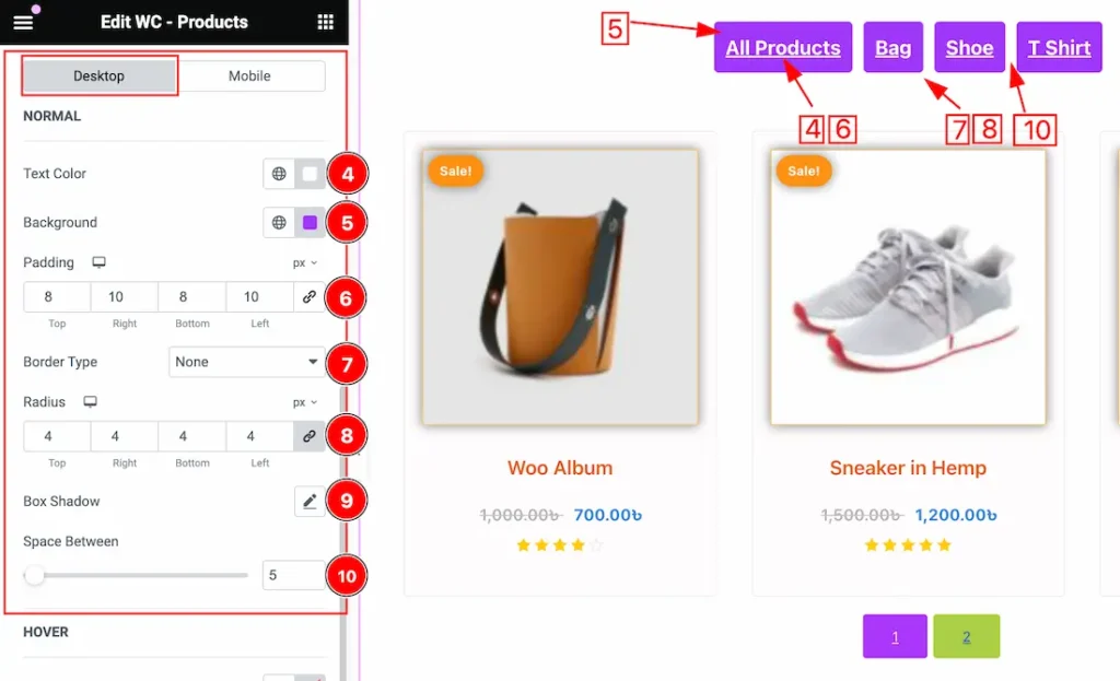
Come to the Filter Bar section, you will get two subsections; Desktop and Mobile.
In the Desktop subsection, you will get the below options-
4. Text Color: This option lets you change the Normal text color for the Filterbar.
5. Background Color: This option lets you change the Normal Background color for the Filterbar.
6. Padding: you can adjust the padding for the Filter Bar.
7. Border Type: you can set the Border Type to Default, None, Solid, Double, Dotted, Dashed, or Groove. We choose here the Border Type Solid.
8. Radius: Customizes the border corners for roundness.
9. Box Shadow: you can add the Box Shadow for the Filter Bar.
10. Space Between: you can adjust the Space between Filter Bar Categories.
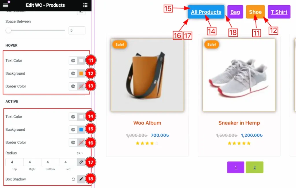
11. Text Color: This option lets you change the Hover text color for the Filterbar.
12. Background Color: This option lets you change the Hover Background color for the Filterbar.
13. Border Color: This option lets you change the Hover Border color for the Filterbar.
14. Text Color: This option lets you change the Active text color for the Filterbar.
15. Background Color: This option lets you change the Active Background color for the Filterbar.
16. Border Color: This option lets you change the Active Border color for the Filterbar.
17. Radius: Customizes the border corners for roundness for the Active Border.
18. Box Shadow: This option lets you set a Box Shadow for the Active Filter Bar.
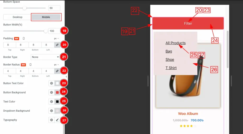
In the Mobile subsection, you will get the below options-
19. Button Width: This option lets you set the filter bar button width for the mobile device.
20. Padding: you can adjust the padding for the Filter Bar button from here for the mobile device.
21. Border Type: you can set the Border Type to Default, None, Solid, Double, Dotted, Dashed, or Groove. We choose here the Border Type Solid.
22. Border Radius: Customizes the border corners for roundness.
23. Button Text Color: This option lets you set the Button text color for the mobile device.
24. Button Background: This option lets you set the Button Background color for the mobile device.
25. Text Color: This option lets you set the Bropdown categories text color.
26. Dropdown Background: This option lets you set the dropdown categories Background color.
27. Typography: Change the font family, size, weight, style, transform, decoration, line height, letter spacing, and word spacing from here for the Dropdown Categories text.
All done! You have successfully customized the WooCommerce Products widget on your website.
Video Assist
You can also watch the video tutorial Learn more about the WooCommerce Products widget. Please visit the demo page for examples.
Thanks for being with us.