

In this documentation, we will show you how to customize the Carbon Slider widget presented by the Ultimate Post Kit addon.
Inserting Carbon Slider Widget
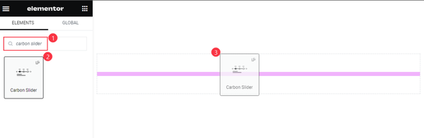
Search by the Carbon slider widget name, then drag and drop it.
Default View of the Carbon Slider
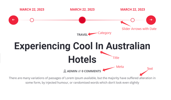
The Slider displays Arrows with Date, Category, Title, Meta, and Text.
Content Tab Customization
Layout Section
Go to Content > Layout
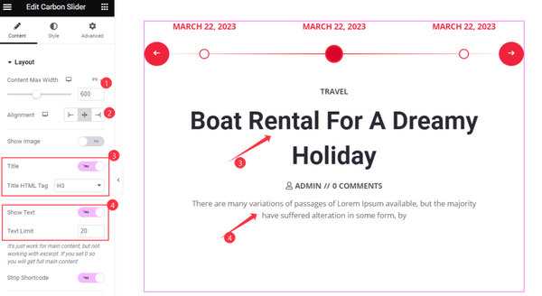
Find the Content Max Width, Alignment, Title, and Title HTML Tag, Show Text, and Text Limit, and Strip Shortcode options.
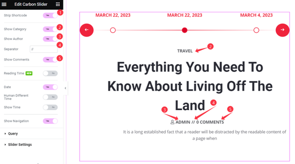
Also find the Show Category, Show Author, Separator, and Show Comments options.
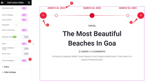
Then find the Date, Human Different Time, Show Time, and Show Navigation options.
Show Slider Image

Turn on the Show Image switcher to add slider images and use the Image Size option.
Query Section
Go to Content > Query
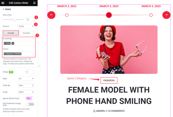
Find the Item Limit, Source, Include & Exclude filters, and Terms options.
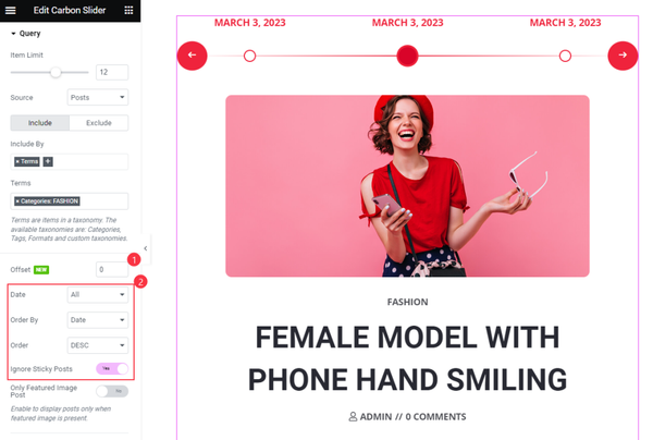
Then find the Offset, Date, Order By, Order, Ignore Sticky Posts, and Only Featured Image Post options.
Slider Settings Section
Go to Content > Slider Settings
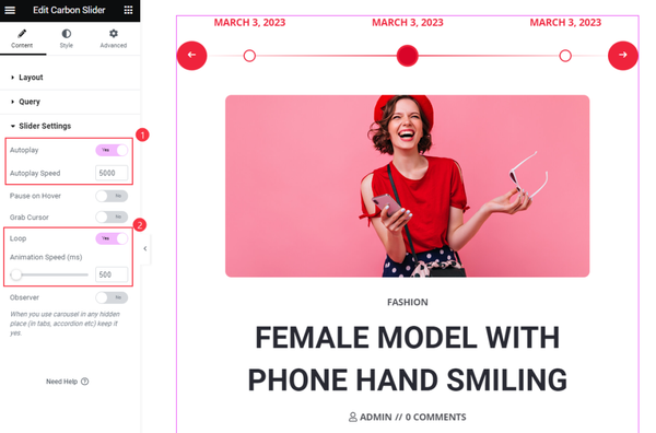
Find the Autoplay and Autoplay Speed, Loop, and Animation Speed options.
Style Tab Customization
Image Section
Go to Style > Image
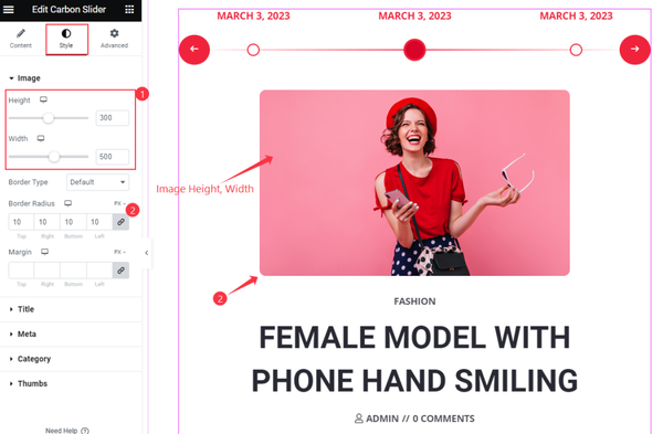
Find the Height, Width, Border Type, Border Radius, and Margin options.
Title Section
Go to Style > Title
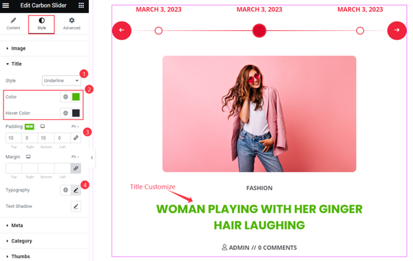
Find the Style, Color, Hover Color, Padding, Margin, Typography, and Text Shadow options.
Meta Section
Go to Style > Meta
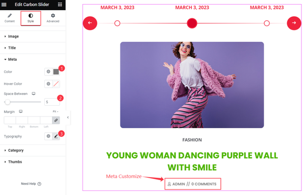
Find the Color, Hover Color, Space Between, Margin, and Typography options.
Category Section
Go to Style > Category
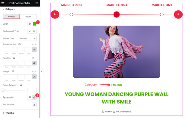
Find the Color, Background Color, Border Type, Border Radius, Padding, Margin, Space Between, Typography, and Box Shadow options.
Thumbs Section
Go to Style > Thumbs
DATE
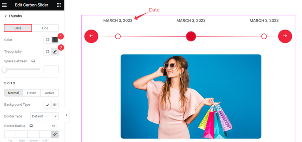
Find the Color, Typography, and Space Between options.
LINE
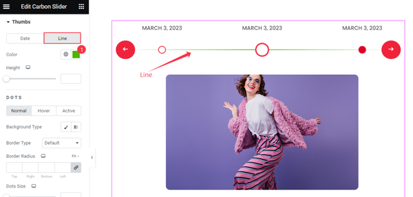
Find the Color and Height options.
DOTS: Normal Mode
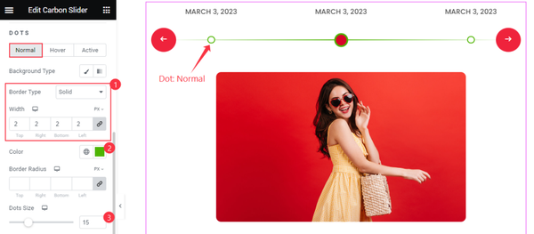
Find the Background Type, Border Type, Width, Color, Border Radius, and Dots Size.
DOTS: Hover Mode
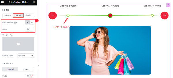
Find the Background Type and Border Type options.
DOTS: Active Mode
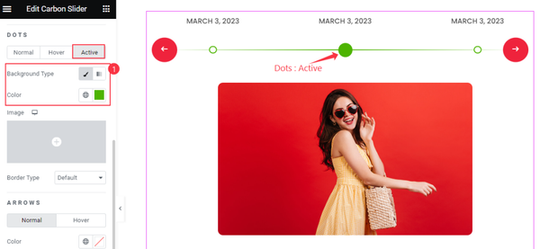
Find the Background Type and Border Type options.
ARROWS: Style
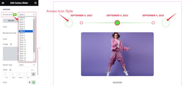
Come to the Arrows sub-section, you can easily select the Arrows Icon Style ( Default, and 1 to 23) as your wish that you like to see on your slider.
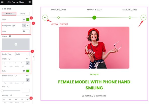
ARROWS: Normal Mode
Find the Color, Background Color, Border Type, Width, Color, Size, and Padding options.
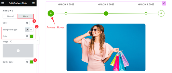
ARROWS: Hover Mode
Find the Color, Background Color, and Border Color options.
Video Assist
Watch the Carbon Slider video tutorial here. Please visit the demo page for examples.
Thanks for being with us.