For your users, presentation is everything. And present your content more dynamically and out of the box, Circle Info can move it to the next level.
Let’s explore how you can customize the Circle Info Widget.
Inserting The Circle Info Widget

On the Elementor editor page, Just Search by the widget’s name and it will appear. Then just drag it and drop it on the page.
Work With Content Tab
Circle Info section
Go to Content > Circle Info
Step-1
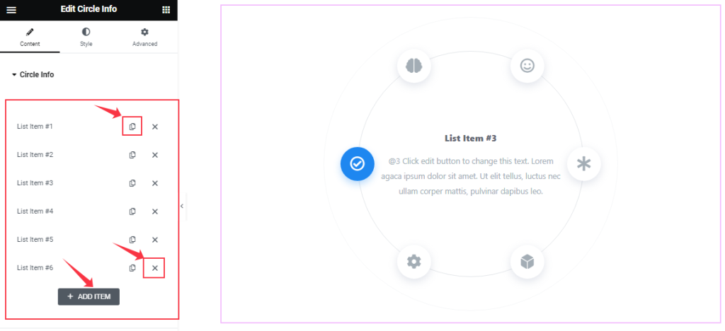
Come to the first section of this widget, you can easily add a Circle Info item by clicking Add Item button. Otherwise, you may increase the Items by clicking the Duplicate Sign symbol and you can also decrease/remove your item by clicking the Cross sign as shown in the screenshot above.
Step-2
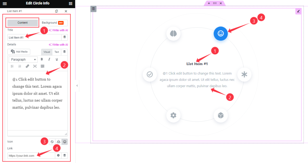
Clicking on a Circle Info item, here you will get two tabs ( Content and Background ). In Content Mode, you will get to change the item Title, description Text or Details, Icon, and Link.
Step-3
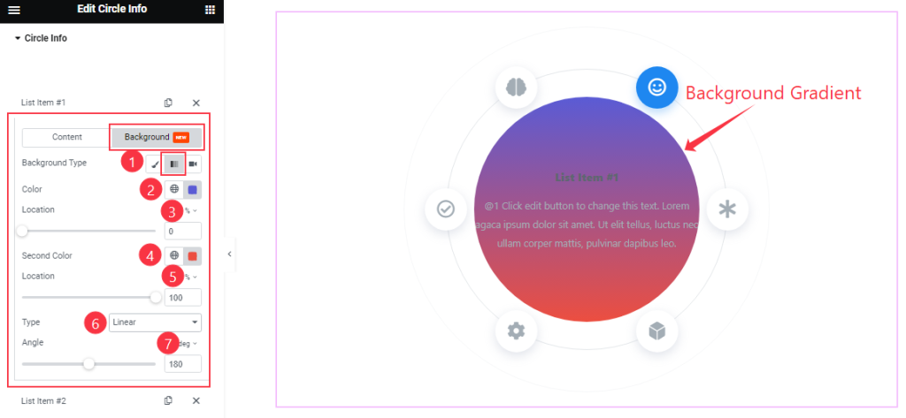
Clicking on the Background tab, you can easily change the Background Type (Classic, Gradient, and Video). Here I change the Background Type Gradient. So, here you will find two colors and their Location, Type, and Angle like in the above screenshot.
In the same process, you can customize the other items of Circle Info.
Additional Info section
Go to Content > Additional Info
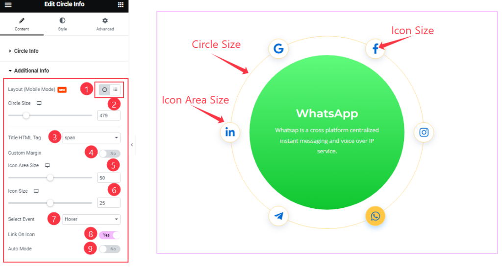
Come To the Additional Info section, you can change the Layout, Title HTML Tag, Select Event, and customize the Circle Size, Icom Area Size, and Icon Size to your working demand.
Here you will get the Custom Margin, Link On Icon, and Auto Mode switcher buttons and you can easily On/Off these switcher buttons to show/hide these elements from The Editor page.
Work with The Style Tab
Content section
Go to Style > Content
Step-1
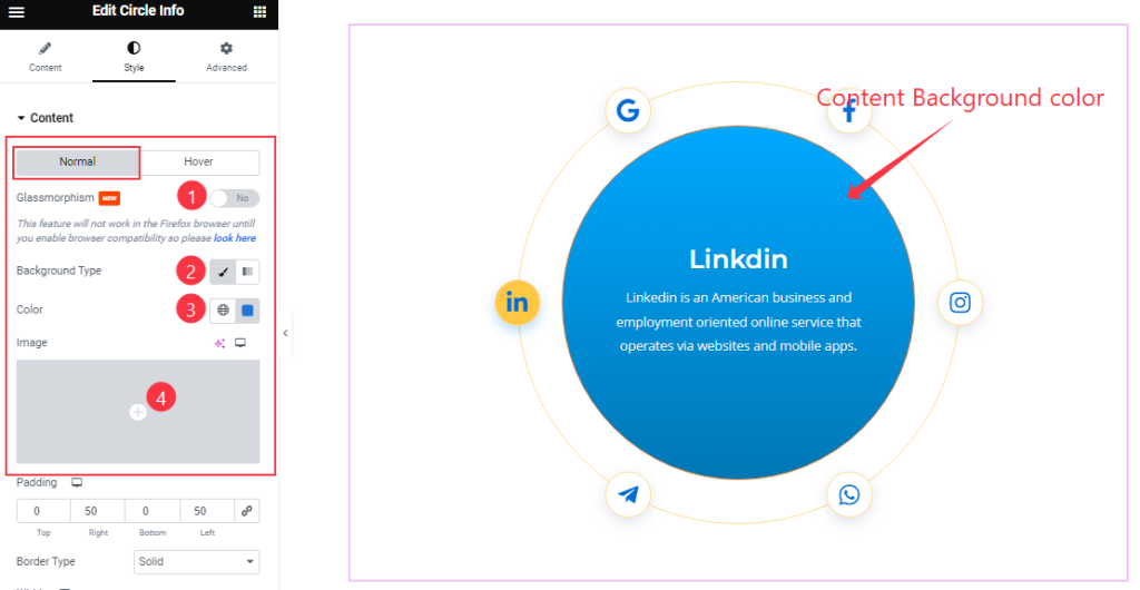
Come to the Content section, Here you will find two tabs (Normal and Hover). In Normal mode, you can easily on/off the Glassmorphism effect switcher to control the effect.
You also can change the content Background Type and background Color and also set an image as the content background.
Step-2
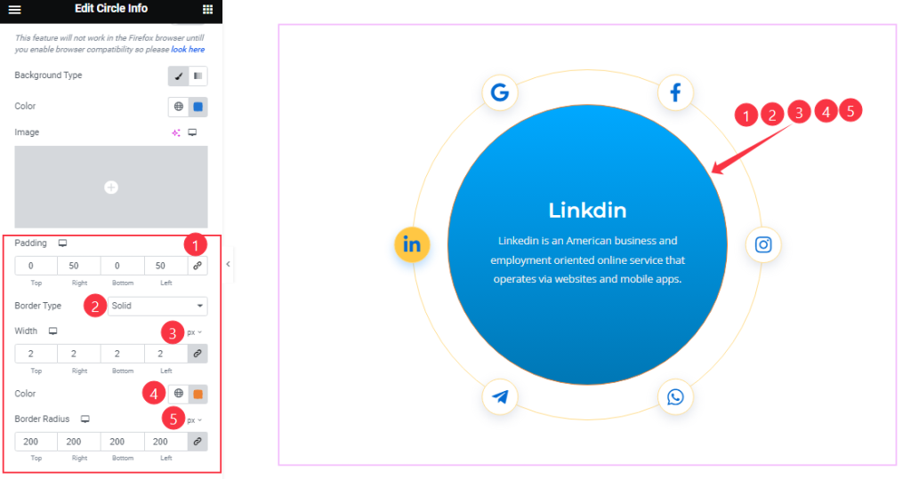
After that, you can set the Padding, Border Type, Width, Border Color, and Border Radius as your wish.
Step-3
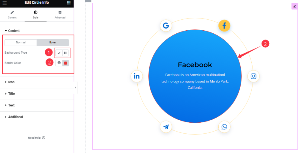
In Hover Mode, you will get the Background Type & Border Color options.
Icon section
Go to Style > Icon
Step-1
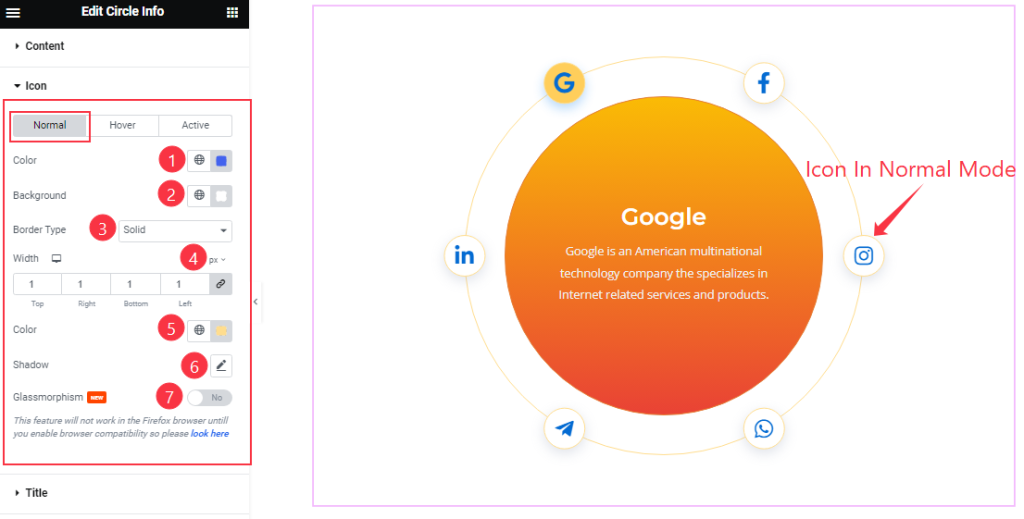
Come to the Icon section, you will see three tabs (Normal, Hover, and Active). In Normal Mode, you can change the Icon Color, Background Color, Border Type, Width, Border Color, and Shadow as above in the screenshot.
Here, you can easily on/off the Glassmorphism switcher button to show/hide this element on the editor page.
Step-2
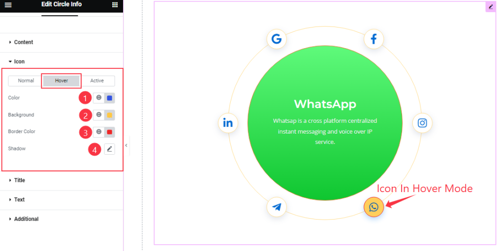
In Hover Mode, you can easily customize the Icon Color, Background Color, and Border Color and also add the Shadow as your wish.
Step-3
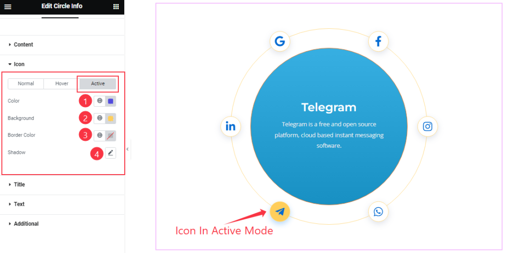
In Active Mode, here you will get a similar set of controls to modify the appearance of this section like hover mode.
Title section
Go to Style > Title
Step-1
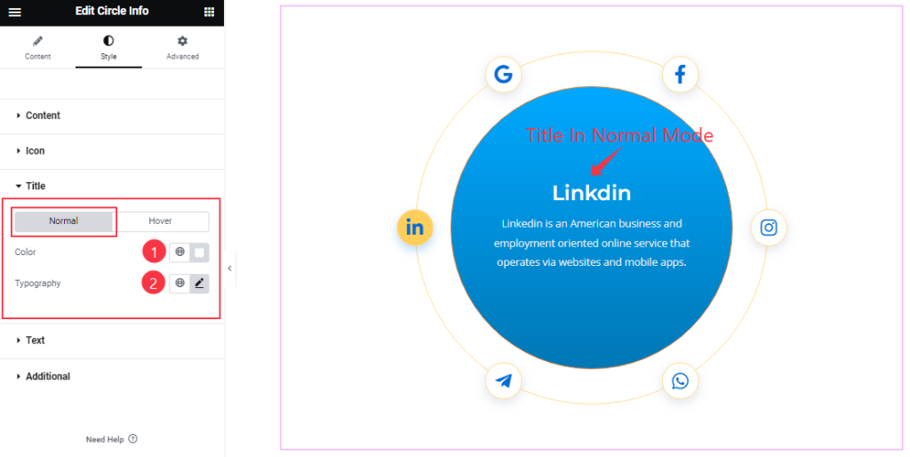
Come to the Title section, in normal mode, you can change the Title Color and set the Typography as your wish.
Step-2
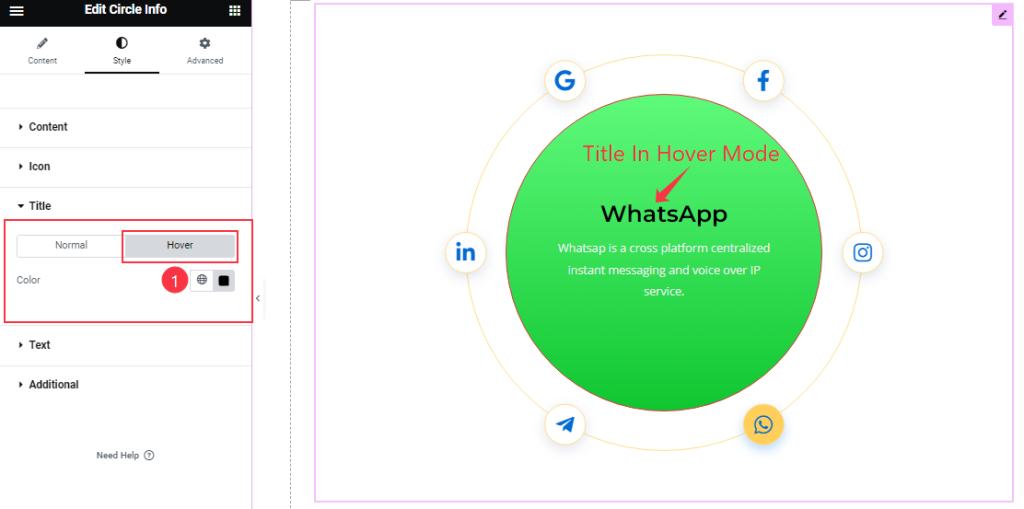
In Hover Mode, you can easily change the title Color.
Text section
Go to Style > Text
Step-1
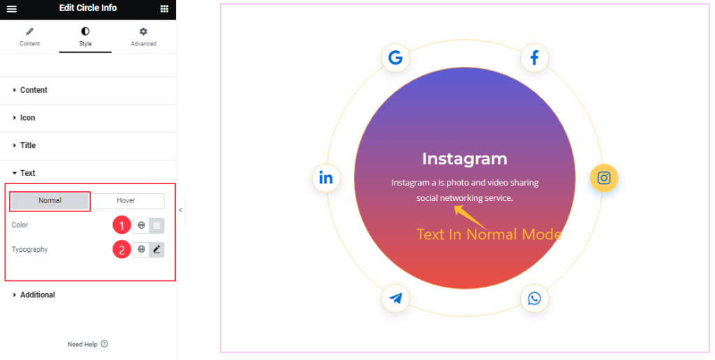
From Text Section, in Normal mode, you can change the Text Color and Typography.
Step-2
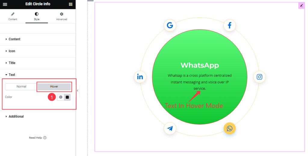
In Hover Mode, you can change the Text Color as your wish.
Additional section
Go to Style > Additional
Step-1
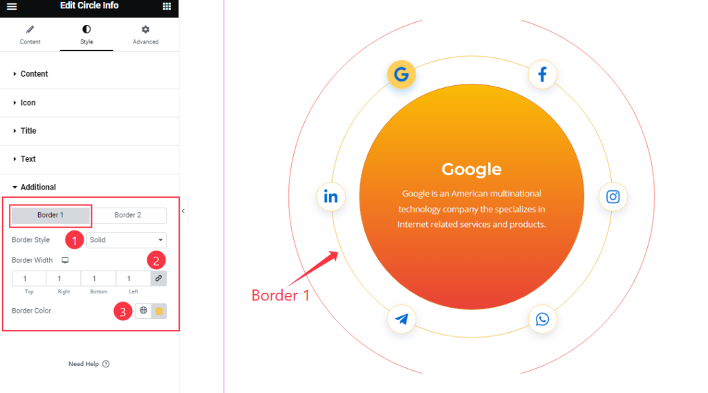
In the Additional section, you will find two tabs (Border 1 and Border 2). Click on Border 1, you can change The Border Style, Border Width, and Border Color to your working demand.
Step-2
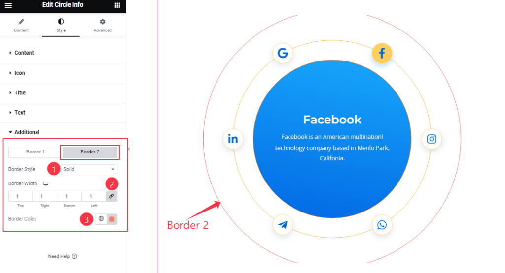
Click on Border 2, and you will get similar customization options as the Border 1 section. So please try it yourself.
All done! You have successfully customized the Circle Info widget on your website.
Video Assist
You can watch this quick video to learn about the Circle Info widget. Please visit the demo page for examples.
Thanks for staying with us.