

This documentation provides comprehensive insights into the List Block developed by Zoloblocks.
Adding a block to the editor
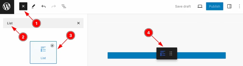
- Click the Toggle Block Inserter icon and a sidebar will appear on the left side, All the blocks will be visible here.
- Search by the List block name.
- Then select the appear blocks ( with zoloblocks logo T.R corner).
- After Drag and Drop it on the page.
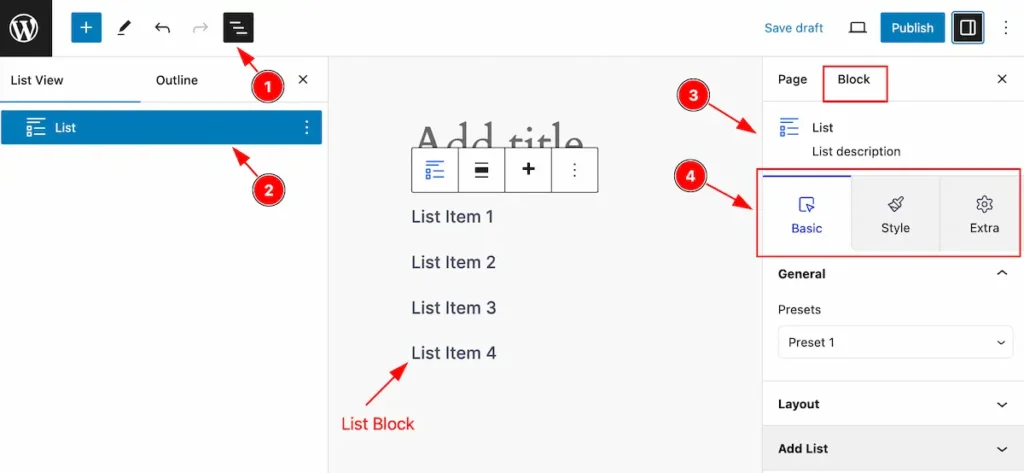
After Inserting the blocks, Follow this.
- Click on the Document Overviewer button and the Blocks list view will appear.
- Here appears the List block.
- After on the right side, Click on the Block. Then the List details appear.
- Here show all the control tabs( Basic, Style, Extra ) of a block.
Basic Tab
The Basic tab controller displayed here offers the flexibility to adjust the layout of blocks according to your preferences.
General Section
Go to Basic > General
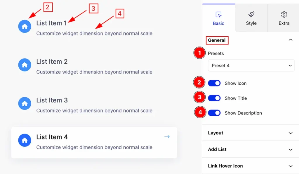
This section provides control for List customization,
- Presets: Click on the presets selector and the pre-made styles will appear. you can select any.
- Show Icon: Enable the switcher to show the Icon.
- Show Title: Enable the switcher to show the Title.
- Show Description: Enable the switcher to show the Description.
Layout Section
Go to Basic > Layout
Layout Type Grid
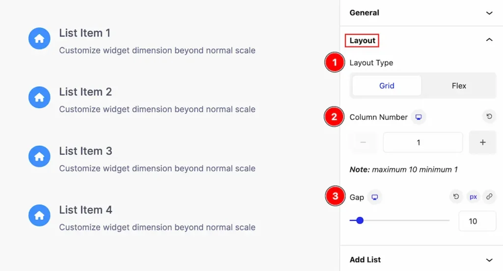
Provides control for the layout,
- Layout Type: Set the layout grid for the list item.
- Column Number: Set the number of the column.
- Gap: Set the gap between the List.
Layout Type Flex
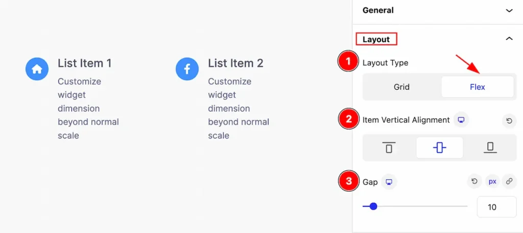
Provides control for the layout,
- Layout Type: Set the layout Flex for the list item.
- Item Vertical Alignment: Make the alignment for the vertical item.
- Gap: Set the gap between the List.
Add List Section
Go to Basic > Add List
Add New List Item
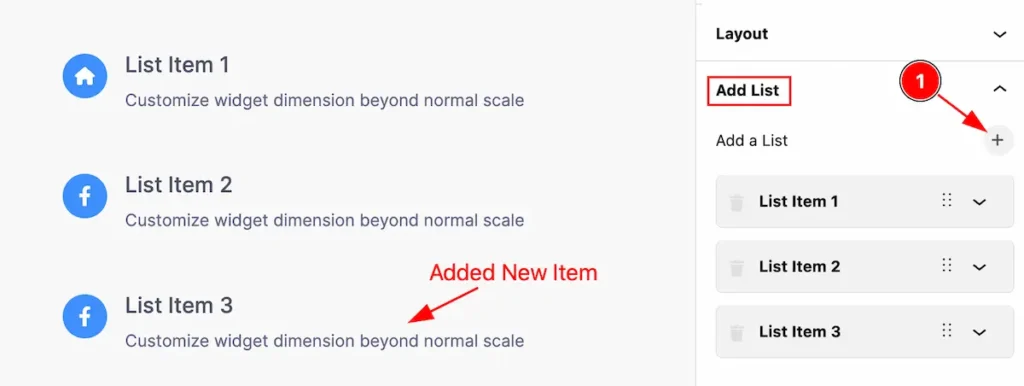
- Click on the ” + ” icon to add a new list item.
Edit List Item
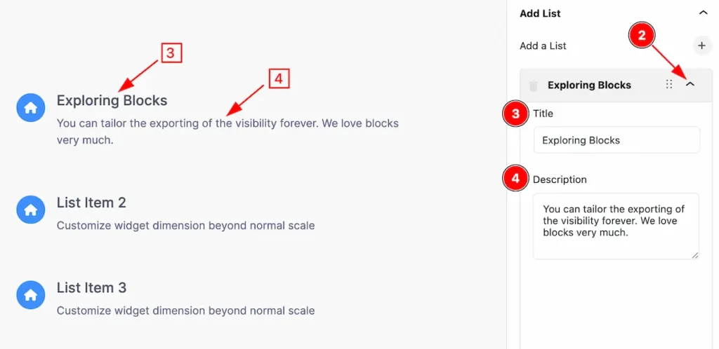
- Click on the carrot icon and it will allow the item to be edited.
- Title: Set the title for the list.
- Description: Set the description for the list item
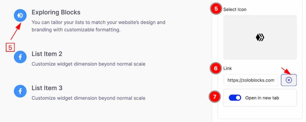
- Select Icon: Select the icon for the list icon.
- Link: Set a link for the icon.
- Open in new tab: Enable the switcher to open the link for the new tab.
Remove List Item
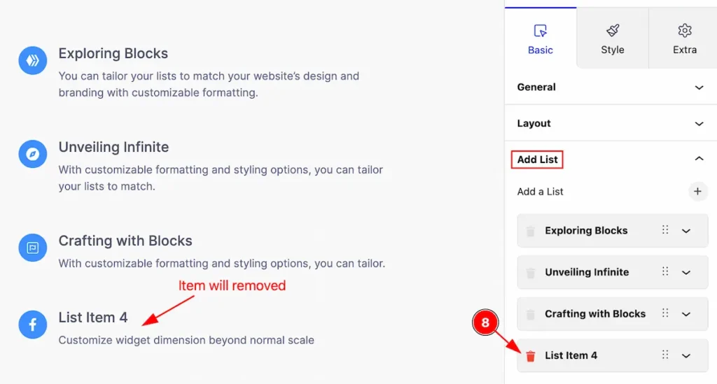
- Click on the ” Trash ” icon to remove the list item.
Link Hover Icon
Go to Basic > Link Hover
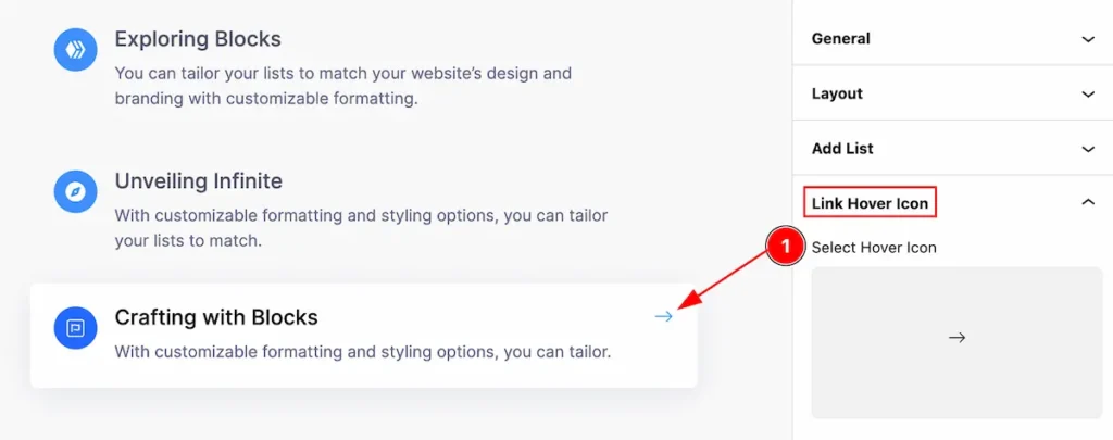
This section provides control for the link hover icon,
- Select Hover Icon: Set the link hover icon for the icon library.
Style Tab
Provide the controller to make the visual appearance or presentation of the tabs. This includes aspects visually appealing and cohesive with the overall design of the interface.
Item
Go to Style > Item
This section provides controls to change the appearance of the items. You can customize it for the Normal and Hover tabs
Normal Tab
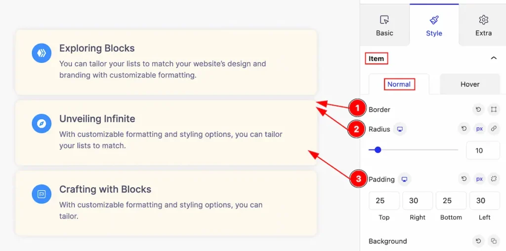
Make customization of the item in normal,
- Border: Set the border for the list item.
- Radius: Make border corner edges rounded by setting the radius.
- Padding: Set the padding for inner space.
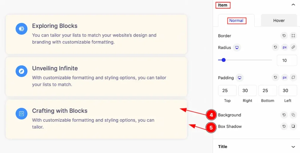
- Background: Set the background for the list item.
- Box Shadow: Set the box shadow for the list item.
Hover Tab
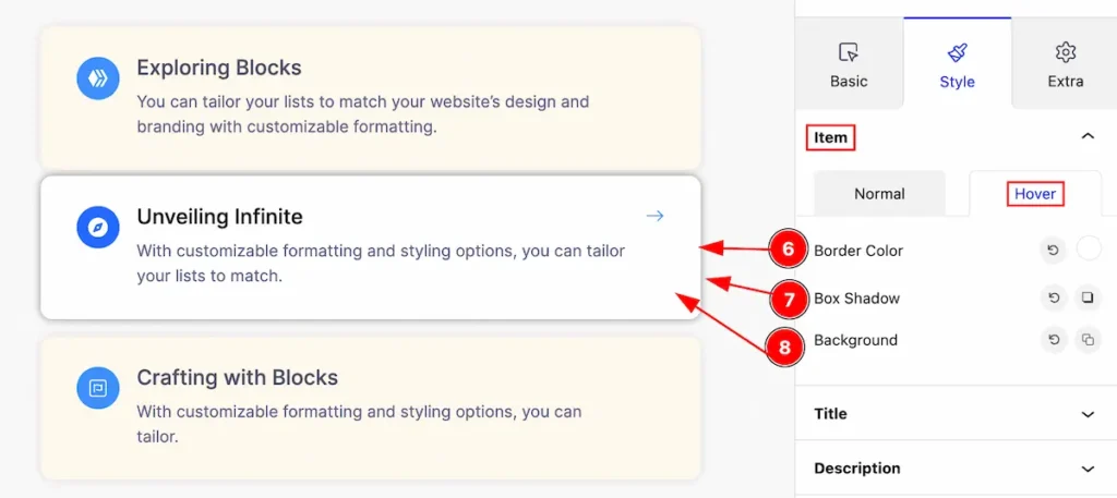
This list item will be visible on mouse hover,
- Border Color: Set the border color for the item.
- Box Shadow: Set box shadow for the list item.
- Background: Set the background for the items.
Title Section
Go to Style > Title
This section provides controls to change the appearance of the items. You can customize it for the Normal and Hover tabs
Normal Tab
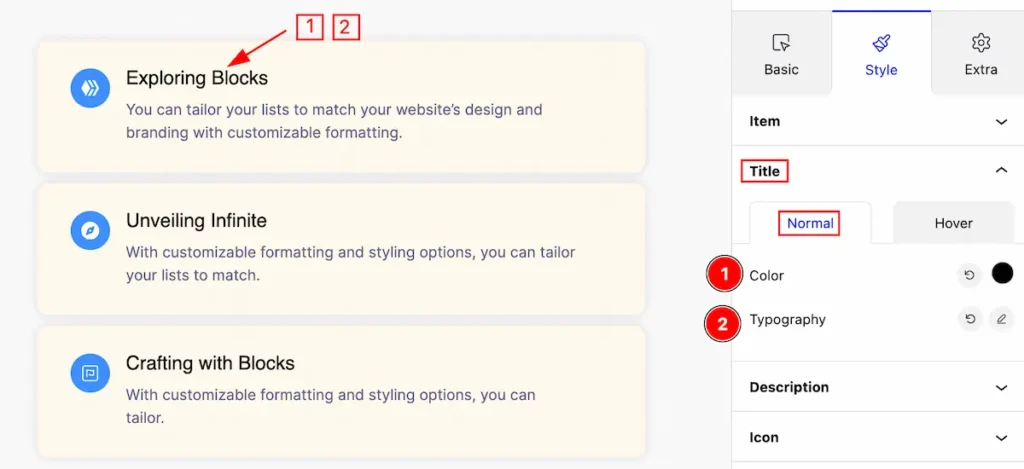
- Color: Set color for the Title.
- Typography: Set typography for the title.
Hover Tab
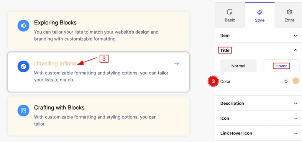
- Color: Set the color for the Title, The changes appear on mouse hover.
Description Section
Go to Style > Description
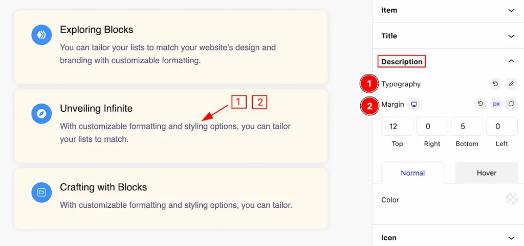
This section provides controls for the description,
- Typography: Set the typography for the description.
- Margin: Set margin for the description.
Normal Tab
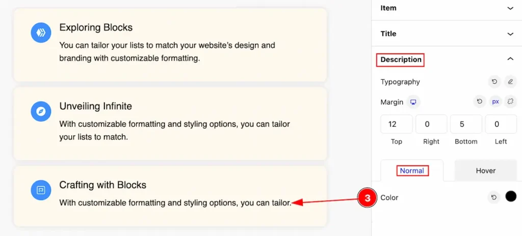
- Color: Set the color for the description.
Hover Tab
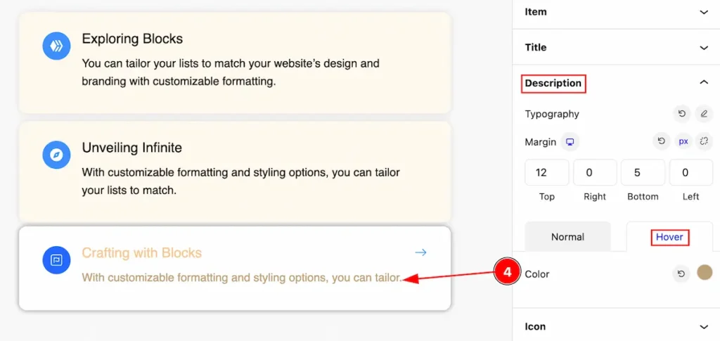
- Color: Set the color of the description, The changes will appear in hover mode.
Icon Section
Go to Style > Icon
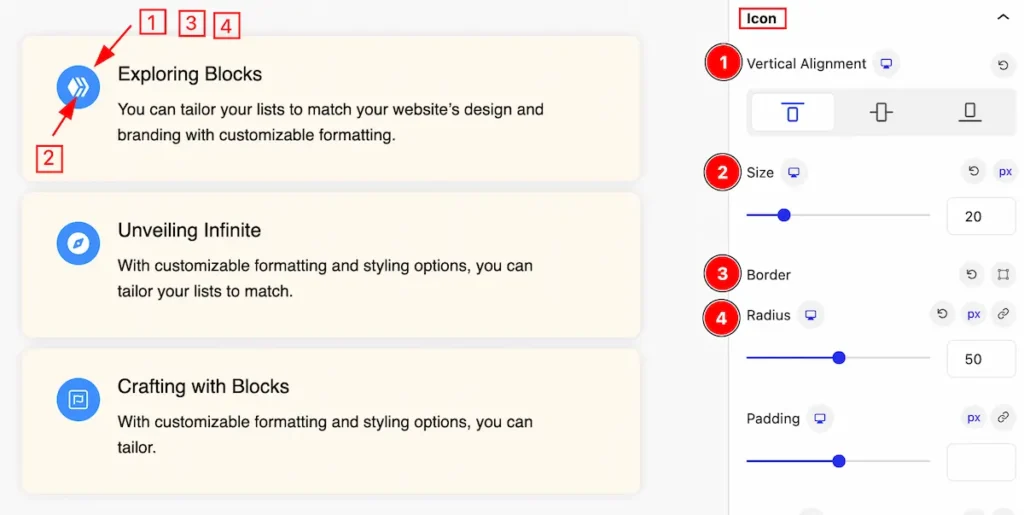
- Vertical Alignment: Set the alignment for the vertical position.
- Size: Set the size for the icon.
- Border: Set the border for the icon.
- Radius: Set the radius for the icon.
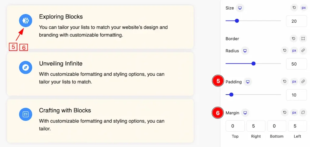
- Padding: Set the padding for the icon.
- Margin: Set the margin for the icon.
Normal State for Icon
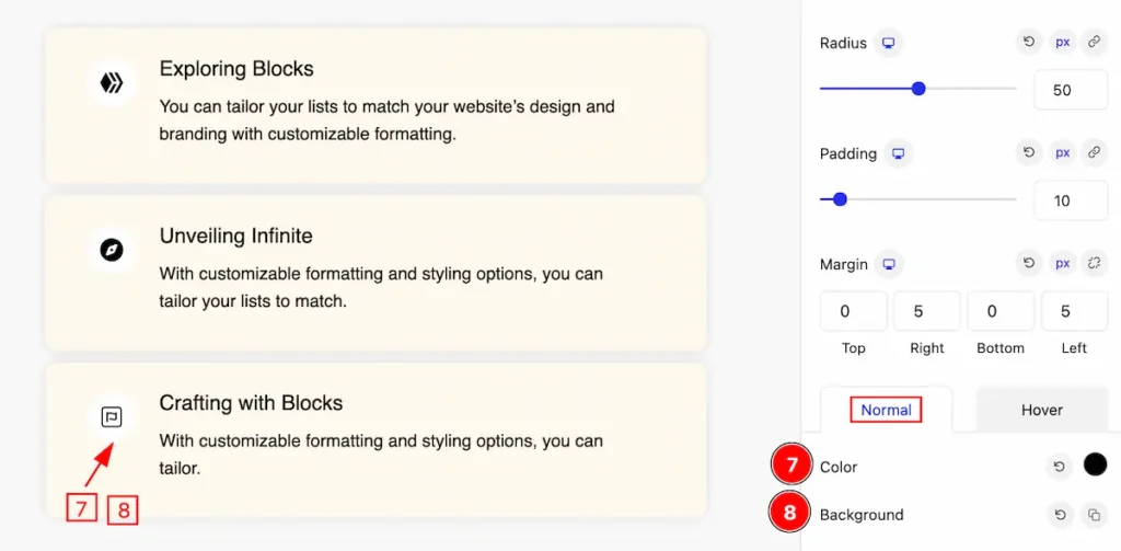
- Color: Set the color for the icon.
- Background: Set the background for the Icon.
Hover State for Icon
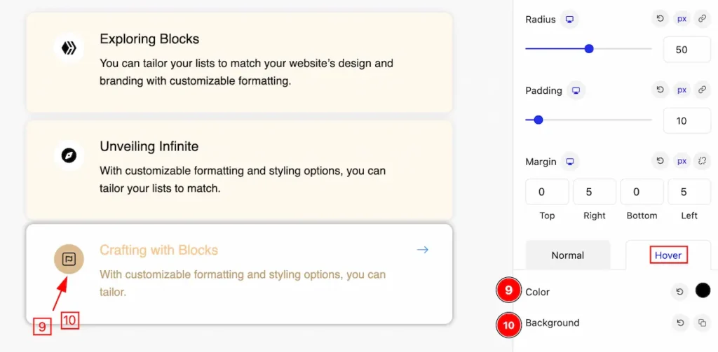
- Color: Set the color for the Icon, that works on mouse hover.
- Background: Set the background for the Icon.
Link Hove Icon
Go to Style > Link Hover Icon
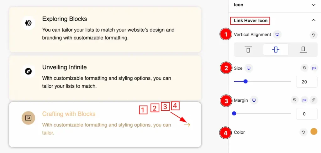
This section provides control for the link hover icon,
- Vertical Alignment: Set the alignment position for the link hover icon( e.g.: Top, Center, Bottom ).
- Size: Set the size for the Icon.
- Margin: Set the margin for the icon.
- Color: Set the color for the Link hover icon.
Extra Tab Control
The extra tabs provide the controls of any blocks. You can make different visual layouts by following these Controls.
Click to learn more>>.
Video Assist
The Video help you to learn more about the block. Please visit the demo page for examples.
Thanks for being with us.