In this documentation, we will discuss the customization of the Titanic slider widget, brought to you by the Prime Slider addon for Elementor.
Enable The Titanic Slider Widget
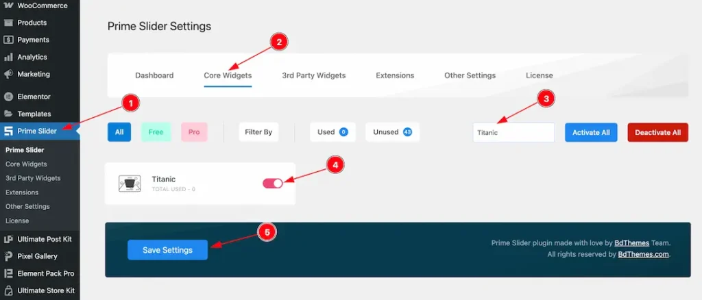
To use the Titanic Slider widget from Prime Slider, first, you have to enable the widget.
- Go to WordPress dashboard > Prime Slider Plugin dashboard.
- Then, Click the Core Widgets Tab.
- Search for the Titanic Slider Widget Name.
- Enable the Titanic Slider Widget.
- Hit the Save Settings Button.
Inserting The Titanic Slider widget
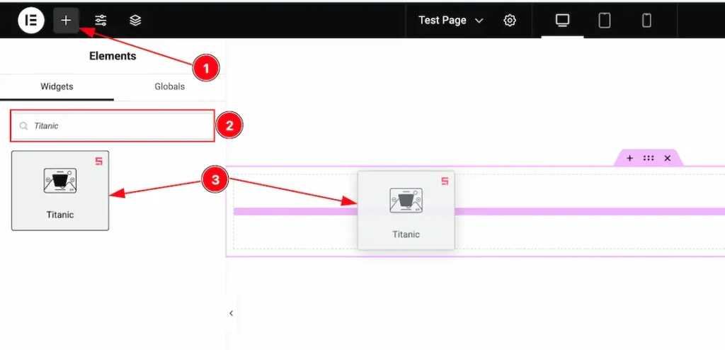
1. Go to the Elementor Editor Page and hit the “+” icon Button.
2. Search the Titanic Slider widget.
3. Drag the widget and drop it on the editor page.
Work With Content Tab Of the Titanic Slider
Slider Items Section
Go to Content > Slider Items
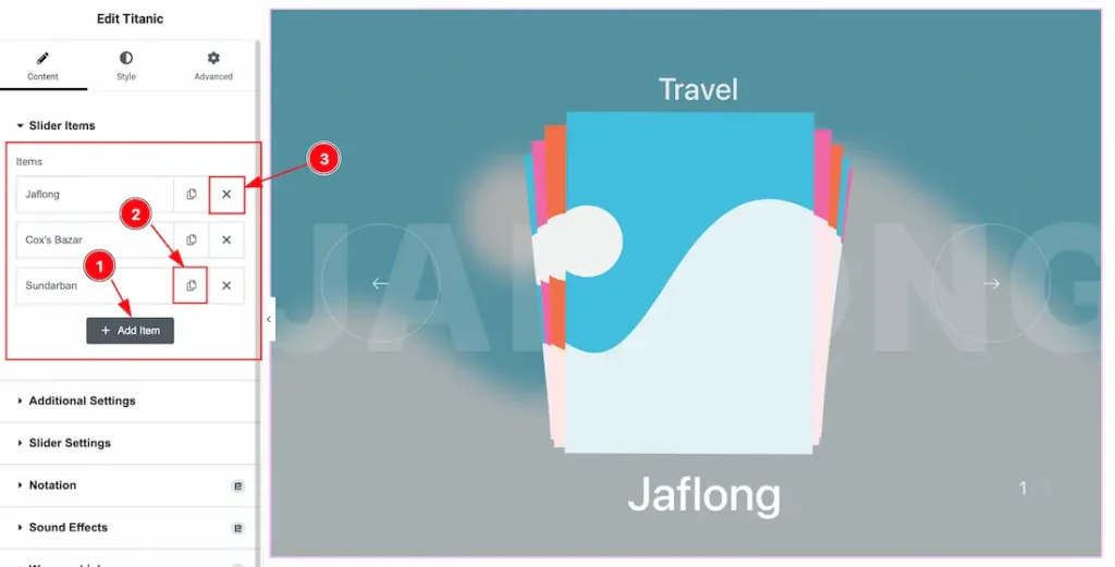
1. Add Item: You can add a new item by clicking the “+”Add Item button.
2. Copy Item: This option lets you copy the same item.
3. Remove Item: You can delete the Slider item by clicking the Close icon button.
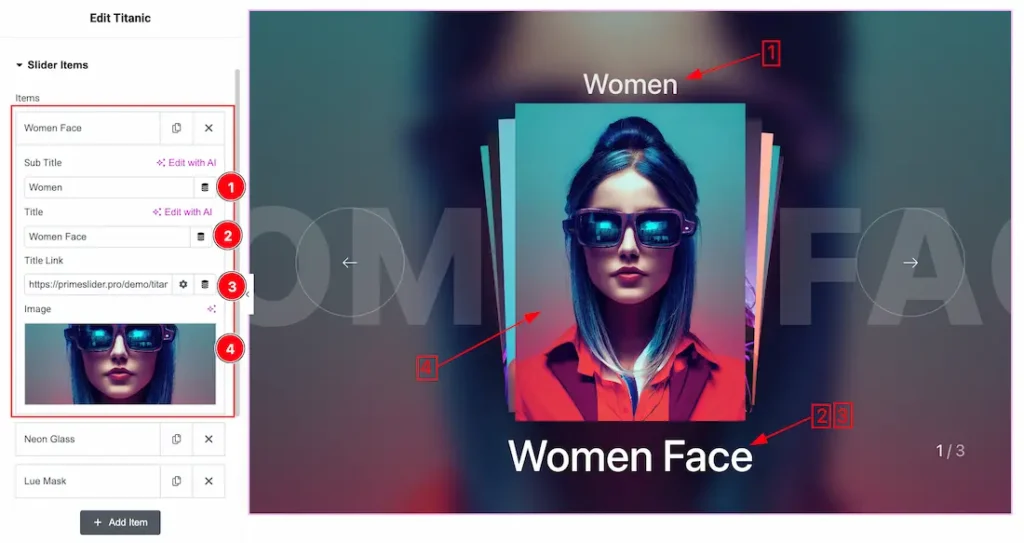
Come to the Each Slider Item, You will get the below customization options-
1. Sub Title: This option lets you change the Sub Title text.
2. Title: This option lets you change the Title text.
3. Title Link: This option lets you set a link under the Title.
4. Image: This option lets you set an image for the Slider item.
Additional Settings Section
Go to Content > Additional Settings
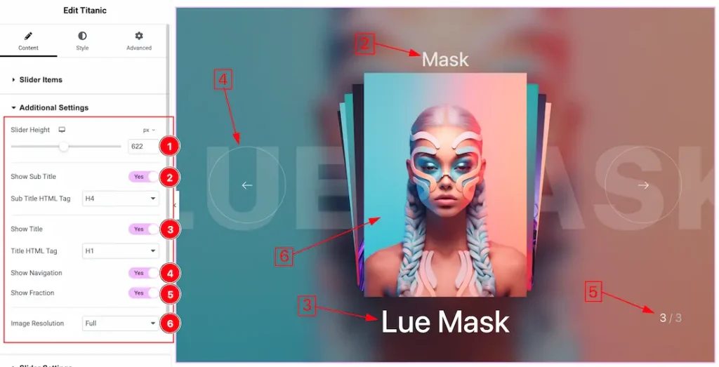
1. Slider Height: You can set the Slider height to your working demand from here.
2. Show Sub Title: Enable/Disable the show sub title switcher button to show/hide the sub title from the slider. You also can set the sub title HTML tag from here.
3. Show Title: Enable/Disable the show title switcher button to show/hide the title from the slider. You also can set the title HTML tag from here.
4. Show Navigation: Enable/Disable the show Navigation switcher button to show/hide the navigation from the slider.
5. Show Fraction: Enable/Disable the show Fraction switcher button to show/hide the sub fraction from the slider.
6. Image Resolution: You can change the image resolution with this option.
Slider Settings Section
Go to Content > Slider Settings
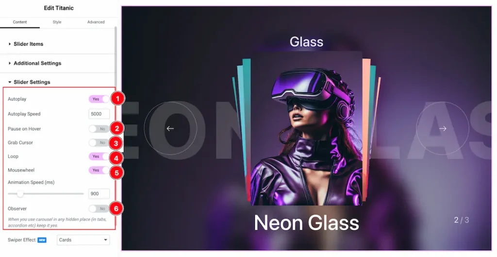
In this section, you will be able to see a bunch of Switchers like Auto Play, Auto Play speed, Pause on Hover, Grab Cursor, Loop, Mousewheel, and Observer. These switcher buttons allow you to show or hide the elements on your page.
What they do-
1. Autoplay switcher: If you Enable the Autoplay switcher button, your slider will slide into Autoplay mode, and you can set the Autoplay Speed as you wish.
2. Pause on Hover: If you activate the pause on Hover button, when visitors Hover the mouse cursor on the slider, then your slider will Hold, otherwise your slider slide Autoplay.
3. Grab Cursor: Your mouse pointer icon will be changed into a grab cursor. Visitors can slide your slider manually with your mouse cursor.
4. Loop: Enable the switcher to go back to the first automatically after the last slide.
5. Mousewheel: The Mousewheel option in a slider allows users to navigate through slides by scrolling their mouse wheel. You also can set the mousewheel speed to your working demand.
6. Observer: If you enable the option then you are able to use the slider/carousel in any hidden places (such as in tabs, Accordion, etc).
Work with The Style Tab of the Titanic Slider
Slide Image Section
Go to Style > Slide Image
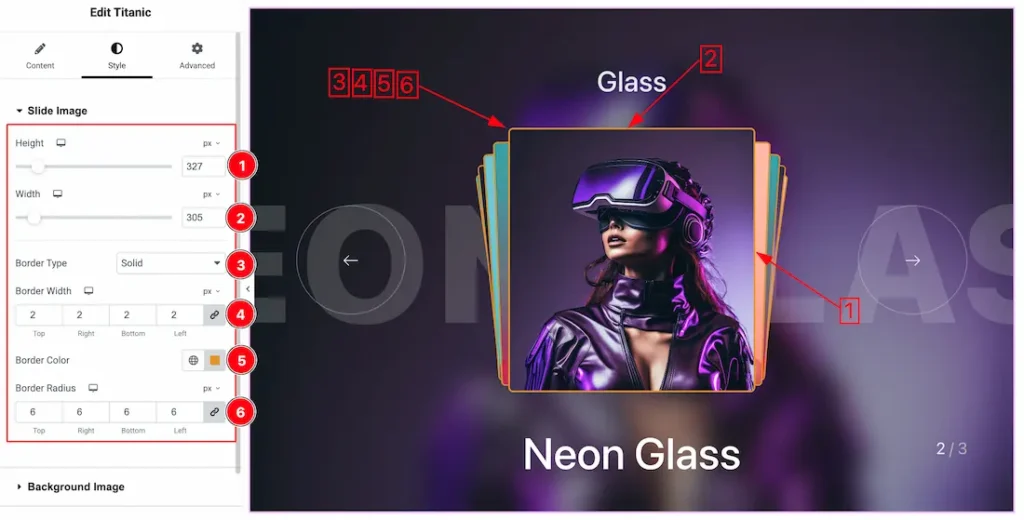
1. Height: This option lets you set the slider image height.
2. Width: This option lets you set the slider image Width.
3. Border Type:Border Type: you can set the Border Type to Default, None, Solid, Double, Dotted, Dashed, or Groove. We choose here the Border Type Solid.
4. Border Width: The border width property allows you to control how thick or thin the border is.
5. Border Color: This lets you change the Border color.
6. Border Radius: Customizes the border corners for roundness.
Background Image Section
Go to Style > Background Image
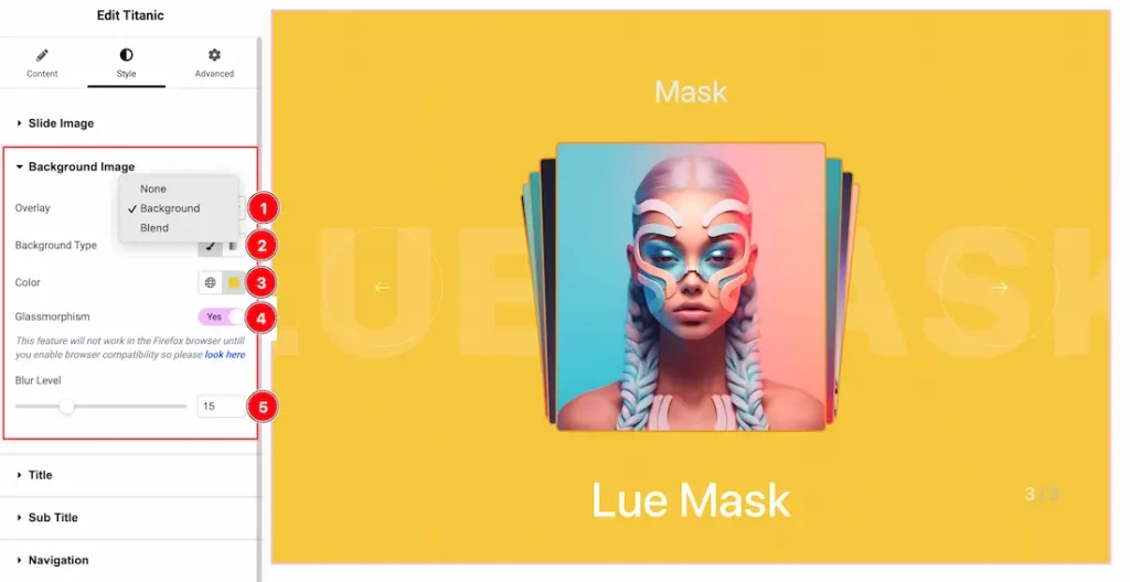
1. Overlay: Overlay is an effect that is displayed over the slider. Here you will get the Overlay Type ( None, Background, and Blend). Here we select the Overlay Type Background. you can choose any one of them.
2. Background Type: You can change the color of any object background to classic or gradient. Here we choose the Background type Classic.
3. Background Color: This option lets you set the Background Color.
4. Glassmorphism: Actually, the Glassmorphism is used to blur the slider background. That we shown in the above screenshot. you can easily enable or disable the Glassmorphism switcher button to show or hide the effect on your slider.
5. Blur Lavel: This option lets you set the blur lavel of the Glassmorphism.
Title Section
Go to Style > Title
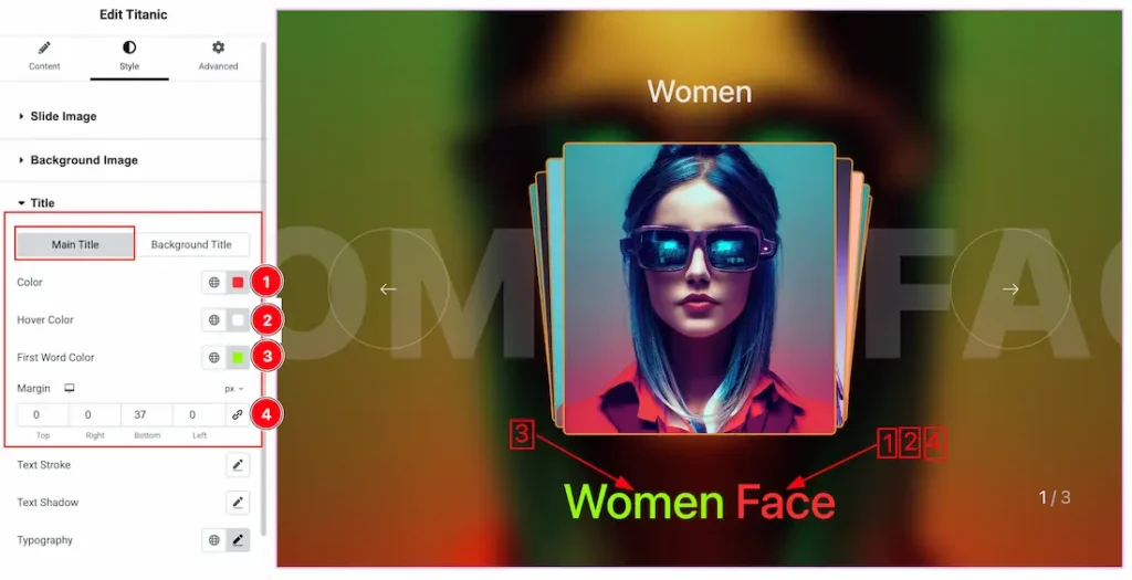
Come to the Title section, you will find two tabs section; Main Title and Background Title.
In the Main Title tab section, find the below options-
1. Color: This option letst you set the Main Title Text Color.
2. Hover Color: This option letst you set the Main Title Hover Text Color.
3. First Word Color: This option letst you set the Main Title First Word Color.
4. Margin: Adjusts the position of an object over the canvas.
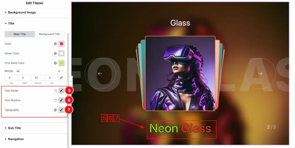
5. Text Stroke: If you want to add a stroke (outline) around the text, you can use the Text Stroke property. you also can change the Text Stroke Color as your working demand.
6. Text Shadow: The Text Shadow property is used to create the shadow around the text. It takes three values: horizontal offset, vertical offset, and blur radius. Here you also can change the Text Shadow Color.
7. Typography: Change the font family, size, weight, style, transform, decoration, line height, letter spacing, and word spacing from here.
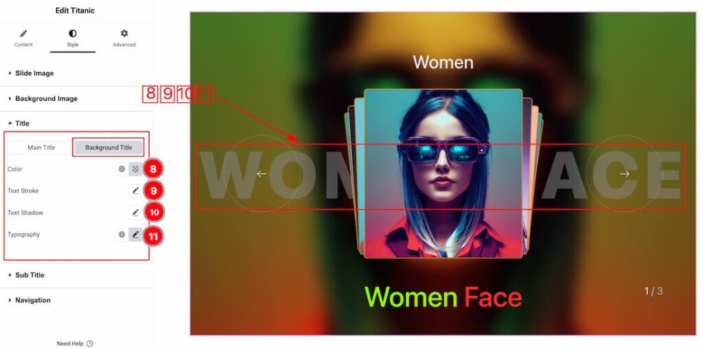
Come to the Background Title section, you will get the following options-
8. Color: This option lets you set the Background Title Text Color.
9. Text Stroke: If you want to add a stroke (outline) around the text, you can use the Text Stroke property. you also can change the Text Stroke Color as your working demand.
10. Text Shadow: The Text Shadow property is used to create the shadow around the text. It takes three values: horizontal offset, vertical offset, and blur radius. Here you also can change the Text Shadow Color.
11. Typography: Change the font family, size, weight, style, transform, decoration, line height, letter spacing, and word spacing from here.
Sub Title Section
Go to Style > Sub Title
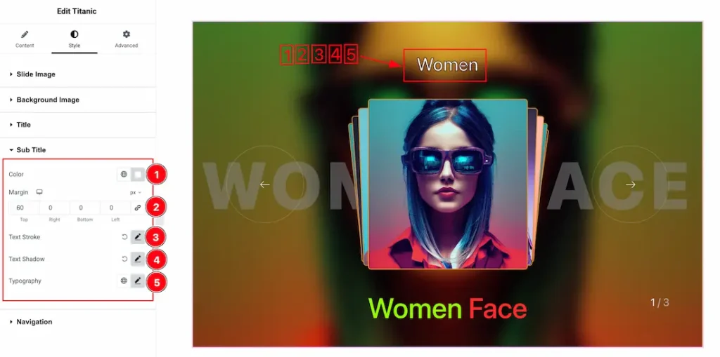
1. Color: This option lets you set the Sub Title Color.
2. Margin: Adjusts the position of an object over the canvas.
3. Text Stroke: If you want to add a stroke (outline) around the text, you can use the Text Stroke property. you also can change the Text Stroke Color as your working demand.
4. Text Shadow: The Text Shadow property is used to create the shadow around the text. It takes three values: horizontal offset, vertical offset, and blur radius. Here you also can change the Text Shadow Color.
5. Typography: Change the font family, size, weight, style, transform, decoration, line height, letter spacing, and word spacing from here.
Navigation Section
Go to Style > Navigation
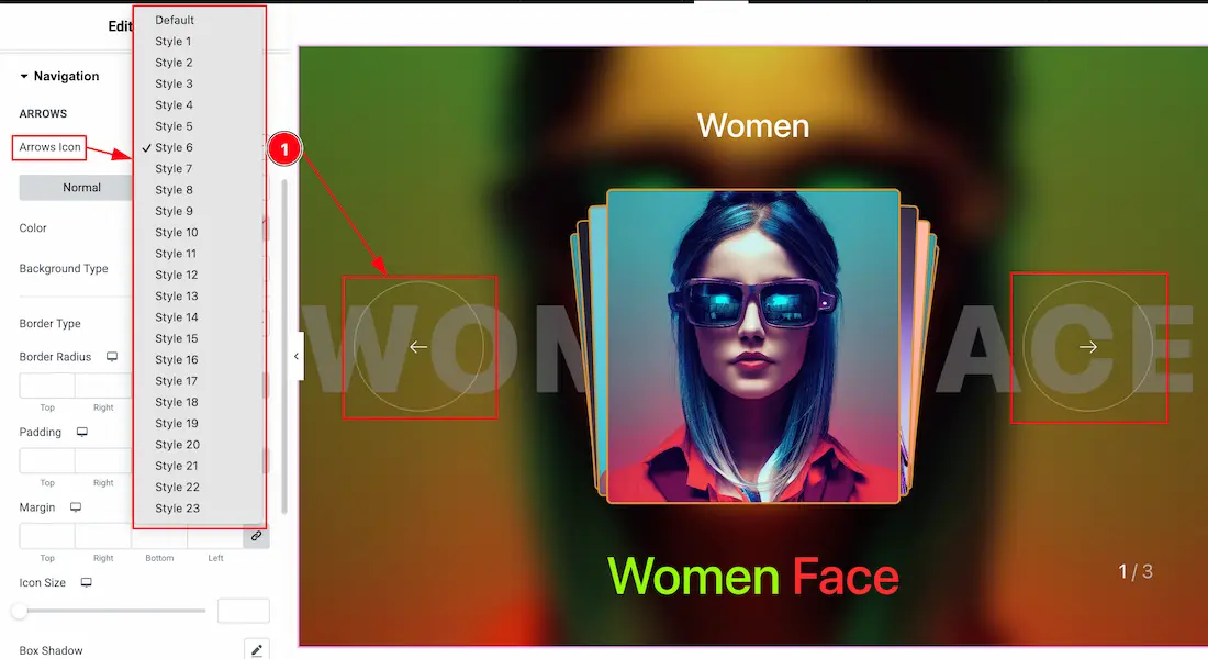
Come to the Navigation section, you will find two tabs section; Normal and Hover.
In the Normal subsection, you will get the below options-
1. Arrow Icon: Here you will get 1 to 23 induvisual arrow icons and you can choose any one of them.
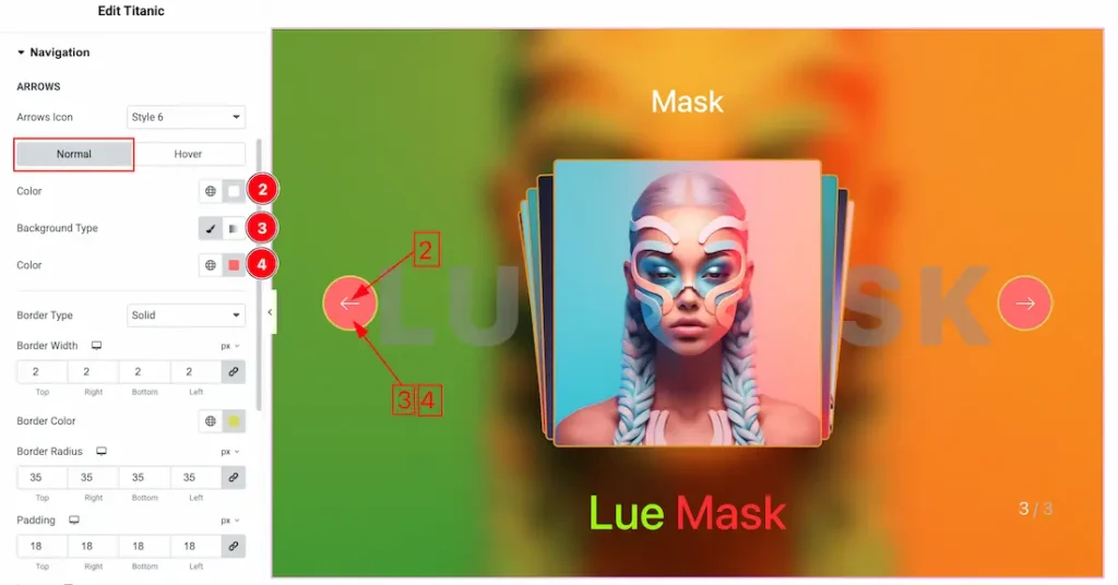
2. Color: This option lets you change the Navigation color.
3. Background Type: You can change the color of any object background to classic or gradient. Here we choose the Background type Classic.
4. Background Color: This lets you change the Background color. If you want, you also can change an image to the Background.
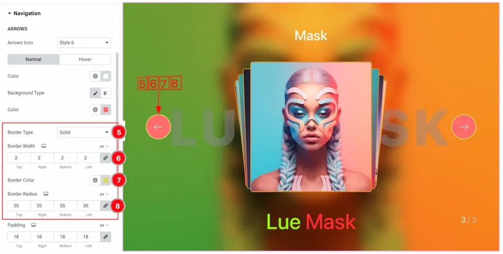
5. Border Type: You can set the Border Type to Default, None, Solid, Double, Dotted, Dashed, or Groove. We choose here the Border Type Solid.
6. Border Width: The border width property allows you to control how thick or thin the border is.
7. Border Color: This lets you change the Border color.
8. Border Radius: Customizes the border corners for roundness.
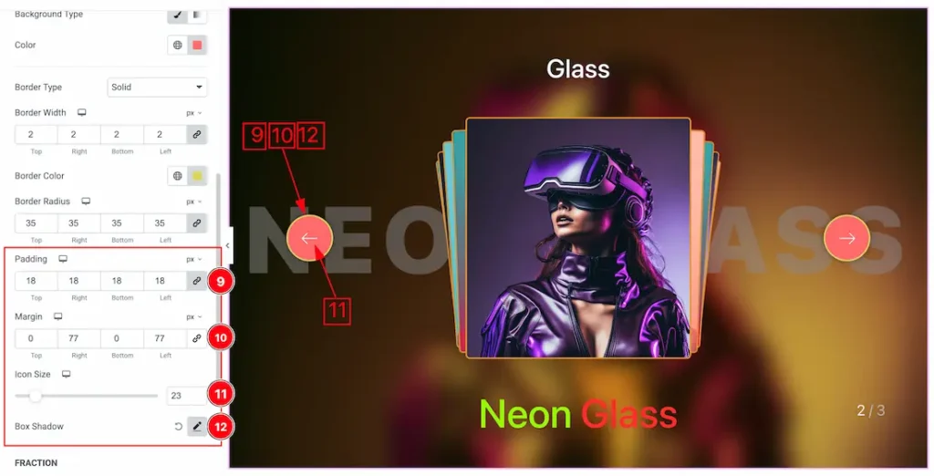
9. Padding: Add spaces around an object to increase the inner area. Padding allows you to control the internal space within an element.
10. Margin: Adjusts the position of an object over the canvas.
11. Icon Size: This option lets you set the icon size of the navigation.
12. Box Shadow: You can add the box shadow for the navigation arrows.
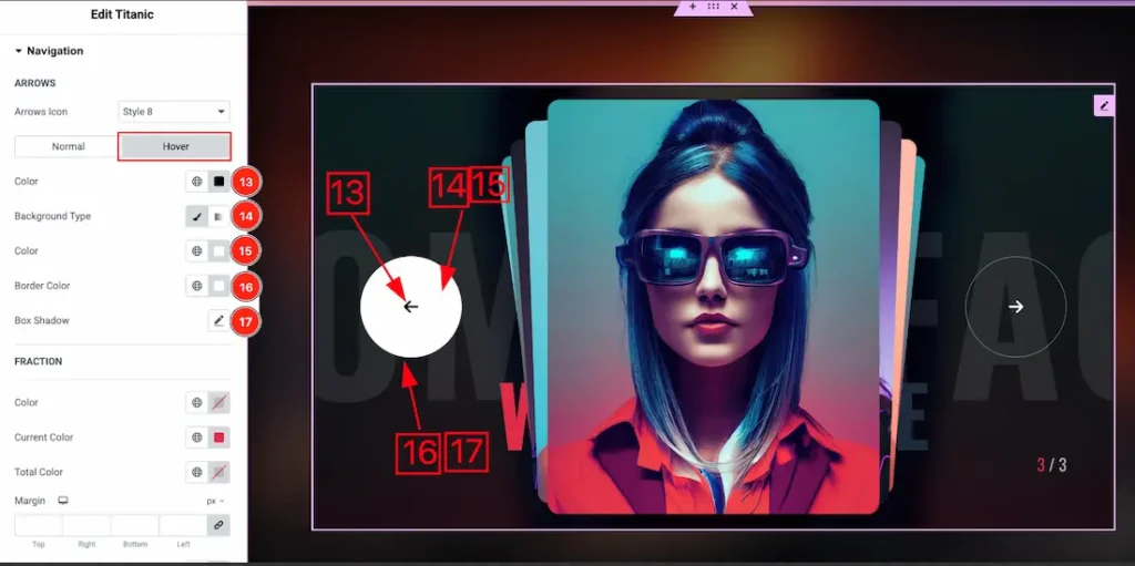
Let’s proceed with the Hover tab sections-
13. Color: This option lets you change the Navigation hover color.
14. Background Type: You can change the color of any object background to classic or gradient. Here we choose the Background type Classic.
15. Background Color: This lets you change the navigation hover background color.
16. Border Color: This lets you change the navigation hover Border color.
17. Box Shadow: You can add the hover box shadow for the navigation arrows.
Fraction Sub Section
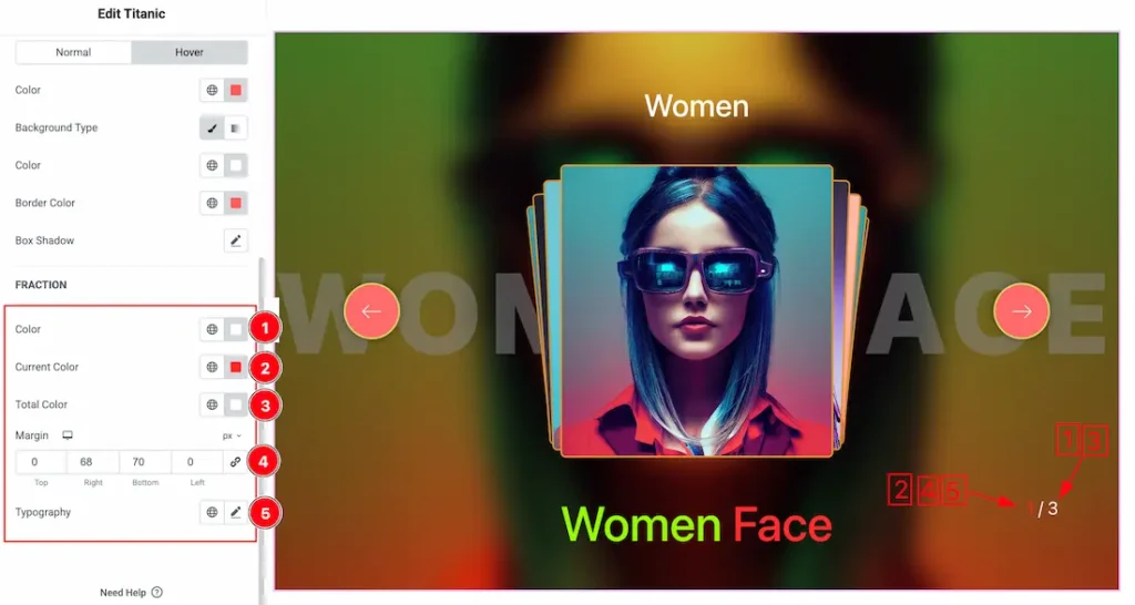
1. Color: This option lets you change the Fraction color.
2. Current Color: This option lets you change the Fraction current color.
3. Total Color: This option lets you change the Fraction total color.
4. Margin: Adjusts the position of an object over the canvas.
5. Typography: Change the font family, size, weight, style, transform, decoration, line height, letter spacing, and word spacing from here.
All done! You have successfully customized the Titanic Slider widget on your website.
Video Assist
You can watch the quick video to learn about the Titanic Slider widget. Please visit the demo page for examples.
Thanks for being with us.