

The Glossy Grid Widget is a product grid layout planner presented by BDthemes and is a part of the Ultimate Store Kit. It lets you show your products to catch the eyes of the visitors.
Let’s learn how to use the widget on your site.
Inserting Widget
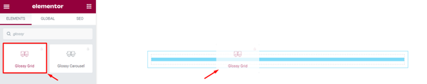
To insert the widget, go to the widget menu, search Glossy Grid, then drag-drop it in the text area on the page.
Content Tab Customizations
Customize the Grid Layout
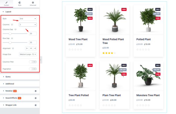
First, we are going to customize the Layout section under the Content tab. To do that, go to Content > Layout. Here, change the Style of the Layout, then select the number of the Columns, then change the Columns Gap by 30.
Use Query to Control What’s on Display
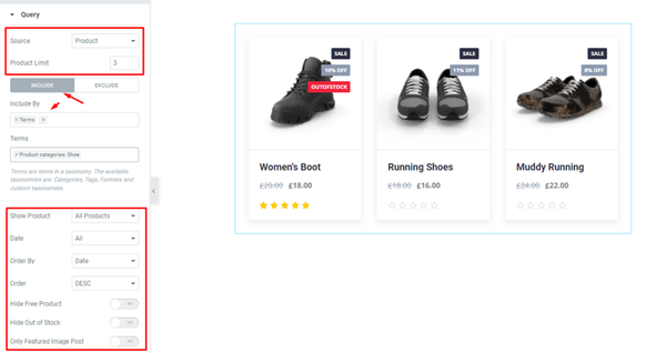
Next, go to Content > Query. Here, change the Source, then change the Product Limit. After that, for the INCLUDE mode, fill up the Include By field. Then change the options of this mode.
Additional Settings for Precise Layout Modifications
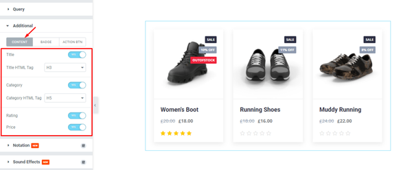
After that, go to Content > Additional. Here, you can see three modes i.e.: CONTENT, BADGE, and ACTION BTN. For the CONTENT mode, enable the switchers and select options from the drop-down menu.
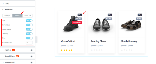
Next, for the BADGE mode, enable the switchers and fill up the field by 30.
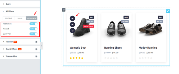
After that, for the ACTION BTN mode, enable the switchers and see what happens.
Style Tab Customizations
Items Appearance Changing
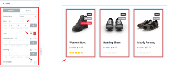
Now, we are going to customize the Items section under the Style tab. Go to Style > Items. Here, in the Items section, set a border, then change the Border Color, then change the Box Shadow, and see the result on the page.
Change Colors of Content Part
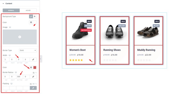
Next, go to Style > Content. Here, you can see two modes i.e.: NORMAL and HOVER. For the NORMAL mode, set a Border, then change the Border Color, Then set Border Radius, and see the result.
Product Image Parameters
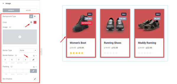
After that, go to Style > Image. Here, you can see two modes i.e.: NORMAL and HOVER. For the NORMAL mode, change the Background Color, Then set Border Radius, and see the result.
Grid Title Customizations
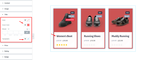
Then, go to Style > Title. Here, change the Hover Color, Typography, and see the result.
Change the Pricing Colors
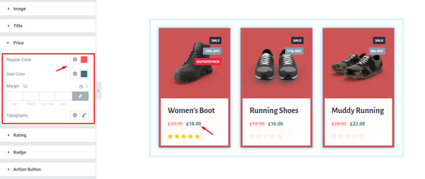
Now, go to Style > Price. Here, change the Regular Color and Sale Color, remember to set different colors for each and see the result.
Setup Personalized Rating Color Code
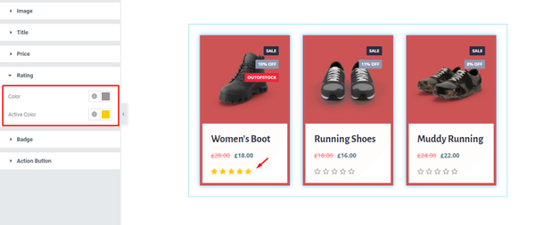
Next, go to Style > Rating. Here, change the Color and Active Color; select separate colors for each, and see the result on the page.
Product Badge Customizations
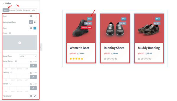
After that, go to Style > Badge. Here, you can see 5 modes i.e.: SALE, DISCOUNT, STOCK, TRENDING, and NEW. For the SALE mode, change the options; following this, change the options for the following modes, and see the result.
Action Buttons Modifications
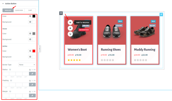
Finally, go to Style > Action Button. Here, you can see three modes i.e.: WISHLIST, QUICKVIEW, and CART. For the WISHLIST mode, change the options shown here; following this change the option of other modes, and see the result.
Final Result
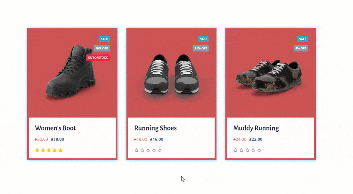
All done! Now sit back and watch the result.
Video Assist
To know more about this, please watch the attached tutorial video. You can also see our demo page to know more. Thanks.