

The Foxico slider, a part of the Ultimate Post Kit, stands out as an exceptional slider option. With its remarkable features, it can effortlessly serve as a captivating hero section for any webpage. Its visually striking design is bound to capture the attention of users. So, without further ado, let’s dive into the details of this impressive slider.
Inserting the Foxico widget
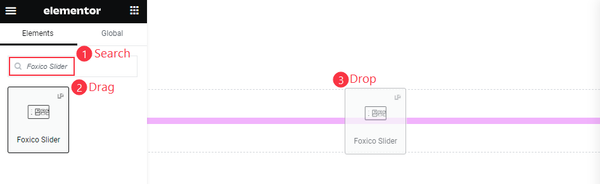
Inserting a widget is not magic, It’s an elementary step. On the Elementor page, Just get the search bar and Type in the name of the desired widget and hit enter. The relevant widget will promptly appear in the search results. All you need to do is drag the widget and drop it onto your page.
The default view of the Foxico Slider
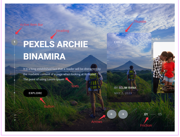
The slider elements consist of posts with accompanying headings, text, and buttons. Additionally, there are Posts Thumbs, Slider Arrows, Friction, and an Active Item friction bar. These components collectively enhance the functionality and visual appeal of the slider.
Content Tab Exploration
The Content tab lies a treasure trove of controls that empower to customize and optimize widgets. These controls give the flexibility to transform default layouts into stunning visual masterpieces. By following along, gain a comprehensive understanding of the Content tab controls, enabling to create captivating and unique widget layouts that capture the attention of audience. Let’s dive in and unlock the full potential of these powerful controls.
Layout Customization
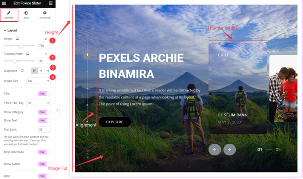
Go to Content > Layout
Within the layout section, configure the height of the slider, ensuring it fits perfectly desired dimensions. Next, adjust their width to achieve the desired visual balance. To align the text within the slider, set a left-aligned approach. Finally, set the featured image size to “Full,” allowing for a captivating display of images that fills the available space.
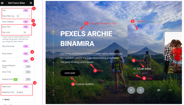
In addition to the layout configurations, here have a range of switchers that grant control over various content options. The “Titles with Heading Tag” switcher allows us to choose whether or not to include heading tags with the titles. The “Show Category” switcher determines whether the category should be displayed.
Similarly, the “Show Text” switcher, “Text Limit” switcher and For meta tags and the content button controls “Show Author”, “Date” ,”Read More Button” switcher will work on visibility control.
Furthermore, there are additional switchers available for further customization, providing the flexibility to enable or disable specific features based on preferences.
Query section explore
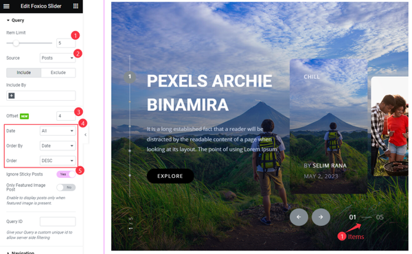
Go to Content > Query
The slider offers a query functionality that enables the to refine its content. Here have the “Included” option to specify a specific category, tags, or taxonomy. By utilizing this feature to display only items relevant to your chosen criteria.
In addition, Here can set an item limit to control the number of items displayed within the slider, ensuring optimal presentation Furthermore, it has the flexibility to select the source post from various available sources.
By setting an offset for the post, we can skip a certain number of posts from the beginning.
The arrangement of the posts can be configured using the Date selector, Order By, and Order selector. The “Ignore the sticky Post” switcher, which ensures that sticky posts are not given special priority.
Navigation Selection
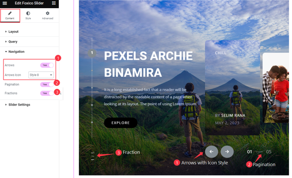
Go to Content > Navigation
The navigation section offers three switchers for controls. The “Arrows” switcher allows to display navigation arrows, enabling users to move through the slider content. Additionally, The flexibility to select a preferred style for the Arrow icon from a variety of available options.
The “Pagination” switcher enables the display of pagination indicators, providing users with a visual representation of their progress within the slider. Furthermore, the “Fraction” switcher allows for the visibility of fractional numbers, aiding users in determining their position within the slider.
Set Slider Settings
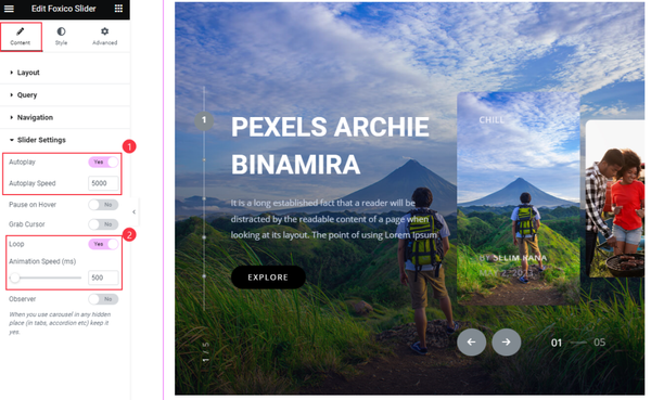
Go to Content > Slider Settings
To make the slider dynamic and engaging, The “Autoplay” switcher, automatically plays the slider without any user interaction. Additionally, The “Autoplay Speed” to control the speed at which the slider transitions between slides.
To ensure continuous playback, The “Loop” switcher, allowing the slider to repeat seamlessly. The “Animation Speed” setting has also been configured to determine the speed at which the slider transitions between slides during the loop.
Style Tab Exploration
This tab holds a plethora of control options that allow to shape the basic appearance of slider. Exploring these options to unlock the potential to create a visually stunning and captivating design. The Style tab offers an extensive array of customization possibilities.
Slider Section Stylizing
Go to Style > Slider
Item Customization
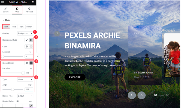
The item settings have the ability to customize the background appearance, adding an overlay effect to enhance visual appeal.
Furthermore, choose the background color and define its location, providing a solid backdrop for the item. Additionally, The option to select a second color and specify its location allows for more dynamic and layered visual effects.
To fine-tune the angle positioning set the location type and angle parameters. These grants control over the placement and orientation, resulting in a harmonious composition.
Set Title Color
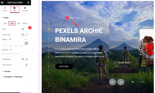
There are numerous customization options available for a truly personalized touch. While exploring these options, we have chosen to focus on setting the color of the title, allowing it to stand out and catch the viewer’s attention.
Text Customization
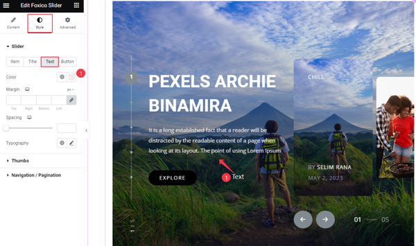
Regarding the text of the posts within the slider, opted to focus solely on setting the color, while leaving the other options at their default settings.
Button Customization
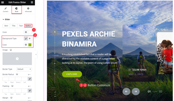
For the button, Here have only configured the Color and Background Color settings, leaving the other options at their default values.
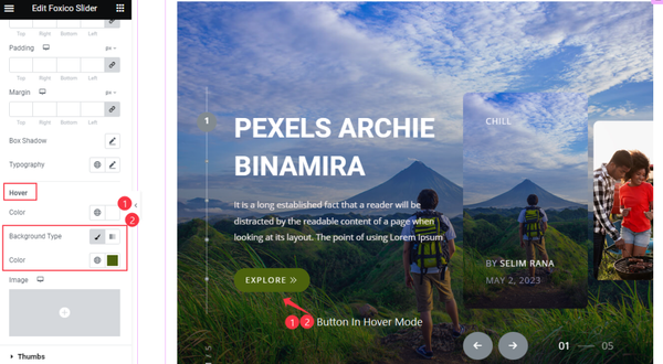
In the Hover Mode, Here have customized the Color and Background Color of the Button, resulting in a visually appealing appearance.
Thumbs Section Customization
Go to Style > Thumbs
Item section edition
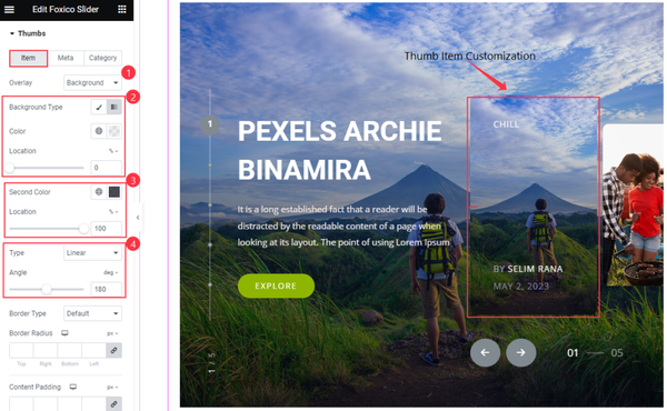
In the thumbs Item section, will find multiple options available for customization. Just configured the Overlay, Background Color, and Location settings, as well as the Second Color and Location, and Type and Angle settings for the thumbs.
Meta Customize
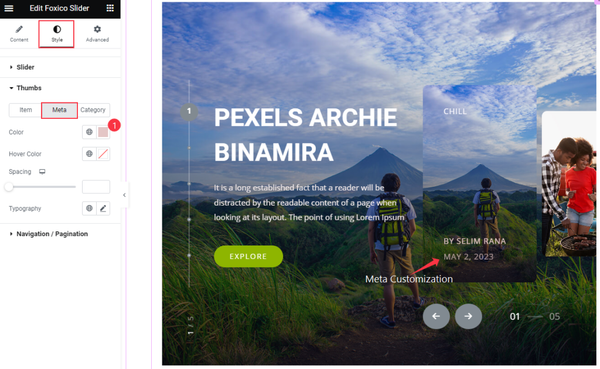
For the Meta tag, here have only specified the Color setting and kept the other options at their default values.
Category Customization of the Thumbs
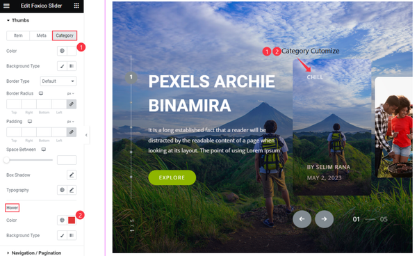
Upon reviewing the screenshot, it is evident of specific customizations for the Category Color and Hover Color settings. However, opted to retain the default values for all other available options that only the colors associated with the category and the hover state have been modified, while the remaining aspects of the interface have remained unchanged.
Navigation Section Customization
Go to Style > Navigation
Nav Customization
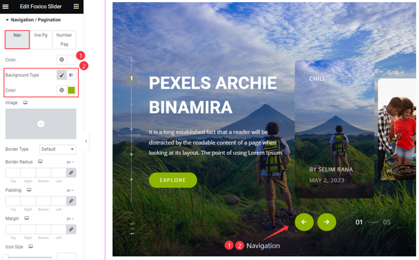
The Navigation Arrows have been customized by specifying only the Color and Background Color settings. The default values have been maintained for other properties such as Border, Border Radius, padding, and margin. Additionally, the size of the icon has been left unchanged, retaining its default size.
Set Line Pagination Customization
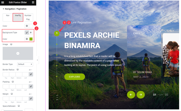
In the Line Pagination section, we have made customizations by setting the Color and Background Color properties only. All other options have been left at their default values. This allows for a simplified customization where the focus is primarily on the color scheme of the Line Pagination component.
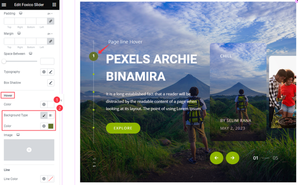
In the hover mode of the Line Pagination, specifically configured the Color and Background Color properties. This customization applies when the user hovers over the Line Pagination component, enhancing the visual experience by modifying the color and background appearance.
By diligently following these instructions and leveraging the available customization options, will be able to craft an awe-inspiring and visually captivating look for the Foxico Slider widget.
Video Assist
Watch the video to get help in visual motion. Follow all the steps. Thanks form BDThemes.