
The Brand Carousel widget is a wonderful feature presented by BdThemes and it is a part of the Element Pack Pro. It helps you automatically showcase your branding in the carousel view.
Now, let’s learn how to use the Brand Carousel widget on your site.
Enable The Brand Carousel Widget
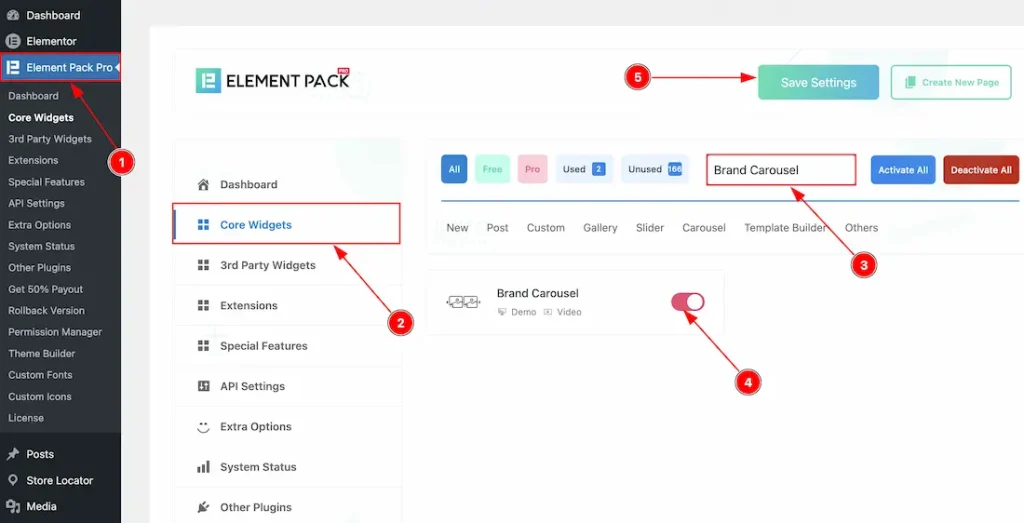
To use the Brand Carousel widget from Element Pack Pro, first, you have to enable the widget.
- Go to WordPress dashboard → Element Pack Pro Plugin dashboard.
- Then, Click the Core Widgets Tab.
- Search the Brand Carousel Widget Name.
- Enable the Brand Carousel Widget.
- Hit the Save Settings Button.
Inserting The Brand Carousel Widget
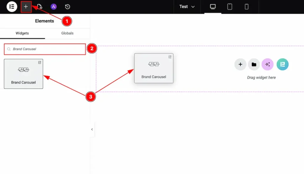
1. Go to the Elementor Editor Page and hit the “+” icon Button.
2. Search the Brand Carousel name.
3. Drag the widget and drop it on the editor page.
Work with Content Tab
Brand Items Section
Go to Content → Brand Items
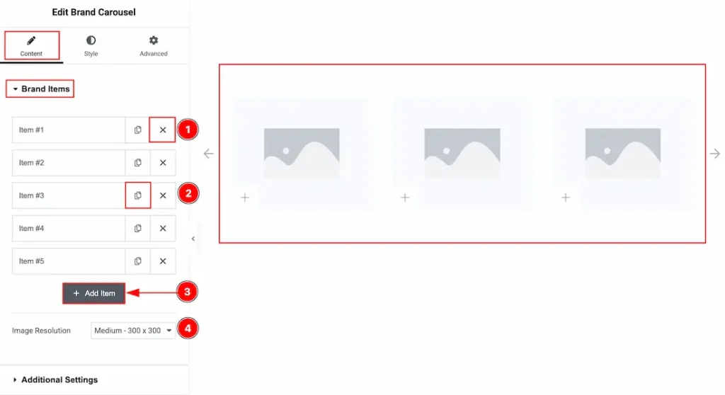
1. Close Button: You can click on the close button to close the brand items with this option.
2. Copy Button: You can click on the copy button to copy same item or duplicate the brand item with this option.
3. Add Item: You can click on this button to add more brand items.
4. Image Resolution: You can adjust the image resolution with this option.
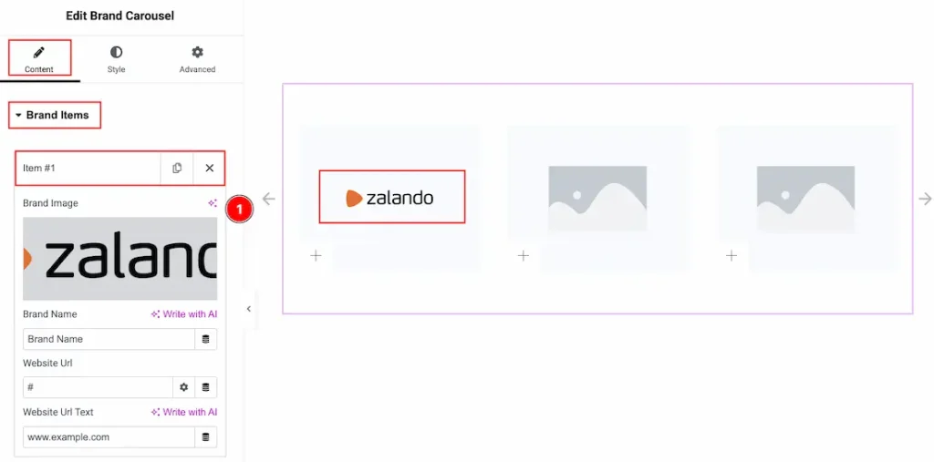
In each brand item, we have more options to customize. Let’s start describing those options –
1. Image: You can add an image with this option.
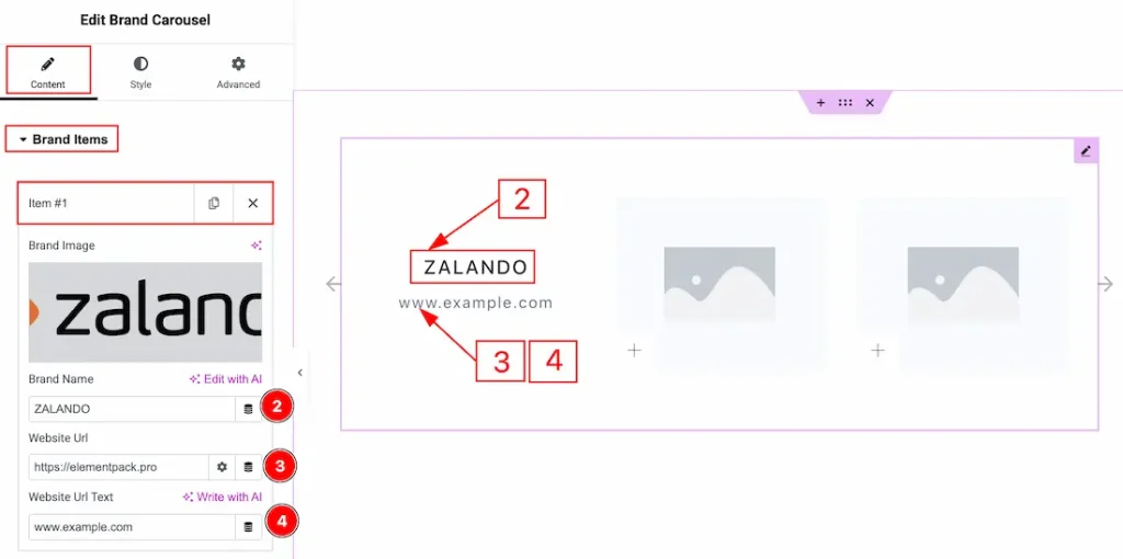
2. Brand Name: You can add or change the brand name with this option.
3. Website URL: You can add a website URL to the Website URL text with this option.
4. Website URL Text: You can add and make changes to the website URL text with this option.
Additional Settings Section
Go to Content → Additional Settings
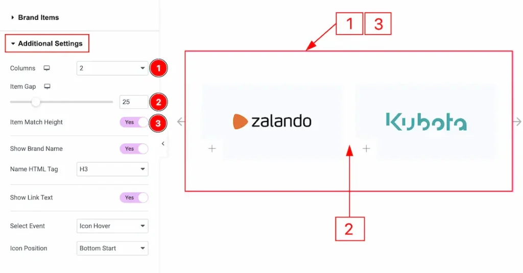
1. Column: You can adjust the column number that you want to show to your audience with this option.
2. Column Gap: You can adjust the space between the column with this option.
3. Item Match Height: You can adjust the space between the row with this option.
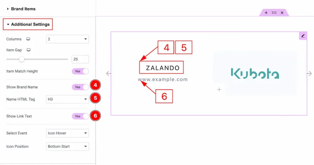
4. Show Brand Name: Enable the switcher to show the brand name to your audience with this option.
5. Name HTML Tag: You can set the brand name HTML tag with this option.
6. Show Link Text: Enable the switcher to show the website url text color with this option.
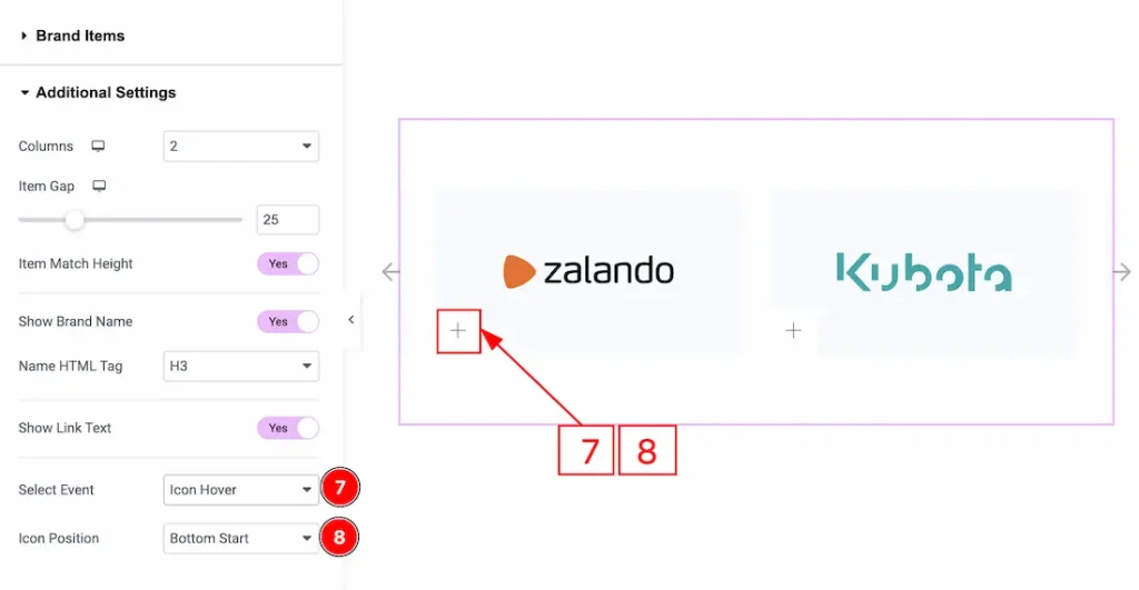
7. Select Event: This option defines the interaction trigger for the icon to activate on click, icon hover or item hover. You can choose your the style as you prefer. Here we have select the event as icon hover.
8. Icon Position: You can set the icon position with this option.
Navigation Section
Go to Content → Navigation
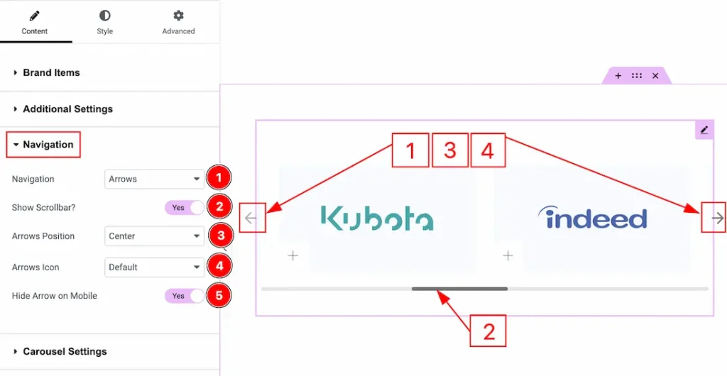
1. Navigation: You can select the navigation type with this option.
2. Show Scrollbar: Enable the switcher to show the scrollbar to the audience while moving the carousel with this option.
3. Arrow Position: You can change the arrow’s position with this option.
4. Arrows Icon: You can select the arrow’s icon style with this option.
5. Hide Arrow on Mobile: Enable the switcher to hide the arrow on mobile devices with this option.
Carousel Settings Section
Go to Content → Carousel Settings
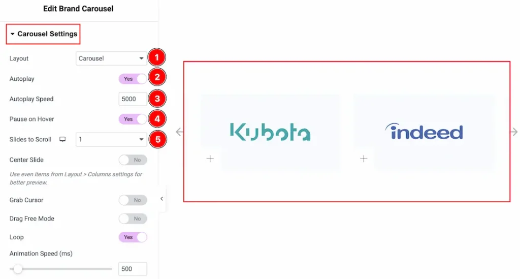
1. Layout: You can set the layout to carousel or coverflow with this option.
2. Autoplay: By enabling this option, you can automatically play the slides one after another.
3. Autoplay Speed: This option lets you set the time between each slide transition.
4. Pause on Hover: Enable the switcher to pause autoplay when the user hovers over the slider.
5. Sliders to Scroll: You can adjust the number of slides that you want to slide in transition.
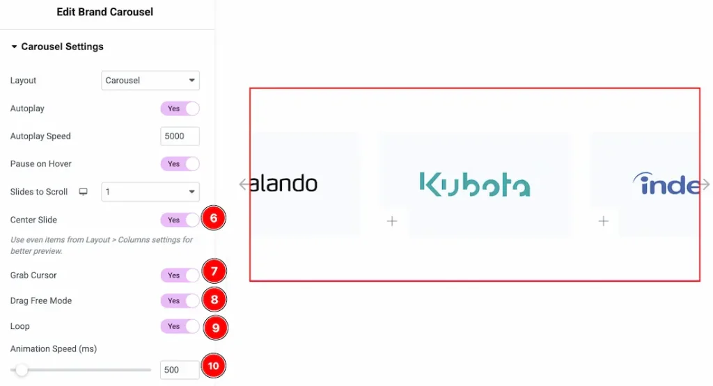
6. Center Slide: The Center Slide option keeps the active slide centered while partially showing the previous and next slides.
7. Grab Cursor: Enable the switcher to make the cursor a grab icon while hovering over the slide.
8. Drag Free Mode: This option allows the carousel to move freely while dragging instead of snapping directly to each slide.
9. Loop: Enable the switcher to go back to the first automatically after the last slide.
10. Animation Speed (ms): This option controls how fast the transition animation occurs between slides.
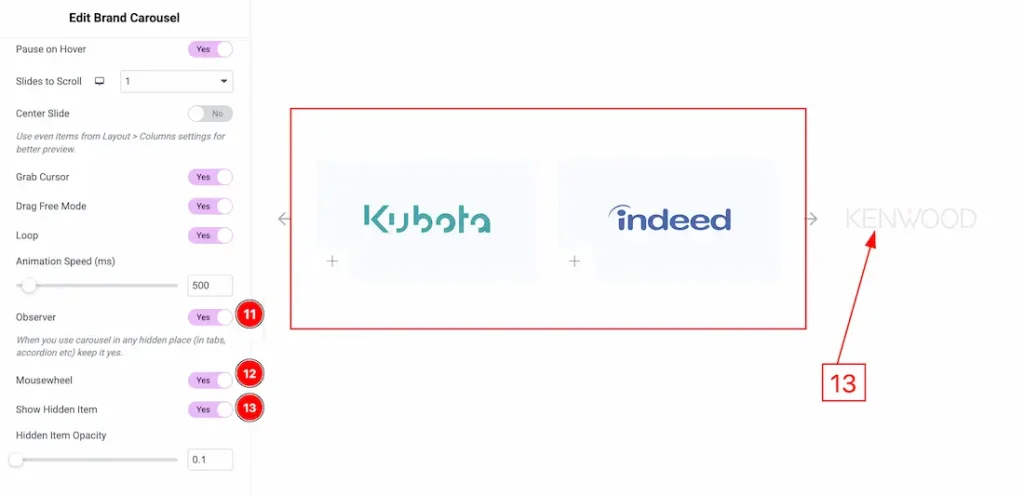
11. Observer: Enabling this option helps the slider function correctly when it’s initially hidden.
12. Mousewheel: You can navigate through the slider’s slides by scrolling your mouse wheel while your cursor is over the slider.
13. Show Hidden Item: Enable the switcher to show the hidden carousel items. You can also adjust the bluriness of the hidden carousel items with this option.
Work with Style Tab
Items Section
Go to Style → Items
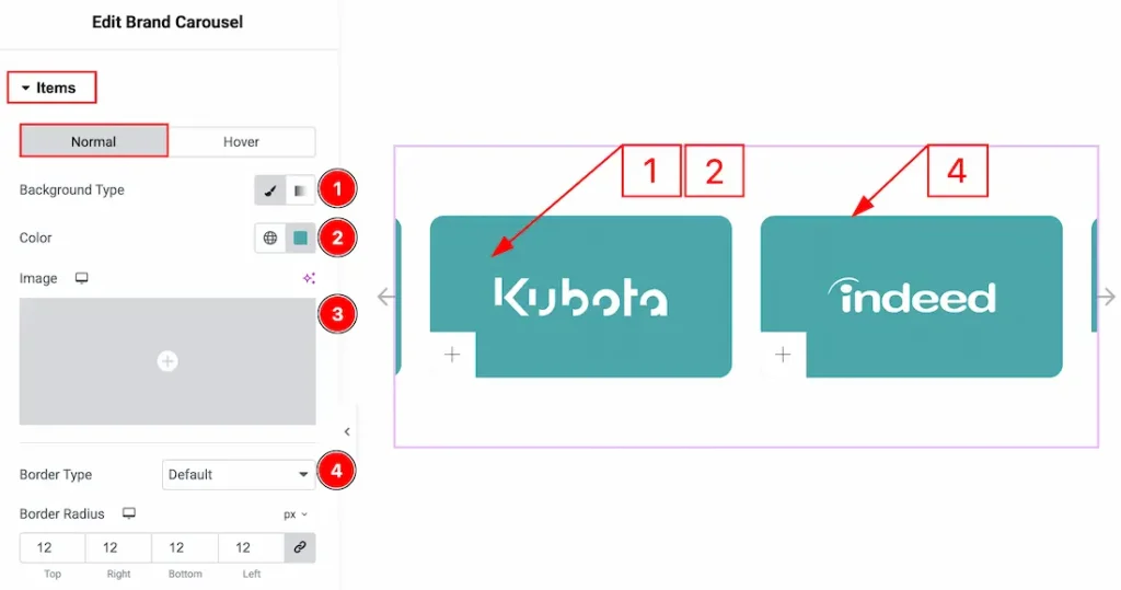
In this section, we have two more tabs. These are Normal & Hover. Let’s start with the Normal Tab first –
1. Background Type: You can choose the background type between classic or gradient with this option. Here we have selected the background type as classic.
2. Color: You can make changes to the background color with this option.
3. Image: You can change the background image with this option.
4. Border Type: You can add and change the border types with this option.
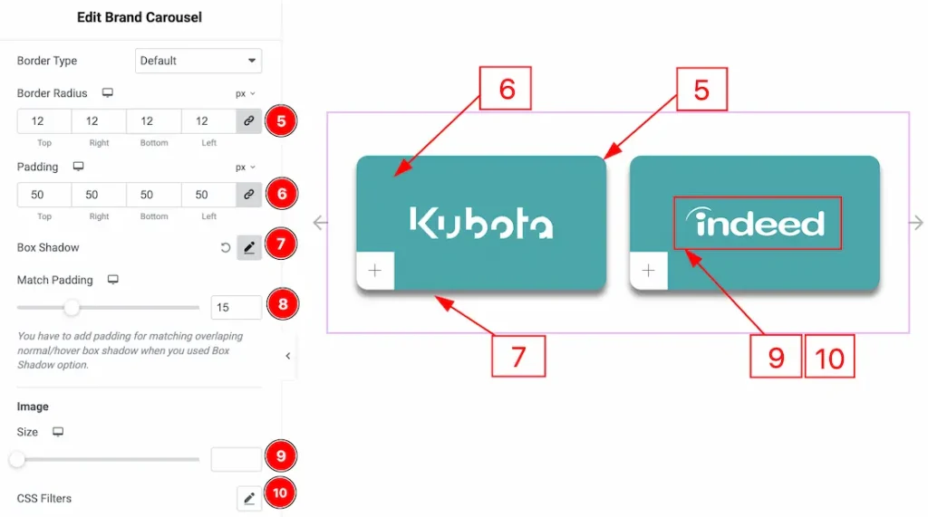
5. Border Radius: You can control the roundness of the border with this option.
6. Padding: You can adjust the inner space of the item with this option.
7. Box Shadow: You can add a shadow effect to the items with this option.
8. Match Padding: Enable the switcher to adjust the padding same for all the items with this option.
9. Image Size: You can adjust the size of the image with this option.
10. CSS Filters: This setting lets you apply visual changes to the image. In this setting, you can modify properties like Blur, Brightness, Contrast, Saturation, and Hue.
- Blur: Softens the image, reducing sharpness.
- Brightness: Adjusts the overall lightness or darkness.
- Contrast: Modifies the difference between light and dark areas.
- Saturation: Controls the intensity of the colors.
- Hue: Shifts the overall color spectrum.
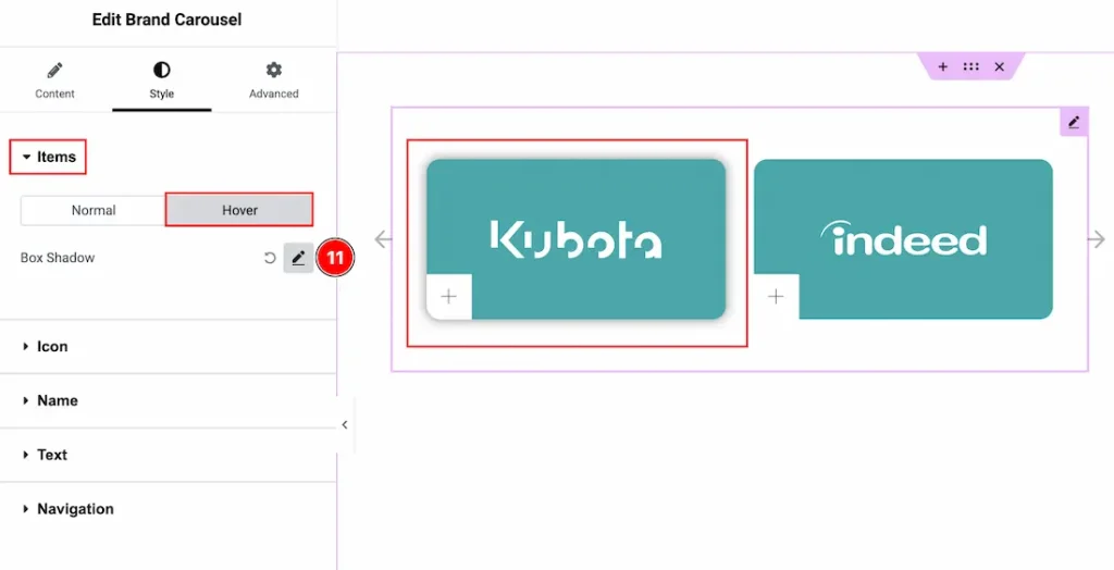
Now let’s proceed to the Hover Tab –
11. Box Shadow: You can add a hover shadow effect to the items with this option.
Icon Section
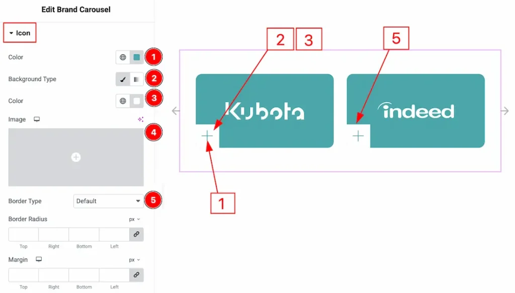
Go to Style → Icon
1. Color: You can make changes to the icon color with this option.
2. Background Type: You can change the background type to be classic or gradient with this option.
3. Color: You can change the background color with this option.
4. Image: You can change the background image with this option.
5. Border Type: You can add and change the border types with this option.
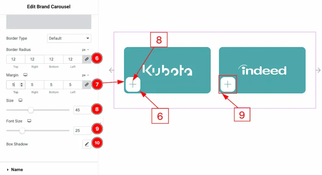
6. Border Radius: You can control the roundness of the border with this option.
7. Margin: You can adjust the space around the icon field with this option.
8. Size: You can adjust the icon field size with this option.
9. Font Size: You can adjust the icon size with this option.
10. Box Shadow: You can add a shadow effect to the icon field with this option.
Name Section
Go to Style → Name
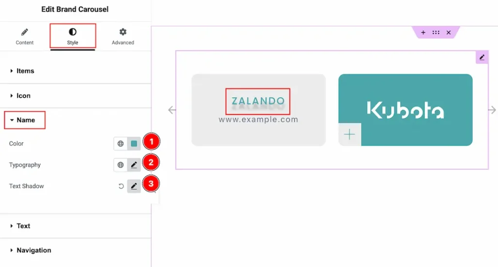
1. Color: You can make changes to the name text color with this option.
2. Typography: Change the font family, size, weight, transform, style, decoration, line height, letter spacing, and word spacing from here.
3. Text Shadow: You can add a shadow effect to the name text with this option.
Text Section
Go to Style → Text
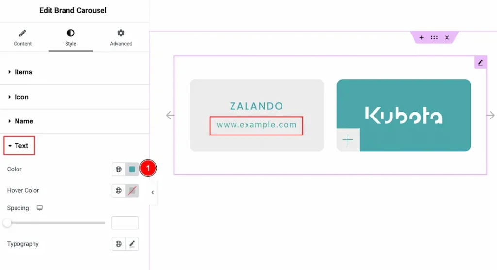
1. Color: You can make changes to the text color with this option.
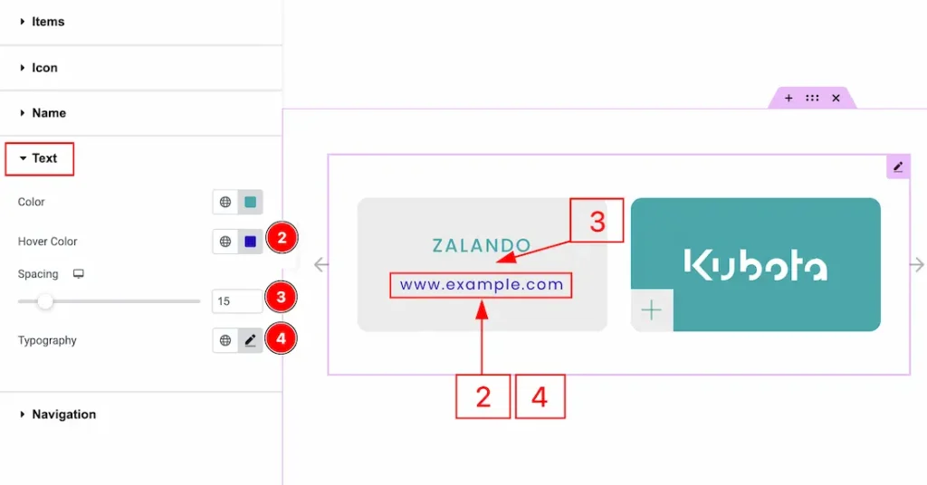
2. Hover Color: You can make changes to the text hover color with this option.
3. Spacing: You can adjust the space between the brand name and the website url text with this option.
4. Typography: Change the font family, size, weight, transform, style, decoration, line height, letter spacing, and word spacing from here.
Navigation Section
Go to Style → Navigation
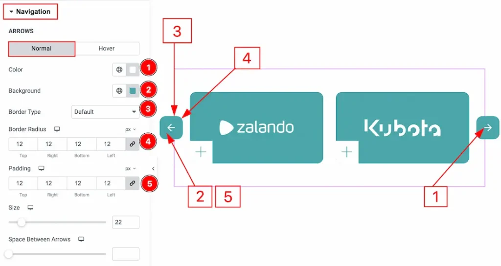
In this section, we have two more tabs. These are Normal & Hover. Let’s start with the Normal Tab –
1. Color: You can make changes to the arrow icon color with this option.
2. Background: You can change the background color with this option.
3. Border Type: You can add and change the border types with this option.
4. Border Radius: You can control the roundness of the border with this option.
5. Padding: You can adjust the inner space of the arrow field with this option.
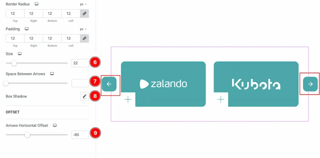
6. Size: You can adjust the size of the arrow icon with this option.
7. Space Between Arrows: You can adjust the space between the arrows with this option.
8. Box Shadow: You can add a shadow effect to the arrow field with this option.
9. Arrow Horizontal Offset: You can move the arrow horizontally with this option.
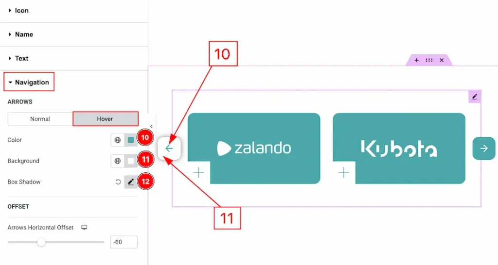
Now let’s proceed to the Hover Tab.
10. Color: You can change the arrow icon hover color with this option.
11. Background: You can change the arrow icon hover background color with this option.
12. Box Shadow: You can add a hover shadow effect with this option.
All done! You have successfully customized the Brand Carousel widget on your website.
Video Assist
You can also watch the video tutorial to learn more about the Brand Carousel widget. Please visit the demo page for examples.
Thanks for being with us.