

In this documentation, we will discuss the customization of the Amox Carousel widget, brought to you by the Ultimate Post Kit addon.
Inserting the widget
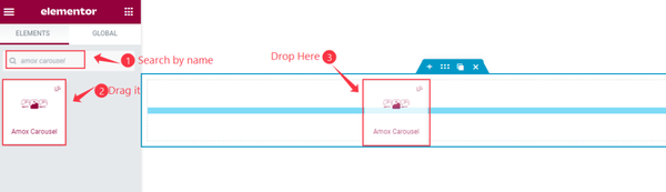
Open your page in Elementor editor, search by the widget name and then drag-drop it on the page.
The default view of the Amox Carousel
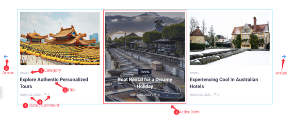
In the default view of the Amox carousel, there are showing in 3 columns with arrows, Post Category, Title, Date, Comment, and Active item with Featured image.
Content tab customization
Layout section
Go to Content > Layout
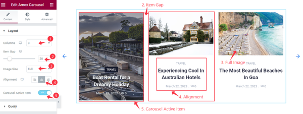
Find the Columns, Item Gap, Image Size, Alignment, and Carousel Active Item options.
Query section
Go to Content > Query
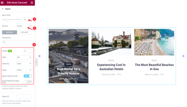
Find the Item Limit and Source (Posts, Pages, Landing Pages, FAQ, Portfolio, etc.) options.
Also, find the Include > Include By and Terms filters. Include filter helps show only selected posts.
Exclude filter does exactly the opposite of the Include filter and helps hide selected posts.
Additional setting section
Go to Content > Additional
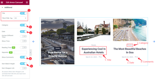
Find the Title, Title HTML Tag, Category, Date, Human Different Time, Show Time, Reading Time, Separator, Show Comments, Item Match Height, and Item Wrapper Link options.
Navigation section
Go to Content > Navigation
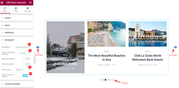
Find the Navigation (arrows, dots, progress, arrows & dots, arrows & fraction), Arrows and Dots Position, Dynamic Bullets, Show Scrollbar, Arrows Icon (23 icons), and Hide Arrows on Mobile options.
Carousel Settings section
Go to Content > Carousel Settings
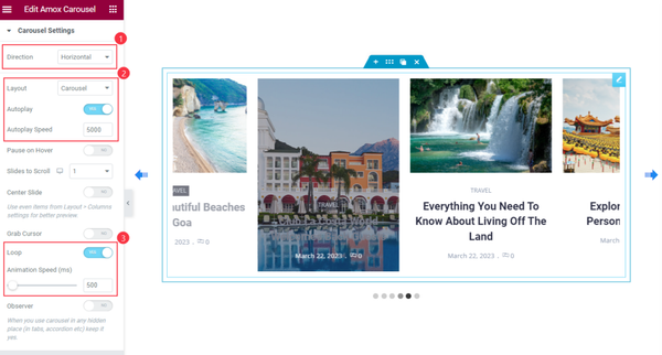
Find the Direction (Horizontal & Vertical), Layout (Carousel & Coverflow), Autoplay, Autoplay Speed, Pause on Hover, Slides to Scroll, Center Slide, Grab Cursor, Loop, Animation Speed, and Observer options.
Style tab customization
Items section
Go to Style > Items
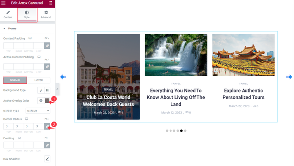
Find the Content Padding and Active Overlay Color options on top.
Then find the Background Type, Active Overlay Color, Border Type, Border Radius, Padding, and Box Shadow options.
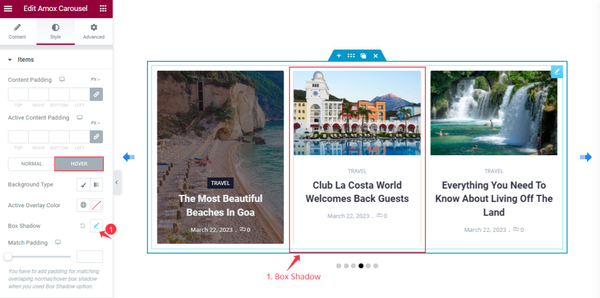
Also, find the Background Type, Active Overlay Color, Box Shadow, and Match Padding options in Hover mode.
Title section
Go to Style > Title
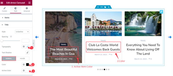
Find the Style (underline/overline & middle underline/overline), Spacing, Typography, and Text Shadow options.
Then find the text Color and Active Color options in Normal mode.
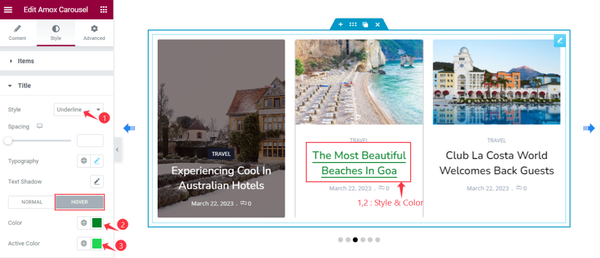
For Hover mode, find the text Color and Active Color options.
Meta section
Go to Style > Meta
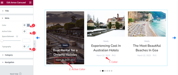
Find the Color, Active Color, Space Between, and Typography options.
Category section
Go to Style > Category
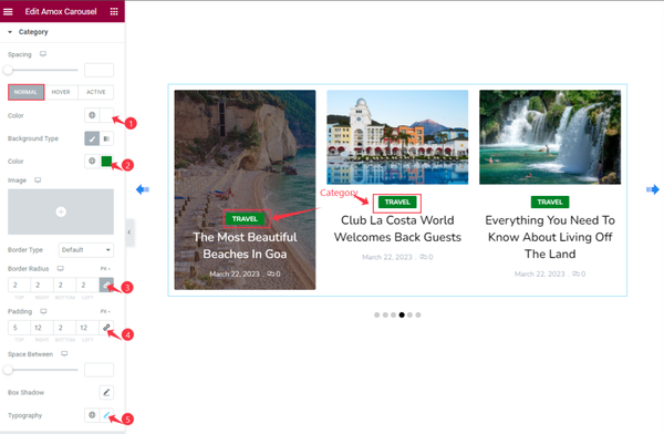
There is a Spacing option on top.
Then for Normal mode, find the text Color, Background Type, Color, Border Type, Border Radius, Padding, Space Between, Box Shadow, and Typography options.
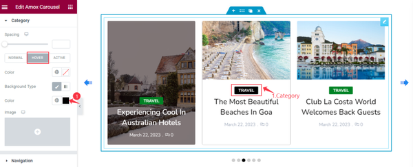
In Hover mode, Find the Color and Background Type options.
Navigation section
Go to Style > Navigation
ARROWS Customization
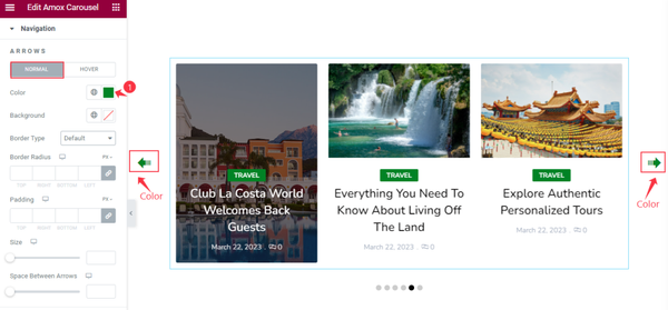
Find the Color, Background color, Border Type, Border Radius, Padding, Size, and Space Between Arrows options in the Normal mode.
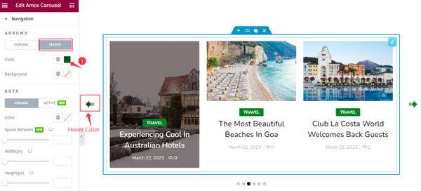
Then find the Color and Background color options in Hover mode.
DOTS Customization
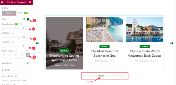
After that, find the icon Color, Space Between, Width, Height, Border Radius, and Box Shadow options in Normal mode.
ARROWS Offset
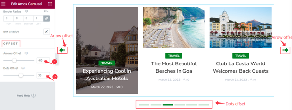
Also, find the Arrows Offset and Dots Offset options.
Video Assist
You can watch the Amox Carousel widget video tutorial above. Please visit the demo page for examples.
Thanks for staying with us.