

The Product Accordion Widget is an excellent feature presented by BDthemes and is a part of the Ultimate Store Kit. It lets you introduce your products attractively to the visitors.
Let’s learn how to use the widget on your site.
Insert the widget
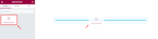
First, you have to insert the widget on your page. To do that, go to the widget menu, then search Product Accordion, then drag-drop the widget in the text area on the page.
Content tab customization
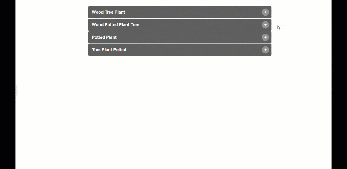
Customize the Layout
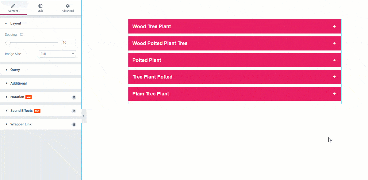
After inserting the widget, you will see a view of the widget like this.
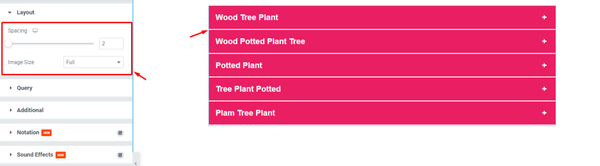
Now, start customizing the Layout. To do that, go to Content > Layout. Here, change the Spacing by 2, then change the Image Size to Full.
Edit the Query
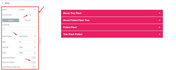
Next, go to Content > Query. Here, select the Source, then set the Product Limit by 4, then change the Show Product option, then enable/disable the Hide Out of Stock switcher.
Format the Additional Setting
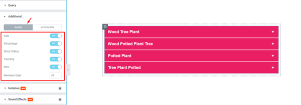
After that, go to Content > Additional. Here, you can see two modes i.e.: BADGE and ACTION BTN. For the BADGE mode, enable the switchers, and then fill up the Newness Days field by 30.
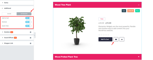
Next, for the ACTION BTN mode, enable the switchers, and see the result.
Style tab customization
Design the Items
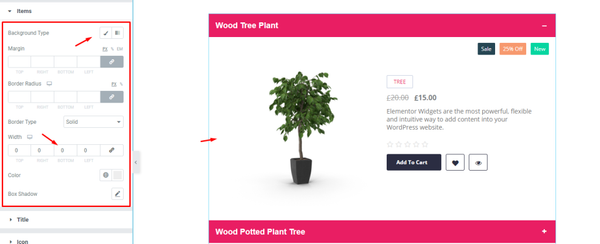
Now, we are going to customize the Items using the Style tab. To do that, go to Style > Items. Here, select a Background Type, then select Border, and see the result on the page.
Edit the Title
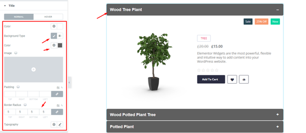
Next, go to Style > Title. Here, you can see two modes i.e.: NORMAL and HOVER. For the NORMAL mode, select Background Type, then change the Background Color, then set the Border Radius by 5, and see what happens.
Change the Icon setting
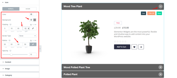
After that, go to Style > Icon. Here, you can see two modes i.e.: NORMAL and HOVER. For the NORMAL mode, change the Background Color, then add some Padding, then set Border Radius by 500, and see the result.
Change the Content
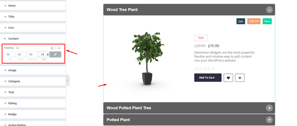
Next, go to Style > Content. Here, add some Padding by 50, and see the result.
Edit the Image
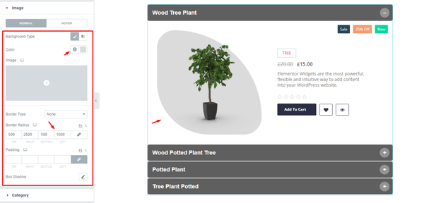
Now, go to Style > Image. Here, you can see two modes i.e.: NORMAL and HOVER. For the NORMAL mode, change the Background Color, then select the Border Radius, and see the result.
Arrange the Category
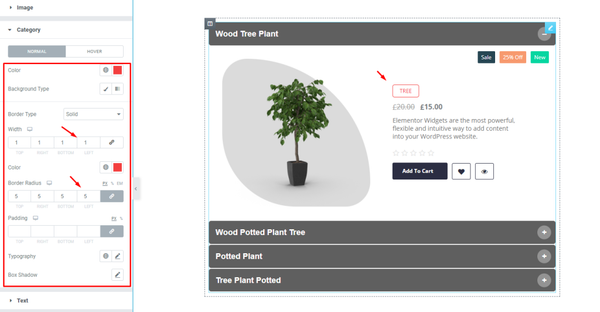
Next, go to Style > Category. Here, you can see two modes i.e.: NORMAL and HOVER. For the NORMAL mode, Change the Color, then set a thin Border, then set the Border Radius by 5, and see the result on the page.
Edit the Text
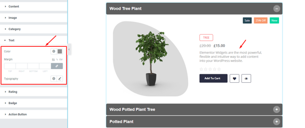
After that, go to Style > Text. Here, change the Color, then change the Typography, and see the result on the page.
Change the Rating option
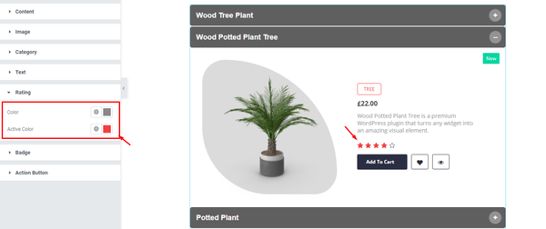
Now, go to Style > Rating. Here, change the Color, then change the Active Color, and see what happens.
Edit the Badge
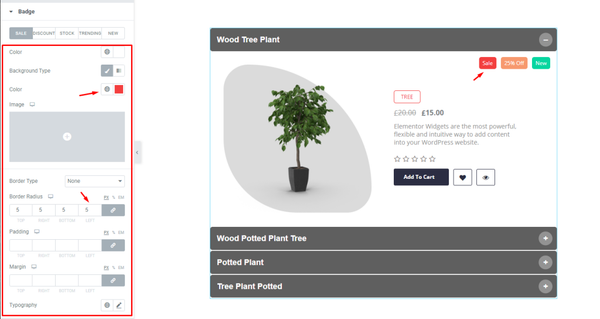
Next, go to Style > Badge. Here, you can see five modes i.e.: SALE, DISCOUNT, STOCK, TRENDING, and NEW. For the SALE mode, change the Background Color, then set the Border Radius, and see the result.
Format the Action Button
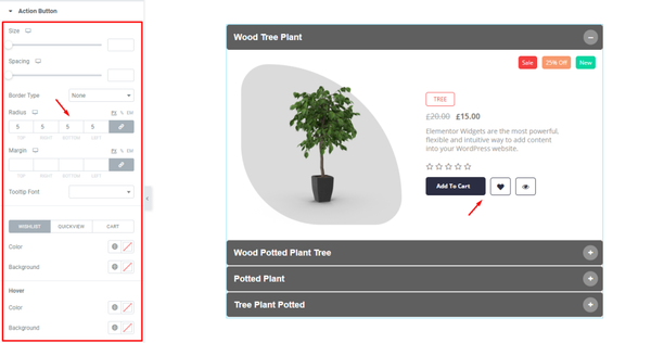
Lastly, go to Style > Action Button. Here, set the Border Radius by 5, and see the result. You can change the other options if needed.
Final result
All done! Let’s relax and enjoy the show.
Video Assist
If you have any more queries about this widget, please watch the tutorial video.
You can also see the demo page to learn more.
Thank you.