In this documentation, we will discuss the customization of the Pacific Slider widget, brought to you by the Prime Slider.
Enable The Pacific Slider Widget
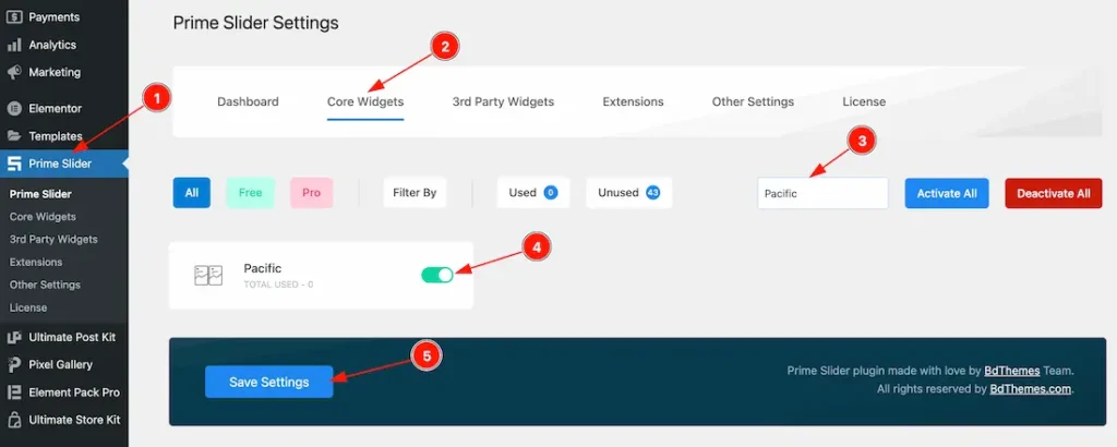
To use the Pacific Slider widget from Prime Slider, first, you have to enable the widget.
- Go to WordPress dashboard > Prime Slider Plugin dashboard.
- Then, Click the Core Widgets Tab.
- Search the Pacific Slider Widget Name.
- Enable the Pacific Slider Widget.
- Hit the Save Settings Button.
Inserting The Pacific Slider widget
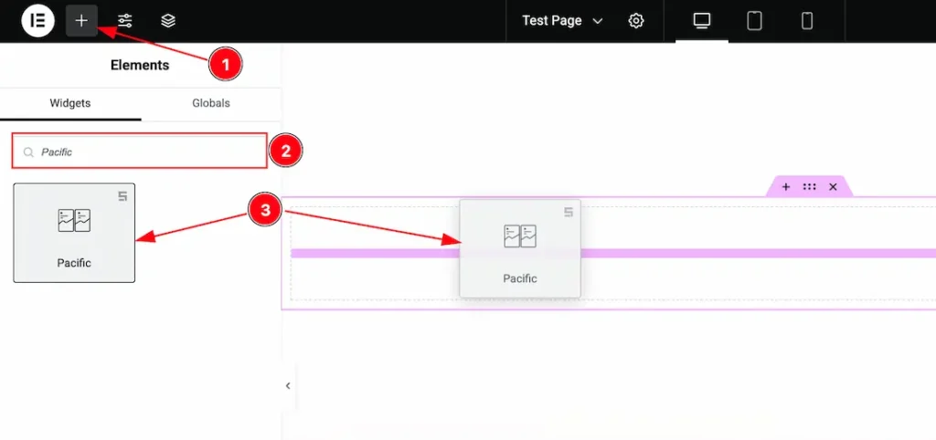
1. Go to the Elementor Editor Page and Hit the “+” icon Button.
2. Search the Pacific Slider widget.
3. Drag the widget and Drop it on the editor page.
Work With The Content Tab of the Pacific Slider
Layout Section
Go to Content > Layout
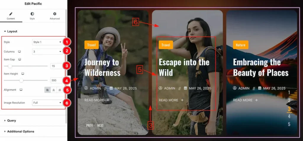
1. Style: Here you will get the layout style type – Style 1, and Style 2. You can choose any one of them.
2. Columns: You can set the slider columns from here. Here we set the columns 3.
3. Item Gap: This option lets you adjust the item gap.
4. Item Height: This option lets you set the item height.
5. Alignment: You can set the slider item content alignement – Left, Center, and Right.
6. Image Resolution: Select the Image Resolution Type( Thumbnail, Medium, Large, Full, etc) to showcase your slider.
The choice of image resolution type depends on the requirements of your slider and the display devices. Here’s a brief overview:
- Full: Images with the highest resolution available, suitable for large displays or backgrounds.
- Thumbnail: Small-sized images suitable for quick loading and display in smaller spaces.
- Medium: Moderately sized images with a balance between quality and file size.
- Large: Higher resolution images suitable for larger sliders or displays with more space.
Query Section
Go to Content > Query
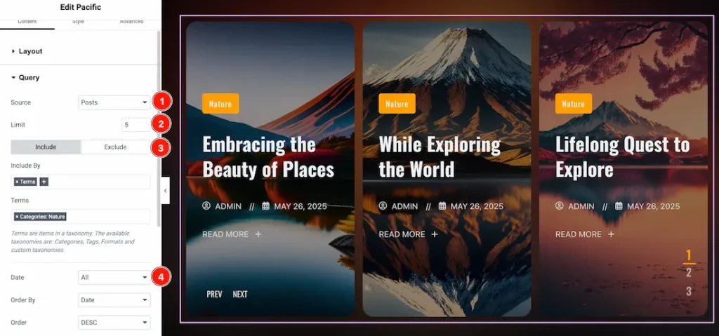
1. Source: Select the source for the slider from here. The types of sources are – Posts, Pages, Floating Elements, Downloads, Products, Mega Menu Items, Template Items, Manual Selection, Current Query, Related. Here we selected the type as posts.
2. Limit: You can adjust the limit here of how many posts you want to show in the slider.
3. Include/Exclude Selection: Select the Include / Exclude filter to show/hide specific posts by Terms (Tags/Categories) or Authors. Here, we selected the include field as Category.
4. Date: You can select the post as per the date of creation with this option.
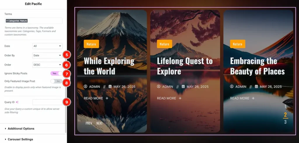
5. Order By: It controls the data you want to display through title, id, date, author, comment count, menu order & random. Here we selected the order as date.
6. Order: This option controls the order by which data is arranged. There are two types of order. Ascending Order (Starts from the smallest or lowest value and goes to the largest or highest.) & Descending Order (Starts from the largest or highest value and goes to the smallest or lowest.)
7. Ignore Sticky Posts: Enable or Disable the switcher to hide or show the sticky posts.
8. Only Featured Image Post: Enable or disable the switcher to show or hide the featured image post.
9. Query ID: Give your query a custom, unique ID to allow server-side filtering. Learn more about the Query.
Additional Options Section
Go to Content > Additional Options
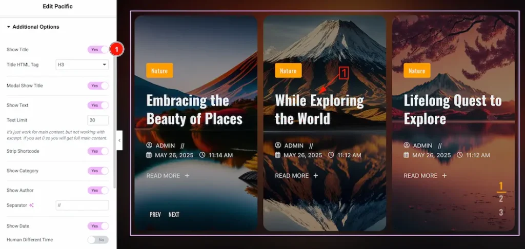
1. Show Title: Enable/disable the switcher to show/hide the title. From here you also can select the Title HTML Tag.
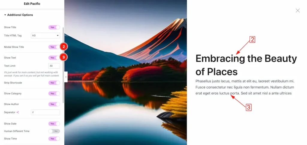
2. Show Modal Title: Enable/disable the switcher to show/hide the modal title.
3. Show Text: Enable/disable the switcher to show/hide the text.
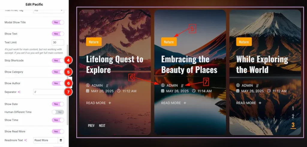
4. Strip Shortcode: This option removes any shortcodes from the slider.
5. Show Category: Enable/disable the switcher to show/hide the category.
6. Show Author: Enable/disable the switcher to show/hide the author.
7. Separator: This option lets you change the separator.
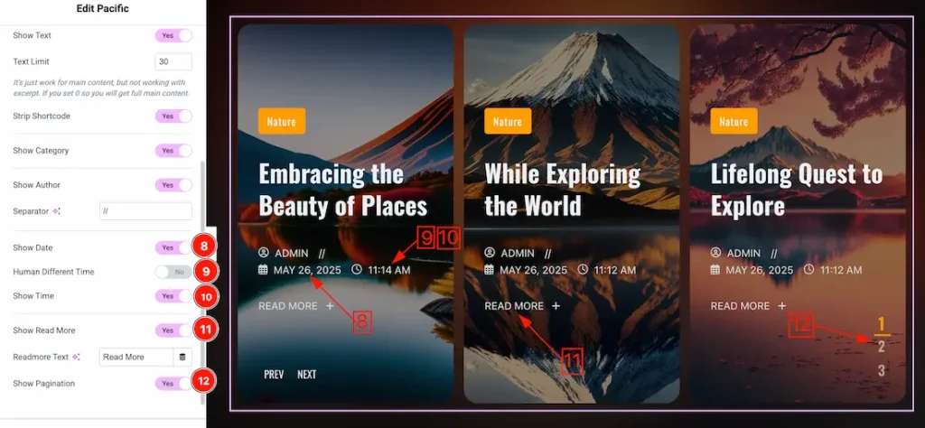
8. Show Date: Enable or disable the switcher to show or hide the post creation date from the slide.
9. Human Different Time: Enable or disable the switcher to show or hide the Human Different Time.
10. Show Time: Enable or disable the switcher to show or hide the Time.
11. Show Read More: Enable or disable the switcher to show or hide the Read More button.
12. Show Pagination: Enable or disable the switcher to show or hide the pagination.
Carousel Settings Section
Go to Content > Carousel Settings
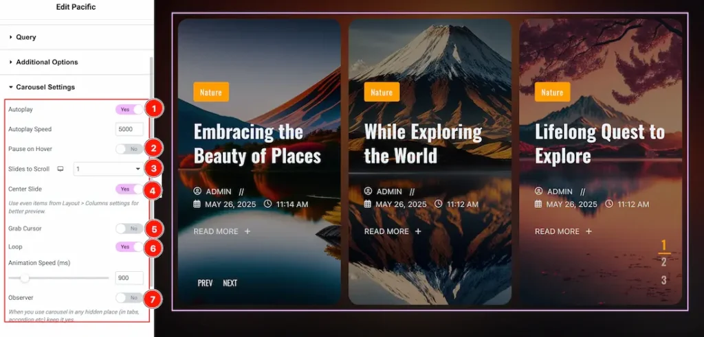
1. Autoplay switcher: If you Enable the Autoplay switcher button, your slider will slide into Autoplay mode, and you can set the Autoplay Speed as you wish.
2. Pause on Hover: If you activate the pause on Hover button, when visitors Hover the mouse cursor on the slider, then your slider will Hold, otherwise your slider slide Autoplay.
3. Slides to scroll: It represents how many slides will slide at once.
4. Center Slide: If you enable the Switcher option, then your Active slider will show the center (depending on your widget style).
5. Grab The Cursor: Your mouse pointer icon will be changed into a grab cursor. Visitors can slide your slider manually with your mouse cursor.
6. Loop: Enable the switcher to go back to the first automatically after the last slide.
7. Observer: If you enable the option then you are able to use the slider/carousel in any hidden places (such as in tabs, Accordion, etc).
Work with The Style Tab
Items Section
Go to Style > Items
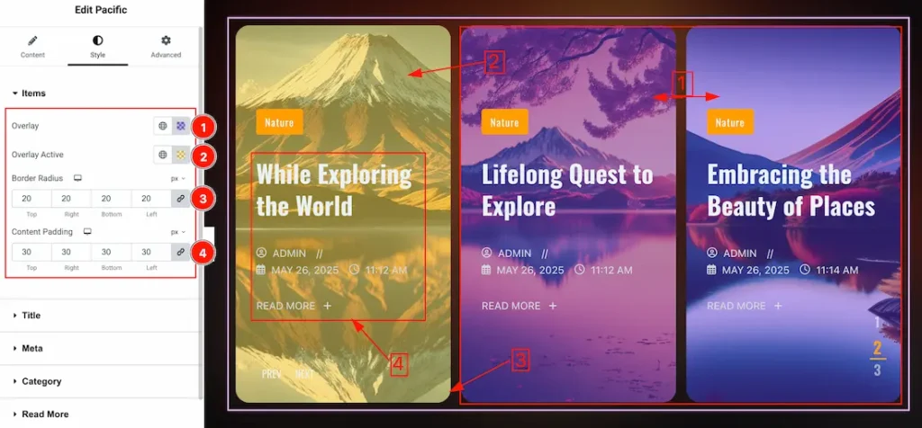
1. Overlay Color: This option lets you change the overlay color.
2. Overlay Active: This option lets you change the overlay active color.
3. Border Radius: This option controls the roundness of the border with this option.
4. Content Padding: You can set the content padding from here.
Title Section
Go to Style > Title
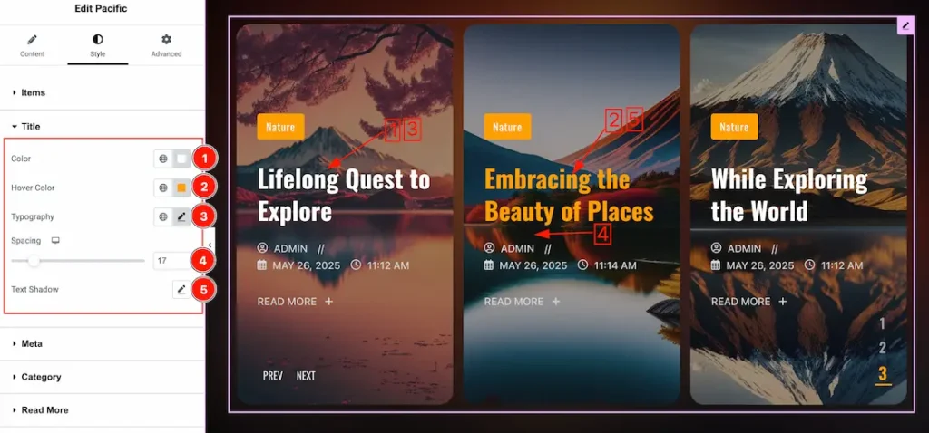
1. Color: This option lets you change the title normal color.
2. Hover Color: This option lets you change the title hover color.
3. Typography: Change the font family, size, weight, style, transform, decoration, line height, letter spacing, and word spacing from here.
4. Spacing: You can adjust the space between tiltles and meta.
5. Text Shadow: This option lets you set the text shadow for the title.
Meta Section
Go to Style > Meta
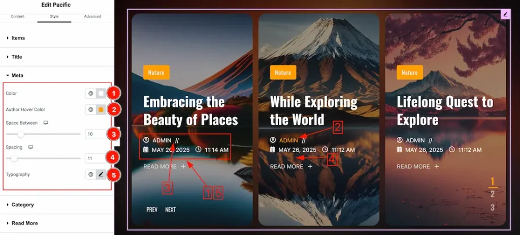
1. Color: This option lets you change the meta normal color.
2. Author Hover Color: This option lets you change the author hover color.
3. Space Between: This option lets you adjust the space between author and separator.
4. Spacing: You can adjust the space between meta and read more button.
5. Typography: Change the font family, size, weight, style, transform, decoration, line height, letter spacing, and word spacing from here.
Category Section
Go to Style > Category
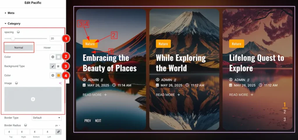
Come to the Category section, you will find two tabs section; Normal and Hover.
In the Normal tab section, you can customize these below options-
1. Color: This lets you change the Category text normal color.
2. Background Type: you can change the color of any object background to classic or gradient. Here we choose the Background type Classic.
3. Background Color: This lets you change the Category Background color. If you want, you also can change an image to the Background.
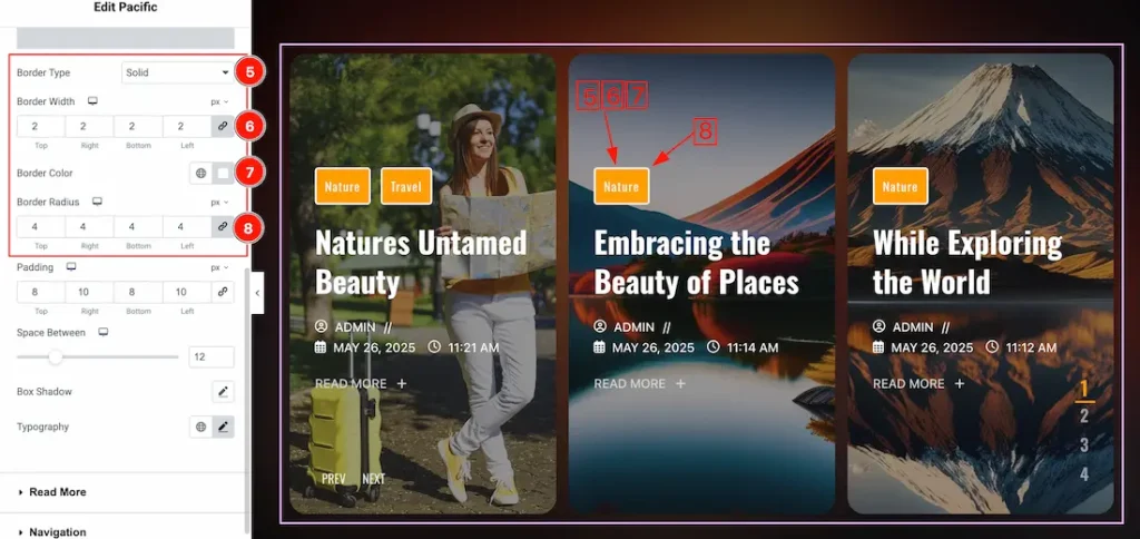
5. Border Type: This option allows you to add a border around the category text.
6. Border Width: Set the thickness of the border with this option.
7. Border Color: You can change the border color with this option.
8. Border Radius: This option controls the roundness of the border.
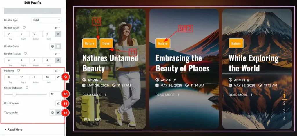
9. Padding: This option allows you to adjust the inner space and gaps around the category text.
10. Space Between: You can adjust the space between categories.
11. Box Shadow: You can add a shadow effect to the category with this option.
12. Typography: Change the font family, size, weight, transform, style, decoration, line height, letter spacing, and word spacing from here.
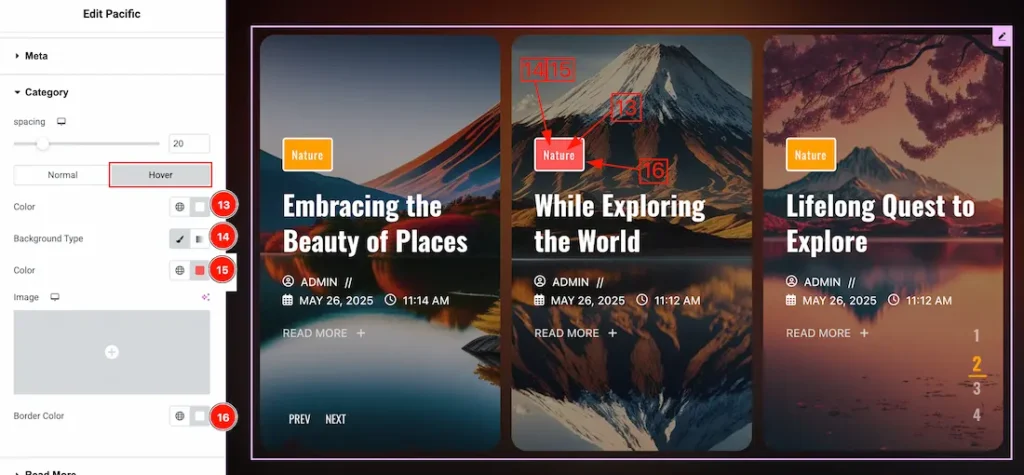
Now let’s proceed to the Hover Tab –
13. Color: You can change the category text hover color with this option.
14. Background Type: You can change the color of any object background to classic or gradient. Here we choose the Background type Classic.
15. Background: You can change the background hover color with this option.
16. Border Color: You can change the hover border color with this option.
Read More Section
Go to Style > Read More
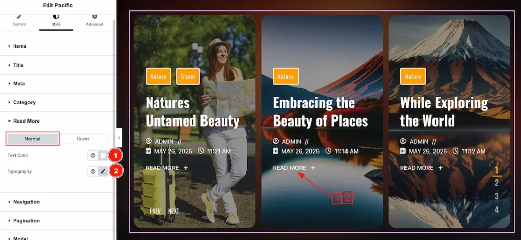
Come to the Read More section, you will get two subsections; Normal and Hover.
In the normal tab section, you will get the below options-
1. Text Color: This option lets you change the text color.
2. Typography: Change the font family, size, weight, style, transform, decoration, line height, letter spacing, and word spacing from here.
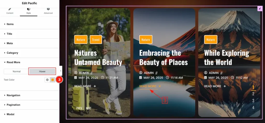
In the hover tab section, you will get the below option-
3. Text Color: This option lets you change the read more text hover color.
Navigation Section
Go to Style > Navigation
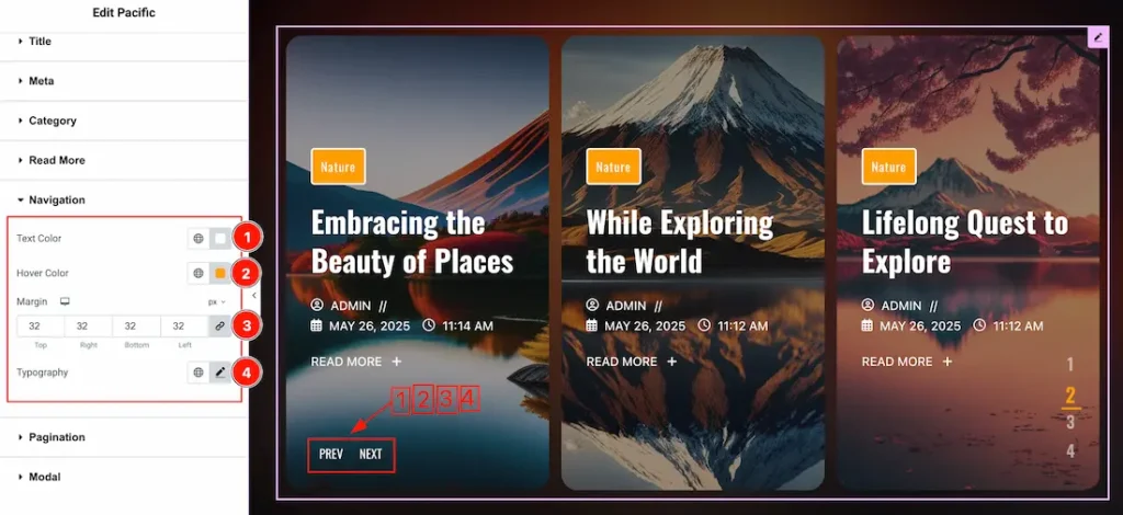
1. Text Color: This option lets you change the navigation text color.
2. Hover Color: This option lets you change the navigation text hover color.
3. Margin: Adjusts the position of an object over the canvas.
4. Typography: Change the font family, size, weight, transform, style, decoration, line height, letter spacing, and word spacing from here.
Pagination Section
Go to Style > Pagination
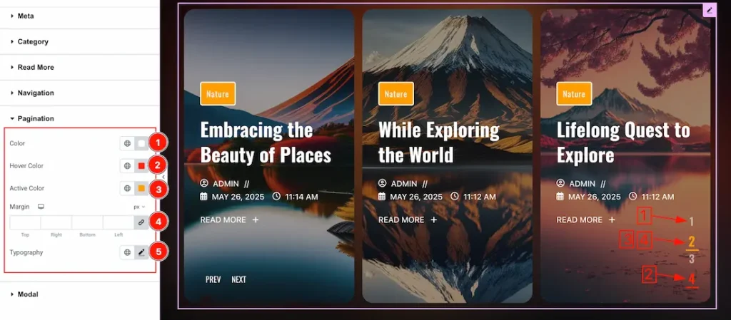
1. Color: This option lets you change the pagination text color.
2. Hover Color: This option lets you change the pagination text hover color.
3. Active Color: This option lets you change the pagination text active color.
4. Margin: Adjusts the position of an object over the canvas.
5. Typography: Change the font family, size, weight, transform, style, decoration, line height, letter spacing, and word spacing from here.
Modal Section
Go to Style > Modal
Come to the Modal section, you will get four subsections; Modal, Title, Text, and Image.
Modal Sub Section
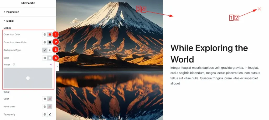
1. Cross Icon Color: This option lets you change the cross icon color.
2. Cross Icon Hover Color: This option lets you change the cross icon hover color.
3. Background Type: You can select the background type to Classic or Gradient from here. Here we selected the Classic.
4. Background Color: You can change the background color with this option.
Title Sub Section
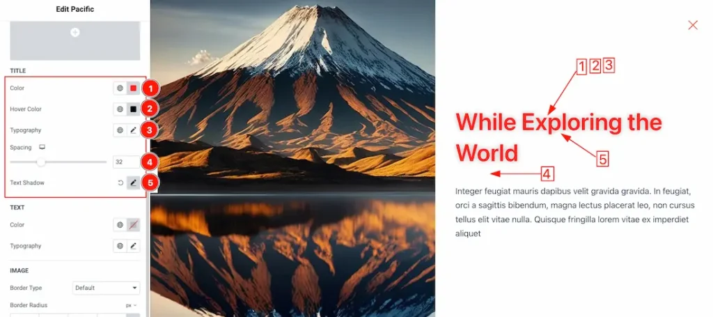
1. Color: This option lets you change the modal title color.
2. Hover Color: This option lets you change the modal title hover color.
3. Typography: Change the font family, size, weight, transform, style, decoration, line height, letter spacing, and word spacing from here.
4. Spacing: You can adjust the space between modal title and text.
5. Text Shadow: You can add the text shadow for the modal title.
Text Sub Section
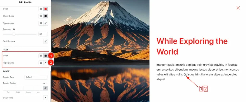
1. Color: This option lets you change the modal text color.
2. Typography: Change the font family, size, weight, transform, style, decoration, line height, letter spacing, and word spacing from here.
Image Sub Section
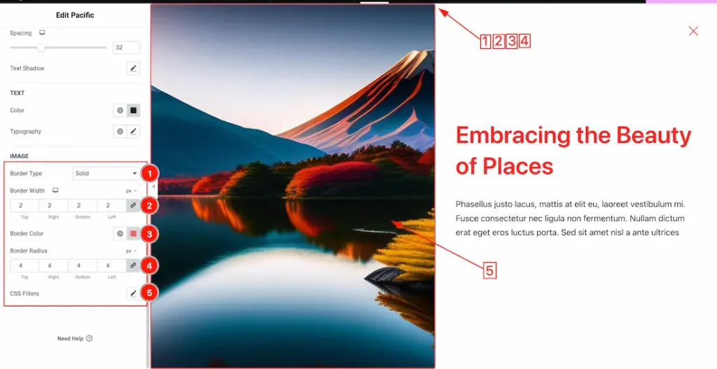
1. Border Type: This option allows you to add a border around the modal image.
2. Border Width: Set the thickness of the border with this option.
3. Border Color: You can change the border color with this option.
4. Border Radius: This option controls the roundness of the border.
5. CSS Filters: From here you can add the css filters for the modal image.
All done! You have successfully customized the Pacific Slider on your website.
Video Assist
You can also watch the video tutorial to learn more about the Pacific Slider widget. Please visit the demo page for examples.
Thanks for being with us.