

The Grove Timeline offers unique styles to show the posts horizontally with a timeline structure. The widget can be customized into various unique styles to entertain your visitors.
Let’s explore the widget customizations.
Inserting Grove Timeline widget
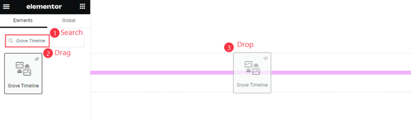
In the search bar of the Elementor editor page, search by the widget name and then drag the Grove Timeline widget and drop it on the page. You will require both Elementor and Ultimate Post Kit addons to be installed to use this widget.
The Default view of the Grove Timeline
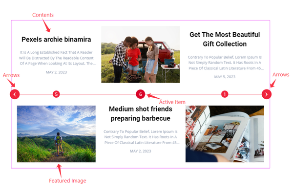
Once you drop the widget inside your page, you will see a long timeline in the middle of the content with a title, text, and meta info paired with an image and seated at the two sides of the timeline. The content repeats the layout style for the rest with additional layout shifting.
Content Tab Exploration
Layout Customization
Go to Content > Layout
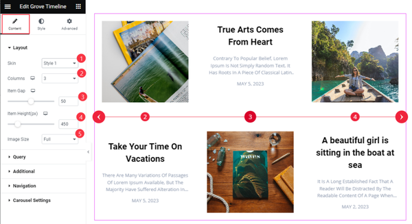
In this section, you can change the Skin of the widget to 3 different layout styles and choose the best one for your website. You can change the Columns lineup between 1 to 6. There are Item Gap, Item Height, and Image Size options below.
Query for Timeline
Go to Content > Query
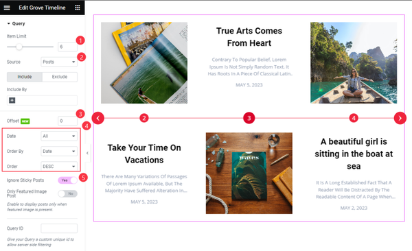
For the Query, first set the Item Limit that determines how many items you want to show. Then select the Source of the items that could be Posts, Templates, etc. The Offset value hides one of the selected items.
You can rearrange the items by Date, Order By, and Order sortings. The Ignore Sticky Post switcher will prevent showing the sticky posts.
Additional Section Set
Go to Content > Additional
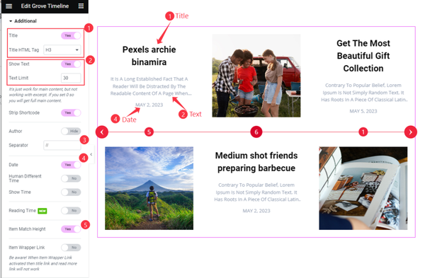
In this section, you will find a number of switchers to show/hide specific elements from the widget. They are Title, Show Text, Strip Shortcode, Author, Date, Human Different Time, Show Time, Reading Time, Item Match Height, and Item Wrapper Link.
Apart from the switchers, you will find Title HTML Tag, description Text Limit, and Separator fields.
Set Navigation Style
Go to Content > Navigation
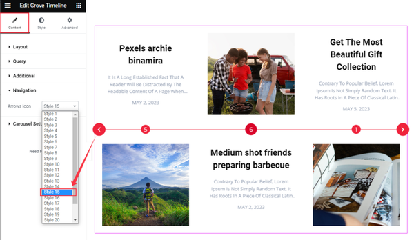
Here, you will get access to over 20 unique Arrows Icon styles to choose from. The arrows work as the navigation part of the widget.
Set Carousel Settings
Go to Content > Carousel Settings
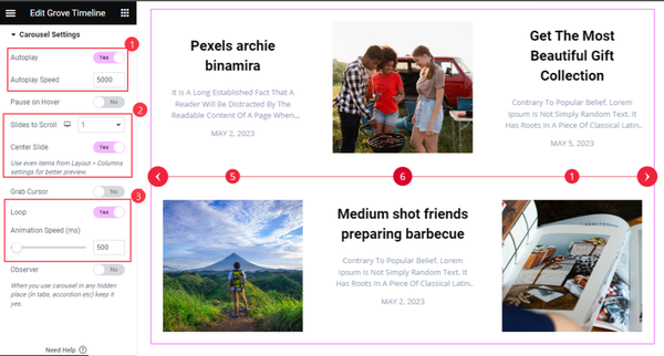
In this section, you will get the Auto Play, Autoplay Speed, Pause on Hover, Slide To Scroll, Center Slide, Loop, and Animation Speed (ms) options to apply the corresponding effects on your slider.
Autoplay switcher: Enable the switcher to make the carousel slide Automatically with a customizable Autoplay Speed control.
Pause on Hover: If turned on, when you Hover your mouse cursor on the carousel, then your slider will Hold, otherwise, your slider will Autoplay.
Slides to Scroll: Determines how many slide will scroll at once.
Loop: You can easily enable or disable the switcher button. When you activate the Loop switcher button, the timeline will loop at a certain interval. You can also set up the loop animation speed here.
Style Tab Explore
Timeline Customization
Go to Style > Timeline
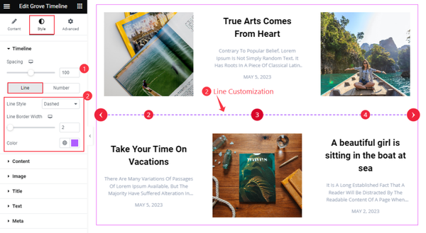
In this section, first, configure the timeline Spacing. The options get divided into two subsections named Line & Number.
For the Line part, find the Line Style option that’s set to ‘Dashed’ by default (changeable), the Line Border Width, and the Color options.
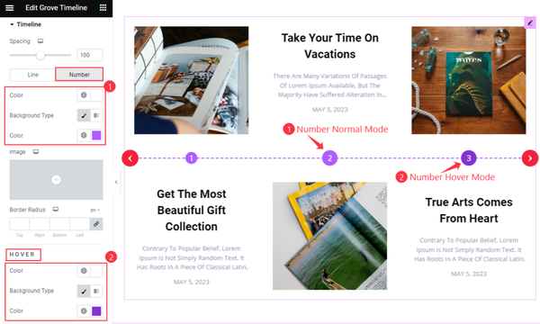
From the Number subsection, you can customize the Color of the numbers over the timeline, the number’s Background Color, and Border Radius.
You will also find Color settings to create a hover effect.
Content Section Customization
Go to Style > Content
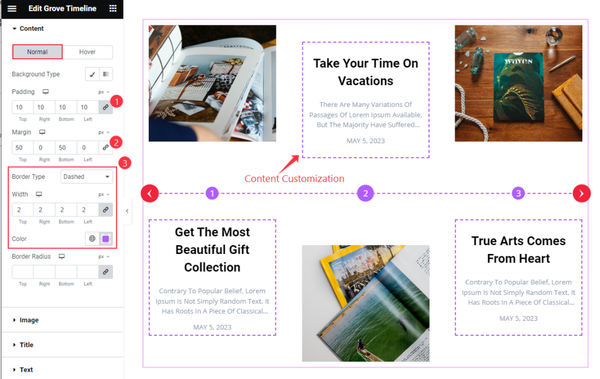
To style the content part, you can use Padding, Margin, Border, border Width, and Color.
Title Customization
Go to Style > Title
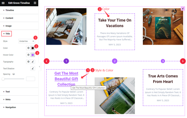
For the Title, you can change the text Style (Underline, Middle Underline, Overline, Middle Overline), text Color, text Hover color, Typography, Text Shadow, and Spacing.
Text Color set
Go to Style > Text
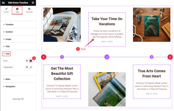
For the Text, you can customize the text Color and Typography.
Meta Customization
Go to Style > Meta
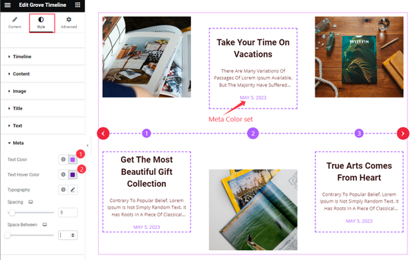
For the Meta tag, you can customize the meta text Color, Hover Color, Typography, Spacing, and Space Between options.
Navigation Customization
Go to Style > Navigation
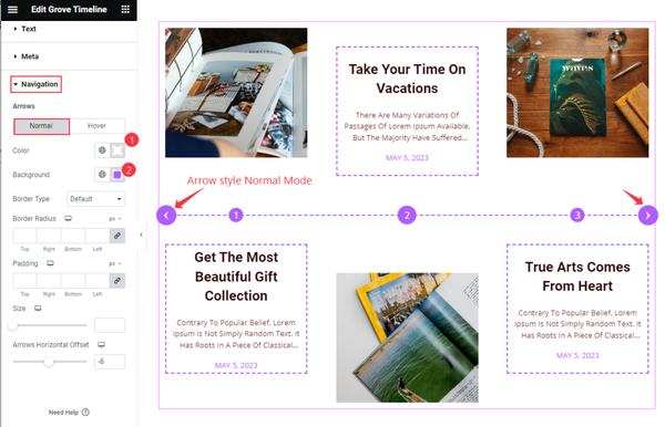
For navigation, the options are divided into two subsections; Normal & Hover. Here, you can change the navigation Arrows icon Color, Background color, Border Type, Border Radius, Padding, Icon Size, and Arrows Horizontal Offset options.
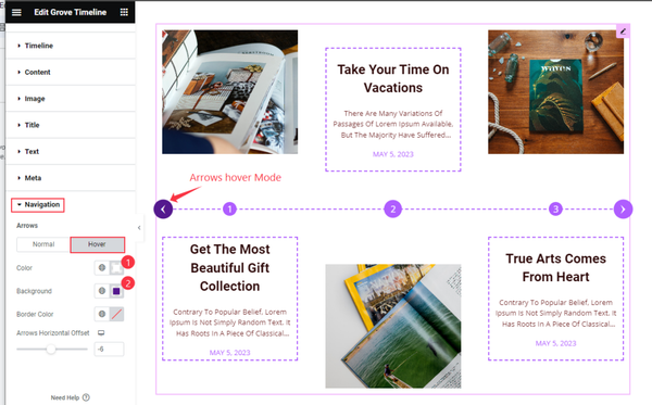
For the Hover mode, there are Color, Background, Border Color, and Arrows Horizontal Offset.
This way, you can make the Grove Timeline more stylish and fit for your website.
Video Assist
This Video will help you with the Grove Timeline widget customizations. Please visit the demo page for examples.
Thank you for being with us.