

If you’re looking for a custom WordPress grid gallery for Elementor, the Elixir gallery addon from Pixel Gallery is a great option. This is another minimalistic gallery widget for WordPress that has a smooth hover transition effect coupled with a bold image title, category, date, and meta information.
Let’s see how to customize it.
Inserting the Elixir gallery addon
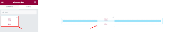
If you want to use the gallery addon for WordPress, simply open the page you want to use it on in Elementor and drag and drop the Elixir widget into the page. Note that you need both Elementor and Pixel Gallery installed on your WordPress site before you can use this widget.
Introduction to Layout customizations
The content tab provides the foundation for your widget – think of it as the frame of a house. Here, you can adjust things like the dimensions, the number of columns, and item spacing to get everything just right.
Plus, you can add individual items and customize their information. So whether you’re starting from scratch or just want to make some adjustments, the content tab has everything you need for the layout.
Let’s explore how to use these features!
Take a look at the default appearance
After you add the gallery addon for WordPress to your page, you’ll see a number of default images. You can, however, change this number to better suit your needs. Notice that, there is a hover effect that pops up and displays the title and meta texts for each image.
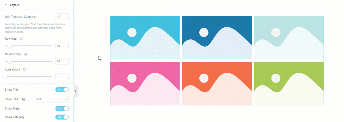
Customize the layout of the Elixir gallery addon
Go to Content> Layout
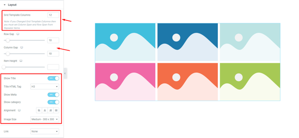
In the Layout section of the gallery addon for WordPress, you can select how many columns you want in the grid template. You can also adjust the item gap, column gap, and item height to customize the look of your gallery.
You can show or hide the title, meta text, and category elements with these switchers here. You can also select a custom HTML tag for the title if you want to. The alignment option is for all texts.
The grid gallery’s image dimensions in Elementor can be customized from the Image Size option.
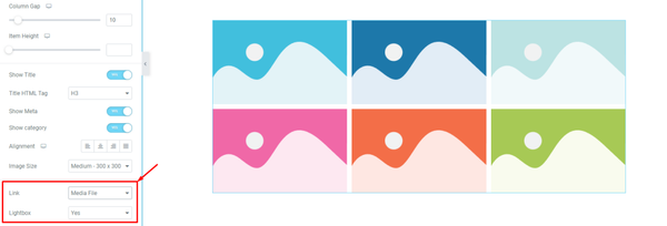
The ‘Link‘ field at the bottom of the page will enable you to turn on the media file linking function for the grid items. Just click on the ‘Link‘ field and choose ‘Media File’ or ‘Custom URL‘ to open the link fields on the items. Then you can choose the media to open in Lightbox or no.
Customize Elixir gallery addon items individually
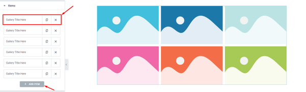
Go to Content> Items
This is where you’ll find all of your gallery items in one place. They’re displayed as small white boxes with a title, and copy/close buttons. You can add more items by clicking the ‘Add Item‘ button, or close any listed item by clicking the ‘X‘ button on the item box.
Content subsection controls
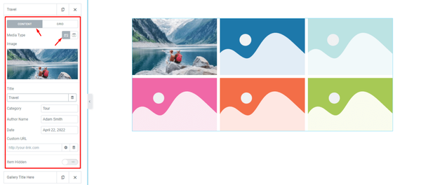
When you click on an item box, the options inside of it will be revealed to you. You can see that the Content subsection has been selected and that the Media type has been set to images. If you want, you can switch the Media type to video.
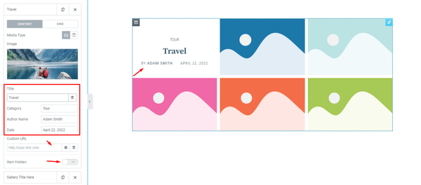
There are some fields located here that will allow you to customize the image, title, category, and meta description to your liking. There’s also a custom URL field along with an item hidden switcher.
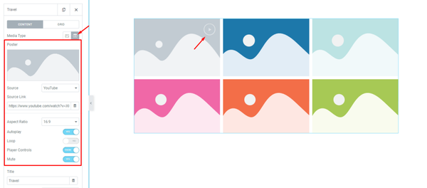
By selecting Video as the Media Type, you will be able to embed a video into the individual Elixir gallery addon item. This will give you access to additional control options, including the video Source option, source link, aspect ratio control, Autoplay, loop, player controls, and mute switcher.
Grid subsection controls
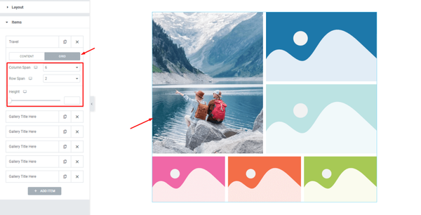
The grid controls let you choose the dimensions for each item, such as how many columns or rows it can occupy. The height option lets you change the height of each item to further adjust the size.
For example, let’s change the column span to 6 and the row span to 2. Now, the first item will occupy 6 of the 12 column bars and 2 rows. By default, the column span is set to 4 and the row span is set to 1. That’s why the next two items appear on the right side of the first gallery addon for WordPress item. We will change their column span to six as well.
Remember, you can always experiment with different settings to see what works best for your project!
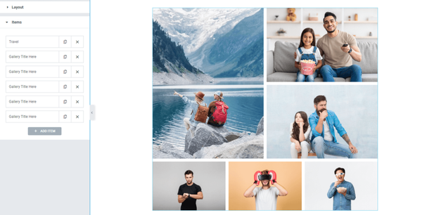
After you customize the grid items, the interface will look something like this. You can easily create this layout by adjusting the grid controls for individual items in the Elixir grid gallery widget.
Style tab for customizing Elixir widget interface appearance
Layout appearance customization is one of the things that makes Pixel Gallery so great. You can easily change things around to create unique interfaces that fit your needs.
Here’s how it’s done:
Items section customizations
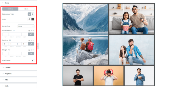
Go to Style> Items
The top section of the page features a background type option, which allows you to choose a single color or gradient for the background of the items. With each gallery item having images that occupy the entire area, you will only be able to see the changed background color once you have added some padding.
Afterwards, there are border and border radius options available along with margin and box shadow options for the Elixir gallery addon.
Here, we just added some padding around the images and that reveled the background color a bit. No border used.
Content area customizations
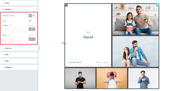
Go to Style> Content
Hovering over the grid items will display a popup content window covering the whole background. This content area comes with a background type customization where you can put solid colors or semi-transparent colors to let the background stay half visible. Additionally, you get margin and padding customizations.
Customize the play icon
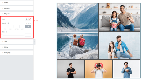
Go to Style> Play Icon
If you select Video from the media type options inside the items section, you’ll see a play button appear on the selected grid item. You can then customize the color, margin, and size of that button to better suit your needs.
Grid gallery title customization
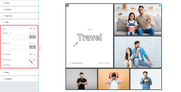
Go to Style> Title
Here, you can make the title text in the content box your own by changing its color, padding, margin, typography, text shadow, and stroke.
Meta text customizations

Go to Style> Meta
Here, you can make your meta text look as good as the title by customizing the options for the color, margin, and typography.
Customizing the Category text
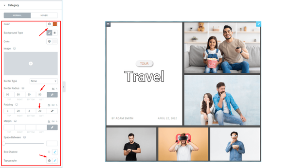
Go to Style> Category
The category text of the Elixir gallery addon is also customizable. Here, you can edit the color of the text and background. Then you can place a border around it as well as curve the edges using border radius. Then there are padding, margin, space, box shadow, and typography options available for the category.
That’s all about the Elixir gallery addon.
Video Assist
Watch this video to see the whole tutorial with more visual details, or check out the demo page for similar examples.