The Blog Slider Zinest Skin has the most vibrant post interface for publishing WordPress blogs. The slider comes with a professional post layout having animated blog info, a thumb post gallery at the bottom, and an inline navigation system.
Let’s explore the slider customizations.
Inserting The Blog Slider Zinest Skin
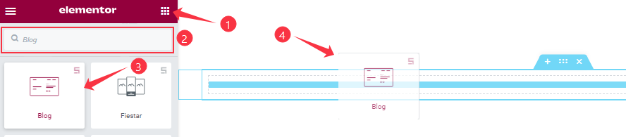
You can add this Prime Slider addon to WordPress by opening the page you want to use it on in Elementor and then dragging and dropping the Blog Slider widget into that page. Please note that you need both Elementor and Prime Slider installed before you can use this widget.
Work With The Content Tab
Layout Section Customizations
Go to Content > Layout
Step-1
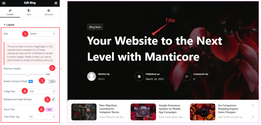
Come to the Layout section, you can change the Blog Skin Type (Default, Coral, Zinest, and Folio). Here we have selected the Zinest Skin to show the widget function.
Here you can set the Minimum Height to adjust the net height of all slides and also the On/Off Viewport Height.
The viewport height of the slider is the height of the element containing the slider. The viewport height will depend on the slider that you’re using. If you have the default slider, the viewport height is calculated by adding the slider height and the slider bottom padding.
Here you also set the Slider Image size and customize the Background Image settings as your working demand.
Step-2
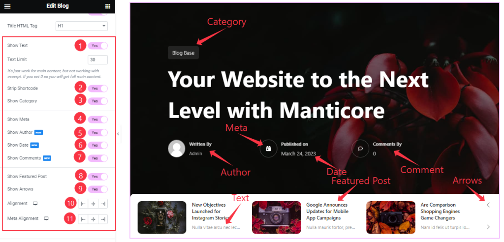
Here you will get the Show Title, Show Text, Strip Shortcode, Show Category, Show Meta, Show Author, Show Date, Show Comments, Show Arrows, and Show Featured Post switchers which you can turn on/off to show/hide these elements from the slider.
You can also edit the Text Limit, Alignment, and Meta Alignment as your wish. If you enable the ‘strip shortcode‘ option, then shortcode content will be removed from your slider content.
Query Section Customizations
Go to Content > Query.
This section works for setting the source location of data that you need to display by references like Posts, Pages, Authors, Categories, Tags, and Names. The references can be different in accordance with the source location.
Step-1
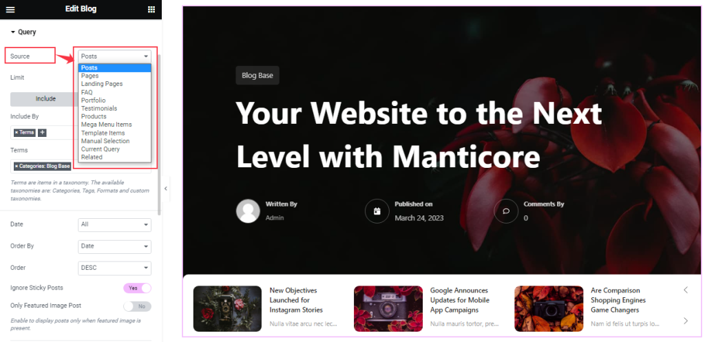
Here you can select the Source of your slider from the predefined categories. The options are based on the resources of your website and may vary from site to site accordingly.
Step-2
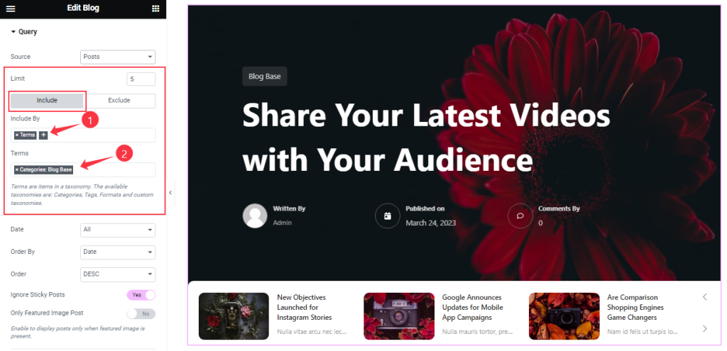
Then you can set your post limit as your need. Also, you can show posts by certain categories through the Include filter here.
Step-3
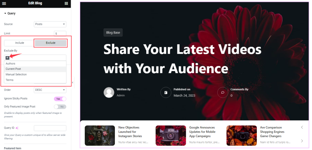
The Exclude filter works in reverse of the Include filter and it hides certain categories of source items from the slider display.
Step-4
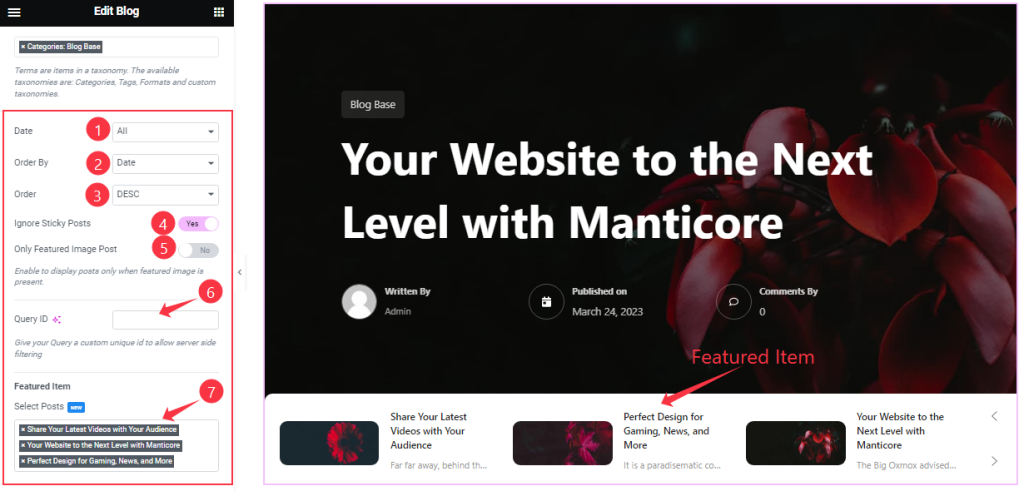
Order By and Order controls are here to arrange the data you want to display through Random, Title, Date, or Menu order wise and also with ascending or descending order.
Here, you can also see two switchers (Ignore Sticky Posts, Only Featured Image Posts). You can set the Query ID that gives your Query a custom unique id to allow server-side filtering.
Lastly, you can select Featured Items like in the above screenshot.
Slider Settings Section Customization
Go to Content > Slider Settings
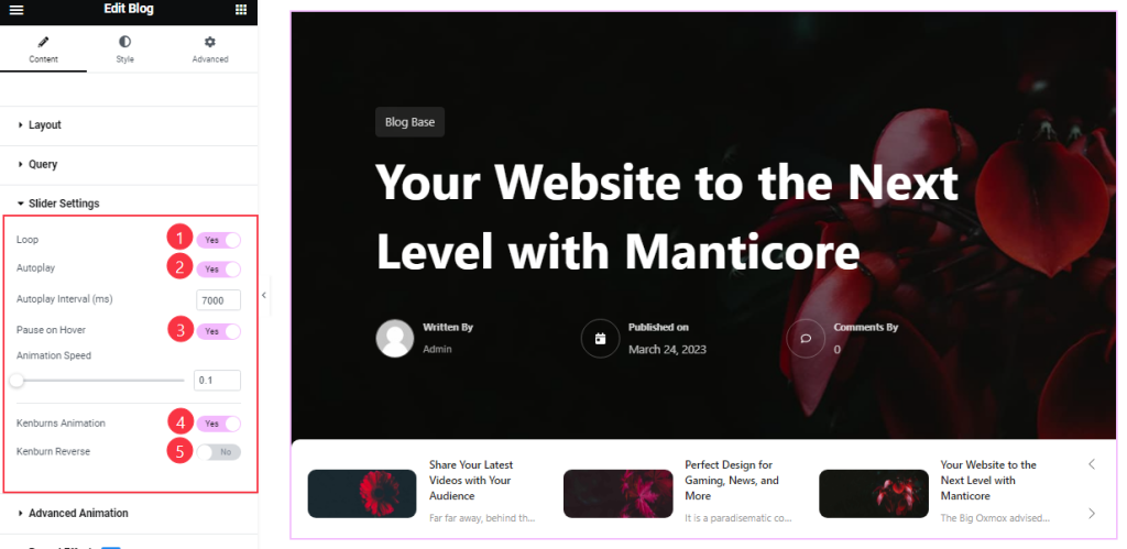
In this section, you will get the Auto Play, Pause on Hover, Loop, Kenburns Animation, and Kenburns Animation Reverse switchers to apply the corresponding effects on your slider. Also, you can customize the Autoplay Interval and Animation Speed for the slider.
Autoplay switcher: Enable the switcher to make the slider slide Automatically with a customizable Autoplay Speed control.
Pause on Hover: If turned on, when you Hover your mouse cursor on the slider then your slider will Hold, otherwise, your slider will Autoplay.
Loop: you can easily enable or disable the switcher button. When you activate the Loop switcher button then your slider will loop at a certain time interval. You can also set up the loop animation speed here.
Kenburns Animation: Kenburns Animation is the most attractive Animation effect for the widget. if you enable the switcher button then your post Image will appear like a zoom-in/zoom-out animation that makes your post image Awesome.
Advanced Animation Section Customizations
Go to Content > Advanced Animation
Step-1
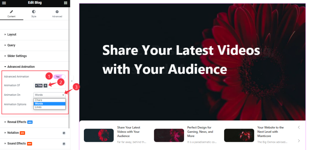
Come to the Advanced Animation section, you can easily on/off the switcher button to show/hide the Animation Effect. If you turn on the Switcher, you can add the Animation of Title and Sub Title. Also, you can select the Animation for Words, Chars, and Lines like the screenshot.
Step-2
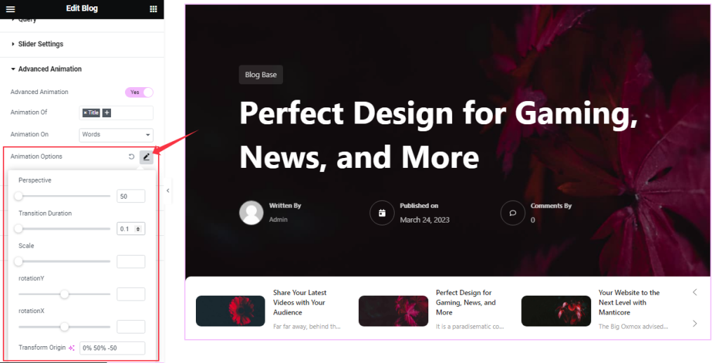
Here you can customize the Animation Options as your working demand.
Work With The Style Tab
Style The Sliders Section
Go to Style > Sliders
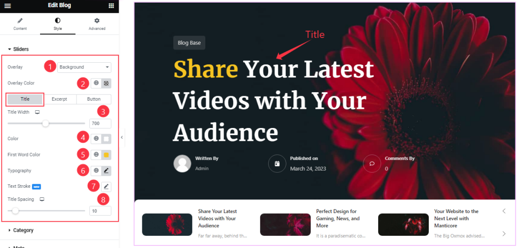
Come to the Sliders section, you can change the Overlay type and Overlay Color.
The rest of the options are divided into 3 subsections.
In Title mode, you can change the Title Color, First-word Color, and Separator Color. You may add Text Strokes or customize the Typography and adjust the Title Width and Title Spacing from here.
The Excerpt and Button subsections have similar controls and some more customizations for the button.
Style The Category Section
Go to Style > Category
Step-1
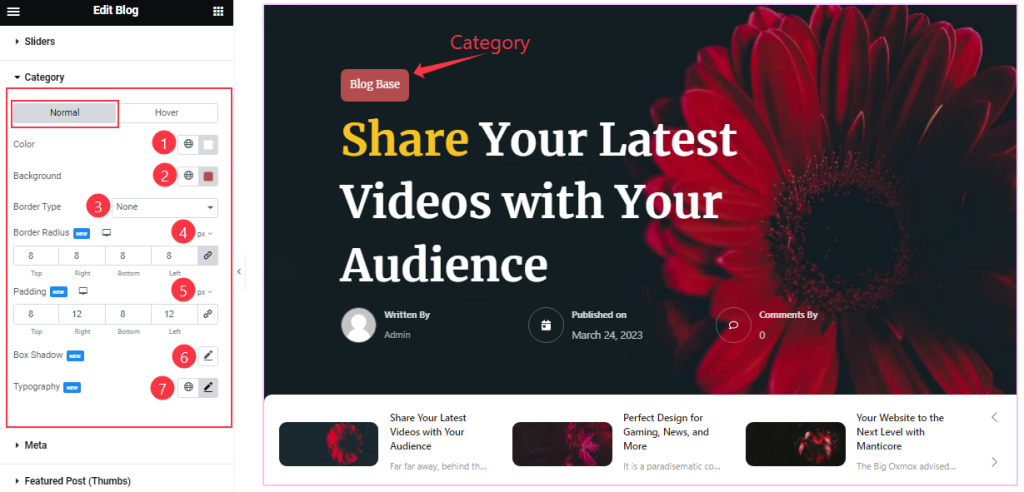
Come to the category section, In Normal mode, you can change the Category Color, Background Color, Border Type, Border Radius, and Padding as your wish.
Here you also set the Typography and Box Shadow.
Step-2
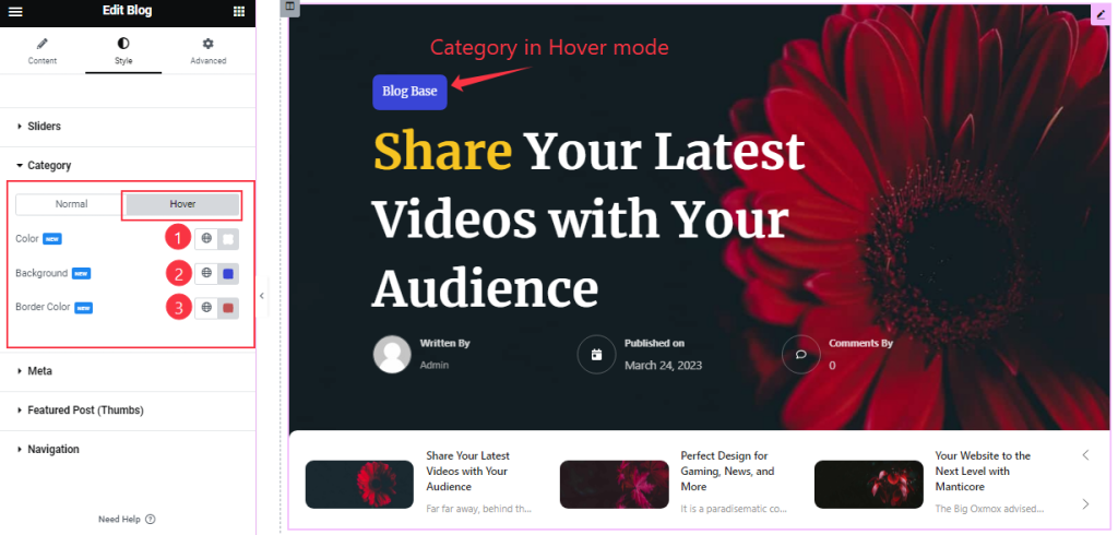
In Hover Mode, you can change the Category Color, Background Color, and Border Color to add a hover effect on the button.
Meta Section Customizations
Go to Style > Meta
Step-1
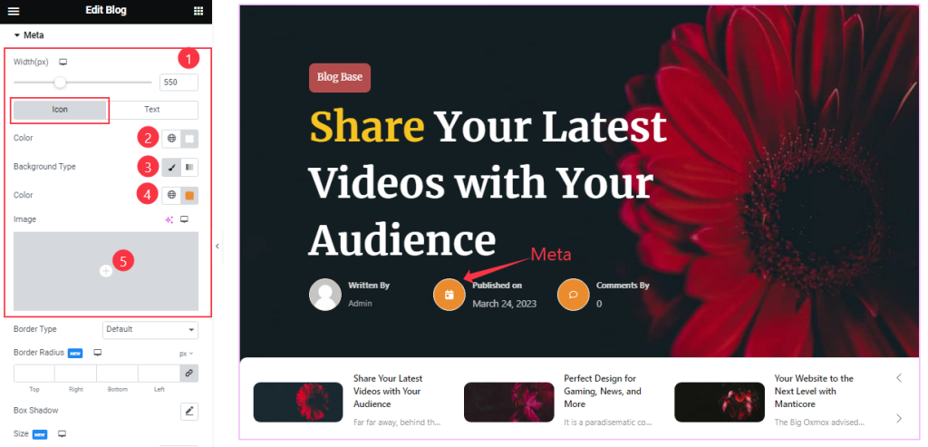
First, you may adjust the Meta Width to allocate the space for the meta content to show.
In this section, in Icon mode, you can change the Meta Icon Color, Icon Background Type, and Background Color and also set an image as Icon Background.
Step-2
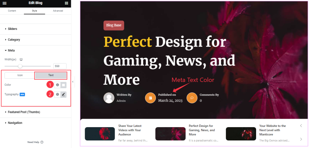
In Text Mode, you can change the Meta Text Color and Typography.
Step-3
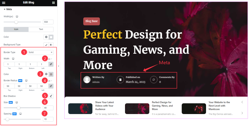
In the icon subsection, you will find more controls below such as Border, Border Radius, color, Box Shadow, Icon Size, and Spacing.
Featured Post (Thumbs) Section Customizations
Go to Style > Featured Post (Thumbs)
Step-1
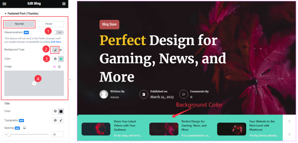
In Featured Post (Thumbs) section, you can easily on/off the Glassmorphism switcher button to add a glass morph effect on the thumbs background. You may customize the Background Type and Color or Image.
Step-2
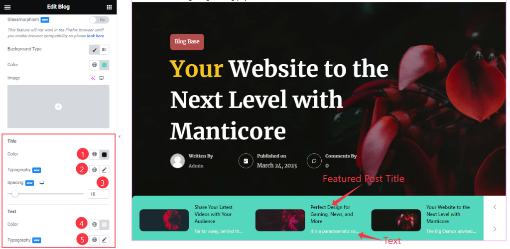
From here, in normal mode, you can change the Title Color, Spacing, Text Color, and Typography as your wish.
Step-3
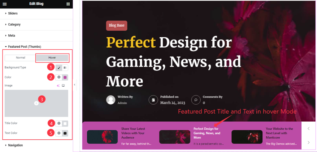
In Hover Mode, you will get the same customization options as in Normal Mode. So please try it yourself.
Work with the Navigation Section
Go to Style > Navigation
Step-1
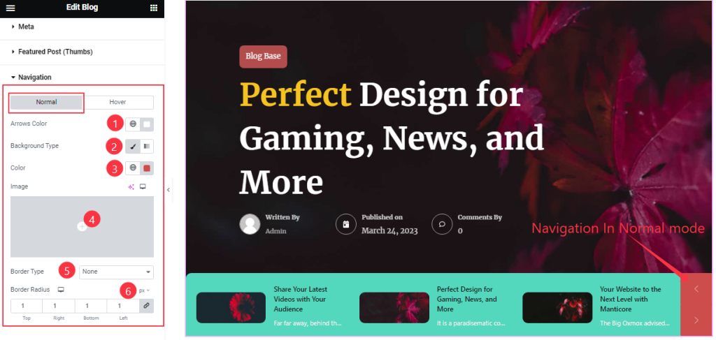
In Normal Mode, you can customize the navigation Arrows Color, Background Type, Border, and Border Radius.
Step-2
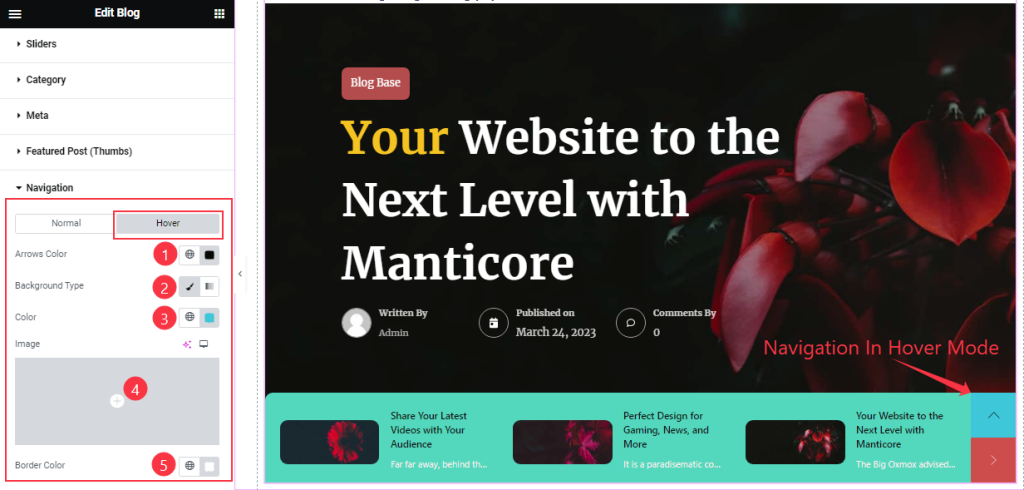
In Hover Mode, you will get similar options with the addition of the Border Color option.
All done! You have successfully customized the Blog Slider Zinest Skin widget on your website.
Video Assist
You can visit the demo page to learn more about the Blog(Zinest Skin) Slider widget.
Thanks for staying with us.