

In this documentation, we will show you how to customize the EDD Tabs widget brought to you by the Element Pack Pro addon.
Inserting the EDD Tabs widget
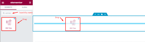
Go to the Elementor editor page, search by the name of the widget “EDD Tabs” and it will appear on the bar. Just drag and drop on the page.
You will require both Elementor and Element Pack Pro addons installed on your WordPress site in order to use the widget.
Customize edd tabs using the Content Tab
EDD Tabs item exploration
Go to Content > EDD Tabs
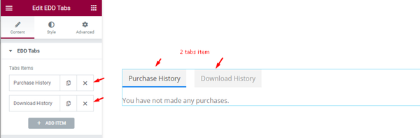
By default, the edd tabs contain two items, “ Purchase History” and “Download History”. You can see that the Purchase History tab opened and showed a message.
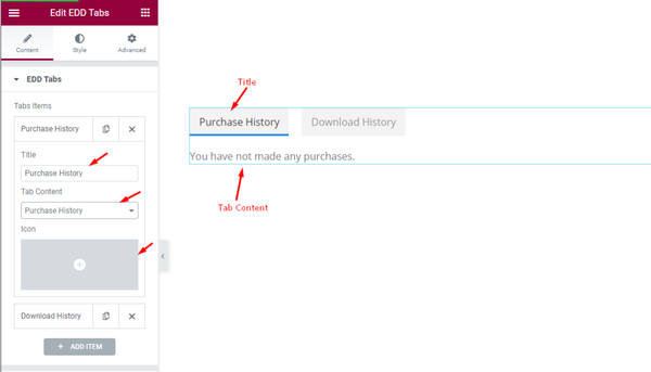
Each item box lets you customize the Title, select a Tab Content from predefined EDD resources, and set an Icon for that specific tab item.
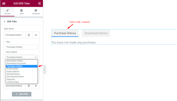
The predefined options pop up once you click on the Tab Content option. Then you can choose one option and the tab will display results from that.
Adding new items on tabs
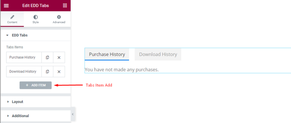
Click on the add item button to add new tabs to the EDD Tabs widget.
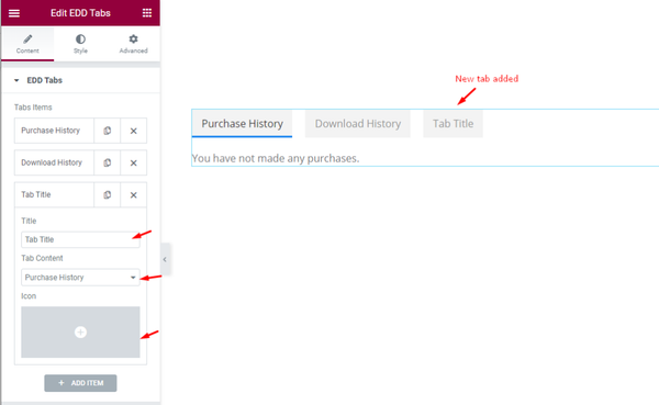
Each time you can set the Title, select Tab Content, and set Icon for the new tab item.
Layout Tab Exploration
Go to Content > Layout
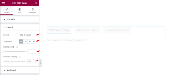
In the layout section, you can change the Layout (Top Default) of the tabs as well as customize the tabs Alignment (Left, Center, Right, and Full page). Nav spacing is for adjusting the space between the tabs. You can set the Content spacing also.
Customize the Additional section
Go to Content > Additional
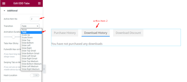
In the additional section, you can set the Active Item No which will show one tab as active. Then select animation Transition (Fade, Scale Up, Scale Down, Scale Top, etc.) for the tabs.
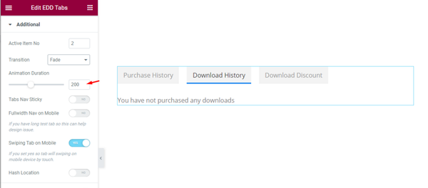
Find Animation Duration option and Tabs Nav Sticky, Fullwidth Nav on Mobile, Swiping Tab on Mobile, Hash Location switchers below.
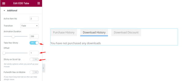
When the Tabs Nav Sticky switcher in on, you can set Offset for the nav.
Style Tab Customization
Customize the Style Tab
Go to Style > Tab
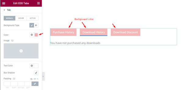
There are three subsections here; Normal, Hover, and Active.
You can customize the tab Background Color and Text Color, set a Box Shadow, adjust the Padding, Border, Radius, and Typography.
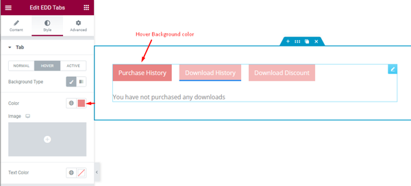
In hover, you can customize the Background Type and Text Color.
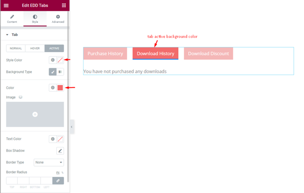
The Active subsection has identical options as the Normal section in order to hightlight the active tab item.
Content Section Customization
Go to Style > Content
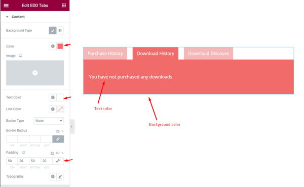
Here, you can customize Background Type, Text Color, Link Color, Border Type, Border Radius, Padding, and Typography options.
Icon Customization
Go to Style > Icon
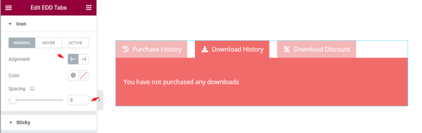
This section lets you customize the tab’s icons by Alignment, Color, and Spacing options.
Here, the Hover and Active subsections only offer icon Color customization.
Sticky section customization
Go to Style > Sticky
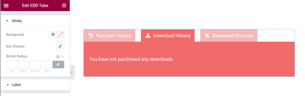
In case you turn on the Tabs Nav Sticky option from Content > Additional, you will be able to customize the sticky nav on this section.
Can customize the Background, Box shadow, and Border Radius.
More Options For Tabs Forms
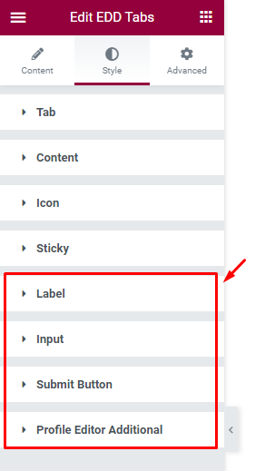
The options displayed in above screenshot work with a Form type tabs item. For demonstration, we will add a new tab named profile editor.
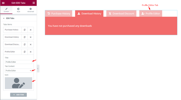
Then select Profile Editor for the Tab Content option.
Label Customization
Go to Style > Label
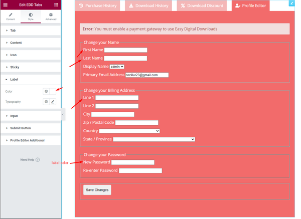
In the profile editor section, you can customize the form Label color and Typography.
Input section customization
Go to Style > Input
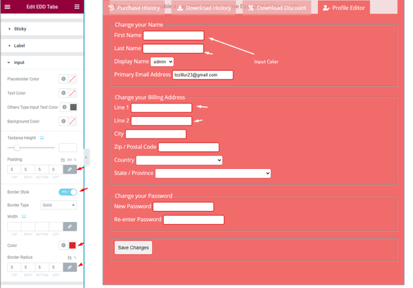
In the input section, you can customization Placeholder Color, Text Color, Input Text Color, Background Color, Textarea Height, Padding, Border type color, Border radius, etc. options to decorate the form input fields.
Submit Button Customization
Go to Style > Submit Button
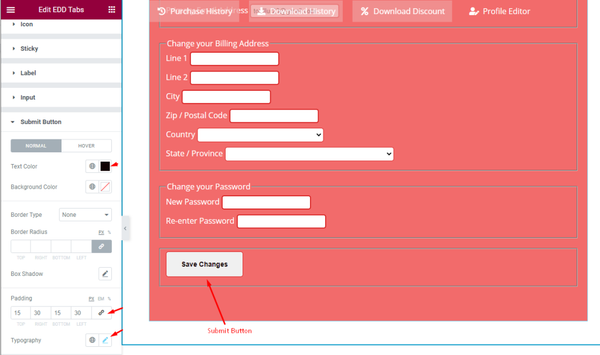
Submit button has two modes; Normal and Hover.
For Normal mode, you can customize the Text Color, Background Color, Border, Box Shadow, Padding, and Typography.
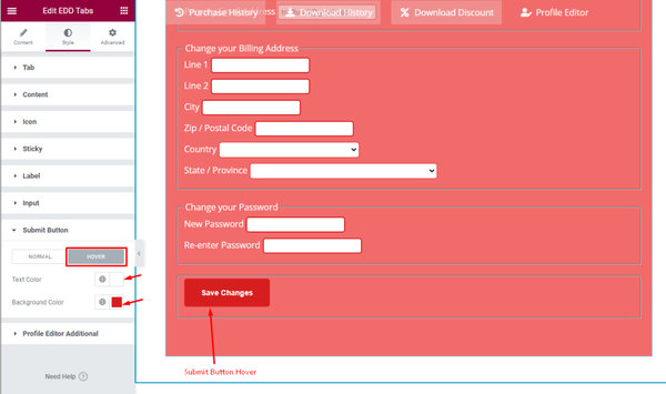
In the hover section, you can set the button Text Color and Background Color.
Profile Editor Additional section customization
Go to Style > Profile Editor Additional
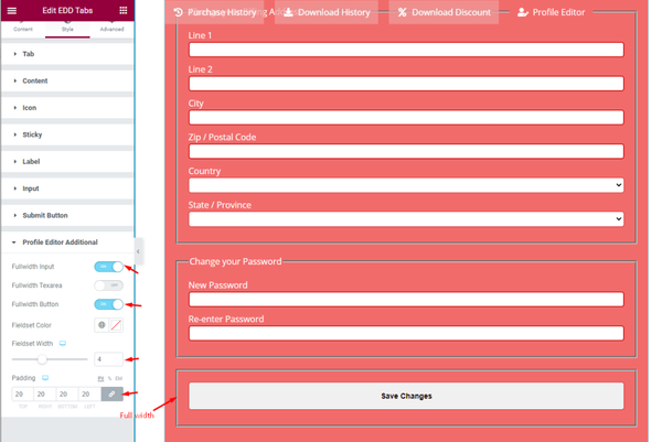
The additonal pack of options for Profile Editor has Fullwidth Input, Fullwidth Textarea, and Fullwidth Button switchers along with Fieldset Color, Fieldset Width, and Padding options.
Like this, you can create the EDD Tabs widget looks more professional and fit for your website/theme.
Video Assist
Video tutorial for EDD Tabs widget coming soon. Please visit the demo page for examples.
Thanks for being with us.