Do you need more than a slider to create a better expression of your website? The Fortune Slider widget is exactly what you want to get. This is a WordPress slider that combines the essence of art and creativity to display content more vibrantly as well as let your visitors enjoy navigating your posts, products, and information you are serving.
Let’s explore the slider customizations.
Inserting the Fortune Slider widget
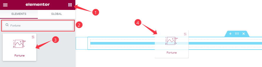
You can add this Prime Slider addon to WordPress by opening the page you want to use it on in Elementor and then dragging and dropping the Fortune Slider widget into that page. Please note that you need both Elementor and Prime Slider installed before you can use this widget.
Work With The Content Tab
Layout Section Customizations
Go to Content > Layout
Step-1
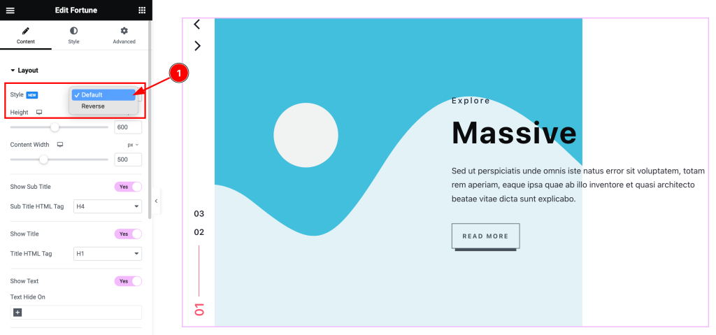
Come to the Layout section, and find the Layout Style (Default, and Reverse) options.
Step-2
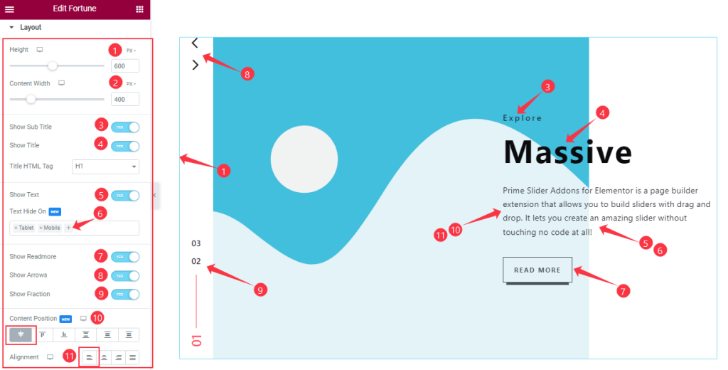
From the first section, you can customize the Height to adjust the net height of all slides and set the Content Width for showing your post content in a fixed range on your slides.
Then you will get the Show Title, Sub Title, Show Text, Show Readmore Button, Show Arrows, and Show Fraction switchers which you can turn on/off to show/hide these elements from the slider. You may choose to Hide Text On certain categories of devices like Desktop, Tablet, or Mobile.
The Alignment and Content Position option works on the text content so you can easily select the best text position on the Fortune Slider.
Sliders Section Customizations
Step-1
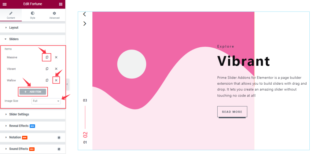
Go to the Content tab > Sliders
In this section, you can easily add a slider item by clicking Add Item button. Otherwise, you can easily increase your Item by clicking the Duplicate Sign symbol and you can also decrease/remove your item by clicking the cross sign as shown in the screenshot above. Here you can set the Image size as your wish from the Image option.
Step-2
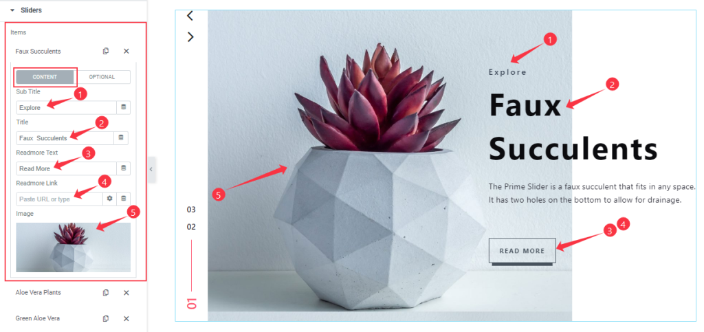
Let’s click the 1st slider item. In content Mode, you are able to change The Title name, Sub Title, and Read More Text and you can set a link under your Button. Also, you can set your slider image as you wish, as shown in the screenshot.
Step-3
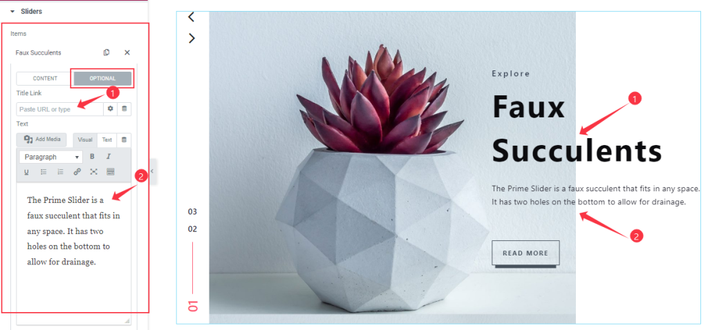
Here in Optional Mode, you are able to add a link under the Title and customize the Text Content as your wish. In the same process, you can customize the other item like the first one.
Customizations of Slider Settings
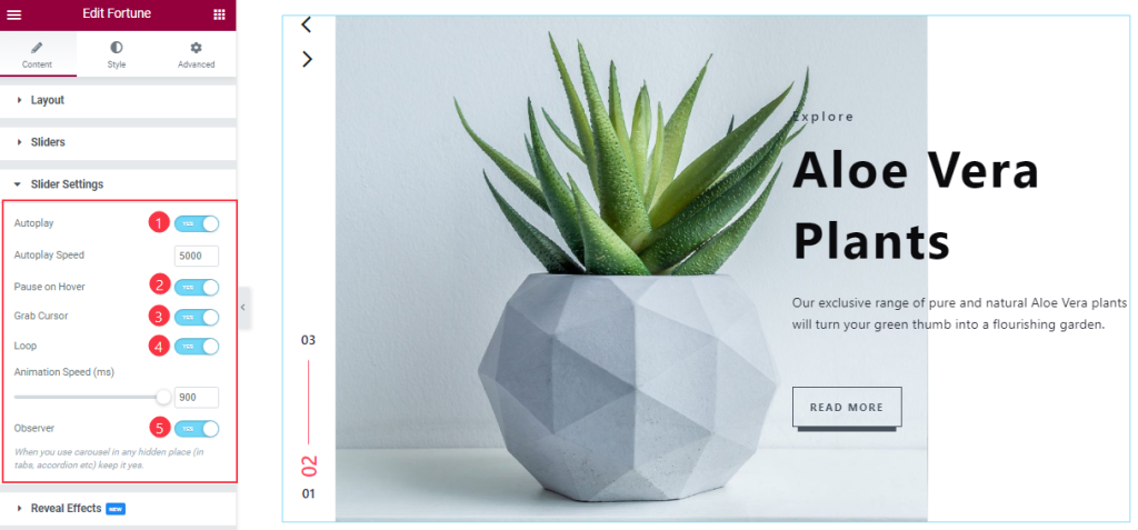
Go to the Content tab >Slider Settings.
you will be able to see some Switchers that are Auto Play, pause on Hover, Grab Cursor, Loop, and Observer. You can easily enable or disable those switcher buttons to apply specific effects. Also, you can customize the Autoplay Speed and Animation Speed for the slider.
Autoplay switcher: Enable the switcher to make the slider slide Automatically with a customizable Autoplay Speed control.
Pause on Hover: If turned on, when you Hover your mouse cursor on the slider then your slider will Hold, otherwise, your slider will Autoplay.
Grab Cursor: Change your mouse pointer icon into a hand-grab cursor when hovering on the slider.
Loop: you can easily enable or disable the switcher button. When you activate the Loop switcher button then your slider will loop at a certain time interval. You can also set up the loop animation speed here.
Observer: If you enable the option then you are able to use the carousel in any hidden places (such as in tabs, Accordion, etc).
Work With The Style Tab
Image Section Customizations
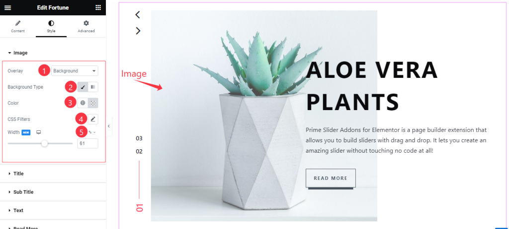
Go to the Style Tab > Image
Come to the Image section, Here you will get some customization options like Overlay Type, Overlay Color, and Background Type and you can easily change the color as you wish and also Customize the CSS Filter to your working demand like the screenshot. Here you also set the Image Width as your wish.
Style The Title Section
Step-1
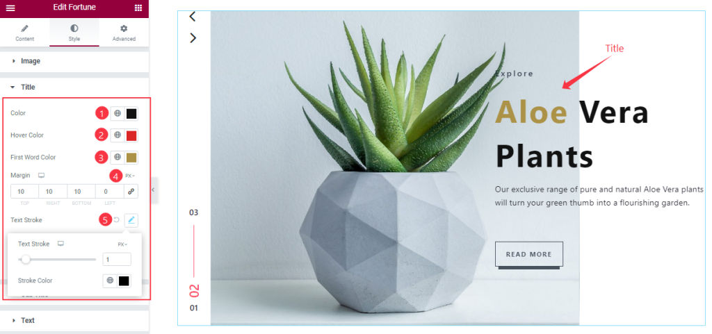
Go to the Style Tab > Title
Here, you will see options to customize the Title color, Title Hover color, First Word Color, Margin, Text Stroke, Typography, And add Text Shadow. you can easily customize the Title Color and Hover Color, First-word Color, and adjust the Margin, and Text Stroke as your wish above the screenshot.
Step-2
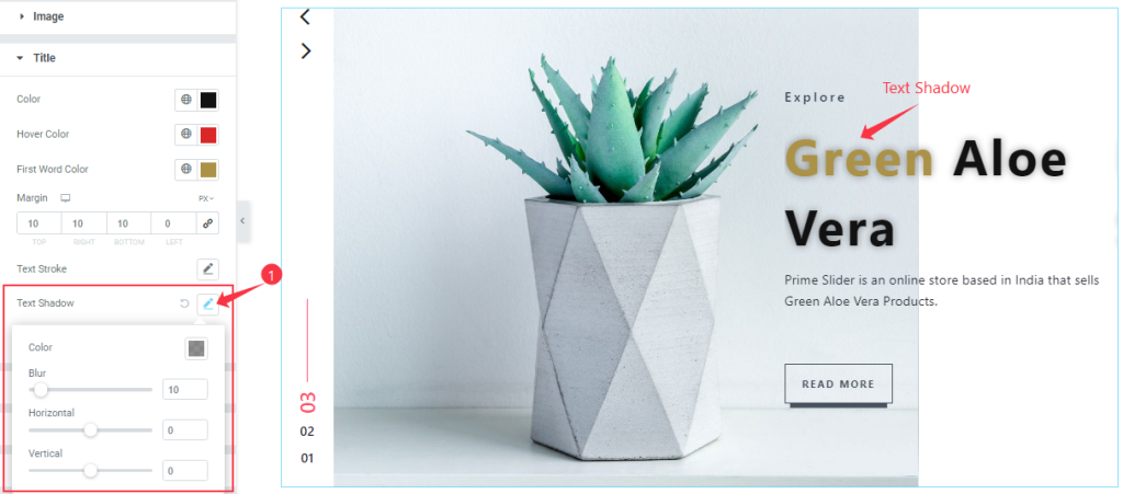
In this section, you will able to change the Text Shadow (Color, Blur, Horizontal, Vertical) by using the options. The Text Shadow gives you the feeling of Like 3D effects on your eye.
Step-3
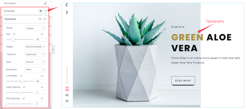
Here, You can set The Typography (Font Family, Size, Weight, Transform, Style, decoration, Line Height, Letter Spacing, and Word Spacing.) like the screenshot.
Customization The Sub Title Section
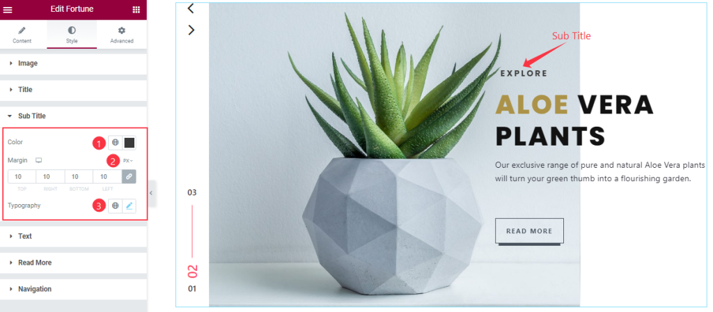
Go to the Style Tab > Sub Title
In this section, you can easily change the Sub Title Color, and Typography as you wish and also adjust the Margin for your Sub Title section like the screenshot.
Customization Of The Text Section
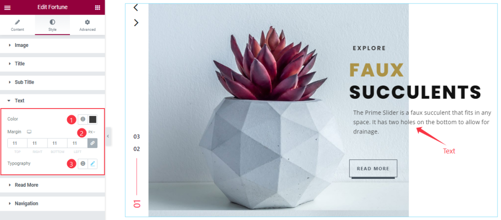
Go to the Style Tab > Text
Here you will get a similar set of controls to modify the appearance of this section like the sub Title section.
Read More Button Section Customizations
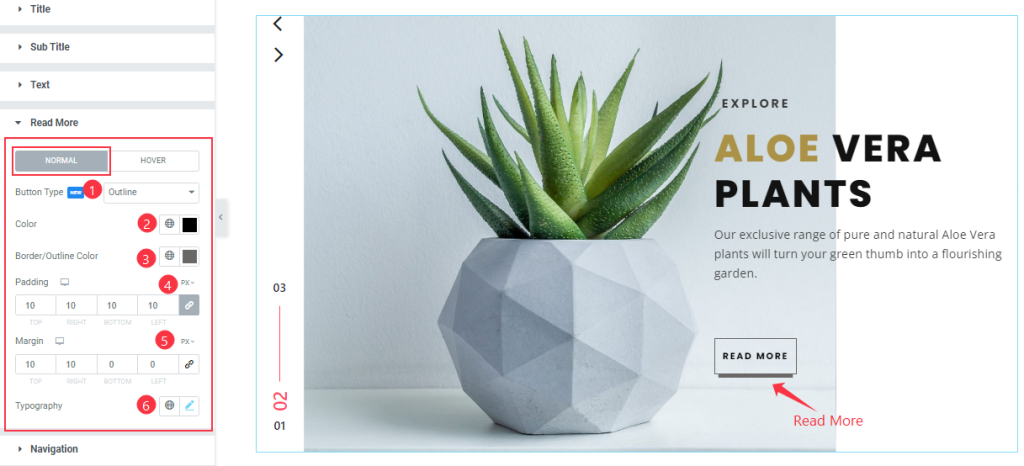
Go to the Style Tab >Read More
Come to the Read More Button section, Here you can change between two modes, in Normal mode, you change the Button Border Type, Text Color, and Border Color as you wish. you also adjust the Padding and Margin and customize the Typography from this section.
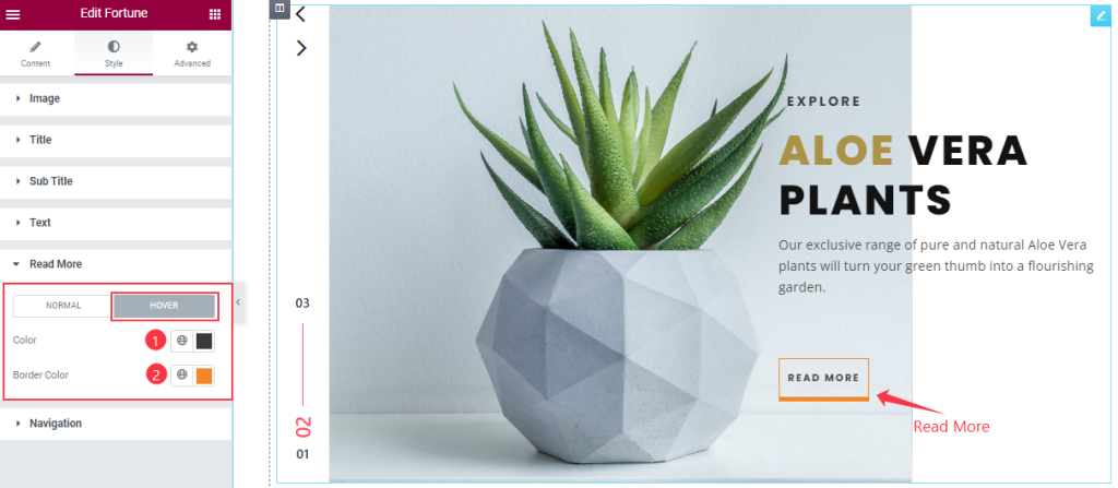
Here in Hover mode, you can change the Button Text Color and Border Color like in the screenshot.
Navigation Section Customization
Step-1
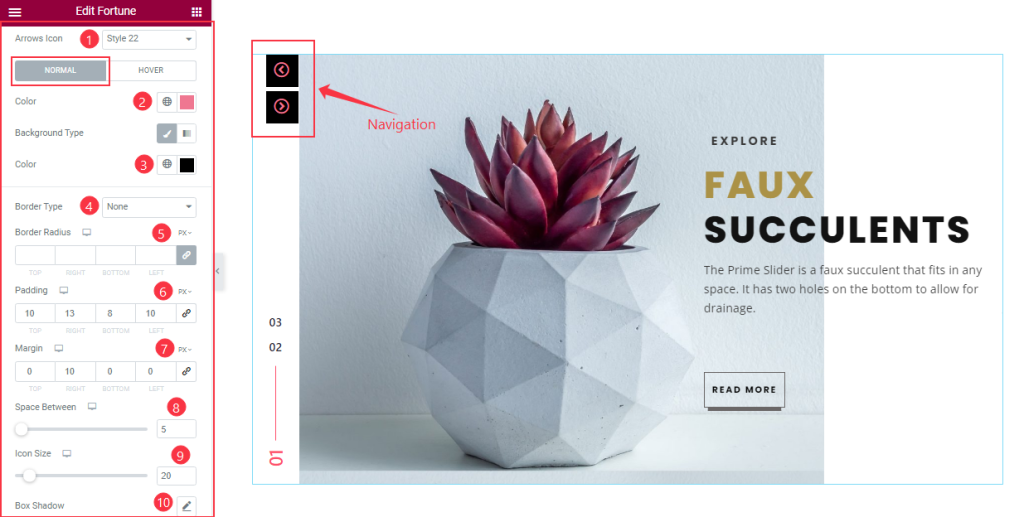
Go to the Style Tab > Navigation
come to the Navigation section, Here you can change between two modes, in Normal mode, you can change the Arrows Icon Style, Arrows Color, and Arrows Background Color, and customize the value of Border Radius, Padding, and Margin to your working demand. Here you also set the Space Between and Icon size and if you want then you can add the Box Shadow like before.
Step-2
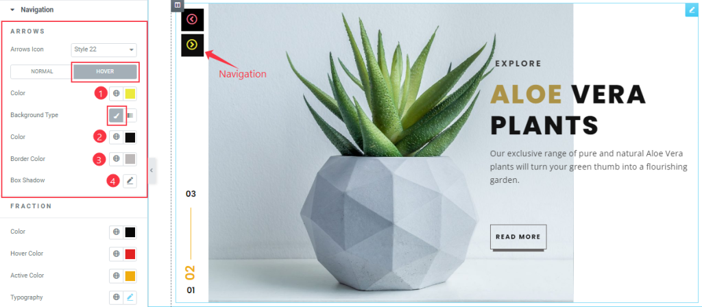
Here in Hover mode, Also you will get a similar set of controls to modify the appearance of this section like normal mode.
Step-3
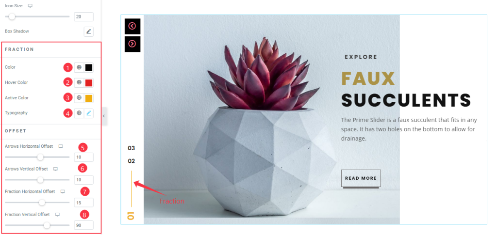
In this section, you will get some controls to modify the appearance like the screenshot. You can easily change the Fraction Color, Hover Color, Active Color, and Typography.
Here you also set the value of Arrows Horizontal Offset, Vertical Offset, Fraction Horizontal Offset, and Vertical Offset as shown in the screenshot.
All done! You have successfully customized the Fortune Slider widget on your website.
Video Assist
Please watch the quick video to learn more about the widget.
You can visit the demo page to learn more about the Fortune Slider widget.
Thanks for staying with us.