

In this documentation, we will show you how to customize the EDD Mini Cart widget presented by the Element Pack Pro add-on.
Insert EDD Mini Cart
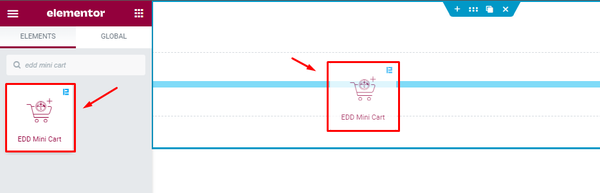
Open your page in the Elementor editor, search by the EDD Mini Cart widget name, then drag and drop it.
Content Tab Customization
Mini Cart section
Go to Content > Mini Cart
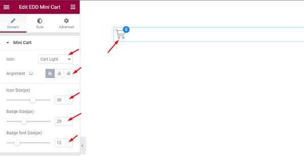
- Icon: Choose the Icon for the Mini Cart widget. Pre made icon are available.
- Alignment: Set the alignment of the Mini Cart Left, Right, Center.
- Icon Size(px): Set the size of the Icon.
- Badge Size(px): Set the Badge size of the Icon.
- Badge font Size(px): Set the font size of the Badge.
Offcanvas section
Go to Content > Offcanvas
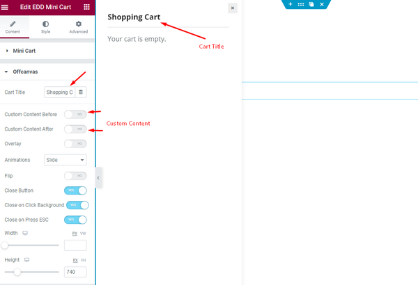
- Cart Title: Set the Title for the Cart.
- Custom Content Before: This demonstrate the Before content of the Offcanvas.
- Custom Content After: This demonstrate the After content of the Offcanvas.
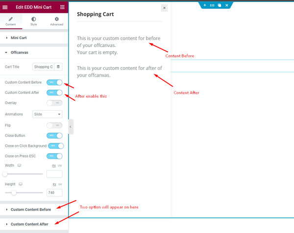
- Custom Content Before: Enable the switcher and it will appear new section controls for Customizing the Before content.
- Custom Content After: Enable the switcher and it will appear new section controls for Customizing the After content.
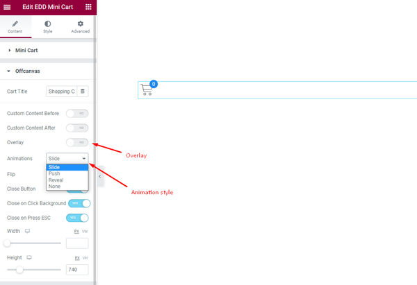
- Overlay: Show the Overlay color for the Offcanvas.
- Animations: Set the animation for the offcanvas, It demonstrate the Slide, Push, Reveal, None animation.
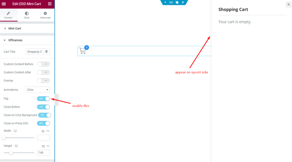
- Flip: Enable the switcher it will flip the offcanvas.
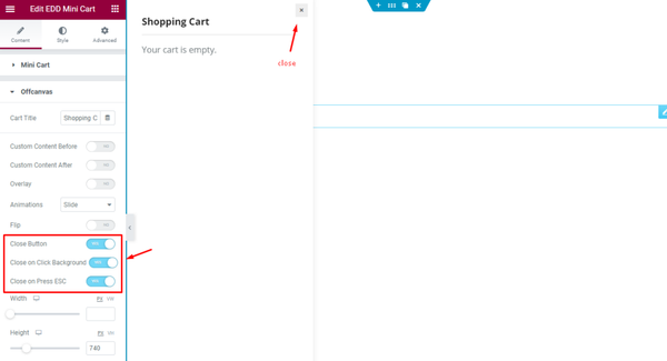
- Close Button: Enable the switcher to show the close button.
- Close on Click Background: Enable it to close the offcanvas by clicking on the Background.
- Close on Press ESC: Enable the switcher to close the offcanvas by pressing the ESC Button.
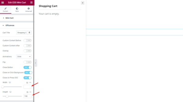
- Width: Set the width for the Button. The Size are responsive allow different size for different devices.
- Height: Set the Height of the Button. The Size are responsive allow different size for different devices.
Custom Content Before section
Go to Content > Custom Content Before
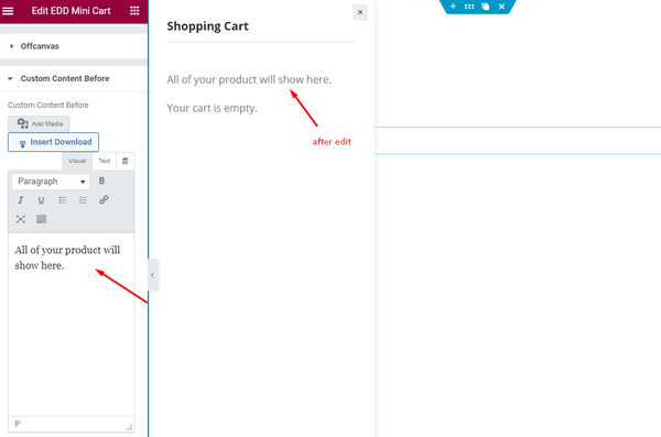
- Custom Content Before: Set the content for the before text.
Custom Content After section
Go to Content > Custom Content After
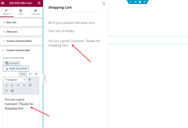
Custom Content After: Set the content for the after content.
Style Tab Customization
Mini Cart section
Go to Style > Mini Cart
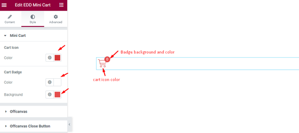
Cart Icon
- Color: Set the color for the Cart Icon.
Cart Badge
- Color: Set the color for the Cart Badge.
- Background: Set the background for the cart badge.
Offcanvas section
Go to Style > Offcanvas
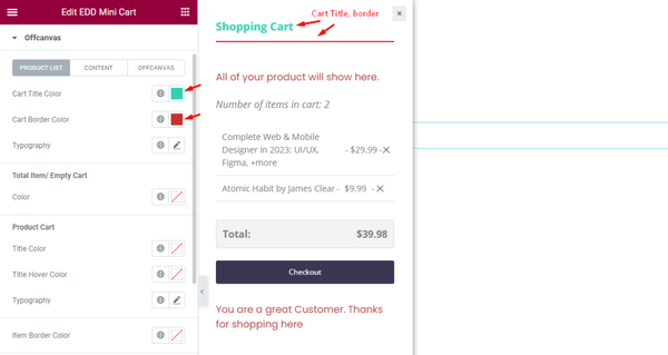
PRODUCT LIST
- Cart Title Color: Set the color for the Cart Title Color.
- Cart Border Color: Set the border color for the Cart.
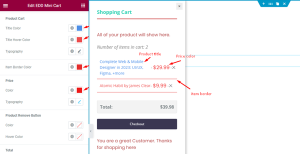
Product Cart
- Title Color: Set the color for the Title.
- Title Hover Color: Set the hover color for the Product Cart.
- Typography: Set the typography of the Cart.
- Item Border Color: Set the border Item Color.
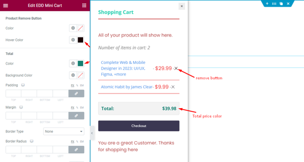
Product Remove Button
- Color: Set the color for the Product Remove Button.
- Hover Color: Set the hover color for the Button.
Total
- Color: Set the color for the Total Amount of the Product Item.
- Background Color: Set the color for the Background.
- Padding: Set the Padding for the button area.
- Margin: Set the margin for the outer space.
- Border Type: Set the border type.
- Border Radius: Set the border radius.
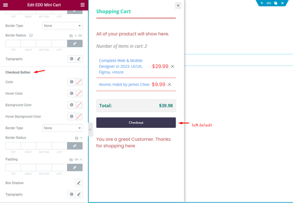
Checkout Buttons
- Color: Set the color for the button.
- Hover Color: Set the hover color.
- Background Color: Set the color for the Background.
- Border Type: Set the border type.
- Border Radius: Set the border radius.
- Padding: Set the padding for the spacing.
- Box Shadow: Set the shadow for the Box.
- Typography: Set the typography for the Button.
CONTENT
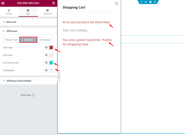
CONTENT
- Text Color: Set the Text Color.
- Link Color: Set the color of the link.
- Link Hover Color: Set the Hover Color for the Button.
- Typography: Set the Typography for the Content.
OFFCANVAS
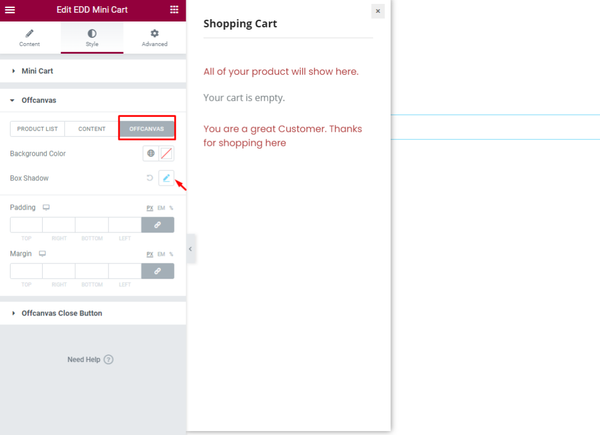
OFFCANVAS
- Background Color: Set the color for the Offcanvas.
- Box Shadow: Set the Box Shadow.
- Padding: Set the padding.
- Margin: Set the margin for the spacing.
Video Assist
The video Tutorial will come soon. Please visit the demo page for examples.
Thanks for being with us.