With the comparison list widget by Element Pack Pro, you can create product, services, or software package comparison lists in order to show the differences or advantages of different packages very easily.
Let’s explore the customizations.
Inserting Widget

Use the search bar of the Elementor editor page, search by typing Comparison List, and then the widget will appear on the menu. Just Drag it and Drop it on the page.
Content Tab Customizations
Comparison List section
Go to Content > Comparison List
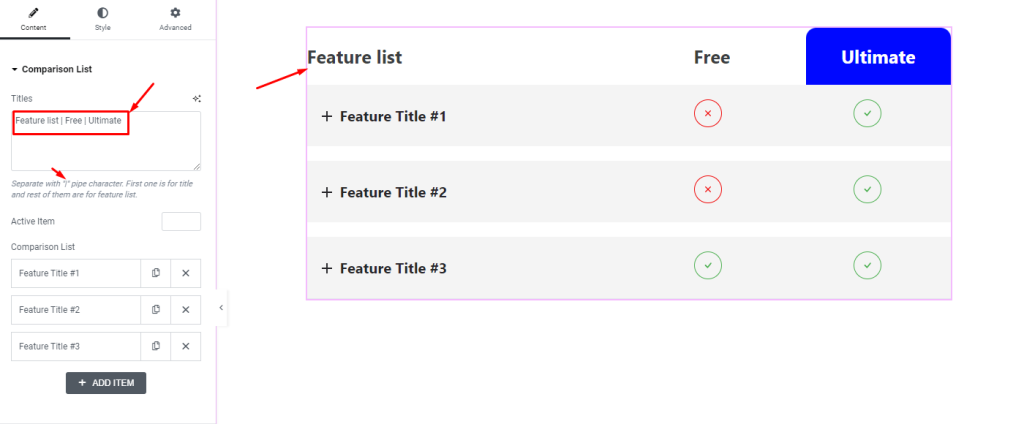
First, the Titles field lets you add the feature/comparison titles one after another. Using the pipe ” | ” character, you will have to separate the titles. By default, there will be 3 titles that you can increase, decrease, or change the text anytime you want.
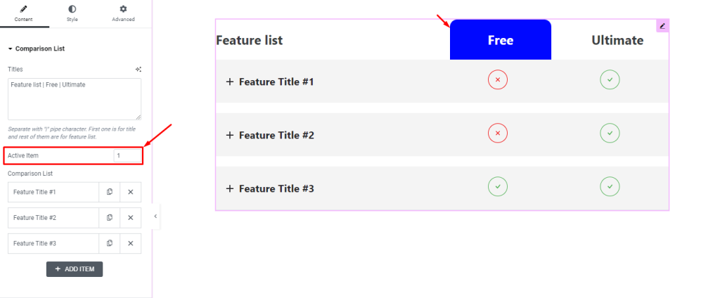
The Active Item field determines which title will be highlighted in the list. The number here will base on the numerical sequence from left to right, excluding the first title.
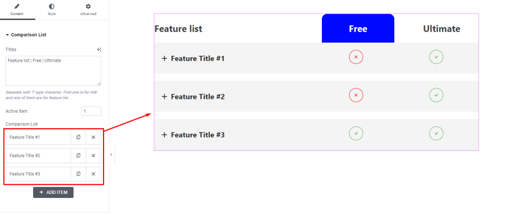
Below are the feature items listed in box shapes. Here, you can find a Duplicate and Close button on each feature item box. Also, there will be an Add Item button below which you can click to add new items.
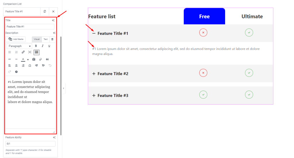
Clicking on a feature item box will unfold the inner options with a Title field and a Description field. By customizing the title and text, you can change the detail about the features on the display.
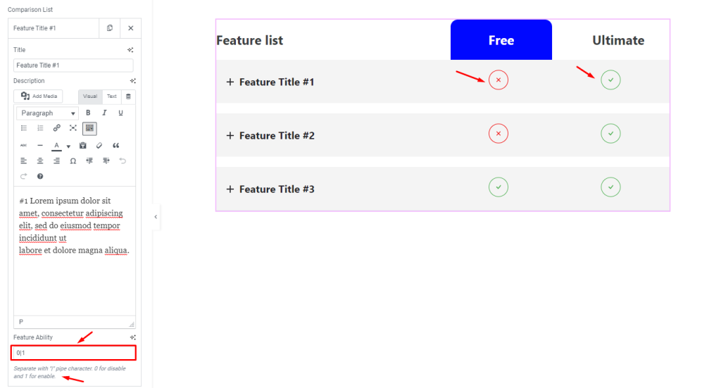
The Feature Ability field determines if the particular feature is available for the next titles. Here, 0 means no, and 1 means yes. You have to line up the numbers per sequence with the pipe ” | ” character.
Style Tab Customizations
Header Feature section
Go to Style > Header Feature
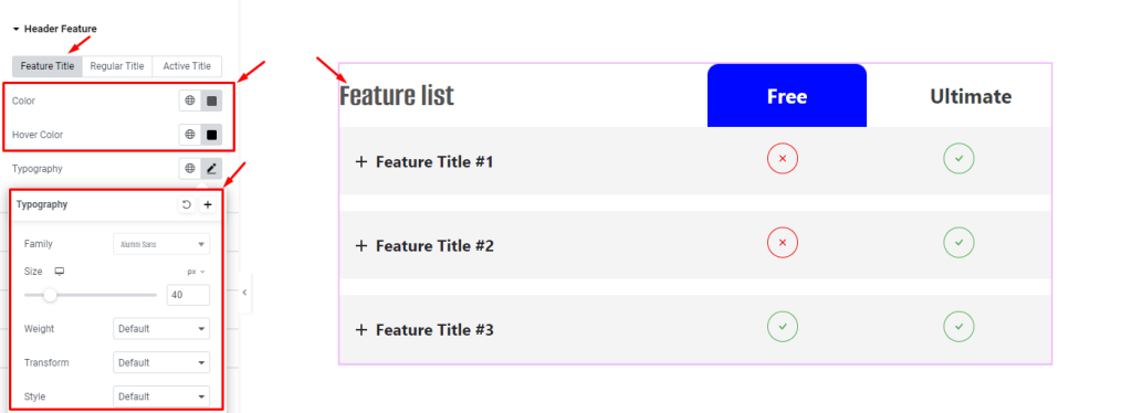
The first section within the style tab lets you customize the color of the Feature Title separately under the corresponding subsection. The options are Color, Hover Color, and Typography.
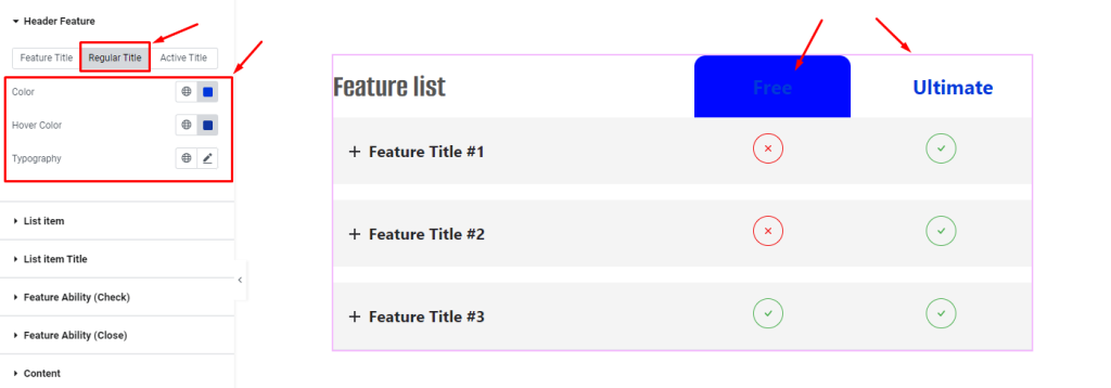
The same options are available in the Regular Title subsection also. The regular title means all other titles except for the featured one.
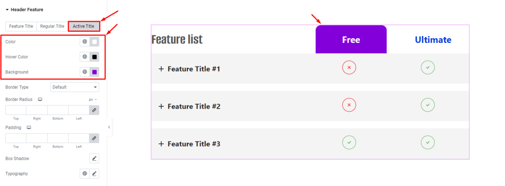
For the Active Title, apart from the text Color and Hover Color options, you can customize the text Background Color which tells apart the active feature list from others.
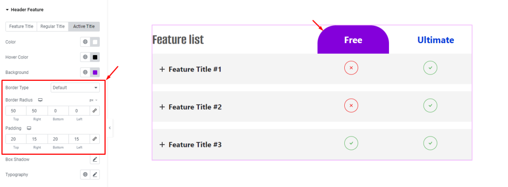
Then you can customize the Border Type, Border Radius, and Padding to refine the shape of the background.
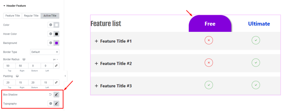
Using the Box Shadow and Typography, you can enhance the visuals by adding a subtle shadow property to the background and changing the font style.
List Item section
Go to Style > List Item
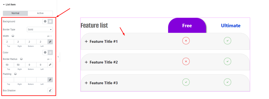
In this section, you can customize the list item Background Color, Border Type, Width, Color, Radius, Padding, and Box Shadow. In the image, we went with the minimum by editing the background and border color with a thin border width and top-right border radius values.
List Item Title section
Go to Style > List Item Title
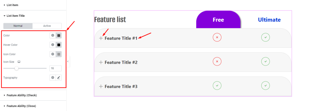
There are separate Color, Hover Color, Icon Color, Icon Size, and Typography customizations for the list item titles.
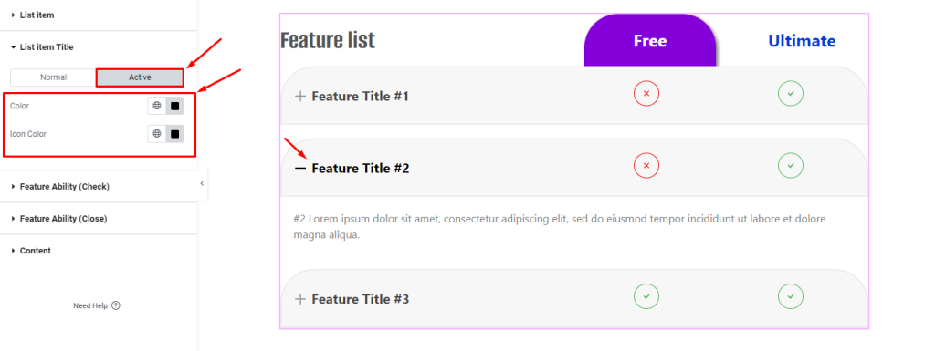
And the text Color and Icon Color are editable for the Active mode also.
Feature Ability (Check) section
Go to Style > Feature Ability (Check)
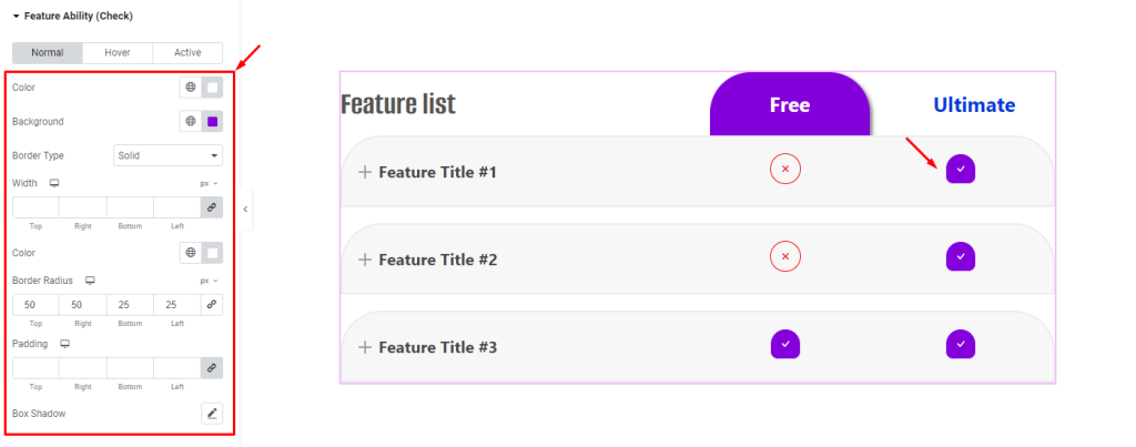
This section lets you customize the check sign ( for 1 value input on features ) by letting you customize the Color, Background, Border, Padding, and Box Shadow for Normal, Hover, and Active modes.
Feature Ability (Close) section
Go to Style > Feature Ability (Close)
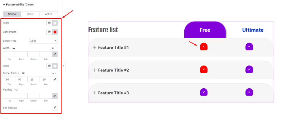
This section lets you customize the close sign ( for 0 value input on features ) by letting you customize the Color, Background, Border, Padding, and Box Shadow for Normal, Hover, and Active modes.
Content section
Go to Style > Content Section
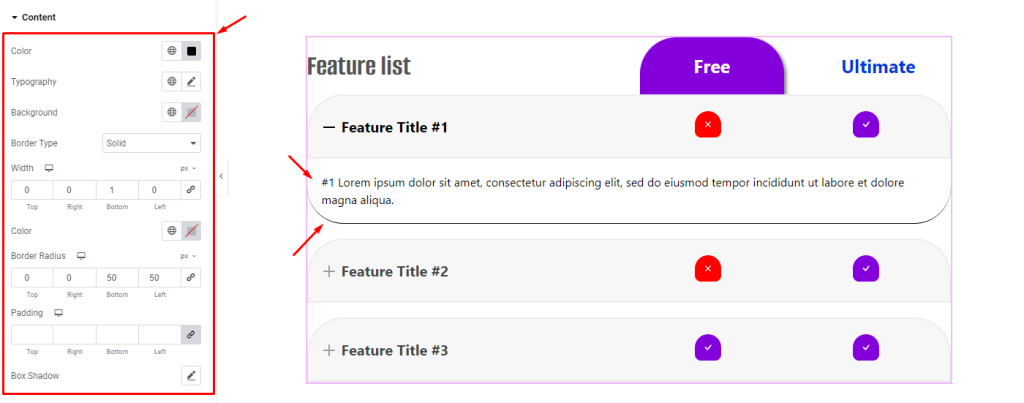
Lastly, you can customize the content belonging to the feature items by changing the Color, Typography, Background, Border, Padding, and Box Shadow properties.
With all these familiar options, you can easily create unique feature lists using our widget.
Video Assist
The Comparison List widget video coming soon. Please check the demo page for examples.
Thanks for staying with us.
