

In this documentation, we will show you how to customize the Portfolio Gallery widget presented by Element Pack Pro.
Inserting The Portfolio Gallery Widget
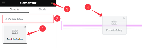
On the Elementor editor page, search by the Portfolio Gallery widget name, then drag and drop it on the page.
Note: You need both Elementor and Element Pack Pro installed to use this widget.
Content Tab Customizations
Layout section
Go to Content > Layout
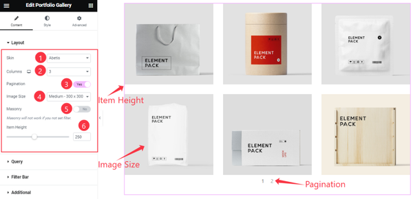
Come to the Layout section, find the Skin( Default, Abetis, Fedara, Trisia, and Janes), Columns, Image Size, and Item Height options.
Also, find the Pagination, and Masonry switchers.
Query section
Go to Content > Query
Step-1
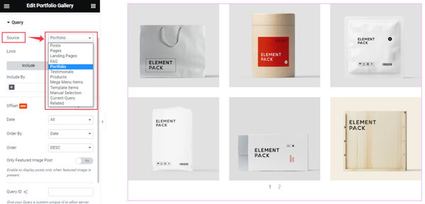
Find the Source (Posts, Pages, Landing Pages, FAQ, Portfolio, etc.) options.
Step-2
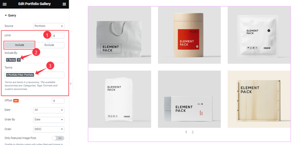
Here find the Item Limit and Also, find the Include > Include By and Terms filters. Include filter helps show only selected posts/Portfolios.
Step-3

Exclude filter does exactly the opposite of the Include filter and helps hide selected posts/Portfolios.
Step-4
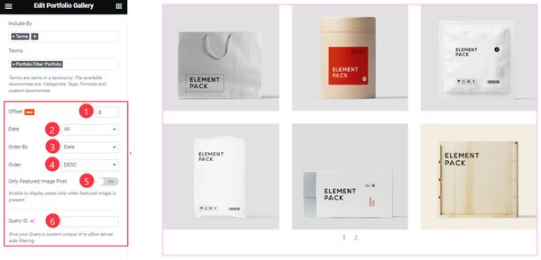
Then find the Offset, Date, OrderBy, Order, Ignore Sticky Posts, and Only Featured Image Post options.
The Query ID field is for applying custom queries on WordPress.
Filter Bar section
Go to Content > Filter Bar
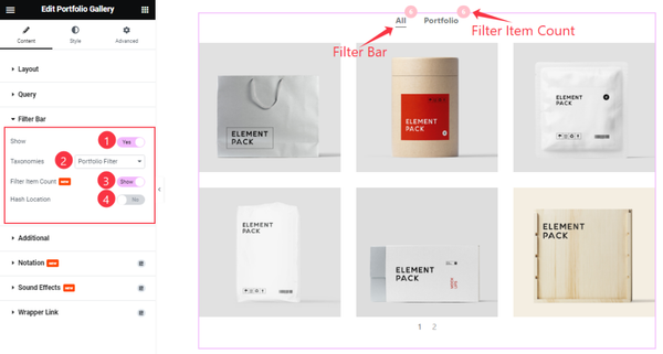
Find the Show, Filter Item Count, Hash Location switchers, and Taxonomies options.
Additional section
Go to Content > Additional
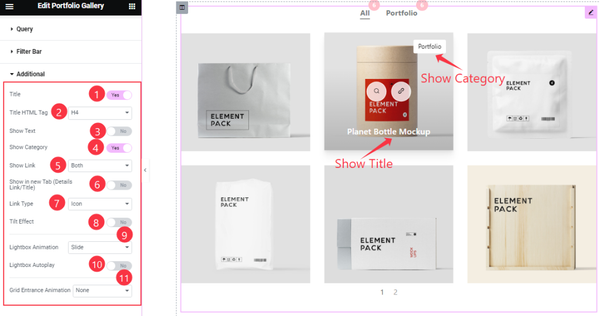
Here, Find the Title, Show Text, Show Category, Show in new Tab, Tilt Effect, and Lightbox Autoplay switchers.
Also, Find the Title HTML Tag, Show Link, Link Type, Lightbox Animation, and Grid Entrance Animation options.
Work with The Style Tab
Items section
Go to Style > Items
Step-1
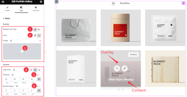
Come to the Items section, you will find three sub-section; Overlay, Content, and Item.
In the Overlay sub-section, Find the Background Type, Color, and Image options.
Also in the Content sub-section, Find the Alignment, Padding, and Border Radius options.
Step-2
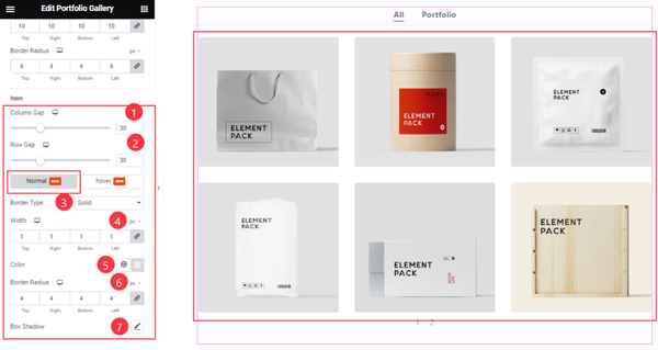
Come to the Items sub-section, In Normal Mode, Find the Column Gap, Row Gap, Border Type, Width, Color, Border Radius, and Box Shadow options.
Step-3
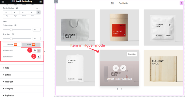
In Hover Mode, Find the Border Color, and Box Shadow options.
Title section
Go to Style > Title
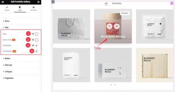
Find the Title Color, Hover Color, Typography, and Text Shadow options.
Button section
Go to Style > Button
Step-1
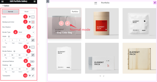
Come to the Button section, you will find two sub-section; Normal and Hover.
In Normal Mode, Find the Button Color, Background Color, Box Shadow, Border Type, Width, Border Color, Border Radius, Padding, and Typography options.
Also, Find the Advanced Radius switcher.
Step-2
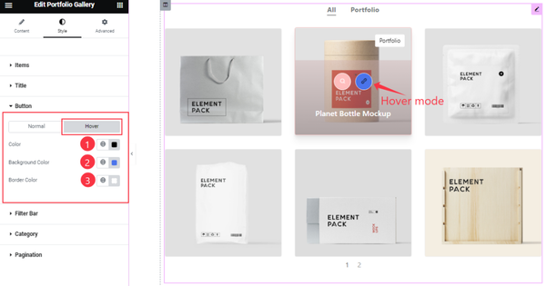
In Hover Mode, Find the Button Color, Background Color, and Border Color options.
Filter Bar section
Go to Style > Filter Bar
Step-1
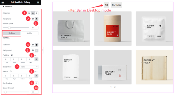
Come to the Filter Bar section, you will find two sub-section; Desktop, and Mobile.
In Desktop Mode, Find the Alignment, Typography, Bottom Space, Text Color, Background Color, Padding, Border Type, Radius, Box Shadow, and Space Between options.
Step-2
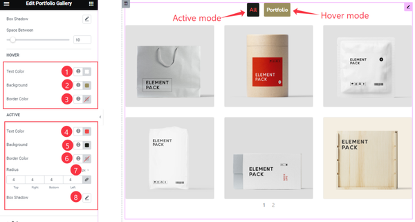
In Desktop mode, in the Hover sub-section, Find the Text Color, Background Color, and Border Color options.
In the Active sub-section, Find the Text Color, Background Color, Radius, and Box shadow options.
Step-3
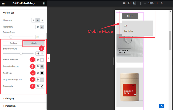
In Mobile Mode, Find the Button Width, Button Text Color, Button Background, Text Color, Dropdown Background, and Typography options.
Category section
Go to Style > Category
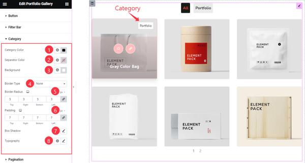
Find the Category Color, Separator Color, Background, Border Type, Border Radius, Padding, Box Shadow, and Typography options.
Pagination section
Go to Style > Pagination
Step-1
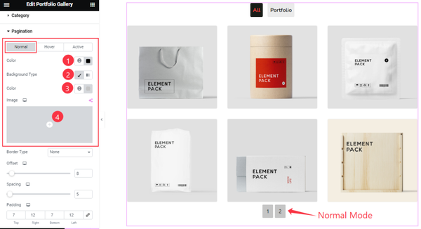
Come to the Pagination section, you will find three sub-section; Normal, Hover, and Active.
In Normal mode, Find the Pagination Color, Background Type, Color, and Image options.
Step-2
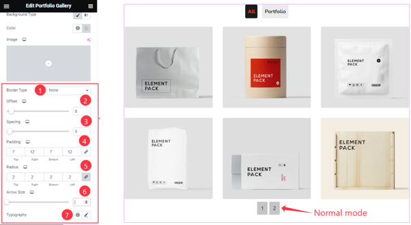
In Normal Mode, also Find the Border Type, Offset, Spacing, Padding, Radius, Arrow Size, and Typography options.
Step-3
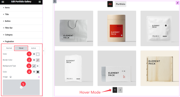
In Hover Mode, you will find similar customization options in this section like Normal mode.
Step-4
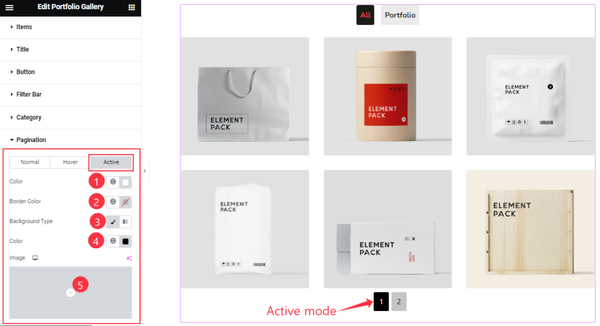
In Active mode, you will also find similar customization options in this section like Normal/Hover mode. So please try it yourself.
All done! You have successfully customized the Portfolio Gallery widget on your website.
Video Assist
You can also watch the tutorial video about the Portfolio Gallery widget. Please visit the demo page for examples.
Thanks for staying with us.