

In this documentation, we will discuss the customization of the Camux Slider widget, brought to you by the Ultimate Post Kit addon for Elmentor.
Inserting the Camux slider widget
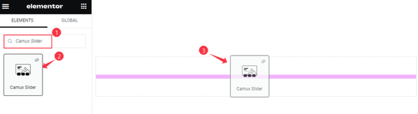
Inserting widgets is an easy task. Just go to the Elementor page then search by the name of the specific widget. Then the widget will appear, just drag it and drop it on the page.
Default View of the Camux Slider
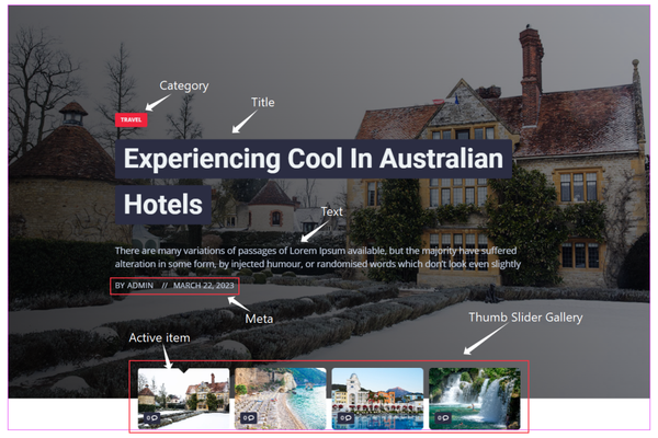
This is the default view of the Camux slider widget. Here is the Full-width Image and the Content. Content has Category, Title, Text, and Meta. Below is the Thumb Slider Gallery with Active Item.
Work with Content Tab
Layout Customization of the Camux Slider
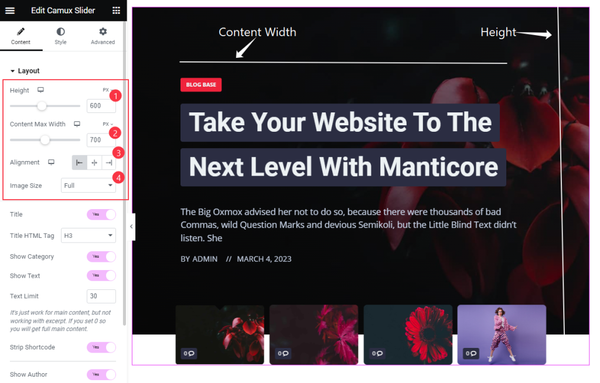
Go to Content > Layout
Here we will set the Height of the Image and Set the Content max width. All the content will be visible in the maximum area. We have set Aligntment for the Content and Set the Image size to Full.
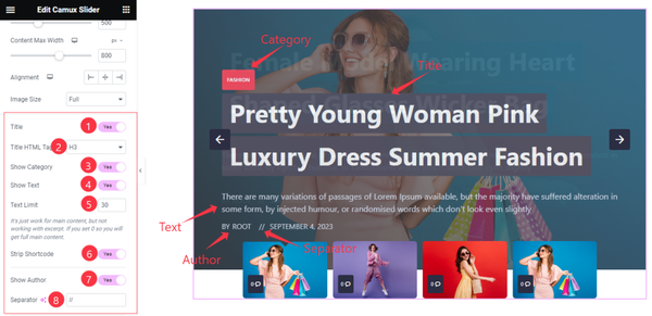
In this section, find the Title, Show Category, Show Text, Strip Shortcode, Show Author switchers, Title HTML Tag, Text Limit, and Separator options.
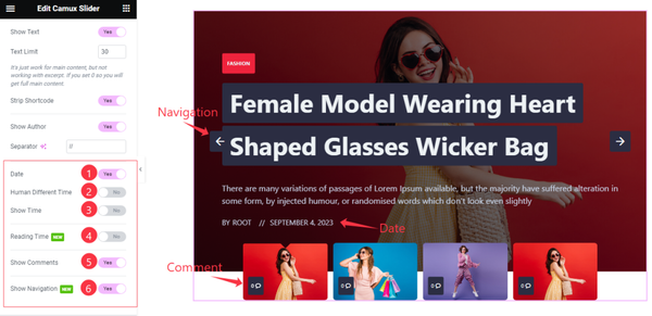
Here also find the Date, Human Different Time, Show Time, Reading Time, Show Comments, and Show Navigation options.
The query for the Slider
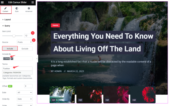
Go to Content > Query
You can make a query for this slider, here you can select Item Limit and Select the Sources. Sources are most important for that where you want to show the Content. We have selected the posts.
You can select a specific category by using the Include By Terms and select any Category, and Tags name.
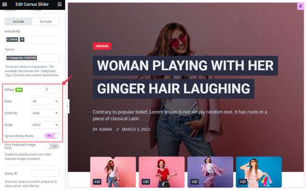
Here you can display the posts in various ways, you can select the Offset and set posts by Date, Order By, or Order. There the switcher Ignore Sticky Posts will ignore the sticky post.
Set Slider Settings
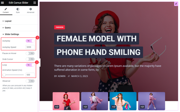
Go to Content > Slider Settings
For the animation of the slider here we have enabled the Autoplay Switcher and Set Autoplay Speed. To repeat the slider we have enabled the Loop Switcher and Set Animation Speed. This will make the slider good animation and looping.
These are all the options in the Content Tab. Now go to Style Section to change the appearance of the Widget.
Style the Camux Slider
Item Customization
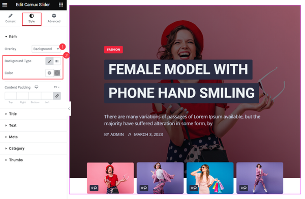
Go to Style > Item
For the item, we have selected the Overlay Background and set the Background Color. Left the Content Padding by default. Which is looking good.
Set Title for the Camux Slider
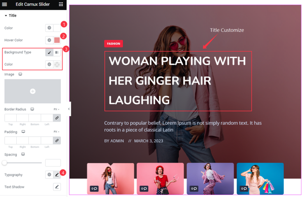
Go to Style > Title
Here for the Title, we have set Color, Hover Color, and Background Color Transparent. Set the Typography for the title. The other option we have left default. Follow the screenshot above.
Text Customization
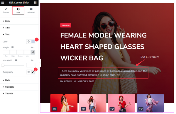
Go to Style > Text
In this section, we have styled the text. We have set the Color and Typography for the text.
Meta section Customization
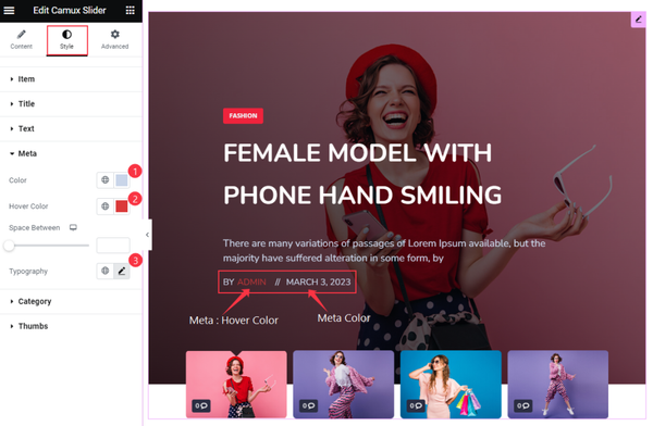
Go to Style > Meta
You can customize the Meta section. Here you will get several options to change. We have set the Color, Hover Color, and Typography for the Meta.
Category Customization
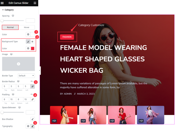
Go to Style > Category
We have to change the default option of the category. In the normal mode, we have set Color, Background Color, Padding, and Border Radius. We have also set the Typography for the font. The other option is left as default.
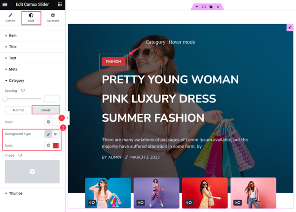
In the hover mode, we have set the Color and Background Color for the Category.
Thumbs Customization of Camux slider
Go to Style > Thumbs
Comments Customization
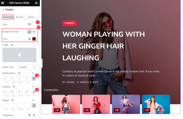
For the comments of the thumbs, we have set several options to customize this. Here we have set Color, Background Color, Border Radius, and Padding.
Set Border in Normal style
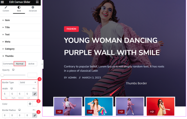
For the Thumbs, we have set Border Type Solid and set Border Width. Color and Border Radius for the Thumbs.
Active Style for the Thumbs Item
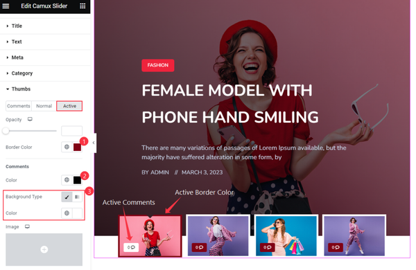
In thumbs active mode, we have set the Border Color for the Items. For the Comments Text Color and Background Color.
Navigation Section
Go to Style > Navigation
Step-1
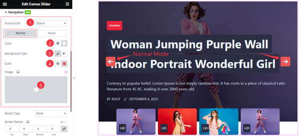
Come to the Navigation section, you will find two sub-sections; Normal and Hover.
In the Normal mode, Find the Navigation Color, Background Type(Classic, and Gradient), Background Color, and Image options.
Step-2
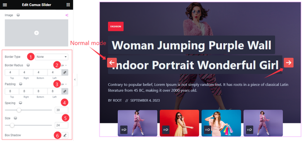
Here find the Border Type, Border Radius, Padding, Spacing, Size, and Box Shadow options.
Step-3
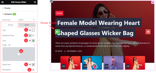
In the Hover mode, you will get a similar customization option as in the Normal mode. So please try it yourself.
That’s all for the Camux slider.
Video Assist for Camux Slider
Watch the Video tutorial of Camux slider. Please visit the demo page for examples.
Thanks for staying with us.