

In this documentation, we will show you how to customize the Koral widget presented by the Pixel Gallery add-on.
Insert Koral Widget
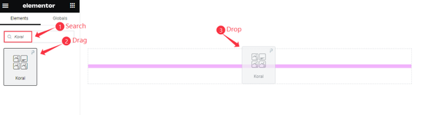
Open your page in Elementor editor, search by the Koral widget name, then drag and drop it.
The default view of Koral Widget
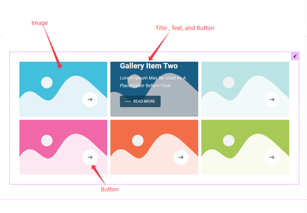
The Koral widget displays Gallery Image, Title, Text, and Button, along with a reveal-type hover effect.
Content Tab Customization
Layout Section
Go to Content > Layout
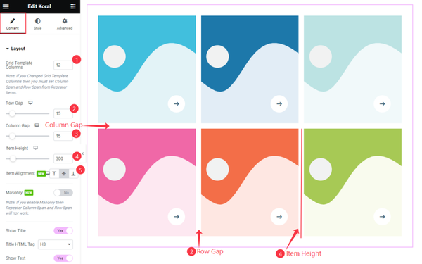
Find the Grid Template Columns, Row Gap, Column Gap, Item Height, and Item Alignment options.
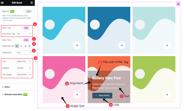
Then find the Masonry, Show Title & Title HTML Tag, Show Text, Alignment, Image Size, Link, Lightbox, and Link Target options.
Items Section
Go to Content > Items
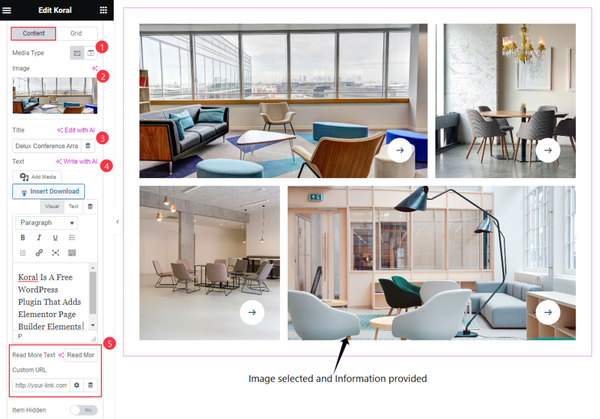
Find the Media Type, Image, Title, Text, Read More Text, Custom URL, and Item Hidden options for each single item box.
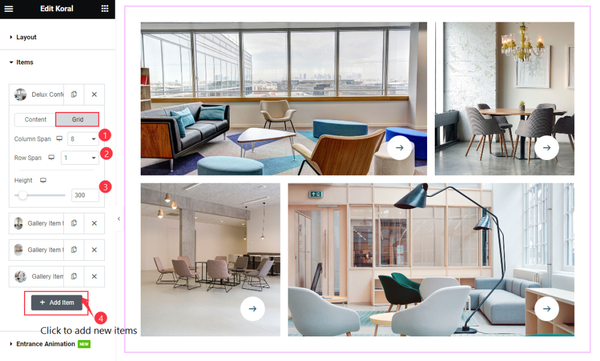
Then find the Grid > Column Span, Row Span, and Height options for each item box.
Click the” + Add Item ” button to add a new item.
Entrance Animation Section
Go to Content > Entrance Animation
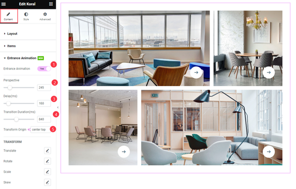
Find the Entrance Animation Switcher, Perspective, Delay, Transition Duration, and Transform (translate, rotate, scale, skew) options.
Style Tab Customization
Items Section
Go to Style > Items
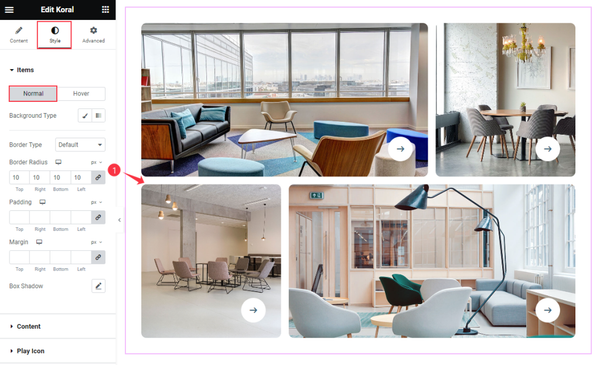
Find the Background Type, Border Type, Border Radius, Padding, Margin, and Box Shadow options in Normal mode.
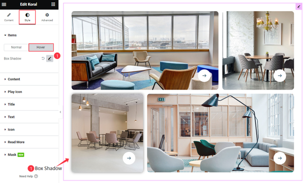
Then find the Box Shadow option for Hover.
Content Section
Go to Style > Content
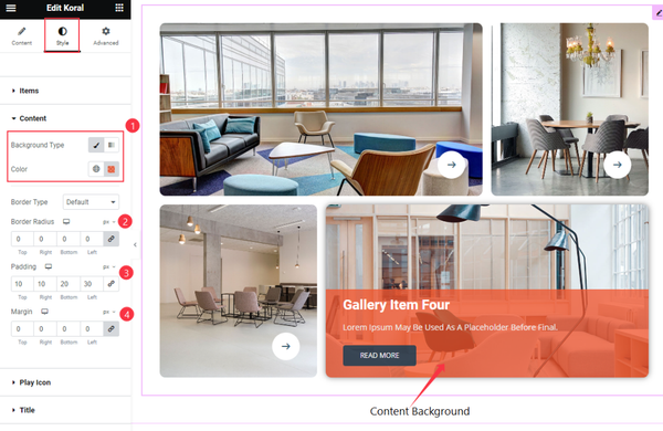
Find the Background Type Color, Border Type, Border Radius, Padding, and Margin options.
Title Section
Go to Style > Title
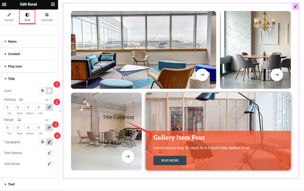
Find the Color, Padding, Margin, Typography, Text Shadow, and Text Stroke options.
Text Section
Go to Style > Text
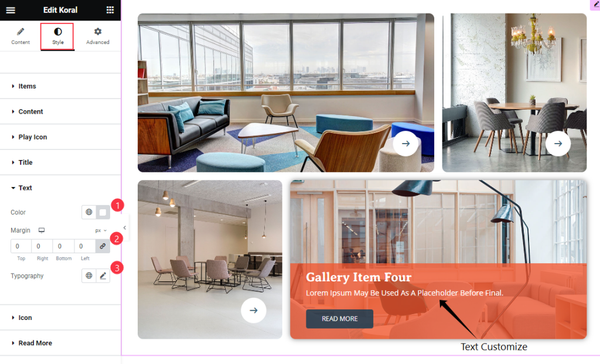
Find the Color, Margin, and Typography options.
Icon Section
Go to Style > Icon
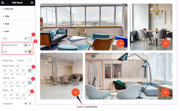
Find the Color, Background Type Color, Border Type, Border Radius, Padding, Margin, and Typography options.
Read More Section
Go to Style > Read More
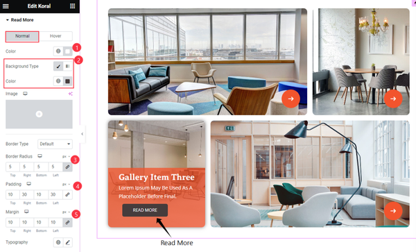
Find the Color, Background Color, Border Radius, Padding, Margin, and Typography options for Normal mode.
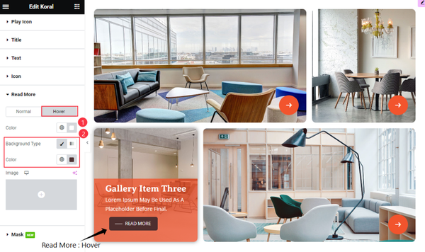
Then find the Color and Background Type Color options for Hover.
Mask Section
Go to Style > Mask
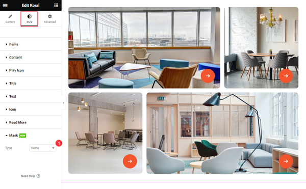
Find the mask Type option only.
Video Assist
Watch the Koral Widget video tutorial here. Please visit the demo page for examples.
Thanks for being with us.