

The Ramble Grid widget is a first-hand element of the Ultimate Post Kit add-on. This tool helps you make the perfect website by rearranging posts into a smart grid formation that has quite a unique layout style.
Let’s have a look at how it works!
Inserting widget
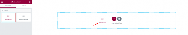
Find the Ramble Grid widget from the widget menu in the Elementor page editor and drag it inside your webpage.
Content tab
The Content tab holds the base settings for the widget and lays the foundation of the layout of the final content. It’s divided into three parts for the Ramble Grid widget.
Layout
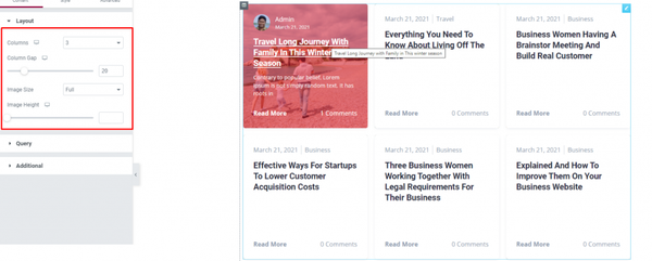
Go to Content> Layout
In this section, you can adjust column gaps for the posts, set the number of columns, adjust image height and size.
The fun fact is, the grid will hide the author, post image, & description behind the white wall and will only show the information upon hover. This mini hides & seek game will add a new taste to your post wall using the Ramble grid for Elementor.
Query
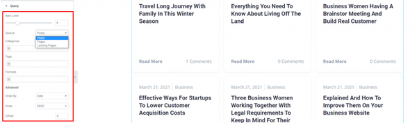
Go to Content> Query
Here, you need to define the number of posts shown on the display. The source can be selected from posts, pages, and landing pages. You can show categories, tags, as well as set the order of the posts of the Elementor post grid.
Additional
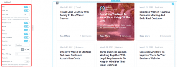
Go to Content> Additional
This section is made with a number of switchers that can be turned on/off to show/hide the specific item on the display. These are for the titles, category, avatar, date, etc.
Style tab
The style tab allows you to change or customize the appearance of the Ramble Grid widget content layout. The options include color settings, borders, paddings, etc.
There are several sections on this tab.
Items
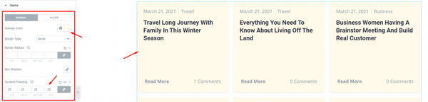
Go to Style> Items
There is an Overlay color option for both normal & hover modes. Adding overlay will hide the background image from displaying.
Add borders around the posts including color & radius for both the normal and hover mode. Use the box-shadow option to add a 3D vibe to the post blocks for the blogging widget. You can use Content Padding for better visuals.
Title
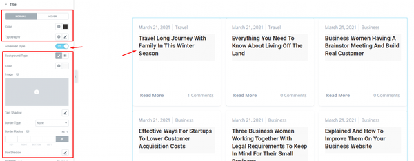
Go to Style> Title
The Title section mainly gives you the option to change the text color and typography of the titles. The color option is available for both active & hover modes. There is another switcher called Advanced Style at the bottom.
Turning it on will reveal more options such as background type & color, text-shadow, border, padding, etc. These options will give extra visual effects on the titles of the Elementor post grid.
Text
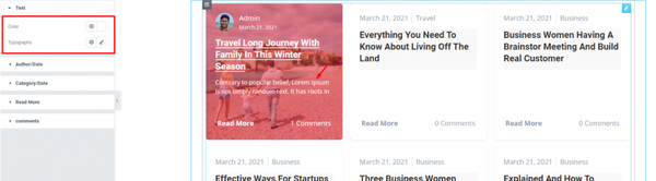
Go to Style> Text
Change color & typography of the post description from this section.
Author/Date
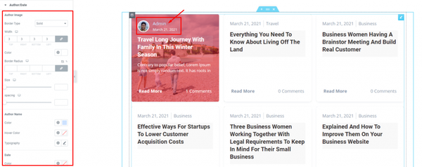
Go to Style> Author/Date
Of course, each post has an author that will be displayed at the top of the post image of the Ramble Grid widget. However, the author’s name, image, & date can be customized by color, border, width, size, spacing, & typography through this section.
Category/Date
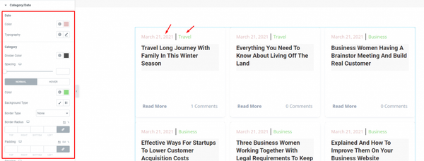
Go to Style> Category/Date
The Ramble Grid widget only displays the Author/Date section upon hover on the post grid. On normal mode, you will see the Category/Date section on top of every grid. You can customize it through the section by color, typography, spacing, border, etc.
Read More
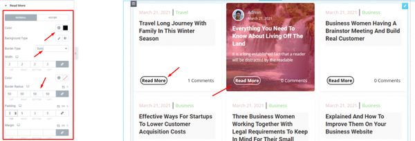
Go to Style> Read More
The read more button appears on both normal and hover modes. You can change their color for text & background, add a border, padding, etc.
Comments
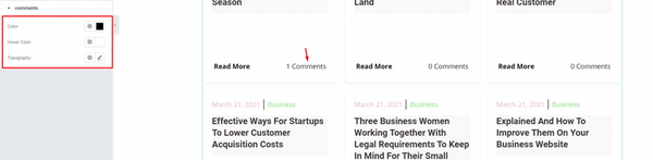
Go to Style> Comments
Each post on the Ramble Grid widget displays the number of comments of the actual post. You can change the color & typography of the text from this section.
Conclusion
Still, stuck?
Watch this quick video for visual instruction and see the demo page for more examples, provided by Bdthemes.