

This documentation provides comprehensive insights into the Navigation Block developed by Zoloblocks.
Adding a block to the editor
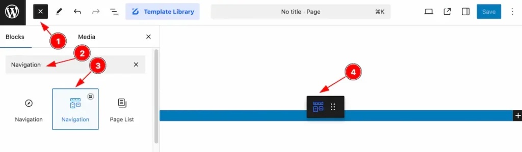
- Click the Toggle Block Inserter icon and a sidebar will appear on the left side, All the blocks will be visible here.
- Search by the Flipbox block name.
- Then select the appear blocks ( with zoloblocks logo T.R corner).
- After Drag and Drop it on the page.
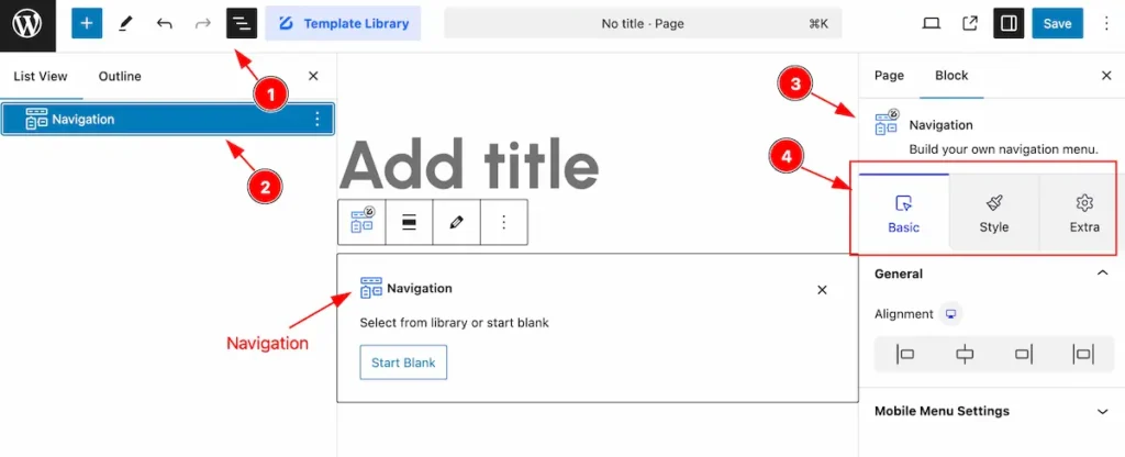
After Inserting the blocks, Follow this.
- Click on the Document Overviewer button and the Blocks list view will appear.
- Here appears the Flipbox block.
- After on the right side, Click on the Block. Then the Flipbox block details appear.
- Here show all the control tabs( Basic, Style, Extra ) of a block.
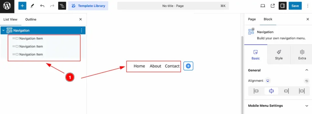
Set Navigation
Only Items
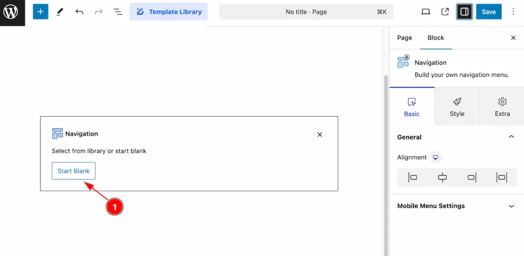
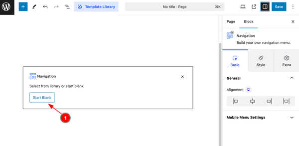
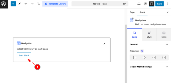
Start with any menu items, please select the with it.
- Click on the ” Start Blank ” button to select the menu and it will appear new items.
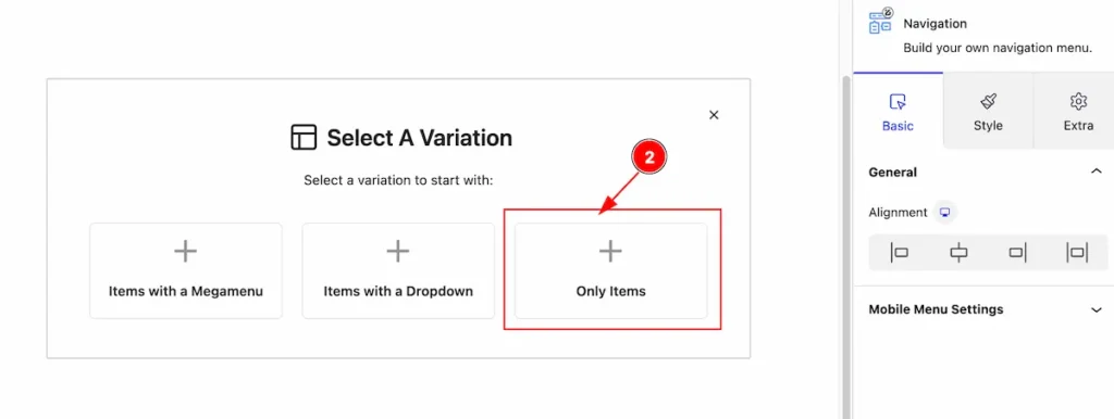
- Select the ” + Only Items ” to set the single navigation.
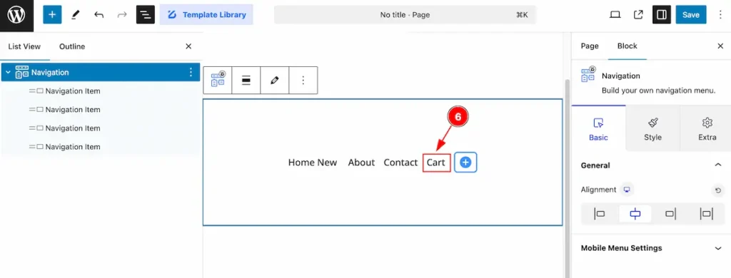
Edit the Navigation Items
After selecting the only items,
- All the single navigation item will appear.
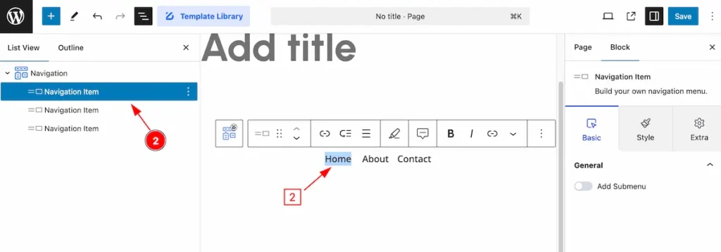
- Select the items what to edit ( e.g.: Home ).
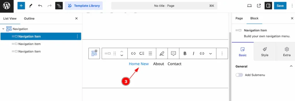
- After edit the navigation items ( e.g.: Home New ).
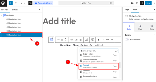
Add New Navigation Item
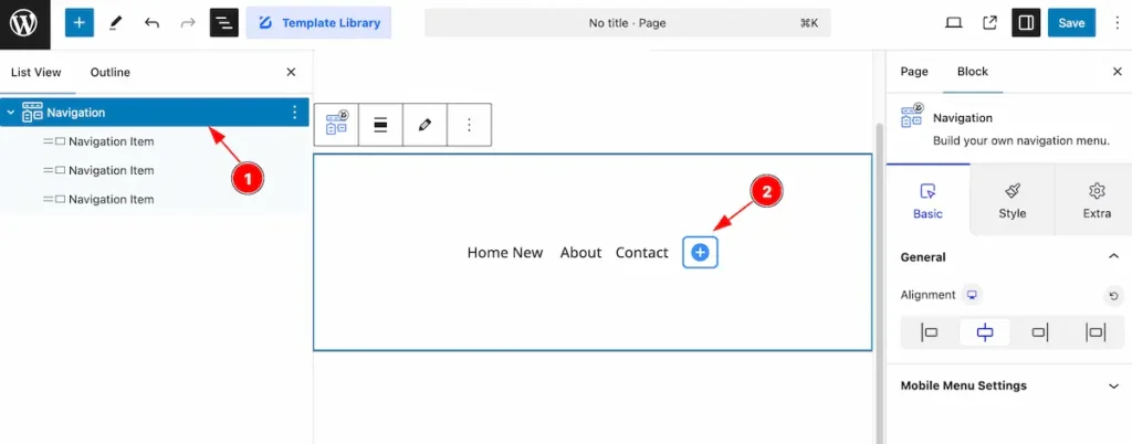
- Select the ” Navigation ” parent item.
- Now click on the ” + ” icon to get new navigation the list.
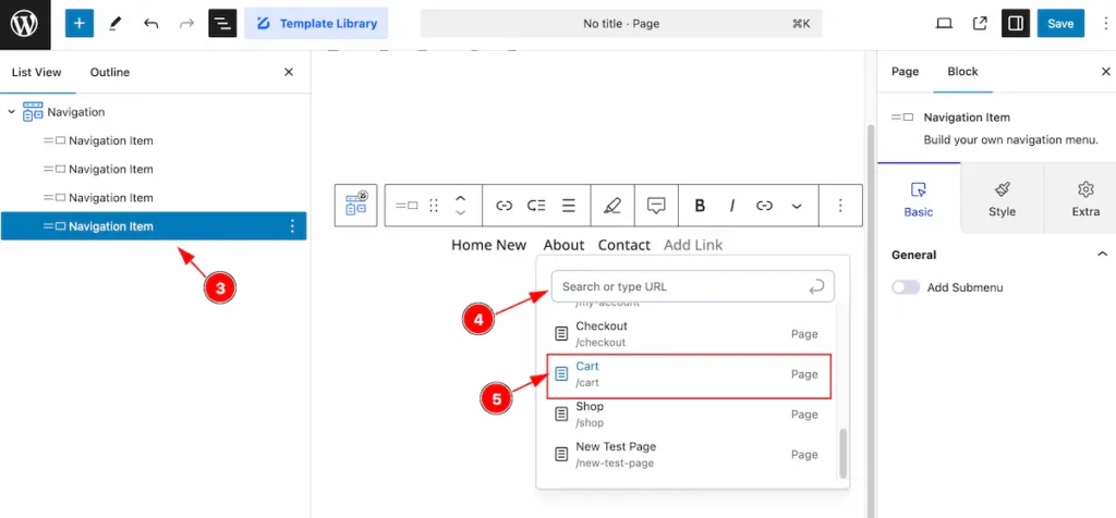
- New item will appear on the navigation item ( Child Item ).
- Search for the page link.
- Select the page item for navigation.
- Newly added item will appear on the navigation item.
Basic Tab
The Basic tab controller displayed here offers the flexibility to adjust the layout of blocks according to your preferences.
General Section
Go to Basic > General
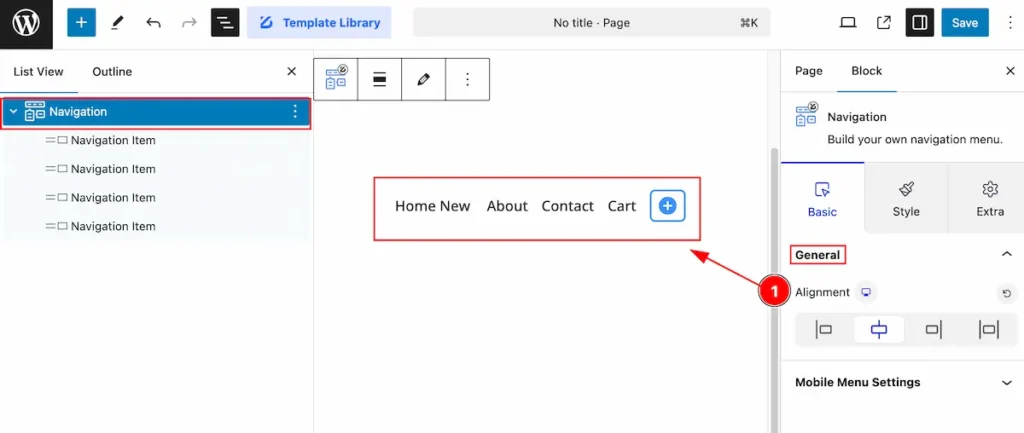
- Alignment: Set the alignment for the navigation.
Mobile Menu Settings
Go to Basic > Mobile Menu Settings
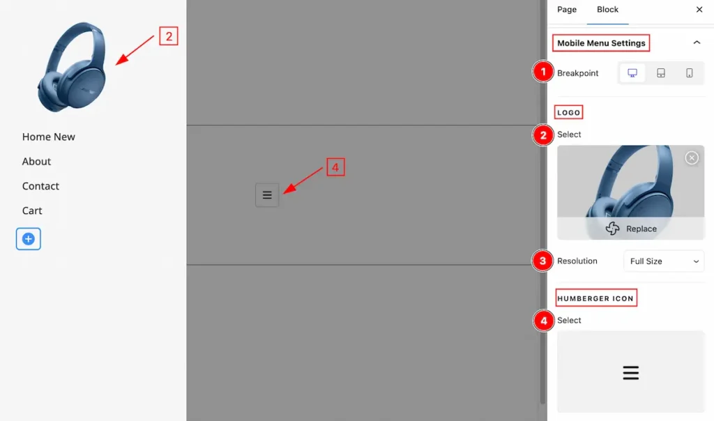
- Breakpoint: Set the break point for the Desktop.
- Logo: Select the logo form library.
- Resolution: Set the resolution for the image.
- HUMBERGER ICON: Select the humberger icon for the.
Style Tab
Provide the controller to make the visual appearance or presentation of the tabs. This includes aspects visually appealing and cohesive with the overall design of the interface.
Wrapper Section
Go to Style > Wrapper
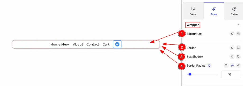
- Background: Set the background for the wrapper.
- Border: Set the border for the wrapper item.
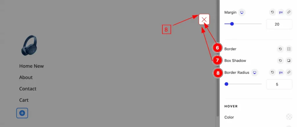
- Box Shadow: Set the box shadow.
- Border Radius: Set the border radius for the wrapper.
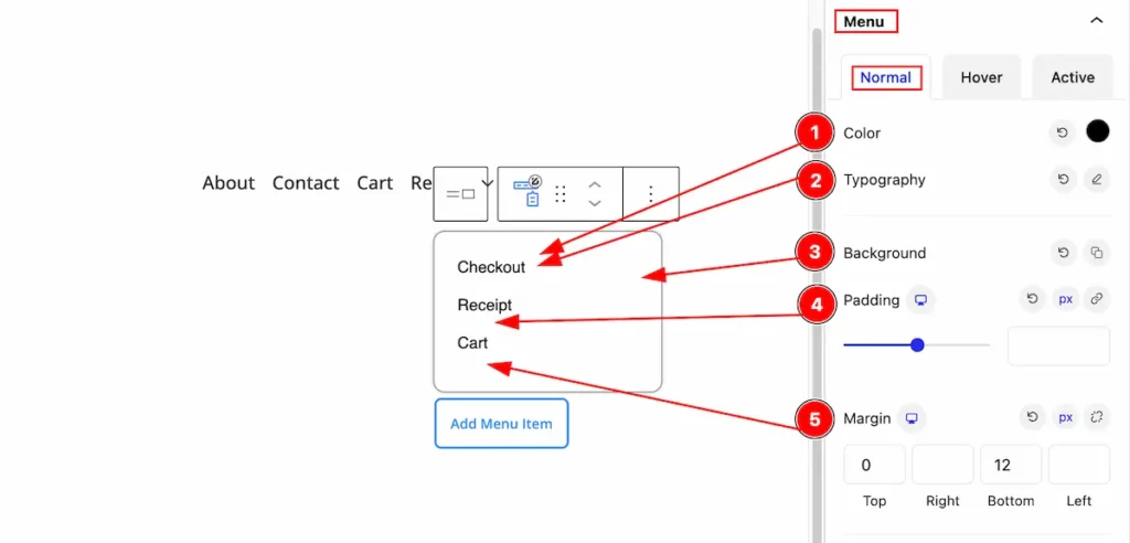
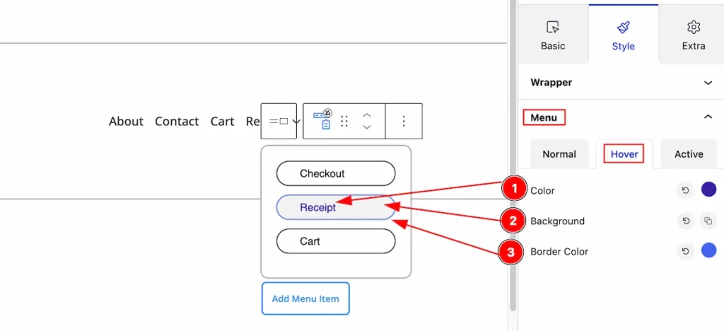
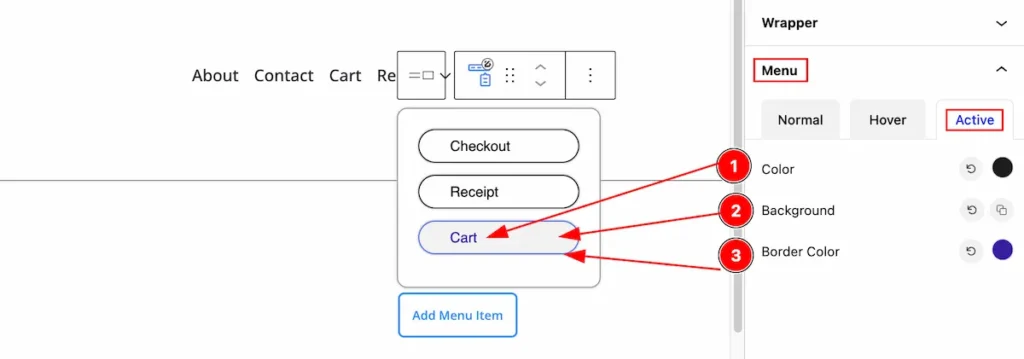
Menu Items Section
Go to Style > Menu Items
Normal state for Menu Items
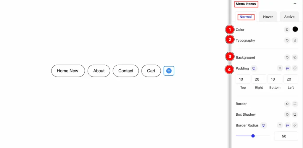
- Color: Set the color for the menu items.
- Typography: Set the typography for item.
- Background: Set the background for the items.
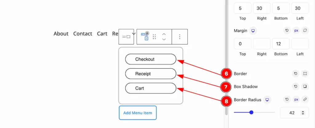
- Padding: Set the padding.
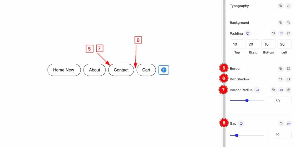
- Border: Set the border for the gap.
- Box Shadow: Set the box shadow.
- Border Radius: Make the border radius for the menu items.
- Gap: Set the Gap for the items.
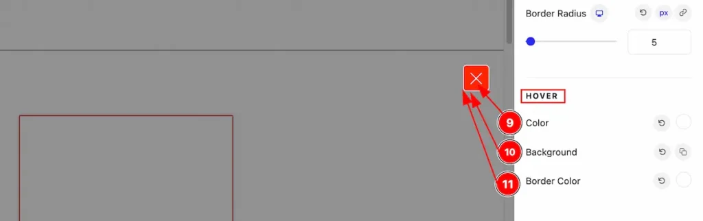
Hover State for Menu Items
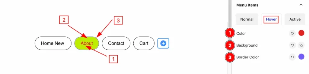
- Color: Set the color for the items.
- Background : Set the background for the itmes.
- Border Color: Set the border color.
Active State for Menu Items
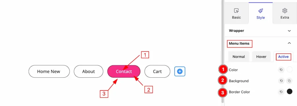
- Color: Set the color for the items.
- Background : Set the background for the itmes.
- Border Color: Set the border color.
Mobile Menu Section
WRAPPER
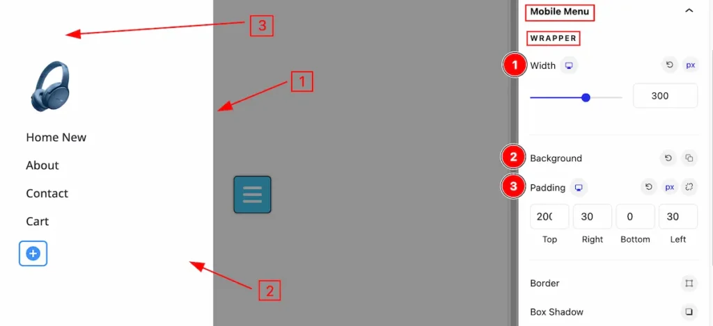
Set customization for the wrapper section,
- Width: Set the width for mobile menu wrapper.
- Background: Set the background for it.
- Padding: Make inner space for padding.
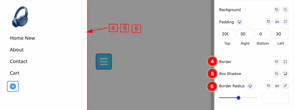
- Border: Set the border for the wrapper menu.
- Box Shadow: Make a shadow for the wrapper item.
- Border Radius: Make the border radius.
Logo
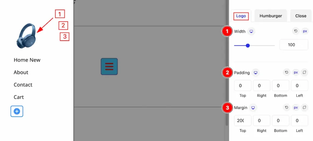
Set stylish for the logo,
- Width: Set the width for the logo.
- Padding: Set the padding for the logo area.
- Margin: Set the margin for logo item.
Humburger
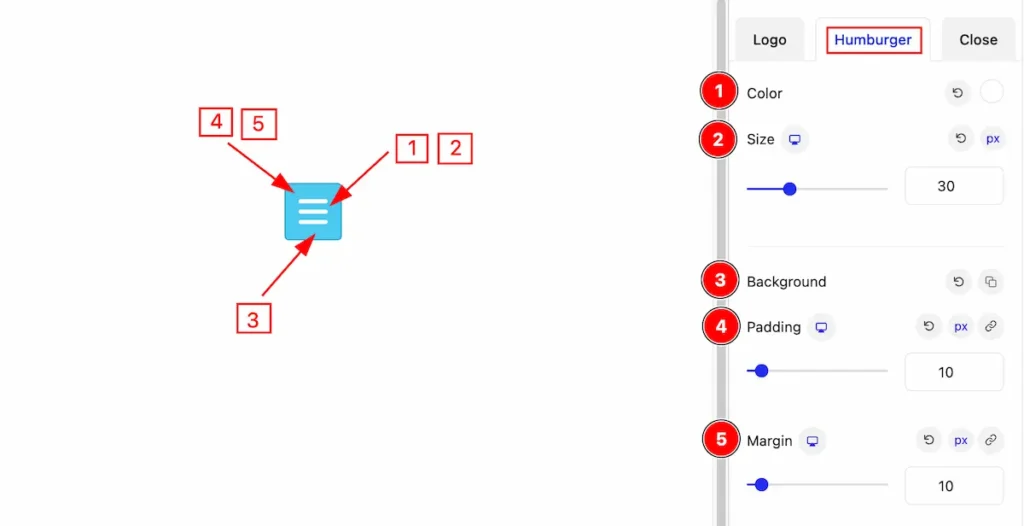
Make stylish for the Humburger menu,
- Color: Set the color for the humburger menu.
- Size: Set the size for it.
- Background: Set the background for it.
- Padding: Make inner space by adding the padding.
- Margin: Set the outer space for the margin.
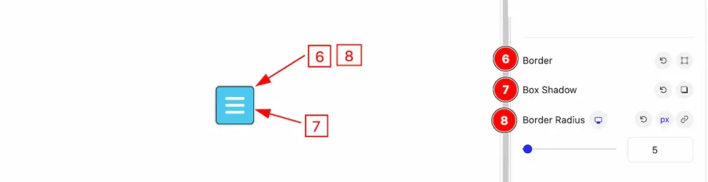
- Border: Set the border for the humburger menu.
- Box Shadow: Make the shadow for the box.
- Border Radius: Make the border radius.
Hover State
The changes will appear on mouse hover,
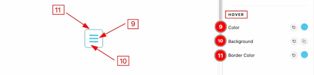
- Color: Set the color for the humburger.
- Background: Set the background for it.
- Border Color: Set the border color.
Close
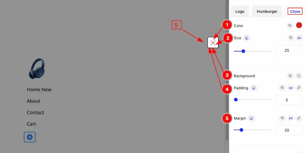
- Color: Set the color for the close icon.
- Size: Set the size for it.
- Background: Set the background for the close icon.
- Padding: Make inner space by setting the padding.
- Margin: Set the margin for the close icon.
- Border: Set the border for the close icon.
- Box Shadow: Make the box shadow for this.
- Border Radius: Make the border radius.
Hover State
The changes will appear on mouse hover,
- Color: Set the color for the close icon.
- Background: Set the background for it.
- Border Color: Set the border color of it.
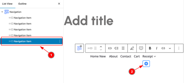
Add Sub Menu of Single Item
Sub Menu can be added on any single menu items by following the instrcution.
Add Sub Menu
- Select the Menu for the single menu item navigation.
- The Navigation Item appear from the List View section.
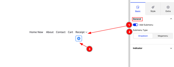
After Selecting the Menu Item, Enable the switcher to add as Sub menu item.
- Add Submenu: Enable the switcher for the sub menu.
- Submenu Type: Set the submenu type Dropdown the single item ( Dropdown and Mega menu ).
- Click on the ” + ” icon to add new items under the menu item.
Adding new sub menu item
- Select the Navigation item to for adding sub menu item.
- Click on the ” + ” icon to add new items.
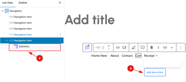
- Now click on the ” Add Menu Item ” for selecting the sub item.
- It will appear ” Submenu ” under the navigation item.
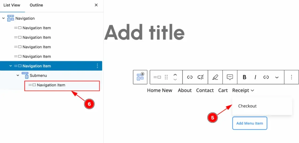
- After adding new item it will appear on there.
- The navigation item appear on there.
- After selecting the adding new items.
- The Sub menu appear on there.
Customize the Sub Menu Item
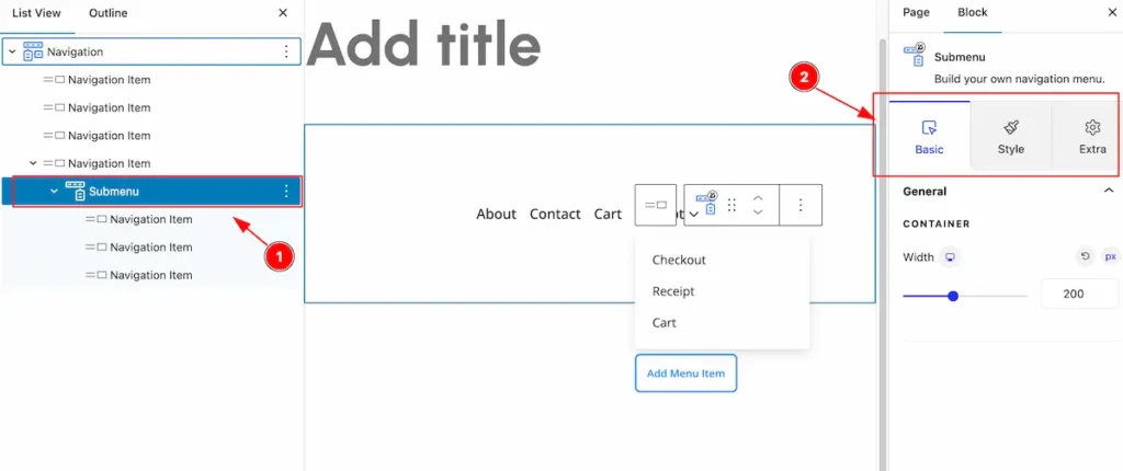
- Select the ” Submenu ” item from the list view section,
- Select the control tabs to customize it ( Basic, Style, Extra ).
General Section
Go to Basic > General
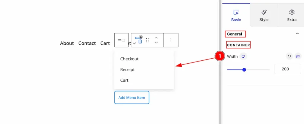
- Width: Select the width for the container item.
Wrapper Section
Go to Style > Wrapper
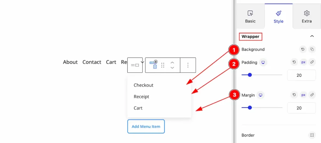
- Background: Set the background for the submenu item.
- Padding: Set the background for it.
- Margin: Set the margin for the wrapper.
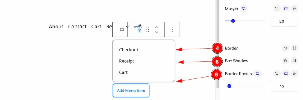
- Border: Set the border for the wrapper item.
- Box Shadow: Set the box shadow for the it.
- Border Radius: Make the border corner edges radius by following the border radius.
Menu Section
Go to Style > Menu
Normal State
- Color: Set the color for the menu item.
- Typography: Set the typography for the menu.
- Background: Set the background for the menu items.
- Padding: Set the padding for the inner space.
- Margin: Set the margin for the menu.
- Border: Set the border for the menu items.
- Box Shadow: Make shadow for box items.
- Border Radius: Make the border radius.
Hover State
Changes will appear on mouse hover,
- Color: Set the color for the hover item.
- Background: Set the background color for it.
- Border Color: Set the border color.
Active State
- Color: Set the text color nav items.
- Background: Set the background for the background.
- Border Color: Set the border color.
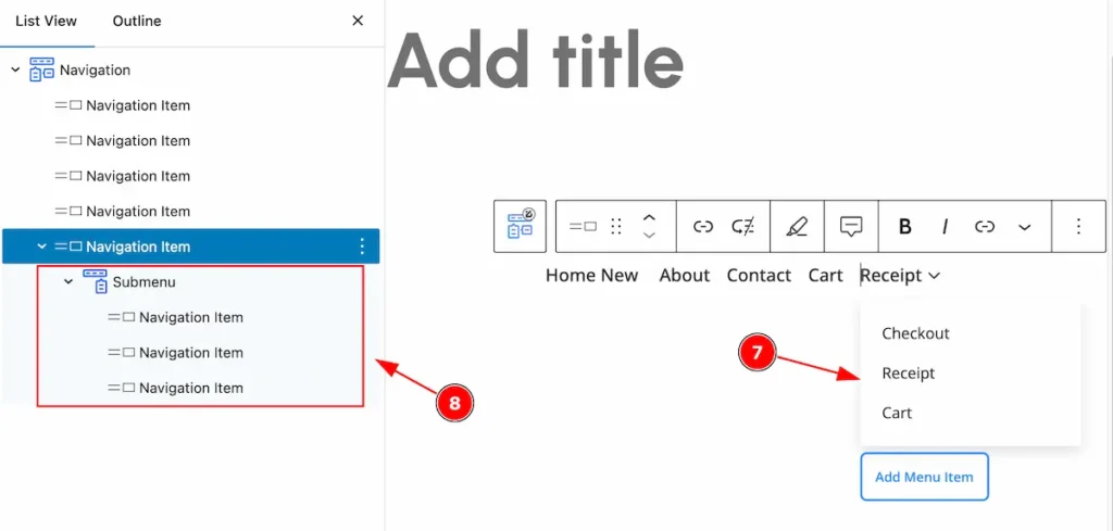
Items with a Dropdown
Select the items that will appear for the dropdown,
- Select the ” Start Blank ” button to select the desire items.
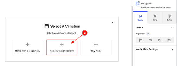
- Select the ” Items with a Dropdown ” for selecting dropdown menu items.
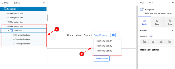
- The Navigation item will appear on the submenu section.
- Then navigation item and submenu item will appear here.
Items with a Mega Menu
Start with any menu items, please select the with it.
- Click on the ” Start Blank ” button to select the menu and it will appear new items.
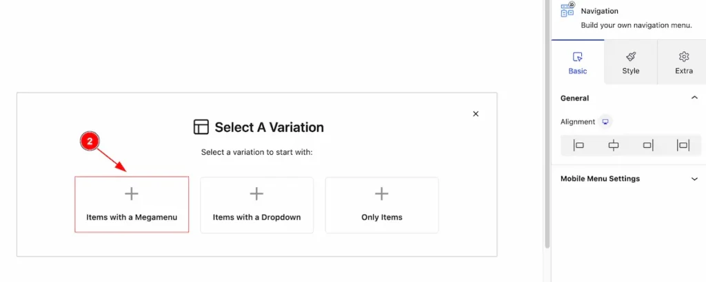
- Select the ” Items with a Mega menu ” for the mega menu items.
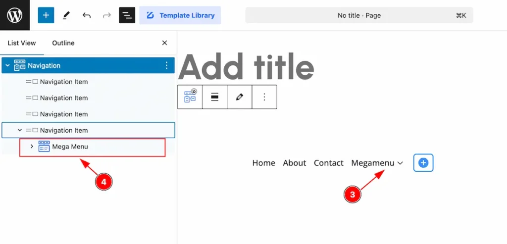
- After adding the Mega Menu item, it will appear on there.
- On the list view the mega menu will appear.
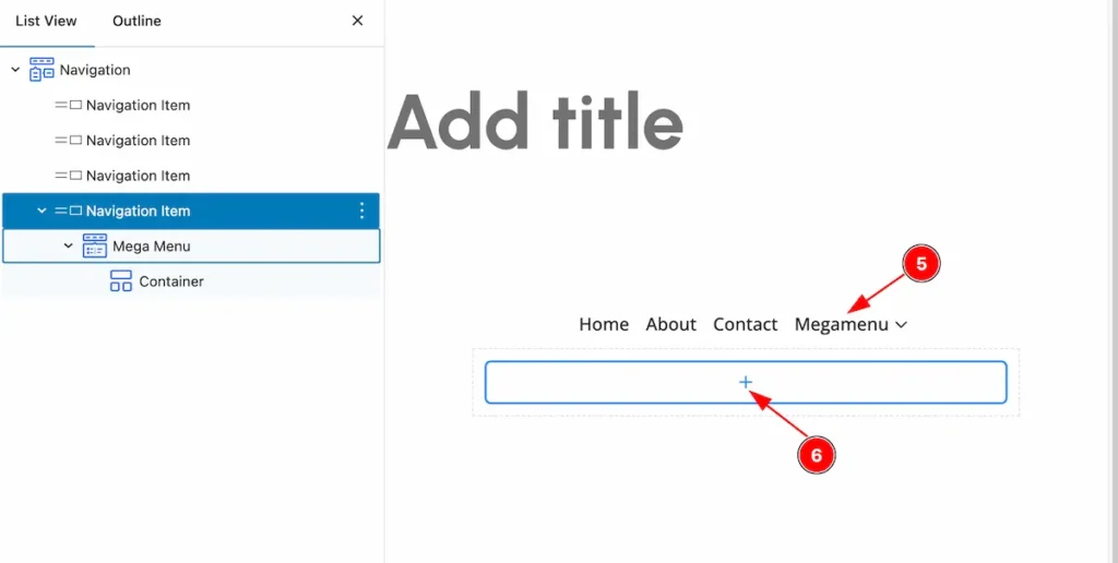
- Hover over the Mega menu item, adding new items will appear.
- Click on the ” + ” icon to add new items for the mega menu.
Extra Tab Control
The extra tabs provide the controls of any blocks. You can make different visual layouts by following these Controls.
Click to learn more>>.
Video Assist
Check the Demo. The Video Tutorial Will be coming Soon!
Thanks for being with us!