

This documentation provides comprehensive insights into the Extra tabs controls developed by Zoloblocks.
Extra Tab
This section enhances the interactivity and engagement of blocks by incorporating additional features. It allows for customization such as setting background colors and adding animations to sections, thereby making the blocks more visually appealing and interactive.
Spacing
Spacing refers to the amount of distance or separation between elements in a layout. It can include padding and margin.
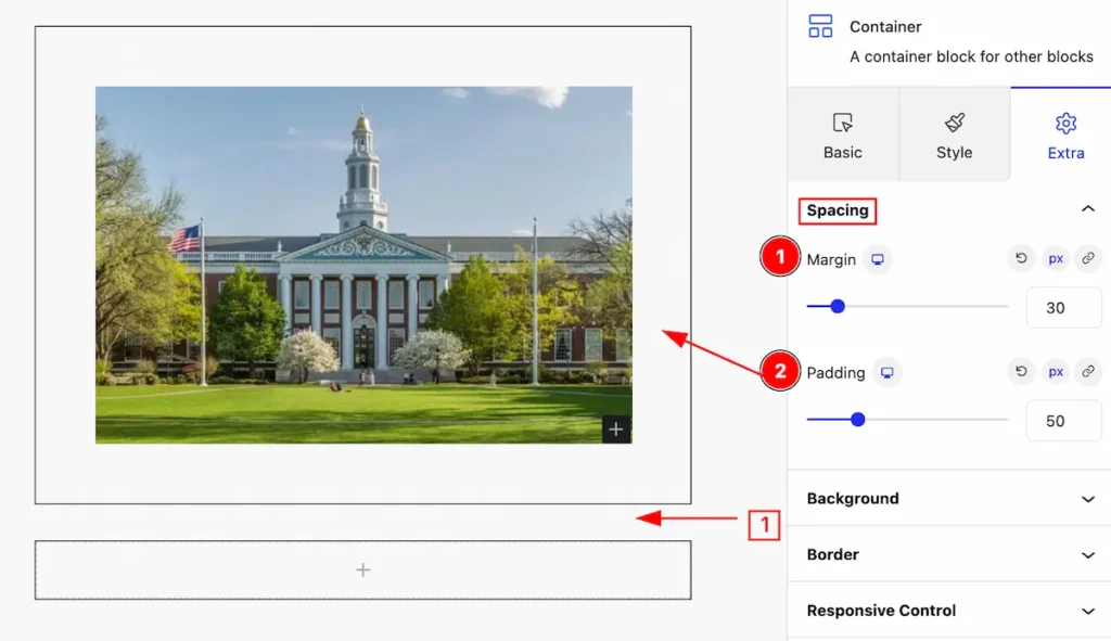
- Margin: Margin is the space around an element, outside of any defined borders. It creates separation between the element and surrounding elements
- Padding: Padding is the space between the content of an element and its border. It adds internal space within the element,
Background
The background property allows you to set its color, image, position, and size to create visually appealing designs and enhance the overall look and feel of blocks.
Normal Tab
These tabs behave in the normal state for the background. The appearance changes by following it.
Set Color for Background
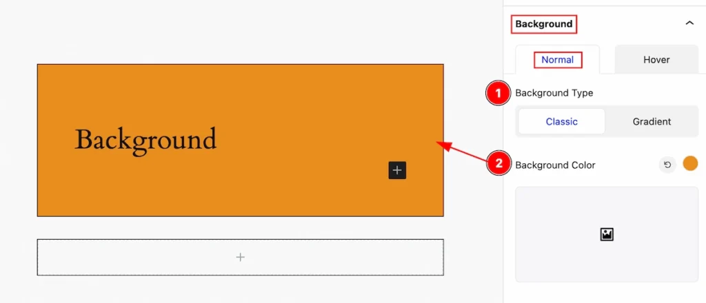
- Background Type: Set the background type to Classic.
- Background Color: Set the background color by clicking on it.
Set Gradient Color for Background
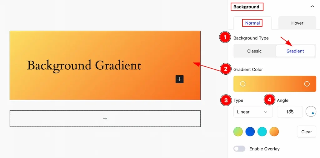
- Background Type: Set the background type Gradient.
- Gradient Color: Gradient color refers to a transition between two or more colors, Set the gradient color.
- Type: Set the type for the gradient (e.g.: Linear or Radial ).
- Angle: Set the angle for the gradient.
Set Image for Background
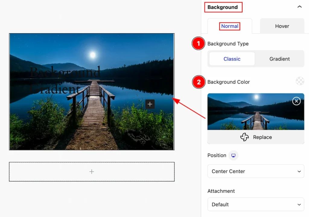
- Background Type: Set the type for the background Classic.
- Background Color: Set the background Image. Click on it and the media library will open then select an image.
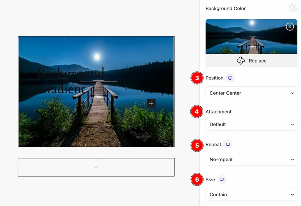
- Position: Set the position for the image (e.g.: Center Center, Center left, center right, top left, etc.).
- Attachment: Set attachment for the image (e.g.: Fixed, scroll ).
- Repeat: Set repetition for the image ( e.g.: No Repeat, Repeat, Repeat- x, Repeat-y ).
- Size: Set the size for the image ( e.g.: Default, auto, cover, container, custom )
Overlay Color for Background
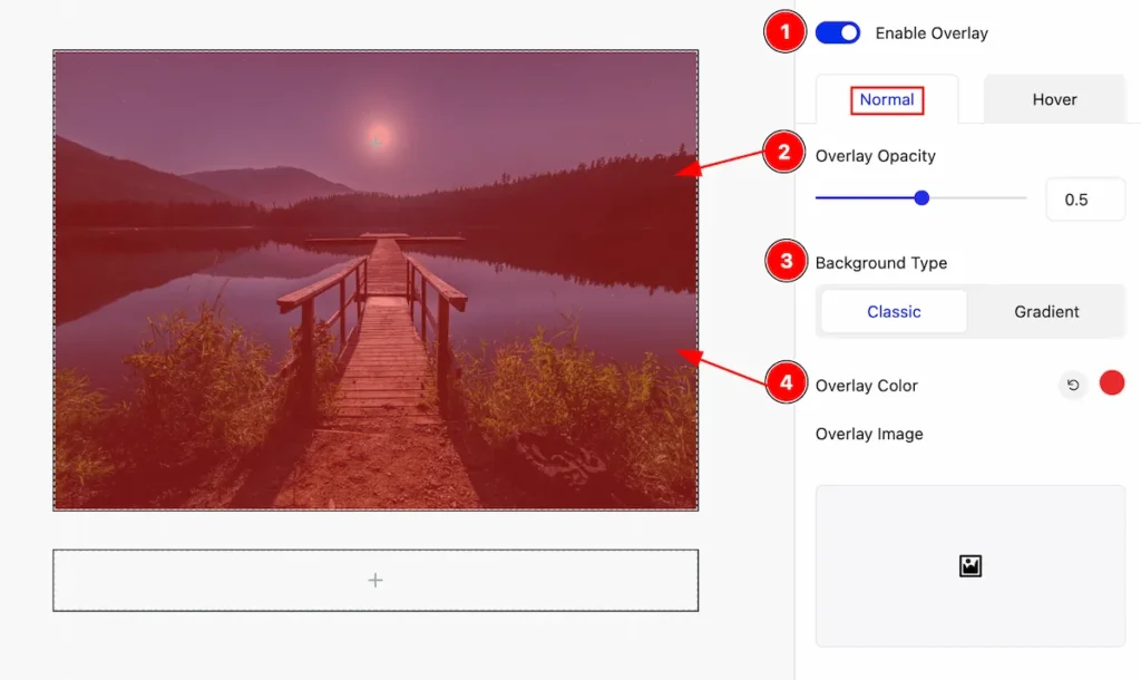
- Enable Overlay: Enable the switcher to color for the overlay. Overlay color typically refers to a semi-transparent color layer applied on top of an element.
- Overlay Opacity: Set the opacity for the overlay.
- Background Type: Set background type Classic to set the color.
- Overlay Color: Set overlay color for the background.
Overlay Gradient for Background
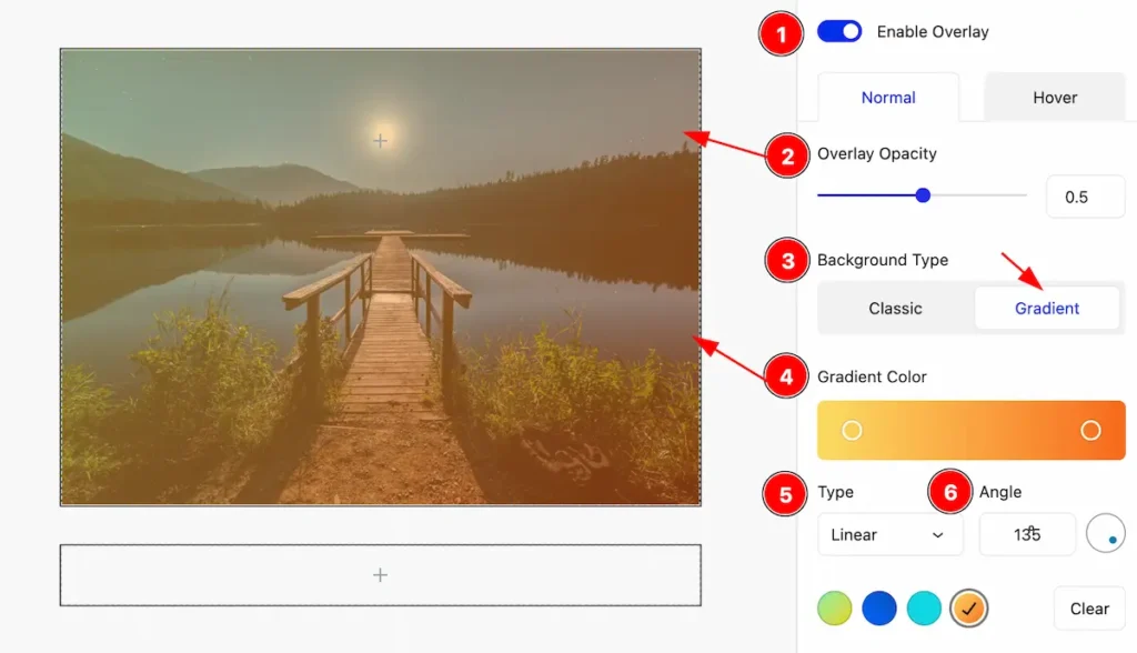
- Enable Overlay: Enable the switcher to open and set the overlay color.
- Overlay Opacity: Set opacity for the overlay.
- Background Type: Set the background type gradient for the background.
- Gradient Color: Gradient color refers to a transition between two or more colors, Set the gradient color.
- Type: Set the type linear for the color.
- Angle: Set the angle for the color.
Hover Tab
The appearance changes on mouse hover.
Background Color for Hover State
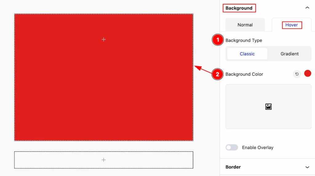
- Background Type: Set the type classic for the background.
- Background Color: Set color for the background.
Background Color Gradient for Hover State
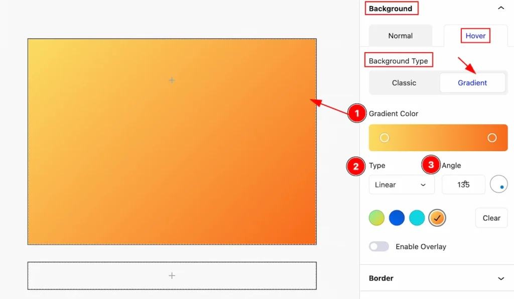
- Gradient Color: Set the gradient color.
- Type: Set type for the gradient linear.
- Angle: Set the angle for the color.
Overlay Hover Color
This appears to change on the mouse hovering.
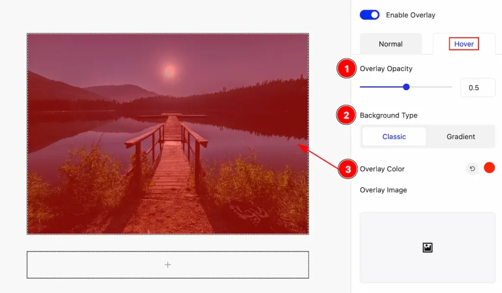
- Overlay Opacity: Set the overlay opacity for the
- Background Type: Set the background type for the overlay color.
- Overlay Color: Set overlay color. The appearance changes on hover.
Overlay Image
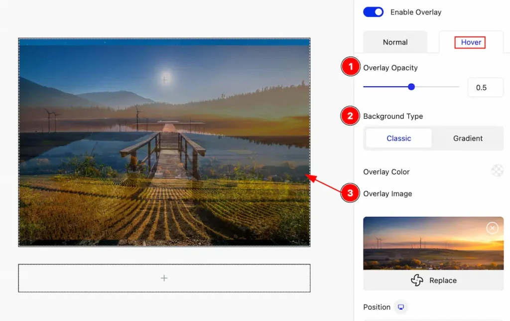
- Overlay Opacity: Set opacity for the overlay.
- Background Type: Set background type classic.
- Overlay Image: Set the image for the overlay.
Cursor Effect
A cursor effect is a visual enhancement that alters the cursor’s appearance or behavior as it moves across a webpage, adding interactivity and style.
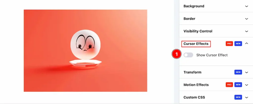
- Show Cursor Effect: The Cursor effect is by default disabled.
Default Cursor Control
Layout Tab
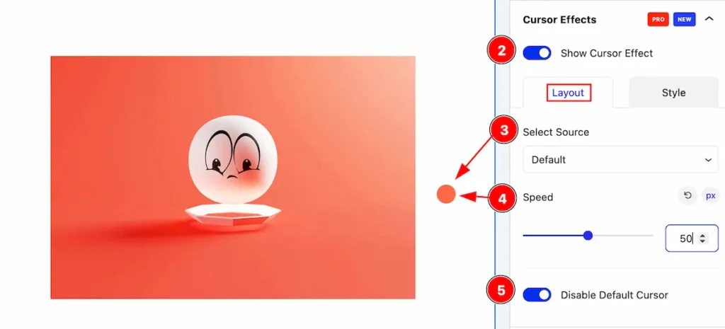
- Show Cursor Effect: Enable the cursor effect to show the cursor and controls.
- Select Source: Select the default cursor effect.
- Speed: Set the speed for cursor.
- Disable Default Cursor: Enable the switcher to disable the default cursor effect.
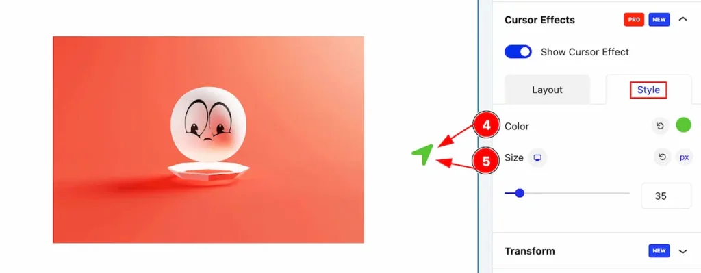
Style Tab
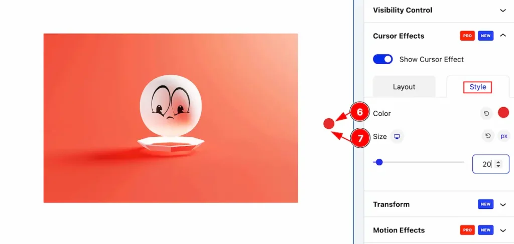
- Color: Set the color for the cursor.
- Size: Set size for the cursor.
Text Cursor Control
Layout Tab
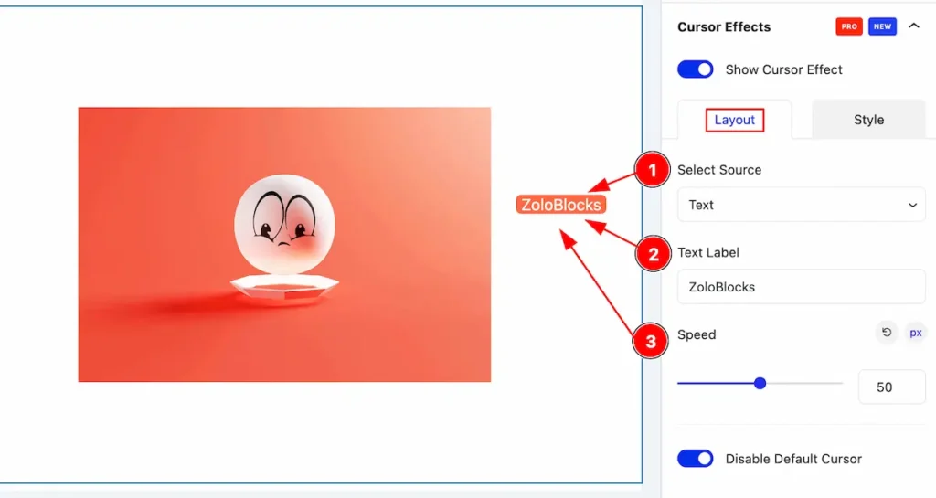
- Select Source: Select the source the Text.
- Text Label: Set the text label for cursor.
- Speed: Set the speed for cursor.
Style Tab
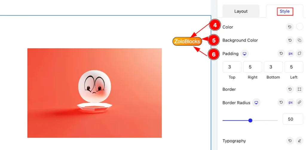
- Color: Set the color for the text.
- Background Color: Set the background color for the cursor.
- Padding: Set the padding.
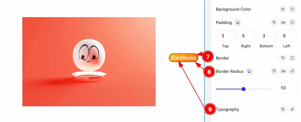
- Border: Set the border for the text cursor.
- Border Radius: Make the border radius.
- Typography: Set the typography for it.
Image Cursor Control
Layout Tab
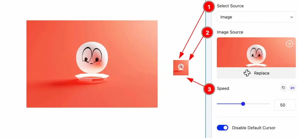
- Select Source: Select Source Image for cursor.
- Image Source: Select the image from the library.
- Speed: Set the speed for cursor.
Style Tab
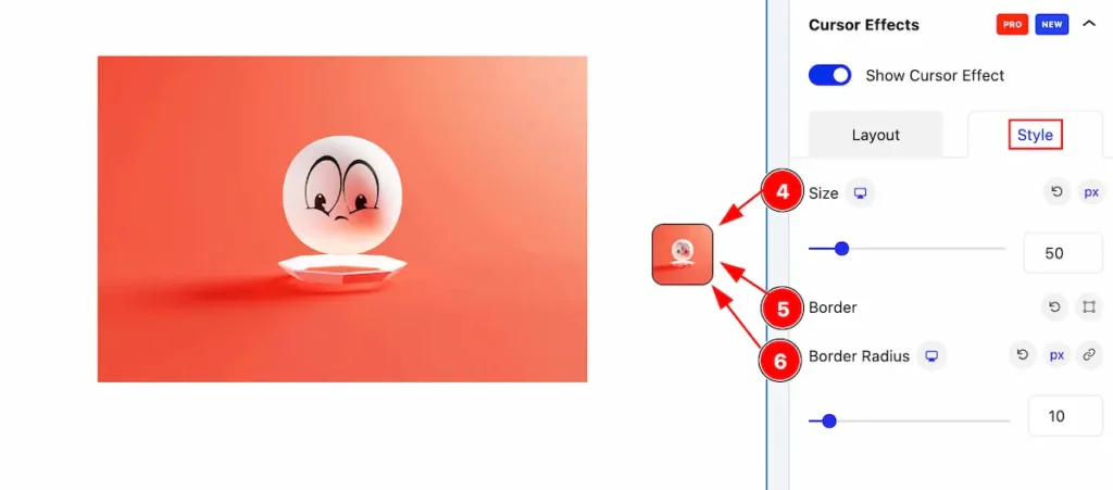
- Size: Set the size for the image cursor.
- Border: Set the border for the cursor.
- Border Radius: Make the border radius by following.
Icon Cursor Control
Layout Tab
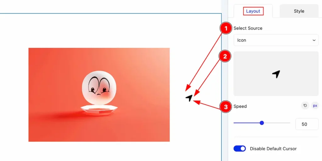
- Selected Source: Select the source Icon for cursor.
- Icon: Select icon from the icon library.
- Speed: Set the speed for icon.
Style Tab
- Color: Set the color for the icon.
- Size: Set size of it.
Border
A border is a visible line or perimeter around an element in a webpage. It can be used to visually separate elements.
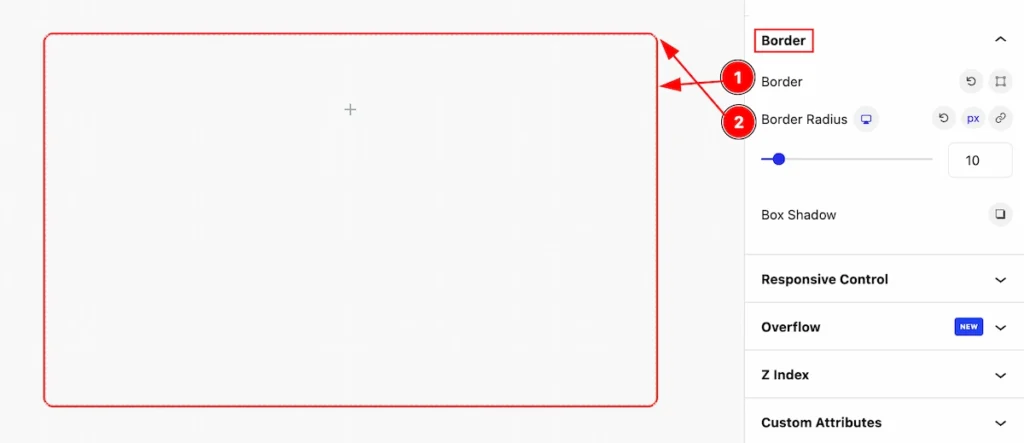
- Border: Set border for the container element.
- Border Radius: Border radius is used to create rounded corners on elements, such as divs or buttons. By applying a border-radius, you can soften the sharp edges of an element, giving it a more visually appealing and modern look
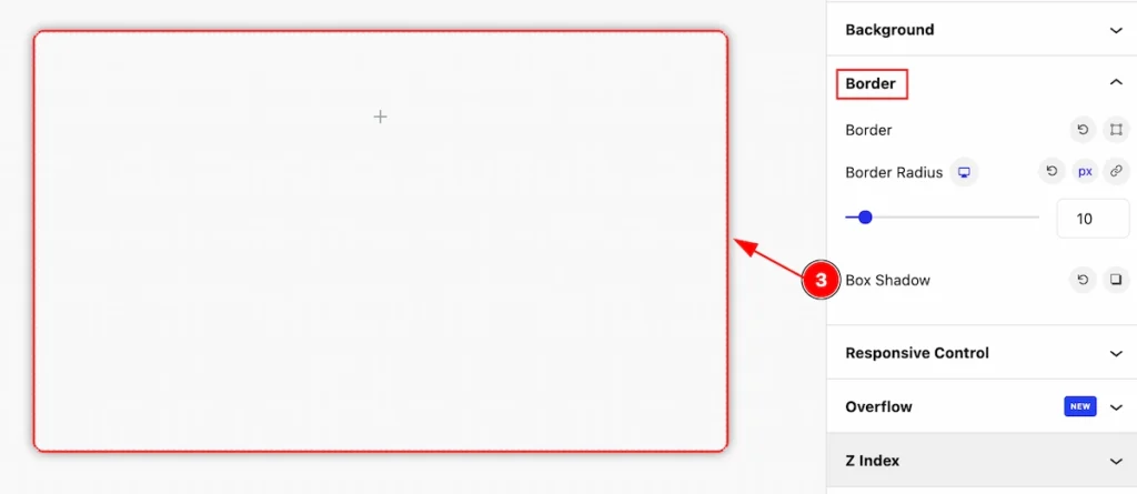
- Box Shadow: shadow effect on an element’s box, creating depth and dimensionality. It allows you to specify the size, spread, color, and blur radius of the shadow.
Responsive Control
Responsive controls in web design refer to elements or techniques used to ensure that a website adapts and displays appropriately across different devices and screen sizes.
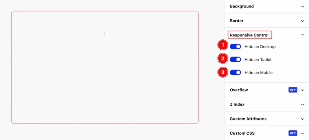
- Hide on Desktop: Enable the switcher to Hide this element for desktop devices.
- Hide on Tablet: Enable the switcher to Hide this element for Tablet devices.
- Hide on Mobile: Enable the switcher to Hide this element for Mobile devices.
Overflow
This property is useful for controlling the behavior of content within elements, especially when dealing with content that may extend beyond the boundaries of its container.
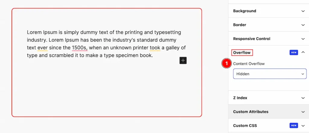
- Visible: Content is not clipped and may overflow the container.
- Hidden: Content that overflows the container is clipped and not visible.
- Scroll: Content is clipped, and a scrollbar is added to allow users to scroll and see the overflowed content.
- Auto: Similar to scroll, a scrollbar is added only when needed, based on the content size.
Z Index
It’s commonly used to control the layering of elements in a webpage, especially in situations where elements overlap.
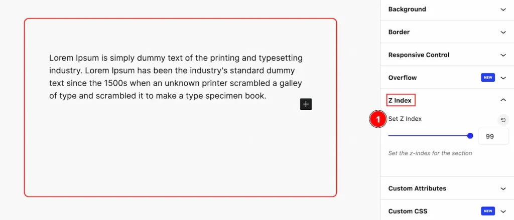
- Set Z Index: Set value for Elements with a higher
z-indexvalue will appear on top of elements with a lowerz-indexvalue.
Custom Attributes
Custom attributes are particularly handy for developers who want to extend the functionality of HTML without relying on non-standard attributes or cluttering the markup with unnecessary classes or IDs.
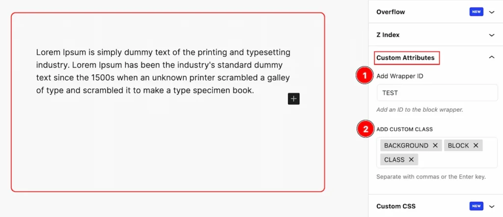
- Add Wrapper ID: You can replace “wrapper” with any unique identifier you prefer. This ID can then be used for styling with CSS or for targeting the element with JavaScript.
- ADD CUSTOM CLASS: You can replace “custom-class” with any unique class name you prefer. This class can then be used for styling with CSS or for targeting the element with JavaScript. If you want to add multiple classes.
Custom CSS
Custom CSS allows you to define your styles to apply to elements. This customization allows for unique designs and better organization of styling code.
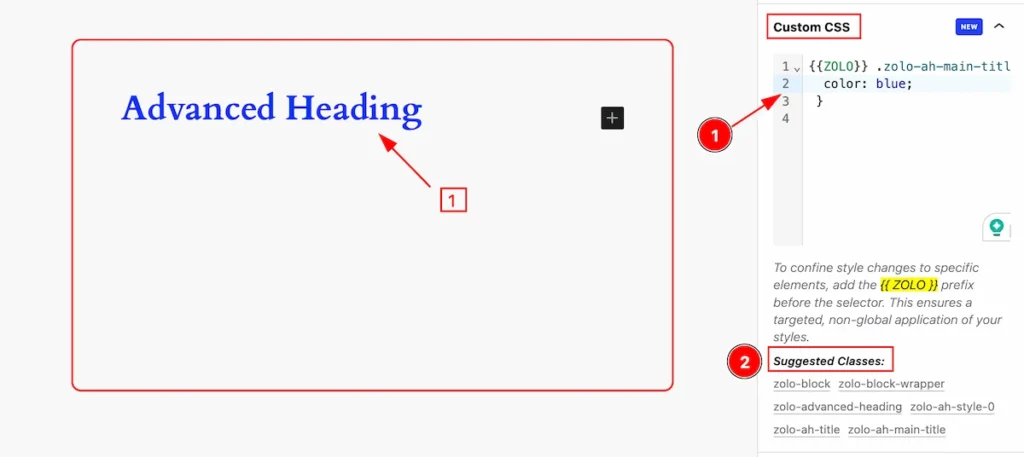
- Custom CSS Input fields: Set your custom CSS code in the input fields. This helps you write the CSS code to achieve that design.
Note: To work with the zolo block CSS you need to use {{ZOLO}} as a prefix. - Suggested Classes: The suggested classes will appear here. Select any Zolo block item.
Motion Effect
Motion effects in web design refer to the use of animations, transitions, or dynamic changes to create visual movement or interactivity on a webpage. These effects can be applied to various elements such as text, images, buttons, and backgrounds to enhance user engagement and create a more dynamic user experience.
Entrance Tab
Entrance animations are motion effects applied to elements as they appear on the screen,
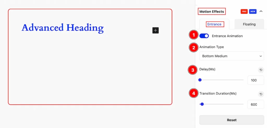
- Entrance Animation: Enable the Entrance Animation switcher to work with it.
- Animation Type: Set the animation type for the entrance( e.g.: Fade, Scale, Top, Bottom Medium, etc.)
- Delay(ms): Set delay time to show the entrance animation.
- Transition Duration(Ms): Set the duration of the transition.
Floating Tab
Floating animation is a dynamic effect where elements appear to float or move gently across the screen.
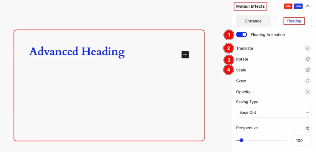
- Floating Animation: Enable the switcher to show the floating animation.
- Translate: The Translate function is used to move an element along the X and Y axes.
- Rotate: The Rotate function is used to rotate an element around a specified point.
- Scale: The scale function is used to resize an element along the X and Y axes.
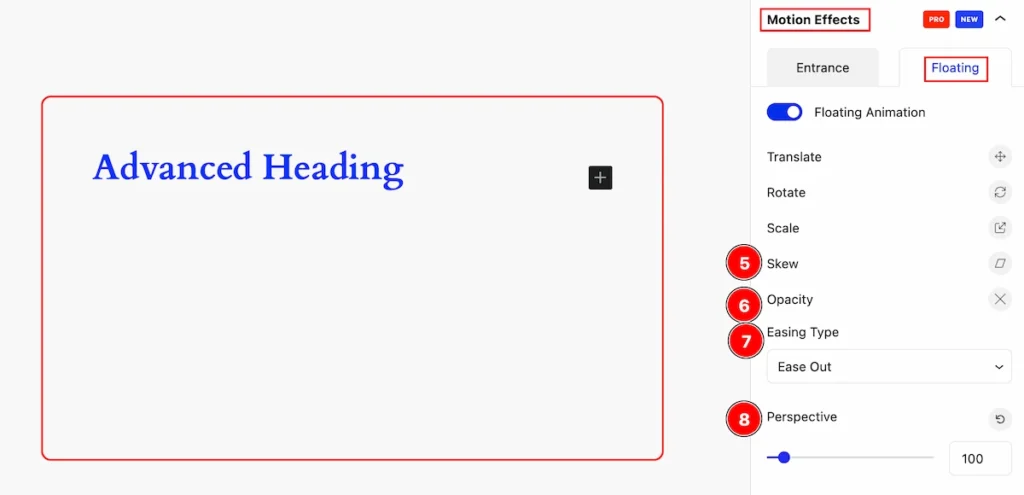
- Skew: The function used to distort an element along the X and Y axes
- Opacity: This property that controls the transparency level of an element.
- Easing Type: Set easing type that can be applied to CSS animations and transitions to create more natural and visually appealing motion effects.
- Perspective: The perspective” is a property used in 3D transformations to create the illusion of depth and distance on a two-dimensional plane.
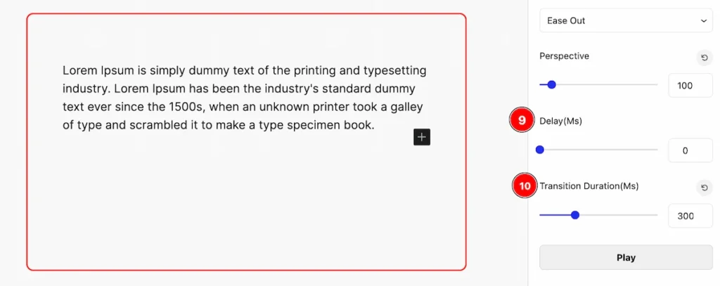
- Delay(Ms): The “delay” property specifies a time interval before the animation or transition begins.
- Transition Duration(Ms): The “transition-duration” property specifies the duration over which a transition effect occurs.
Transform
Transformations can be combined and applied simultaneously to create dynamic visual effects and animations on web elements.
The appearance changes will be visible in normal and hover states. Let’s customize it.
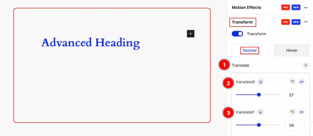
Translate
- Translate: The Translate function is used to move an element along the X and Y axes.
- translateX: The
translateX()function in CSS is used to move an element horizontally along the X-axis. - translateY: The translateY() function in CSS is used to move an element vertically along the Y-axis.
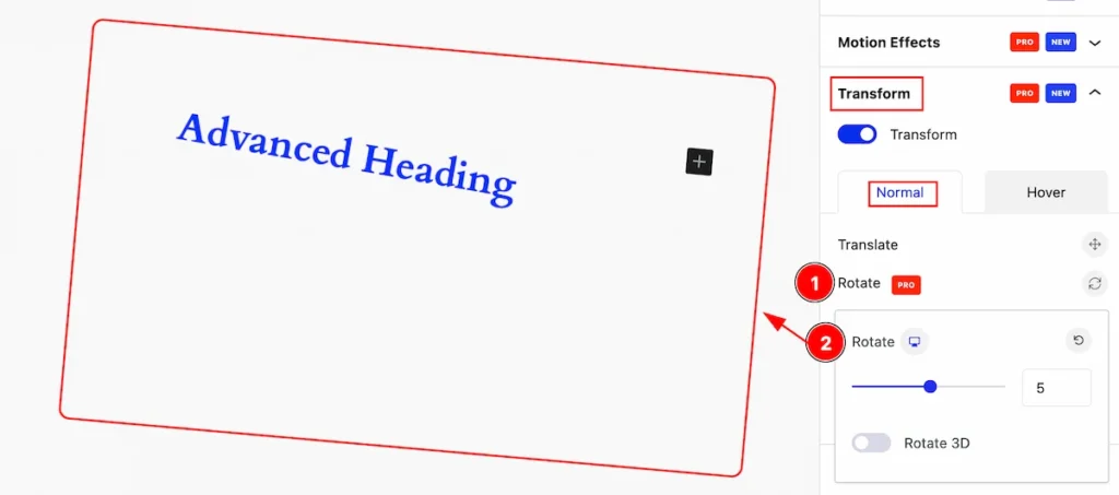
Rotate
- Rotate: The function is used to rotate an element around a fixed point determined by its center.
- Rotate: Set value for rotation.
Scale
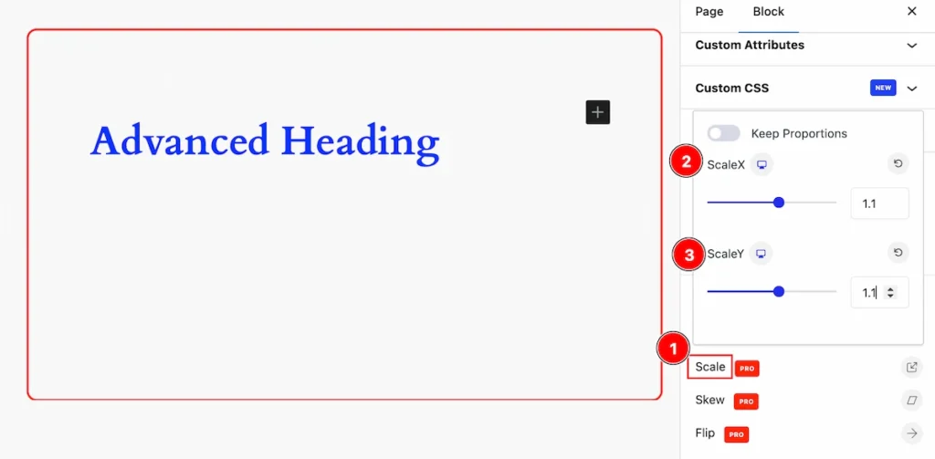
- Scale: It allows you to specify scaling factors for both axes, controlling the element’s size relative to its original dimensions.
- ScaleX: The function is used to resize an element along the X-axis only.
- ScaleY: The function is used to resize an element along the Y-axis only.
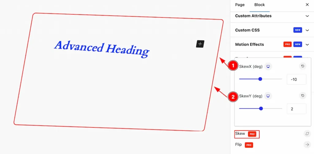
Skew
The function is used to skew an element along the X and Y axes. It allows you to specify angles of skewing for both axes.
- SkewX(deg): It allows you to specify an angle of skewing for the horizontal dimension of the element.
- SkewY(deg): It allows you to specify an angle of skewing for the vertical dimension of the element.
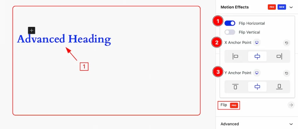
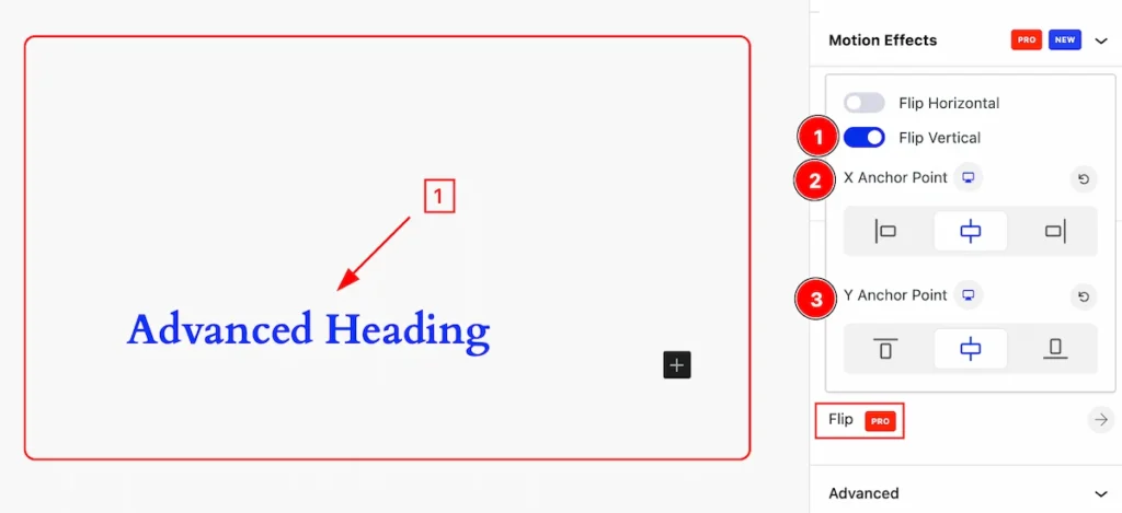
Flip
Flipping an element involves reversing its appearance along either the horizontal or vertical axis.
Flip Horizontal
- Flip Horizontal: Enable the flip horizontal switcher to work with Flip.
- X Anchor Point: To specify an anchor point for transformations along the X-axis (e.g.: Left, Center, Right ).
- Y Anchor Point: To specify an anchor point for transformations along the Y-axis (e.g.: Left, Center, Right ).
Flip Vertical
- Flip Vertical: Enable the flip vertical switcher to work with Flip.
- X Anchor Point: To specify an anchor point for transformations along the X-axis (e.g.: Left, Center, Right ).
- Y Anchor Point: To specify an anchor point for transformations along the Y-axis (e.g.: Left, Center, Right ).
By following this you can make the layout more interactive and visually stylish.