

In this documentation, we will show you how to customize the Diamond widget presented by Pixel Gallery Pro.
Inserting The Diamond Widget
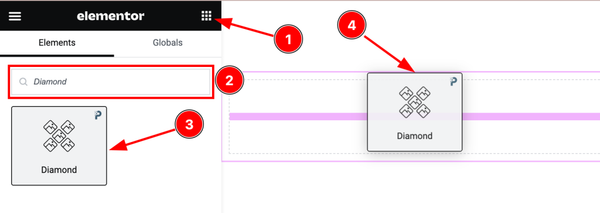
Open your page in the Elementor editor, search by the widget name, and then drag and drop it on the page.
Content Tab Customizations
Layout Section Customization
Go to Content > Layout
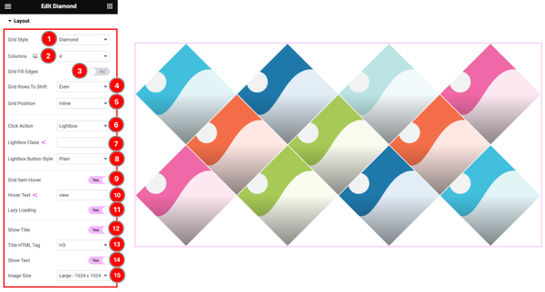
Come to the Layout section and find the Grid Style( Diamond, Hexagon, Ellipse, Tile), Columns, Grid Rows To Shift(Even, Odd), Grid Position( Inline, Outline), Click Action( Lightbox, Redirect, None), Lightbox Class, Lightbox Button Style( Plain, Circle), Hover Text, and Title HTML Tag options.
Here also find the Grid Fill Edges, Grid Item Hover, Lazy Loading, Show Title, and Show Text switchers.
Items Section Customization
Go to Content > Items
Step-1
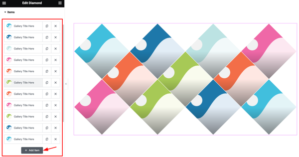
Come to the Items section, Here you can add Diamond widget items (with the Add Item button).
Step-2
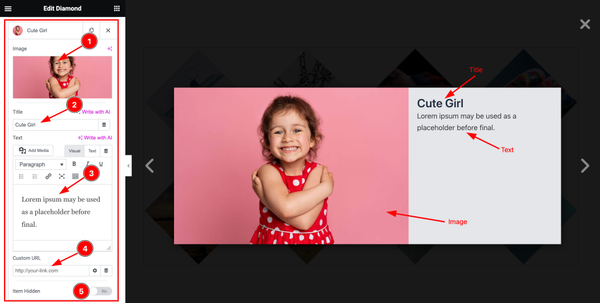
Click on Each widget item, you will find the Image, Title, Text, Custom URL, and Item Hidden options.
Work with The Style Tab
Grid Item Section
Go to Style > Grid Item
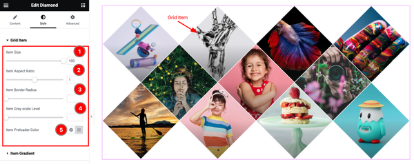
Come to the Grid Item section, and find the Item Size, Item Aspect Ratio, Item Border Radius, Item Gray Scale Level, and Item Preloader Color options.
Item Gradient Section
Go to Style > Item Gradient
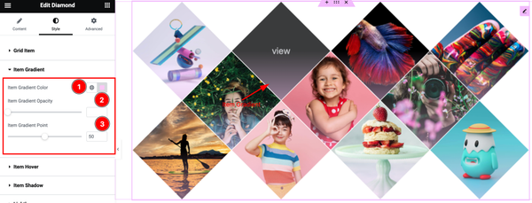
Here find the Item Gradient Color, Item Gradient Opacity, and Item Gradient Point options.
Item Hover Section
Go to Style > Item Hover
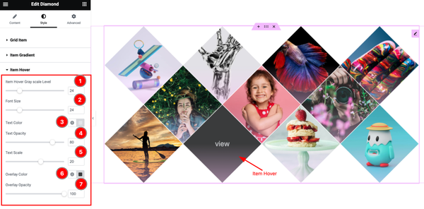
In this section, Find the Item Hover Gray Scale Level, Font Size, Text Color, Text Opacity, Text Scale, Overlay Color, and Overlay Opacity options.
Item Shadow Section
Go to Style > Item Shadow
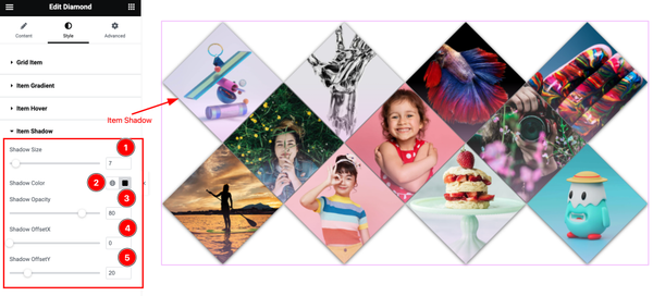
Here find the Shadow Size, Shadow Color, Shadow Opacity, Shadow OffsetX, and ShadowOffsetY options.
Lightbox Section
Go to Style > Lightbox
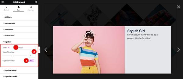
Here find the Zindex, Touchhold, and Keyboard Control options.
Lightbox Button Section
Go to Style > Lightbox Button
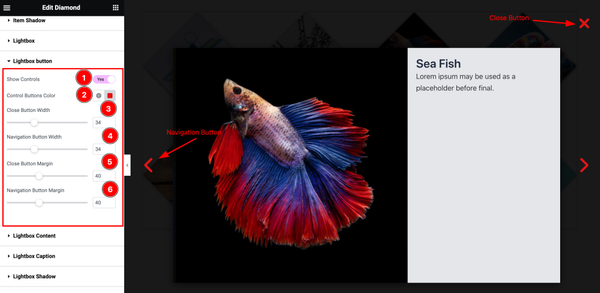
Here find the Show Controls, Control Buttons Color, Close Button width, Navigation Button Width, Colse Button Margin, and Navigation Button Margin options.
Lightbox Content Section
Go to Style > Lightbox Content
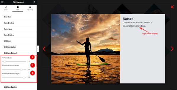
Here find the Content Scale, Content Maximum Width, and Content Maximum Height options.
Lightbox Caption Section
Go to Style > Lightbox Caption
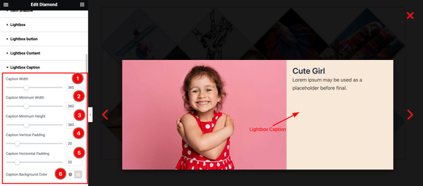
Here find the Caption Width, Caption Minimum Width, Caption Minimum Height, Caption Vertical Padding, Caption Horizontal Padding, and Caption Background Color options.
Lightbox Shadow Section
Go to Style > Lightbox Shadow
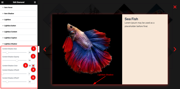
Here find the Content Shadow Size, Content Shadow Opacity, Content Shadow Color, Content Shadow OffsetX, and Content Shadow OffsetY options.
Lightbox Background Section
Go to Style > Lightbox Background
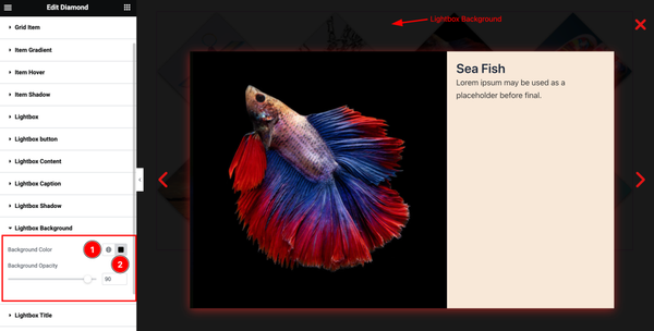
Here find the Lightbox Background Color, and Background Opacity options.
Lightbox Title Section
Go to Style > Lightbox Title
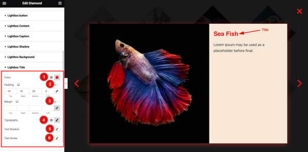
Come to the Lightbox Title section, and find the Title Color, Padding, Margin, Typography, Text Shadow, and Text Stroke options.
Lightbox Text Section
Go to Style > Lightbox Text
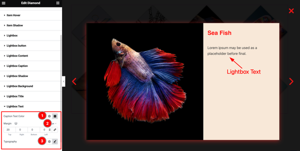
Here find the Lightbox Text Color, Margin, and Typography options.
All done! You have successfully customized the Diamond widget on your website.
Video Assist
You can watch the quick video to learn about the Diamond widget. Please visit the demo page for examples.
Thanks for being with us.