

In this documentation, we will show you how to customize the Coslide widget presented by Pixel Gallery Pro.
Inserting The Coslide Widget
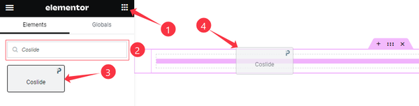
Open your page in the Elementor editor, search by the widget name, and then drag and drop it on the page.
Content Tab Customizations
Layout Section Customization
Go to Content > Layout
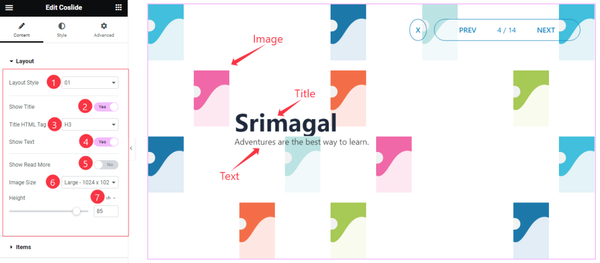
Come to the Layout section, Find the Layout Style (01, and 02), Title HTML Tag, Image Size, and Height options, and also find the Show Title, Show Text, and Show Read More switchers.
Items Section Customization
Go to Content > Items
Step-1
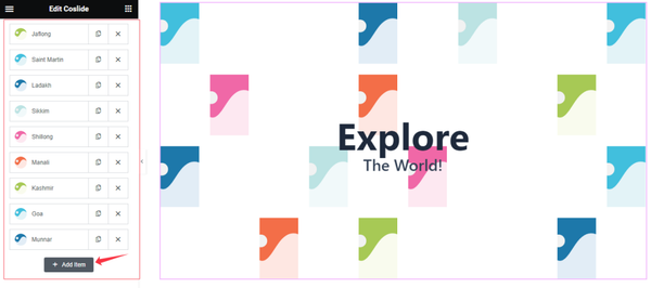
Come to the Items section, Here you can add Coslide widget items (with the Add Item button).
Step-2
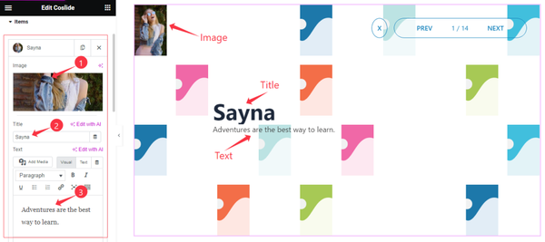
For Each Coslide Slider item, Find the Image, Title, and Text options.
Step-3
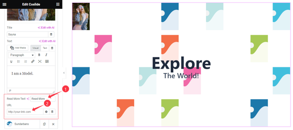
For Each Coslide Slider item, also Find the Read More Text and URL Link options.
Static Content Section
Go to Content > Static Content
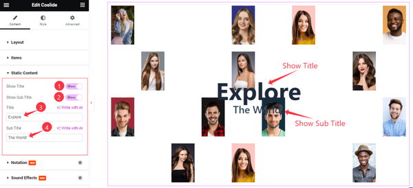
Here Find the Show Title, Show Sub Title switchers, and options.
Work with The Style Tab
Style The Images Section
Go to Style > Images
Step-1
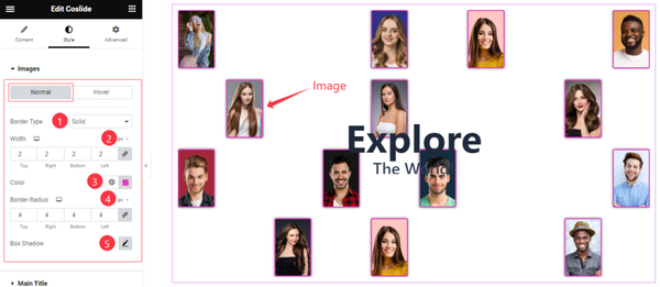
Come to the Images section, you will find two sub-sections; Normal and Hover.
In the Normal mode, Find the Border Type, Width, Border Color, Border Radius, and Box Shadow options.
Step-2
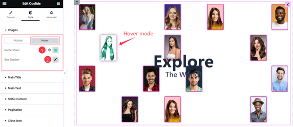
In the Hover mode, find the Border Color, and Box Shadow options.
Main Title Section
Go to Style > Main Title
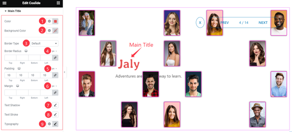
In this section, Find the Title Color, Background Color, Border Type, Border Radius, Padding, Margin, Text Shadow, Text Stroke, and Typography options.
Main Text Section
Go to Style > Main Text
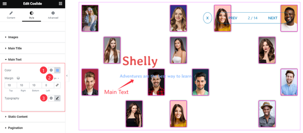
Find the Text Color, Margin, and Typography options.
Static Content Section
Go to Style > Static Content
Step-1
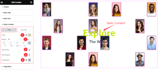
Come to the Static Content section, you will find two sub-sections; Title, and Sub Title.
In the Title Mode, Find the Color, Margin, Text Stroke, Text Shadow, and Typography options.
Pagination Section
Go to Style > Pagination
Step-1
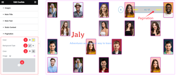
Come to the Pagination section, find the Pagination Color, Background Type (Classic, and Gradient), Background Color, and Image options.
Step-2
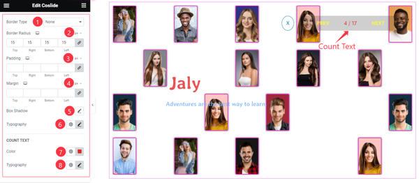
Here also find the Border Type, Border Radius, Padding, Margin, Box Shadow, Typography, Count Text Color, and Count Text Typography options.
Style The Cross Icon Section
Go to Style > Cross Icon
Step-1
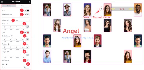
Come to the Cross Icon section, you will find two sub-sections; Normal and Hover.
In the Normal mode, Find the Cross Icon Color, Background Type, Background Color, Border Type, Border Color, Width, Border Radius, Padding, Margin, Box Shadow, and Size options.
Step-2
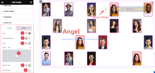
In the Hover Mode, you will get a similar customization option as in the Normal mode. So please try it yourself.
All done! You have successfully customized the Coslide widget on your website.
Video Assist
The video and the Demo page will be coming soon.