

In this documentation, we will discuss the customization of the Material Slider widget, brought to you by the Prime Slider addon for Elementor.
Enable Material Slider Widget
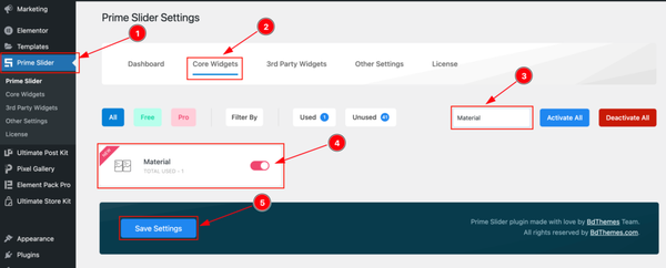
To use the Elementor Material Slider widget from Prime Slider, first, you have to enable the widget.
- Go to WordPress > Prime Slider Plugin dashboard.
- Then Click the Core Widgets Tab.
- Search the Material Slider Widget Name.
- Enable the Material Slider Widget.
- Hit the Save Settings Button.
Inserting The Material Slider widget
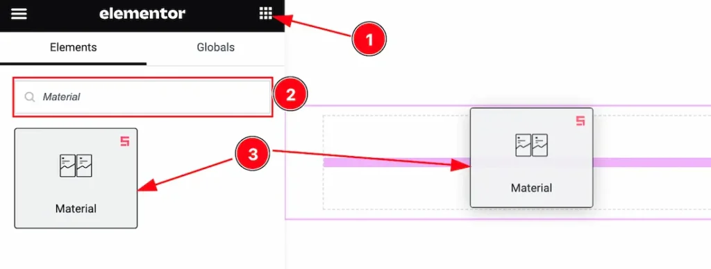
- Go to the Elementor Editor Page and Hit the Get Back To Button.
- Search the Material Slider widget.
- Drag the widget and Drop it on the editor page.
Note: You need both Elementor and Prime Slider Pro installed to use this widget.
Work With The Content Tab
Layout Section
Go to Content > Layout
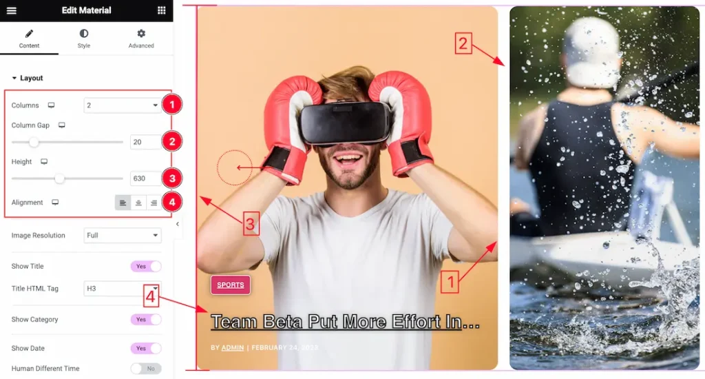
Come to the Layout section, you can customize these options-
- Column: you can show the whole slider in 1 or 2 columns by the Columns option.
- Column Gap: Column Gap works between two columns.
- Height: The Height options allow you to customize the slider height.
- Alignment: Alignment may refer to the positioning of text or data within a specified space or column. you can set the Alignment – Left, Center, and Right.
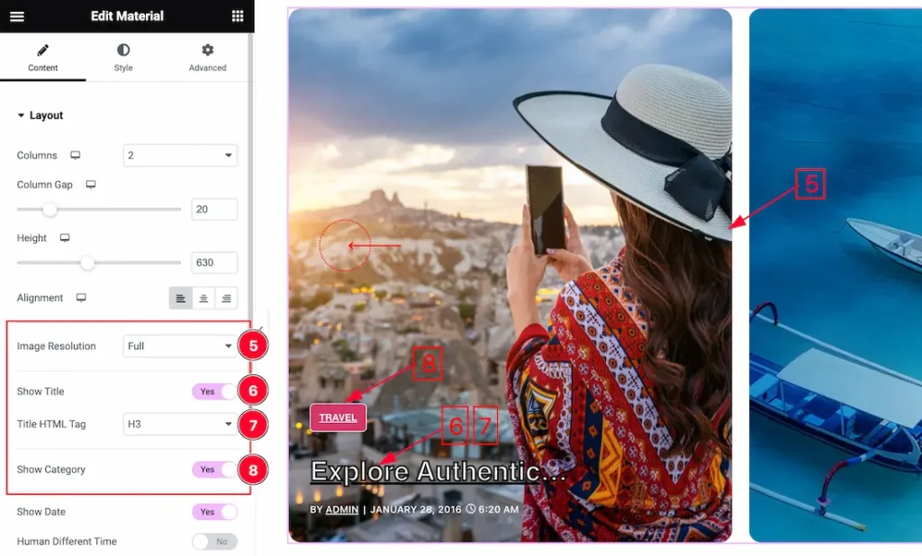
In this section, you also get the below options to customize the widget.
5. Image Resolution: Select the Image Resolution Type( Thumbnail, Medium, Large, Full, etc) to showcase your slider.
The choice of image resolution type depends on the requirements of your slider and the display devices. Here’s a brief overview:
- Thumbnail: Small-sized images suitable for quick loading and display in smaller spaces.
- Medium: Moderately sized images with a balance between quality and file size.
- Large: Higher resolution images suitable for larger sliders or displays with more space.
- Full: Images with the highest resolution available, suitable for large displays or backgrounds.
6. Show Title: The Show Title switcher buttons Allow you to show and hide the Title from your editor page.
7. Title HTML Tag: Here also you get the Title HTML Tag options to decorate your Title in different Tags. Like as H1 to H6, Div, Span, and P.
8. Show Category: The Show Category switcher buttons Allow you to show and hide the Category from your editor page.
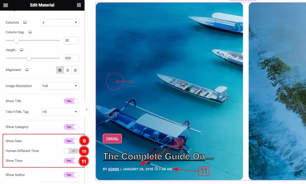
9. Show Date: The Show Date switcher buttons Allow you to show and hide the Date from your editor page.
10. Human Different Time: Enable this switcher button to show the Human Different Time.
11. Show Time: The Show Time switcher buttons Allow you to show and hide the Time from your editor page.
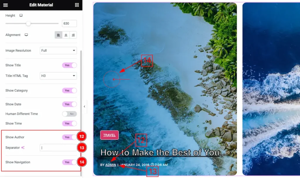
12. Show Author: Enable this switcher button to show the Author. if you disable the switcher button then the Author will disappear from your Slider.
13. Separator: This option lets you customize the Separator as you wish. For Example, you can use this type of symbol – “|”, “,”, “$”, “%”, “@”, “.” etc as a Separator.
14. Show Navigation: The Show Navigation buttons Allow you to show or hide the Navigation from your Slider.
Query Section Customization
Go to Content > Query
Explore The Source Element
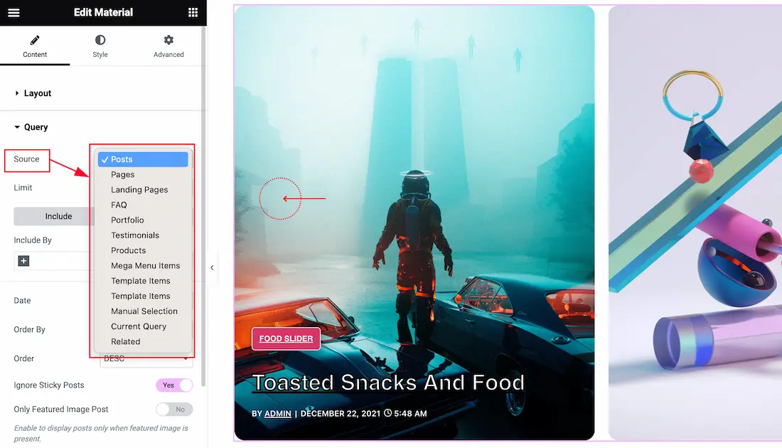
Come to the Query section, you can select the Source Type ( Like- Posts, Pages, Landing Pages, FAQ, Portfolio, etc.) to show your posts or anything else that you select as Source. whatever you select, will show on your Page. I selected here Posts that’s why it shows the posts.
To learn more about the Query section features. please visit the link- Query section.
Slider Settings Section
Go to Content > Slider Settings
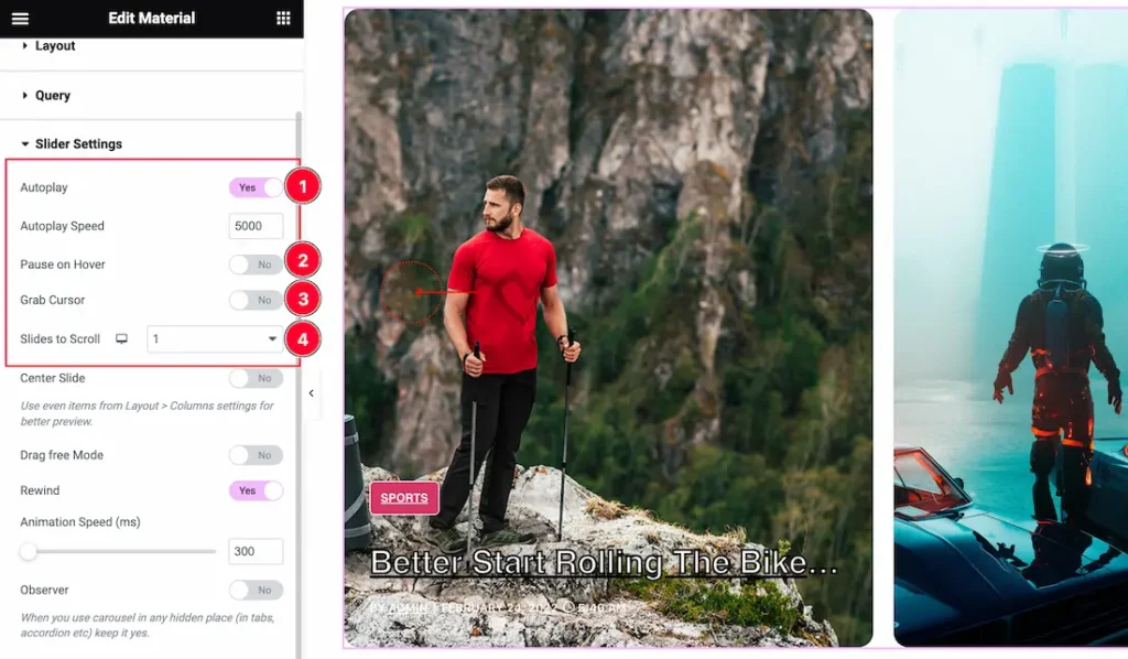
In this section, you will be able to see a bunch of Switchers like Auto Play, Auto Play speed, Pause on Hover, Slides to Scroll, Center Slide, Grab Cursor, Drag free Mode, Rewind, Animation Speed, and Observer. These switcher buttons allow you to show or hide the elements on your page.
What they do-
1. Autoplay switcher: If you Enable the Autoplay switcher button, your slider will slide into Autoplay mode, and you can set the Autoplay Speed as you wish.
2. Pause on Hover: If you activate the pause on Hover button, when visitors Hover the mouse cursor on the slider, then your slider will Hold, otherwise your slider slide Autoplay.
3. Grab The Cursor: Your mouse pointer icon will be changed into a grab cursor. Visitors can slide your slider manually with your mouse cursor.
4. Slides to scroll: It represents how many slides will slide at once.
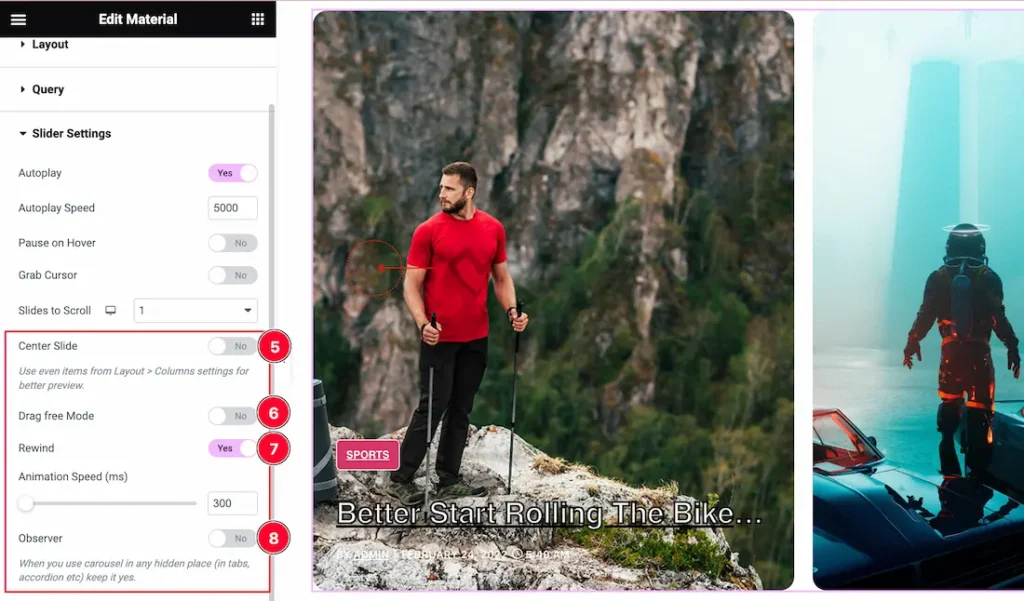
5. Center Slide: If you enable the Switcher option, then your Active slider will show the center (depending on your widget style).
6. Drag Free Mode: In this mode, you can easily make it visible by Dragging your slider into the slide Area.
7. Rewind: Once the slider is finished sliding, it will restart from the beginning.
8. Observer: If you enable the option then you are able to use the slider/carousel in any hidden places (such as in tabs, Accordion, etc).
Work with The Style Tab
Items Section
Go to Style > Items
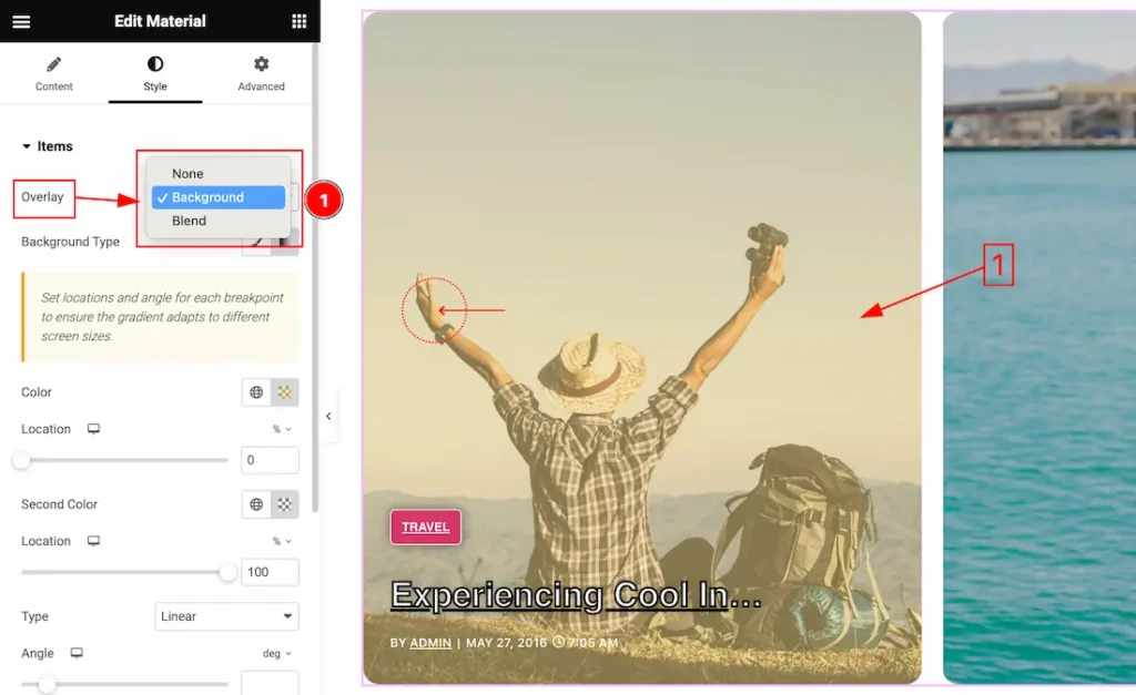
1. Overlay: Overlay is an effect that is displayed over the slider. Here you will get the Overlay Type ( None, Background, and Blend). Here we select the Overlay Type Background. you can choose any one of them.
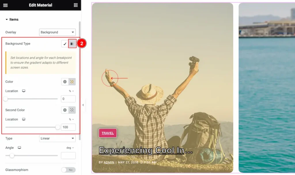
2. Background Type: you can change the color of any object background to classic or gradient. Here we choose the Background type Gradient. if you select the Type Gradient then you will get the 1st color, 1st location, 2nd color, and 2nd location options to customize it.
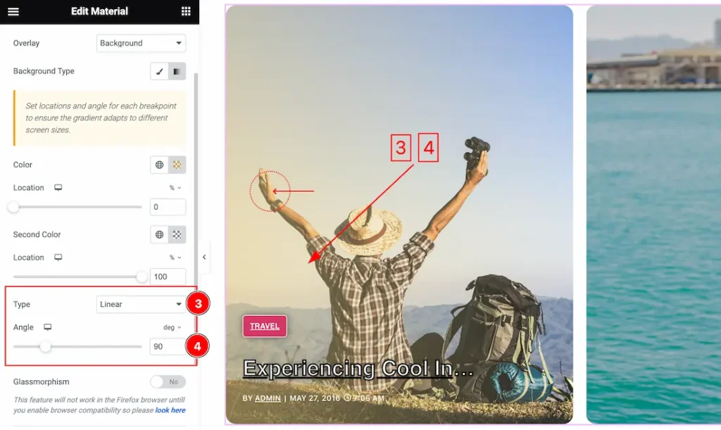
3. Type: In this section, you can change the Background Type to Linear and Radial.
- Linear: A linear gradient is a type of fill or shading effect that transitions colors in a straight line from one point to another.
- Radial: A radial gradient is a fill or shading effect that transitions colors outward from a central point, radiating in a circular or elliptical pattern.
4. Angle: The gradient angle defines the direction of the gradient fill, indicating where one color starts and another ends. The gradient angle is often measured in degrees, typically ranging from 0 to 360. you also can change the Angle in Deg, Grad, Rad, and turn options.
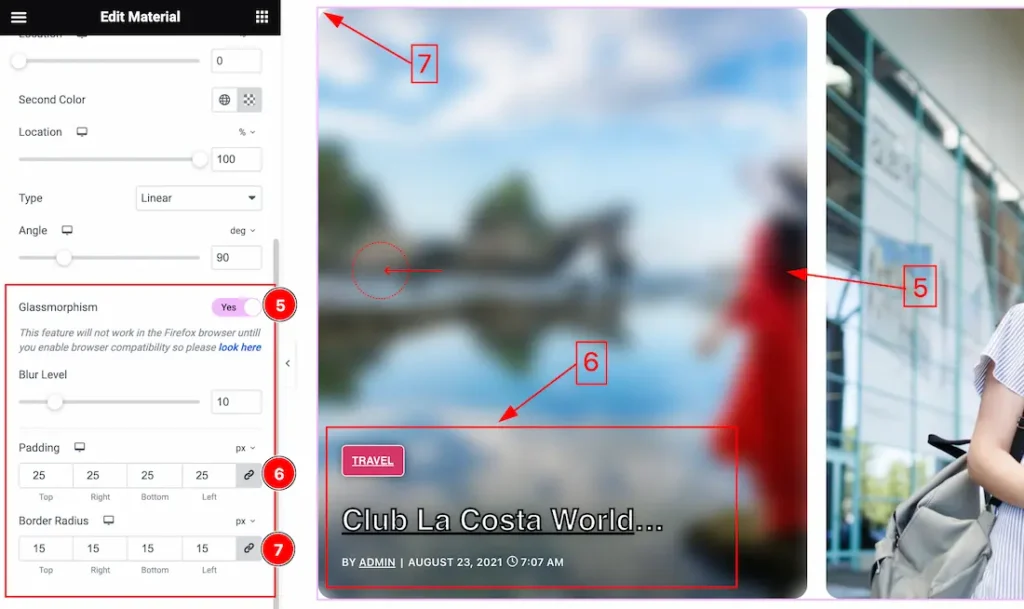
5. Glassmorphism: Actually, the Glassmorphism is used to blur the slider background. That we shown in the above screenshot. you can easily enable or disable the Glassmorphism switcher button to show or hide the effect on your slider.
6. Padding: Add spaces around an object to increase the inner area. Padding allows you to control the internal space within an element.
7. Border Radius: Customizes the border corners for roundness.
Title Section
Go to Style > Title
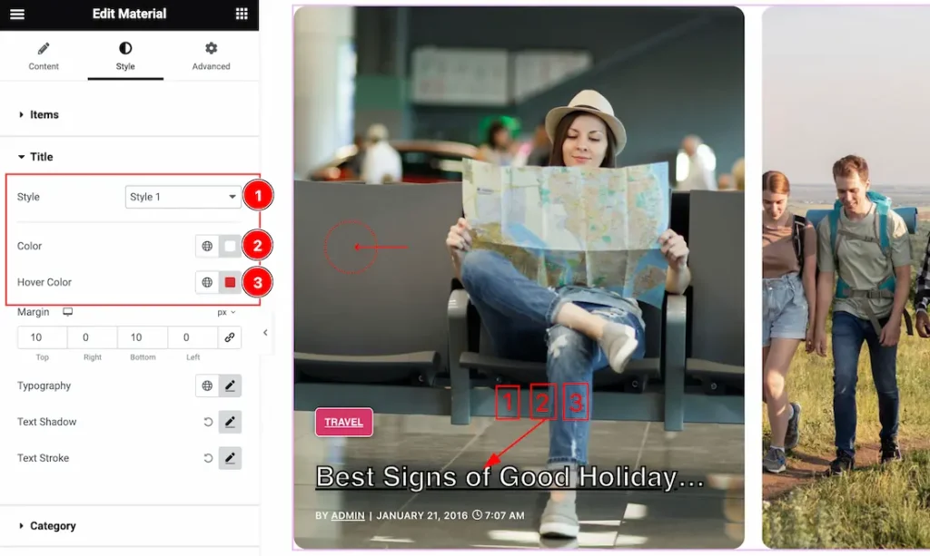
1. Style: The Style option works over the Title. Here you will get Style 1 to Style 6 to design the title.
2. Normal Color: This lets you change the title text color.
3. Hover Color: This lets you change the title text Hover color.
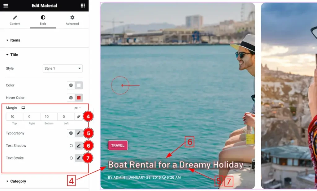
4. Margin: Adjusts the position of an object over the canvas.
5. Typography: Changes the font family, size, weight, style, transform, decoration, line height, letter spacing, and word spacing.
6. Text Shadow: The Text Shadow property is used to create the shadow around the text. It takes three values: horizontal offset, vertical offset, and blur radius. Here you also can change the Text Shadow Color.
7. Text Stroke: If you want to add a stroke (outline) around the text, you can use the Text Stroke property. you also can change the Text Stroke Color as your working demand.
Category Section
Go to Style > Category
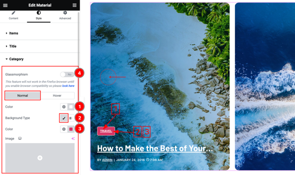
Come to the Category section, you will find two tabs section; Normal and Hover.
In the Normal tab section, you can customize these below options-
1. Text Color: This lets you change the Category text color.
2. Background Type: you can change the color of any object background to classic or gradient. Here we choose the Background type Classic.
3. Background Color: This lets you change the Category Background color. If you want, you also can change an image to the Background.
4. Glassmorphism: In the previous section we discussed the function. Please check it once again.
In the Normal mode, you will get some more options like-
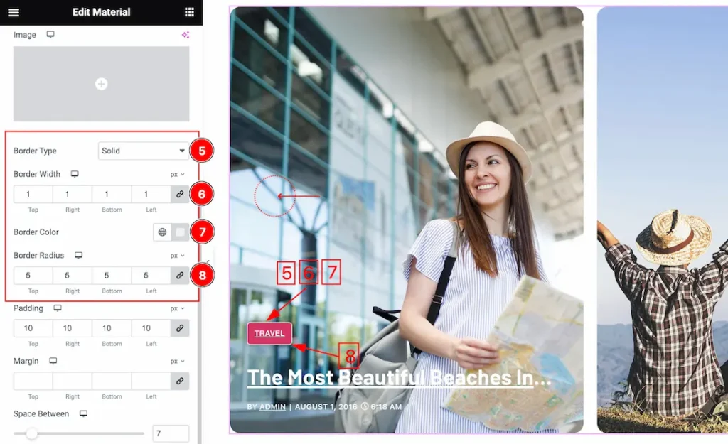
5. Border Type: you can set the Border Type to Default, None, Solid, Double, Dotted, Dashed, or Groove. We choose here the Border Type Solid.
6. Border Width: The border width property allows developers or designers to control how thick or thin the border around a widget should be.
7. Border Color: This lets you change the Border color.
8. Border Radius: Customizes the border corners for roundness.
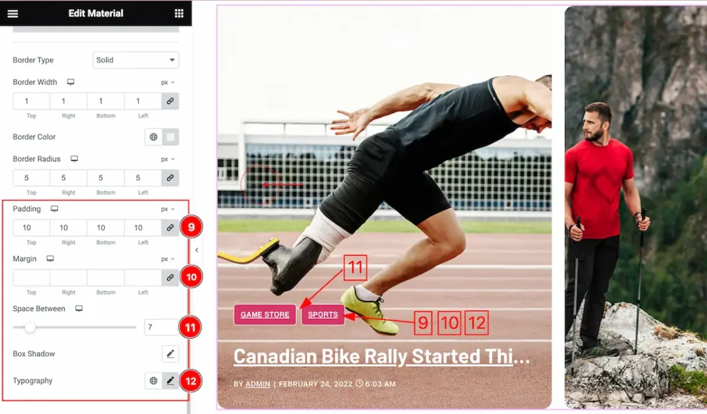
9. Padding: Add spaces around an object to increase the inner area. Padding allows you to control the internal space within an element.
10. Margin: Adjusts the position of an object over the canvas.
11. Space Between: Actually, the Space Between works between two categories. you can customize the space to your working demand.
12. Typography: Change the font family, size, weight, style, transform, decoration, line height, letter spacing, and word spacing from here.
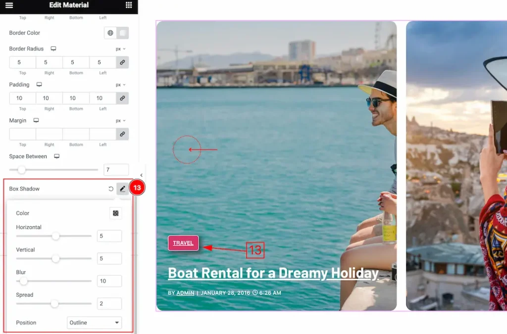
13. Box Shadow: The Box Shadow property is used to create the shadow around the Category Button. It takes Four values: Horizontal offset, Vertical offset, blur, and Spread to customize the Box shadow.
- Box Shadow Color: This lets you change the Box Shadow color.
- Position: you can set the Box Shadow position Outline and Inset. Here we set the Box Shadow position Outline.
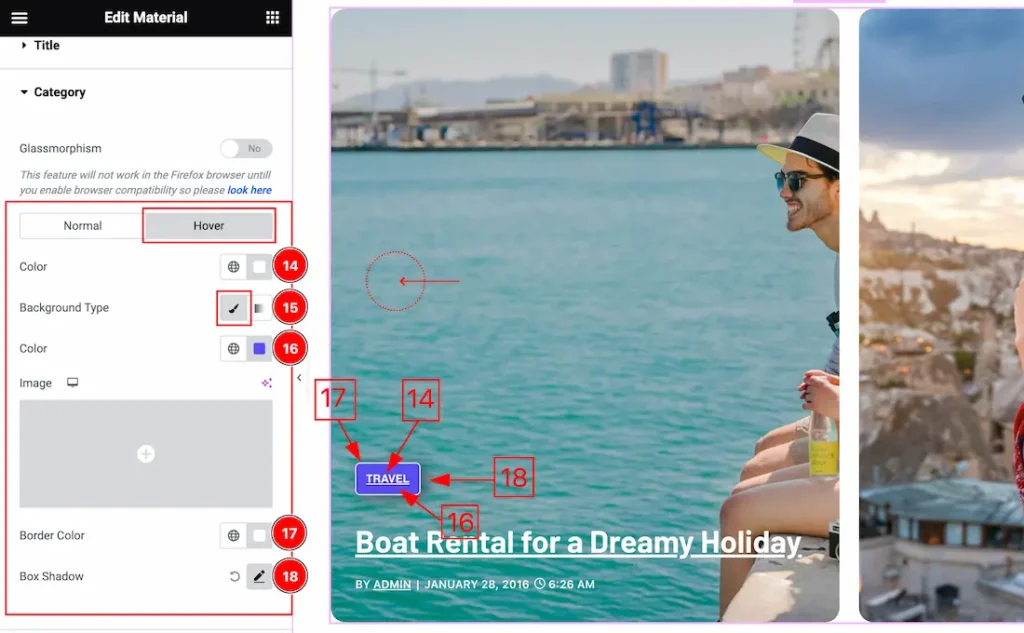
In the Hover mode, you will get the same customization options as in the normal mode.
14. Text Color: This lets you change the Category text Hover color.
15. Background Type: you can change the color of any object background to classic or gradient. Here we choose the Background type Gradient. Here we select the type Classic.
16. Background Color: This lets you change the Category Hover Background color. If you want, you also can change an image to the Background.
17. Border Color: Border Color lets you change the border color surrounding an element.
18. Box Shadow: The Box Shadow property is used to create the shadow around the Category Button. In the above steps, we discussed about it.
Meta Section
Go to Style > Meta
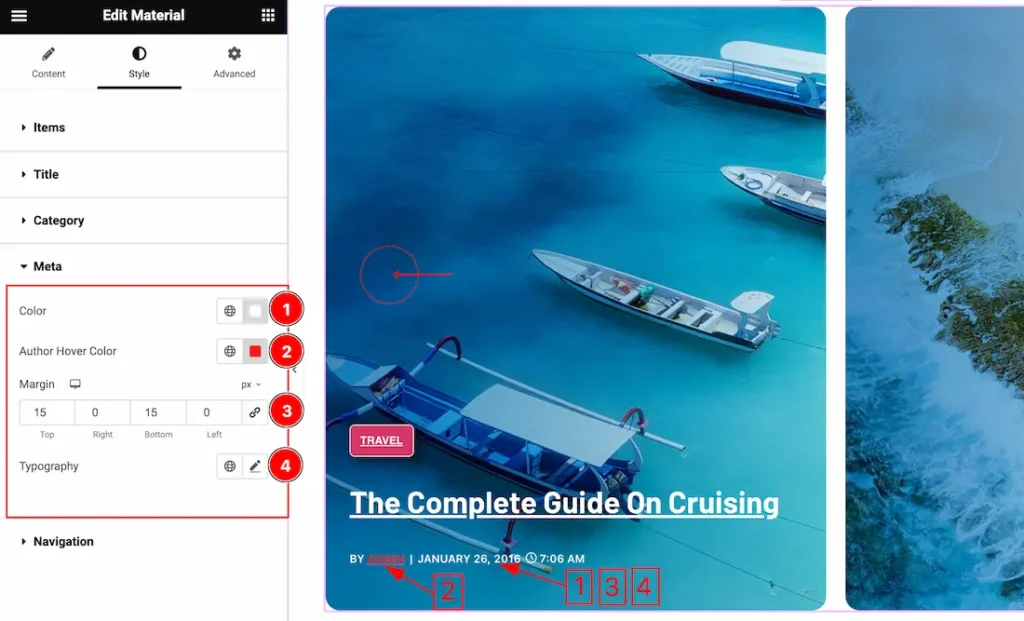
Come to the Meta section, and find the Meta Color, Author Hover Color, Margin, and Typography options.
1. Meta Color: This lets you change the Meta Text color.
2. Author Hover Color: This lets you change the Author Hover color.
3. Margin: Adjusts the position of an object over the canvas.
4. Typography: Change the font family, size, weight, style, transform, decoration, line height, letter spacing, and word spacing from here.
Navigation Section
Go to Style > Navigation
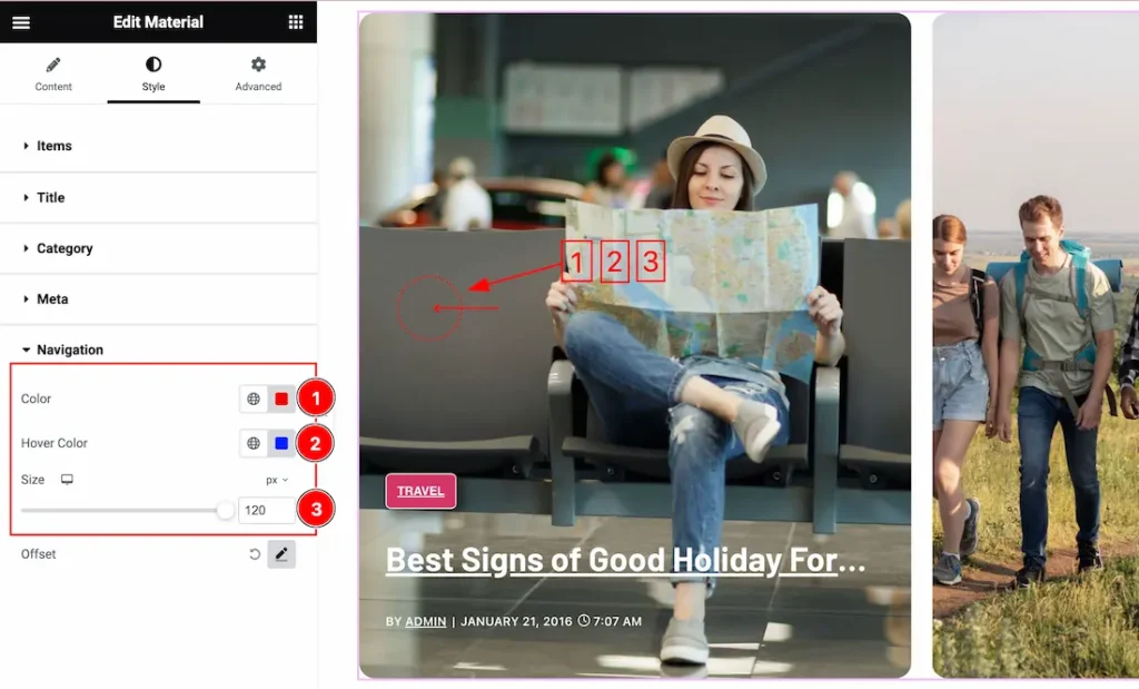
In the Navigation section, you will find the below options-
1. Navigation Color: This option lets you change the Navigation color.
2. Hover Color: This lets you change the Navigation Hover color.
3. Size: you can customize the Navigation Size as you wish.
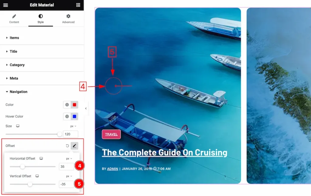
Offset: The Offset property is used to set the Navigation Position. It takes Two values: Horizontal Offset and vertical offset.
4. Horizontal Offset: This option lets you set the Navigation Horizontal position.
5. Vertical Offset: This option lets you set the Navigation Vertical position.
All done! You have successfully customized the Material Slider widget on your website.
Video Assist
You can also watch the video tutorial Learn more about the Material Slider widget. Please visit the demo page for examples.
Thanks for being with us.