In this documentation, we will discuss the customization of the Woolamp slider, brought to you by the Prime Slider addon for Elementor.
Enable The Woolamp Slider
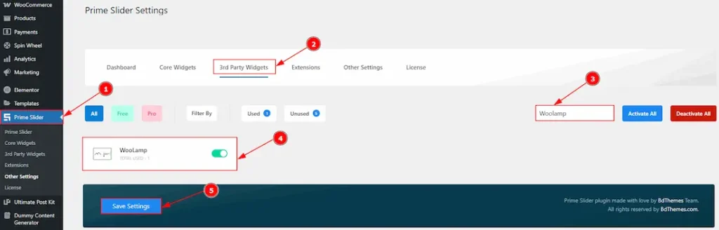
To use the Woolamp Slider widget from Prime Slider, first, you have to enable the widget.
- Go to WordPress dashboard > Prime Slider Plugin dashboard.
- Then, Click the 3rd Party Widgets Tab.
- Search the Woolamp Slider Name.
- Enable the Woolamp Slider.
- Hit the Save Settings Button.
Inserting The Woolamp Slider
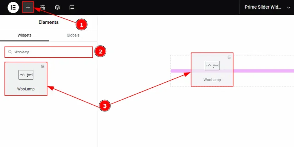
1. Go to the Elementor Editor Page and Hit the “+” icon Button.
2. Search the Woolamp slider.
3. Drag the widget and drop it on the editor page.
Work With The Content Tab
Layout Section
Go to Content > Layout
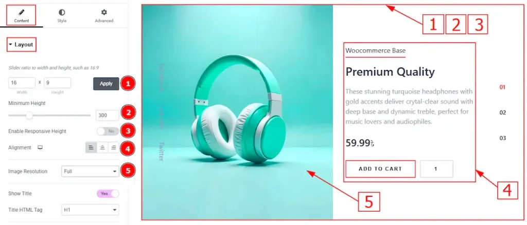
1. Slider Ratio: You can adjust the slider ratio to width & height with this option.
2. Minimum Height: You can adjust the slider height with this option.
3. Enable Response Height: Enable the switcher to set the slider height as responsive for all devices.
4. Alignment: You can adjust the content alignment to left, center or right with this option.
5. Image Resolution: You can adjust the image resolution with this option.
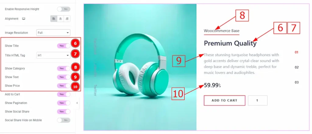
6. Show Title: Enable the switcher to show the title to the audience.
7. Title HTML Tag: This option lets you select the heading for the title.
8. Show Category: Enable the switcher to show the category name to the audience.
9. Show text: Enable the switcher to show the text/description to the audience.
10. Show Price: Enable the switcher to show price to the audience.
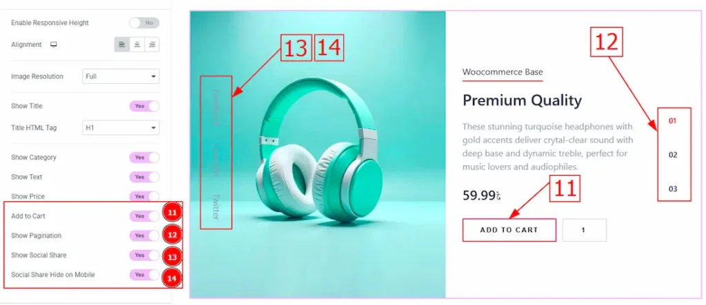
11. Add to Cart: Enable the switcher to show the add to cart button to the audience.
12. Show Pagination: Enable the switcher to show the pagination to the audience.
13. Show Social share: You can show the social share text to the audience by enabling this option.
14. Social Share Hide on Mobile: Enable the switcher to hide the social share on mobile devices.
Social Share Section
Go to Content > Social Share
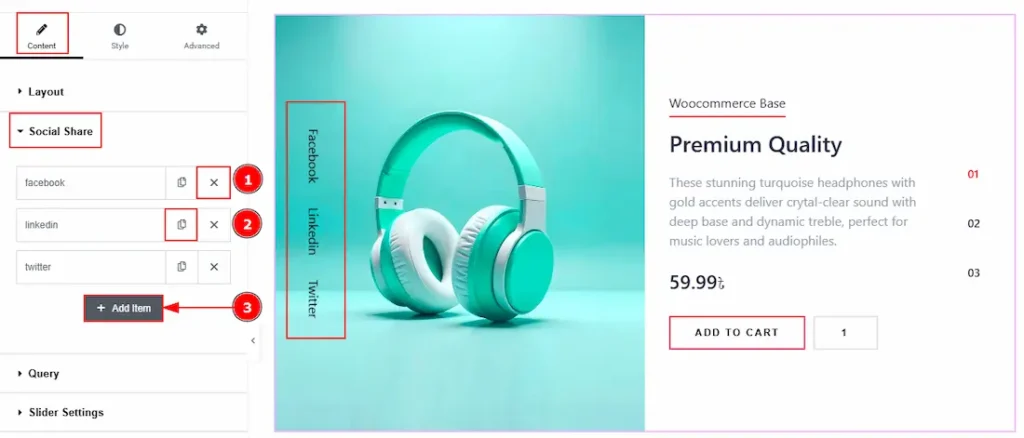
1. Close Item: You can delete the Slider item by clicking the Close icon button.
2. Copy Item: This option lets you copy the same item.
3. Add Item: You can add a new item by clicking the “+”Add Item button.
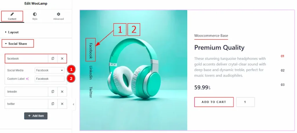
Now, let’s proceed to the inner options of the social icon –
1. Social Media: You can select the social media type with this option.
2. Custom label: You can change the social share name with this option.
Query Section
Go to Content > Query
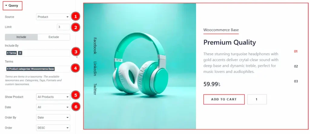
1. Source: Select the source for the slider from here. The types of sources are – Posts, Pages, Floating Elements, Downloads, Products, Mega Menu Items, Template Items, Manual Selection, Current Query, Related. Here we selected the type as posts.
2. Limit: You can adjust the limit here of how many posts you want to show in the slider.
3. Include/Exclude Selection: Select the Include / Exclude filter to show/hide specific posts by Terms (Tags/Categories) or Authors. Here, we selected the include field as Author.
4. Author: This option lets you select the author’s name whose post you want to add to the slider.
5. Show Product: You can choose the option to show products (All products, On Sale & Featured) to the audience with this option.
6. Date: You can select the post as per the date of creation with this option.
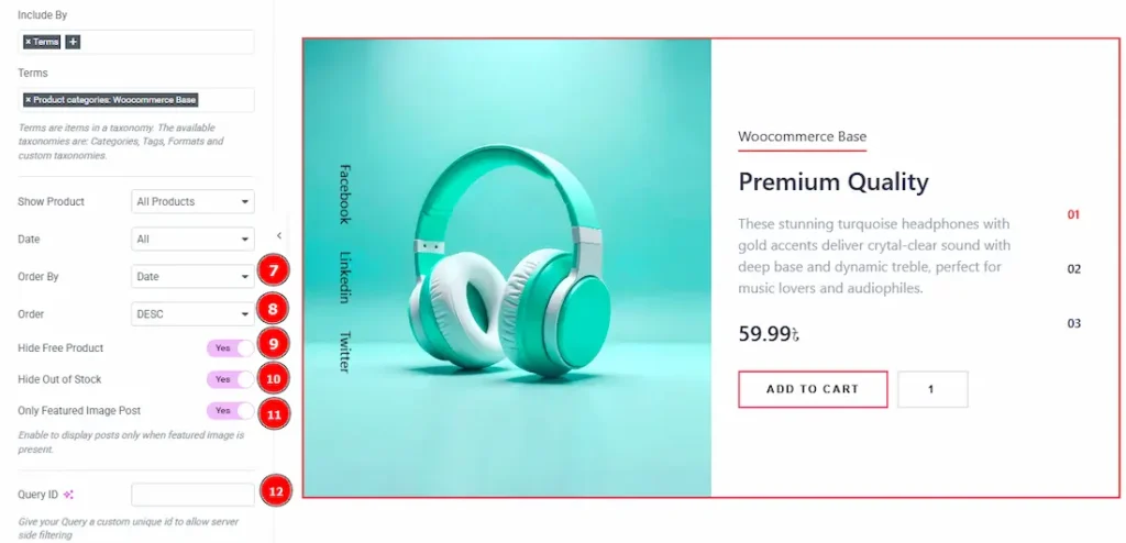
7. Order By: It controls the data you want to display through title, id, date, author, comment count, menu order & random. Here we selected the order as date.
8. Order: This option controls the order by which data is arranged. There are two types of order. Ascending Order (Starts from the smallest or lowest value and goes to the largest or highest.) & Descending Order (Starts from the largest or highest value and goes to the smallest or lowest.)
9. Hide Free Products: Enable the switcher to hide free products from the slide.
10. Hide Out of Stock: Enable the switcher to hide out-of-stock products from the slide.
11. Only Featured Image Post: Enable or disable the switcher to show or hide the featured image post.
12. Query ID: Give your query a custom, unique ID to allow server-side filtering. Learn more about the Query.
Slider Settings Section
Go to Content > Slider Settings
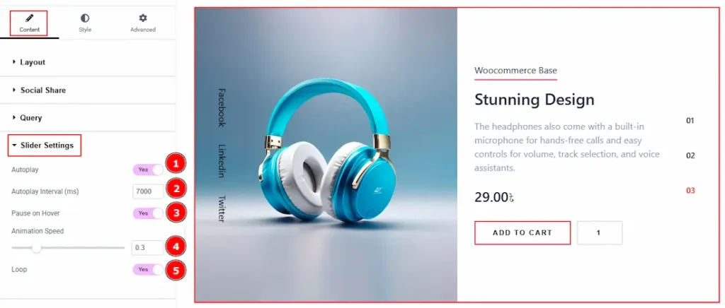
1. Autoplay: By enabling this option, you can automatically play the slides one after another.
2. Autoplay Interval (ms): This option lets you set the time delay between each slide transition.
3. Pause on Hover: Enable the switcher to pause autoplay when the user hovers over the slider.
4. Animation Speed: This option controls how fast the transition animation occurs between slides.
5. Loop: Enable the switcher to go back to the first automatically after the last slide.
Work with The Style Tab
Sliders Section
Go to Style > Sliders
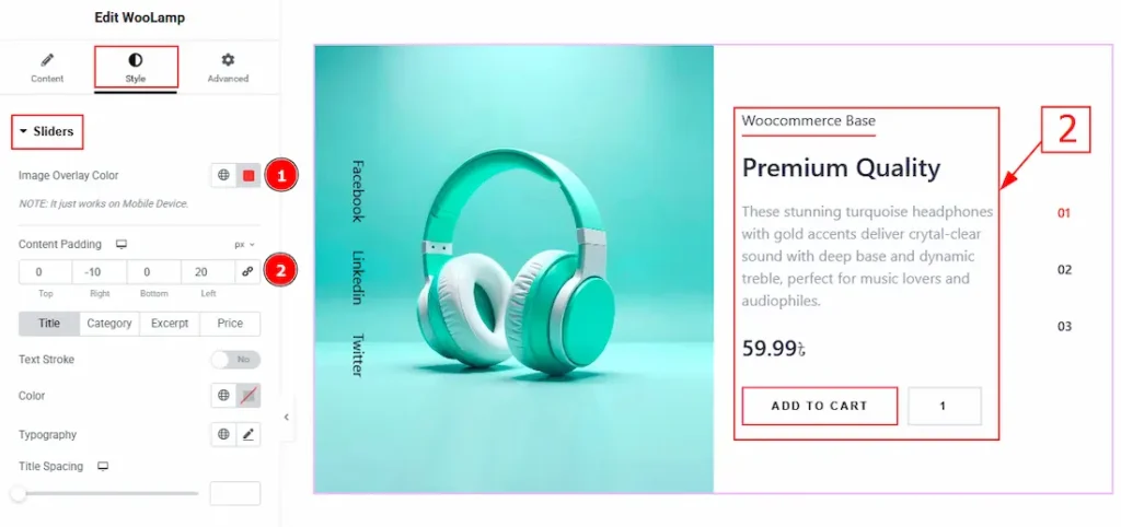
1. Image Overlay Color: You can change the image overlay with this option.
(Note: This option is applicable only for mobile devices)
2. Content Padding: This option allows you to adjust the space & create gaps of the content area.
In this section, we have four tabs. These are Title, Category, Excerpt & Price. Let’s explore those tabs one by one.
Title Tab
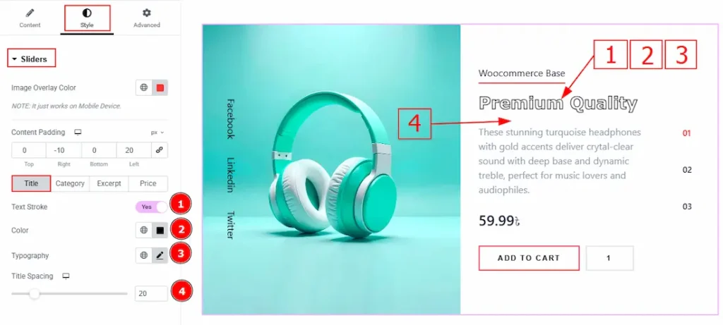
1. Text Stroke: This option allows you to add an outline or border around text, creating a visually distinct effect.
2. Color: You can change the title color with this option.
3. Typography: Change the font family, size, weight, transform, style, decoration, line height, letter spacing, and word spacing from here.
4. Title Spacing: You can adjust the space between the title and the excerpt with this option.
Category Tab
Normal
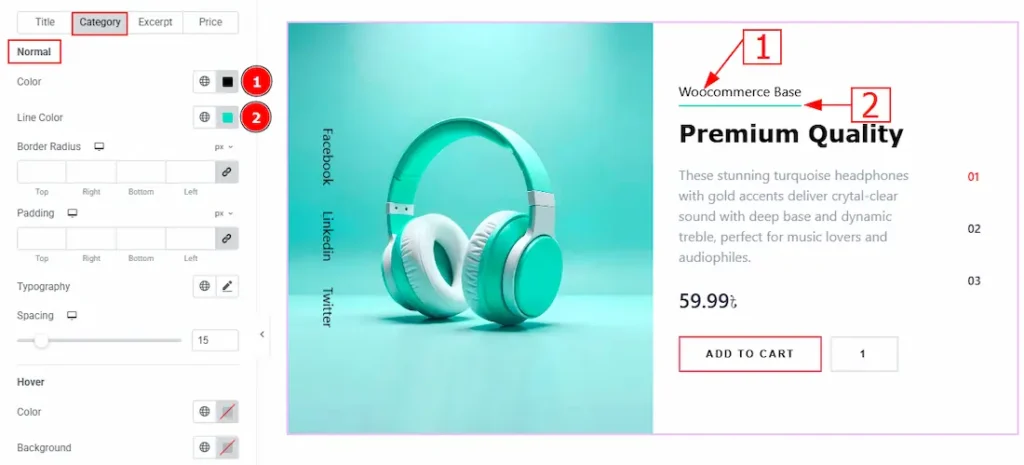
1. Color: You can change the category text color with this option.
2. Line Color: You can change the line color with this option.
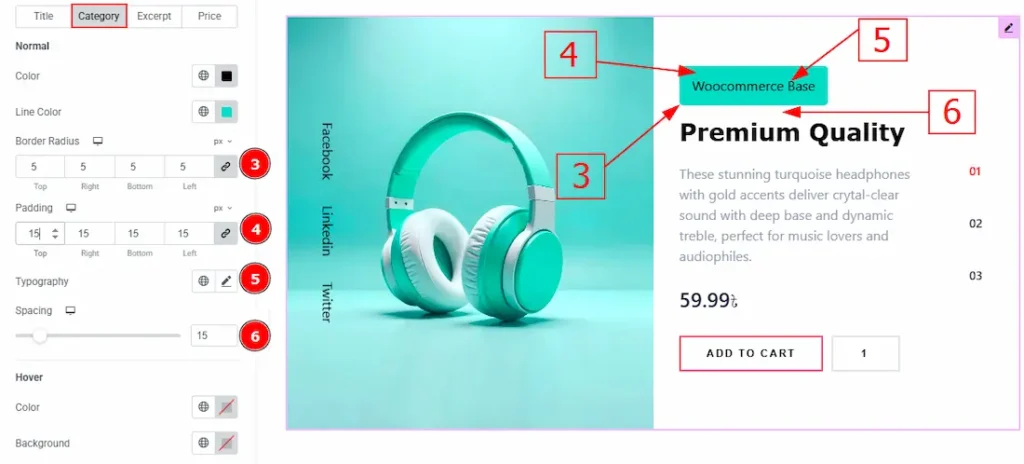
3. Border Radius: This option controls the roundness of the border.
4. Padding: You can adjust the space and gaps of the category field with this option.
5. Typography: Change the font family, size, weight, transform, style, decoration, line height, letter spacing, and word spacing from here.
6. Spacing: You can adjust the space between the category and the title with this option.
Hover
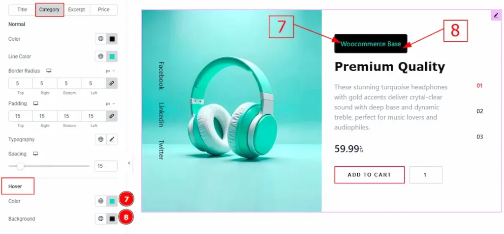
7. Color: You can change the category text hover color with this option.
8. Background: You can change the background hover color with this option.
Excerpt Tab
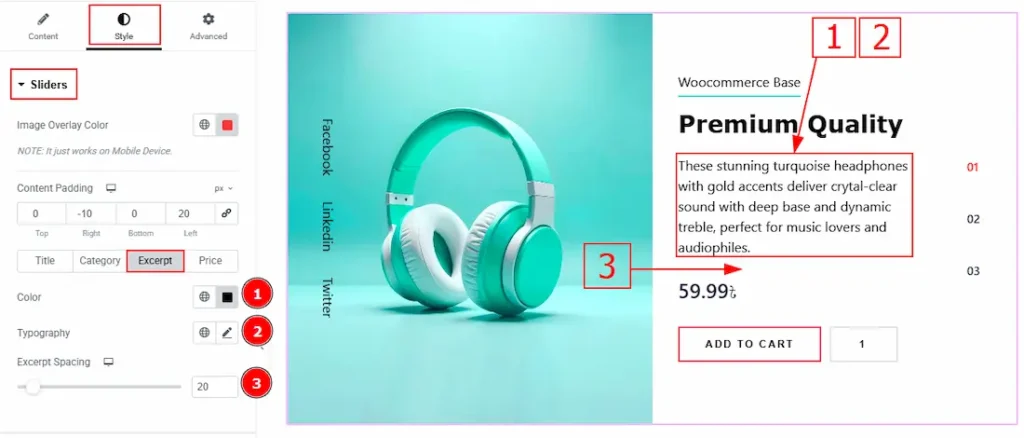
1. Color: You can change the excerpt text color with this option.
2. Typography: Change the font family, size, weight, transform, style, decoration, line height, letter spacing, and word spacing from here.
3. Excerpt Spacing: You can adjust the space and gaps between the text and the price with this option.
Price Tab
Old Price
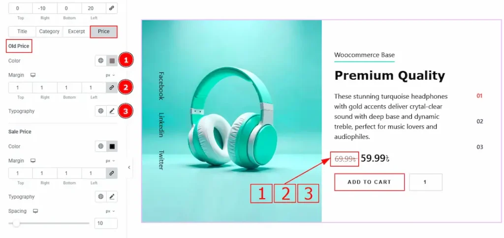
1. Color: You can change the old price color with this option.
2. Margin: This option allows you to adjust the space & create gaps between elements.
3. Typography: Change the font family, size, weight, transform, style, decoration, line height, letter spacing, and word spacing from here.
Sale Price
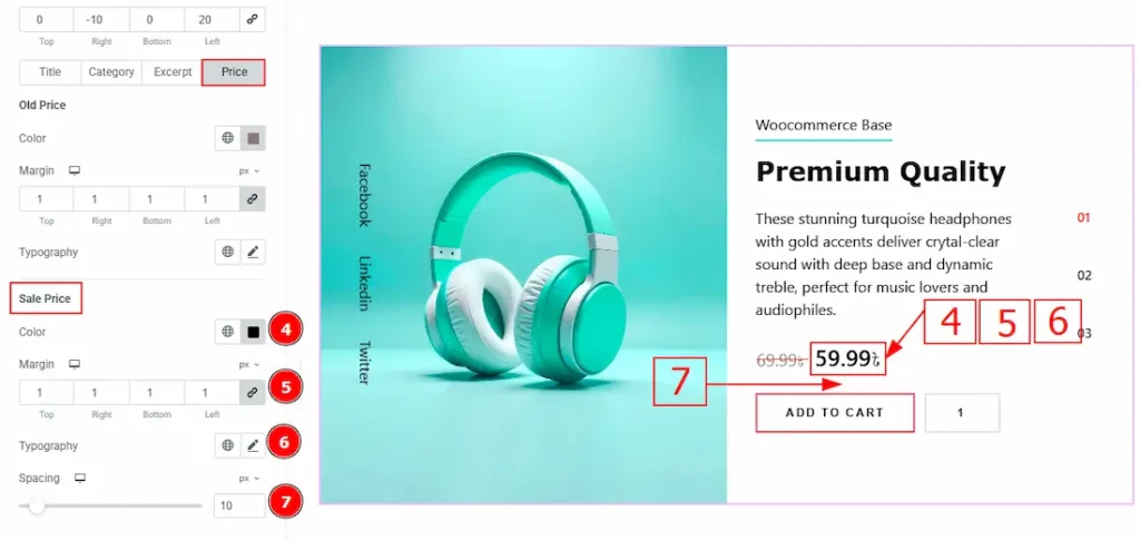
4. Color: You can change the sale price color with this option.
5. Margin: This option allows you to adjust the space & create gaps between elements.
6. Typography: Change the font family, size, weight, transform, style, decoration, line height, letter spacing, and word spacing from here.
7. Spacing: You can adjust the space between the price and the add to cart button with this option.
Add to Cart Button Section
Go to Style > Add to Cart Button
In this Section, we have three tabs. These are Normal, Hover & Quantity. Let’s start with the Normal Tab –
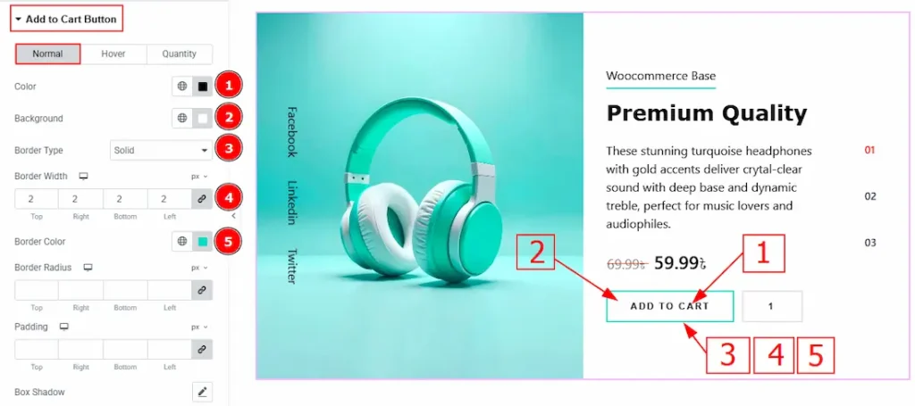
1. Color: You can change the add to cart text color with this option.
2. Background: You can change the background color with this option.
3. Border Type: You can add a border to the add to cart button with this option.
4. Border Width: Set the thickness of the border with this option.
5. Border Color: You can change the border color with this option.
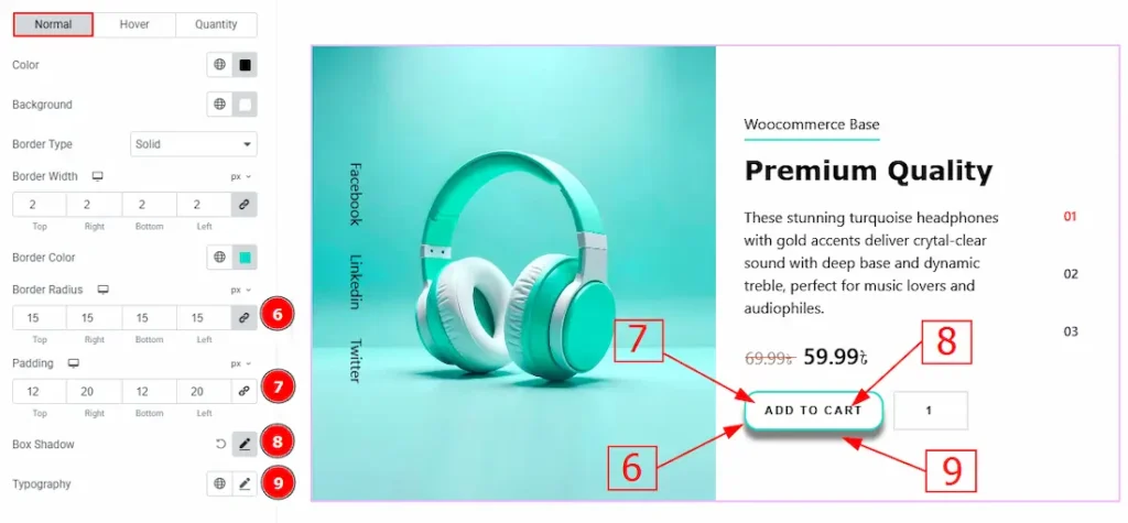
6. Border Radius: This option controls the roundness of the border with this option.
7. Padding: You can adjust the inner space of the button with this option.
8. Box Shadow: You can add a shadow effect with this option.
9.Typography: Change the font family, size, weight, transform, style, decoration, line height, letter spacing, and word spacing from here.
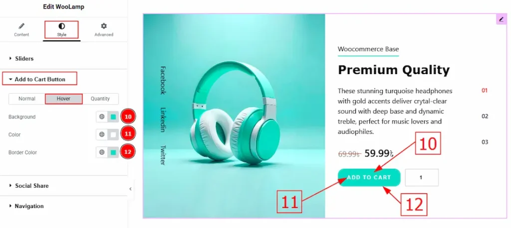
Now, let’s proceed to the Hover Tab –
10. Background: You can change the background hover color with this option.
11. Color: You can change the add to cart text hover color with this option.
12. Border Color: You can change the border hover color with this option.
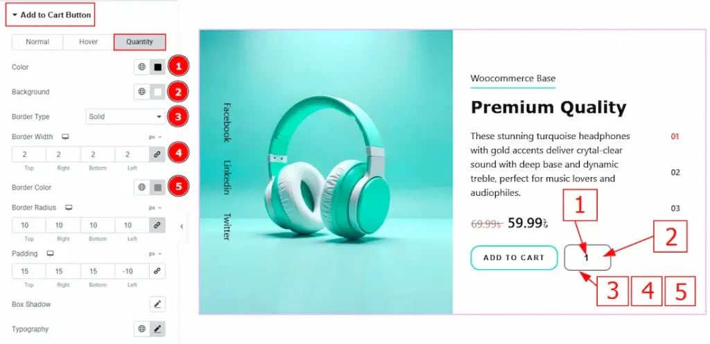
Now, let’s proceed to the Quantity Tab –
1. Color: You can change the quantity text color with this option.
2. Background: You can change the background color with this option.
3. Border Type: You can add a border to the quantity button with this option.
4. Border Width: Set the thickness of the border with this option.
5. Border Color: You can change the border color with this option.
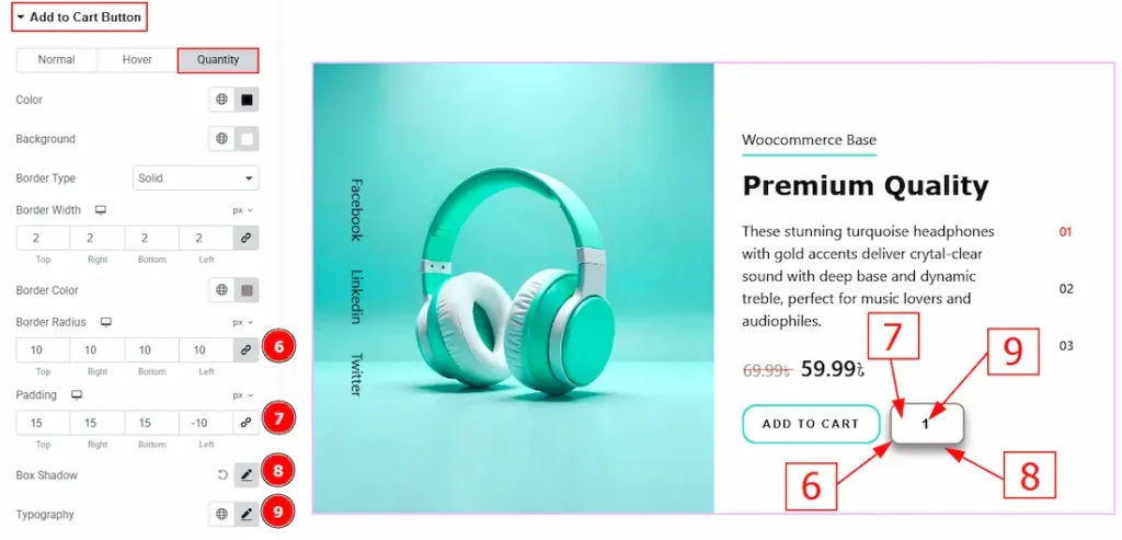
6. Border Radius: This option controls the roundness of the border with this option.
7. Padding: You can adjust the inner space of the button with this option.
8. Box Shadow: You can add a shadow effect with this option.
9. Typography: Change the font family, size, weight, transform, style, decoration, line height, letter spacing, and word spacing from here.
Social Share Section
Go to Style > Social Share
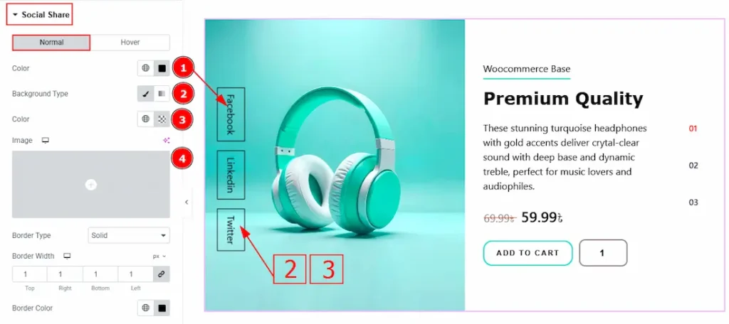
In this Section, we have two tabs. These are Normal & Hover. Let’s start with the Normal Tab –
1. Color: You can change the social share text color with this option.
2. Background Type: You can change the background type to classic or gradient with this option.
3. Color: You can change the background color with this option.
4. Image: You can change the image with this option.
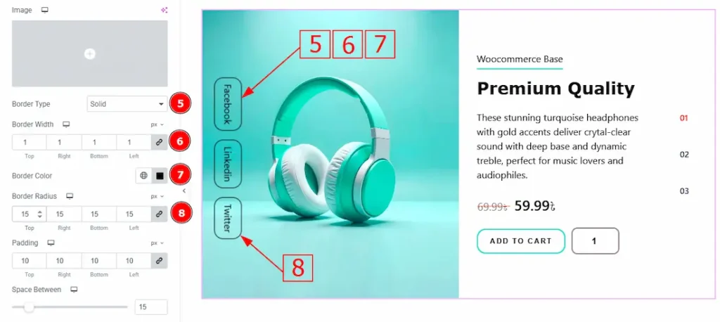
5. Border Type: You can change the border type with this option.
6. Border Width: Set the thickness of the border with this option.
7. Border Color: You can change the border color with this option.
8. Border Radius: This option controls the roundness of the border.
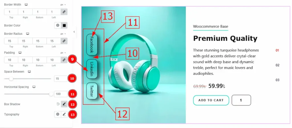
9. Padding: You can adjust the inner space of the social share field with this option.
10. Space Between: You can adjust the space between social shares with this option.
11. Horizontal Spacing: You can move the social share field horizontally with this option.
12. Box Shadow: You can add a shadow effect to the social share field with this option.
13. Typography: Change the font family, size, weight, transform, style, decoration, line height, letter spacing, and word spacing from here.
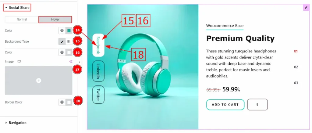
Now let’s proceed to the Hover Tab –
14. Color: You can change the social share text hover color with this option.
15. Background Type: You can change the background type to classic or gradient with this option.
16. Color: You can change the background hover color with this option.
17. Image: You can change the background image with this option.
18. Border Color: You can change the border hover color with this option.
Navigation Section
Go to Style > Navigation
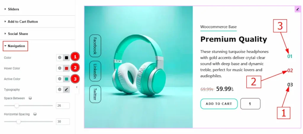
1. Color: You can change the navigation color with this option.
2. Hover Color: You can change the navigation hover color with this option.
3. Active Color: You can change the navigation hover color with this option.
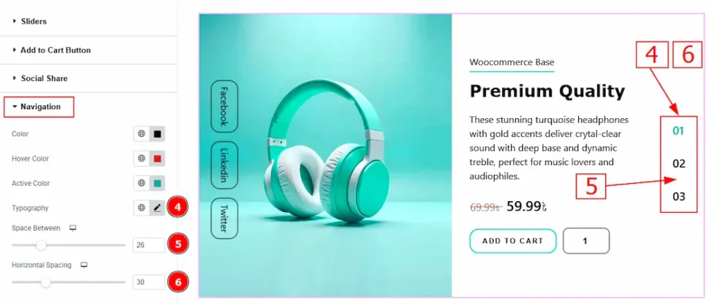
4. Typography: Change the font family, size, weight, transform, style, decoration, line height, letter spacing, and word spacing from here.
5. Space Between: You can adjust the space between navigations with this option.
6. Horizontal Spacing: You can move the navigation horizontally with this option.
All done! You have successfully customized the Woolamp Slider on your website.
Video Assist
You can also watch the video tutorial to learn more about the Woolamp Slider. Please visit the demo page for examples.
Thanks for being with us.