In this documentation, we will show you how to customize the Read More Toggle widget presented by Element Pack Pro.
Inserting The Read More Toggle

Inserting the widget by following this,
- Search by the Read More Toggle widget name.
- Then select the appear widget ( with Element Pack Pro logo T.R corner).
- After Drag and Drop it on the Elementor Editor page.
Content Tab
The Content tab controller displayed here offers the flexibility to adjust the layout of the widget according to your preferences.
Toggle Section
Go to Content > Toggle

Customize the toggle section by following,
- Normal Title: Set the title for the visually appear.
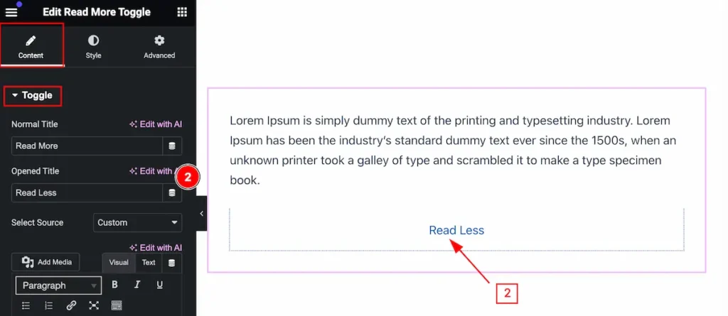
- Opened Title: Set the title for the opened the toggle.
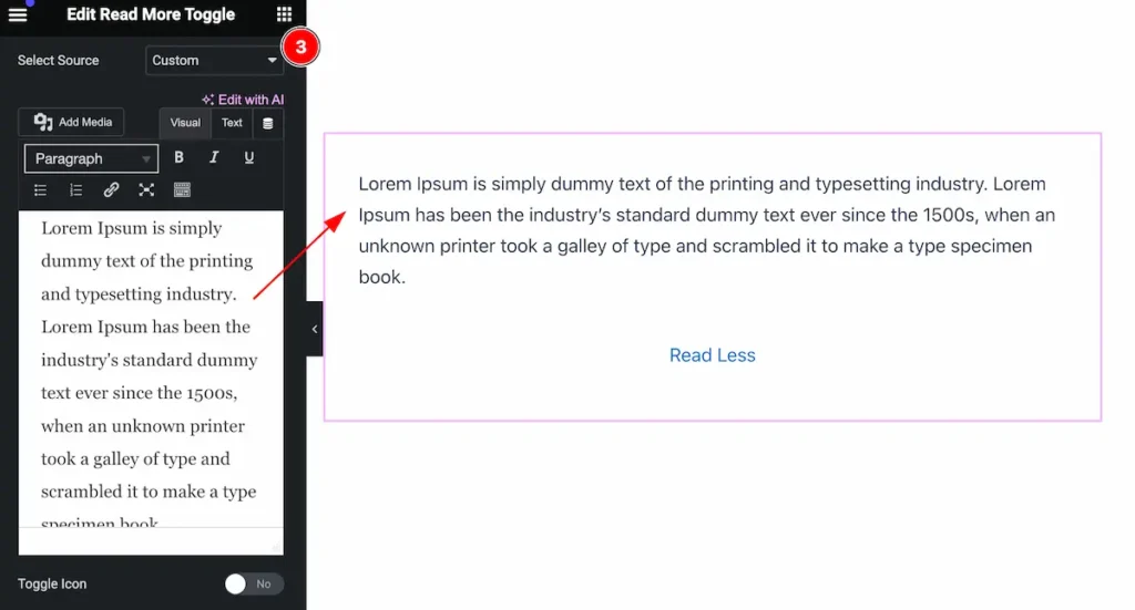
- Select Source: Select the source for the toggle. (e.g.: Custom, Template Library, AE Template, Widget Selector).
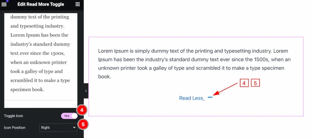
- Toggle Icon: Enable the switcher to show the toggle icon.
- Icon Position: Set the position for the Icon.
Additional Section
Go to Content > Additional
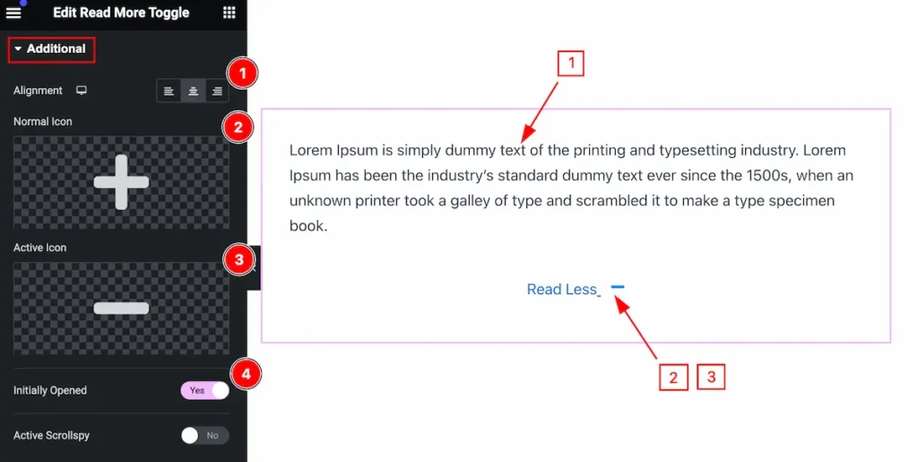
Make the additional section customizable,
- Alignment: Set the alignment for the Icon.
- Normal Icon: Select the normal icon.
- Active Icon: Select active icon.
- Initially Opened: Enable the switcher to opened it initially.
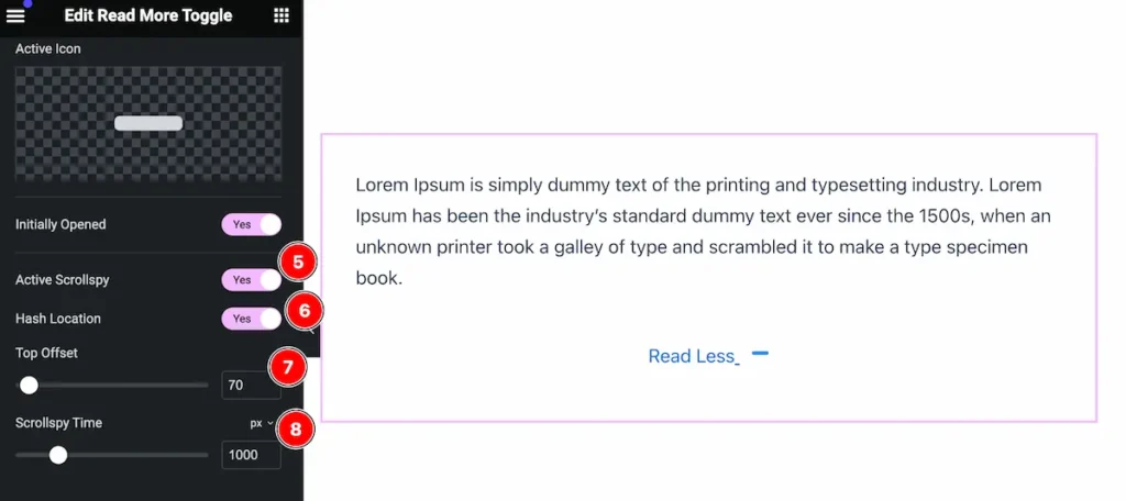
- Active Scrollspy: Enable the switcher to active the scrollspy.
- Hash Location: Enable it to show the hash location.
- Top Offset: Set offset position for it.
- Scrollspy Time: Set the scrollspy time.
Style Tab
Provide the controller to make the visual appearance or presentation of the tabs. This includes aspects that are visually appealing and cohesive with the overall design of the interface.
Title Section
Go to Style > Title
Normal State for Title
This changes appear normally.
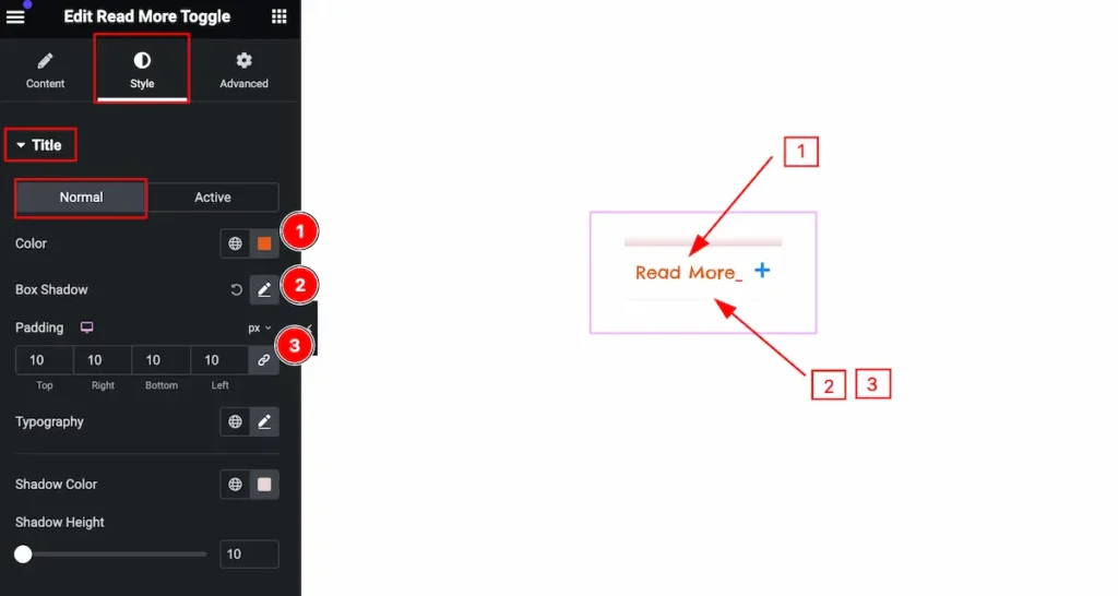
Make the title visually good by following,
- Color: Set the color for the title.
- Box Shadow: Make the box shadow.
- Padding: Set the padding.
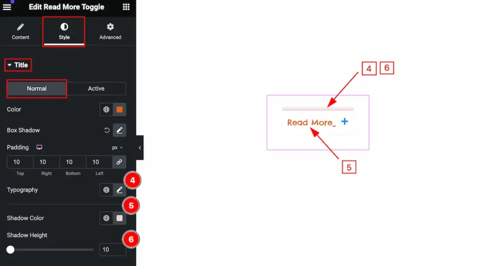
- Typography: Set the typography for it.
- Shadow Color: Set color shadow.
- Shadow Height: Set the height shadow.
Active State for Title
The changes will appear when it is active.

- Color: Set the color for active toggle.
Content Section
Go to Style > Content
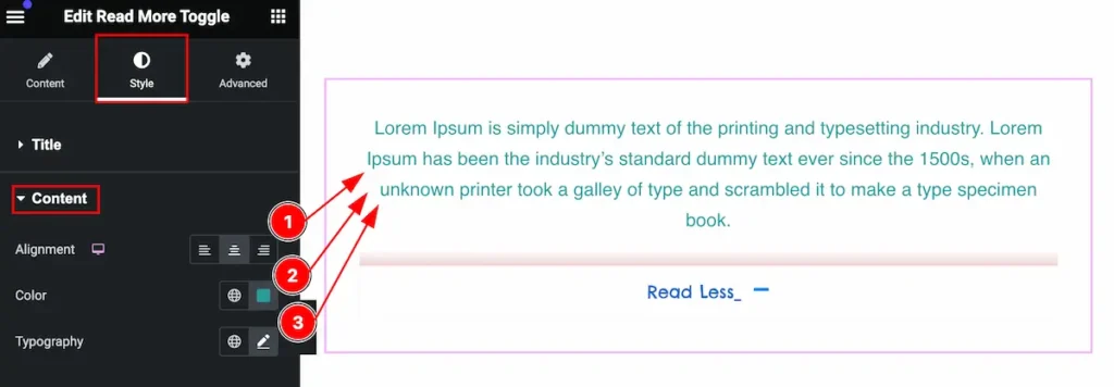
Make the content visually good by following,
- Alignment: Set the alignment of the text.
- Color: Set the color for the content.
- Typography: Set typography for it.
Icon Section
Go to Style > Icon
Normal State for Icon

- Color: Set the color for the Icon.
- Spacing: Set the spacing for the icon.
Active State for Icon

The changes appear when it is active.
- Color: Set the color for the icon.
Video Assist
You can watch the video above to learn about the Search widget.
Please visit the demo page for examples.
Thanks for staying with us.
