

In this documentation, we will discuss the customization of the Menuz widget, brought to you by the Pixel Gallery.
Enable the Menuz Widget
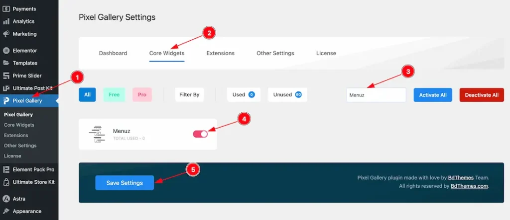
To use the Menuz widget from Pixel Gallery, first, you have to enable the widget.
- Go to WordPress > Pixel Gallery Plugin dashboard.
- Then Click the Core Widgets Tab.
- Search the Menuz Widget Name.
- Enable the Menuz Widget.
- Hit the Save Settings Button.
Inserting The Menuz widget
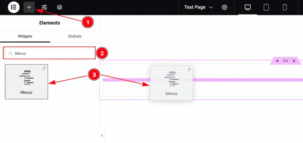
- Go to the Elementor Editor Page and Hit the “+” icon Button.
- Search the Menuz widget.
- Drag the widget and Drop it on the editor page.
Content Tab Customizations
Layout Section Customization
Go to Content > Layout
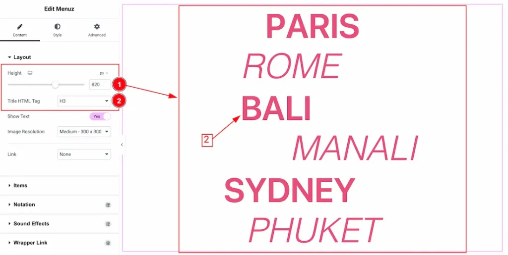
1. Height: You can set the slider height from here.
2. Title HTML Tag: You can set the Title HTML Tag as – H1-H6, Div, Span, and P.
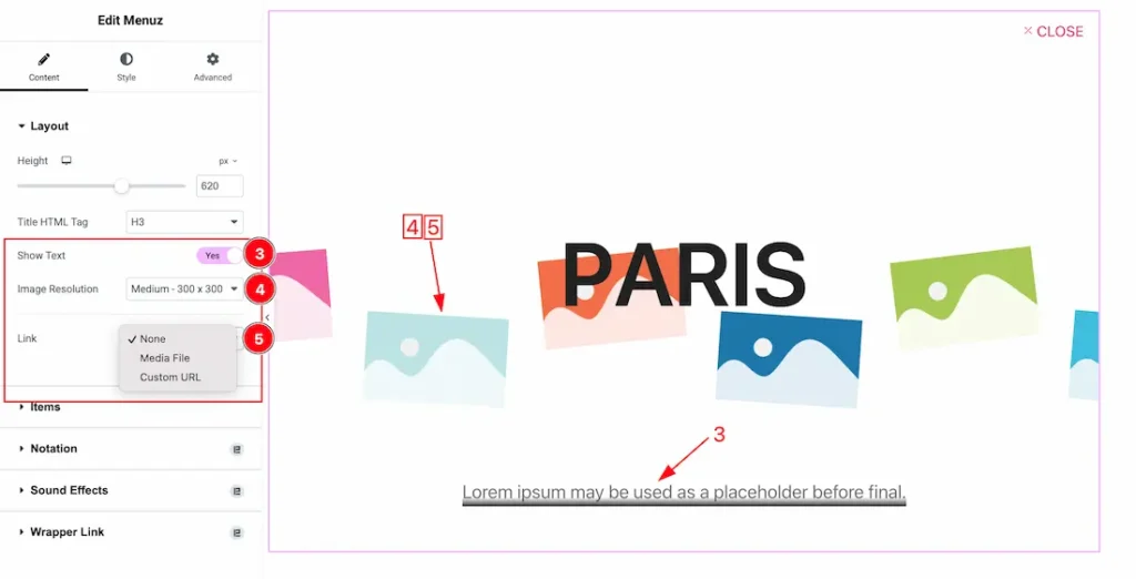
3. Show Text: Enable/disable the Show Text switcher button to show/hide the Text.
4. Image Resolution: You can set the item image resolution from here.
5. Link: Come to the Link section, you will get three options. These are, None, Media File(Lightbox), and Custom Url.
- None: If you set the link type- none then no link will work.
- Custom Url: If you select the link type – Custom Url then your whole slide item will work as a link.
- Media File: If you select the link type – Media File then you will get the lightbox option Yes or No. If you select the Lightbox type- Yes then the slide image will apear as lightbox.
Items Section Customization
Go to Content > Items
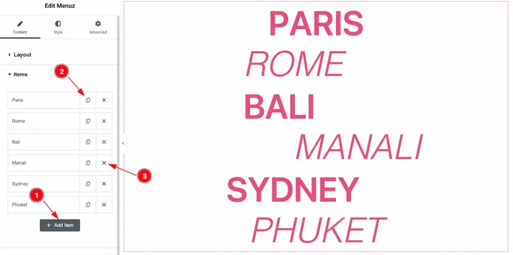
1. Add Item: You can add slide item by clicking the “+” Add Item button.
2. Copy Item: This option lets you to copy the same item.
3. Close Item: You can delete the Item by clicking the Close Icon button.
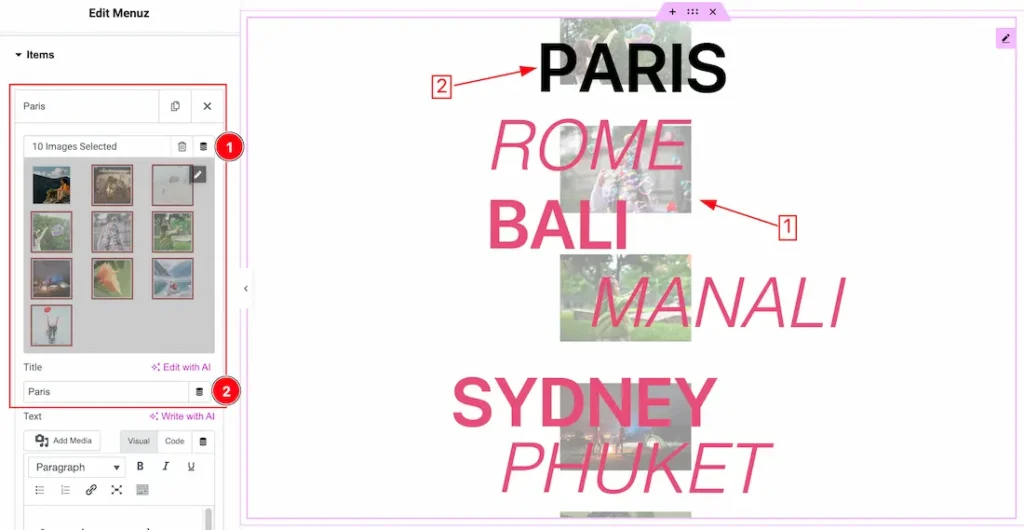
1. Select Image: You can select the Gallery image from here.
2. Title: This option lets you change the Title.
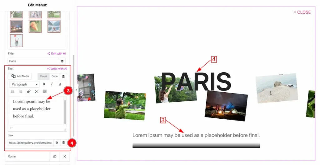
3. Text: This option lets you change the gallery text.
4. Link: You can set a link under the whole item. Actually, the link work when you select the source type – custom url.
Style Tab Customization
Title Section
Go to Style > Title
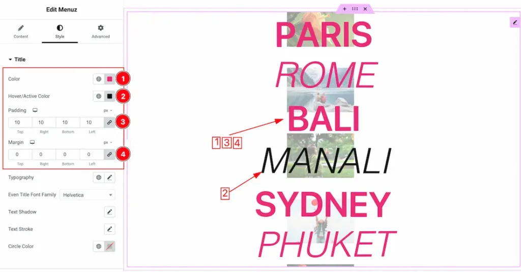
1. Color : This option lets you change the Title color.
2. Hover/Active Color: This option lets you change the Title hover/ active color.
3. Padding: Add spaces around an object to increase the inner area. Padding allows you to control the internal space within an element.
4. Margin: Adjusts the position of an object over the canvas.
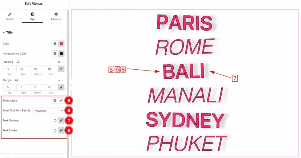
5. Typography: Change the font family, size, weight, style, transform, decoration, line height, letter spacing, and word spacing from here.
6. Even Title Font Family: This option lets you change the Even font family.
7. Text Shadow: The Text Shadow property is used to create the shadow around the text. It takes three values: horizontal offset, vertical offset, and blur radius. Here you also can change the Text Shadow Color.
8. Text Stroke: If you want to add a stroke (outline) around the text, you can use the Text Stroke property. you also can change the Text Stroke Color as your working demand.
Modal Section
Go to Style > Modal
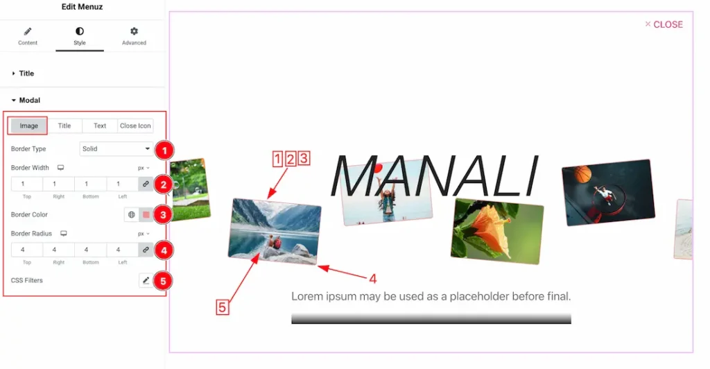
Come to the Modal section, you will get these subsections; Image, Title, Text, and Close Icon.
Lets proceed with the image sub section-
1. Border Type: you can set the Border Type to Default, None, Solid, Double, Dotted, Dashed, or Groove. We choose here the Border Type Solid.
2. Border Width: The border width property allows you to control how thick or thin the border is.
3. Border Color: This lets you change the Border color.
4. Border Radius: Customizes the border corners for roundness.
5. Css Filter: The CSS Filter option gives you the opertunity to customize the slides image and you will get the below customization options-
- Blur: Applies a soft blur to the image; higher values create a stronger blur effect.
- Brightness: Modifies how light or dark the image appears; 100 is the original level, higher brightens, lower darkens.
- Contrast: Adjusts the difference between the light and dark parts of the image; increasing it makes details more defined.
- Saturation: Changes the intensity of the colors; higher values make colors more vivid, lower values make them more muted.
- Hue: Rotates the color values around the color wheel to give the image a different color tone.
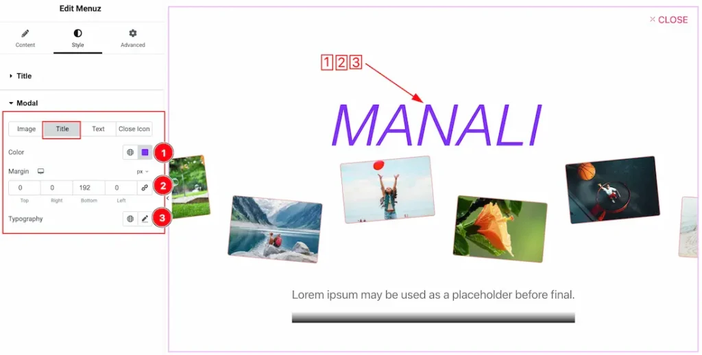
Lets proceed with the Title sub section-
1. Color: This option lets you change the Title color.
2. Margin: Adjusts the position of an object over the canvas.
3. Typography: Change the font family, size, weight, style, transform, decoration, line height, letter spacing, and word spacing from here.
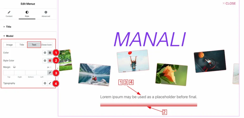
Lets proceed with the Text sub section-
1. Color: This option lets you change the Text color.
2. Style Color: This option lets you change the Style color.
3. Margin: Adjusts the position of an object over the canvas.
4. Typography: Change the font family, size, weight, style, transform, decoration, line height, letter spacing, and word spacing from here.
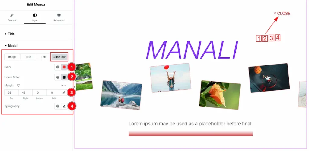
Lets proceed with the Close Icon sub section-
1. Color: This option lets you change the Close icon color.
2. Hover Color: This option lets you change the close icon hover color.
3. Margin: Adjusts the position of an object over the canvas.
4. Typography: Change the font family, size, weight, style, transform, decoration, line height, letter spacing, and word spacing from here.
All done! You have successfully customized the Menuz widget on your website.
Video Assist
The video will come soon. Please check the demo page for more examples.
Thanks for staying with us.