

The Step Flow widget from Element Pack Pro lets you create step-by-step guides and flow charts with interactive layouts. It helps improve content clarity and user experience with easy customization. This documentation explains how to use and customize the Step Flow widget in Elementor.
Enable The Step Flow Widget
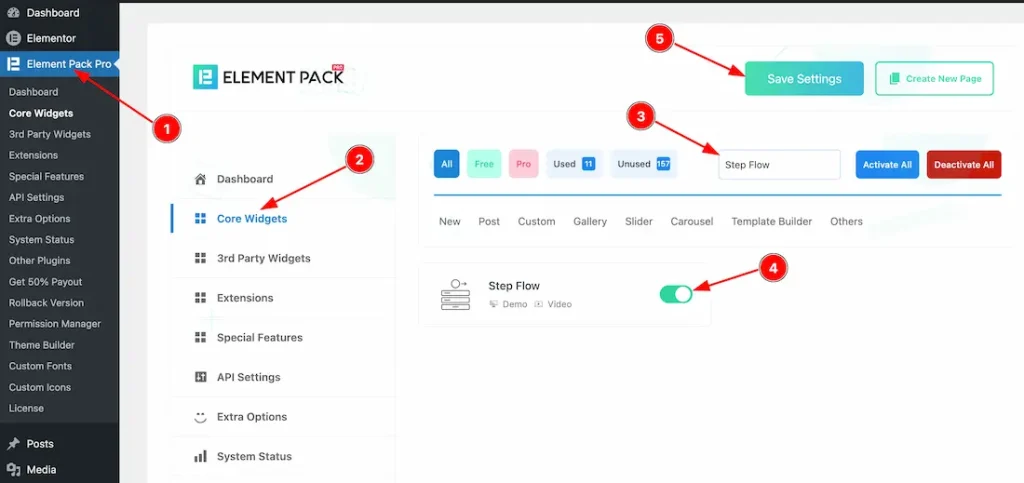
To use the Step Flow widget from Element Pack Pro, first, you have to enable the widget.
- Go to WordPress dashboard → Element Pack Pro Plugin dashboard.
- Then, Click the Core Widgets Tab.
- Search the Step Flow Widget Name.
- Enable the Step Flow Widget.
- Hit the Save Settings Button.
Inserting the Step Flow widget
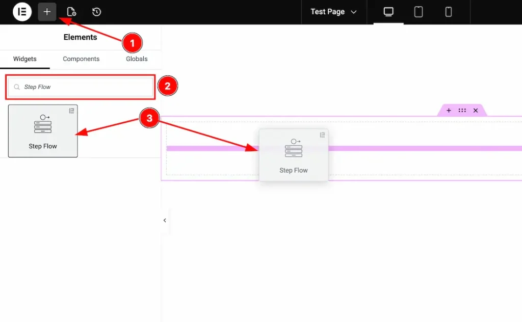
1. Go to the Elementor Editor Page and hit the “+” icon Button.
2. Search the Step Flow name.
3. Drag the widget and drop it on the editor page.
Work With Content Tab
Step Flow section
Go to Content > Step Flow
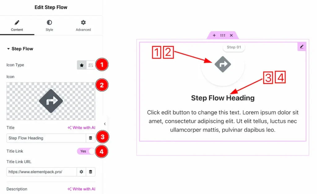
1. Icon Type: You can choose the icon type- icon and image. Here we choose the icon type- icon.
2. Icon: This option lets you choose the icon. You can upload your preferred icon from here.
3. Title: This option lets you change the title.
4. Title Link: Enable/disable the title link switcher button to show/hide the title link.
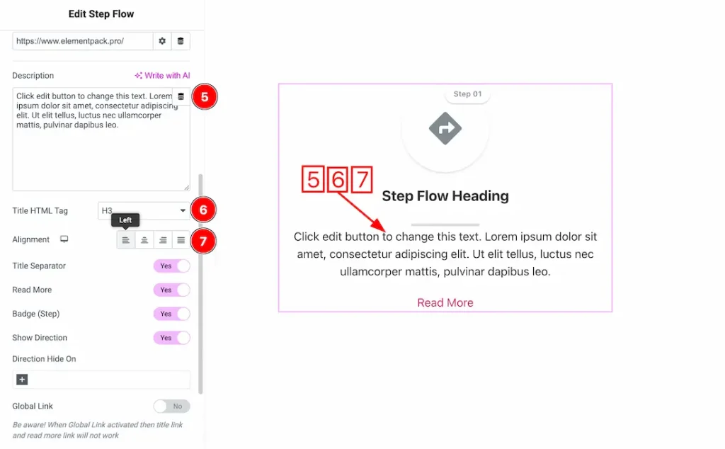
5. Description: This option lets you change the description.
6. Title HTML Tag: You can set the title HTML tag H1 to H6, Div, span, and P.
7. Alignment: You can set the content alignment- Left, center, right, and justify.
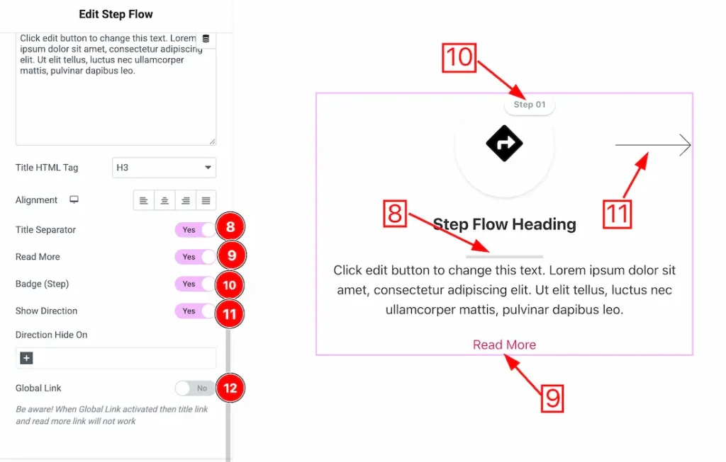
8. Title Separator: Enable/disable the title separator switcher button to show/hide the title separator.
9. Read More: Enable/disable the read more switcher button to show/hide the read more button.
10. Badge(Step): Enable/disable the Badge(Step) switcher button to show/hide the badge.
11. Show Direction: Enable/disable the show direction switcher button to show/hide the direction.
12. Global Link: After enabling the global link switcher button, the title link works as a global link.
Read More section
Go to Content > Read More
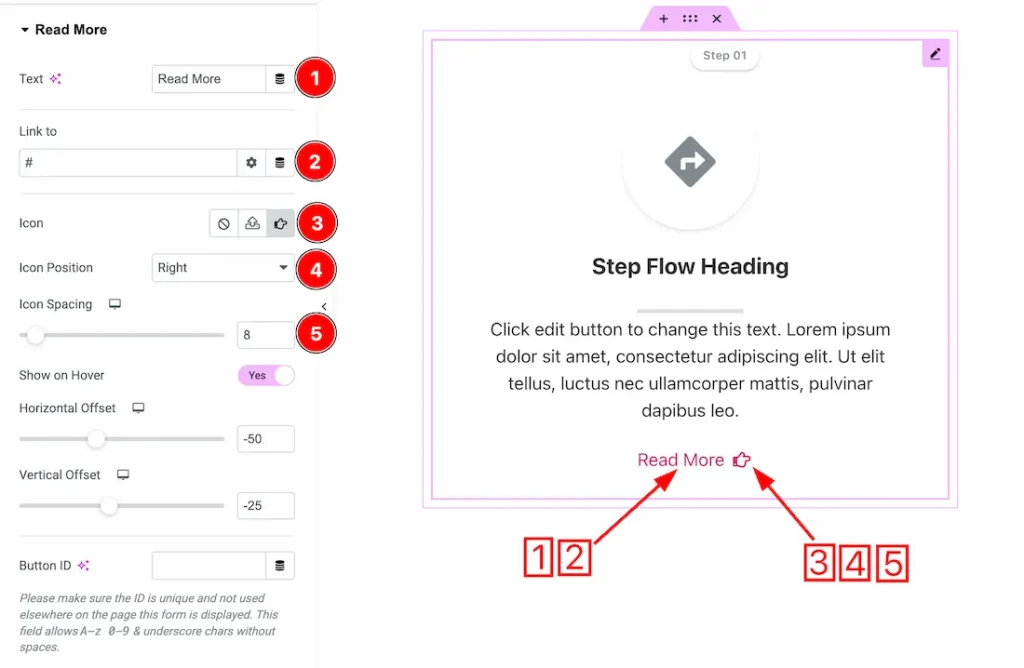
1. Text: This option lets you change the read more text.
2. Link: You can add a link under the read more text button.
3. Icon: This option lets you choose and upload your preferred icon.
4. Icon Position: You can set the icon position from here.
5. Icon Spacing: You can adjust the icon spacing from here.
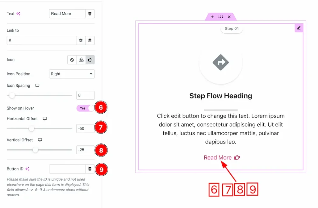
6. Show on Hover: After enabling the show on hover switcher button, the read more button will appear only on hover.
7. Horizontal Offset: This option lets you set the horizontal position.
8. Vertical Offset: This option lets you set the vertical position.
9. Button ID: This option lets you set a Button ID.
Badge(Step) section
Go to Content > Badge(Step)
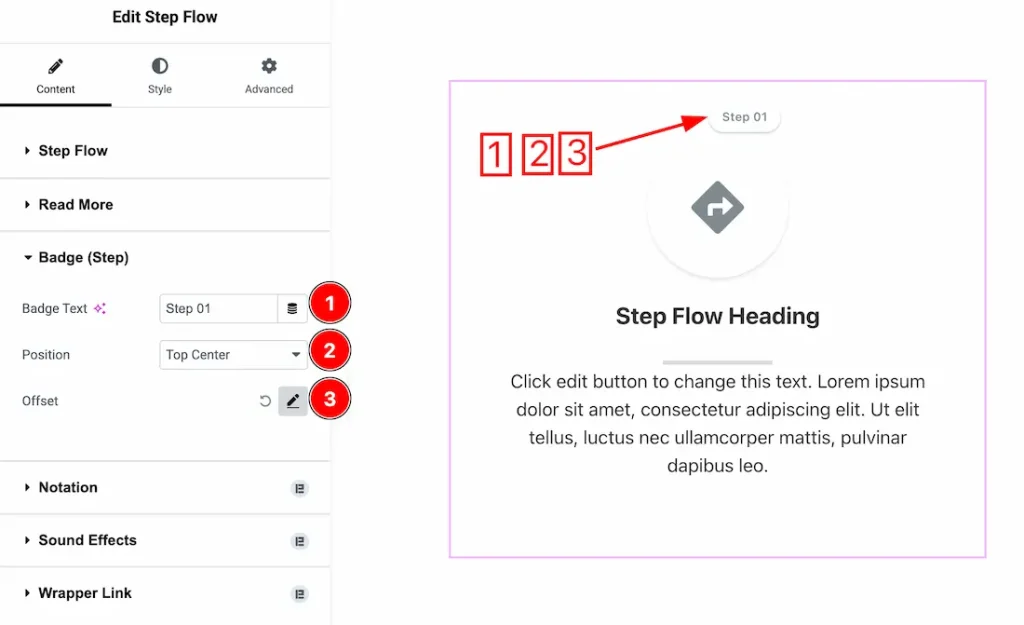
1. Badge Text: This option lets you change the badge text.
2. Position: You can set the badge text position from here.
3. Offset: You can set the badge text vertical and horizontal offset from here.
Work with The Style Tab
Icon/Image Section
Go to Style → icon/image
In this section, we have two more tabs. These are Normal & Hover. Let’s start with the Normal Tab first –
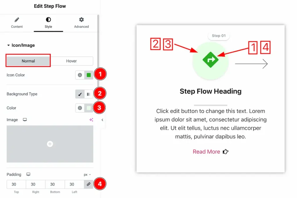
1. Icon Color: This option lets you change the icon color.
2. Background Type: You can choose the icon background type between classic or gradient with this option. Here we have selected the background type as classic.
3. Color: You can make changes to the icon background color with this option.
4. Padding: You can adjust the icon padding from here.
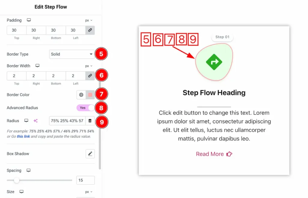
5. Border Type: You can set the icon border Type to Default, None, Solid, Double, Dotted, Dashed, or Groove. We choose here the Border Type Solid.
6. Border Width: The border width property allows you to control how thick or thin the border is.
7. Border Color: This lets you change the icon border color.
8. Advanced Radius: If you enable the advanced radius switcher button, then you will get a manual value input option to make the radius to your preferred need.
9. Radius value: Just keep the custom value of the radius.
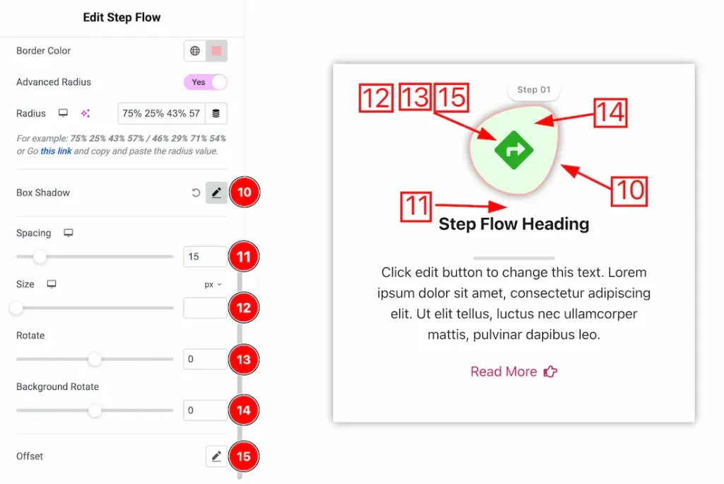
10. Box Shadow: You can add a box shadow under the icon.
11. Spacing: You can adjust the icon spacing from here.
12. Size: This option lets you set the icon size.
13. Rotate: You can adjust the icon rotation from here.
14. Background Rotate: You can adjust the icon background rotation from here.
15. Offset: You can set the icon’s horizontal and vertical offset from here.
Now let’s proceed to the Hover Tab –
1. Icon Color: This option lets you change the icon hover color.
2. Background Type: You can choose the icon hover background type between classic or gradient with this option. Here we have selected the background type as classic.
3. Color: You can make changes to the icon hover background color with this option.
4. Effects: Here, you will get Effects A to Effects E icon hover effects and choose one of them.
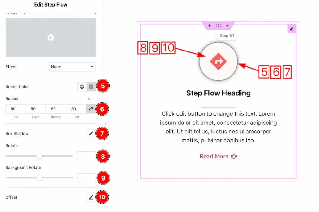
5. Border Color: This lets you change the icon hover border color.
6. Border Radius: Customizes the icon hover border corners for roundness.
7. Box Shadow: You can add the icon hover box shadow from here.
8. Rotate: This option lets you add the icon hover rotation.
9. Background Rotate: This option lets you add the icon hover background rotation.
10. Offset: You can add the horizontal and vertical offset from here.
Title Section
Go to Style → Title
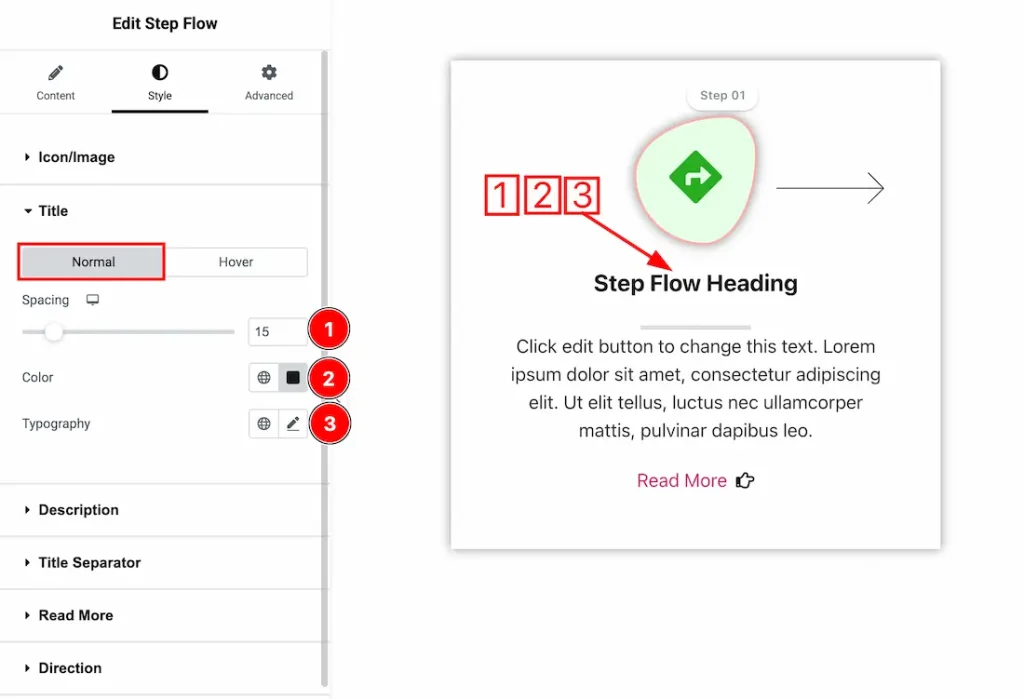
In this section, we have two more tabs. These are Normal & Hover. Let’s start with the Normal Tab first –
1. Spacing: You can adjust the title spacing from here.
2. Color: This option lets you change the title color.
3. Typography: Change the font family, size, weight, style, transform, decoration, line height, letter spacing, and word spacing from here.
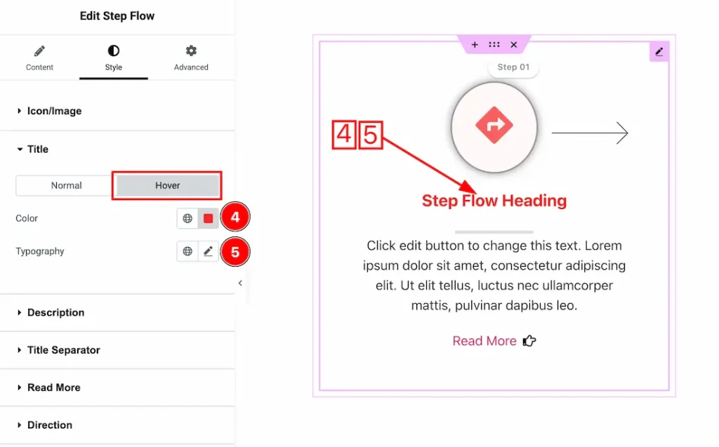
Now let’s proceed to the Hover Tab –
4. Color: This option lets you change the title hover color.
5. Typography: Change the font family, size, weight, style, transform, decoration, line height, letter spacing, and word spacing from here.
Description Section
Go to Style → Description
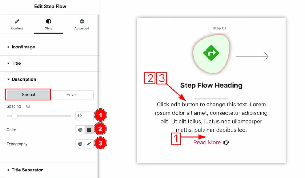
In this section, we have two more tabs. These are Normal & Hover. Let’s start with the Normal Tab first –
1. Spacing: You can adjust the description spacing from here.
2. Color: This option lets you change the description’s normal color.
3. Typography: Change the font family, size, weight, style, transform, decoration, line height, letter spacing, and word spacing from here.
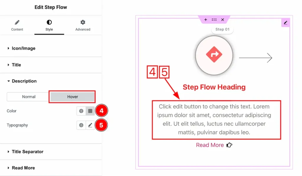
Now let’s proceed to the Hover Tab –
4. Color: This option lets you change the description hover color.
5. Typography: Change the font family, size, weight, style, transform, decoration, line height, letter spacing, and word spacing from here.
Title Separator Section
Go to Style → Title Separator
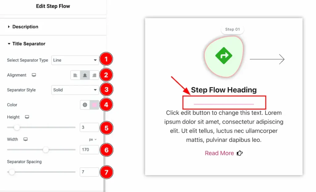
1. Select Separator Type: Here, you will get some separator styles and just choose one of them that you like.
2. Alignment: You can set the separator alignment – left, center, and right.
3. Separator Style: This option lets you select the separator style.
4. Color: This option lets you change the separator color.
5. Height: This option lets you set the separator height.
6. Width: This option lets you set the separator width.
7. Separator Spacing: This option lets you set the separator spacing.
Read More Section
Go to Style → Read More
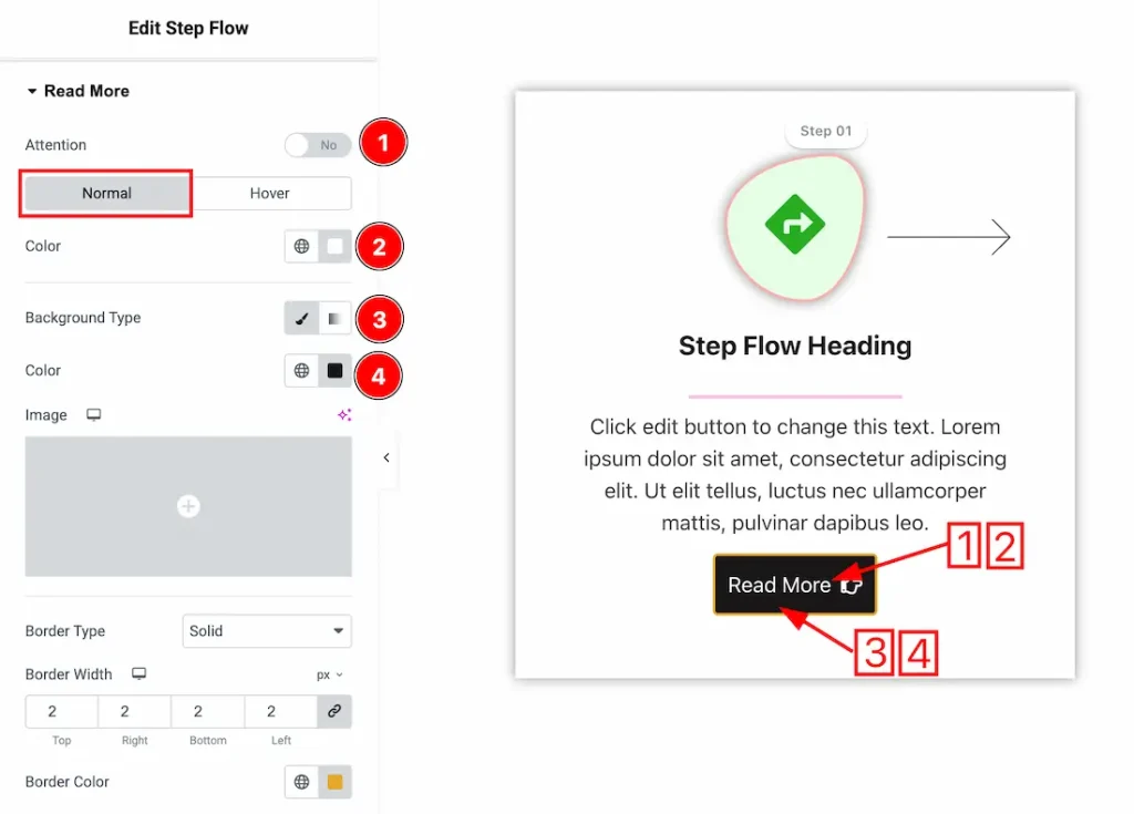
1. Attention: After enabling the attention switcher button, the read more button will vibrate.
In this section, we have two more tabs. These are Normal & Hover. Let’s start with the Normal Tab first –
2. Color: This option lets you change the read more text’s normal color.
3. Background Type: You can choose the read more background type between classic or gradient with this option. Here we have selected the background type as classic.
4. Background Color: You can make changes to the read more background color with this option.
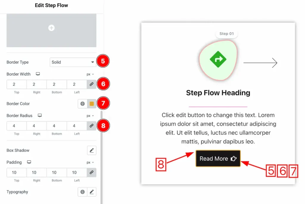
5. Border Type: You can add and change the read more border types with this option.
6. Border Width: You can set the border width from here.
7. Border Color: This lets you change the close button border normal color.
8. Border Radius: You can control the roundness of the border with this option.
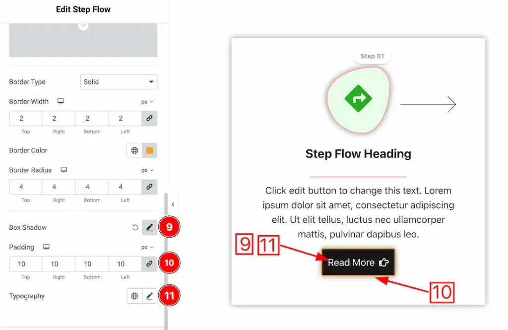
9. Box Shadow: You can add a shadow effect to the items with this option.
10. Padding: You can adjust the inner space of the item with this option.
11. Typography: Change the font family, size, weight, transform, style, decoration, line height, letter spacing, and word spacing from here.
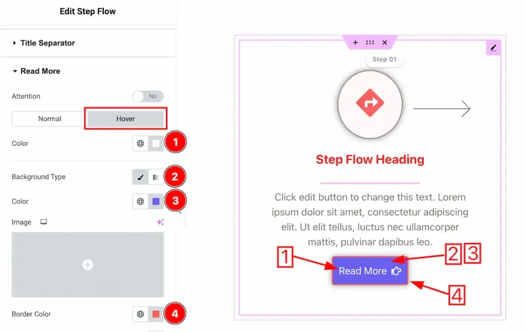
Now let’s proceed to the Hover Tab –
1. Color: This option lets you change the read more text hover color.
2. Background Type: You can choose the read more hover background type between classic or gradient with this option. Here we have selected the background type as classic.
3. Color: This lets you change the read more background hover color.
4. Border Color: This lets you change the read more border hover color.
Direction Section
Go to Style → Direction
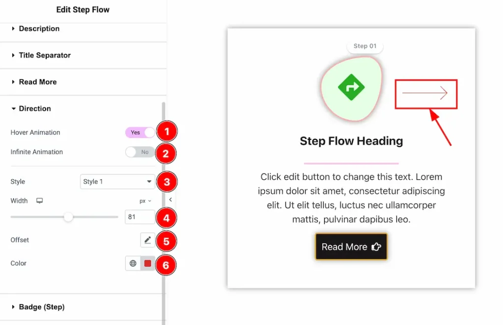
- Hover Animation: Enables animation when the user hovers over the direction arrow.
- Infinite Animation: After enabling the switcher button, it continuously animates the direction arrow without user interaction.
- Style: Selects the visual style of the direction arrow.
- Width: Adjusts the size (width) of the direction arrow.
- Offset: Controls the position of the arrow relative to its default placement.
- Color: Sets the color of the direction arrow.
Badge(Step) Section
Go to Style → Badge(Step)
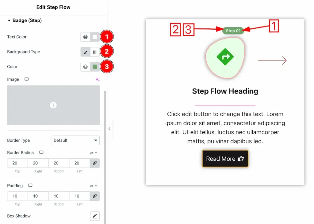
1. Text Color: This option lets you change the badge text color.
2. Background Type: You can choose the badge background type between classic or gradient with this option. Here we have selected the background type as classic.
3. Background Color: You can make changes to the badge background color with this option.
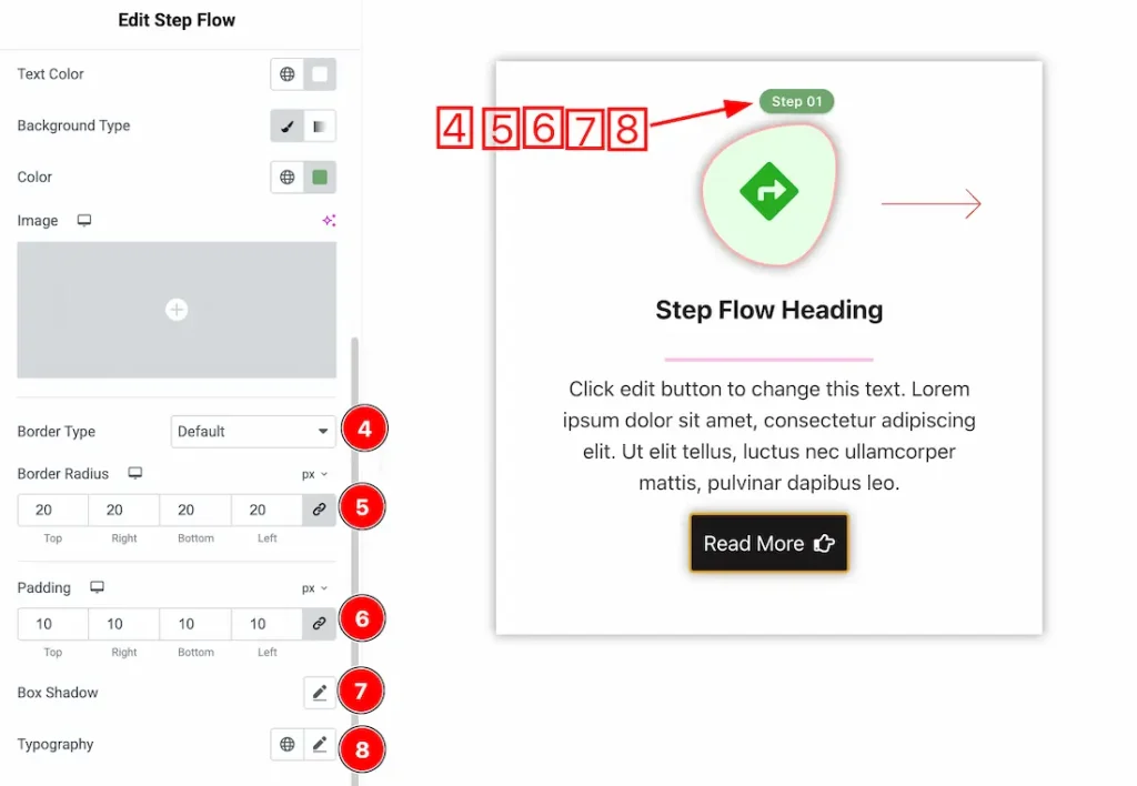
4. Border Type: You can add and change the border types with this option.
5. Border Radius: You can control the roundness of the border with this option.
6. Padding: You can adjust the inner space of the item with this option.
7. Box Shadow: You can add a shadow effect to badge with this option.
8. Typography: Change the font family, size, weight, style, transform, decoration, line height, letter spacing, and word spacing from here.
Additional Section
Go to Style → Additional
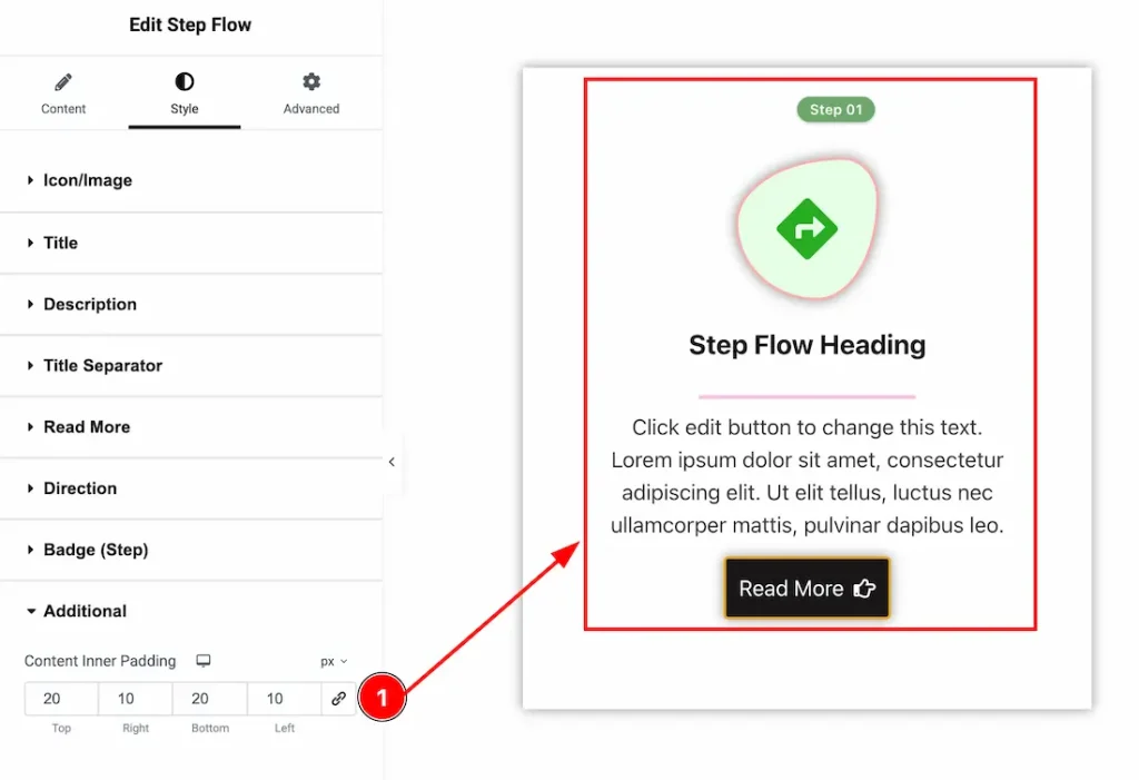
1. Content Inner Padding: You can adjust the content inner padding from here.
All done! You have successfully customized the Step Flow widget on your website.
Video Assist
You can also watch the video tutorial to learn more about the Step Flow widget. Please visit the demo page for examples.
Thanks for being with us.