

The SVG Image widget from Element Pack Pro lets you display scalable vector graphics with sharp quality on any device. It offers flexible options for size, color, and styling. This documentation explains how to use and customize the SVG Image widget in Elementor.
Enable The SVG Image Widget
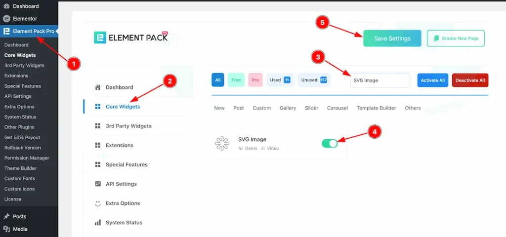
To use the SVG image widget from Element Pack Pro, first, you have to enable the widget.
- Go to WordPress dashboard → Element Pack Pro Plugin dashboard.
- Then, Click the Core Widgets Tab.
- Search the SVG image Widget Name.
- Enable the SVG image Widget.
- Hit the Save Settings Button.
Inserting the SVG Image widget
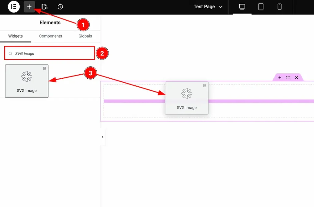
1. Go to the Elementor Editor Page and hit the “+” icon Button.
2. Search the SVG Image name.
3. Drag the widget and drop it on the editor page.
Work With Content Tab
SVG section
Go to Content > SVG
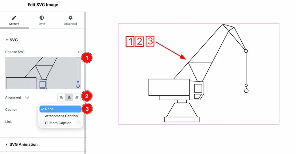
1. Choose SVG: You can upload your preferred SVG image from here.
2. Alignment: You can set the SVG image alignment- Left, Center, Right.
3. Caption Type: Here, you get the caption type- None, Attachment Caption, and Custom Caption. You can choose your preferred type from here.
When Caption Type- Attachment Caption
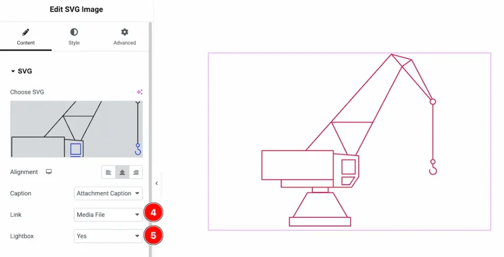
If you select the caption type- Attachment Caption, you will get the following options-
4. Link: When you select the caption- Attachment Caption, then you will get the link type- None, Media File, and Custom link. Here, we select the link type- Media file.
5. Lightbox: If you select the lightbox type- Yes, then when you click on the image, it will open as a lightbox.
When Link Type- Custom link
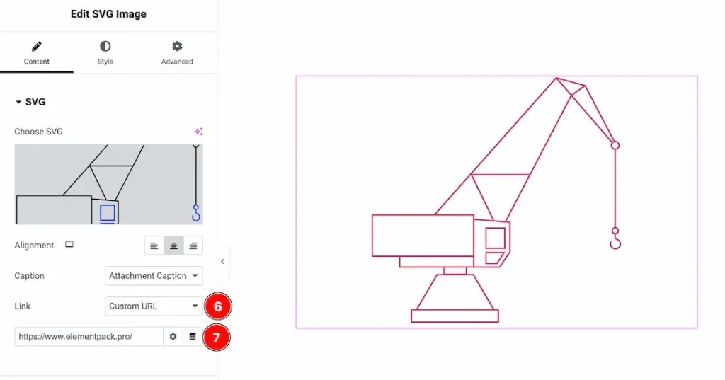
6. Link Type: When you select the link type -custom link, you will get an option to add a link under the SVG image.
7. Link: Just keep your link inside the link box.
When Caption Type- Custom Caption
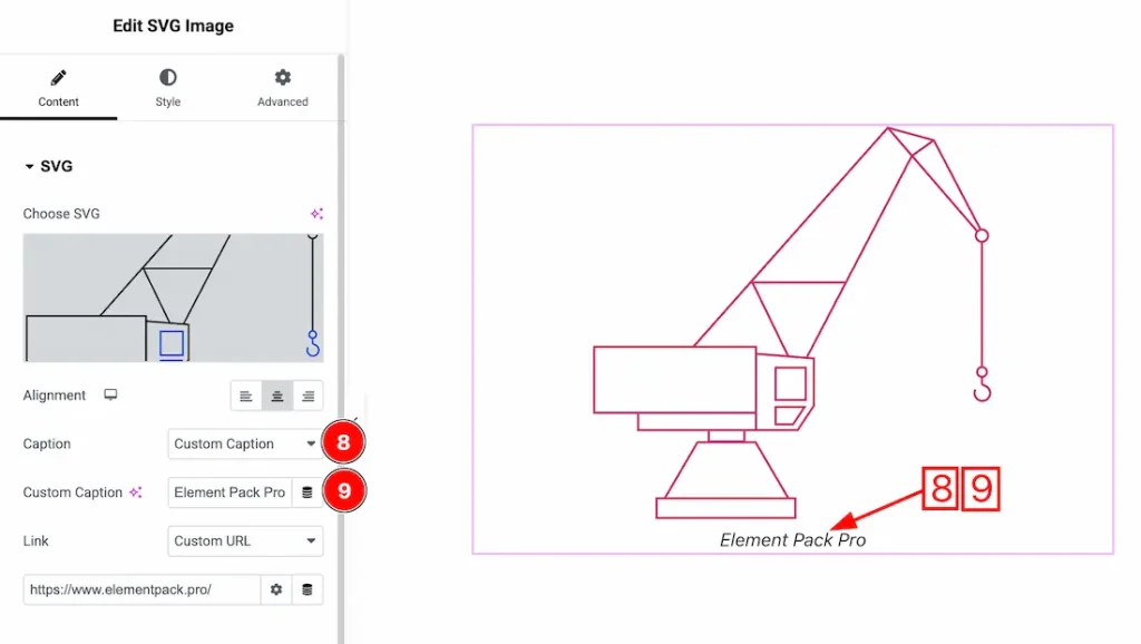
8. Caption Type: Here, you get the caption type- None, Attachment Caption, and Custom Caption. You can choose your preferred type from here. Here, we select the custom caption to explore the feature.
9. Custom Caption: Just put your custom caption text inside the text field.
SVG Animation section
Go to Content > SVG Animation
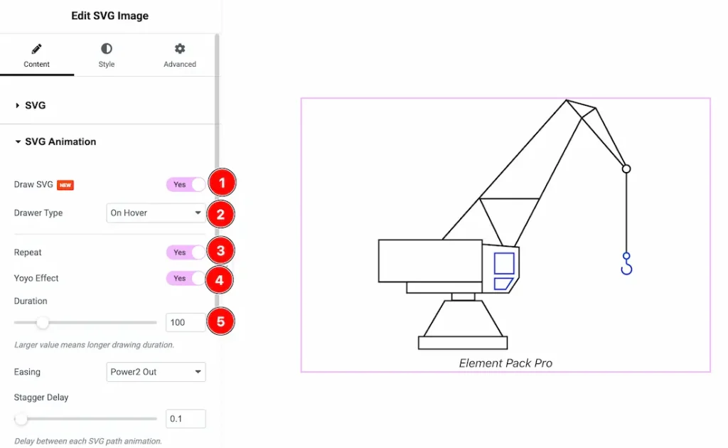
1. Draw SVG: Enable this option to animate the SVG as if it were being drawn.
2. Drawer Type: Choose when the drawing animation is triggered (e.g., on hover, On Scroll, or Automatic).
3. Repeat: Enable the switcher button to allow the animation to replay continuously.
4. Yoyo Effect: Enable the switcher button to reverse the animation after completion, creating a back-and-forth effect.
5. Duration: Controls how long the drawing animation takes to complete.
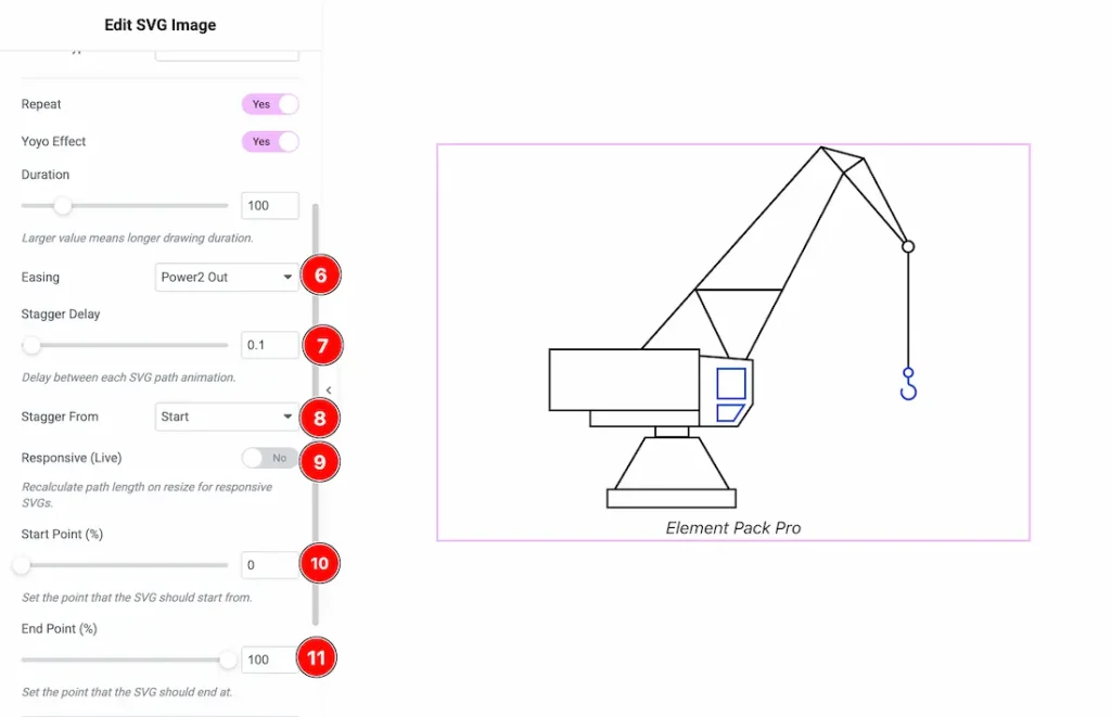
6. Easing: Defines the animation speed curve for smoother motion effects. Here you get many options, just select your preferred option.
7. Stagger Delay: Adds a delay between each SVG path animation for a sequential drawing effect.
8. Stagger From: Sets the starting point for the stagger animation (e.g., start, center, end, edges, random).
9. Responsive (Live): Enable it to recalculates SVG paths on resize to maintain responsiveness.
10. Start Point (%): Specifies where the drawing animation begins along the path.
11. End Point (%): Specifies where the drawing animation ends along the path.
Work with The Style Tab
SVG Section
Go to Style → SVG
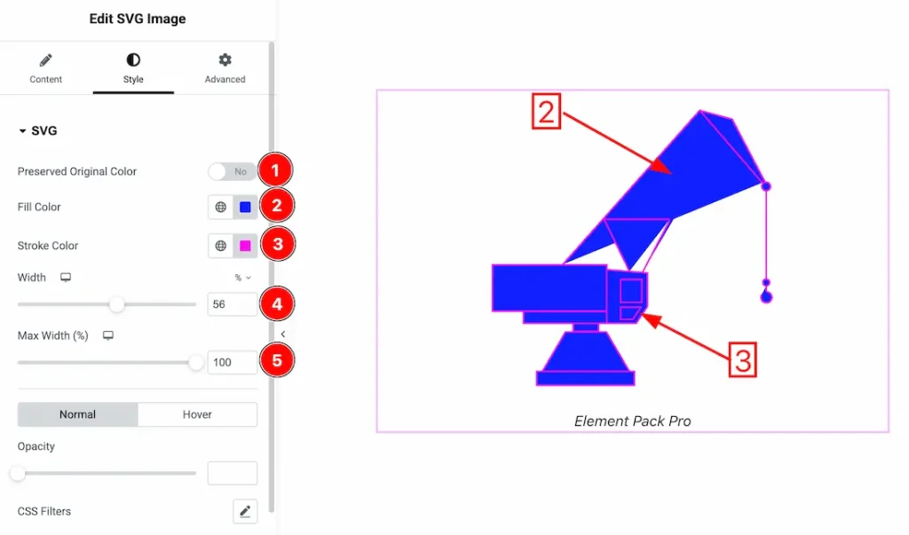
1. Preserved Original Color: Enable the switcher button to show the Preserved Original Color of the SVG image.
2. Fill Color: This option lets you change the fill color of the SVG image.
3. Stroke Color: This option lets you change the stroke color of the SVG image.
4. Width: You can set the SVG image width from here.
5. Max Width: You can set the SVG image’s max width from here.
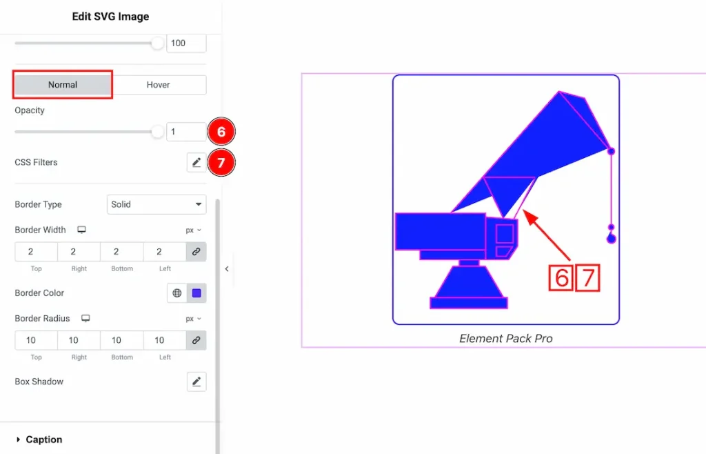
In this section, we have two more tabs. These are Normal & Hover. Let’s start with the Normal Tab first –
6. Opacity: You can change the SVG image opacity level from here.
7. CSS Filters: CSS filters are used for images to enhance their appearance directly in the browser without editing the original file. They allow you to quickly adjust effects like blur, brightness, contrast, and color to match your design, create interactive hover effects, and improve visual focus.
- Saturation – Increases or decreases color intensity to make images more vibrant or muted.
- Hue – Shifts the color spectrum of the image, allowing creative color transformations without changing the original asset.
- Blur – Softens the image by reducing sharp edges, creating depth or background focus effects.
- Brightness – Adjusts the overall lightness or darkness of the image to enhance visibility or mood.
- Contrast – Controls the difference between light and dark areas, making visuals appear sharper or flatter.
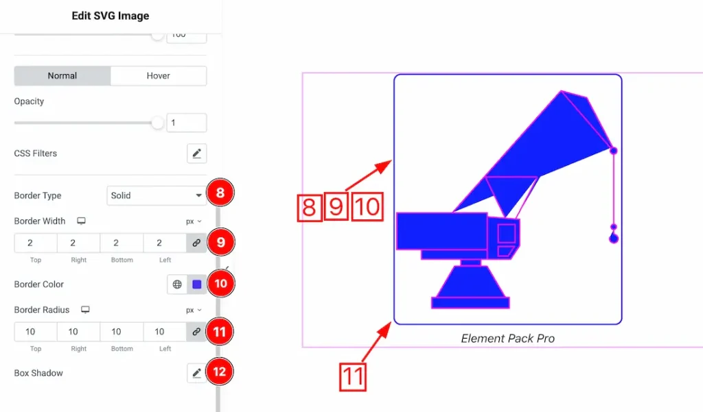
8. Border Type: You can set the image border Type to Default, None, Solid, Double, Dotted, Dashed, or Groove. We choose here the Border Type Solid.
9. Border Width: The border width property allows you to control how thick or thin the border is.
10. Border Color: This lets you change the image border color.
11. Border Radius: Customizes the image border corners for roundness.
12. Box Shadow: You can add a box shadow under the svg image.
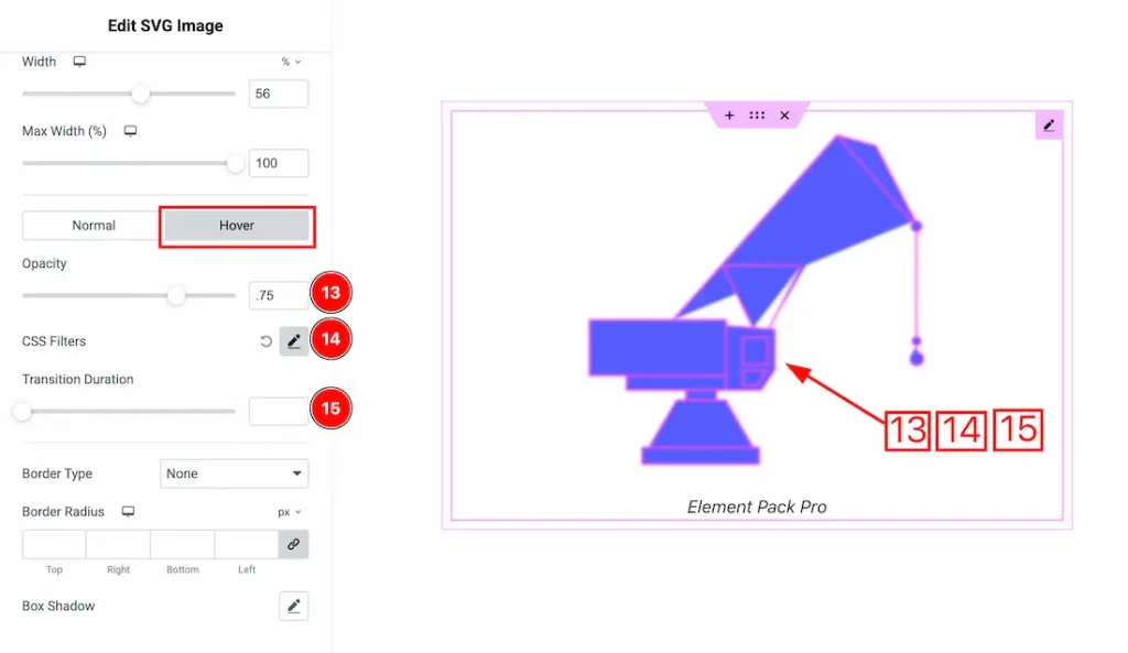
Now let’s proceed to the Hover Tab –
13. Opacity: You can change the SVG image hover opacity level from here.
14. CSS Filters: You can add the hover CSS Filters for the SVG image.
15. Transition Duration: You can adjust the hover Transition Duration from here.
Caption Section
Go to Style → Caption
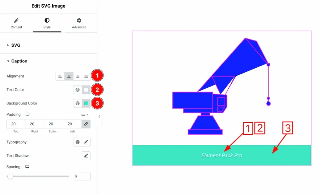
1. Alignment: You can set the caption alignment- left, center, right, and justify from here.
2. Text Color: This option lets you change the caption text color.
3. Background Color: This option lets you change the caption text background color.
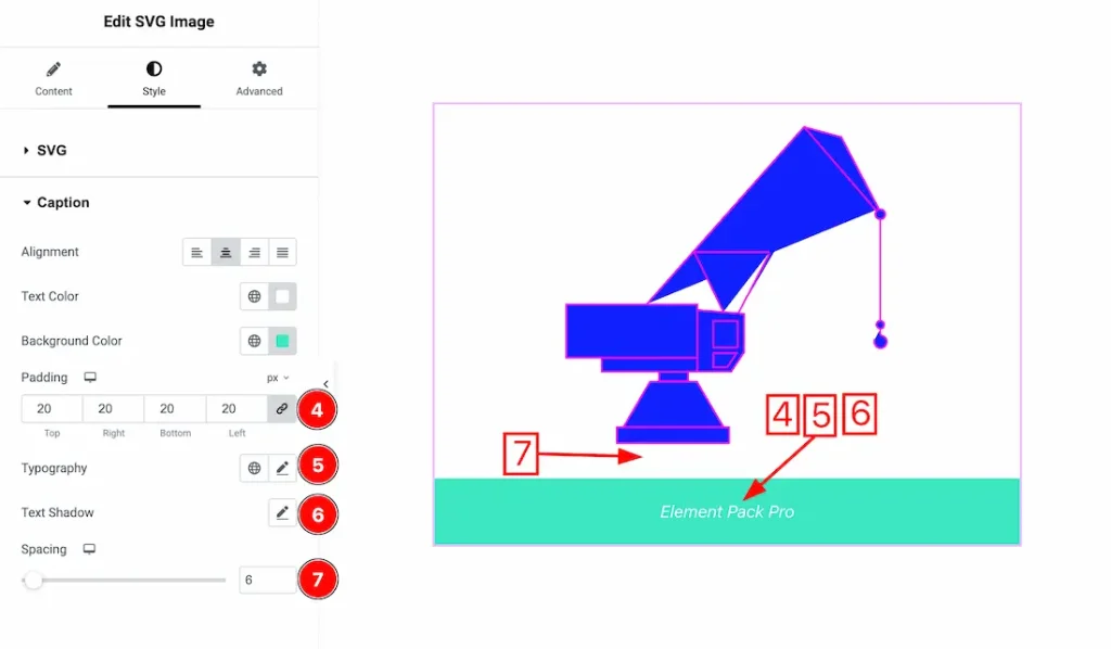
4. Padding: You can adjust the caption text padding from here.
5. Typography: Change the font family, size, weight, style, transform, decoration, line height, letter spacing, and word spacing from here.
6. Text Shadow: You can add caption text shadow from here.
7. Spacing: This option lets you adjust the caption text spacing.
All done! You have successfully customized the SVG Image widget on your website.
Video Assist
You can also watch the video tutorial to learn more about the SVG Image widget. Please visit the demo page for examples.
Thanks for being with us.