

The Static Grid Tab widget is a handy feature presented by BDthemes, and it is a part of the Element Pack Pro. It helps you show the items statically in a grid with tab functions.
Now, let’s learn how to use the widget on your site.
Enable The Static Tab Grid Widget
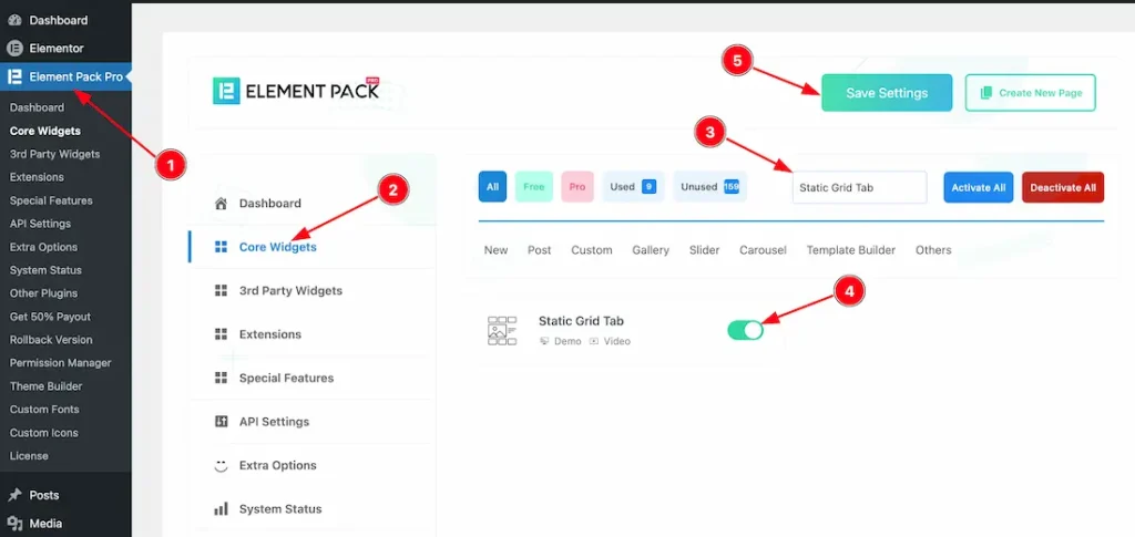
To use the Static Grid Tab widget from Element Pack Pro, first, you have to enable the widget.
- Go to WordPress dashboard → Element Pack Pro Plugin dashboard.
- Then, Click the Core Widgets Tab.
- Search the Static Tab Grid Widget Name.
- Enable the Static Tab Grid Widget.
- Hit the Save Settings Button.
Inserting the Static Tab Grid widget
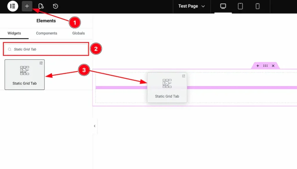
1. Go to the Elementor Editor Page and hit the “+” icon Button.
2. Search the Static Grid Tab name.
3. Drag the widget and drop it on the editor page.
Work With Content Tab
Items section
Go to Content > Items
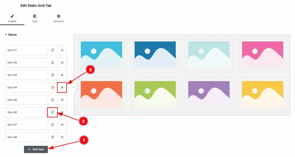
1. Add Item: You can click on this button to add more items.
2. Copy Button: You can click on the copy button to copy the same item or duplicate the item with this option.
3. Close Button: You can click on the close button to close/delete the items with this option.
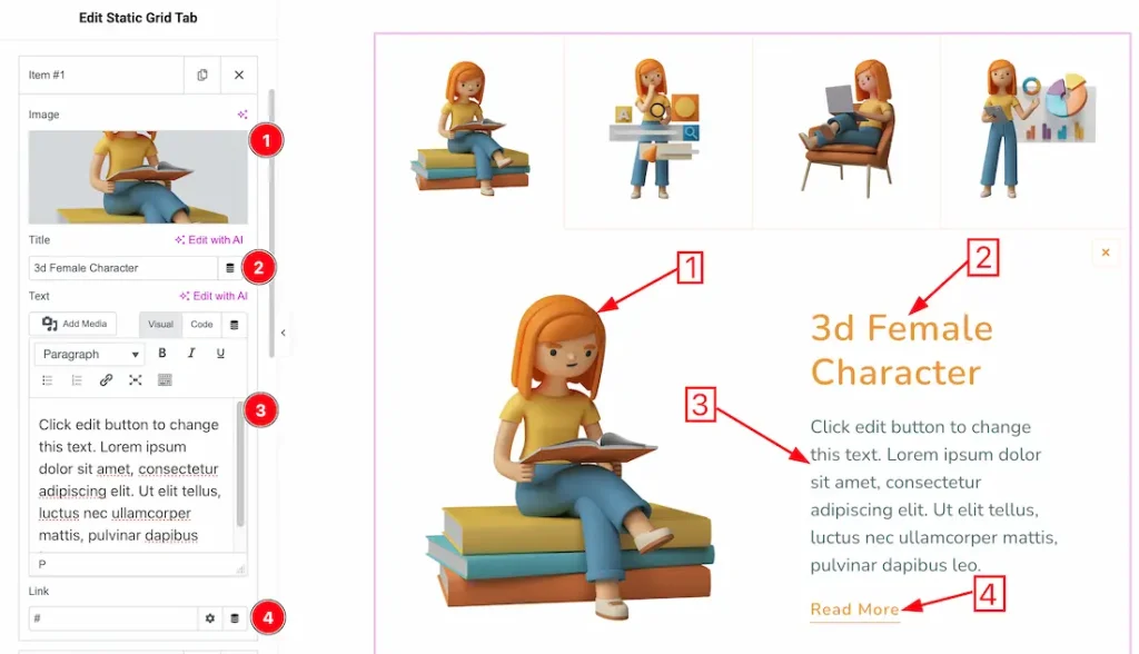
1. Image: This option lets you change the image of the item.
2. Title: This option lets you change the title text of the item.
3. Text: This option lets you change the text of the item.
4. Link: You can add a link under the read more button.
Additional Settings section
Go to Content > Additional Settings
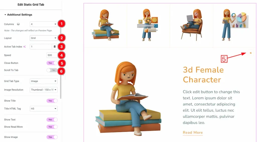
1. Columns: You can set the number of columns from here.
2. Layout: You can select the layout type- Grid and Tab. Here, we select the layout type- Grid.
3. Active Tab Index: You can set the active tab/grid index number from here. Your selected tab number will be shown as active.
4. Speed: You can set the tab/grid animation from here.
5. Close Button: Enable/disable the close button switcher button to show/hide the close button from the widget.
6. Scroll to Tab: After enabling the Scroll to Tab option, the page view automatically moves (scrolls) to the active tab content when a user clicks on a tab.
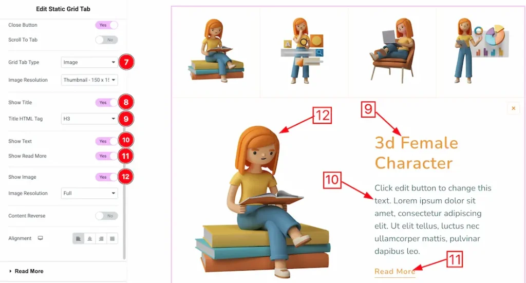
7. Grid Tab Type: You can select the grid type- image or Title. Here we select the grid type- image.
8. Show Title: Enable/disable the show title switcher button to show/hide the title from the tab grid.
9. Title HTML Tag: You can set the title HTML tag H1 to H6, Div, span, and P.
10. Show Text: Enable/disable the show text switcher button to show/hide the text from the tab grid.
11. Show Read More: Enable/disable the show read more switcher button to show/hide the read more from the tab grid.
12. Show Image: Enable/disable the show image switcher button to show/hide the image from the tab grid.
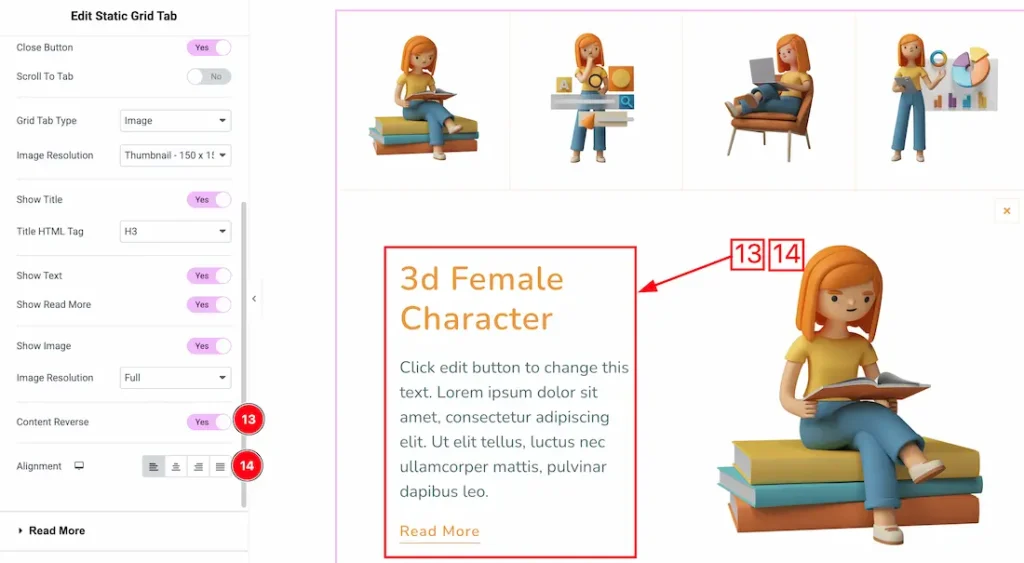
13. Content Reverse: Enable the switcher button to show the tab/grid content reverse.
14. Alignment: You can set the content alignment- Left, center, right, and justify.
Read More section
Go to Content > Read More
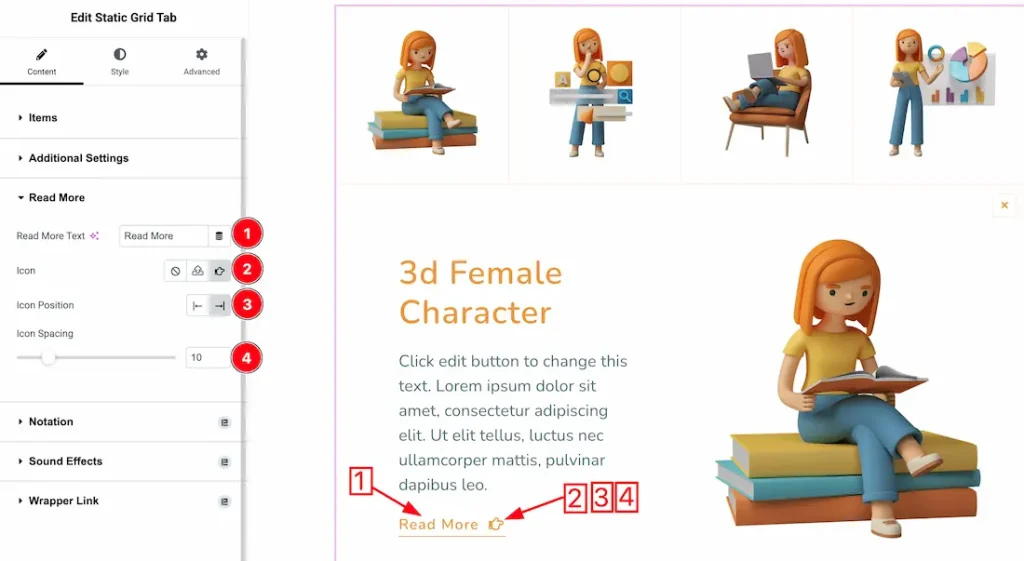
1. Read More Text: This option lets you change the read more text.
2. Icon: You can add your preferred read more icon from here.
3. Icon Position: You can set the icon position- left or Right.
4. Icon Spacing: You can adjust the icon spacing from here.
Work with The Style Tab
Tab Section
Go to Style → Tab
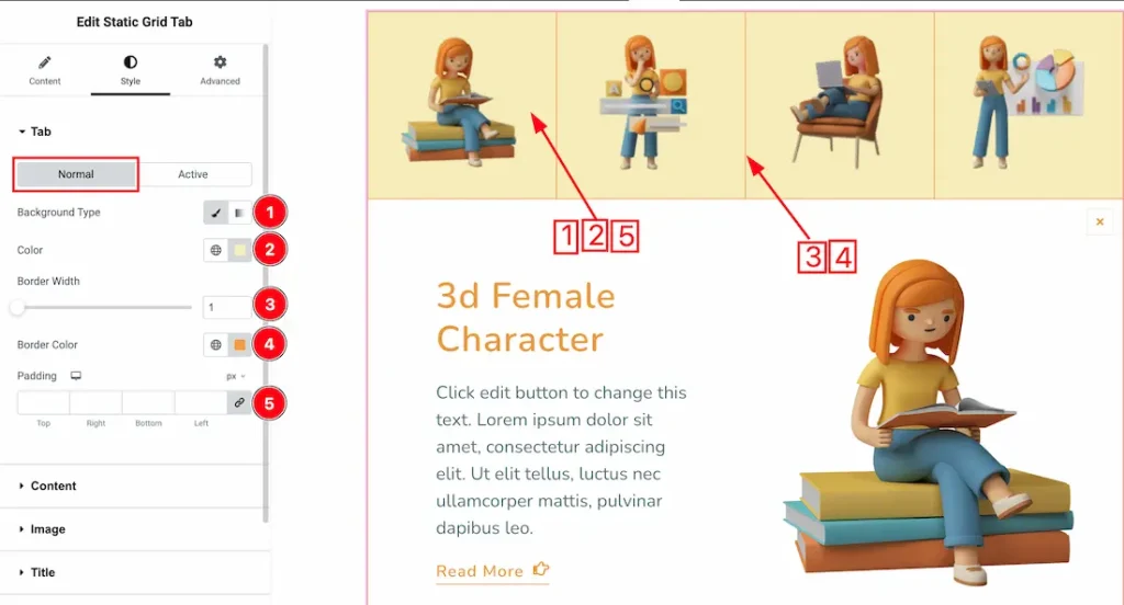
In this section, we have two more tabs. These are Normal & Active. Let’s start with the Normal Tab first –
1. Background Type: You can choose the background type between classic or gradient with this option. Here we have selected the background type as classic.
2. Color: You can make changes to the background color with this option.
3. Border Width: You can adjust the border width from here.
4. Border Color: This option lets you change the border color.
5. Padding: You can adjust the padding from here.
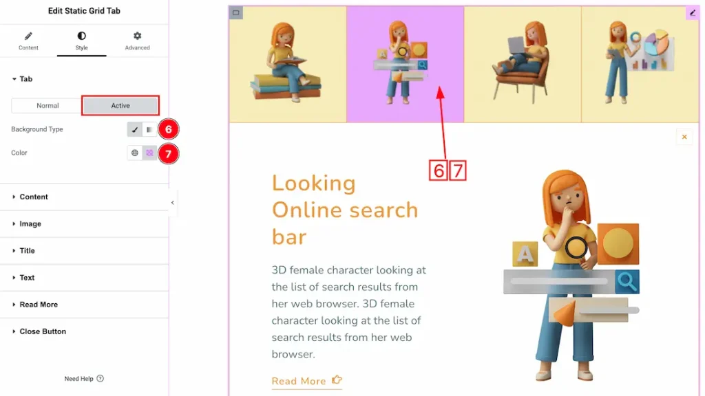
Now let’s proceed to the Active Tab –
1. Background Type: You can choose the tab hover background type between classic or gradient with this option. Here we have selected the background type as classic.
2. Color: You can make changes to the Tab hover background color with this option.
Content Section
Go to Style → Content
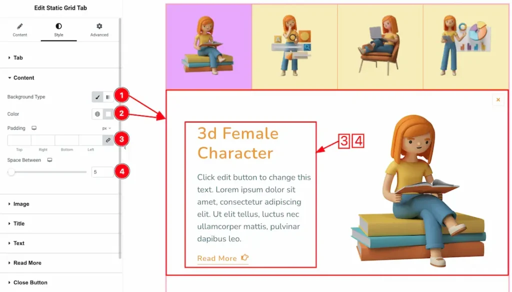
1. Background Type: You can choose the tab content background type between classic or gradient with this option. Here we have selected the background type as classic.
2. Color: You can make changes to the Tab content background color with this option.
3. Padding: You can adjust the content padding from here.
4. Space Between: You can adjust the space between content and image.
Image Section
Go to Style → Image
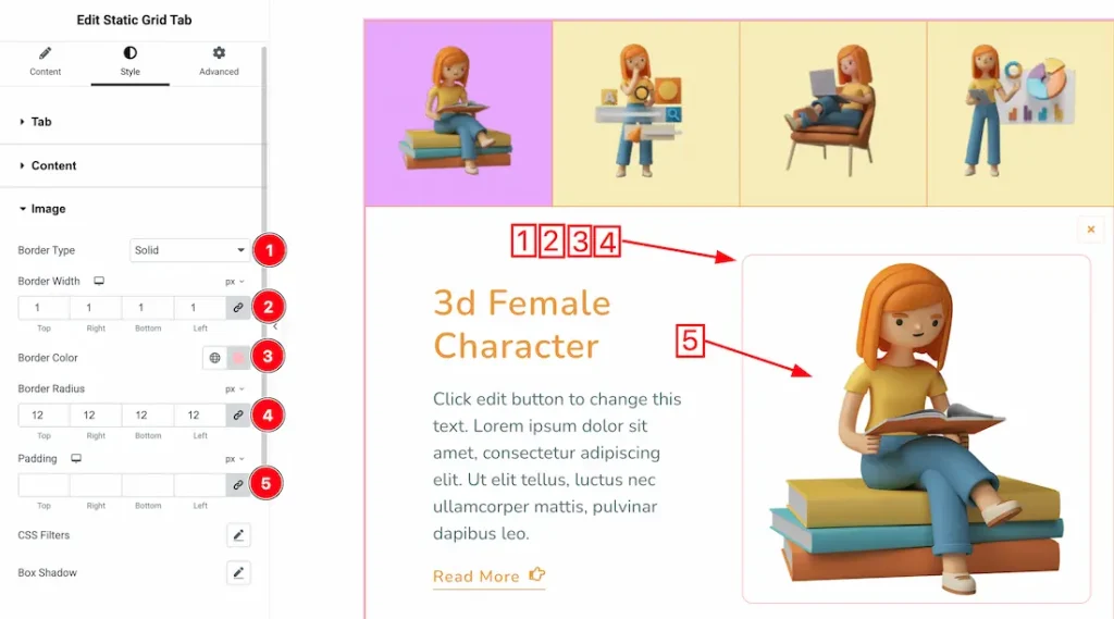
1. Border Type: You can set the image border Type to Default, None, Solid, Double, Dotted, Dashed, or Groove. We choose here the Border Type Solid.
2. Border Width: The border width property allows you to control how thick or thin the border is.
3. Border Color: This lets you change the image border color.
4. Border Radius: Customizes the image border corners for roundness.
5. Padding: You can adjust the image padding from here.
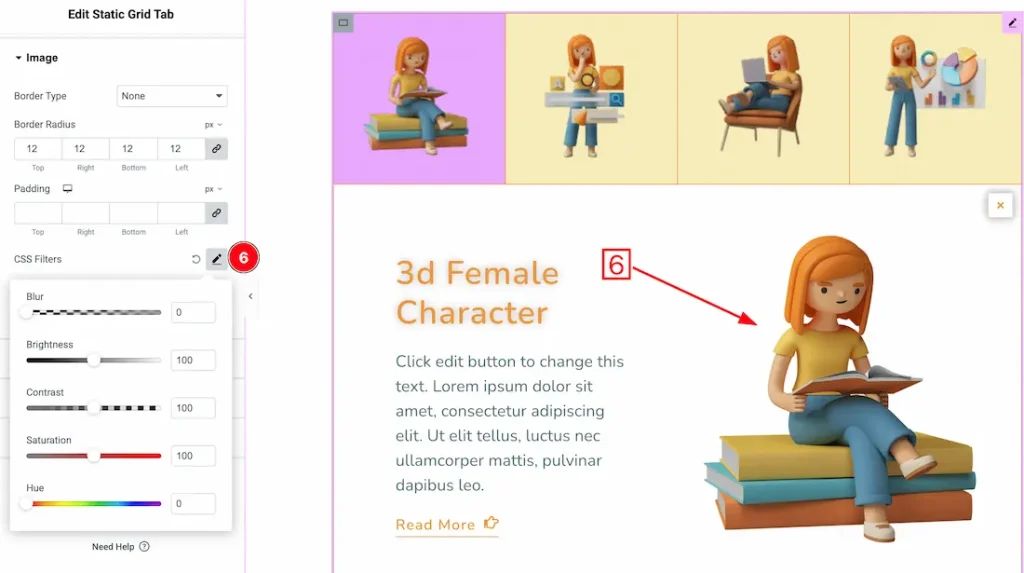
6. CSS Filters: CSS filters are used for images to enhance their appearance directly in the browser without editing the original file. They allow you to quickly adjust effects like blur, brightness, contrast, and color to match your design, create interactive hover effects, and improve visual focus.
- Blur – Softens the image by reducing sharp edges, creating depth or background focus effects.
- Brightness – Adjusts the overall lightness or darkness of the image to enhance visibility or mood.
- Contrast – Controls the difference between light and dark areas, making visuals appear sharper or flatter.
- Saturation – Increases or decreases color intensity to make images more vibrant or muted.
- Hue – Shifts the color spectrum of the image, allowing creative color transformations without changing the original asset.
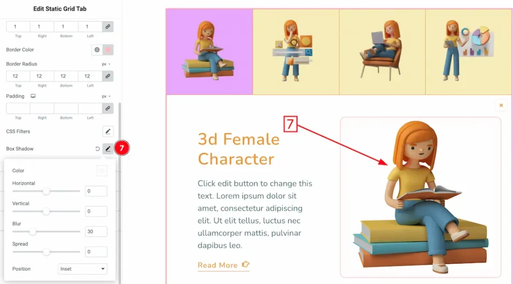
7. Box Shadow: You can add a box shadow under the image from here.
Title Section
Go to Style → Title
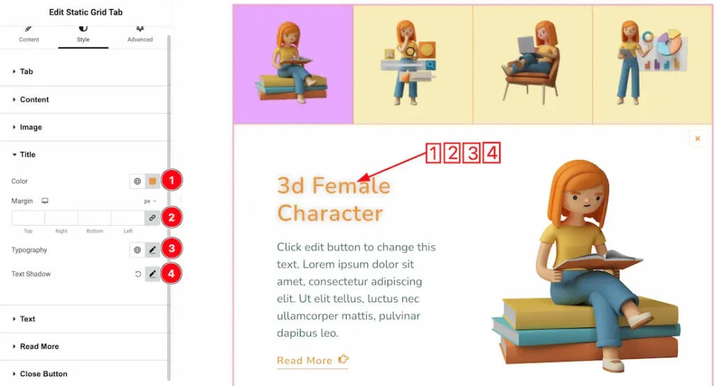
1. Color: This option lets you change the Title color.
2. Margin: You can adjust the margin from here.
3. Typography: Change the font family, size, weight, style, transform, decoration, line height, letter spacing, and word spacing from here.
4. Text Shadow: You can add a text shadow under the title.
Text Section
Go to Style → Text
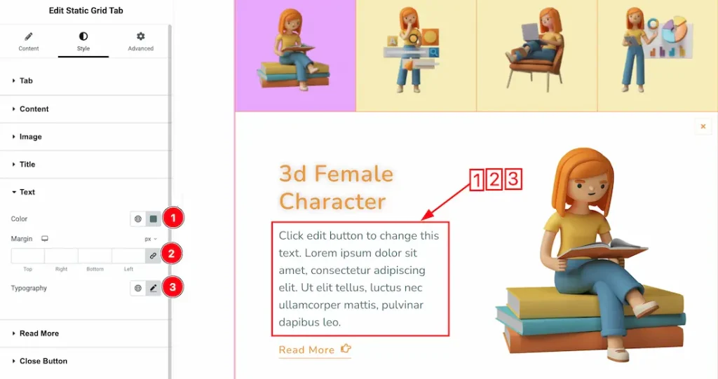
1. Color: This option lets you change the Text color.
2. Margin: You can adjust the margin from here.
3. Typography: Change the font family, size, weight, style, transform, decoration, line height, letter spacing, and word spacing from here.
Read More Section
Go to Style → Read More
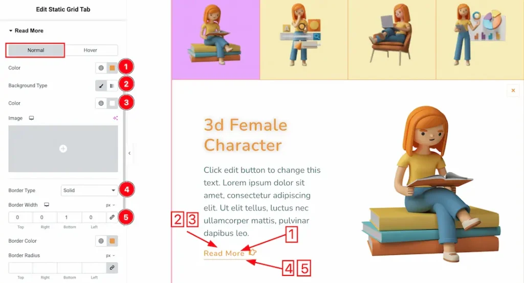
In this section, we have two more tabs. These are Normal & Hover. Let’s start with the Normal Tab first –
1. Color: This option lets you change the read more text normal color.
2. Background Type: You can choose the read more background type between classic or gradient with this option. Here we have selected the background type as classic.
3. Background Color: You can make changes to the read more background color with this option.
4. Border Type: You can add and change the border types with this option.
5. Border Width: You can set the border width from here.
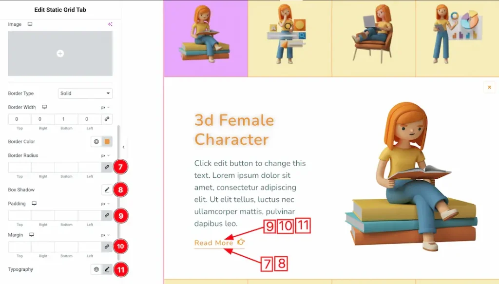
7. Border Radius: You can control the roundness of the border with this option.
8. Box Shadow: You can add a shadow effect to the items with this option.
9. Padding: You can adjust the inner space of the arrow field with this option.
10. Margin: You can adjust the read more margin from here.
11. Typography: Change the font family, size, weight, transform, style, decoration, line height, letter spacing, and word spacing from here.
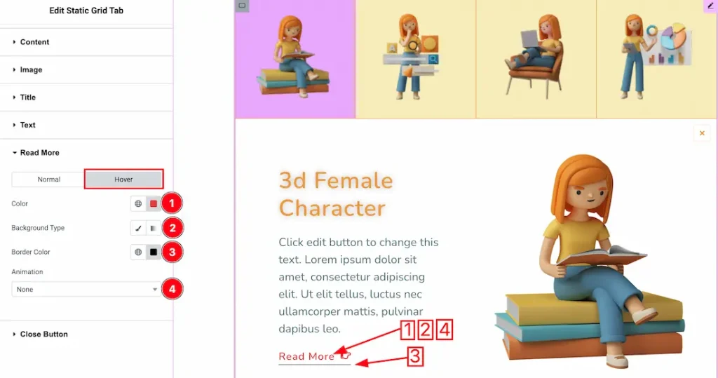
Now let’s proceed to the Hover Tab –
1. Color: This option lets you change the read more text hover color.
2. Background Type: You can choose the read more hover background type between classic or gradient with this option. Here we have selected the background type as classic.
3. Border Color: This lets you change the read more border hover color.
4. Animation: From here, you can choose your preferred animation for the read more button.
Close Button Section
Go to Style → Close Button
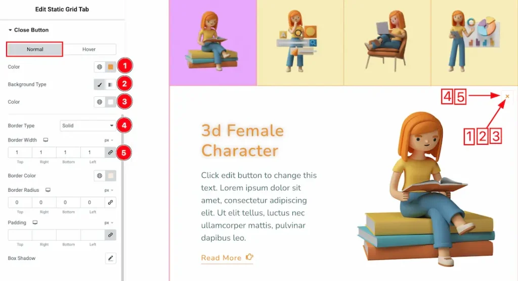
In this section, we have two more tabs. These are Normal & Hover. Let’s start with the Normal Tab first –
1. Color: This option lets you change the close button’s normal color.
2. Background Type: You can choose the close button background type between classic or gradient with this option. Here we have selected the background type as classic.
3. Background Color: You can make changes to the close button background color with this option.
4. Border Type: You can add and change the border types with this option.
5. Border Width: You can set the border width from here.
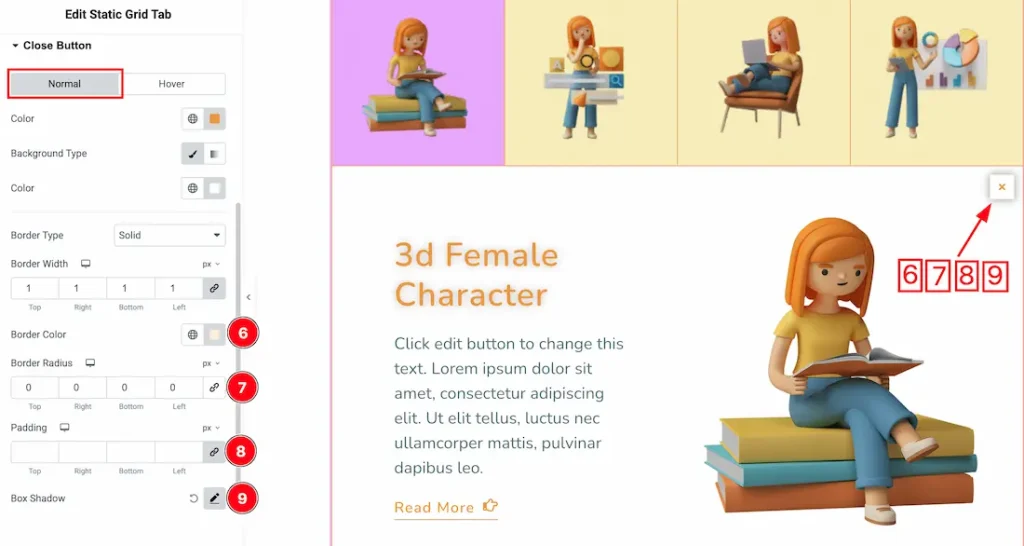
6. Border Color: This lets you change the close button border normal color.
7. Border Radius: You can control the roundness of the border with this option.
8. Padding: You can adjust the inner space of the item with this option.
9. Box Shadow: You can add a shadow effect to the items with this option.
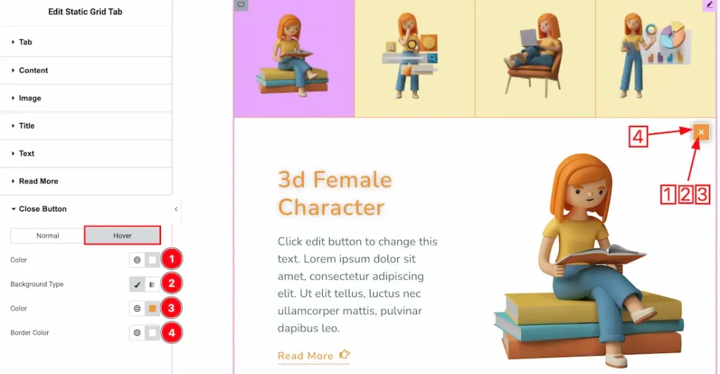
Now let’s proceed to the Hover Tab –
1. Color: This option lets you change the close button’s hover color.
2. Background Type: You can choose the close button hover background type between classic or gradient with this option. Here we have selected the background type as classic.
3. Background Color: You can make changes to the close button hover background color with this option.
4. Border Color: This lets you change the close button border’s hover color.
All done! You have successfully customized the Static Grid Tab widget on your website.
Video Assist
You can also watch the video tutorial to learn more about the Static Grid Tab widget. Please visit the demo page for examples.
Thanks for being with us.