

This documentation provides comprehensive insights into the using ACF Slider widget developed by Element Pack Pro.
Activate ACF Slider Widget
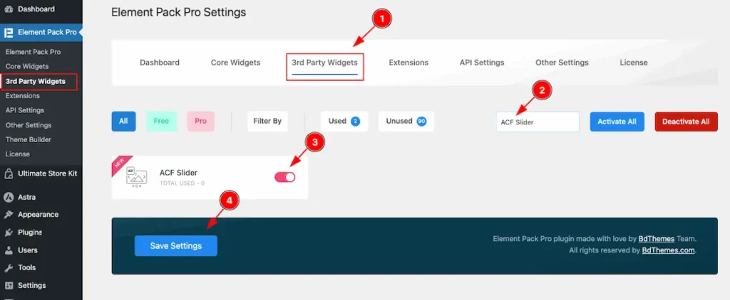
To use the ACF Slider from Element Pack Pro Widget must be enabled. Navigate to WordPress Dashboard > Element Pack Pro Plugin dashboard.
- Navigate to 3rd Party Widgets Tab.
- Search by the ACF Slider Widget Name.
- Enable the ACF Slider Widget.
- Hit the Save Settings Button.
Create ACF Content
We will create an ACF content from the ACF Fields section. Please follow Step by step guide.
Note: you must install and activate the ACF Pro Plugin.
Add Fields Group
Navigate to the ACF > Field Groups Section.
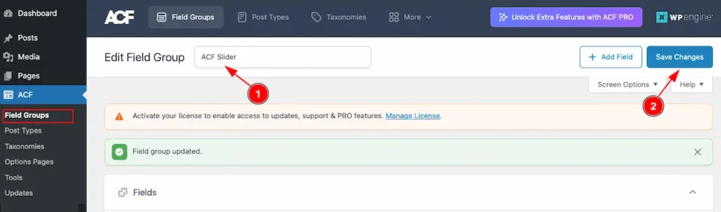
- Select the name for the Field Group e.g.: ACF Slider .
- To make changes hit the ” Save Changes ” button.
Add Repeater Field
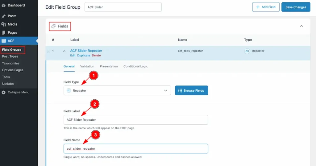
- Field Type: Select the Repeater for Field Type. The Repeater field is selected to store and manage multiple sets of similar sub-fields dynamically within a single custom field group.
- Field Label: Set the label for the field label.
- Field Name: Set the name for the Field name. It will be in small later no space , use the underscore.
Add Sub Field

- Navigate to the sub field and click on the “ + Add Field ” button to add sub fields
ACF Slider Title
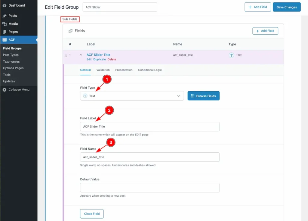
- Field Type: Select the Field Type. Different types of fields are available. Select the Text for Field Type.
- Field Label: Set the label for the field label. e.g.: ACF Slider Title.
- Field Name: Set the name for the Field name. It will be in small later no space , use the underscore.
ACF Image
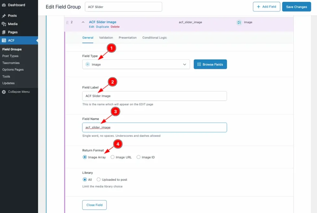
- Field Type: Select the Field Type. Different types of fields are available. Select the Image for Field Type.
- Field Label: Set the label for the field label. e.g.: ACF Slider Image.
- Field Name: Set the name for the Field name. It will be in small later no space , use the underscore.
- Return Format: Set the format of the Image. e.g: Image Array,
ACF Content
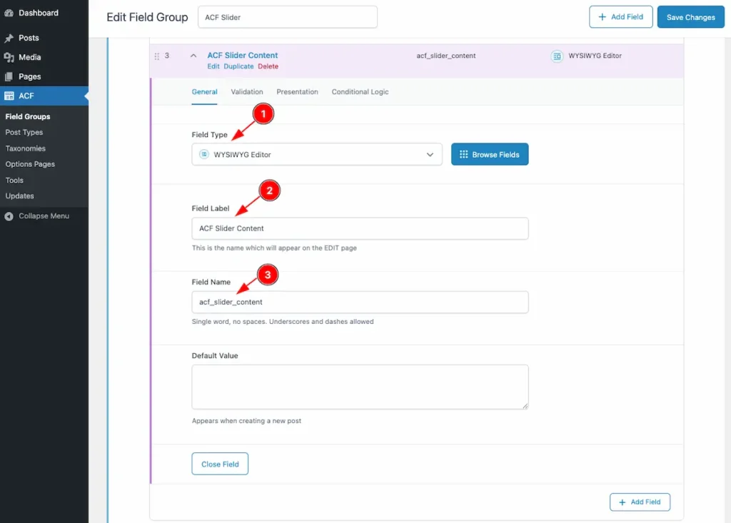
- Field Type: Select the Field Type. Different types of fields are available. Select the Text for Field Type.
- Field Label: Set the label for the field label. e.g.: ACF Slider Content.
- Field Name: Set the name for the Field name. It will be in small later no space , use the underscore.
ACF URL
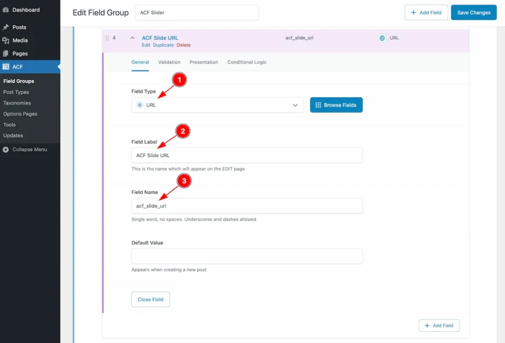
- Field Type: Select the Field Type. Different types of fields are available. Select the URL for Field Type.
- Field Label: Set the label for the field label. e.g.: ACF Slide URL.
- Field Name: Set the name for the Field name. It will be in small later no space , use the underscore.
Settings
Set the Rules for appearing the ACF content on certain place.

- Post Type: Select the type for the field Post, Pages, User, Or Forms. Choose the Post Type.
- Set condition: Set the condition Is equal to or Is not equal to. If this select the is equal to it will refer the similar with the condition.
- Select the condition where to work with, Select Page, Post, Templates etc. Please select the Post type is equal to Page.
Create a Page for ACF Slider
Navigate to the Pages > All Pages

- Click on the ” Add New ” page to add new pages.
Page Named Find the ACF Slider Fields
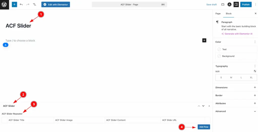
- Set the name for the page. e.g.: ACF Slider.
- The Fields group appear on the top.
- The Repeater fields appear with all the repeater items.
- At the bottom of the page the Newly added ACF Fields appear. Here add the ACF content by following. Click on the ” Add Row ” button to add new row for the custom fields.
Add Content
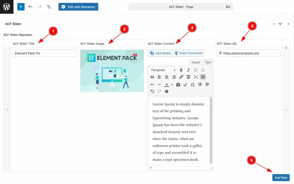
- ACF Slider Title: Set the Content of this Title fields.
- ACF Slider Image Set the Image for the ACF Slider Image.
- ACF Slider Content: Set the Content on the Content fields.
- ACF Slider URL: Set the URL for the slider content.
- Add Row: To add more repeater item click on the ” Add Row ” button. Add as many as row item want.
Edit with Elementor
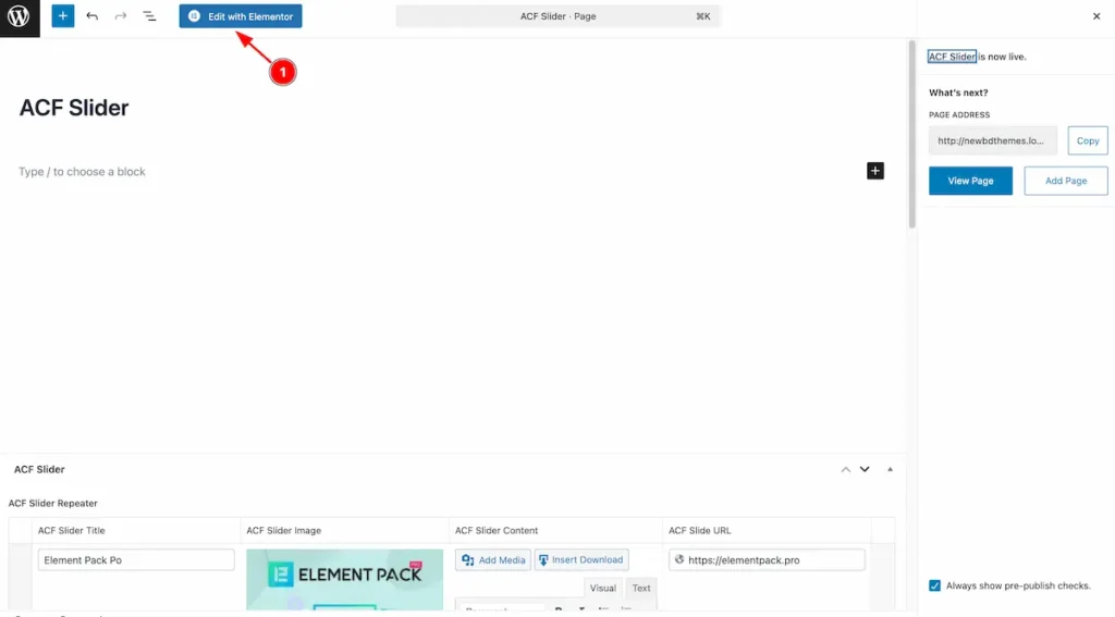
- After adding items on the Repeater Fields. Click on the ” Edit with Elementor ” button to edit the content. It will navigate to the editor page.
Insert ACF Slider
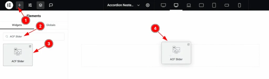
- Go to the Elementor Editor Page and Hit the Add Element ” + ” Icon.
- Search by the ACF Slider widget name.
- The widget will appear, Check the Element Pack Pro logo on top right corner.
- Select the widget then Drag and Drop it on the editor page.
Configuring the Content Tab
The Content Tab provides options to manage and structure the core settings of elements. It allows to define the content and functionality to align with design goals.
Slider Section
Go to Content > Slider
Repeater Field Select
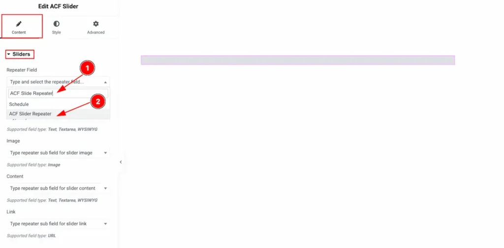
- Search by the field name. e.g.: ACF Slider Repeater.
- The Repeater field will appear and select it.
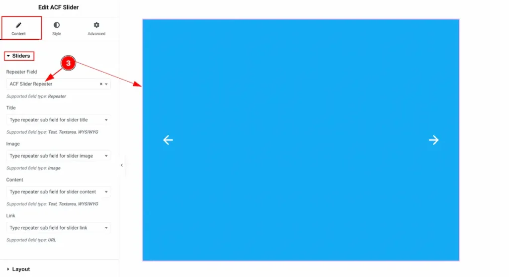
- After selecting the slider will appear.
Title
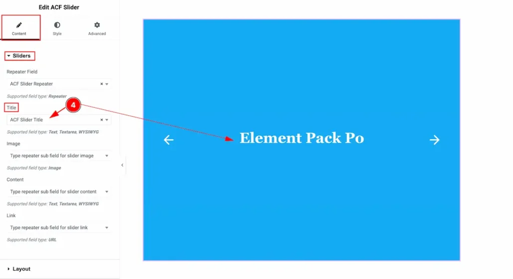
- Search by the field name. e.g.: ACF Slider Title. and Select the Title.
Image
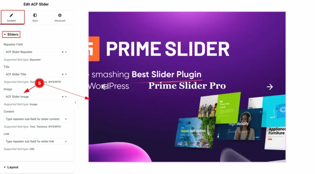
- Search by the field name. e.g.: ACF Slider Image. and Select the Image.
Content

- Search by the field name. e.g.: ACF Slider Content. and Select the Content.
Link
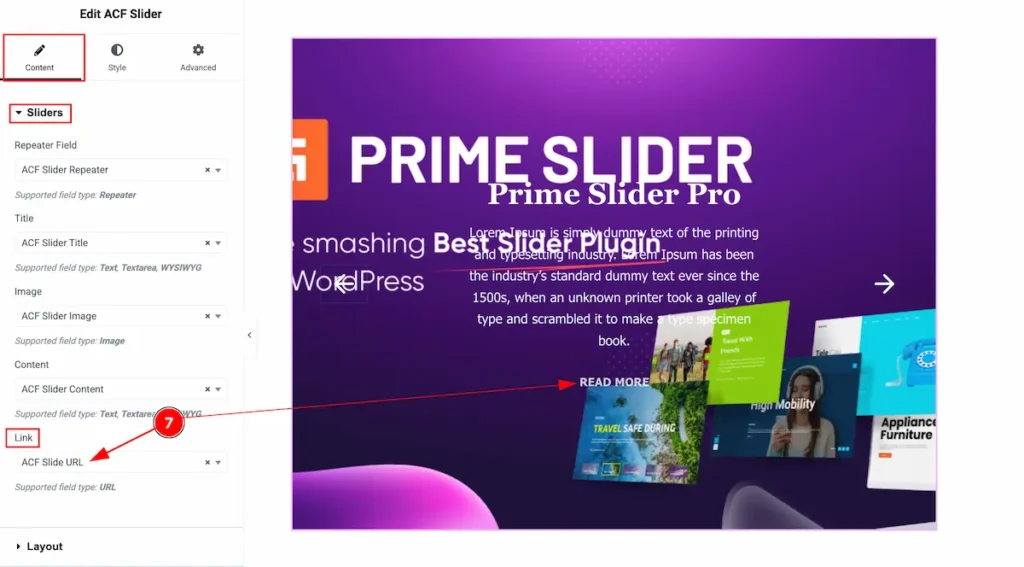
- Search by the field name. e.g.: ACF Slidr URL. and Select the url. It will link with the Read More Button.
Layout Section
Go to Style > Layout
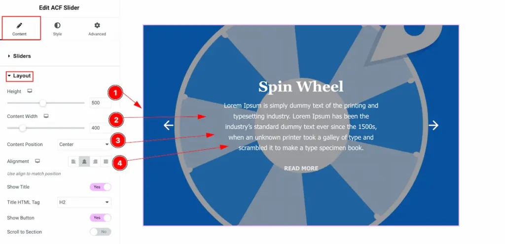
- Height: Set the height for the Slider section.
- Content Width: Set the width for the content.
- Content Position: Set position for the content, left, right, centre.
- Alignment: Set alignment for matching the position. Left, Center, Right, Justified.
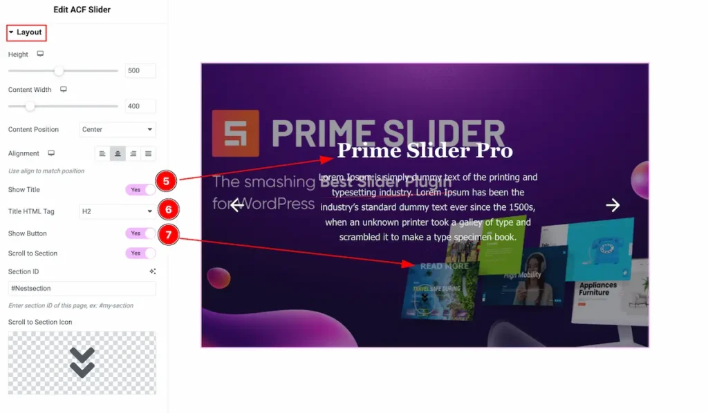
- Show Title: Enable the switcher to show the Title of the Slider.
- Title HTML Tag: Set any Title HTML Tag for Title ( H1, H2, H3, H4, H5, H6, p, span ). The Title tag is essential for both user experience and search engine optimization (SEO).
- Show Button: Enable the switcher to display the Read More Button right after the content.
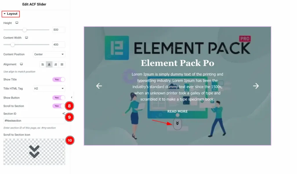
- Scroll to Section: Enable the switcher to display the scroll to section button. It will scroll to relevant section according to the Section ID.
- Section ID: Input the section ID on this field.
- Scroll to Section Icon: Set the Icon for the scroll to section button.
Button
Go to Style > Button
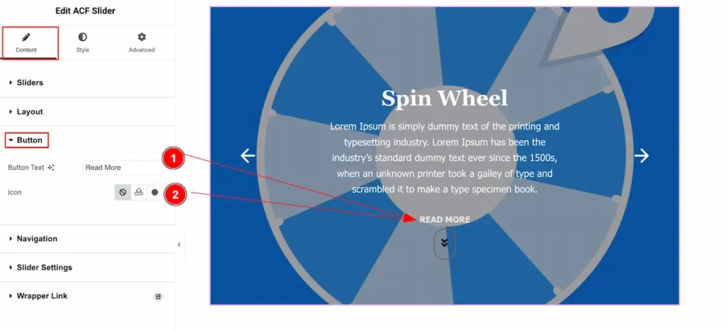
- Button Text: Set the text for the Button.
- Icon: Set the from the icon library.
Navigation Section
Go to Style > Navigation
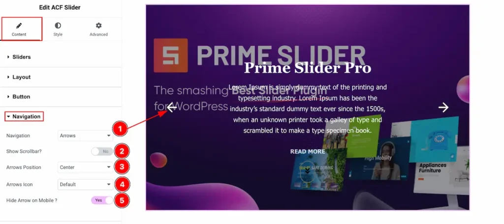
- Navigation: Set the position for the navigation. Choose the Arrows.
- Show Scrollbar?: It will display the scrollbar on the slide show.
- Arrows Position: Set the position for the arrows:
- Arrows Icon: Choose different types of Icon from the selection table.
- Hide Arrow on Mobile?: Enable the switcher to hide the arrow on the mobile device.
Slider Settings Section
Go to Style > Slider Settings
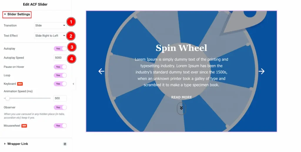
- Transition: Set the transition for the slide settings.
- Text Effect: Set the effect for the Text. Different type of effect are available.
- Autoplay: Enable the switcher to show the autoplay settings.
- Autoplay Speed: Set the speed for the autoplay.
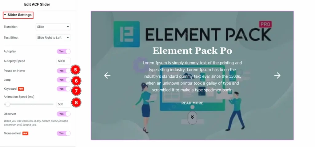
- Pause on Hover: Enable the switcher to pause the item on hover.
- Loop: For the infinity time play enable the Loop switcher.
- Keyboard: Enable the switcher to enable it by following the keyboard.
- Animation Speed (ms): Set the speed for the animation.
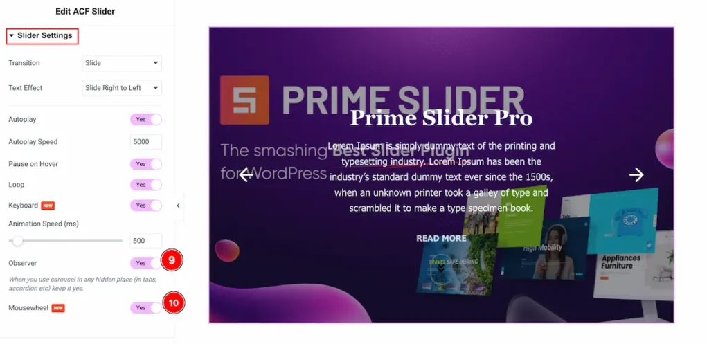
- Observer: Enable the switcher to demonstrate the observer feature.
- Mouse wheel: Enable the switcher to scroll the slider on the mouse wheel.
Designing with the Style Tab
The Style Tab offers a range of options to enhance the visual appearance of elements, enabling precise adjustments and creative design possibilities. It helps create polished and engaging layouts effortlessly.
Slider Section
Go to Style > Slider
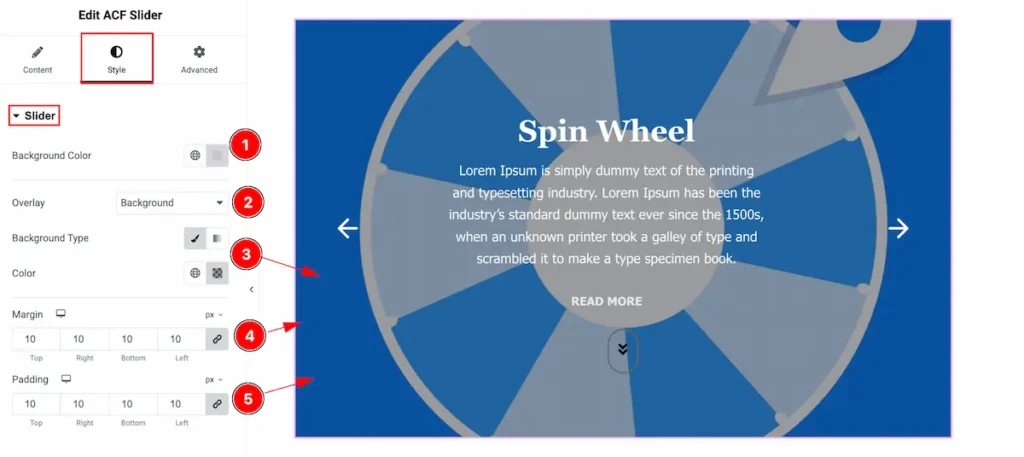
- Background Color: Choose the background color for the slider.
- Overlay: Choose the overlay background to demonstrate the feature.
- Background Type: Set the background type color and choose the color for this.
- Margin: Set the margin for the inner space.
- Padding: Set the padding for this.
Title Section
Go to Style > Title
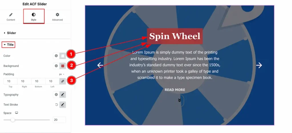
- Color: Set the color for the title.
- Background: Set the background for the Title.
- Padding: Set the padding for this.
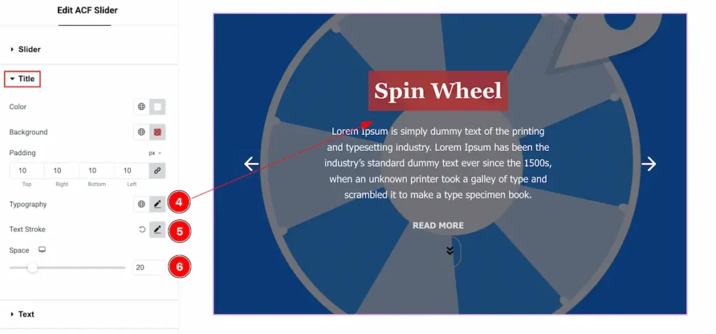
- Typography: Set the typography for the title.
- Text Stroke: Set the stroke for the text.
- Space: Set the space between the Title and Content.
Text Section
Go to Style > Text
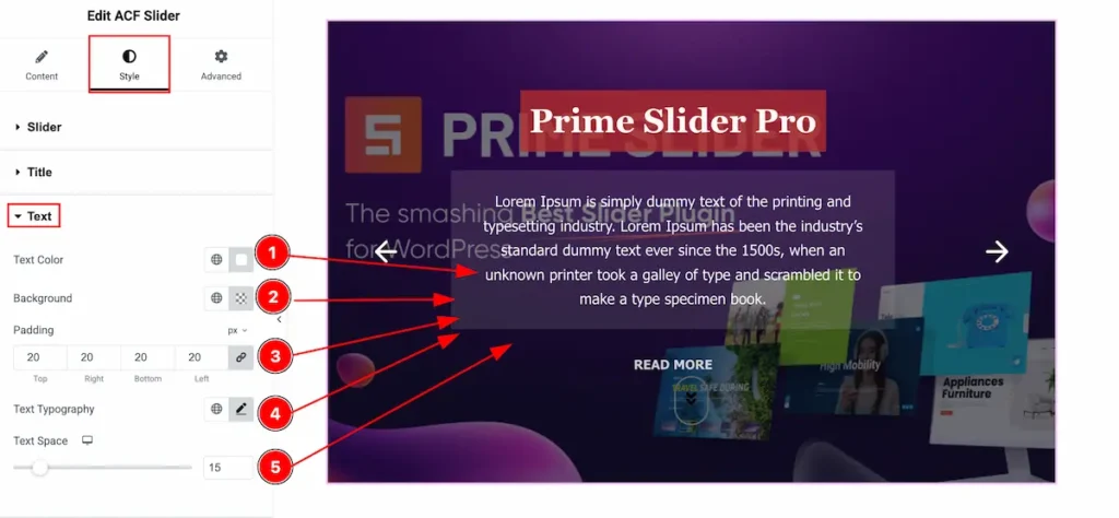
- Text Color: Set the color for the text.
- Background: Set the background for the text.
- Padding: Set padding for the inner space.
- Text Typography: Set the typography for the text.
- Text Space: Set the space between the text.
Button Section
Go to Style > Button
Normal
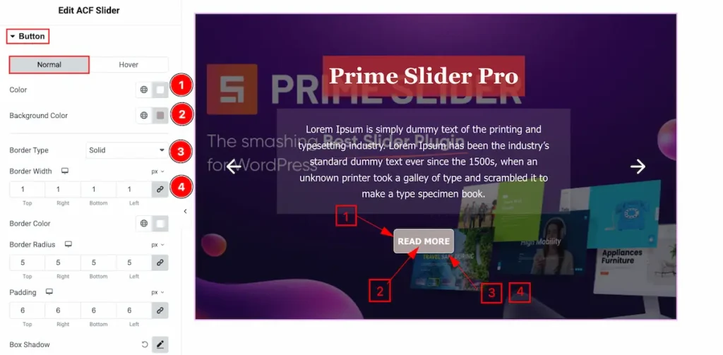
- Color: Set the color for the button text.
- Background Color: Choose the background color for the button.
- Border Type: Set the type for the border.
- Border Width: Set the thickness for the border.
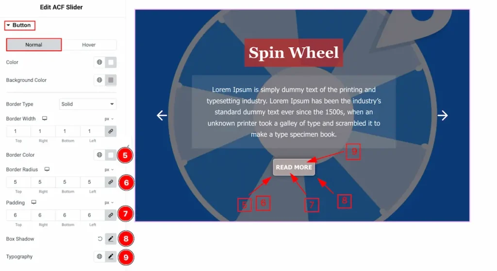
- Border Color: Select the color for the border.
- Border Radius: Set the radius for the border.
- Padding: Set the inner space for the padding.
- Box Shadow: Make a shadow for the box item.
- Typography: Set the typography for the button.
Hover
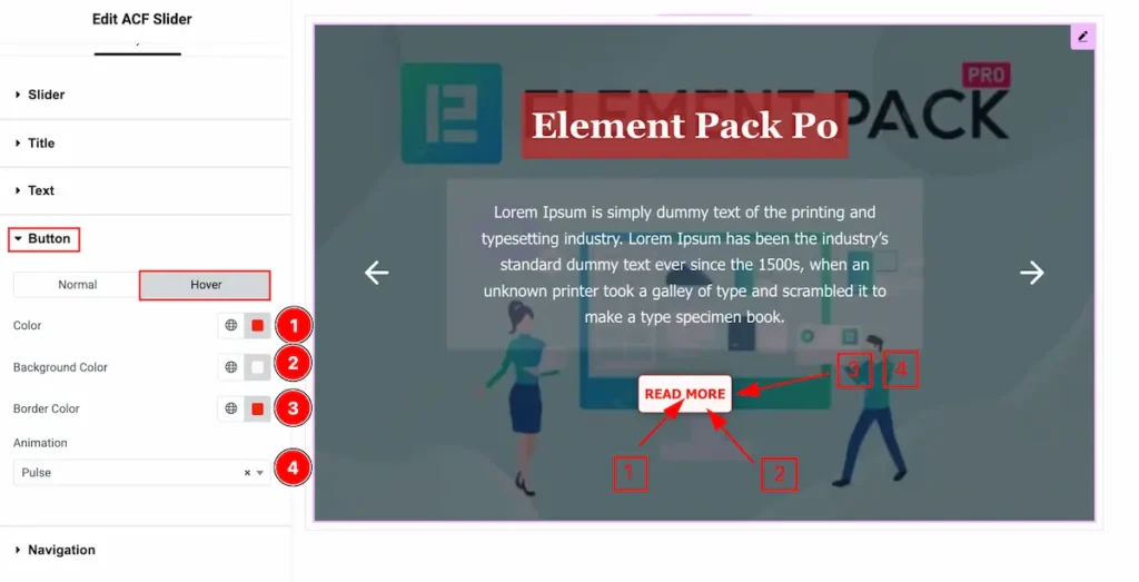
- Color: Set the color for the Button.
- Background: Set the background for the button.
- Border Color: Set the color for the border.
- Animation: Set the animation for the button.
Navigation Section
Go to Style > Navigation
ARROWS
Normal
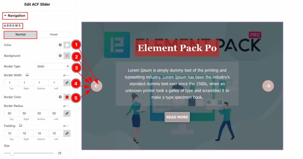
- Color: Set the color for the navigation arrows icon.
- Background: Set the background for the navigation.
- Border Type: Set the type for the border.
- Border Width: Set the thickness for the border.
- Border Color: Set the color for the border.
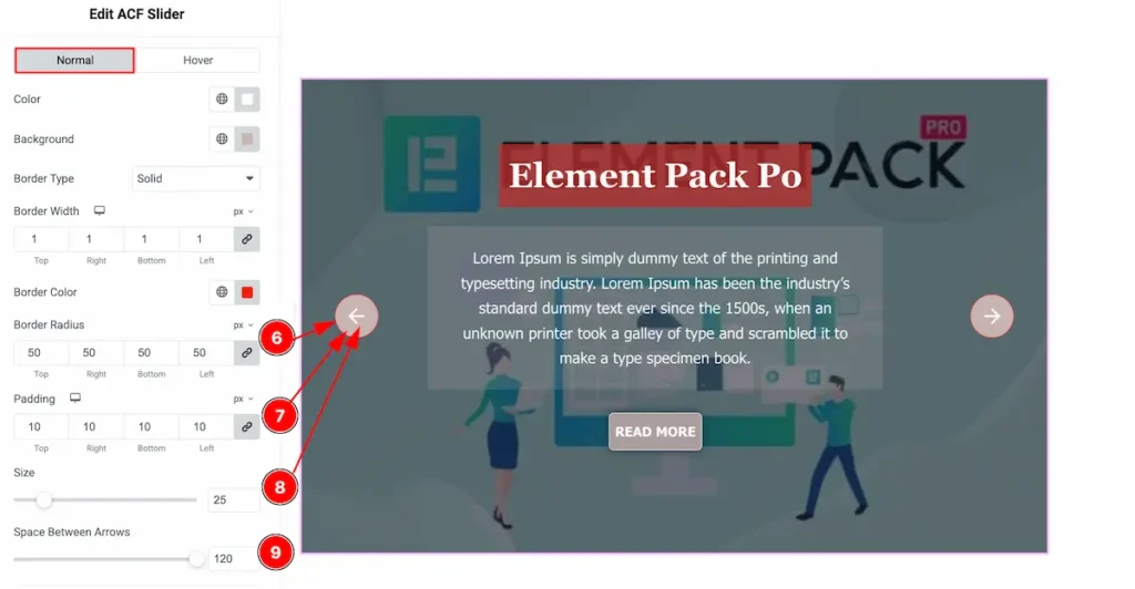
- Border Radius: Set the radius for the border.
- Padding: Set the padding for the border.
- Size: Set the size for the normal.
- Space Between Arrows: Set the spacing for the arrows.
Hover
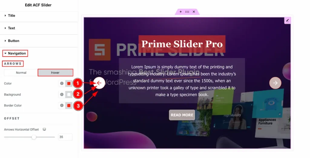
- Color: Set the color for the arrows.
- Background: Set the background for the arrows.
- Border Color: Set the color for the border.
OFFSET
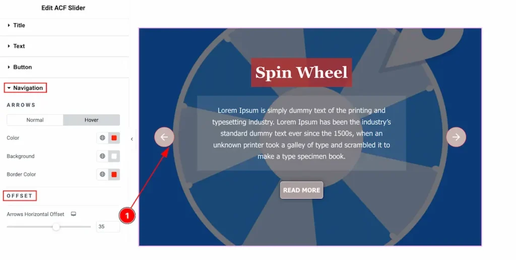
- Arrows Horizontal Offset: Set the offset for the horizontal position.
Video Assist
Please check the demo page for examples.
Thanks in advance.