

In this documentation, we will show you how to customize the Product Tabs widget by Ultimate Store Kit.
Enable the Product Tabs Widget
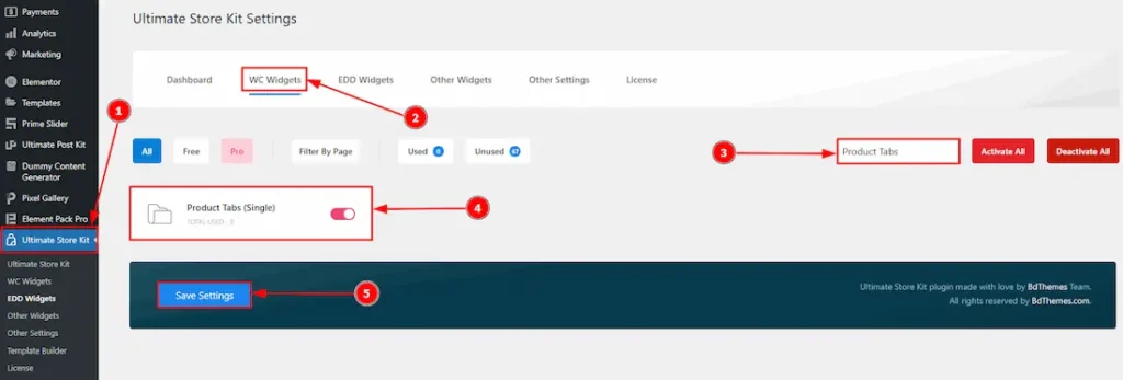
To use the Product Tabs widget by Ultimate Store Kit, first, you have to enable the widget.
- Go to WordPress > Ultimate Store Kit Plugin dashboard.
- Then Click the WC Widgets Tab.
- Search the Product Tabs Widget Name.
- Enable the Product Tabs Widget.
- Hit the Save Settings Button.
Inserting The Product Tabs widget
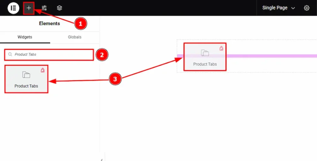
- Go to the Elementor Editor Page and Hit the “+” (Add Element) icon button.
- Search the Product Tabs widget.
- Drag the widget and drop it on the editor page.
Work with the Style Tab
Tabs Section
Go to Style > Tabs
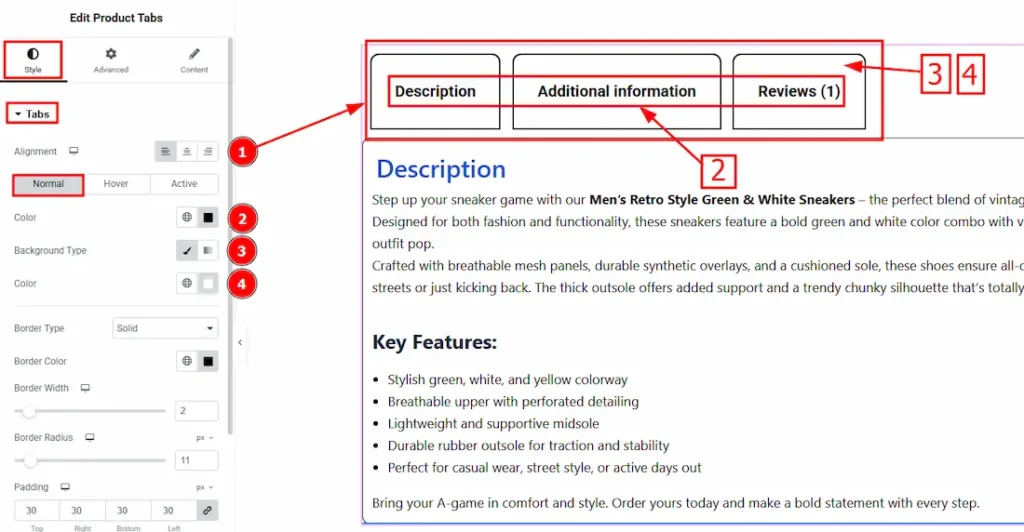
In this section, we have three tabs. These are – Normal, Hover & Active. Let’s start with the Normal tab –
1. Alignment: You can set the tabs position to left, center or right by using this option.
2. Color: You can change the tabs color by using this option.
3. Background Type: You can change the color of any object background to classic or gradient. In Classic, you can change the background color and also set an image to the background. In the gradient option, you can also set background color along with locations and angle for each breakpoint to ensure the gradient adapts to different screen sizes. Also, you can change the gradient type (Radial & Linear) and positions.
4. Color: You can change the background color by using this option.
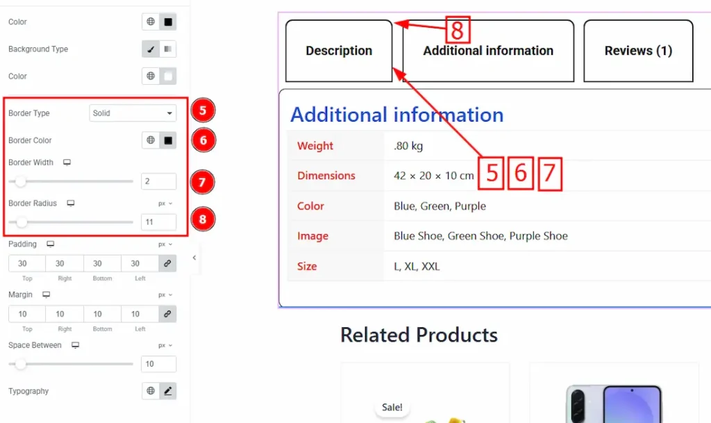
5. Border Type: This option allows you to add borders to your items. You can select various border types from this option. Such as Solid, Double, Dotted, Dashed, Groove.
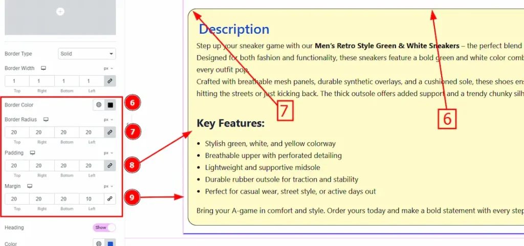
6. Border Color: You can change the border color by using this option.
7. Border Width: Set the thickness of the border by selecting the width.
8. Border Radius: The Border Radius controls the roundness of the border.
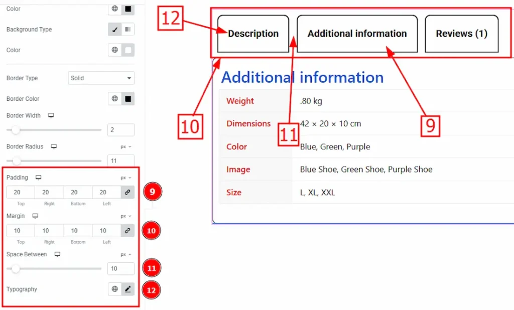
9. Padding: Add spaces around an object to increase the inner area. Padding allows you to control the internal space within an element.
10. Margin: This option allows you to adjust the space & create gaps around the tabs.
11. Space Between: You can adjust the space between tabs by using this option.
12. Typography: Change the tab’s font family, size, weight, transform, style, decoration, line height, letter spacing, and word spacing from here.
Now, Let’s Proceed to the Hover Tab –
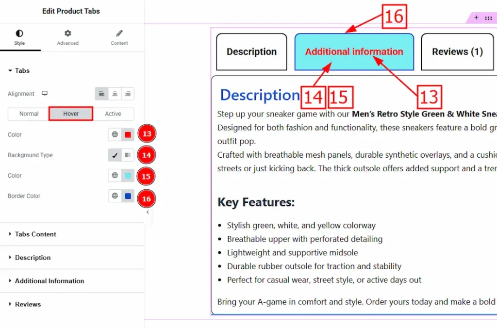
13. Color: You can change the tab’s title hover color by using this option.
14. Background Type: You can select the background type to classic or radiant. Here we selected the classic.
15. Color: You can change the background hover color by using this option.
16. Border Color: You can change the border color by using this option.
Now, Let’s Proceed to the Active Tab –
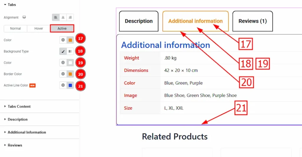
17. Color: You can change the tab’s title active color by using this option.
18. Background Type: You can select the background type to classic or radiant. Here we selected the classic.
19. Color: You can change the background active color by using this option.
20. Border Color: You can change the active border color by using this option.
21. Active Line Color: You can add and change the active line color by using this option.
Tabs Content Section
Go to Style > Tabs Content
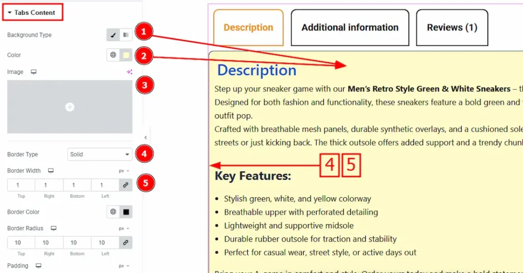
1. Background Type: There are two types of background. These are – Classic & Gradient. Here we selected classic.
2. Color: You can change the background color by using this option.
3. Image: You can change the background image by using this option.
4. Border Type: This option allows you to add borders to your items. You can select various border types from this option. Such as Solid, Double, Dotted, Dashed, Groove.
5. Border Width: Set the thickness of the border by selecting the width.
6. Border Color: You can change the border color by using this option.
7. Border Radius: The Border Radius controls the roundness of the border.
8. Padding: Padding allows you to control the internal space within an element.
9. Margin: This option allows you to adjust the space & create gaps around the tabs content.
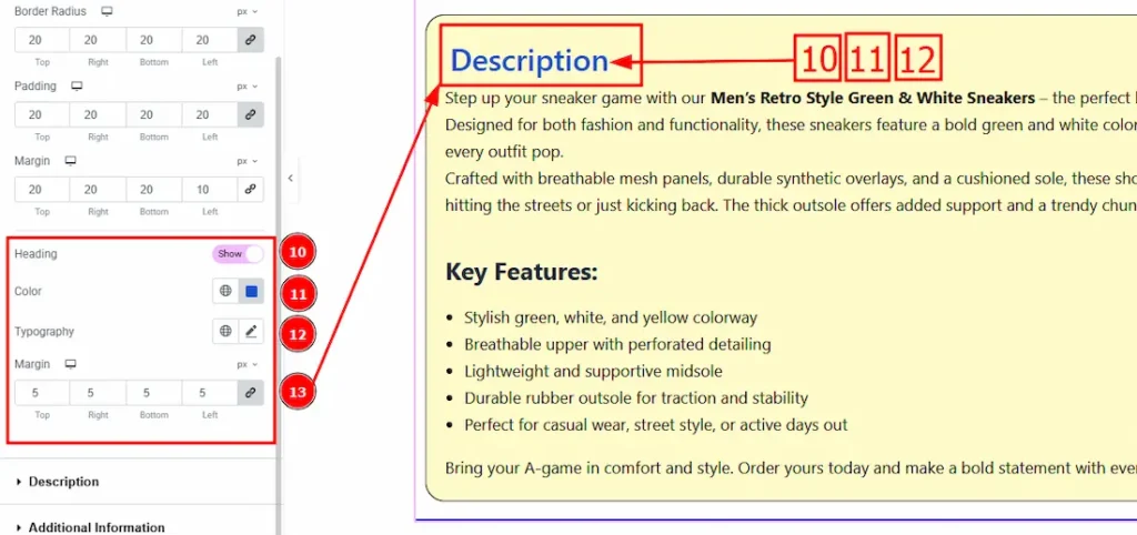
10. Heading: Enable the switcher to show the heading.
11. Color: You can change the heading color by using this option.
12. Typography: Change the heading’s font family, size, weight, transform, style, decoration, line height, letter spacing, and word spacing from here.
13. Margin: This option allows you to adjust the space & create gaps around the heading.
Description Section
Go to Style > Description
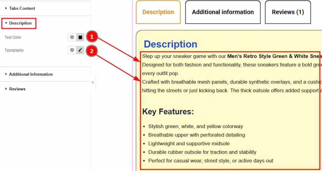
1. Text Color: You can change the text color by using this option.
2. Typography: Change the text’s font family, size, weight, transform, style, decoration, line height, letter spacing, and word spacing from here.
Additional Information Section
Go to Style > Additional Information
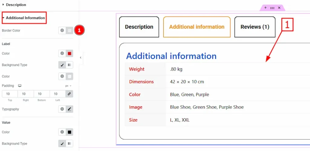
1. Border Color: You can change the border color by using this option.
Let’s Explore the Label Sub-section
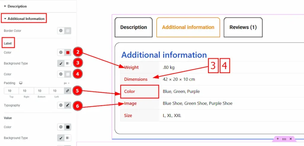
2. Color: You can change the label color by using this option.
3. Background Type: There are two types of background. These are classic and gradient. Here we used classic.
4. Color: You can change the background color by using this option.
5. Padding: Padding allows you to control the internal space within an element.
6. Typography: Change the label’s font family, size, weight, transform, style, decoration, line height, letter spacing, and word spacing from here.
Let’s Explore the Value Sub-section
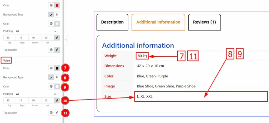
7. Color: You can change the value’s color by using this option.
8. Background Type: There are two types of background. These are classic and gradient. Here we used classic.
9. Color: You can change the background color by using this option.
10. Padding: Padding allows you to control the internal space within an element.
11. Typography: Change the label’s font family, size, weight, transform, style, decoration, line height, letter spacing, and word spacing from here.
Reviews Section
Go to Style > Reviews
Avatar Sub-section Customization
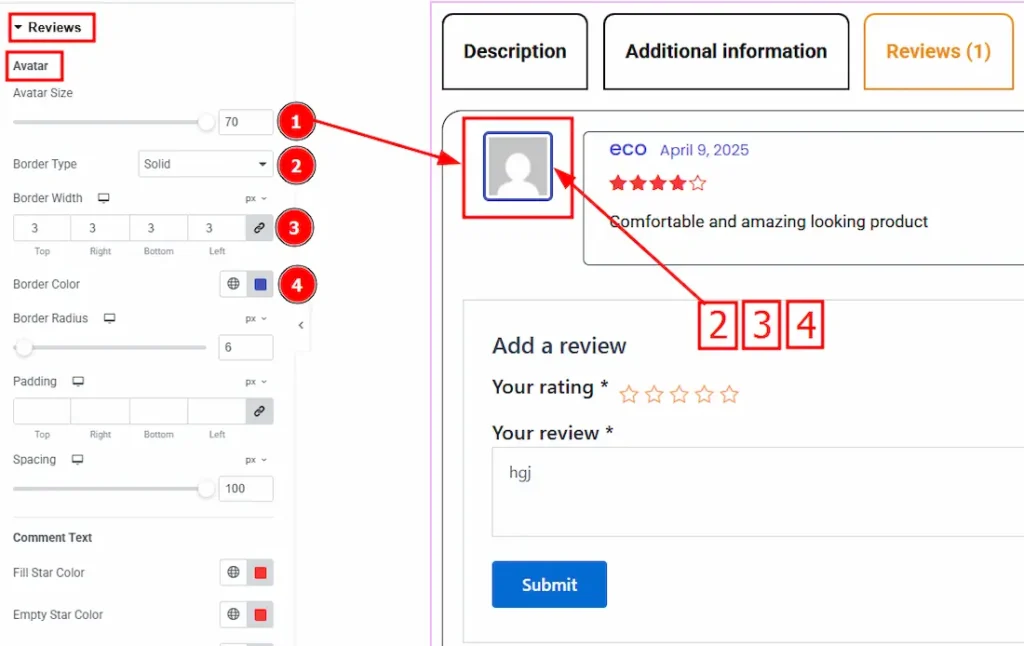
1. Avatar Size: You can make changes to the avatar size by using this option.
2. Border Type: This option allows you to add borders to your items. You can select various border types from this option. Such as Solid, Double, Dotted, Dashed, Groove.
3. Border Width: Set the thickness of the border with this option.
4. Border Color: This option allows you to change the avatar border color.
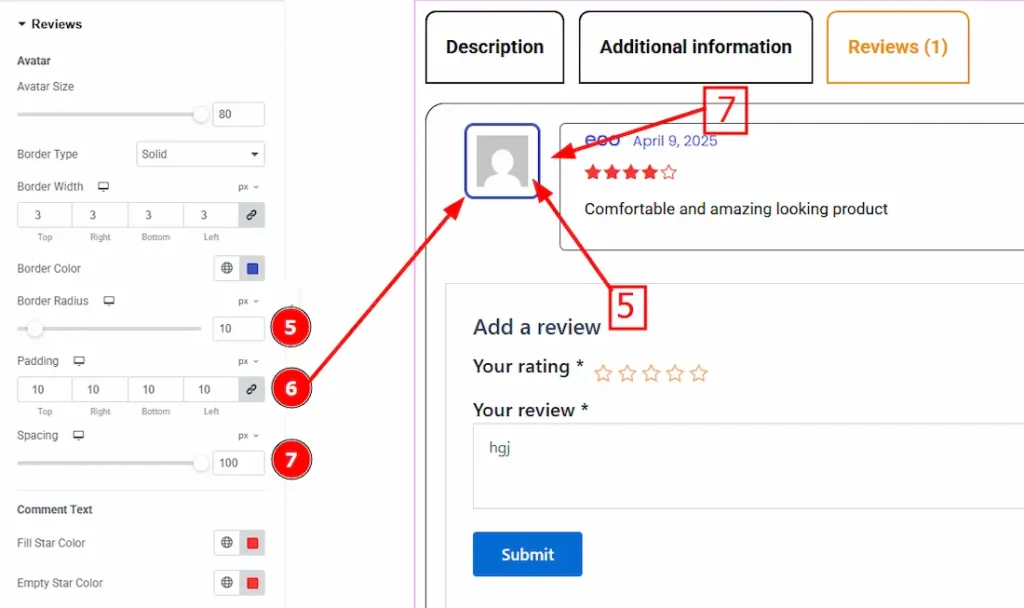
5. Border Radius: The Border Radius controls the roundness of the border.
6. Padding: Padding allows you to control the internal space within an element.
7. Spacing: You can adjust the space between the avatar and the meta field by using this option.
Comment Text Sub Section
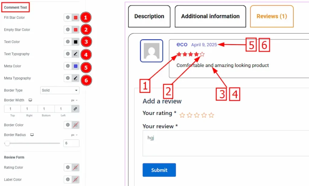
1. Fill Star Color: You can change the color of the filling star by using this option.
2. Empty Star Color: You can change the color of the empty star by using this option.
3. Text Color: You can change the review text color by using this option.
4. Text Typography: Change the texts font family, size, weight, transform, style, decoration, line height, letter spacing and word spacing from here.
5. Meta Color: You can change the meta color by using this option.
6. Meta Typography: Change the meta’s font family, size, weight, transform, style, decoration, line height, letter spacing and word spacing from here.
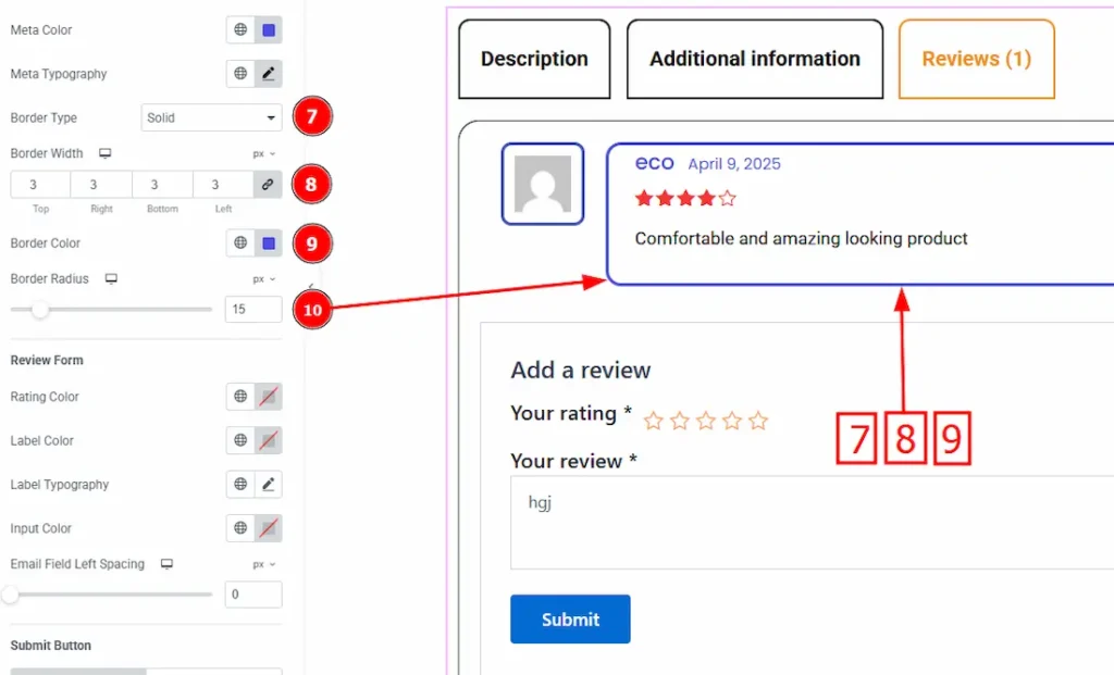
7. Border Type: This option allows you to add borders to your items. You can select various border types from this option. Such as Solid, Double, Dotted, Dashed, Groove.
8. Border Width: Set the thickness of the border by selecting the width.
9. Border Color: You can change the border color by using this option.
10. Border Radius: The Border Radius controls the roundness of the border.
Review Form Sub-Section
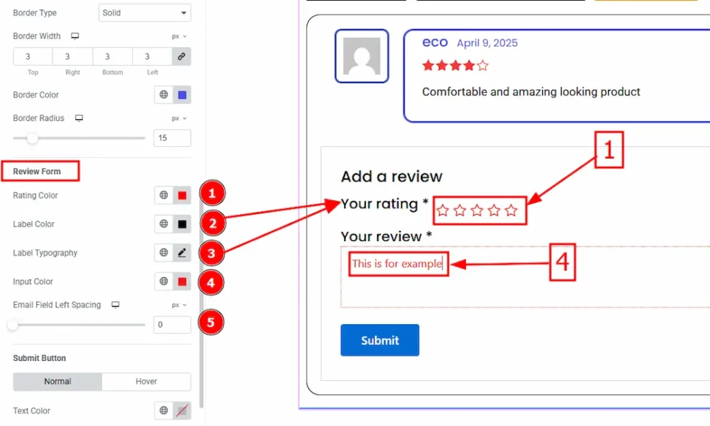
1. Rating Color: You can change the rating color by using this option.
2. Label Color: You can change the label color by using this option.
3. Label Typography: Change the label’s font family, size, weight, transform, style, decoration, line height, letter spacing amd word spacing from here.
4. Input Color: You can change the input text color by using this option.
5. Email Field Left Spacing: You can adjust the space between name and email field by using this option.
Submit Button Sub Section
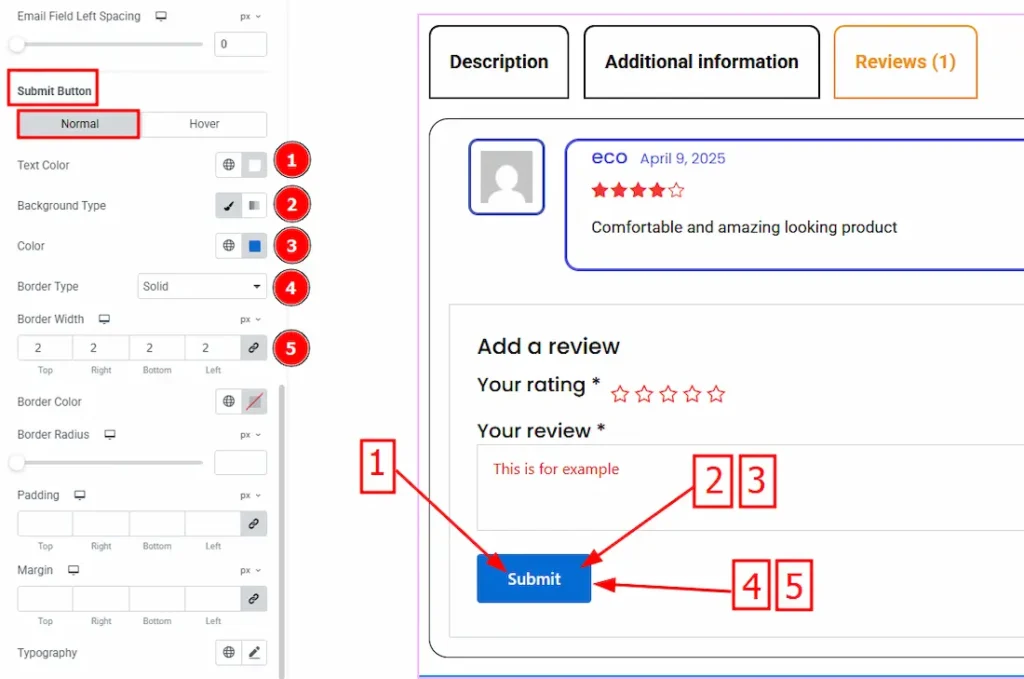
In this sub-section, we have two tabs. One is Normal and the other is Hover. Let’s start with the Normal tab –
1. Text Color: You can change the button text color by using this option.
2. Background Type: There are two types of background. These are Classic and Gradient. Here we selected the classic background.
3. Color: You can change the background color by using this option.
4. Border Type: This option allows you to add borders to your items.
5. Border Width: Set the thickness of the border by using this option.
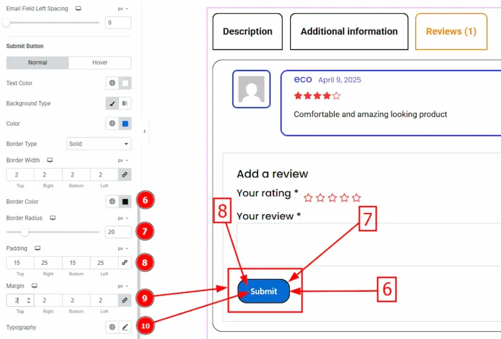
6. Border Color: This option lets you set the submit button border color.
7. Border Radius: The Border Radius controls the roundness of the border.
8. Padding: Padding allows you to control the internal space within an element.
9. Margin: This option allows you to adjust the space & create gaps around the button.
10. Typography: Change the button’s font family, size, weight, transform, style, decoration, line height, letter spacing and word spacing from here.
Now, let’s proceed to the Hover tab –
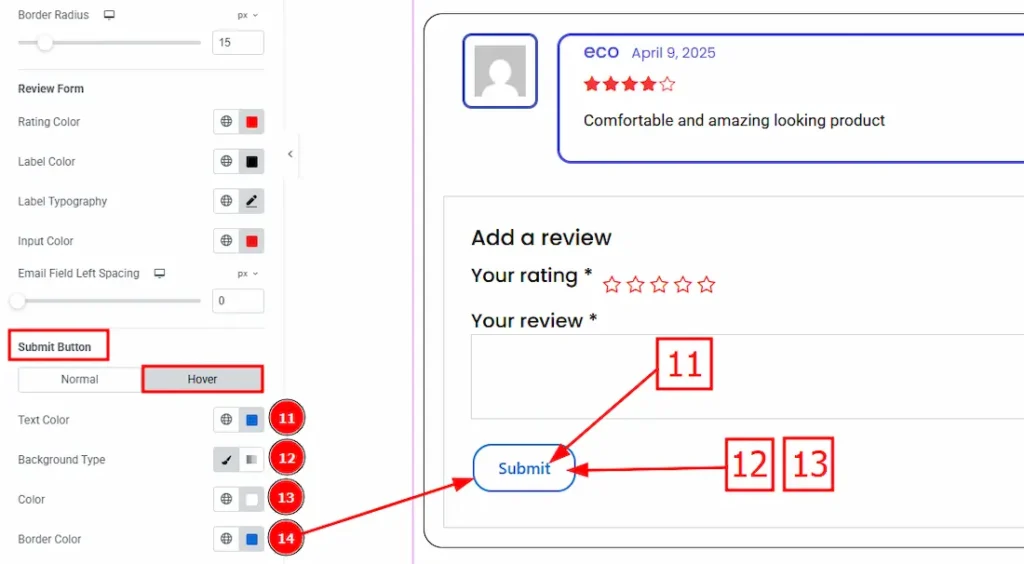
11. Text Color: You can change the button text color by using this option.
12. Background Type: There are two types of background. These are Classic & gradient. Here we selected classic.
13. Color: You can change the background color by using this option.
14. Border Color: You can change the border hover color by using this color.
All done! You have successfully customized the Product Tabs widget on your website.
Video Assist
The video will come soon. Please visit the demo page for examples.
Thanks for being with us.