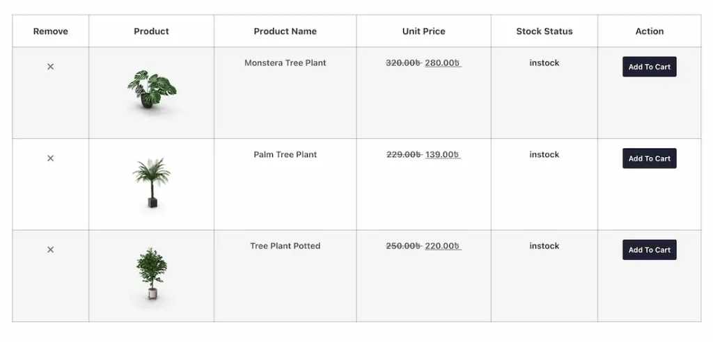
The Wishlist Products widget by Ultimate Store Kit Pro allows customers to view and manage all the products they have added to their wishlist in a dedicated, organized layout. It enhances the shopping experience by enabling users to easily revisit their favorite items, Wishlist options, and move products to the cart when they are ready to purchase. By encouraging return visits and simplifying product management, the widget helps improve customer engagement and boost conversions. In this documentation, we will show you how to customize the Wishlist Products Widget by Ultimate Store Kit Pro.
Enable the Wishlist Products Widget
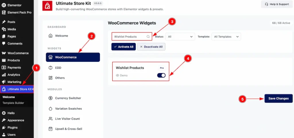
To use the Wishlist Products widget by Ultimate Store Kit, first, you have to enable the widget.
- Go to WordPress > Ultimate Store Kit Plugin dashboard.
- Then, click the WooCommerce Tab.
- Search the Wishlist Products Widget Name.
- Enable the Wishlist Products Widget.
- Hit the Save Settings Products.
Things That Must Be Done
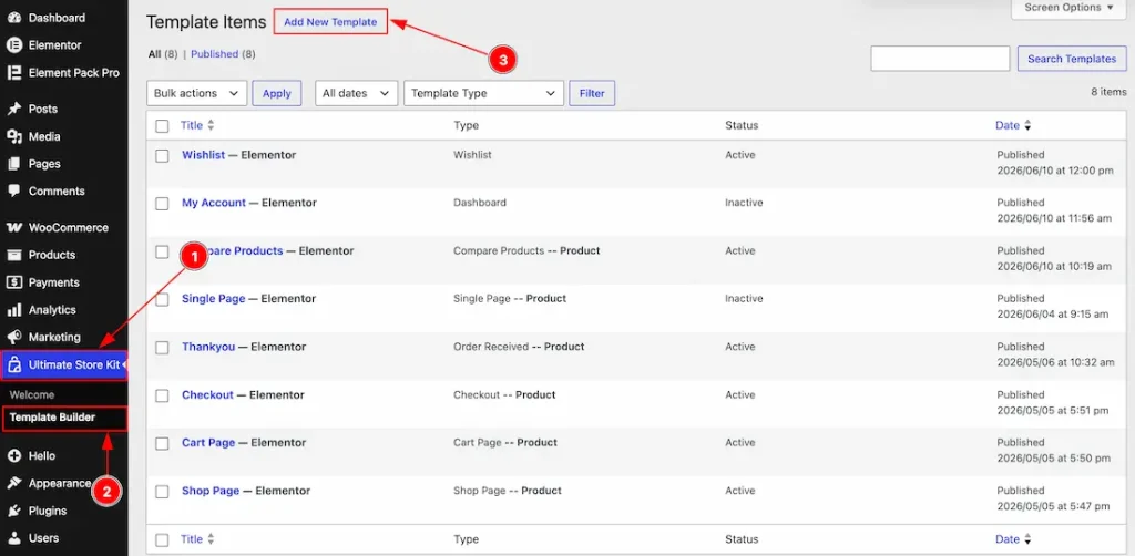
1. Go to the WP Dashboard and then click on the Ultimate Store Kit.
2. Below, inside the Ultimate Store Kit dashboard, you will find the Template Builder section. Now click on it.
3. After that, click on the Add New Template to create a new template.
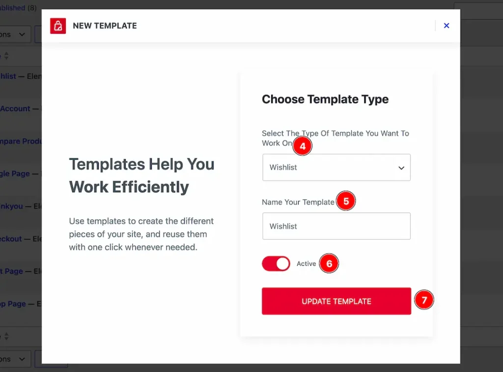
4. Choose Template Type: You can select the template type with this option. You need to find the template type named Wishlist products and select that.
5. Name Your Templates: In this field, you have to name the template.
6. Switcher: Enable the switcher to make the template active with this option.
7. Update Template: Click on this Products to save the settings that you have changed above.Product
Now, you need to insert the widget to the template page –
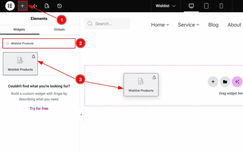
After clicking on the update template Products, the settings will change, and it will redirect to the Elementor editor page, where you can customize the template. Let’s see what we have to do here –
1. Go to the Elementor Editor Page and Hit the “+” (Add Element) icon Products.
2. Search the Wishlist Products widget.
3. Drag the widget and drop it on the editor page and publish the page.
How the user Wishlists count on the Wishlist Products
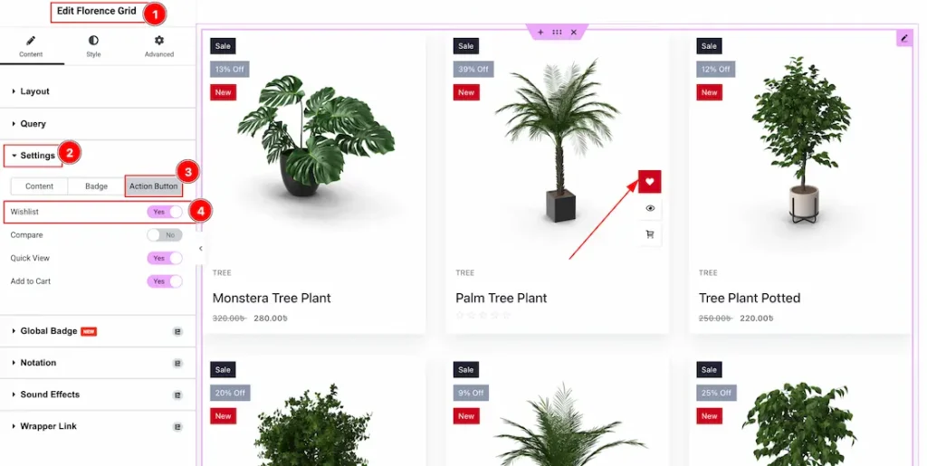
You must enable the Wishlist feature on the grid widget that you are using to showcase your products. You need to follow this –
1. Select the Grid widget. Here, we have used the Florence Grid, so we have selected the Florence Grid and then navigated to the content tab.
2. Click on the Settings section to open the settings options.
3. Now, move to the Action Products tab of the settings section.
4. Now, enable the switcher of the Wishlist to display the Wishlist icon on the products.
All done, now the product will display the Wishlist icon, and let’s see how we can connect the Wishlist Products with this appeared Wishlist icon.
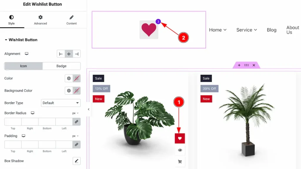
You will see this page redirected when you click on the Wishlist button.
Configuring the Style Tab
Header Section
Go to Style > Header
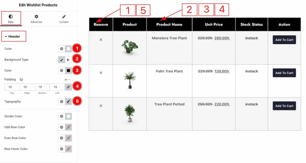
1. Color: You can make changes to the header text’s color with this option.
2. Background Type: You can change the background type to be classic or gradient with this option. Here, we have selected the background type as classic.
3. Color: You can change the background color with this option.
4. Padding: You can adjust the inner space of the heading field with this option.
5. Typography: Change the font family, size, weight, transform, style, decoration, line height, letter spacing, and word spacing from here.
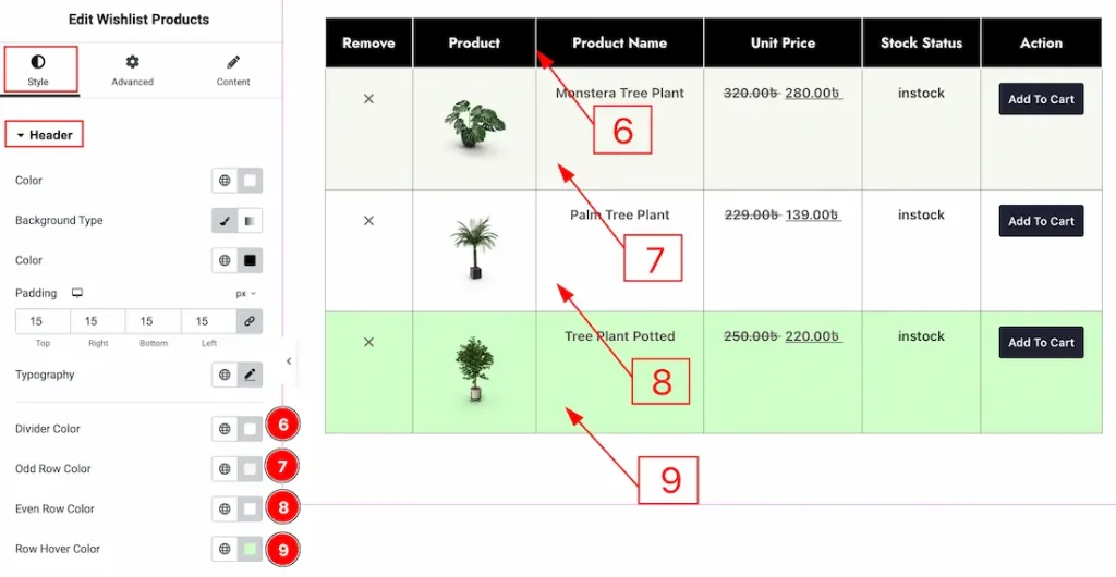
6. Divider Color: You can make changes to the divider color with this option.
7. Odd Row Color: You can make changes to the odd row color with this option.
8. Even Row Color: You can make changes to the even row color with this option.
9. Row Hover Color: You can make changes to the row hover color with this option.
Remove Button Section
Go to Style > Remove Button
In this section, we have two more tabs. These are Normal & Hover. Let’s start customizing the Normal Tab first –
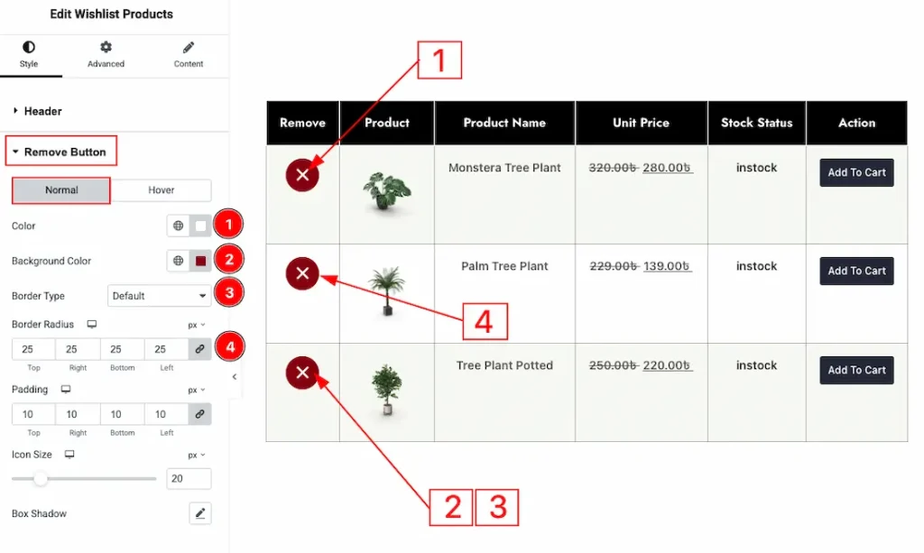
1. Color: You can make changes to the remove icon color with this option.
2. Background Color: You can change the background color with this option.
3. Border Type: You can add and change the border types with this option.
4. Border Radius: You can control the roundness of the border with this option.
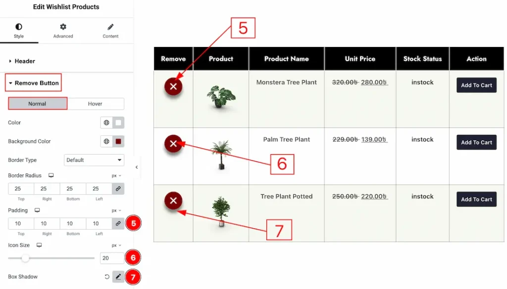
5. Padding: You can adjust the inner space of the remove button field with this option.
6. Icon Size: You can adjust the remove icon size with this option.
7. Box Shadow: You can add a shadow effect to the remove button with this option.
Now, let’s proceed to the Hover Tab –
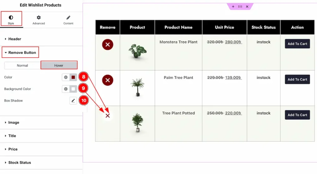
8. Color: You can make changes to the remove button icon hover color with this option.
9. Background Color: You can make changes to the background hover color with this option.
10. Box Shadow: You can add a hover shadow effect to the remove button with this option.
Image Section
Go to Style > Image
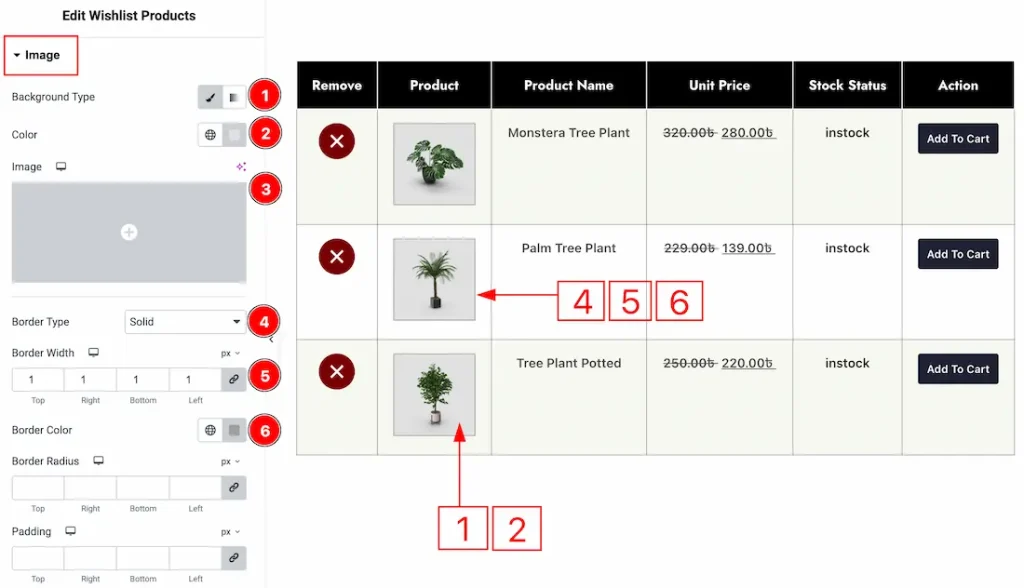
1. Background Type: You can change the background type to be classic or gradient with this option.
2. Color: You can change the background color with this option.
3. Image: You can change the background image with this option.
4. Border Type: You can add and change the border types with this option.
5. Border Width: You can set the thickness of the border with this option.
6. Border Color: You can change the border color with this option.
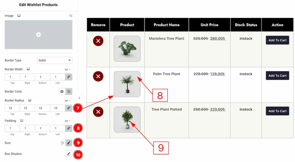
7. Border Radius: You can control the roundness of the border with this option.
8. Padding: You can adjust the inner space of the image with this option.
9. Size: You can control the image size with this option.
10. Box Shadow: You can add a shadow effect to the image with this option.
Title Section
Go to Style > Title
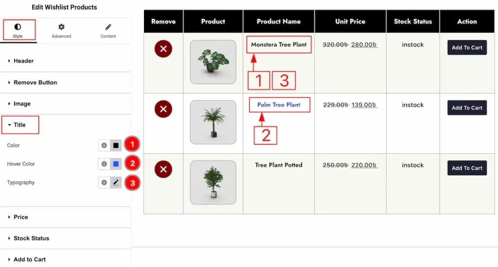
1. Color: You can make changes to the title text color with this option.
2. Hover Color: You can make changes to the title text hover color with this option.
3. Typography: Change the font family, size, weight, transform, style, decoration, line height, letter spacing, and word spacing from here.
Price Section
Go to Style > Price
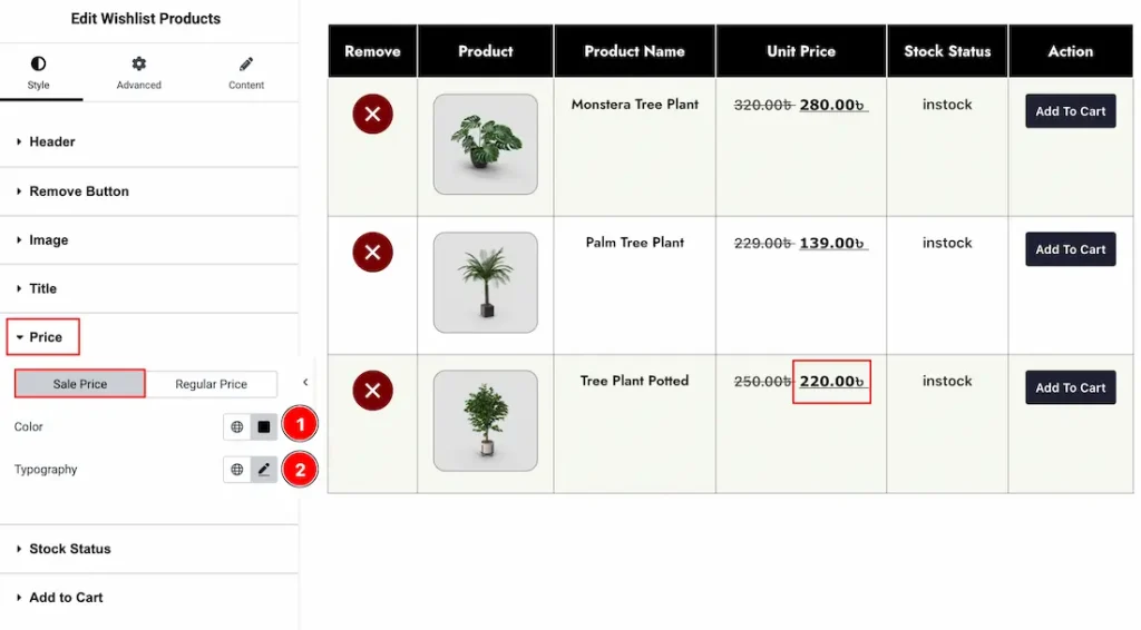
In this section, we have two more tabs. These are Sale Price and Regular Price. Let’s start with the sale price first –
1. Color: You can make changes to the sale price color with this option.
3. Typography: Change the font family, size, weight, transform, style, decoration, line height, letter spacing, and word spacing from here.
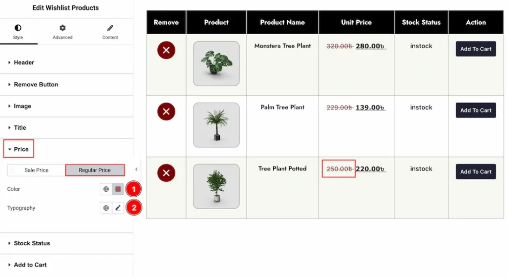
Now, let’s proceed to the Regular Price tab –
1. Color: You can make changes to the regular price color with this option.
2. Typography: Change the font family, size, weight, transform, style, decoration, line height, letter spacing, and word spacing from here.
Stock Status Section
Go to Style > Stock Status
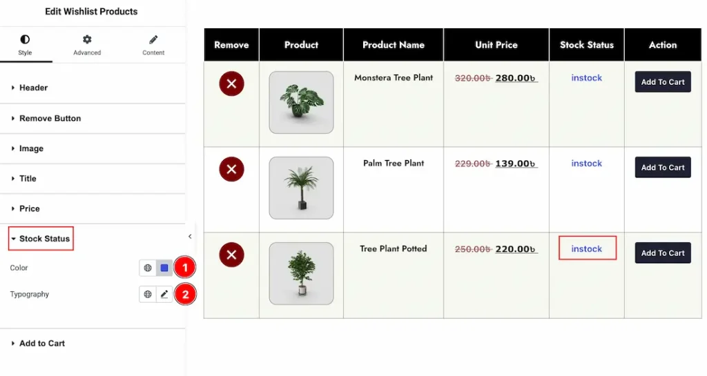
1. Color: You can make changes to the stock status text color with this option.
2. Typography: Change the font family, size, weight, transform, style, decoration, line height, letter spacing, and word spacing from here.
Add to Cart Section
Go to Style > Add to Cart
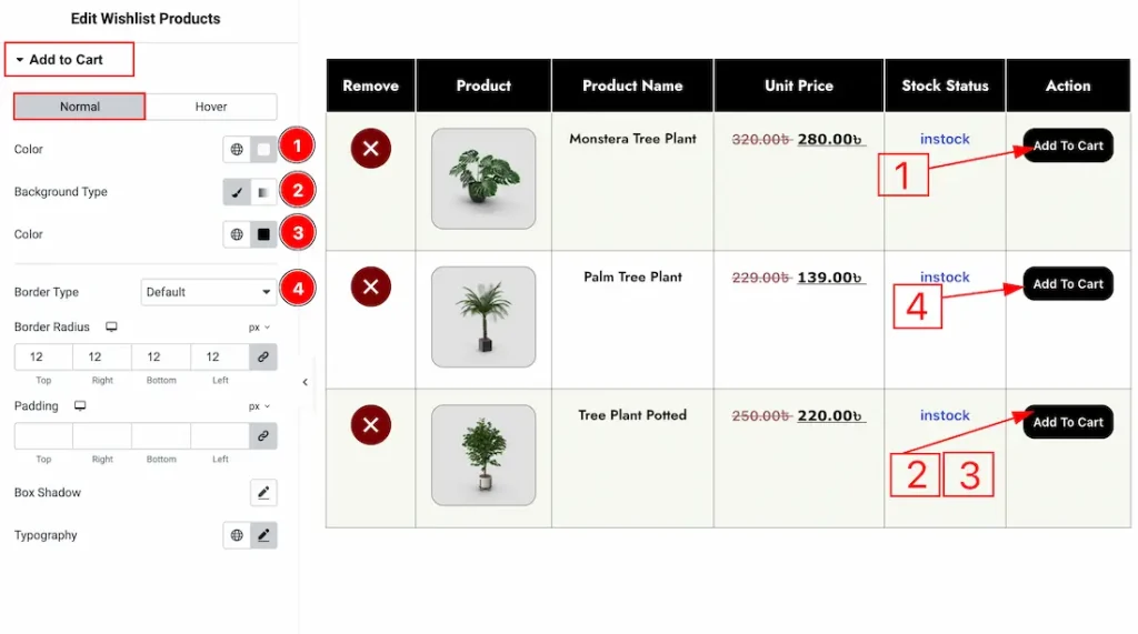
In this section, we have two more tabs. These are Normal & Hover. Let’s start with the Normal Tab first –
1. Color: You can make changes to the add to cart button text color with this option.
2. Background Type: You can change the background type to be classic or gradient with this option.
3. Color: You can change the background color with this option.
4. Border Type: You can add and change the border types with this option.
5. Border Radius: You can control the roundness of the border with this option.
6. Padding: You can adjust the inner space of the add to cart button with this option.
7. Box Shadow: You can add a shadow effect to the button with this option.
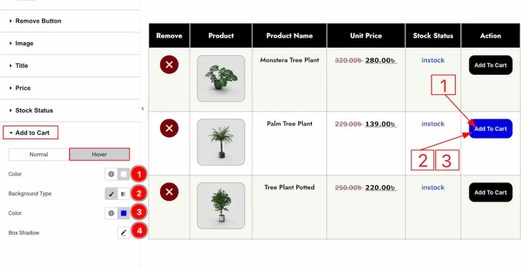
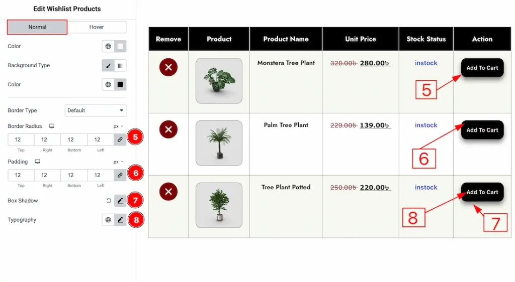
Now, let’s proceed to the Hover tab –
1. Color: You can make changes to the add to cart button’s text hover color with this option.
2. Background Type: You can change the background type to be classic or gradient with this option.
3. Color: You can change the background hover color with this option.
4. Box Shadow: You can add a hover shadow effect to the button with this option.
All done! You have successfully customized the Wishlist Products widget on your website.
Video Assist
The demo and video will come soon. Thanks for staying with us.