

In this documentation, we will discuss the customization of the Escape Slider, brought to you by the Prime Slider.
Enable The Escape Slider Widget
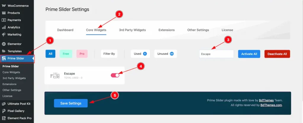
To use the Elementor Escape Slider widget from Prime Slider, first, you have to enable the widget.
- Go to WordPress dashboard > Prime Slider Plugin dashboard.
- Then Click the Core Widgets Tab.
- Search the Escape Slider Widget Name.
- Enable the Escape Slider Widget.
- Hit the Save Settings Button.
Inserting The Escape Slider widget
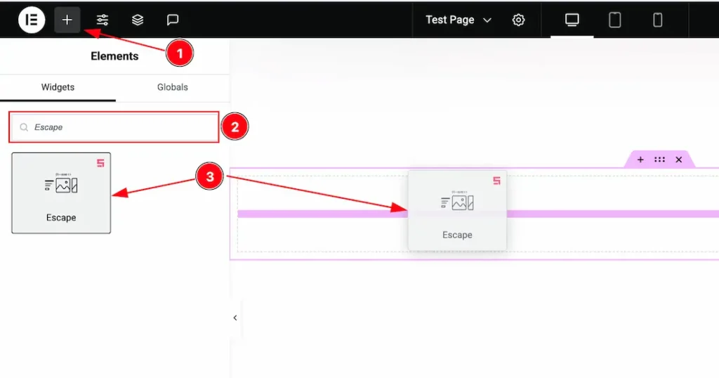
1. Go to the Elementor Editor Page and Hit the “+” icon Button.
2. Search the Escape Slider widget.
3. Drag the widget and Drop it on the editor page.
The Content Tab of Escape Slider
Sliders Section
Go to Content > Sliders
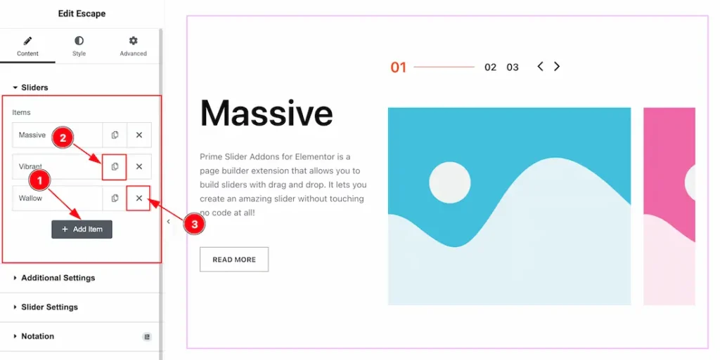
1. Add Item: You can add a new item by clicking the “+”Add Item button.
2. Copy Item: This option lets you copy the same item.
3. Close Item: You can delete the Slider item by clicking the Close icon button.
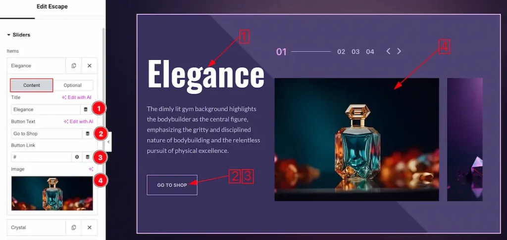
To click over each sliders items, you will get two subsections; Content and Optional.
In the Content subsection, you will get the below options-
1. Title: This option lets you change the slides items title text.
2. Button Text: This option lets you change the slides items button text.
3. Button Link: You can set a link under the button.
4. Image: This option lets you set an image of the sliders item.
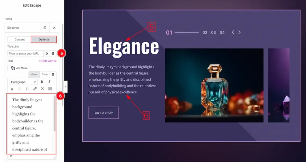
In the Optional subsection, you will get the below options-
5. Title Link: You can set a link under the Title.
6. Slider Text: You can input your slider items text from here.
Additional Settings Section
Go to Content > Additional Settings
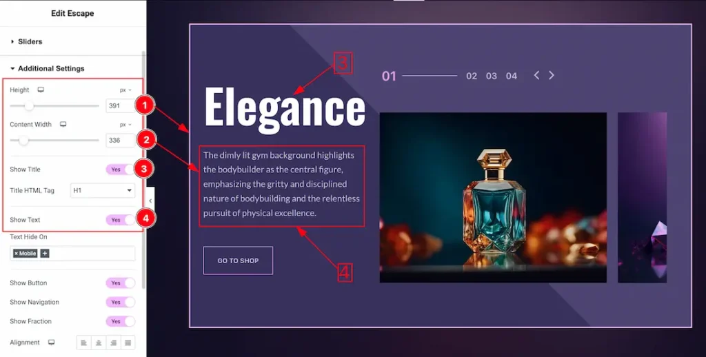
1. Height: You can adjust the slider height with this option.
2. Content Width: You can set the content width to your working demand.
3. Show Title: Enable/disable the switcher to show/hide the title. From here you also can set the title HTML tag.
4. Show Text: Enable/disable the switcher to show/hide the text. If you want then you also can hide the text for the selected device as like- Desktop, Tablet, or Mobile.
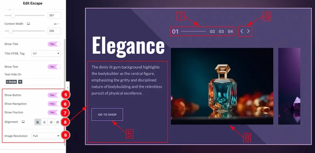
5. Show Button: Enable/disable the switcher to show/hide the button.
6. Show Navigation: Enable/disable the switcher to show/hide the navigation.
7. Show Fraction: Enable/disable the switcher to show/hide the fraction.
8. Alignment: You can set the content position to left, center or right with this option.
9. Image Resolution: You can change the image resolution with this option.
Slider Settings Section
Go to Content > Slider Settings
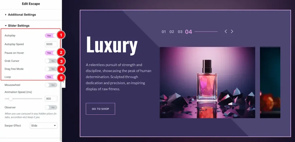
1. Autoplay switcher: If you Enable the Autoplay switcher button, your slider will slide into Autoplay mode, and you can set the Autoplay Speed as you wish.
2. Pause on Hover: If you activate the pause on Hover button, when visitors Hover the mouse cursor on the slider, then your slider will Hold, otherwise your slider slide Autoplay.
3. Grab Cursor: Your mouse pointer icon will be changed into a grab cursor. Visitors can slide your slider manually with your mouse cursor.
4. Drag Free Mode: Enable the switcher to allow users to manually drag (swipe) slides left/right.
5. Loop: Enable the switcher to go back to the first automatically after the last slide.
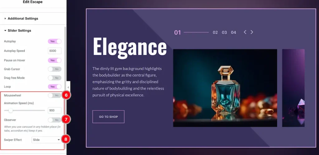
6. Mousewheel: The Mousewheel option in a slider allows users to navigate through slides by scrolling their mouse wheel. You also can set the mousewheel speed to your working demand.
7. Observer: If you enable the option then you are able to use the slider/carousel in any hidden places (such as in tabs, Accordion, etc).
8. Swiper Effect: Here you will get 1 to 10 swiper slider effects. You can choose any one of them that you like for your slider.
Work with The Style Tab
Sliders Section
Go to Style > Sliders
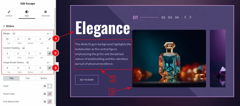
1. Margin: You can set the slider margin from here.
2. Content Padding: You can set the content padding to your working demand.
3. Image Border Radius: You can set the image border radius from here.
In this section, we have three tabs. These are Title, Text, and Button. Let’s explore those tabs one by one.
Title Tab
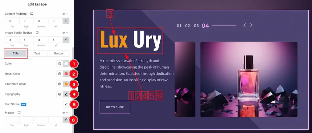
1. Color: This option lets you set the title color.
2. Hover Color: This option lets you set the title hover color.
3. First Word Color: This option lets you set the title first word color.
4. Typography: Change the font family, size, weight, style, transform, decoration, line height, letter spacing, and word spacing from here.
5. Text Stroke: This option allows you to add an outline or border around text, creating a visually distinct effect.
6. Margin: Adjusts the position of an object over the canvas.
Text Tab
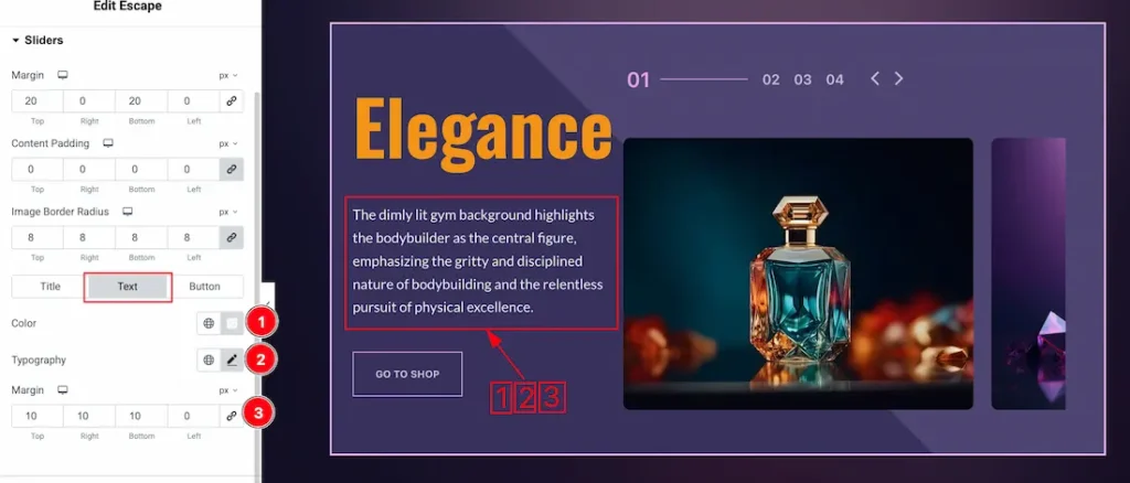
1. Color: This option lets you change the text color.
2. Typography: Change the font family, size, weight, style, transform, decoration, line height, letter spacing, and word spacing from here.
3. Margin: Adjusts the position of an object over the canvas.
Button Tab
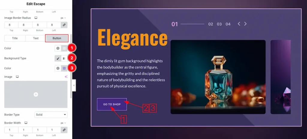
1. Color: This option lets you change the button text color.
2. Background Type: you can change the color of any object background to classic or gradient. Here we choose the Background type Classic.
3. Background Color: This lets you change the button Background color. If you want, you also can change an image to the Background.
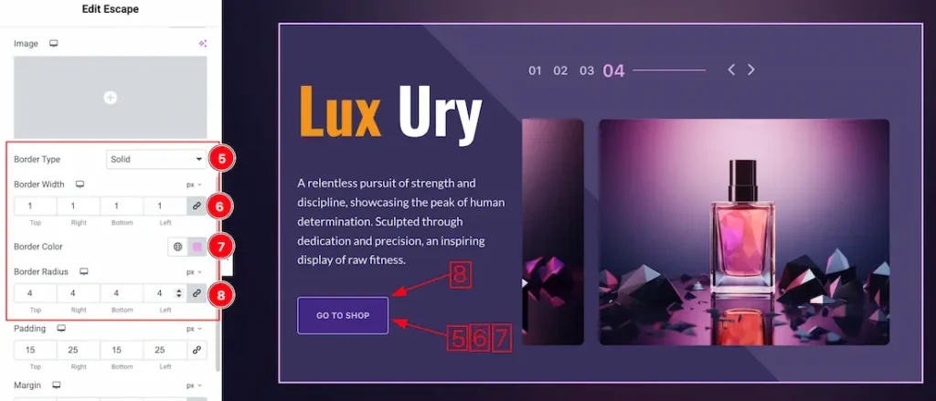
4. Border Type: You can set the Border Type to Default, None, Solid, Double, Dotted, Dashed, or Groove. We choose here the Border Type Solid.
5. Border Width: Set the thickness of the border with this option.
6. Border Color: You can change the border color with this option.
7. Border Radius: This option controls the roundness of the border.
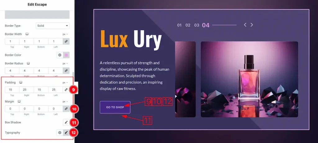
9. Padding: Add spaces around an object to increase the inner area. Padding allows you to control the internal space within an element.
10. Margin: This option allows you to adjust the space & create gaps between elements.
11. Box Shadow: You can add the shadow effect to the button with this option.
12. Typography: Change the button text font family, size, weight, transform, style, decoration, line height, letter spacing, and word spacing from here.
Navigation Section
Go to Style > Navigation
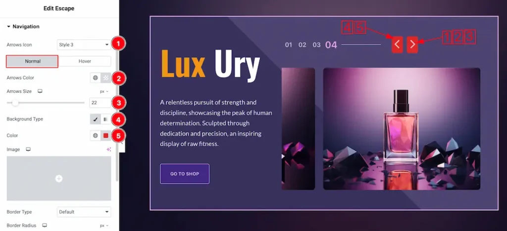
In this Section, we have two tabs. These are Normal & Hover. Let’s start with the Normal Tab –
1. Arrows Icon: Here you will get 1 to 23 ready mades arrows icon and you can choose any one of them.
2. Arrows Color: This option lets you change the arrows color.
3. Arrows Size: You can change the arrows size from here.
4. Background Type: You can change the color of any object background to classic or gradient. Here we choose the Background type Classic.
5. Background Color: This lets you change the arrows Background color. If you want, you also can change an image to the Background.
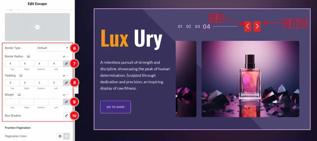
6. Border Type: You can set the Border Type to Default, None, Solid, Double, Dotted, Dashed, or Groove. We choose here the Border Type Solid.
7. Border Radius: Customizes the border corners for roundness.
8. Padding: Add spaces around an object to increase the inner area. Padding allows you to control the internal space within an element.
9. Margin: Adjusts the position of an object over the canvas.
10. Box Shadow: You can add a shadow effect for the navigation.
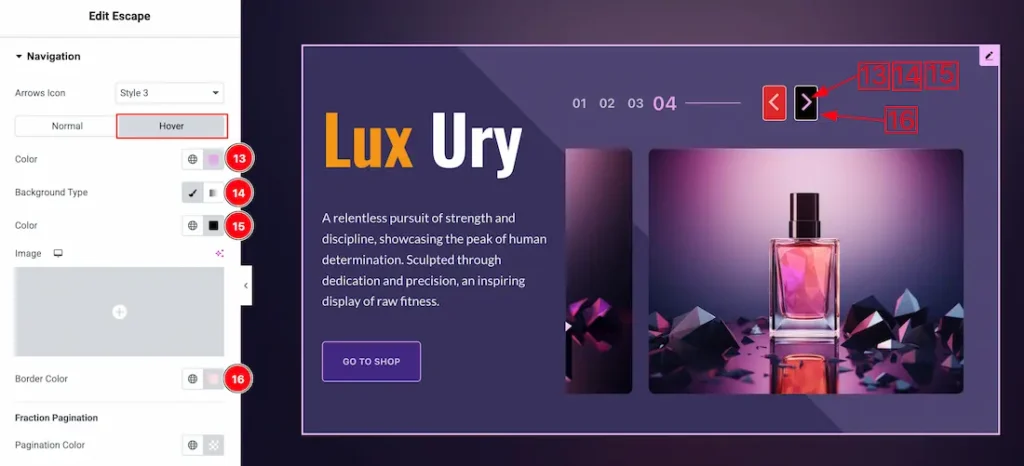
In the hover mode, you will get the below options-
13. Color: You can change the navigation text hover color with this option.
14. Background Type: You can change the color of any object background to classic or gradient. Here we choose the Background type Classic.
15. Background: You can change the background hover color with this option.
16. Border Color: You can change the hover border color with this option.
Fraction Tab
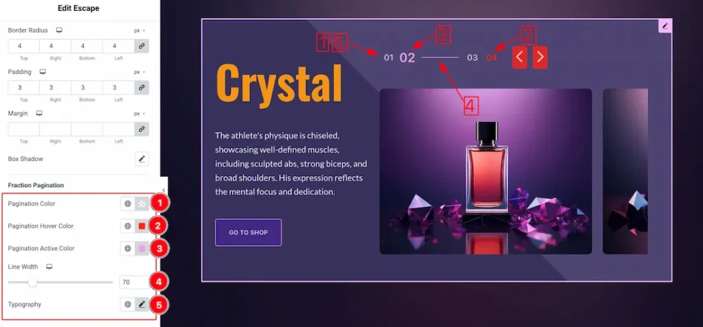
1. Pagination Color: This option lets you change the pagination normal color.
2. Pagination Hover Color: This option lets you change the pagination hover color.
3. Pagination Active Color: This option lets you change the pagination active color.
4. Line Width: You can adjust the line width from here.
5. Typography: Change the font family, size, weight, style, transform, decoration, line height, letter spacing, and word spacing from here.
All done! You have successfully customized the Escape Slider on your website.
Video Assist
You can watch the quick video to learn about the Escape Slider widget. Please visit the demo page for examples.
Thanks for being with us.