

In this documentation, we will show you how to customize the User Login widget presented by the Element Pack Pro add-on.
Insert User Login Widget
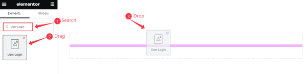
- Search by the User Login widget name.
- The widget will appear, Check the Element Pack Pro logo on top right corner.
- Select the widget then Drag and Drop it on the editor page.
The Default view of User Login
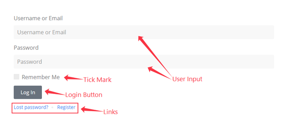
The User Login Displays the Input Form, Checkbox, Button, and Links.
Content Tab Customization
Forms Layout Section
Go to Content > Forms Layout
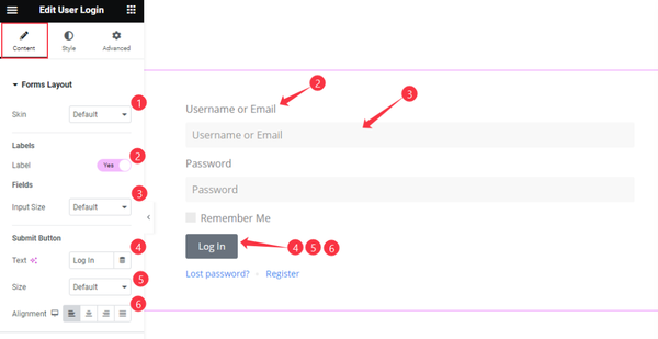
- Skin: Different Skin are available for the Forms Layout. Choose any of them.
- Labels
- Label: Enable the toggle switcher to demonstrate the label of the Forms.
- Fields
- Fields: Set the Size for the Fields. Here are available service are, Default, Small, Big, & Medium.
- Submit Button
- Text: Set the text for the Button.
- Size: Set the size of the button. e.g: Default, Small, Medium, Large.
- Alignment: Set the alignment of the button Left, Center, Right, Stretch.
Additional Options Section
Go to Content > Additional Options
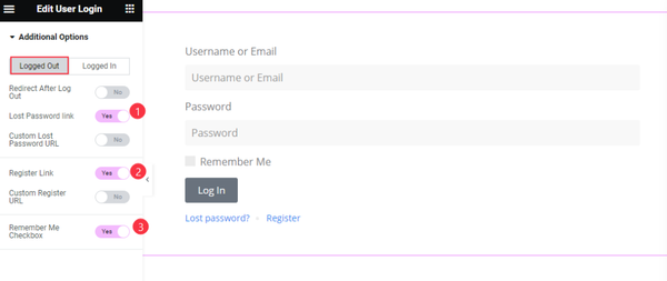
Logged Out
- Lost Password Link: Enable the switcher to show the Link of Lost Password.
- Register Link: Enable the switcher to show the link of the Register.
- Remember Me Checkbox: It allow the user to remember. Enable the toggle switcher to open it.
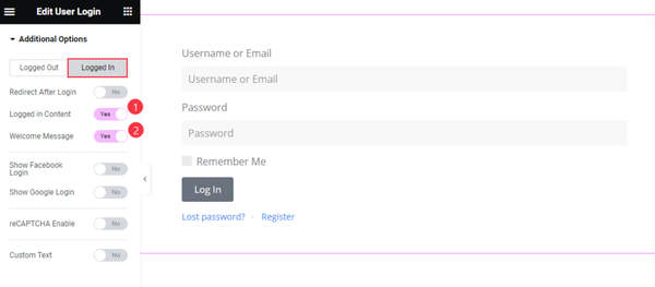
Logged In
- Logged in Content: Enable the switcher to show the content to logged in.
- Welcome Message: Enable the switcher to show the Welcome Message.
Style Tab Customization
Form Style Section
Go to Style > Form Style
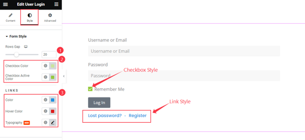
- Rows Gap: Set the gap between the Rows of the Table.
- Checkbox Color: Enable the color for the Checkbox.
- Checkbox Active Color: Set the Active color for the Color.
- Color: Set the color for the Links.
- Hover Color: Set the color for the hover state of the links.
- Typography: Set the typography of the links.
Form Label Section
Go to Style > Form Label
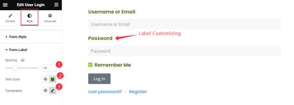
- Spacing: Set the spacing of the Forms label.
- Text Color: Choose the color for the Text.
- Typography: Set the typography for the Label.
Form Fields Section
Go to Style > Form Fields
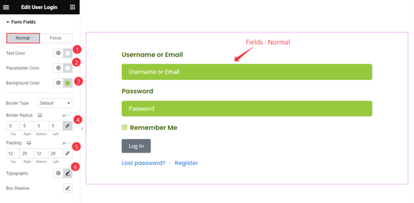
Normal
- Text Color: Set the color for the Text of the Forms Fields.
- Placeholder Color: Set the placeholder color.
- Background Color: Set the Background Color.
- Border Radius: Make the border radius.
- Padding: Set the spacing by setting the padding.
- Typography: Set the typography for the Fields.
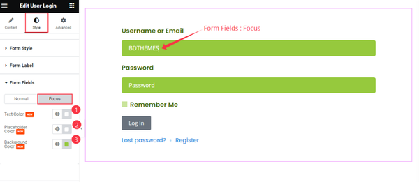
Focus
- Text Color: Set the text color for the forms fields.
- Placeholder Color: Set the color for the placeholder.
- Background Color: Set the background color.
Form Submit Button Section
Go to Style > Form Submit Button
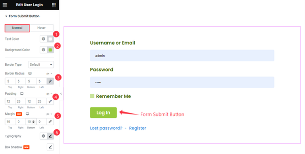
Normal
- Text Color: Set the color for the Text.
- Background Color: Set the Background color for the Text.
- Border Radius: Make the border radius.
- Padding: Set the padding for the inner space.
- Margin: Set the margin for the outer space.
- Typography: Set the typography of the Button.
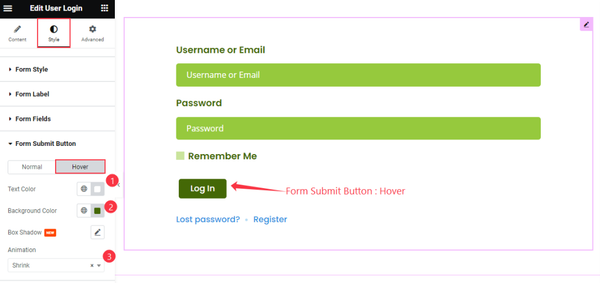
Hover
- Text Color: Set the color for the Submit button.
- Background Color: Set the background color.
- Animation: Set the animation of the submit button.
Video Assist
Watch the User Login video tutorial here. Please visit the demo page for examples.
Thanks for being with us.