

In this documentation, we will show you how to customize the Modal widget presented by Element Pack Pro.
Inserting The Modal Widget
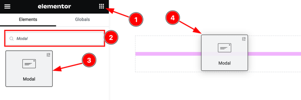
Open your page in the Elementor editor, search by the Modal widget name, and then drag and drop it on the page.
Note: You need both Elementor and Element Pack Pro installed to use this widget.
Content Tab Customizations
Layout Section
Go to Content > Layout
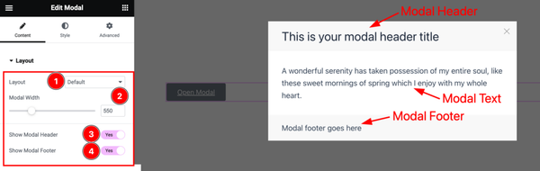
Come to the Layout section, find the Layout ( Default, Splash Screen, Exit Popup, On Scroll, and Custom Link), Modal Width, Show Modal Header, and Show Modal Footer options.
Trigger Button Section
Go to Content > Trigger Button
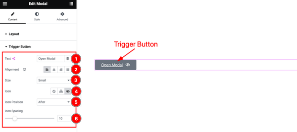
Here find the Trigger Button Text, Alignment, Size, Icon, Icon Position, and Icon Spacing options.
Modal Header Section
Go to Content > Modal Header
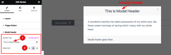
Here find the Modal Header Text, and Alignment options.
Modal Content Section
Go to Content > Modal Content
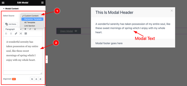
Come to the Modal Content section, and find the Select Source( Custom Content, Elementor Template, AE Template, and Link Section), Custom Content Field, and Alignment options.
Modal Footer Section
Go to Content > Modal Footer
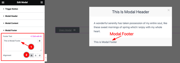
Here find the Modal Footer Text Field, and Alignment options.
Additional Section
Go to Content > Additional
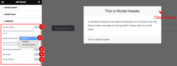
Here find the Overflow Scroll, Modal Close Button( Default, Outside, and No Close Button), Close Button Dealy Show, Full Screen, and Center Position options.
Work with The Style Tab
Trigger Button Section
Go to Style > Trigger Button
Step-1
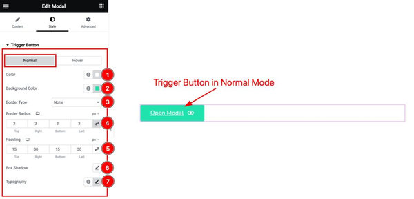
Come to the Trigger Button section, you will find two tabs section; Normal and Hover.
In the Normal tab section, find the Trigger Button Text Color, Background Color, Border Type, Border Width, Border Color, Border Radius, Padding, Box Shadow, and Typography options.
Step-2
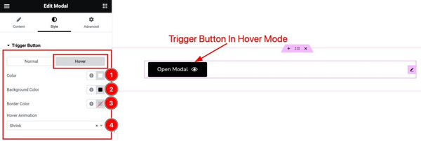
In the Hover tab section, find the Trigger Button Text Color, Background Color, Border Color, and Hover Animation options.
Modal Close Button Section
Go to Style > Modal Close Button
Step-1
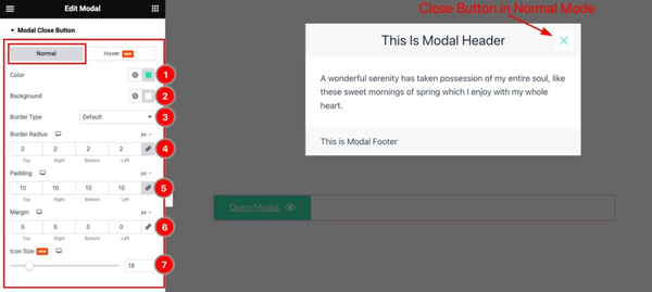
Come to the Modal Close Button section, you will find two tabs section; Normal and Hover.
In the Normal tab section, find the Modal Close Button Color, Background Color, Border Type, Border Width, Border Color, Border Radius, Padding, Margin, and Icon Size options.
Step-2
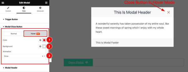
In the Hover tab section, find the Modal Close Button Color, Background Color, and Hover Animation options.
Modal Header Section
Go to Style > Modal Header
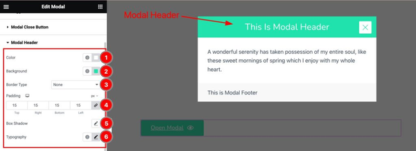
Here find the Modal Header Text Color, Background Color, Border Type, Border Width, Border Color, Padding, Box Shadow, and Typography options.
Modal Content Section
Go to Style > Modal Content
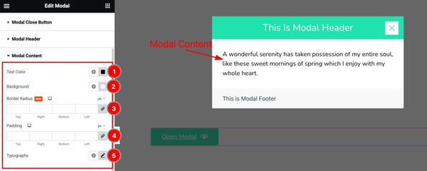
Here find the Modal Content Text Color, Background Color, Border Radius, Padding, and Typography options.
Modal Footer Section
Go to Style > Modal Footer
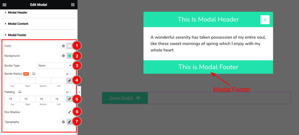
Here find the Modal Footer Color, Background Color, Border Type, Border Width, Border Color, Border Radius, Padding, Box Shadow, and Typography options.
Additional Section
Go to Style > Additional
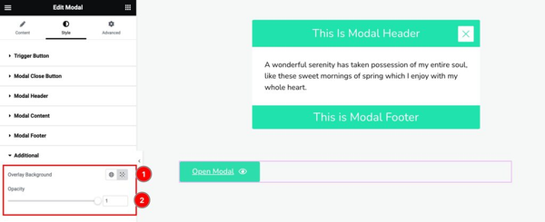
Come to the Additional section, find the Overlay Background Color, and Opacity options.
All done! You have successfully customized the Modal widget on your website.
Video Assist
You can also watch the tutorial video about the Modal widget. Please visit the demo page for examples.
Thanks for staying with us.