

In this documentation, we will discuss the customization of the Omatic Slider widget, brought to you by the Prime Slider addon for Elementor.
Enable Omatic Slider Widget
To use the Elementor Omatic Slider widget from Prime Slider, you first must enable the widget.
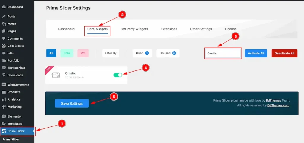
- Go to WordPress > Prime Slider Plugin dashboard.
- Then Click the Core Widgets Tab.
- Search the Omatic Slider Widget Name.
- Enable the Omatic Slider Widget.
- Hit the Save Settings Button.
Inserting The Omatic Slider widget
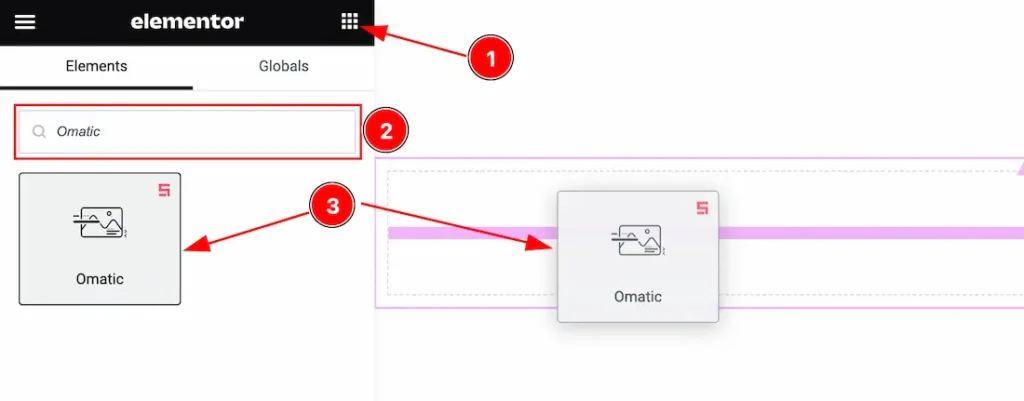
- Go to the Elementor Editor Page and Hit the Get Back To Button.
- Search the Omatic Slider widget.
- Drag the widget and Drop it on the editor page.
Note: Use this widget to install Elementor and Prime Slider Pro.
Work With The Content Tab
Slider Items Section
Go to Content > Slider Items
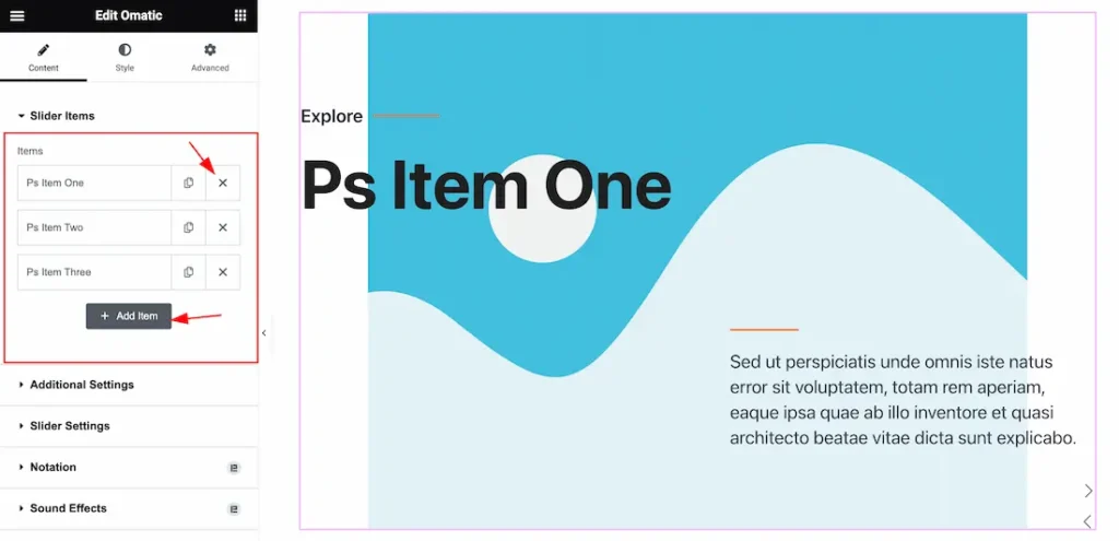
Add & Remove Item: Come to the Slider Items section, you can add Omatic Slider widget items (with the Add Item button) and also remove the Item by Close icon button.
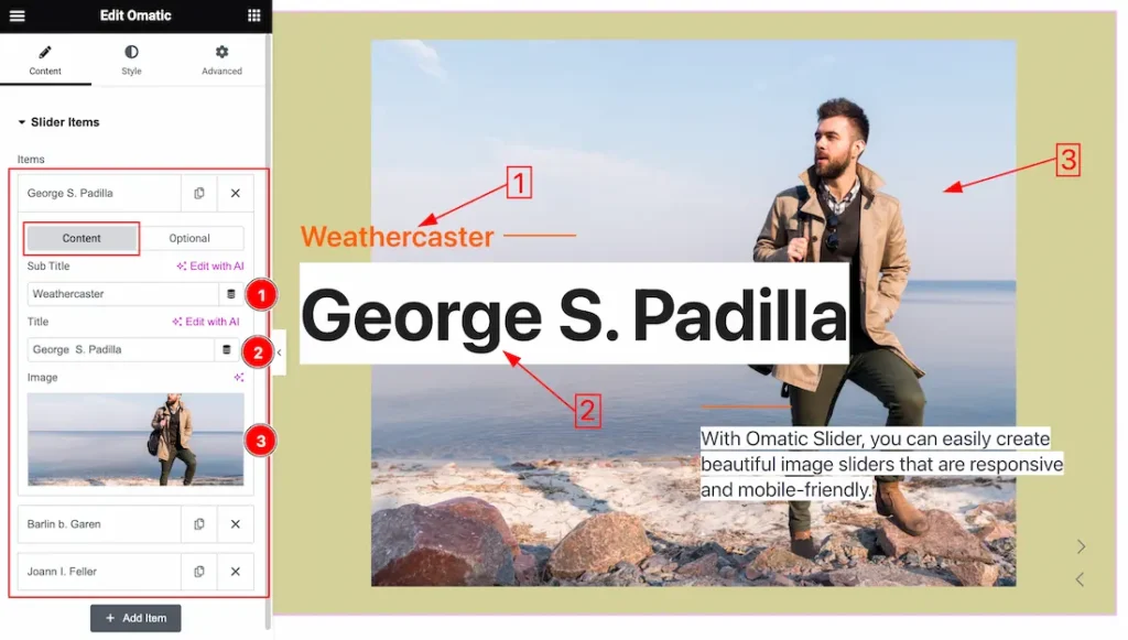
Come to the Slider Items section, you will get two sub-sections; Content and Optional.
In the Content tab mode, you will get the below options.
1. Sub Title: This option lets you change the Sub Title Text for the slider.
2. Title: This option lets you change the Title Text for the slider.
3. Image: This option lets you change the Image for the slider.
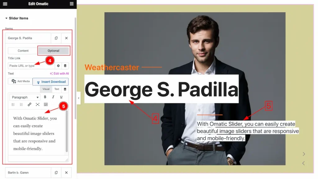
In the Optional tab mode, you will get the below options.
4. Title Link: you can set a link for the Title.
5. Text: you can set the Text for the slider items.
Click on Each widget item, you will find a similar customization option.
Additional Settings Section
Go to Content > Additional Settings
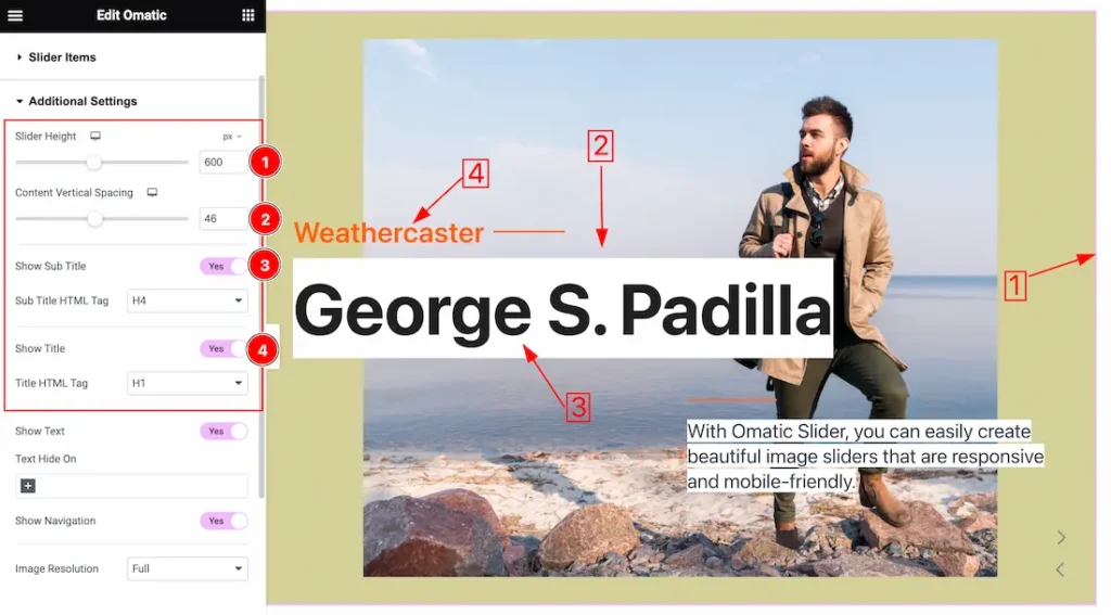
1. Slider Height: This option lets you set the Height for the Slider.
2. Content Vertical Spacing: This option lets you set the Content Vertical Spacing for the Title and Sub Title.
3. Show Sub Title: Enable or Disable the Show Sub Title switcher button to show or hide the Sub Title from your Slider. Here also you get the Sub Title HTML Tag options to decorate your Sub Title in different Tags. Like as H1 to H6, Div, Span, and P.
4. Show Title: Enable or Disable the Show Title switcher button to show or hide the Title from your Slider. Here also you get the Title HTML Tag options to decorate your Title in different Tags. Like as H1 to H6, Div, Span, and P.
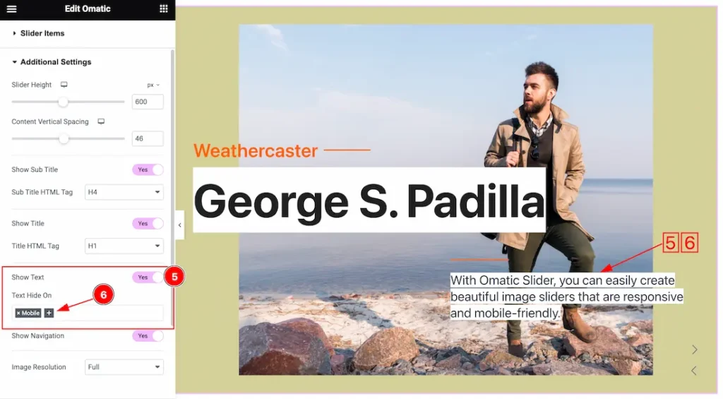
5. Show Text: Enable or Disable the Show Text switcher button to show or hide the Text from your Slider.
6. Text Hide On: The Text Hide On option lets you hide the text for Mobile, Tablet, and Desktop devices. Just click the “+” sign and select the device then the Text will hide for that device.
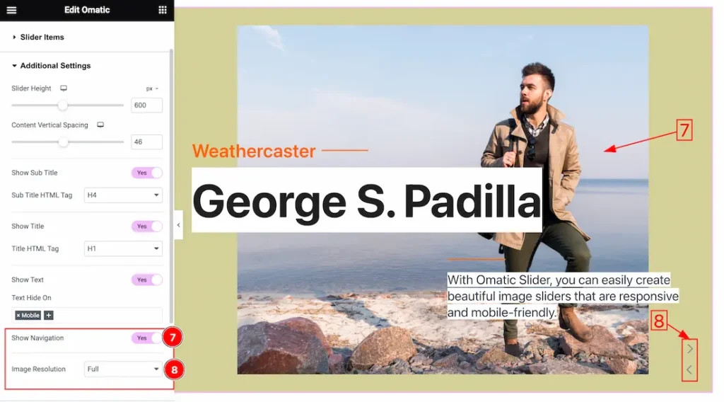
7. Show Navigation: Enable or Disable the Show Navigation switcher button to show or hide the Navigation from your Slider.
8. Image Resolution: Select the Image Resolution Type( Thumbnail, Medium, Large, Full, etc) to showcase your slider.
The choice of image resolution type depends on the requirements of your slider and the display devices. Here’s a brief overview:
- Thumbnail: Small-sized images suitable for quick loading and display in smaller spaces.
- Medium: Moderately sized images with a balance between quality and file size.
- Large: Higher resolution images suitable for larger sliders or displays with more space.
- Full: Images with the highest resolution available, suitable for large displays or backgrounds.
Slider Settings Section
Go to Content > Slider Settings
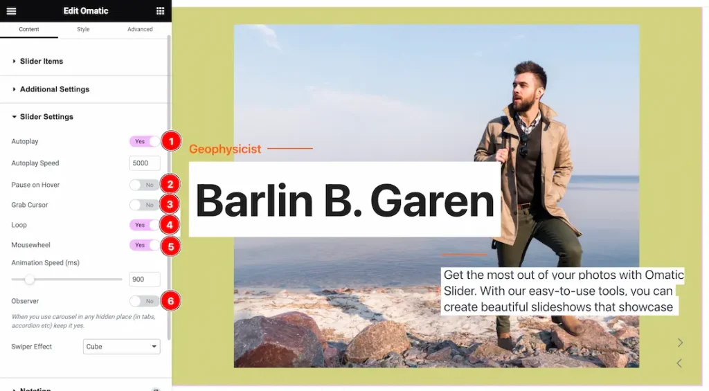
In this section, you will get the below options to customize the slider.
1. Autoplay switcher: If you Enable the Autoplay switcher button, your slider will slide into Autoplay mode, and you can set the Autoplay Speed as you wish.
2. Pause on Hover: If you activate the pause on Hover button, when visitors Hover the mouse cursor on the slider, then your slider will Hold, otherwise your slider slide Autoplay.
3. Grab The Cursor: Your mouse pointer icon will be changed into a grab cursor. Visitors can slide your slider manually with your mouse cursor.
4. Loop: When you activate the Loop switcher button, your slider will loop at a certain time interval.
5. Mousewheel: If you Activate the Mousewheel switcher button, when you scroll your Mousewheel then the Slider will change with the scroll. You also can set the Mousewhell Animation Speed as you need.
6. Observer: If you enable the option then you are able to use the slider/carousel in any hidden places (such as in tabs, Accordion, etc).
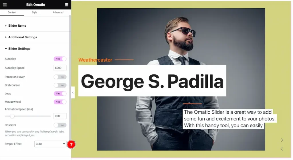
7. Swiper Effect: This option lets you set the Swiper Effects as Slide, Fade, Cube, CoverFlow, Flip, Shutters, Slicer, Tinder, GL, and Creative.
Work with The Style Tab
Image Section
Go to Style > Image
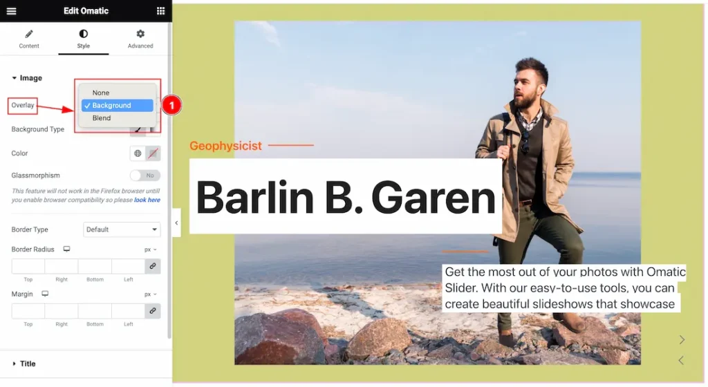
1. Overlay: Overlay is an effect that is displayed over the slider. Here you will get the Overlay Type ( None, Background, and Blend). Here we select the Overlay Type Background. you can choose any one of them.
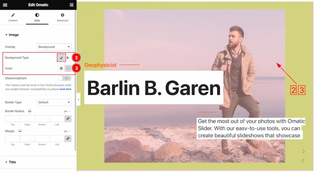
2. Background Type: you can change the color of any object background to classic or gradient. Here we choose the Background type Classic. if you select the Type Classic then you will get the Background Color options to customize it.
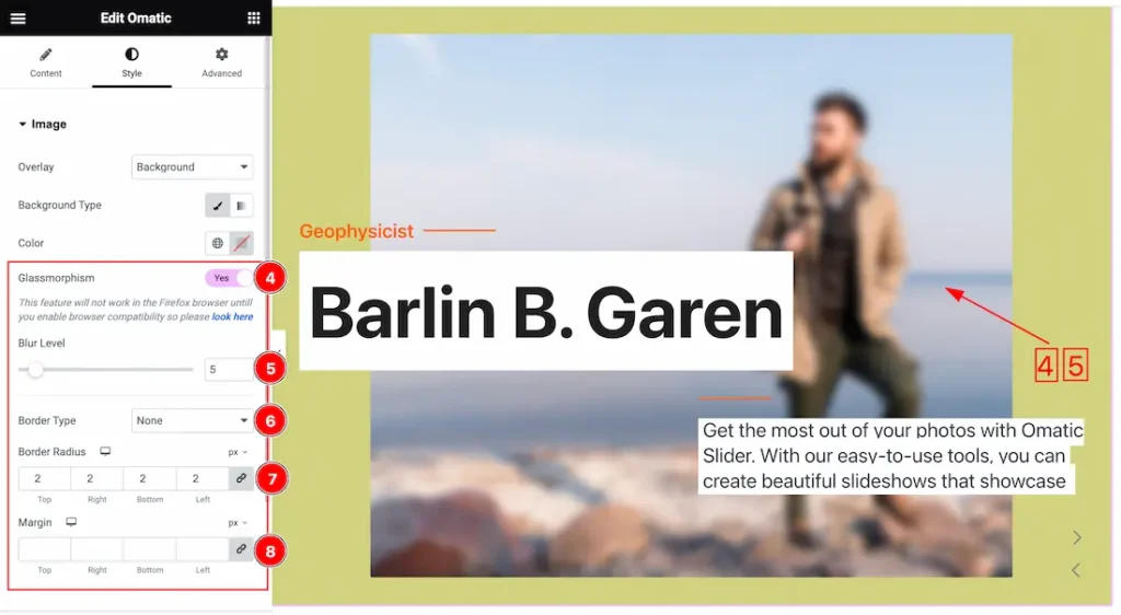
4. Glassmorphism: Actually, the Glassmorphism is used to blur the slider background. That is shown in the above screenshot. you can easily enable or disable the Glassmorphism switcher button to show or hide the effect on your slider.
5. Blur Level: This option lets you set the Blur Level for the Glassmorphism.
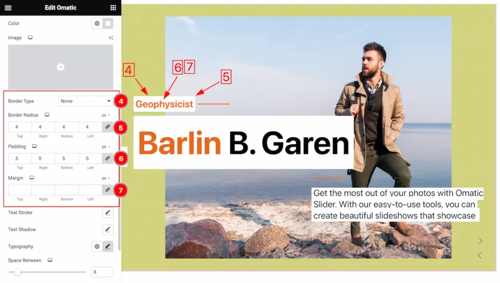
6. Border Type: you can set the Border Type to Default, None, Solid, Double, Dotted, Dashed, or Groove. We choose here the Border Type Solid.
7. Border Radius: Customizes the border corners for roundness.
8. Margin: Adjusts the position of an object over the canvas.
Title Section
Go to Style > Title
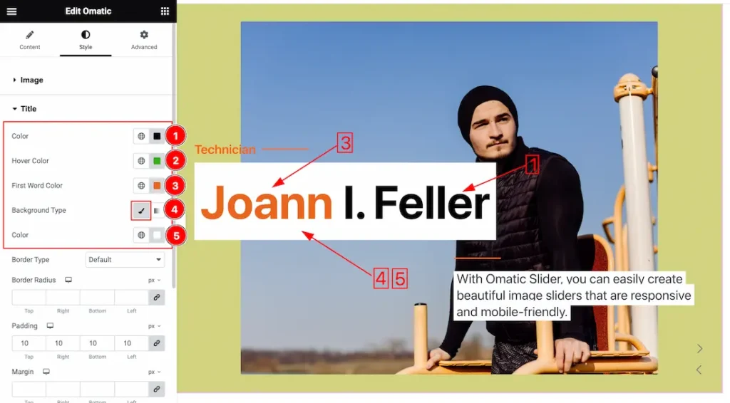
1. Color: This lets you change the title text color.
2. Hover Color: This lets you change the title text Hover color.
3. First Word Color: This lets you change the title’s first-word color.
4. Background Type: you can change the color of any Title background to classic or gradient. Here we choose the Background type Classic.
5. Background Color: This lets you change the Title Background color. If you want, you also can change an image to the Background.
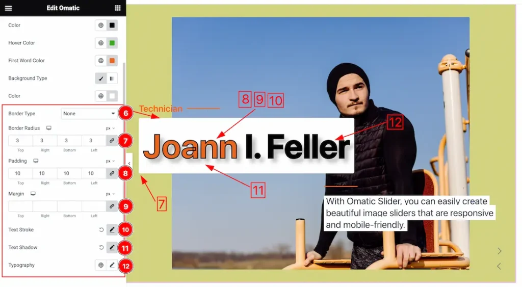
6. Border Type: you can set the Border Type to Default, None, Solid, Double, Dotted, Dashed, or Groove. We choose here the Border Type Solid.
7. Border Radius: Customizes the border corners for roundness.
8. Padding: Add spaces around an object to increase the inner area. Padding allows you to control the internal space within an element.
9. Margin: Adjusts the position of an object over the canvas.
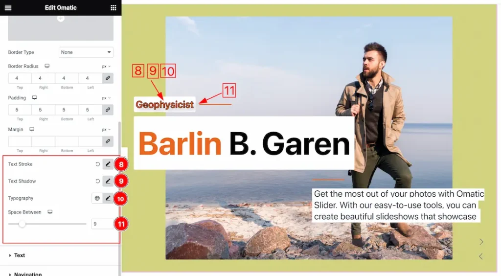
10. Text Stroke: If you want to add a stroke (outline) around the text, you can use the Text Stroke property. you also can change the Text Stroke Color as your working demand.
11. Text Shadow: The Text Shadow property is used to create the shadow around the text. It takes three values: horizontal offset, vertical offset, and blur radius. Here you can also change the Text Shadow Color.
12. Typography: Change the font family, size, weight, style, transform, decoration, line height, letter spacing, and word spacing from here.
Sub Title Section
Go to Style > Sub Title
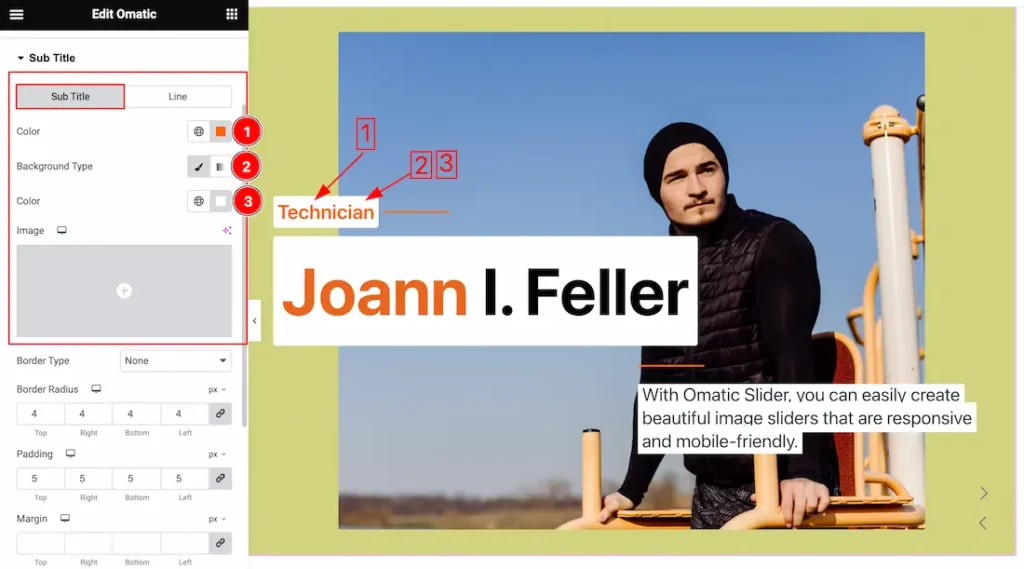
Come to the Sub Title section, you will get two sub-sections; Sub Title and Line.
Under the Sub Title section, you will get the below options to customize the section.
1. Color: This option lets you change the Sub Title text color.
2. Background Type: you can change the color of any Sub Title background to classic or gradient. Here we choose the Background type Classic.
3. Background Color: This lets you change the Sub Title Background color. If you want, you also can change an image to the Background.
4. Border Type: you can set the Border Type to Default, None, Solid, Double, Dotted, Dashed, or Groove. We choose here the Border Type Solid.
5. Border Radius: Customizes the border corners for roundness.
6. Padding: Add spaces around an object to increase the inner area. Padding allows you to control the internal space within an element.
7. Margin: Adjusts the position of an object over the canvas.
8. Text Stroke: If you want to add a stroke (outline) around the text, you can use the Text Stroke property. you also can change the Text Stroke Color as your working demand.
9. Text Shadow: The Text Shadow property is used to create the shadow around the text. It takes three values: horizontal offset, vertical offset, and blur radius. Here you can also change the Text Shadow Color.
10. Typography: Change the font family, size, weight, style, transform, decoration, line height, letter spacing, and word spacing from here.
11. Space Between: Actually, the Space Between works between sub title and Line. you can customize the space to your working demand.
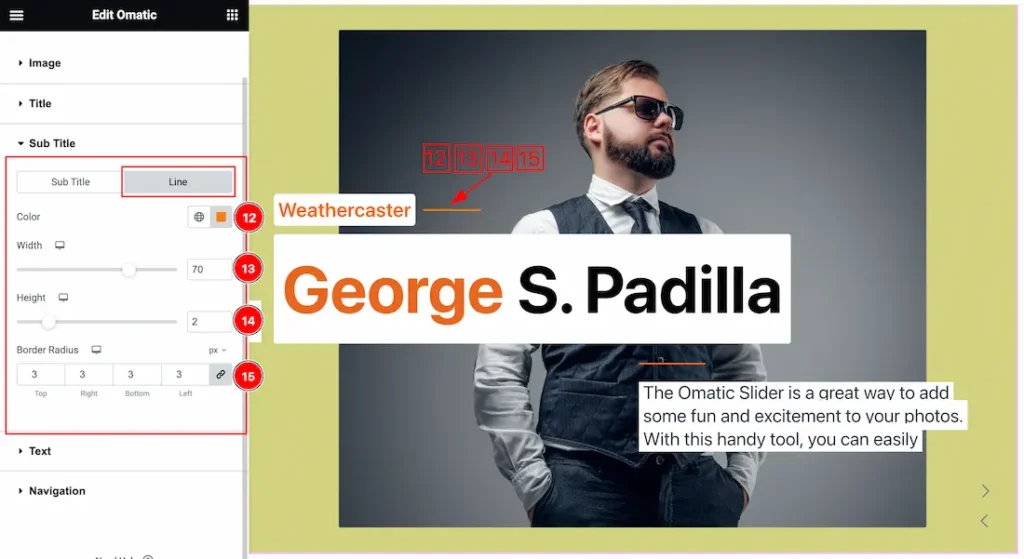
Under the Line section, you will get the below options to customize the section.
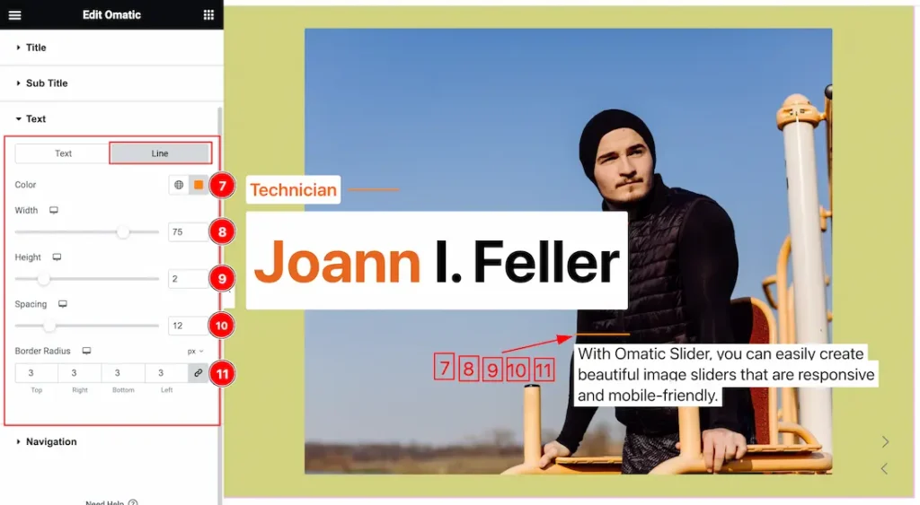
12. Color: This option lets you change the Line color.
13. Width: This option lets you change the Line Width.
14. Height: This option lets you change the Line Height.
15. Border Radius: Customizes the border corners for roundness.
Text Section
Go to Style > Text
Come to the Text section, you will get two sub-sections; Text and Line.
Under the Text section, you will get the below options to customize the section.
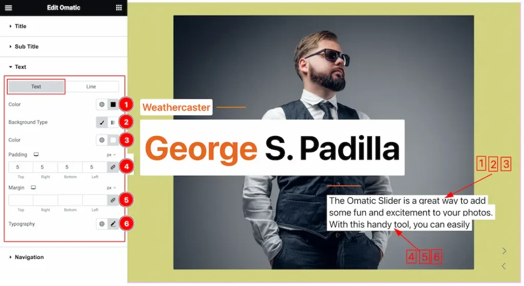
1. Color: This option lets you change the Text color.
2. Background Type: you can change the color of any Text background to classic or gradient. Here we choose the Background type Classic.
3. Background Color: This lets you change the Text Background color. If you want, you also can change an image to the Background.
4. Padding: Add spaces around an object to increase the inner area. Padding allows you to control the internal space within an element.
5. Margin: Adjusts the position of an object over the canvas.
6. Typography: Change the font family, size, weight, style, transform, decoration, line height, letter spacing, and word spacing from here.
Under the Line section, you will get the below options to customize the section.
7. Color: This option lets you change the Line color.
8. Width: This option lets you change the Line Width.
9. Height: This option lets you change the Line Height.
10. Spacing: This option lets you to set the space between Text and Line.
11. Border Radius: Customizes the border corners for roundness.
Navigation Section
Go to Style > Navigation
Come to the Navigation section, you will get two sub-sections; Normal and Hover.
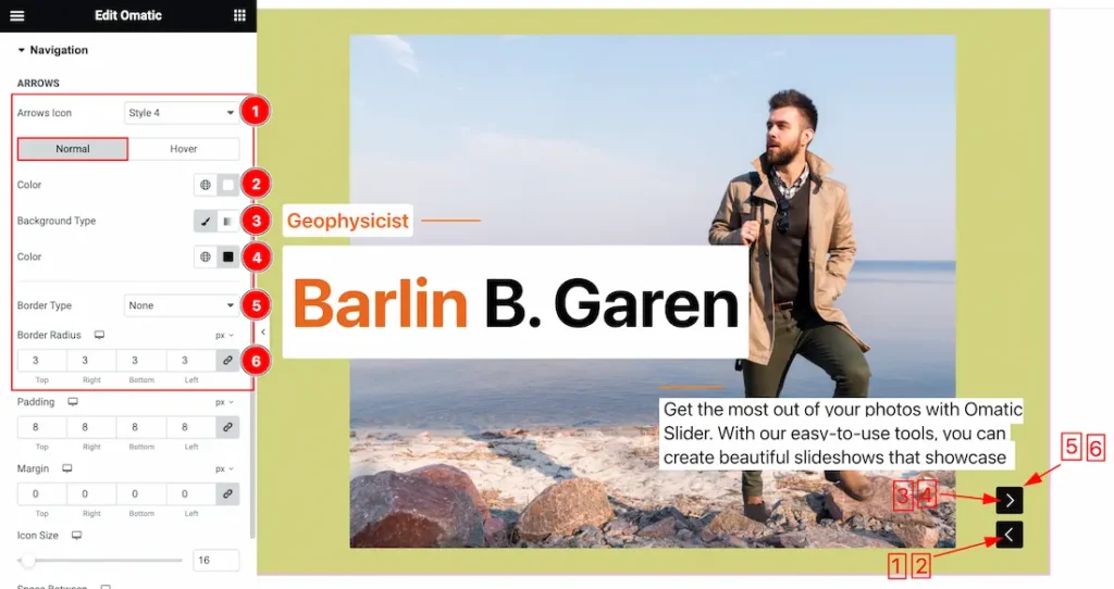
Under the Normal sub section, you will get the below options to customize the section.
1. Arrow Icon: This option lets you change the Arrow Icon Style. Here you get 1 to 23 ready styles. you can easily choose one of them.
2. Icon Color: This options lets you change the Icon Color.
3. Background Type: you can change the color of any Text background to classic or gradient. Here we choose the Background type Classic.
4. Background Color: This lets you change the Text Background color. If you want, you also can change an image to the Background.
5. Border Type: you can set the Border Type to Default, None, Solid, Double, Dotted, Dashed, or Groove. We choose here the Border Type Solid.
6. Border Radius: Customizes the border corners for roundness.
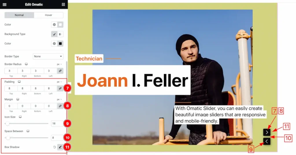
7. Padding: Add spaces around an object to increase the inner area. Padding allows you to control the internal space within an element.
8. Margin: Adjusts the position of an object over the canvas.
9. Icon Size: This option lets you change the Icon Size of the Navigation.
10. Space Between: This option lets you set the Space Between two Navigation buttons.
11. Box Shadow: The Box Shadow property is used to create the shadow around the Category Button. It takes Four values: Horizontal offset, Vertical offset, blur, and Spread to customize the Box shadow.
- Box Shadow Color: This lets you change the Box Shadow color.
- Position: you can set the Box Shadow position Outline and Inset. Here we set the Box Shadow position Outline.
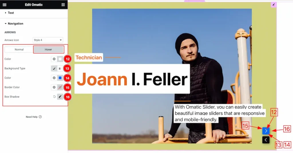
Under the Hover sub section, you will get a similar options as in the Normal sub section. So please try it yourself.
All done! You have successfully customized the Omatic Slider widget on your website.
Video Assist
You can also watch the video tutorial Learn more about the Omatic Slider widget.. Please visit the demo page for examples.
Thanks for being with us.