The Advanced Progress Bar widget from Element Pack Pro lets you display progress, skills, or statistics with stylish and customizable bars. It offers flexible layouts, animations, and styling options to create engaging visual indicators. This documentation explains how to use and customize the Advanced Progress Bar widget in Elementor.
Enable The Advanced Progress Bar Widget
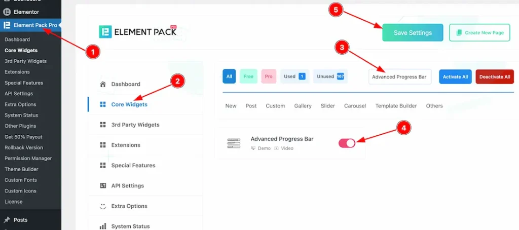
To use the Advanced Progress Bar widget from Element Pack Pro, first, you have to enable the widget.
- Go to WordPress dashboard → Element Pack Pro Plugin dashboard.
- Then, Click the Core Widgets Tab.
- Search the Advanced Progress Bar Widget Name.
- Enable the Advanced Progress Bar Widget.
- Hit the Save Settings Button.
Inserting The Advanced Progress Bar Widget
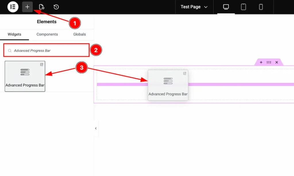
1. Go to the Elementor Editor Page and hit the “+” icon Button.
2. Search the Advanced Progress Bar name.
3. Drag the widget and drop it on the editor page.
Work With Content Tab
Progress Bars section
Go to Content > Progress Bars
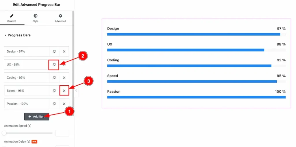
1. Add Item: You can click on this button to add more bar items.
2. Copy Button: You can click on the copy button to copy the same item or duplicate the bar item with this option.
3. Close Button: You can click on the close button to close/delete the bar items with this option.
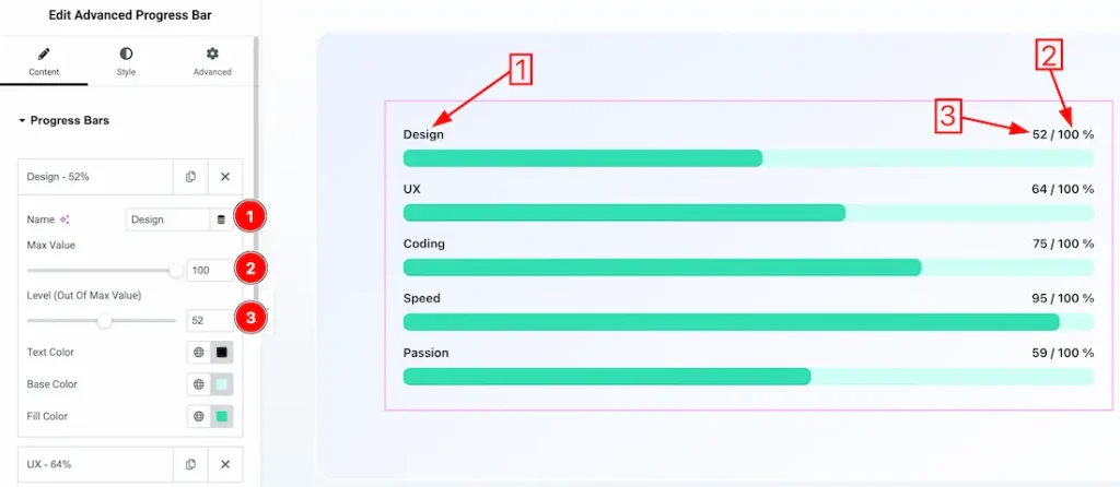
Inside each bar item, you will get the following customization options-
1. Name: This option lets you change the bar item’s name.
2. Max Value: You can set the item’s max value from here.
3. Lavel(Out of Max Value): You can set the label Out of Max Value value from here.
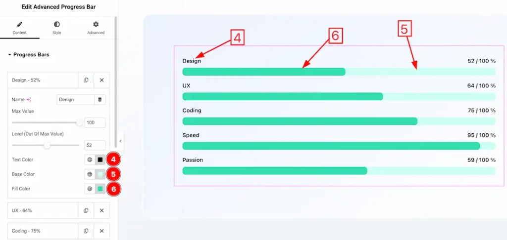
4. Text Color: This option lets you change the bar text color.
5. Base Color: This option lets you change the bar’s base color.
6. Fill Color: This option lets you change the bar fill color.
When Progress Style- Default
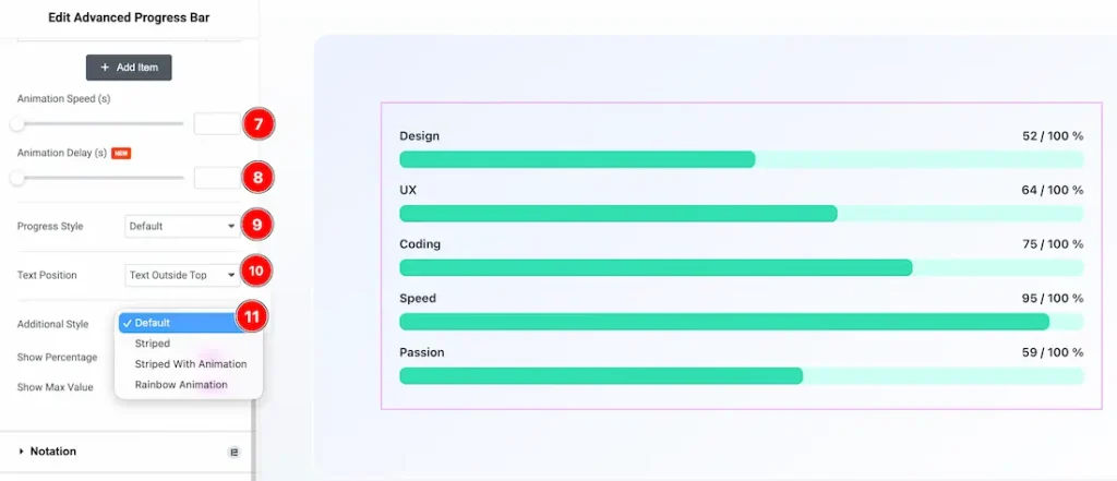
7. Animation Speed: You can set the progress bar animation speed from here.
8. Animation Delay: You can set the progress bar animation delay time from here.
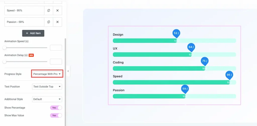
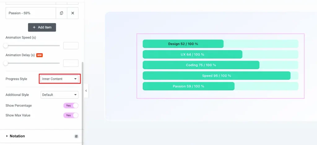
9. Progress Style: From here, you can choose your preferred progress style- Default, Percentage with progress, and inner content.
10. Text Position: You can set the bar text position- Text outside top, or text outside bottom.
11. Additional Style: You can set the additional style- Default, Striped, Striped with Animation, and Rainbow Animation.
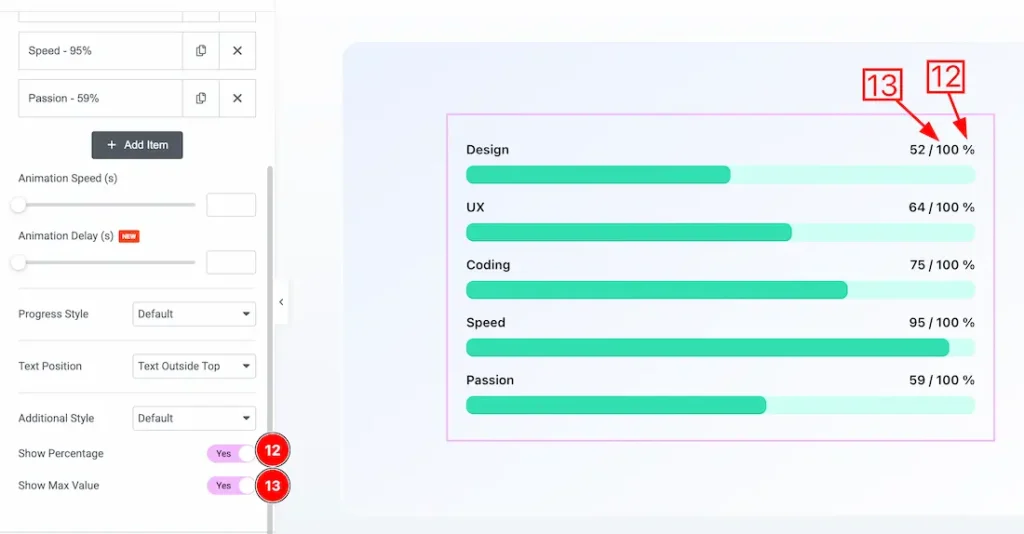
12. Show Percentage: Enable/disable the show percentage switcher button to show/hide the percentage from the bar.
13. Show Max Value: Enable/disable the show Max Value switcher button to show/hide the Max Value from the bar.
When Progress Style- Percentage with progress
When Progress Style- Inner Content
Work with Style Tab
Progress Bars Section
Go to Style → Progress Bars
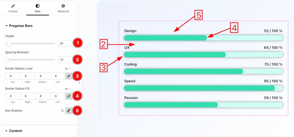
1. Height: You can set the bar height from here.
2. Spacing Between: You can adjust the space between bars from here.
3. Border Radius Level: You can adjust the bar border radius level from here.
4. Border Radius Fill: You can adjust the bar border fill radius level from here.
5. Box Shadow: You can add the box shadow for the progress bar from here.
Content Section
Go to Style → Content
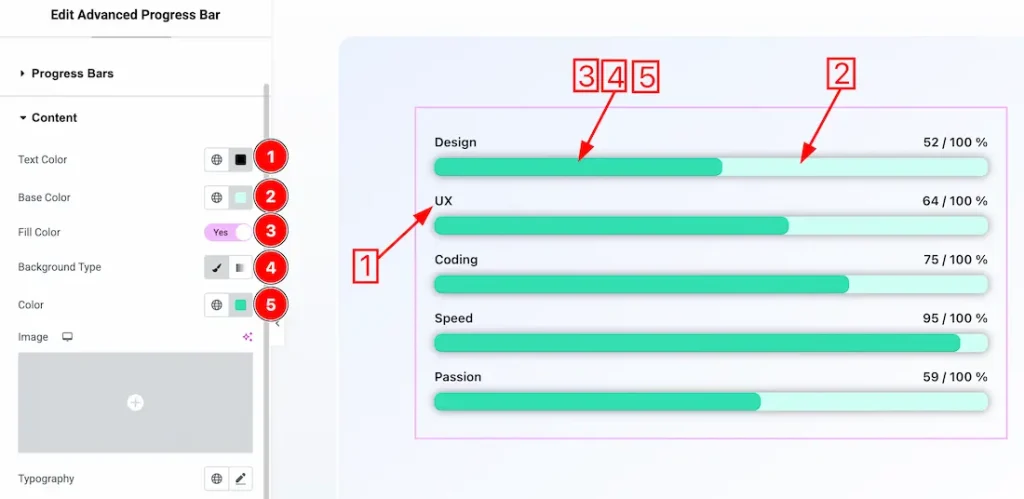
1. Text Color: This option lets you change the bar text color.
2. Base Color: This option lets you change the bar’s base color.
3. Fill Color: This option lets you change the bar fill color.
4. Background Type: You can change the bar’s background to classic or gradient. Here we choose the Background type Classic.
5. Background Color: You can change the bar background color from here.
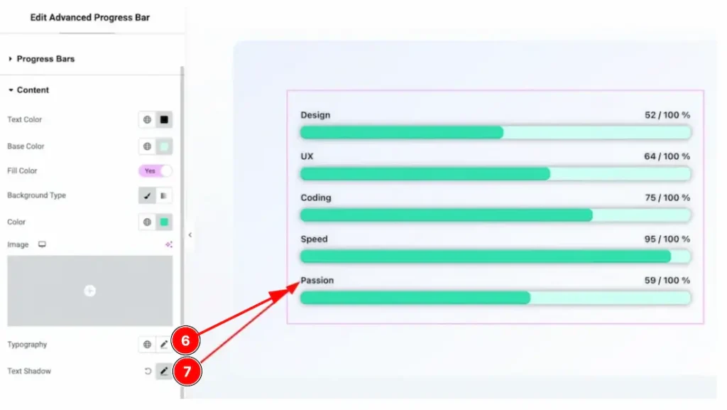
6. Typography: Change the font family, size, weight, style, transform, decoration, line height, letter spacing, and word spacing from here.
7. Text Shadow: You can add the bar text shadow from here.
All done! You have successfully customized the Advanced Progress Bar widget on your website.
Video Assist
You can watch this quick video to learn about the Advanced Progress Bar widget. Please visit the demo page for examples.
Thanks for staying with us.