

In this documentation, we will discuss about the customizations of the Banner widget brought to you by Ultimate Post Kit addon for Elementor.
Inserting Banner Widget
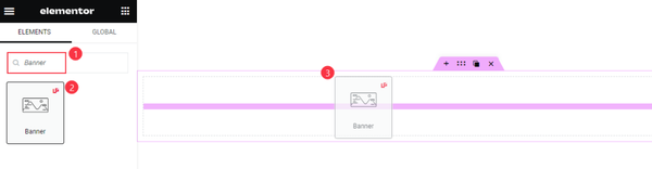
First Go to the Elementor editor search bar, type in the widget name, and drag-drop it on the page.
Introduce with the Default view
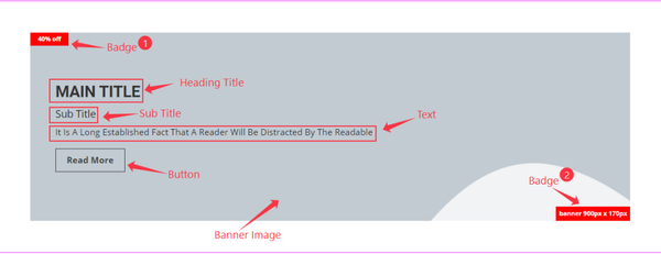
You can see a Banner placeholder Image, Title, Sub Title, Description text, Button, and two Badges.
Content Section Customization
Layout customization
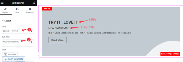
Go to Content > layout
Find the Title and Sub Title fields for the banner.
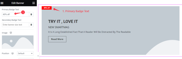
Then there are Primary Badge Text and Secondary Badge Text fields. We just removed text from the secondary field to hide that badge.
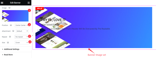
Next, you can set the banner Image. Find the image Position, Attachment, Repeat, and Size options to customize the image.
Additional Section Customization
Go to Content > Additional Settings
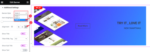
In the additional settings section, you can select the style of the Banner. Let’s select Style 3 and change the content Alignment to the right side. You can also adjust the Item Height aka the banner height.
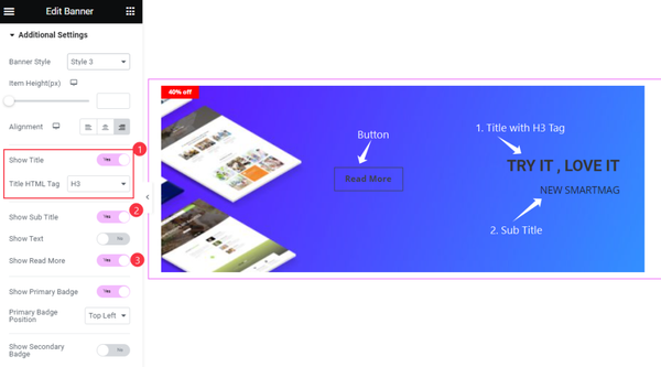
Below are several switchers such as the Title and Heading Tag, Sub Title, and the Read More Button which are enabled already. You can keep the corresponding element on the banner interface by toggling these switchers.
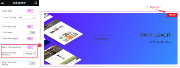
You can see the Primary Badge switcher enabled. Then you may change the Badge Position from the options.
Read More Button Customization
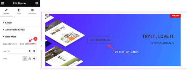
Go to Content > Read More
Here you can customize the button. You can set the Read More Text, set Link, and select Icon.
Customization with Style Tab
Item Customization
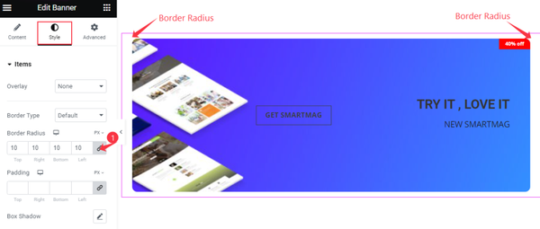
Go to Style > Items
Item has several options to customize it. We have set the Border Radius. If you want you can set the Overlay color, select Border, and add Padding and Box Shadow.
Title Customization
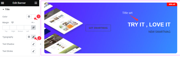
Go to Style > Title
You can make the Title stylish. Just add the Color and Set Typography for the text. There are Margin, Text Shadow, and Text Stroke options available.
Read More Button Customization
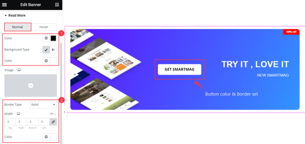
Go to Style > Read More
To make the read More button more stylish, In normal mode, we have set the text Color and Background Color, For the border we have selected Border Type, Width, and Color.
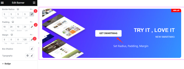
Here we have set Border Radius, Added Padding and Margin for the Read More button. Now it looks good. Let’s customize in Hover mode.
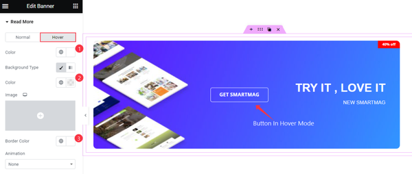
For the hover mode of the Button, we have set Color, Background Color, and Border color.
Badge Customization
Go to Style > Badge
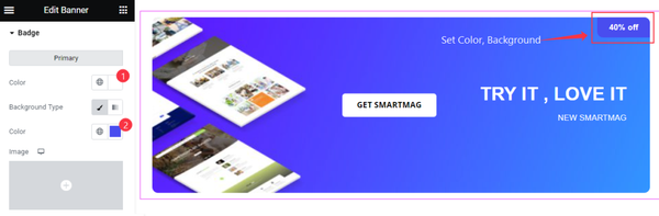
For the badge, we have set the Color and Background.
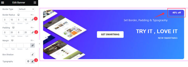
To make the badge stylish we set the Border Radius, Padding, and Typography.
This way you can make the banner more stylish and good to look at.
Video Assist
Watch this video to learn about the Banner widget. Please visit the demo page for examples.
Thanks for being with us.