

The Content Switcher Widget is a user interface element that allows users to switch between different content views within a single container. Content switchers can be used to display different sets of content within minimal space.
Let’s explore the customizations.
Inserting Content Switcher Widget
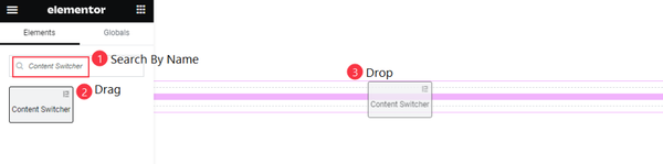
In the search bar of the Elementor editor page, Search by the widget name ‘Content Switcher’ and then the widget will appear on the menu. Just Drag it and Drop it on the page.
The default view of the Content Switcher
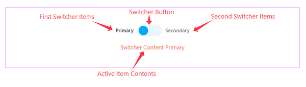
As you see in the screenshot above, There showing the Two Switcher Items, the Switcher button, and The active item Contents. This is a simple and interactive widget.

See the changes between the two switchers showing different content.
Content Tab Explore
The content tab contains the basic controls of any widget. You can change the default layout using these options one by one.
Switcher Selection and Add Items
Go to Style > Switcher
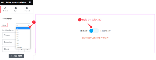
First, you can select the Switcher Style from the several styles available at the top option. Here, we have selected the first style.
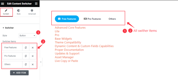
Right below, the Content Switcher items are listed as Primary, Secondary, and Others. You can change their title and rearrange positions or add more items anytime you want.
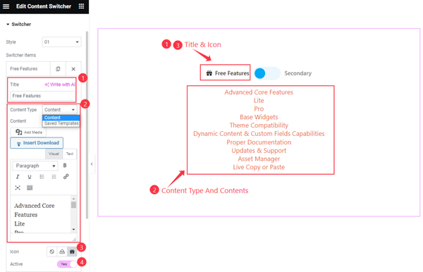
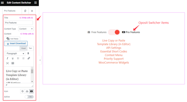
Clicking on an item box, you can customize the Switcher Item. First, set the Title for the Item. You can select Content Type ( Content or Saved Template). If you work with a template you can select the Saved Template and then choose any template.
With Content selected for the type, you can customize the content with the given options. You can add Icon along with the Title. Just set the Icon and keep the item active by enabling the Active switcher.
By following the previous way, you can set the secondary content or another switcher item.
Works with Multiple Switcher Items
If you select Style Button, the switcher items will show as clickable tabs and all items will be visible on the screen. This can help you to work with multiple contents.
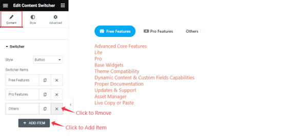
You can remove the default Item by clicking on the Cross Button there. If you like you can add items by clicking the “ + ADD ITEM “ button. You can add as many items as you want.
Style Tab Customization
The Style Tab contains the basic options to change the default appearances of any widget. Here, you can make interactive designs by using the style tab.
Let’s explore them one by one.
Switch Customization
Go to Style > Switch
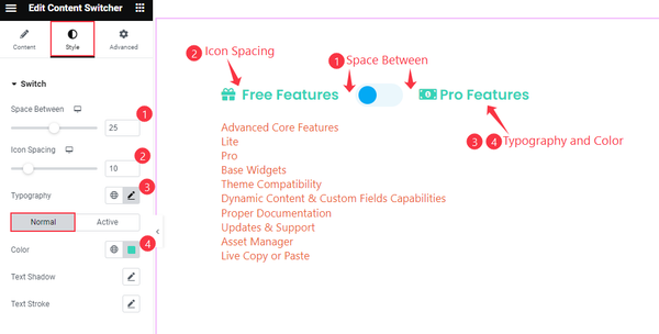
For the switch, you can customize the Space Between and Icon Spacing. You can edit the font by the Typography option.
Then from the Normal subsection, you can change the text Color, Text Shadow, and Text Stroke. Both Normal and Active subsections hold the same controls.
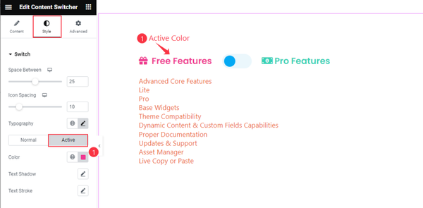
To specify the Active Item, you can set a different Color for looking good too.
Switcher Customization
Go to Style > Switcher
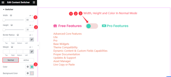
In the switcher section, you can adjust the Width and Height of the switcher button with the additional Border Radius and Margin.
At the bottom, you can change the button dot Color and Background Color in Normal Mode.
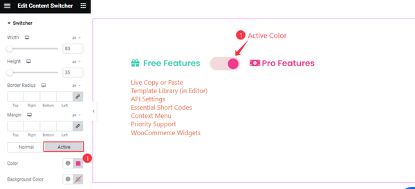
The same goes for the Active Switcher mode.
Switcher Bar Customization
Go to Style > Switcher Bar
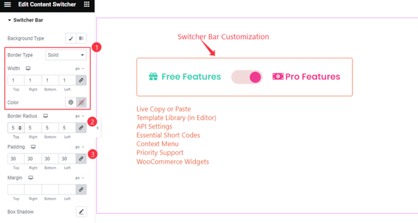
For the switcher bar, or to be specific, the switcher set, you can start with the Background Type option and then go for the Border Type, Width, Border Radius (to round the corners), Padding (to increase inner space), Margin, and Box Shadow (3D drop shadow) options.
Content Section Customization
Go to Style > Content
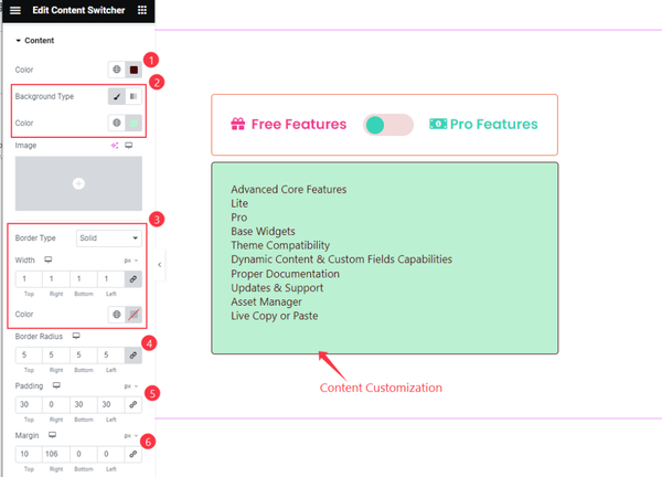
For the Content part, you can customize the Text Color and Background Color on the top. Then go with Border Type, Width, Color, Border Radius, Padding, and Margin options.
By following all the steps you will be able to make an interactive design of the Content Switcher Widget.
Video Assist
The Content Switcher widget video tutorial coming soon. Please visit the demo page for examples.
Thanks for being with us.