

In this documentation, we will show you how to customize the Iconic Slider widget presented by the Ultimate Post Kit addon.
Inserting Iconic Slider Widget
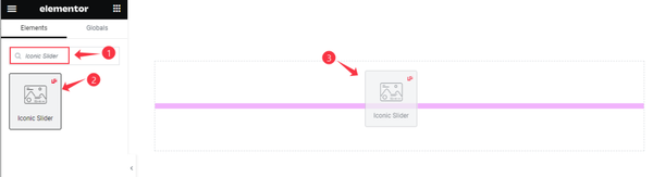
Search by the Iconic slider widget name, then drag and drop it.
Default view of the Iconic Slider
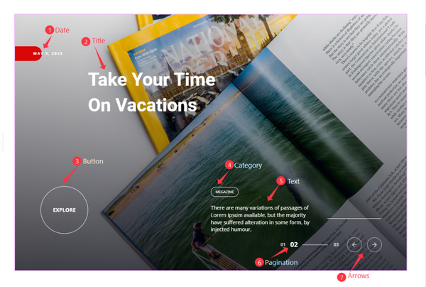
This Iconic Slider displays the post Date, Title, readmore Button, Category, Text, Pagination, Arrows, and a broad Feature Image. The layout places these elements in nice proportions while boosting the user experience.
Content Tab Customization
Layout Section
Go to Content > Layout
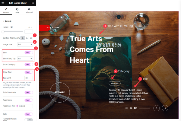
Find the Height, Content Alignment, Image Size, Title and Title HTML Tag, Show Category, Show Text, and Text Limit options.
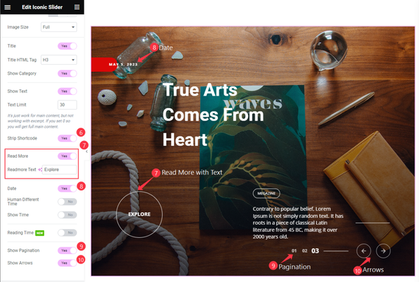
Then Find the Strip Shortcode, Read More and Readmore Text, Date, Human Different Time, ShowTime, Reading Time, Show Pagination, and Show Arrows options.
Query Section
Go to Content > Query
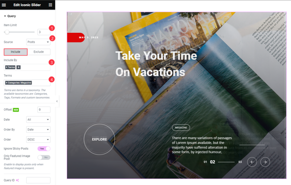
Find the Item Limit and Source (Posts, Pages, Landing Pages, FAQ, Portfolio, etc.) options.
Also, find the Include > Include By and Terms filters. Include filter helps show only selected posts.
Exclude filter does exactly the opposite of the Include filter and helps hide selected posts.
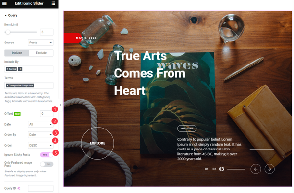
Then find the Offset, Date, OrderBy, Order, Ignore Sticky Posts, and Only Featured Image Post options.
The Query ID field is for applying custom queries on WordPress.
Slider Settings
Go to Content > Slider Settings
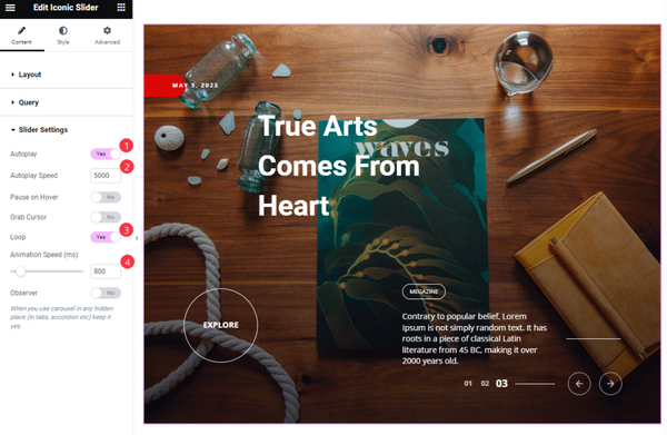
Find the Autoplay, Autoplay Speed, Pause on Hover, Grab Cursor, Loop, and Animation Speed options.
Style Tab Customization
Slider Section
Go to Style > Slider
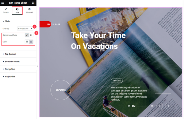
Find the Overlay and Background Type (Classic > Color and Gradient > Colors) options.
Top Content Section
Go to Style > Top Content
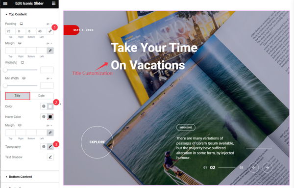
Find the Padding, Margin, Width, and Max Width options.
For the Title subsection, find the title Color, Hover Color, Margin, Typography, and Text Shadow Options.
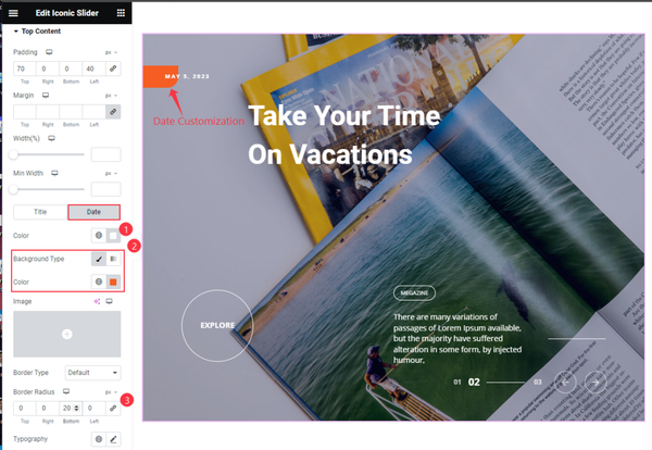
For the Date subsection, find the text Color, Background Type, Color, Border Type, Border Radius, and Typography options.
Bottom Content Section
Go to Style > Bottom Content
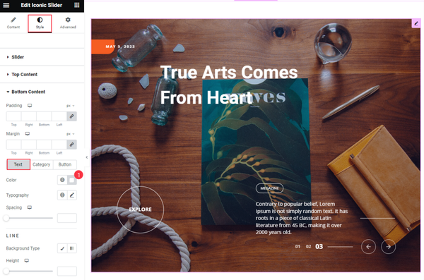
Find the Padding and Margin options.
For the Text subsection, find the Color, Typography, and Spacing options. Also, find the Background Type and Height options for the Line beside the text.
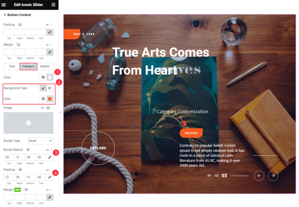
For the Category subsection, find the text Color, Background Type, Color, Border Type, Border Radius, Padding, Margin, Space Between, Box Shadow, and Typography options. Also, find the text Color, Background Type, and Border Color for Category Hover.
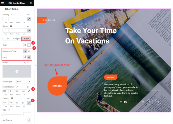
For the Button subsection, find the text Color, Background Type, Color, Border Type, Border Radius, Padding, Size, Box Shadow, and Typography options.
Also, find the text Color, Background Type, and Border Color options for button hover.
Navigation Section
Go to Style > Navigation
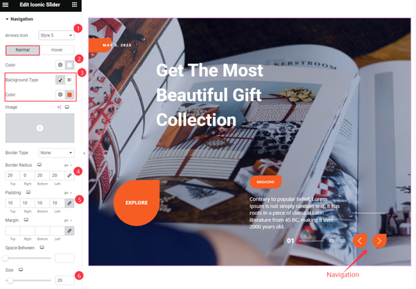
You can find the Arrows Icon (23 icons) option at the top. Then in Normal subsection, find the icon Color, Background Type, Color, Border Type, Border Radius, Padding, Margin, Space Between, and Size Options.
The Hover subsection has icon Color, Background Type, and Border Color options available.
Pagination Section
Go to Style > Pagination
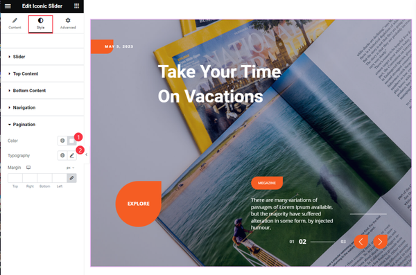
Find the Color, Typography, and Margin options.
Video Assist
The Iconic Slider widget video tutorial coming soon. Please visit the demo page for examples.
Thanks for being with us.